
Xamarin Community Toolkit Succinctly®

CHAPTER 5
Data Validation with Reusable Behaviors
In Xamarin.Forms (and, more generally, in XAML-based platforms), behaviors let you add functionality to user interface views without having to subclass them. The actual functionality is implemented in a behavior class, but it is simply attached to a control in XAML for easy usage.
As you can imagine, this chapter assumes you already have knowledge of behaviors. If you are new to this feature, I strongly recommend you first get started with the official documentation. Here you will find guidance on the behaviors that are most relevant for data validation in the Xamarin Community Toolkit. Keep the official sample project open in Visual Studio, as this will serve as the reference for the discussion.
Note: Among others, the Xamarin Community Toolkit also provides behaviors to animate visual elements. These are not covered in this chapter, whose goal is explaining how to perform data validation in an efficient way. In addition, the EventToCommandBehavior is not discussed in this chapter because it is related to working with the Model-View-ViewModel pattern, so it makes more sense to discuss it in Chapter 6.
Behaviors’ common properties
All the behaviors exposed by the Xamarin Community Toolkit derive from the Xamarin.CommunityToolkit.Internals.Behaviors.ValidationBehavior class. This base class provides a number of properties that all derived behaviors expose. Table 6 summarizes the most relevant and used properties.
Table 6: Behaviors’ common properties
Most of these properties will be recalled very often in the next paragraphs, so it’s important for you to know what they are about.
Note: In the sample project, the IsValidStyle and IsInvalidStyle properties have the same value for most behaviors, so you will get screenshots only when appropriate.
Validating an email address
Validating an email address that the user enters via an Entry view is a very common task, and the Xamarin Community Toolkit makes it simpler by exposing the EmailValidationBehavior class. In the sample project, this is demonstrated in the Behaviors\EmailValidationBehaviorPage.xaml file.
For a better understanding, consider Figure 42, where an invalid email address has been entered.
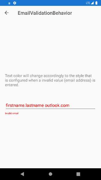
Figure 42: Email address validation
The entered string has been recognized as invalid by the EmailValidationBehavior object, which automatically performs formal validation. This behavior exposes two properties, IsValid and IsNotValid, which return true if the email address is either valid or invalid.
Based on these property values, you can style other UI elements; for example, with an invalid email address, the label you see in Figure 42 is set as visible, and the color for the invalid text is in red. When the behavior recognizes the supplied email address as valid, the views’ styles return to their original state. Code Listing 8 shows how this is implemented.
Code Listing 8
<?xml version="1.0" encoding="UTF-8"?> <pages:BasePage xmlns="http://xamarin.com/schemas/2014/forms" xmlns:x="http://schemas.microsoft.com/winfx/2009/xaml" xmlns:xct="http://xamarin.com/schemas/2020/toolkit" xmlns:pages="clr-namespace:Xamarin.CommunityToolkit.Sample.Pages" x:Class="Xamarin.CommunityToolkit.Sample.Pages.Behaviors.EmailValidationBehaviorPage"> <pages:BasePage.Resources> <Style x:Key="InvalidEntryStyle" TargetType="Entry"> <Setter Property="TextColor" Value="Red" /> </Style> </pages:BasePage.Resources> <StackLayout Padding="{StaticResource ContentPadding}" Spacing="50" VerticalOptions="CenterAndExpand"> <Label Text="Text color will change accordingly to the style that is configured when a invalid value (email address) is entered." /> <StackLayout Spacing="3"> <Entry Placeholder="Email"> <Entry.Behaviors> <xct:EmailValidationBehavior x:Name="EmailValidator" DecorationFlags="Trim" InvalidStyle="{StaticResource InvalidEntryStyle}"/> </Entry.Behaviors> </Entry> <Label Text="Invalid email" TextColor="Red" FontSize="10" IsVisible="{Binding IsNotValid, Source={x:Reference EmailValidator}}" /> </StackLayout> </StackLayout> </pages:BasePage> |
Notice how the InvalidStyle property of the behavior is assigned with a style that is applied to the Entry only when the email address is recognized as invalid. The DecorationFlags property allows for managing white spaces in the string. Other supported values, other than Trim and all self-explanatory, are None, NormalizeWhiteSpace, NullToEmpty, Trim, TrimEnd, and TrimStart. Finally, notice how the Label becomes visible only when the IsNotValid property of the behavior becomes true. This is a common approach to display an error message close to the input box.
Validating characters in a string
The Xamarin Community Toolkit makes it easy to validate characters in a string. This is possible via the CharactersValidationBehavior class, which you can attach to an Entry or Editor views. In the sample project, it is demonstrated in the Behaviors\CharactersValidationBehavior.xaml file and its code-behind.
The CharactersValidationBehavior requires you to specify values for the following properties:
- CharacterType: This is of type CharacterType and establishes the validation criterion. This is an enumeration so multiple values can be combined together. More details are coming shortly.
- MaximumCharacterCount: The maximum allowed length for the input string.
- MinimumCharacterCount: The minimum number of characters for the input string.
Now consider Figure 43. Notice that the sample code offers two examples, and the second one is based on visual states. I will use the first one.
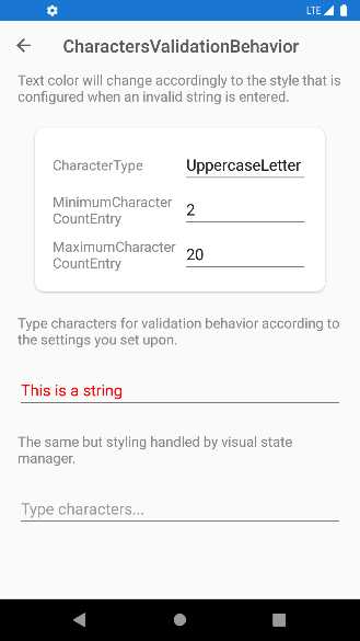
Figure 43: Validating characters in a string
In the example, the UppercaseLetter criterion requires the input string to be all uppercase; otherwise, it will be considered invalid. In addition, minimum and maximum lengths are also specified. Because the string in the figure is not all uppercase, it is considered invalid and displayed in red. The XAML code for this example looks like the following.
<Entry Placeholder="Type characters...">
<Entry.Behaviors>
<xct:CharactersValidationBehavior CharacterType="{Binding SelectedItem,
Source={x:Reference CharacterTypePicker}}"
InvalidStyle="{StaticResource InvalidEntryStyle}"
ValidStyle="{StaticResource ValidEntryStyle}"
MaximumCharacterCount="{Binding Text,
Source={x:Reference MaximumCharacterCountEntry}}"
MinimumCharacterCount="{Binding Text,
Source={x:Reference MinimumCharacterCountEntry}}"/>
</Entry.Behaviors>
</Entry>
MinimumCharacterCount and MaximumCharacterCount are data-bound to the Text property of other entries in the user interface. CharacterType is data-bound to the SelectedItem property of a Picker view, whose ItemsSource is assigned in code-behind with the following code.
public List<CharacterType> CharacterTypes { get; } =
new List<CharacterType>()
{
CharacterType.LowercaseLetter,
CharacterType.UppercaseLetter,
CharacterType.Letter,
CharacterType.Digit,
CharacterType.Alphanumeric,
CharacterType.Whitespace,
CharacterType.NonAlphanumericSymbol,
CharacterType.LowercaseLatinLetter,
CharacterType.UppercaseLatinLetter,
CharacterType.LatinLetter,
CharacterType.Any
};
The values of the CharacterType enumeration are really self-explanatory. Just to give you some examples, if you select Alphanumeric, the input string is considered valid if it contains both letters and numbers; if you select Digit, the input string is considered valid if it only contains numbers. The way the Entry displays the input string (in the example, green when valid, and red when invalid) is determined by the ValidStyle and InvalidStyle properties, respectively bound to the following styles.
<pages:BasePage.Resources>
<Style x:Key="InvalidEntryStyle"
TargetType="Entry">
<Setter Property="TextColor" Value="Red"/>
</Style>
<Style x:Key="ValidEntryStyle"
TargetType="Entry">
<Setter Property="TextColor" Value="Green"/>
</Style>
</pages:BasePage.Resources>
In summary, the CharactersValidationBehavior is very useful to validate characters in a string, or a string as a whole, but it is not the only behavior available for string validation. In the next section, you will learn about the MaxLengthReachedBehavior.
Detecting when the maximum length of a string is reached
The CharactersValidationBehavior provides several criteria for character validation, but sometimes you only need to set up the maximum length for a string and make sure the user does not enter a longer one. For this simpler scenario, you can use the MaxLengthReachedBehavior class.
In the sample project, this is demonstrated in the Behaviors\MaxLengthReachedBehaviorPage.xaml file. The XAML code for the example is the following.
<Entry Placeholder="Start typing until MaxLength is reached..."
MaxLength="{Binding Path=Text, Source={x:Reference MaxLengthSetting}}"
Margin="{StaticResource ContentPadding}">
<Entry.Behaviors>
<xct:MaxLengthReachedBehavior MaxLengthReached=
"MaxLengthReachedBehavior_MaxLengthReached"
ShouldDismissKeyboardAutomatically="{Binding Path=IsToggled,
Source={x:Reference AutoDismissKeyboardSetting}}" />
</Entry.Behaviors>
</Entry>
In the example, all the relevant properties are data-bound to other visual elements. Here’s what you need to know:
- The MaxLength property must be set on the Entry that needs validation with the maximum number of allowed characters.
- The ShouldDismissKeyboardAutomatically property of the behavior, of type bool, allows you to decide whether the keyboard should be automatically dismissed once the maximum length has been reached.
- The MaxLengthReached event of the behavior is raised when the maximum length has been reached. With the related event handler, you can decide what action to take when this happens. In the sample project, the code moves the focus to the next entry.
You can quickly try yourself using the sample code. This behavior is very useful when the validation requirement is only checking for the maximum number of characters in a string.
Validating numbers
The Xamarin Community Toolkit offers the NumericValidationBehavior class, which makes it possible to validate a number against its length and decimal places. In the sample project, it is demonstrated in the Behaviors\NumericValidationBehaviorPage.xaml file. Consider Figure 44, where a number is highlighted in red and considered invalid.
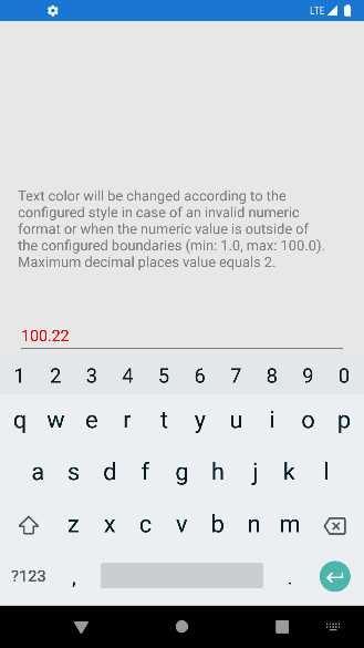
Figure 44: Validating numbers
The following XAML puts in place the number validation.
<Entry Placeholder="Number">
<Entry.Behaviors>
<xct:NumericValidationBehavior
InvalidStyle="{StaticResource InvalidEntryStyle}"
MinimumValue="1.0"
MaximumValue="100.0"
MaximumDecimalPlaces="2"/>
</Entry.Behaviors>
</Entry>
The MinimumValue and MaximumValue properties allow you to set the boundaries of the number. Outside such boundaries, the number is considered invalid. The MaximumDecimalPlaces property allows you to specify how many decimal numbers can be accepted after the separator.
Validating uniform resource identifiers (URI)
Uniform resource identifiers (also referred to as URIs) are typically used to represent web addresses. A URI is made up of the protocol (https://) and the address (www.microsoft.com). Validating URIs is another extremely common requirement in any app, and the Xamarin Community Toolkit makes this easy via the UriValidationBehavior class. All you have to pass to the behavior is the type of URI, which can be Absolute, Relative, or RelativeOrAbsolute (which are the ways the System.Uri class represents URIs).
In the sample project, this is demonstrated in the Behaviors\UriValidationBehaviorPage.xaml file. The following is the XAML sample code.
<Entry Placeholder="UriKind: Absolute">
<Entry.Behaviors>
<xct:UriValidationBehavior UriKind="Absolute"
InvalidStyle="{StaticResource InvalidEntryStyle}"/>
</Entry.Behaviors>
</Entry>
<Entry Placeholder="UriKind: Relative">
<Entry.Behaviors>
<xct:UriValidationBehavior UriKind="Relative"
InvalidStyle="{StaticResource InvalidEntryStyle}"/>
</Entry.Behaviors>
</Entry>
<Entry Placeholder="UriKind: RelativeOrAbsolute">
<Entry.Behaviors>
<xct:UriValidationBehavior UriKind="RelativeOrAbsolute"
InvalidStyle="{StaticResource InvalidEntryStyle}"/>
</Entry.Behaviors>
</Entry>
As for the other behaviors, you can specify a style for the invalid state via the InvalidStyle property, and one for the valid state via the ValidStyle property. If you run the sample project and check this behavior, you will see how an invalid URI will be highlighted in red.
Validating strings for equality
Sometimes you might need to validate a string and consider it valid only if it equals another string. This is the case when the user specifies a new password and then needs to confirm the password inside another input box, so the validation passes only if the second string matches the first one.
For this particular scenario, you can use the RequiredStringValidationBehavior class, demonstrated in the Behaviors\RequiredStringValidationBehavior.xaml file. The following XAML code demonstrates how easy it is to use.
<Entry Placeholder="Confirm Password">
<Entry.Behaviors>
<xct:RequiredStringValidationBehavior
InvalidStyle="{StaticResource InvalidEntryStyle}"
Flags="ValidateOnValueChanging"
RequiredString="{Binding
Source={x:Reference passwordEntry},Path=Text}" />
</Entry.Behaviors>
</Entry>
Tip: If you want to use this behavior for password validation, it is good practice to assign the IsPassword property of the Entry with true.
You simply need to bind the RequiredString property to the Text property of an Entry, Label, Editor, or to any other string you want to match, and set the InvalidStyle with the style you want to use for invalid strings. Notice that, in this particular case, the Flags property has been assigned with ValidateOnValueChanging, which causes validation to happen at every key stroke. If you run the code, you will see the text highlighted in red if it does not match the text in the first Entry.
Hints about multiple validation behaviors
It is possible to combine multiple validation behaviors and have them attached to the same view by using the MultiValidationBehavior class. The following XAML code demonstrates how to implement more complex password validation.
<Entry IsPassword="True" Placeholder="Password">
<Entry.Behaviors>
<xct:MultiValidationBehavior
InvalidStyle="{StaticResource InvalidEntryStyle}" >
<xct:CharactersValidationBehavior x:Name="digit" CharacterType="Digit" MinimumCharacterCount="1" xct:MultiValidationBehavior.Error="1 number" RegexPattern="" />
<xct:CharactersValidationBehavior x:Name="upper" CharacterType="UppercaseLetter" MinimumCharacterCount="1" xct:MultiValidationBehavior.Error="1 upper case" RegexPattern="" />
<xct:CharactersValidationBehavior x:Name="symbol" CharacterType="NonAlphanumericSymbol" MinimumCharacterCount="1" xct:MultiValidationBehavior.Error="1 symbol" RegexPattern="" />
<xct:CharactersValidationBehavior x:Name="any" CharacterType="Any" MinimumCharacterCount="8" xct:MultiValidationBehavior.Error="8 characters" RegexPattern="" />
</xct:MultiValidationBehavior>
</Entry.Behaviors>
</Entry>
Note: The original XAML sample code displays validation messages in a different language, so here you see the English counterparts.
The Behaviors\MultiValidationBehaviorPage.xaml file includes several code snippets that target different validation behaviors concurrently.
Handling focus changes
It is not uncommon to perform actions when a view’s focus changes. For example, suppose you have a form with multiple input boxes and you want to automatically move the focus to the next Entry once the user stops typing. Because the Entry and Editor expose a Completed event that is raised when the user stops typing and presses Enter, you can attach the SetFocusOnEntryCompletedBehavior, which is capable of intercepting such an event, and automatically set the focus on the specified Entry.
In the sample project, this is demonstrated in the Behaviors\SetFocusOnEntryCompleteBehaviorPage.xaml file. The following code snippet demonstrates how to move to the next Entry when the user completes typing in the first one.
<Entry x:Name="Entry1"
Placeholder="Entry 1"
ReturnType="Next"
xct:SetFocusOnEntryCompletedBehavior.
NextElement="{x:Reference Entry2}"/>
It is very simple to use: you just need to assign the NextElement property of the behavior using the x:Reference syntax, passing the name of the Entry that will receive the focus. Another interesting behavior is called UserStoppedTypingBehavior, which is demonstrated in the Behaviors\UserStoppedTypingBehaviorPage.xaml file of the sample project. This behavior is useful to assume that the user stopped typing inside an input box, without handling events or implementing custom logic.
Unlike the other examples, for this behavior the sample project works with a SearchBar, and the XAML code is the following.
<SearchBar Placeholder="Start searching..."
Margin="{StaticResource ContentPadding}">
<SearchBar.Behaviors>
<xct:UserStoppedTypingBehavior Command="{Binding SearchCommand}"
StoppedTypingTimeThreshold="{Binding Path=Text,
Source={x:Reference TimeThresholdSetting}}"
MinimumLengthThreshold="{Binding Path=Text,
Source={x:Reference MinimumLengthThresholdSetting}}"
ShouldDismissKeyboardAutomatically="{Binding Path=IsToggled,
Source={x:Reference AutoDismissKeyboardSetting}}" />
</SearchBar.Behaviors>
</SearchBar>
StoppedTypingTimeThreshold represents how many milliseconds must pass before the behavior can consider the user to have really stopped typing, combined with a minimum number of characters the user must have typed (MinimumLengthThreshold). When the combination of these properties is a true condition, the Command property invokes the data-bound command to perform an action automatically. If you run the sample project, the bound command displays the text you typed in the search bar after you stop typing, and after the specified number of milliseconds.
Chapter summary
Data validation is not always an option in every kind of application, and mobile apps are no exception. The Xamarin Community Toolkit exposes several reusable behaviors that make it quick and easy to validate strings without implementing custom logic. In fact, you can quickly validate email addresses, URIs, characters in a string, numbers, and equality of strings, and you can even perform multiple validations concurrently.
Data is often related to an important programming pattern such as Model-View-ViewModel (MVVM), and the next chapter discusses how the Xamarin Community Toolkit extends the development possibilities when using MVVM.
- 155+ high-performance Xamarin controls, including DataGrid, Charts, and ListView.
- Elegant XAML layouts for common scenarios.
- Layouts optimized for mobile and desktop.