
Xamarin Community Toolkit Succinctly®

CHAPTER 8
Creating the User Interface with C# Markup
In every development platform based on XAML, the declarative markup is not the only way to create the user interface. Everything you do in XAML can be also done in C#. Although this might not be very common, there are situations in which you might need to add views to the visual tree at runtime depending on some conditions.
Building the user interface with C# can be tricky, especially when you need to set up data-bindings, and especially because of the way the C# syntax works. In order to simplify creating the user interface with C#, Microsoft has been working on a new API called C# Markup, which provides a new syntax you can use to define views, their properties, and their interaction behaviors more easily and elegantly. This new API is now offered by the Xamarin Community Toolkit and is the topic of this chapter.
Introducing C# Markup
C# Markup is a new set of fluent APIs that simplify the way developers can create the user interface in C# with the help of new extension methods, and using a syntax based on lambda expressions. You will need to install the Xamarin.CommunityToolkit.Markup NuGet package before using this feature. It is already included in the official sample project, so you do not need any further steps.
It is worth mentioning that before this feature was released to production, it was part of the Xamarin.Forms code base in a preview state. So if you had a chance to try this feature in its early days, you need to remember to upgrade your code by installing the aforementioned NuGet package and removing the preview flags from the App.xaml.cs file.
In the sample app, you can click the C# Markup card to access a page completely built with this new feature, shown in Figure 48.
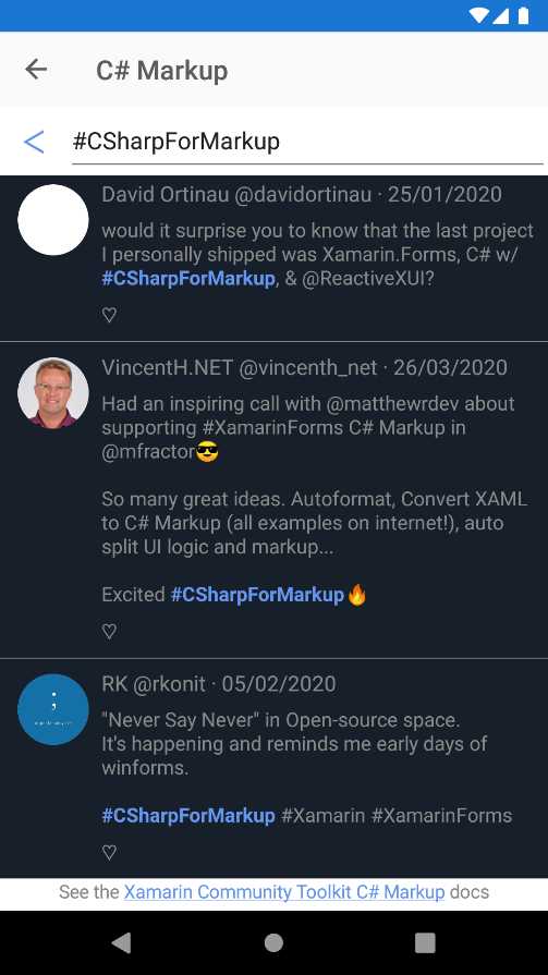
Figure 48: An example of a page created with C# Markup
As you can see, the page represents a Twitter-like user interface, with a list of tweets, each with its own set of visual elements, including images and a search bar. The C# code for the page is in the Pages\Markup\SearchPage.cs file, whereas the logic for the page is in the SearchPage.logic.cs file.
You will also notice a file called Styles.cs, where some styles are also defined in C#, as you will see shortly. Let’s now focus on the definition of the user interface with C# Markup.
Working with fluent APIs
Note: This section describes the most relevant and common methods of the Xamarin C# Markup. For a full list and reference, you can read the official documentation.
The SearchPage.cs file contains the definition of the page and its child views. The first part of the page is the header, which includes a back button and the entry where the user can search. The code is the following.
StackLayout Header => new StackLayout { Children = {
new Button { Text = "\u1438" } .Style (Styles.HeaderButton)
.Width (50)
.Bind (nameof(vm.BackCommand)),
new Entry { Placeholder = "Search" }
.FillExpandHorizontal ()
.Invoke (entry =>
{
entry.Focused += Search_FocusChanged;
entry.Unfocused += Search_FocusChanged;
})
.Bind (nameof(vm.SearchText))
}}.Horizontal ();
The syntax of C# Markup is a combination of the object initializers feature and new extension methods, together with the shorter syntax of lambda expressions (=>) that simplify property getters. If you look at the Button declaration, the Style extension method makes it possible to assign an object of type Style to the current visual element. (Styles used in the example are also defined in C# inside the Styles.cs file and will be discussed shortly.)
Notice how the Bind extension method quickly allows for binding a property to another object, in this case a command. If you know how setting up data-binding in C# code normally works, you can immediately understand the benefit of having this method available. In this particular example, the bound property BackCommand is defined in the ViewModel and simply allows for going back to the previous navigation state. You can look at its definition yourself, since it’s not relevant for the explanation here.
It is also possible to use the BindTapGesture method to quickly implement gesture recognizers. This method allows you to specify the target Command object that is executed on tap, the source object for the command, and command parameters.
If you now look at the Entry definition, you can see how the FillExpandHorizontal extension method does with one invocation that you would get assigning the HorizontalOptions property with a value of FillAndExpand. Then, notice how it is possible to implement interaction via the Invoke extension method, which allows for assigning event handlers to the events exposed by the current view instance.
In the end, the Horizontal extension method invoked over the StackLayout provides horizontal alignment of its child elements, again with a simple method invocation instead of nested property assignments with a more verbose syntax.
The next relevant piece of the user interface definition that contains interesting extension methods is the declaration of the CollectionView used to display the list of tweets, and whose code is shown in Code Listing 12.
Code Listing 12
enum TweetRow { Separator, Title, Body, Actions } enum TweetColumn { AuthorImage, Content } CollectionView SearchResults => new CollectionView { ItemTemplate = new DataTemplate(() => new Grid { RowDefinitions = Rows.Define ( (TweetRow.Separator, 2 ), (TweetRow.Title , Auto), (TweetRow.Body , Auto), (TweetRow.Actions , 32 ) ), ColumnDefinitions = Columns.Define ( (TweetColumn.AuthorImage, 70 ), (TweetColumn.Content , Star)), Children = { new BoxView { BackgroundColor = Color.Gray } .Row (TweetRow.Separator) .ColumnSpan (All<TweetColumn>()) .Top() .Height (0.5), RoundImage ( 53, nameof(Tweet.AuthorImage) ) .Row (TweetRow.Title, TweetRow.Actions) .Column (TweetColumn.AuthorImage) .CenterHorizontal () .Top () .Margins (left: 10, top: 4), new Label { LineBreakMode = LineBreakMode.MiddleTruncation } .FontSize (16) .Row (TweetRow.Title) .Column (TweetColumn.Content) .Margins (right: 10) .Bind (nameof(Tweet.Header)), new Label { } .FontSize (15) .Row (TweetRow.Body) .Column (TweetColumn.Content) .Margins (right: 10) .Bind (Label.FormattedTextProperty, nameof(Tweet.Body), convert: (List<TextFragment> fragments) => Format(fragments)), LikeButton ( ) .Row (TweetRow.Actions) .Column (TweetColumn.Content) .Left () .Top () .Size (24) } })}.Background (Color.FromHex("171F2A")) .Bind (nameof(vm.SearchResults)); |
In Code Listing 12, you can see many extension methods in action, most of them related to the definition of the Grid layout that represents the DataTemplate of the CollectionView. For example, the Rows and Columns collections expose the Define method that simplifies how you can add rows and columns to the Grid. This method takes an array of objects where each represents the row or column position and the height. In the previous example, the row or column position is represented with integer values of the TweetRow and TweetColumn enumerations.
The next group of methods is related to how visual elements are positioned within their parent layout. If you consider the visual elements defined inside the Children property of the Grid, you can see that their position is set via the Row and Column methods. Other methods like Top, Left, Right, Bottom, TopExpand, LeftExpand, RightExpand, and BottomExpand allow for specifying the element position with or without expansion to fit the available space.
You can also see how the Margins method allows you to specify a margin with a verbose syntax (for example, .Margins(left: 10, top: 4)) instead of explicitly assigning an object of type Thickness. Views that support working with text also expose the Font and FontSize methods. The first method allows you to assign the font family and font attributes to the view, whereas the second method allows for assigning the font size with the same fluent approach. Some more specialized objects for working with text, like Span, expose additional methods to change the text appearance, such as Bold and Italic.
Working with styles
At the beginning of the discussion about working with the fluent APIs, you saw that views expose the Style extension method, which allows for assigning a style. If you look at the Styles.cs file, you will see how to declare styles with the C# Markup syntax. For example, consider the following styles.
static Style<Span> link;
static Style<Button> headerButton;
public static Style<Span> Link => link ??= new Style<Span>(
(Span.FontSizeProperty, 14),
(Span.TextColorProperty, Color.CornflowerBlue),
(Span.TextDecorationsProperty, TextDecorations.Underline)
);
public static Style<Button> HeaderButton => headerButton ??= new Style<Button>(
(Button.TextColorProperty, Color.CornflowerBlue),
(Button.FontSizeProperty, 24)
) .BasedOn (Implicit.Buttons);
C# Markup allows for declaring styles by defining properties of type Style<T>, where T is the target type for the style. In the previous code snippet, the first style is applied to Span objects, and it simplifies the way properties are assigned with the desired value. The fluent APIs also allow for using style inheritance via the BasedOn extension method, which you see in action in the second style, HeaderButton, that targets the Button type. The base style is called Buttons, and is defined in the Implicit static class located in the same code file, which is declared as follows.
public static Style<Button> Buttons => buttons ??= new Style<Button>(
(Button.BackgroundColorProperty, Color.Transparent)
);
In this example, the base style sets a default background color for the button, and then derived styles can add further customizations.
Finding more extension methods
Including the full reference to C# Markup in a book of the Succinctly series is not possible; as I mentioned at the beginning of this chapter, you can read the official documentation to get more information. However, as a developer, you can also look into the source code of the Xamarin.CommunityToolkit.Markup library, which is included in the full project repository. File names help identify the target of the extension methods.
For instance, the BindableObjectExtensions.cs file contains extension methods that extend objects of type BindableObject; VisualElementExtensions.cs contains extension methods that extend objects of type VisualElement, and so on. This work will not only give you the full list of fluent APIs available, but it will also give you a different point of view in writing C# code with the most modern syntax.
Chapter summary
C# Markup is a new set of fluent APIs that simplify the way developers can create the user interface in C#. New extension methods and a syntax based on lambda expressions provide a more convenient and elegant way to design views and assign their properties, as well as implement their interaction behaviors via events. These capabilities are now available via the Xamarin.CommunityToolkit.Markup NuGet package, and will really boost the way you create the UI in C#—especially when you need to add views at runtime.
- 155+ high-performance Xamarin controls, including DataGrid, Charts, and ListView.
- Elegant XAML layouts for common scenarios.
- Layouts optimized for mobile and desktop.