
Writing Native Mobile Apps in a Functional Language Succinctly®

CHAPTER 5
Adding Syncfusion Controls
“Good artists copy, great artists steal.”
Pablo Picasso
In this chapter, we are going to see how to add controls not developed by us, but by someone else. As an example, I decided to use Syncfusion controls. Why?
- They look really cool and are very similar on iOS and Android.
- They are easy to use and configure.
- They are easy to include in the CSCS Framework, making them look as a part of CSCS.
- There is a Community License that allows free use of the Syncfusion framework, provided your revenue is below $1 million and there are up to five developers in your company that will be working with this framework.
- Even the Community License includes email support.
- I enjoy using free stuff. Don’t you? (If your revenue is more than $1 million or you have more than five developers, you will need to buy a license here).
It goes without saying that this book is published by Syncfusion not because I advertise their controls: they explicitly told me that I should use any product that fits this book the best.
Adding Syncfusion to the CSCS project
The easiest way to figure out how the Syncfusion controls work is to download the Syncfusion sample project. You can add the Syncfusion controls to your project in two different ways:
- As DLLs from the sample project to the References section of your project.
- As NuGet Packages via Your Project > Packages > Add Packages
Figure 8 shows how your Visual Studio project will look after adding the Syncfusion NuGet packages.
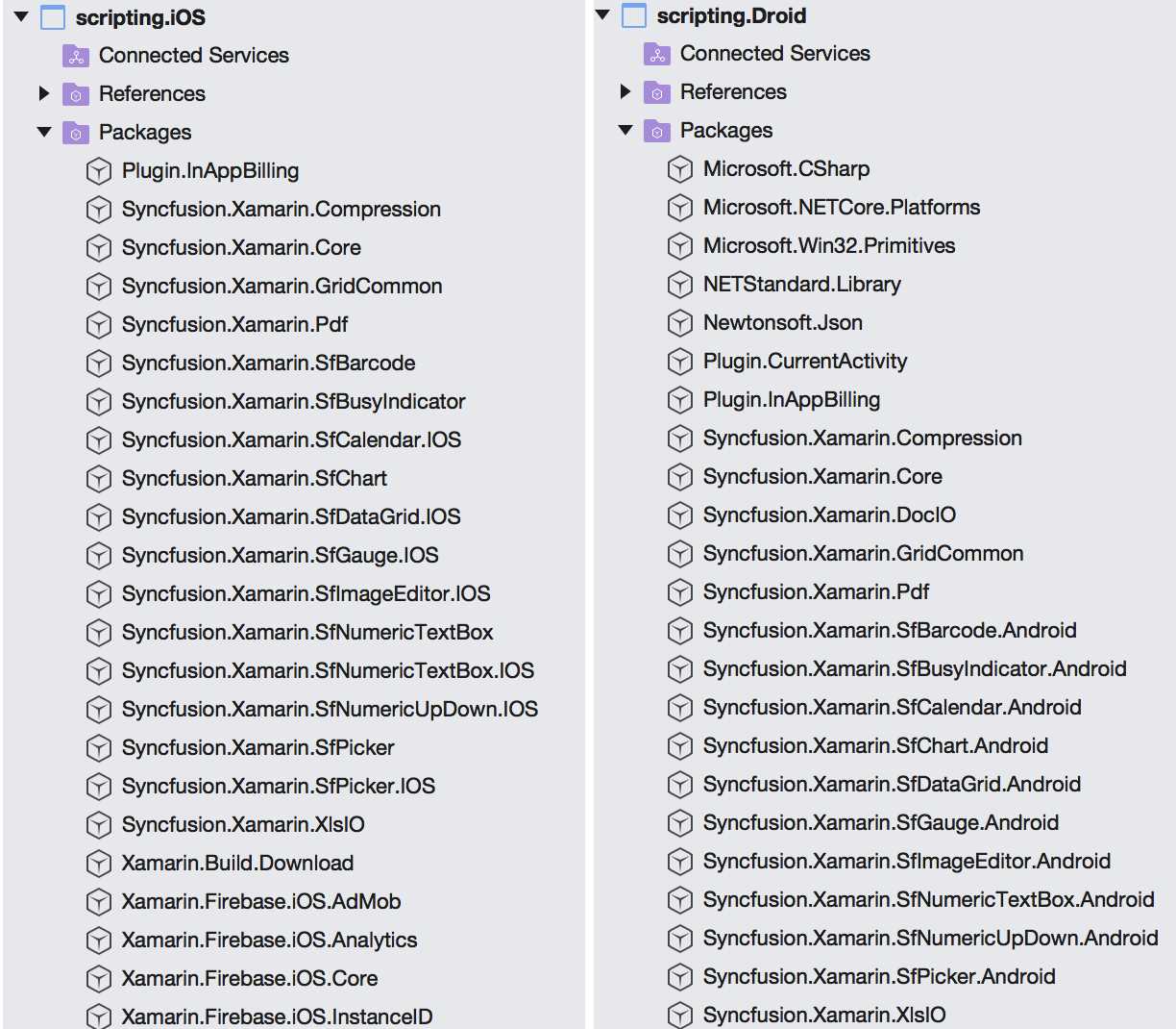
Figure 8: Syncfusion iOS and Android NuGet Packages (on macOS)
For using the controls, I created the SfWidget class in both Xamarin.iOS and Xamarin.Android. I didn’t want to put the common class into the shared project since there are too many differences between the iOS and Android Syncfusion implementations (for example, SFBarcode on iOS versus SfBarcode on Android, and so on).
So I added all of the Syncfusion widgets to the SfWidget class, deriving from the iOSVariable class on iOS, and from the DroidVariable class on Android. A fragment of the iOS version is shown in Code Listing 23. The Android version looks very similar.
Code Listing 23: A Fragment of the SfWidget Class on iOS
public class SfWidget : iOSVariable STEPPER, BUSY_INDICATOR,PICKER, SPLINE_GRAPH, DOUGHNUT_GRAPH, DATA_GRID public SfWidget(SyncFusionType type, string name, string text, CGRect rect) : string widgetName, string initArg, CGRect rect) widgetName, initArg, rect); widgetName, initArg, rect); widgetName, initArg, rect); widgetName, initArg, rect); widgetName, initArg, rect); widgetName, initArg, rect); widgetName, initArg, rect); widgetName, initArg, rect); widgetName, initArg, rect); widgetName, initArg, rect); |
I registered all the Syncfusion controls and related functions within the CustomInit class; see Code Listing 5. I informed the parser that it needs to look for a particular type of a widget in this statement in CustomInit:
UIVariable.WidgetTypes.Add(new SfWidget());
Next, let’s look at some of the Syncfusion controls.
Stepper or Numeric Up Down
Figure 9 contains a screenshot of a stepper (or a Numeric Up Down, in Syncfusion terms). There are three kinds of steppers, depending on the stepper configuration: the buttons could be either on the left, right, or on both sides of the widget. They look somewhat different when the buttons are on both sides of the widget—in iOS, + precedes -. I guess this is more the iOS style.
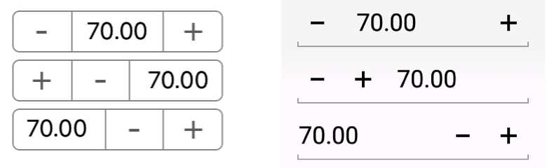
Figure 9: Syncfusion Stepper on iOS and Android
The controls in Figure 9 were created using the following CSCS script:
locStepper1 = GetLocation("ROOT", "CENTER", "ROOT", "CENTER");
AddSfStepper(locStepper1, "stepper1", "70:10:120:5", 300, 60);
SetValue(stepper1, "buttons", "both");
locStepper2 = GetLocation("ROOT", "CENTER", stepper1, "BOTTOM", 0, 10);
AddSfStepper(locStepper2, "stepper2", "70:10:120:5", 300, 60);
SetValue(stepper2, "buttons", "left");
locStepper3 = GetLocation("ROOT", "CENTER", stepper2, "BOTTOM", 0, 10);
AddSfStepper(locStepper3, "stepper3", "70:10:120:5", 300, 60);
SetValue(stepper3, "buttons", "right");
The "70:10:120:5" initialization means that 70 is the default value, the minimum is 10, the maximum is 120, and the step is 5. This is just a shortcut; you can do the same with these separate CSCS statements:
SetValue(stepper, "value", 70); or SetValue(stepper, 70);
SetValue(stepper, "min", 10);
SetValue(stepper, "max", 120);
SetValue(stepper, "step", 5);
To get the current value of the stepper, use the following statement:
stepperValue = GetValue(stepper);
You can also subscribe to an event of the user by pressing a plus or minus button:
AddAction(stepper, "stepper_clicked");
function stepper_clicked(sender, arg)
{
// arg contains the current stepper value.
}
Now let’s see the stepper’s implementation. As follows from Code Listing 23, the CreateStepper() method is called in case of a stepper. It is shown in Code Listing 24.
Code Listing 24: The Implementation of the CreateStepper Method
void CreateStepper() ref maxValue, ref step); m_stepper.ValueChanged += (sender, e) => { |
That’s it—as you can see, the C# implementation is pretty compact, since the rest was done by the good people at Syncfusion.
To be able to use the generic SetValue() CSCS function, the iOSVariable.SetValue() function for iOS, and the DroidVariable.SetValue() function for Android, must be overridden. A fragment of the SfWidgetSetValue() function for the stepper is shown in Code Listing 25.
Code Listing 25: A Fragment of the SfWidget.SetValue Method
public override bool SetValue(string value1, string value2 = "") if (m_stepper != null) { SFNumericUpDownSpinButtonAlignment.Left; SFNumericUpDownSpinButtonAlignment.Right; SFNumericUpDownSpinButtonAlignment.Both; } // Other Syncfusion Widgets. } |
You can also set up custom icons instead of the + and - buttons, but this is out of our scope.
QR barcode
A QR (“Quick Response”) barcode is a form of a two-dimensional machine-readable matrix. It is often used to code website addresses. There is also a Syncfusion control that creates these codes. Check out an example of applying the QR code to the Google website in Figure 10.

Figure 10: Syncfusion QR Barcode for www.google.com
The QR barcode in Figure 10 was created using the following CSCS code:
locSFWidget = GetLocation("ROOT", "CENTER", "ROOT", "CENTER");
AddSfQRBarcode(locSFWidget, "QRBarcode", "http://www.google.com", 450, 450);
You can also set the QR code in a separate CSCS statement, for example:
SetText(QRBarcode, "http://www.iLanguage.ch");
The C# implementation is very compact as well; see Code Listing 26.
Code Listing 26: The Implementation of the CreateQRBarcode Method
void CreateQRBarcode() |
Barcode 39
Code 39 is a one-dimensional barcode used to code uppercase words, numbers, and some special characters. It can be used to code prices for subsequent scanning. Figure 11 shows an example of coding a $9.99 price.
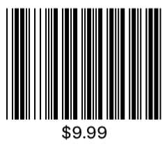
Figure 11: Syncfusion Barcode 39
The barcode in Figure 11 was created using the following CSCS code:
AddSfCode39Barcode(locSFWidget, "Code39", "$9.99", 600, 400);
Note that we can reuse the same location for locSFWidget that we used before, placing into it a different widget and hiding the widget that was there before. The C# code is very similar to the Code Listing 26, so we will skip it.
Picker
We already saw the Syncfusion Picker in action in Chapter 3. The cool part about this control is that it’s very easy to configure it to have multiple columns. However, here we are going to look at a harder part to implement—a picker with an image and a text together. See how it looks on iOS and Android in Figure 12.
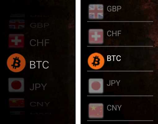
Figure 12: Syncfusion Picker Control on iOS and on Android
The CSCS code to produce the picker in Figure 12 is the following:
AddSfPicker(locSFWidget, "cbCurrency", "75", 200, 380);
currencies = {"EUR", "USD", "GBP", "CHF", "BTC", "JPY", "CNY",
"MXN", "RUB", "BRL", "SAR"};
flags = {"eu_EU", "en_US", "en_GB", "de_CH", "BTC", "ja_JP", "zh_CN",
"es_MX", "ru_RU", "pt_BR", "ar_SA"};
AddWidgetData(cbCurrency, currencies);
AddWidgetImages(cbCurrency, flags);
SetSize(cbCurrency, 80, 40);
SetText(cbCurrency, "BTC");
We are going to see how to implement it on Android because it requires more effort—we have to manually create a view for each picker entry.
We also have to manually create different views for selected and unselected entries. On top of that, we have to reload all views on each selection. See Code Listing 27 for details.
Code Listing 27: A Fragment of the CreatePicker Method for Android
void CreatePicker() Orientation = Orientation.Vertical }; ViewGroup.LayoutParams.WrapContent); ViewGroup.LayoutParams.WrapContent); ViewGroup.LayoutParams.MatchParent, ViewGroup.LayoutParams.WrapContent); ViewGroup.LayoutParams.WrapContent); ViewGroup.LayoutParams.WrapContent); |
Digital Gauge
The Digital Gauge control looks especially cool when showing the current time; see Figure 13.
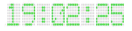
Figure 13: Syncfusion Digital Gauge
The CSCS code producing what you see in Figure 13 is the following:
AddSfDigitalGauge(locSFWidget, "DigitalGauge", "", 500, 200);
SetValue(DigitalGauge, "value", Now("HH:mm:ss"));
SetFontColor(DigitalGauge, "green");
Schedule(1000, "timer_timeout", "", "timerId", 1);
function timer_timeout(sender, arg)
{
SetValue(DigitalGauge, "value", Now("HH:mm:ss"));
}
Note that the time shown in the Digital Gauge control is being updated every second. The C# wrapper over the Syncfusion Digital Gauge is shown in Code Listing 28.
Code Listing 28: The Implementation of the CreateDigitalGauge Method
void CreateDigitalGauge() SFDigitalGaugeCharacterTypeEightCrossEightDotMatrix; SFDigitalGaugeStrokeTypeTriangleEdge; |
Circular Gauge
The Circular Gauge control is probably one of the most complex, regarding the configuration. There are many different options for it. An example with two scales is shown in Figure 14.
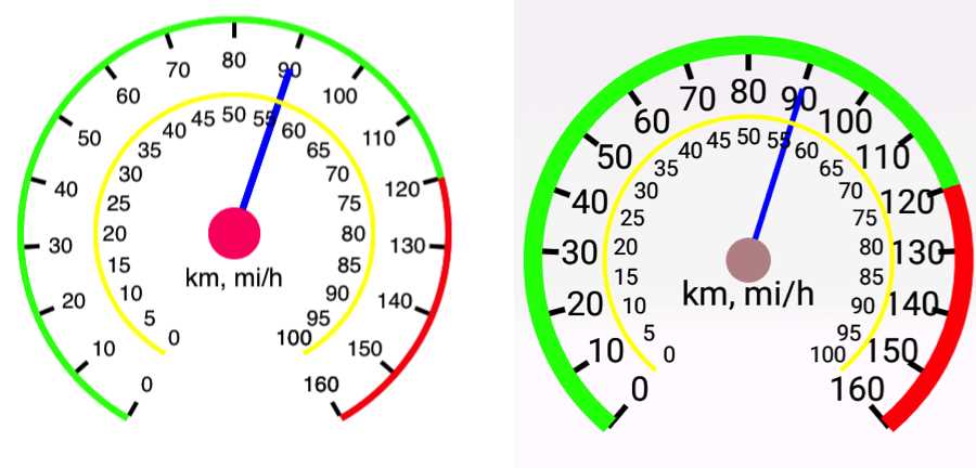
Figure 14: Syncfusion Circular Gauge on iOS and on Android
The example in Figure 14 was created using the CSCS code in Code Listing 29:
Code Listing 29: The CSCS Code to Create a Syncfusion Circular Gauge
AddSfCircularGauge(locSFWidget, "CircularGauge", "", 400, 400); |
Calendar
The Syncfusion Calendar is a nice widget displaying either a month or a year (depending on the configuration). You can get the previous or next years or months by swiping it left and right. You can also easily add appointments to the calendar. Check out Figure 15 for an example.
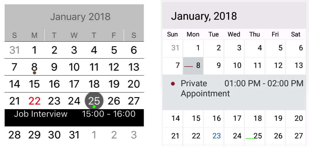
Figure 15: Syncfusion Calendar on iOS and on Android
Here is the CSCS code that created the controls in Figure 15:
AddSfCalendar(locSFWidget, "Calendar", "", 450, 450);
AddSfAppointment(Calendar, "Private Appointment",
"2018/01/08 13:00", "2018/01/08 14:00", "brown");
AddSfAppointment(Calendar, "Job Interview",
"2018/01/25 15:00", "2018/01/25 16:00", "green");
Image Editor
This is probably one of the coolest Syncfusion widgets. You can actually use it to edit images! See Figure 16 for an example.
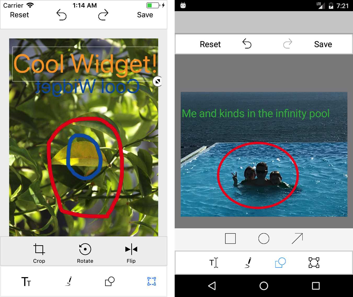
Figure 16: Syncfusion Image Editor on iOS and on Android
The Syncfusion Image Editor can be created from the following CSCS code:
AddSfImageEditor(locSFWidget, "ImageEditor", "library",
DisplayWidth, DisplayHeight);
Yes, just a one-liner! Note that DisplayWidth and DisplayHeight are special CSCS variables, indicating that the widget should take over the whole screen.
The library initialization parameter indicates that the picture will be selected by the user from a device library file. Another option is camera, meaning that the image will be taken from a device camera.
Busy Indicator
The Busy Indicator control currently contains 15 different animations that can be shown to the user while the app is doing some other work. Figure 17 contains all these 15 animations. It is a static picture, but in reality, all the images are animated.
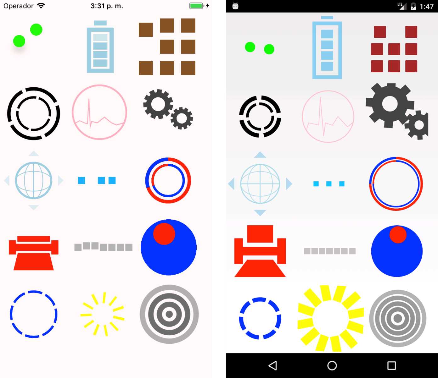
Figure 17: Syncfusion BusyIndicator on iOS and Android
The indicators in Figure 17 were set up in CSCS by providing different parameters during the initialization. Check out the CSCS code in Code Listing 30.
Code Listing 30: The CSCS Code to Create Syncfusion BusyIndicators
SetBackgroundColor("snow"); h = 200; BusyIndicator1, "CENTER", delta); BusyIndicator2, "CENTER", delta); BusyIndicator1, "BOTTOM", 0, delta); BusyIndicator2, "BOTTOM", delta, delta); BusyIndicator3, "BOTTOM", delta, delta); BusyIndicator4, "BOTTOM", 0, delta); BusyIndicator5, "BOTTOM", delta, delta); BusyIndicator6, "BOTTOM", delta, delta); BusyIndicator7, "BOTTOM", 0, delta); BusyIndicator8, "BOTTOM", delta, delta); BusyIndicator9, "BOTTOM", delta, delta); BusyIndicator10, "BOTTOM", 0, delta); BusyIndicator11, "BOTTOM", delta, delta); BusyIndicator12, "BOTTOM", delta, delta); |
Data Grid
The Data Grid control shows a list of data entries; see Figure 18. This list has different configuration options. When the user clicks on the Edit button, an extra window is shown, where the user can edit the row’s entries.

Figure 18: Syncfusion DataGrid After Swiping a Row to the Right and to the Left on iOS
The CSCS code that created the Data Grid in Figure 18 is shown in Code Listing 31.
Code Listing 31: The CSCS Code to Create Syncfusion Data Grid
AddSfDataGrid(locSFWidget, "DataGrid", "", 600, 625); "Profession", "string", "Salary", "currency"}; |
The column name configuration is taking place in:
AddWidgetData(DataGrid, listCols, "columns");
The format of the listCols list is the following:
{ columnName1, columnType1, columnName2, columnType2, …}
Note that we explicitly allow the user to sort by the column values, resize column widths, drag and drop rows in different places, and so on, as defined in the SetValue() functions at the end of Code Listing 31.
Spline Chart
The Spline Chart creates a continuous, piecewise polynomic function from some data points: see Figure 19. When you touch one of the black data points on the graph, you will see the exact value it represents.
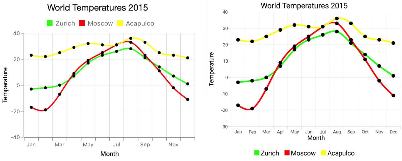
Figure 19: Syncfusion Spline Chart on iOS and on Android
The CSCS code that created the Spline charts in Figure 19 is shown in Code Listing 32.
Code Listing 32: The CSCS Code to Create Syncfusion Spline Chart
AddSfSplineGraph(locSFWidget, "SplineGraph", "", 600, 500); "Jun",23, "Jul",26, "Aug", 28, "Sep",21, "Oct",14, "Nov",7, "Dec",1}; "Jun",25, "Jul",31, "Aug",33, "Sep",23, "Oct",11, "Nov",-2, "Dec",-11}; chartData3 = {"Jan",23, "Feb",22, "Mar",25, "Apr",29, "May",32, "Jun",31, "Jul",31, "Aug",36, "Sep",33, "Oct",25, "Nov",23, "Dec",21}; |
Doughnut and Semi-Doughnut Charts
The Syncfusion Doughnut and Semi-Doughnut graphs are shown in Figure 20.
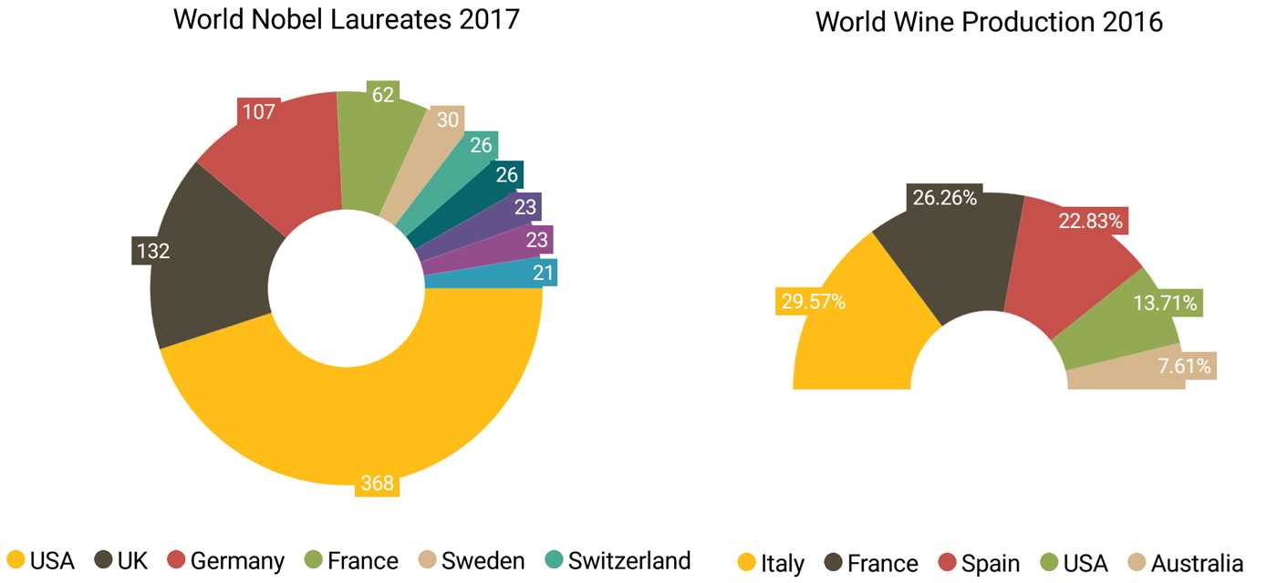
Figure 20: Syncfusion Doughnut and Semi-Doughnut Charts on Android
The CSCS code that created the charts in Figure 20 is shown in Code Listing 33. Note that the charts can have either a percentage value, or an absolute one. This is set up by an initialization parameter in the AddWidgetData() call (it can be either values or percent).
We also define there from which angle to which angle the graph is going to be shown. 0:360 means the full circle, and 180:360 means the upper half. All other values between 0 and 360 are possible as well.
Code Listing 33: The CSCS Code to Create Syncfusion Doughnut and Semi-Doughnut Charts
AddSfDoughnutGraph(locSFWidget, "DoughnutGraph", "", 600, 500); "Sweden", 30, "Switzerland", 26, "Japan", 26, "Canada", 23, "Russia", 23, "Austria", 21}; "USA", 23600, "Australia", 13100}; |
Summary
In this chapter, we saw a few of the Syncfusion controls. There are also many controls that we did not have time to see here, for instance, a calculator, an image rotator, different list views, a diagram creator, and many others.
This chapter is also important because it can give you an idea of how to add other existing widget frameworks to CSCS.
In the next chapter, we are going to dig deeper into Syncfusion controls, looking into how to create known file types.
- 1800+ high-performance UI components.
- Includes popular controls such as Grid, Chart, Scheduler, and more.
- 24x5 unlimited support by developers.