
WPF Succinctly®

CHAPTER 3
WPF Controls Overview
A solid understanding of the default controls available in .NET and WPF can save a lot of time in development. In fact, having a strong understanding of the basics is virtually required. Most WPF controls were designed to be extended. This is the beauty of WPF. You have the ability to work with controls at their lowest levels to tweak the elements that make up their appearance. Remember that controls are the basis for virtually any 2-D WPF application. They range from the basic label and button to complex tree views and grids. WPF allows nearly endless customization and nesting of controls. You will quickly notice that certain properties such as background, font size, etc., are shared between most WPF controls.
WPF controls
The following two lists are reproduced from the article WPF Controls - A Visual Quick Start by Josh Fischer, published on the Code Project website on November 21, 2008. The original article is available at codeproject.com/Articles/31137/WPF-Controls-A-Visual-Quick-Start.
The default WPF control types are:
- Button
- Text
- Shapes
- Containers
- Media
- Toolbars
- Scrolls
- Panels and lists
- Miscellaneous
Buttons
- Button: Indicates an area that can be clicked.
- ToggleButton: A button that remains selected after it is clicked.
- CheckBox: Indicates a positive, negative, or indeterminate state represented by a check box.
- RadioButton: Allows exclusive selection between a range of options.
Layout controls
The layout of controls is critical to an application’s usability. Arranging controls based on fixed pixel coordinates may work in some instances. However, it can introduce problems, particularly when you need to support different screen resolutions or with different font sizes and resizing windows. WPF provides a rich set of built-in layout panels to help you avoid layout problems.
Grid
Some of the content in this section is reproduced from Christian Mosers’ Grid Panel tutorial at wpftutorial.net/GridLayout.html.
The Grid is a layout panel that arranges its child controls in a tabular structure of rows and columns. Typically, its functionality is similar to the HTML table. A cell can contain multiple controls that can span over multiple cells and even overlap themselves. The alignment of the controls is defined by the HorizontalAlignment and VerticalAlignment properties of the Grid Control.
A grid has one row and column by default. To create any additional rows and columns, you have to add RowDefinition items to the RowDefinitions collection and ColumnDefinition items to the ColumnDefinitions collection.
The following figure shows a grid with four rows and two columns.
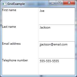
- Grid Layout Panel
And here is the XAML markup:
<Window x:Class="WPF.GridExample" xmlns="http://schemas.microsoft.com/winfx/2006/xaml/presentation" xmlns:x="http://schemas.microsoft.com/winfx/2006/xaml" Title="GridExample" Height="300" Width="300"> <Grid> <Grid.ColumnDefinitions> <ColumnDefinition /> <ColumnDefinition /> </Grid.ColumnDefinitions> <Grid.RowDefinitions> <RowDefinition /> <RowDefinition /> <RowDefinition /> <RowDefinition /> </Grid.RowDefinitions>
<TextBlock Grid.Column="0" Grid.Row="0" Text="First name" /> <TextBox Grid.Column="1" Grid.Row="0" Text="Joe" /> <TextBlock Grid.Column="0" Grid.Row="1" Text="Last name" /> <TextBox Grid.Column="1" Grid.Row="1" Text="Jackson" /> <TextBlock Grid.Column="0" Grid.Row="2" Text="Email address" /> <TextBox Grid.Column="1" Grid.Row="2" Text="[email protected]" /> <TextBlock Grid.Column="0" Grid.Row="3" Text="Telephone number" /> <TextBox Grid.Column="1" Grid.Row="3" Text="555-555-5555" /> </Grid> </Window> |
The following table shows the methods of sizing grid columns and rows:
- Methods for Sizing Grid Columns and Rows.
Fixed | Fixed size of logical units (1/96 inch). |
Auto | Takes as much space as needed by the contained control. |
Star (*) | Takes as much space as available (after filling all auto and fixed sized columns), proportionally divided over all star-sized columns. So 3*/5* means the same as 30*/50*. Remember that star sizing does not work if the grid size is calculated based on its content. |
StackPanel
Some of the content in this section is reproduced from Christian Mosers’ WPF StackPanel tutorial at wpftutorial.net/StackPanel.html.
In WPF, the StackPanel is a simple and useful layout panel. It stacks the child elements below or beside each other depending on the value of the Orientation property. The Orientation property’s possible values are Vertical and Horizontal. The StackPanel is especially useful when creating a list of controls. All WPF ItemsControls like ComboBox, ListBox, or Menu use a StackPanel as their internal layout panel.
For example:
<Window x:Class="WPFExamples.StackPanelExample" xmlns="http://schemas.microsoft.com/winfx/2006/xaml/presentation" xmlns:x="http://schemas.microsoft.com/winfx/2006/xaml" Title="StackPanel" Height="300" Width="300"> <StackPanel> <TextBlock Margin="10" FontSize="20">How do you like your coffee?</TextBlock> <Button Margin="10">Black</Button> <Button Margin="10">With milk</Button> <Button Margin="10">Latte macchiato</Button> <Button Margin="10">Cappuccino</Button> </StackPanel> </Window> |

- StackPanel Layout Panel
As you can see in the previous figure, the text and buttons are stacked on top of each other when using the StackPanel as the container. The default value of the Orientation property is Vertical.
I find that the StackPanel can be very effective for lining up confirmation buttons at the bottom of a dialog window.
For instance, take a look at the following example:
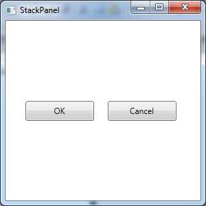
- Horizontally Oriented StackPanel
<Window x:Class="WPFExamples.StackPanelExample" xmlns="http://schemas.microsoft.com/winfx/2006/xaml/presentation" xmlns:x="http://schemas.microsoft.com/winfx/2006/xaml" Title="StackPanel" Height="300" Width="300"> <StackPanel Orientation="Horizontal" Height="49" Width="247"> <Button Width="100" Margin="10">OK</Button> <Button Width="100" Margin="10">Cancel</Button> </StackPanel> </Window> |
DockPanel
Some of the content in this section is reproduced from Christian Mosers’ WPF Dock Panel tutorial at wpftutorial.net/DockPanel.html.
The DockPanel defines an area where you can arrange your child elements either horizontally or vertically relative to each other. The dock panel is a layout panel that provides easy docking of the elements to the left, right, top, bottom, or even center of the panel. The dock-side of an element is defined by the attached property DockPanel.Dock. To dock an element to the center of the panel, the element must be the last child of the panel and the LastChildFill property must be set to true.
For example:
<DockPanel LastChildFill="True"> <Button Content="Dock=Top" DockPanel.Dock="Top"/> <Button Content="Dock=Bottom" DockPanel.Dock="Bottom"/> <Button Content="Dock=Left"/> <Button Content="Dock=Right" DockPanel.Dock="Right"/> <Button Content="LastChildFill=True"/> </DockPanel> |
WrapPanel
Some of the content in this section is reproduced from Christian Mosers’ WPF Wrap Panel tutorial at wpftutorial.net/WrapPanel.html.
The WrapPanel is similar to the DockPanel; however, it does not stack all child elements to one row. It wraps them to new lines if no space is left in the width of the container. The orientation can be set to Horizontal or Vertical. The WrapPanel can also be used to arrange tabs of a tab control, menu items in a toolbar, or items in a Windows Explorer-like list.
<WrapPanel Orientation="Horizontal"> <Button Content="Button" /> <Button Content="Button" /> <Button Content="Button" /> <Button Content="Button" /> <Button Content="Button" /> </WrapPanel> |
Canvas
Some of the content in this section and the one that follows is reproduced from Christian Mosers’ WPF Canvas Panel tutorial at wpftutorial.net/Canvas.html.
The Canvas is the most basic layout panel in WPF; it allows you to position its child elements using exact coordinates. The Canvas container can be used as a surface for drawing shapes and animations.
Typically, the Canvas is used to group 2-D graphic elements together. The Canvas is not a great container for other user interface elements because it does not perform any resizing optimizations when its parent container is resized. The position-based layout is problematic in resizing scenarios. Observe the following example in which I’ve placed a Rectangle, an Ellipse, and a Path element.
<Canvas> <Rectangle Canvas.Left="40" Canvas.Top="31" Width="63" Height="41" Fill="Blue" /> <Ellipse Canvas.Left="130" Canvas.Top="79" Width="58" Height="58" Fill="Blue" /> <Path Canvas.Left="61" Canvas.Top="28" Width="133" Height="98" Fill="Blue" Stretch="Fill" Data="M61,125 L193,28"/> </Canvas> |
Example to override the z-order of elements
Normally the z-order of elements inside a Canvas element is specified by the order in XAML, but you can override the natural z-order by explicitly defining the Canvas.ZIndex property on the element. See the example that follows.
<Canvas> <Ellipse Fill="Green" Width="60" Height="60" Canvas.Left="30" Canvas.Top="20" Canvas.ZIndex="1"/> <Ellipse Fill="Blue" Width="60" Height="60" Canvas.Left="60" Canvas.Top="40"/> </Canvas> |
Layout best practices
Some of the content in this list is reproduced from Christian Mosers’ Introduction to WPF Layout tutorial at wpftutorial.net/LayoutProperties.html.
- Avoid fixed positions; instead, use the Alignment properties in combination with Margins to position elements in a panel.
- Avoid fixed sizes. Set the Width and Height of elements to Auto whenever possible.
- Don't use the Canvas panel to specify the layout of common controls; instead use it to arrange vector graphics.
- Use a StackPanel to lay out dialog confirmation buttons on a dialog.
- Use a Grid to lay out complex user interfaces and data entry forms.
TextBlock
The TextBlock control represents a block of text that cannot be edited. You can use the TextBlock much like a label control. The TextBlock is also used in control templates to display text.
TextBox
The TextBox control has been around as long as the Windows operating system. It is the main control used to capture text entry from a user. WPF takes data entry a step further with a concept known as data binding. The TextBox supports events and properties related to the entry of data from the keyboard.
Animation
Animated transitional view example
WPF provides a very rich API related to animations. Animation can be a complex topic and though it’s great for enriching your user interface, it does not change the way in which line-of-business applications are created. Thus, instead of covering every aspect of animation in WPF, I plan to provide an example application that will pique your interest so that you can study the topic on your own. Here is an article to get you started: MSDN Animation Overview, http://msdn.microsoft.com/en-us/library/ms752312.aspx.
In this section, I will show you how to build a “transitional view” switching mechanism that uses WPF animation to add some flair to your applications. The effect is accomplished by implementing your user interface views as WPF user controls that inherit from a class that I call TransitionControl. The TransitionControl will provide the methods that will display an animated effect as you switch between UserControls. Here is the code:
TransitionControl.xaml
<UserControl x:Class="ScreenSlideTransitionExample.TransitionControl" xmlns="http://schemas.microsoft.com/winfx/2006/xaml/presentation" xmlns:x="http://schemas.microsoft.com/winfx/2006/xaml" xmlns:mc="http://schemas.openxmlformats.org/markup-compatibility/2006" xmlns:d="http://schemas.microsoft.com/expression/blend/2008" mc:Ignorable="d" d:DesignHeight="300" d:DesignWidth="300" >
</UserControl> |
TransitionControl.xaml.cs
using System; using System.Windows.Controls; namespace ScreenSlideTransitionExample { /// <summary> /// Interaction logic for ScreenOne.xaml /// </summary> public partial class TransitionControl : UserControl { public MainWindow ParentWindow { get; set; } public TransitionControl CurrentScreen { get; set; } public TransitionControl(MainWindow parent) { this.ParentWindow = parent; } public void ChangeScreen(TransitionControl screen) { if (screen == null) throw new ArgumentNullException("Unable to navigate to next screen. A null reference section occurred"); this.CurrentScreen = screen; this.ParentWindow.ChangeContent(screen); } } } |
MainWindow.xaml
<Window x:Class="ScreenSlideTransitionExample.MainWindow" xmlns="http://schemas.microsoft.com/winfx/2006/xaml/presentation" xmlns:x="http://schemas.microsoft.com/winfx/2006/xaml" Title="MainWindow" Height="350" Width="525"> <Canvas x:Name="TransitionContainer" /> </Window> |
MainWindow.xaml.cs
using System; using System.Windows; using System.Windows.Controls; using System.Windows.Media.Animation; namespace ScreenSlideTransitionExample { /// <summary> /// Interaction logic for MainWindow.xaml /// </summary> public partial class MainWindow : Window { readonly Duration _animationDuration = new Duration(TimeSpan.FromSeconds(1.0)); public MainWindow() { InitializeComponent(); ChangeContent( new ScreenOne( new TransitionControl( this ) ) ); } DoubleAnimation CreateDoubleAnimation(double from, double to, EventHandler completedEventHandler) { DoubleAnimation doubleAnimation = new DoubleAnimation(from, to, _animationDuration);
if (completedEventHandler != null) { doubleAnimation.Completed += completedEventHandler; }
return doubleAnimation; } void SlideAnimation(UIElement newContent, UIElement oldContent, EventHandler completedEventHandler) { double leftStart = Canvas.GetLeft(oldContent); Canvas.SetLeft(newContent, leftStart - Width); TransitionContainer.Children.Add(newContent); if (double.IsNaN(leftStart)) { leftStart = 0; } DoubleAnimation outAnimation = CreateDoubleAnimation(leftStart, leftStart + Width, null); DoubleAnimation inAnimation = CreateDoubleAnimation(leftStart - Width, leftStart, completedEventHandler); oldContent.BeginAnimation(Canvas.LeftProperty, outAnimation); newContent.BeginAnimation(Canvas.LeftProperty, inAnimation); } public void ChangeContent(UIElement newContent) { if (TransitionContainer.Children.Count == 0) { TransitionContainer.Children.Add(newContent); return; } if (TransitionContainer.Children.Count == 1) { TransitionContainer.IsHitTestVisible = false; UIElement oldContent = TransitionContainer.Children[0]; EventHandler onAnimationCompletedHandler = delegate(object sender, EventArgs e) { TransitionContainer.IsHitTestVisible = true; TransitionContainer.Children.Remove(oldContent); if (oldContent is IDisposable) { (oldContent as IDisposable).Dispose(); } oldContent = null; }; SlideAnimation(newContent, oldContent, onAnimationCompletedHandler); } } } } |
ScreenOne.xaml
<UserControl x:Class="ScreenSlideTransitionExample.ScreenOne" xmlns="http://schemas.microsoft.com/winfx/2006/xaml/presentation" xmlns:x="http://schemas.microsoft.com/winfx/2006/xaml" xmlns:mc="http://schemas.openxmlformats.org/markup-compatibility/2006" xmlns:d="http://schemas.microsoft.com/expression/blend/2008" mc:Ignorable="d" d:DesignHeight="300" d:DesignWidth="300" Height="350" Width="525" Background="BlanchedAlmond"> <Grid> <Grid.RowDefinitions> <RowDefinition /> <RowDefinition /> <RowDefinition /> </Grid.RowDefinitions> <TextBlock Text="Screen one" FontFamily="Verdana" FontSize="30" Grid.Row="0" /> <Button Name="btnChangeContent" Grid.Row="2" Content="Change content" Click="btnChangeContent_Click" Margin="267,59,140,12" /> </Grid> </UserControl> |
ScreenOne.xaml.cs
using System.Windows; using System.Windows.Controls; namespace ScreenSlideTransitionExample { /// <summary> /// Interaction logic for ScreenOne.xaml /// </summary> public partial class ScreenOne : UserControl { private TransitionControl _transitionControl;
public ScreenOne(TransitionControl transitionControl) { InitializeComponent(); _transitionControl = transitionControl; } private void btnChangeContent_Click(object sender, RoutedEventArgs e) { _transitionControl.ParentWindow.ChangeContent( new ScreenTwo( new TransitionControl( _transitionControl.ParentWindow ) ) ); } } } |
ScreenTwo.xaml
<UserControl x:Class="ScreenSlideTransitionExample.ScreenTwo" xmlns="http://schemas.microsoft.com/winfx/2006/xaml/presentation" xmlns:x="http://schemas.microsoft.com/winfx/2006/xaml" xmlns:mc="http://schemas.openxmlformats.org/markup-compatibility/2006" xmlns:d="http://schemas.microsoft.com/expression/blend/2008" mc:Ignorable="d" d:DesignHeight="300" d:DesignWidth="300" Height="350" Width="525"> <Grid> <Grid.RowDefinitions> <RowDefinition /> <RowDefinition /> </Grid.RowDefinitions> <TextBlock Text="Screen two" FontFamily="Verdana" FontSize="30" Grid.Row="0" /> <Button Name="btnChangeContent" Content="Change content" Margin="241,68,159,72" Click="btnChangeContent_Click" /> </Grid> </UserControl> |
ScreenTwo.xaml.cs
using System.Windows; using System.Windows.Controls; namespace ScreenSlideTransitionExample { /// <summary> /// Interaction logic for ScreenTwo.xaml /// </summary> public partial class ScreenTwo : UserControl { private TransitionControl _transCtrl; public ScreenTwo(TransitionControl transitionControl) { InitializeComponent(); _transCtrl = transitionControl; } private void btnChangeContent_Click(object sender, RoutedEventArgs e) { var transCtrl = new TransitionControl(_transCtrl.ParentWindow); var screenOne = new ScreenOne(transCtrl); _transCtrl.ParentWindow.ChangeContent(screenOne); } } } |
Type Converters
The System.ComponentModel.TypeConverter class provides a unified way of converting XAML string attribute values to corresponding object value types. The MSDN documentation for the TypeConverter class can be found at http://msdn.microsoft.com/en-us/library/system.componentmodel.typeconverter.aspx.
Here is an example:
1 <Window x:Class="Chapter._02.MainWindow" 2 xmlns="http://schemas.microsoft.com/winfx/2006/xaml/presentation" 3 xmlns:x="http://schemas.microsoft.com/winfx/2006/xaml" 4 Title="MainWindow" Height="350" Width="525"> 5 <Grid> 6 <Grid.RowDefinitions> 7 <RowDefinition /> 8 <RowDefinition /> 9 </Grid.RowDefinitions> 10 <Grid.ColumnDefinitions> 11 <ColumnDefinition /> 12 <ColumnDefinition /> 13 </Grid.ColumnDefinitions> 14 <TextBlock x:Name="txtDisplay" Text="This is a textblock control. Can't be 15 edited." Grid.Column="0" Grid.Row="0" /> 16 <Button x:Name="btnDisplayButton" Grid.Column="1" Grid.Row="0" Background="Blue" 17 Content="Button" Width="100" Height="40" /> 18 <TextBlock x:Name="txtHexRGBColor" Text="Background as a three digit hex value 19 RGB." Grid.Column="0" Grid.Row="1" /> 20 <Button x:Name="btnHexRGBColor" Grid.Column="1" Grid.Row="1" Background="#299" 21 Content="Button" Width="100" Height="40" /> 22 </Grid> 23 </Window> |
Note: Observe the grid attributes on the buttons and text blocks. This is how we position controls in our user interface.

- Using TypeConverters
As you can see, we have a window that contains two text blocks and two button objects inside of a grid. The grid has two columns and two rows defined. We've specified the Background attribute on each of the button controls. In the first button, we simply specified the string name of the color we wanted to use as the background. For the second button we specified the RGB values as a three digit hex value. The System.Drawing.ColorConverter class is responsible for providing this functionality.
Tip: You can create your own TypeConverter class by implementing the IValueConverter and inheriting from the TypeConverter base class.
Implementing a TypeConverter
The TypeConverter class existed before XAML was added to the .NET Framework. The purpose of the TypeConverter class, pre-XAML, was to provide string conversions for property dialogs in WinForms applications. As you become more proficient with WPF and XAML, you may find the need to implement your own TypeConverter class. To do this, you create a class that derives from the TypeConverter base class.
For the purposes of XAML value conversion, there are four relevant members that must be overridden.
- TypeConverter Methods
Method | Method Description |
CanConvertTo() | A support method that returns a Boolean indicating whether the value can be converted to the specified type. |
CanConvertFrom() | A support method that returns a Boolean indicating whether the value can be converted from a specified type. |
ConvertTo() | Converts the given value object to the specified type. |
ConvertFrom() | Converts the given value to the type of this converter. |
You must apply the TypeConverterAttribute to the class that implements TypeConverter. Here is an example of the use of the attribute [TypeConverter(typeof(MyCustomConverter))].
Person.cs
using System; using System.Collections.Generic; using System.ComponentModel; using System.Linq; using System.Text; using System.Threading.Tasks; using TypeConverterExample.TypeConverters; namespace TypeConverterExample { /// <summary> /// Represents a person's information. /// </summary> [TypeConverter(typeof(PersonInfoTypeConverter))] public class Person { /// <summary> /// Represents the person's name. /// </summary> public string Name { get; set; } /// <summary> /// Represents the person's age. /// </summary> public int Age { get; set; } /// <summary> /// Represents the person's birth date. /// </summary> public DateTime BirthDate { get; set; } /// <summary> /// The default constructor. /// </summary> public Person(){} /// <summary> /// An overloaded constructor to allow for easy creation of a person and their properties. /// </summary> /// <param name="name">The person's name.</param> /// <param name="age">The person's age.</param> /// <param name="birthDate">The person's birth date.</param> public Person(string name, int age, DateTime birthDate) { if (string.IsNullOrEmpty(name)) throw new ArgumentNullException("name"); if (age <= 0) throw new ArgumentException("age must be greater than 0"); this.Name = name; this.Age = age; this.BirthDate = birthDate; } /// <summary> /// This method will take the details. /// </summary> /// <param name="xamlPropertyValue">Represents the string value of the XAML property.</param> /// <returns>A person object to the caller.</returns> public static Person Parse(string xamlPropertyValue) { if (string.IsNullOrEmpty(xamlPropertyValue)) return new Person(); string[] propertyValues = xamlPropertyValue.Split(','); if (propertyValues.Length != 3) throw new FormatException("Please specify the Name, Age, and Birthdate of the person."); Person returnValue = new Person(); returnValue.Name = propertyValues[0]; try { int personAge = int.Parse(propertyValues[1]); returnValue.Age = personAge; } catch (Exception ex) { throw new Exception(string.Format("Unable to parse the person's age. The value = {0}. The error message = {1}", propertyValues[1], ex.ToString())); } try { DateTime personBirthDate = DateTime.Parse(propertyValues[2]); returnValue.BirthDate = personBirthDate; } catch (Exception ex) { throw new Exception(string.Format("Unable to parse the person's birth date. The value = {0}. The error message = {1}", propertyValues[2], ex.ToString())); } return returnValue; } public override string ToString() { return string.Format("{0}, {1}, {2}", this.Name, this.Age.ToString(), this.BirthDate.ToString()); } } } |
PersonInfoTypeConverter.cs
using System; using System.Collections.Generic; using System.Linq; using System.Text; using System.Threading.Tasks; using System.ComponentModel; namespace TypeConverterExample.TypeConverters { /// <summary> /// Represents an ITypeConverter implementation that will take the PersonInfoControl's XAML string values. /// and convert them into a PersonInfo object. /// </summary> public class PersonInfoTypeConverter : TypeConverter { /// <summary> /// Determines if the source type can be converted. /// </summary> /// <param name="context">The type description context.</param> /// <param name="sourceType">The type to convert to Person.</param> /// <returns>True if the sourceType can be converted.</returns> public override bool CanConvertFrom(ITypeDescriptorContext context, Type sourceType) { //Since we are dealing with a XAML property, the value must be of type string. if (sourceType == typeof (string)) return true; //Otherwise, try the base implementation. return base.CanConvertFrom(context, sourceType); } /// <summary> /// Determines whether the destination type can be converted. /// </summary> public override bool CanConvertTo(ITypeDescriptorContext context, Type destinationType) { return base.CanConvertTo(context, destinationType); } /// <summary> /// Converts from the Person value to the XAML string representation. /// </summary> /// <param name="context">Type description context.</param> /// <param name="culture">The string culture for localization purposes.</param> /// <param name="value">The value to convert.</param> /// <returns>A person object with the properties specified in the value string.</returns> public override object ConvertFrom(ITypeDescriptorContext context, System.Globalization.CultureInfo culture, object value) { if (value == null) throw new ArgumentNullException("value"); try { Person convertedPerson = Person.Parse((string)value); return convertedPerson; } catch (Exception ex) { //Log the exception and try the base implementation. return base.ConvertTo(context, culture, value, destinationType); } } /// <summary> /// Converts a person object to the XAML representation. /// </summary> /// <param name="context">The type description context.</param> /// <param name="culture">The string culture for localization.</param> /// <param name="value">The XAML string representing the person.</param> /// <param name="destinationType">The type to convert to (Person).</param> /// <returns></returns> public override object ConvertTo(ITypeDescriptorContext context, System.Globalization.CultureInfo culture, object value, Type destinationType) { if (value == null) throw new ArgumentNullException("value"); if (value is Person) { var personObject = (Person) value; var xamlAttributeValue = personObject.ToString(); return xamlAttributeValue; } return base.ConvertFrom(context, culture, value); } } } |
The core WPF class hierarchy
Object: The base class for all .NET classes.
DispatcherObject: This is a base class for any object that can only be accessed on the thread for which the object was created. Most WPF classes derive from DisaptcherObject, so naturally the ones that do are not thread-safe.
DependencyObject: This is the base class for any object that has the ability to support DependencyProperties.
DependencyProperties: The base class provides the GetValue and SetValue methods, which DependencyProperties must use in order to work.
Freezable: The base class for all objects that can be “frozen” into a read-only state. Once frozen, they cannot be unfrozen.
Visual: The base class for all objects that have a visual representation.
UIElement: The base class for all visual objects with support for routed events, command binding, layout, and focus support.
ContentElement: A base class similar to UIElement but for pieces of content that don't have rendering behavior on their own. Instead, ContentElements are hosted in a Visual-derived class to be rendered on the screen.
FrameworkElement: The base class that adds support for styles, data binding, resources, and a few common mechanisms for Windows-based controls such as tooltips and context menus.
FrameworkContentElement: The analog to FrameworkElement for content.
Control: The base class for familiar controls such as Button, ListBox, and StatusBar. Control adds many properties to its FrameworkElement base class, such as Foreground, Background, and FontSize. Controls also support templates that enable you to completely replace their visual tree.
Resource dictionaries
Whether you are designing a custom type converter class or you are writing a ViewModel for data-binding to implement the MVVM pattern (we will discuss this pattern in detail later in this book), you have to tell XAML of the existence of your class. You can do so by creating a resource dictionary. You can create a resource dictionary at the Application, Window, and UserControl levels. A XAML dictionary contains elements known as resources. This essentially allows you to import your own C# objects to use in XAML data binding. With this approach, it's possible to write an application without writing a single line of code in your code behind.
- 100+ essential WPF UI controls like DataGrid, Charts, and Diagram.
- 10+ built-in themes, plus Theme Studio app for designing custom themes.
- Powerful document processing libraries for Excel, PDF, Word, and PowerPoint file formats.