
W3.CSS Succinctly®

CHAPTER 6
Visual Elements
W3.CSS includes a few classes for creating visual elements on the page. All these elements use the w3-panel as their base class.
CSS notes
Notes are boxes of information displayed on the website, and can be easily constructed using the w3-panel base and some helper classes. For example, the following code snippet would produce a bordered note container.
Code Listing 25
<div class="w3-container"> <div class="w3-panel w3-border w3-pale-red w3-round-large"> <p>All credit card payments MUST be verified prior to shipping!</p> </div> </div> |
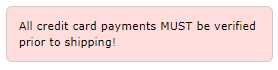
Figure 22 : CSS note example
Customizing the notes
In addition to colors and rounded corners, you can use the following classes to improve the appearance of notes:
- w3-border-color: Defines the color for border elements.
- w3-leftbar: Adds a vertical bar on left side of the container.
- w3-rightbar: Adds a vertical bar on right side of the container.
- w3-topbar: Adds a horizontal bar on the top of the container.
- w3-bottombar: Adds a horizontal bar on the container bottom.
Figure 23 shows the previous note with a w3-border-red and w3-leftbar class added.
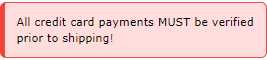
Figure 23: CSS custom note appearance
CSS alerts
Alerts are generally messages on the website that need attention from the user. Typically, the color of the alert suggests the severity of the issue. A red alert indicates a risky or negative situation, while green is generally positive, a confirmation that something worked.
The general structure of an alert is as follows.
Code Listing 26
<div class="w3-display-container w3-panel w3-pale-yellow w3-margin"> <span onclick="this.parentElement.style.display='none'" class="w3-button w3-pale-yellow w3-large w3-display-topright">×</span> <h3>Confirm</h3> <p>Please confirm address prior to shipping!</p> </div> |
In this example, we are using the w3-display-container class to place an X in the upper corner. Clicking the X will dismiss the alert. We are using the × HTML entity rather than the letter X for the closing button.
The onclick code simply changes the alert’s display style property to none, causing the alert to disappear from the screen.

Figure 24: Sample alert panel
Generally, the following colors could be used for alert messages:
- Red or pale red: Error condition, needs attention.
- Yellow or pale yellow: Warning, might need attention.
- Green, pale green : Success!
- Blue, cyan: Information only.
Note: Colors are not universal, and have different meanings in different cultures. For example, the color red in western cultures generally means danger, while in China, the color red represents luck. Be sure to consider your audience when choosing colors for alerts and boxes.
- 1800+ high-performance UI components.
- Includes popular controls such as Grid, Chart, Scheduler, and more.
- 24x5 unlimited support by developers.