
W3.CSS Succinctly®

CHAPTER 9
Tables and Lists
The HTML table system is primarily designed for displaying tabular data in rows and columns. Your HTML code must create the basic table structure, but W3 provides classes to easily enhance the table’s appearance.
CSS tables
A basic table consists of the <table> tag, followed by some number of rows of <tr> elements. Within the <tr>…</tr> row will be any number of <td>…</td> elements. Each row should have the same number of elements; if not, blank spaces will appear within the table structure.
Code Listing 42
<table> <tr> <th>Player name</th> <th>Team</th> <th>Yards</th> <th>TD</th> </tr> <tr> <td>Nick Foles</td> <td>Philadelphia Eagles</td> <td>373</td> <td>3</td> </tr> <tr> <td>Tom Brady </td> <td>New England Patriots </td> <td>505</td> <td>3</td> </tr> </table> |
Each of the available W3 classes is applied to the <table> element.
Basic table
The w3-table class provides the basic table structure, with a width of 100 percent. You can add this class to any table within a site.
Code Listing 43
<table class="w3-table"> </table> |
Figure 32 shows the sample table.

Figure 32: Sample table
Additional classes can be added to control the table’s appearance.
Striped table
The w3-striped class adds striping, so alternating rows will have a shaded effect, as shown in Figure 33.
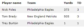
Figure 33: Striped table
The striped rows make the table easier to read.
Borders
There are two classes for adding borders to the table. The w3-border class adds a border around the entire table. The w3-bordered class adds a bottom border to each row in the table.
w3-table-all
The w3-table-all class adds all the features (borders and shading) to the table. Figure 34 shows the class applied to our sample table.
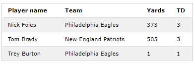
Figure 34: All table features
Hovering
There are times when a table can be used as an edit list, so it is important to let the user know which row is currently selected. W3.CSS makes this easy to do by adding the w3-hoverable class to the table. Figure 35 shows a table with the first row selected.
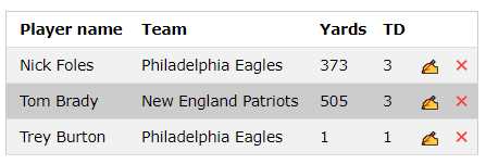
Figure 35: Hoverable table
We’ve added a new column with the HTML entity Ďd; to produce the “writing hand” Edit icon and the entity જ (with the class w3-text-red) for the red Delete icon.
You can use the w3-hover-color classes to change the hover color to something other than a gray background. The hover color is set on the row level, as shown in the following code snippet.
Code Listing 44
<tr> <td class="w3-hover-green">Nick Foles</td> ... </tr> <tr> <td class="w3-hover-blue">Tom Brady</td> ... </tr> |
Hovering is a simple visual indicator of which row you are going to edit or delete.
CSS lists
HTML allows you to create lists using the <ul> (unordered list) or <ol> (ordered list) tags with a collection of <li> tags contained within. The basic structure is shown in the following code snippet.
Code Listing 45
<ul> <li>Soccer</li> <li>Football</li> </ul> |
The framework provides classes to style the lists.
Basic list style
The w3-ul tag sets the basic list structure and handles the indentation of the list elements. The following code produces the list as shown in Figure 36.
Code Listing 46
<ul class="w3-ul"> <li>Soccer</li> <li>Football</li> <li>Baseball</li> </ul> |

Figure 36: Basic list
Tweaking the list
You can use many of the classes to adjust the appearance of the basic list design. These include:
- w3-border: Places a border around the entire list box.
- w3-card-4: Wraps the list in a shadowed card.
- w3-center: Centers the elements within the list.
- w3-color: Provides a color to the list.
Keep in mind that the basic list class sets the list width to 100 percent of its container. If you need to make a smaller width list, you will need to use the CSS style to set the width.
Code Listing 47
<ul class="w3-ul w3-border w3-margin" style="width:20%;" > |
Hoverable list
The w3-hoverable class can be added to the <ul> element to cause a gray background to be used when the mouse hovers over one of the list elements. You can change the background color by setting the w3-hoverable-color class on any of the list elements.
Closable list
You can add an X icon to the list items, and with a little JavaScript call, give the user the ability to remove an item from the list. For example, the following code snippet will use the × HTML entity and, when clicked, will hide the list item.
Code Listing 48
<li class="w3-display-container">Baseball <span onclick="this.parentElement.style.display='none'" class="w3-button w3-display-right">×</span> </li> |
Adding icons to list items
List items are not limited to just text—you can add images using the <img> tag with the w3-bar-item class to show an image, rather than text. For the example, the following code snippet will add sports images next to the sport name.
Code Listing 49
<li><img src="soccer.jpg" class="w3-bar-item" width="32" height="32"> Soccer</li> <li><img src="football.jpg" class="w3-bar-item" width="32" height="32"> Football</li> <li><img src="baseball.jpg" class="w3-bar-item" width="32" height="32"> Baseball</li> |
The result will appear as shown in Figure 37.
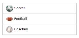
Figure 37: List with images
Tip: When using images, you will get better performance (smaller file sizes) if you adjust the image file size, rather than using the HTML height and width attributes to resize the image.
Summary
The table and list classes make it easy to style your basic tables and lists, and are summarized as follows:
- w3-table: Basic table class.
- w3-striped: Adds stripes to alternate rows in a table.
- w3-border: Adds a border around the entire table.
- w3-bordered: Adds a border between table rows.
- w3-table-all: Adds borders and striping to a table.
- w3-ul: Basic list class.
- 1800+ high-performance UI components.
- Includes popular controls such as Grid, Chart, Scheduler, and more.
- 24x5 unlimited support by developers.