
W3.CSS Succinctly®

CHAPTER 8
Menus
Navigation refers to the hyperlinks and references that allow a user to move among pages in a website. The W3.CSS framework provides classes to allow you to control the appearance of your menu links.
CSS navigation
The basic navigation element is an anchor tag <a>, with an HREF attribute indicating the content to load when the element is clicked. You can also use JavaScript and Ajax to load partial content, by using the onclick event. The syntax is as follows.
Code Listing 33
<a href="#" onclick="CallJavaScript();return false;"> Menu text </a> |
The value of the HREF indicates the link to execute when clicked. If an onclick event is called, then the HREF will only be used if the onclick function returns TRUE. Single page applications keep the menu structure generally intact, and only update the content area by calling JavaScript to build the content window.
Basic structure
The following code snippet shows the basic menu structure, without any classes applied yet.
Code Listing 34
<div> <a href="#">Home</a> <a href="#">Customers</a> <a href="#">Orders</a> <a href="#">Shipping</a> </div> |
Running this code produces the screen shown in Figure 26, simply a row of hyperlinks.
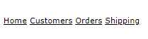
Figure 26: Menu items
Horizontal menu
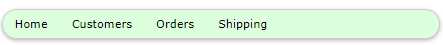
Adding the w3-bar class, an optional color class to the <div> tag, and the w3-bar-item and w3-button classes, produces a horizontal menu with a blue background.
Code Listing 35
<div class="w3-bar w3-blue"> <a href="#" class="w3-bar-item w3-button">Home</a> <a href="#" class="w3-bar-item w3-button">Customers</a> <a href="#" class="w3-bar-item w3-button">Orders</a> <a href="#" class="w3-bar-item w3-button">Shipping</a> </div> |
The w3-button class displays the hyperlinks as buttons, so they are not underlined. The result is shown in Figure 27.
Figure 27: Horizontal menu
Other classes
You can add some helper classes to adjust the menu’s appearance even more. These classes are:
- w3-border: Adds a border around the entire bar.
- w3-card: Displays the bar in a “card,” with a shadow.
- w3-round: Creates a rounded menu effect.
- w3-mobile: Causes the items to stack vertically on smaller screens.
- w3-size: Increases the font size of the menu items.
For example, the following code snippet would produce the pale green, rounded menu bar shown in Figure 28.
Code Listing 36
<div class="w3-bar w3-pale-green w3-border w3-round-xxlarge w3-margin"> |
Figure 28: Rounded menu bar
Menu items
The w3-bar-item class is the basic class to create menu items within the bar. When you hover over a menu item, the background color will change to gray to indicate the menu item to be clicked.
Changing hover colors
Adding w3-hover-color class to an item allows you to overwrite the hover color from gray to another color. You can also add the w3-hover-none if you don’t want the hover effect at all.
Code Listing 37
<!-- Change hover color to green. --> <a href="#" class="w3-bar-item w3-button w3-hover-green">Customers</a> <!-- Remove hover entirely for this item. --> <a href="#" class="w3-bar-item w3-button w3-hover-none">Home</a>
|
Right-align items
The w3-right class, when added to the bar item, causes the item to be aligned to the right side of the bar. Often, the help link is moved to the right, to keep it distinct from the operational links.
Adding text and buttons to the menu bar
Since the bar is the primary navigation for the site, you might need to add text or input elements to the bar. The following screen illustrates a navigation bar showing the currently selected club and the ability to search for a team or player.

Figure 29: Soccer site navigation
The following code illustrates adding text (YSC Sports club) and a search box and button to the bar items. You do not need to limit bar items to just buttons.
Code Listing 38
<div class="w3-bar w3-pale-green w3-border w3-round-xxlarge w3-margin"> <span class="w3-bar-item w3-text-blue"><b>YSC Sports Club</b> </span> <a href="#" class="w3-bar-item w3-button">Teams</a> <a href="#" class="w3-bar-item w3-button">Players</a> <!-- HTML entity for a calendar icon --> <a href="#" class="w3-bar-item w3-button">📅Schedule</a> <input type="text" class="w3-bar-item w3-input" placeholder="Search for team or player.." > <!-- HTML entity for a search icon --> <a href="#" class="w3-bar-item w3-button">🔍</a> </div> |
Drop-down menu items
You can also add a drop-down menu to your navigation using the w3-dropdown-hover and w3-dropdown-content classes. The following code snippet shows an example of added schedule menu options to our soccer navigation bar.
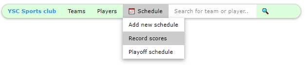
Figure 30: Drop-down menus
The following is the code for this example. The menu option is a wrapper in the w3-dropdown-hover class, and the actual drop-down menu is in the w3-dropdown-content class.
Code Listing 39
<div class="w3-dropdown-hover"> <button class="w3-button">📅 Schedule</button> <div class="w3-dropdown-content w3-bar-block w3-card-4"> <a href="#" class="w3-bar-item w3-button">Add new schedule</a> <a href="#" class="w3-bar-item w3-button">Record scores</a> <a href="#" class="w3-bar-item w3-button">Playoff schedule</a> </div> </div> |
The bar items within the drop-down menu can also have custom colors and hover colors. They are regular menu bar items, and can even be text and input text elements.
Navigation bar positions
Often, you want to keep the navigation bar positioned at the top or bottom of the page. This is accomplished simply by wrapping the entire menu bar and items with a <div> tag using the w3-top or w3-bottom classes.
Code Listing 40
<div class="w3-top"> Menu bar items </div> |
Vertical navigation bar
You can flip the navigation bar to a vertical orientation simply by replacing the w3-bar class with the w3-bar-block class, as follows.
Code Listing 41
<div class="w3-bar-block w3-pale-green w3-margin" style="width:27%;"> |
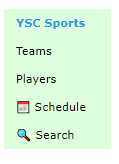
Figure 31: Vertical bar
Notice that you might need to set the width of the block, since the default is the entire width of the parent container.
Summary
Navigation among pages should be easy and intuitive, and the W3 classes make it simple to create visually appealing menu structures. Here is a summary of the classes:
- w3-bar: Creates the menu bar.
- w3-bar-block: Creates a vertical menu bar.
- w3-top: Keeps menu bar at top of page.
- w3-bottom: Keeps menu bar at bottom of page.
- w3-bar-item: Adds button, text, or input for item on the menu.
- w3-dropdown-hover: Creates a drop-down element on the menu.
- w3-dropdown-content: Menu bar items within the drop-down menu.
- 1800+ high-performance UI components.
- Includes popular controls such as Grid, Chart, Scheduler, and more.
- 24x5 unlimited support by developers.