
W3.CSS Succinctly®

CHAPTER 2
Layout
HTML elements on the screen all rely on the “box” model to display how the element appears. Each element is considered a box, with several styling options. Figure 2 shows the box model.

Figure 2: Box model
There are four parts to the box. The inner content is the default content shown in the element. The height and width refer to that content. The next layer is the padding, which is some number of pixels wrapped around the content. The border is the third layer, wrapped around the padding, and the final layer is the margin.
Note: There is some confusion, particularly with older browsers, as to what the width and height actually represent. According to the W3C standards, the height and width should represent the content only. However, Internet Explorer calculated the width and height to include padding and border. The default behavior is the content, so a 50 x 20 pixel content with 5 pixels padding and border takes up 70 x 30 pixels on the screen.
You can use the box-sizing CSS style rule to set the width and height to either content-box (default) or border-box. If you are going to use border-box, I would recommend setting the rule on the body tag, rather than individual elements. However, sticking with the W3C standard is your best bet. If you need to support older versions of Internet Explorer, or aren’t sure which model is used by the users’ browsers, I would add the box-sizing rule and set it to content-box.
CSS gives you total control over the margin, border, and padding; you can set them all to the same value or set different values for the individual sides (left and right), top, and bottom. One of the benefits of the W3 CSS framework is that the class definition sets them consistently for you.
CSS layout
W3 uses two basic classes to display cell content, the w3-cell-row class and the w3-cell class. The row element is a wrapper around a collection of cells. The cells take up 100 percent of the row width and are automatically adjusted based on their content. For example, take a look at the following code snippet.
Code Listing 3
<div class="w3-cell-row"> <div class="w3-container w3-red w3-cell"> <p>John Smith</p> </div> <div class="w3-container w3-green w3-cell"> <p>Lead developer and system architect on pipeline database project</p> </div> </div> |
This would produce the following appearance in the browser window. The two cells take up 100 percent of the width, and the larger content would take up more space.
Figure 3: Row/cell appearance
One feature of the layout class is that the cell heights will match the height of the largest content, so if the cell's description had much more detail, it might appear as shown in Figure 4.
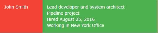
Figure 4: Same-height cells
You can adjust the alignment of the text within the cell using the w3-cell-top, middle, or bottom classes. For example, if we added the w3-cell-bottom class, the name John Smith would be aligned to the bottom of the red cell in the previous example.
Code Listing 4
<div class="w3-container w3-red w3-cell w3-cell-bottom"> <p>John Smith</p> </div> |
The w3-mobile class can be added to a w3-cell as well. This will cause the cells to be laid out horizontally on a larger screen, but be stacked vertically on smaller screens, such as mobile devices (phones and some tablets).
Classes summary
The following is a list of the various w3 classes for controlling your screen layout:
- w3-cell-row: Starts a container row for a collection of cells.
- w3-cell: Individual cell content within the row.
- w3-cell-top: Aligns content to top of the cell.
- w3-cell-middle: Centers content vertically within the cell.
- w3-cell-bottom: Aligns content to bottom of the cell.
- w3-mobile: Helper class added to cell; will display cell horizontally if there’s room, but stack vertically on smaller devices.
CSS responsive
The W3.CSS framework includes a grid system designed to be responsive to the screen size, rearranging columns as needed to render on different devices. For example, let’s look at a website that displays information about U.S. coins. A sample is shown in Figure 5.
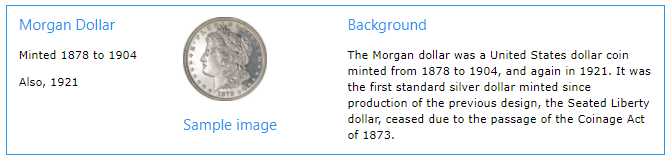
Figure 5: Responsive website example
When this screen is displayed on a mobile device, the layout will change to stack the information vertically, as shown in Figure 6.

Figure 6: Mobile device display
Responsive layout
To create the responsive layout, you must start with a w3-row or w3-row-padding container.
Code Listing 5
<div class="w3-row w3-border w3-border-blue w3-margin"> </div> |
To be responsive, the elements must be nested with the w3-row class. Within the w3-row div, you can add additional div containers to create columns.
General-width columns
Here are the general column classes:
- w3-half: Takes up half of the row width.
- w3-third: Takes up one-third of the row width.
- w3-twothird: Takes up two-thirds of the row width.
- w3-quarter: Takes up one-fourth of the row width.
- w3-threequarter: Takes up three-fourths of the row width.
The coin website code snippet is shown in Code Listing 6. The first two columns (coin name and image) each take up one-fourth of the screen, while the background column takes up half of the row width.
Code Listing 6: Coin website
<div class="w3-row w3-border w3-border-blue w3-margin"> <div class="w3-container w3-quarter"> <h4 class="w3-text-blue">Morgan Dollar</h4> <p>Minted 1878 to 1904</p> <p>Also 1921</p> </div> <div class="w3-container w3-quarter w3-center"> <p><img src="morgan.jpg" style="width:60%"></p> <h4 class="w3-text-blue">Sample image</h4> </div> <div class="w3-container w3-half"> <h4 class="w3-text-blue">Background</h4> <p>The Morgan dollar was a United States dollar coin minted from 1878 to 1904, and again in 1921. It was the first standard silver dollar minted since production of the previous design, the Seated Liberty dollar, ceased due to the passage of the Coinage Act of 1873.</p> </div> </div> |
12-column responsive
In addition to the general column widths, you can use the w3-col class to create columns based on a 12-column grid. To do so, you need to add the w3-col class, followed by the number of columns (based on screen size). The size classes are:
- l1 – l12: Number of columns on large screens (> 992 pixels).
- m1 – m12: Number of columns on medium screens.
- s1 – s12: Number of columns on small screens (< 601 pixels).
For example, the classes w3-col, s6, m4, and l3 indicate to use half the screen width on a small device, one-third of the screen on a medium device, and one-fourth of the screen on a large device.
You can also set the width using the class w3-col and an inline style to set the width attribute. There is also a w3-rest class that indicates the column should take the remaining row width.
Show and hide columns
By default, all columns are visible on every device. However, that might not be the best approach for your website. For our example, we might want to skip the background column when viewing the site on a mobile device. For a restaurant site, you might consider the directions column critical when displaying the site on a mobile device, but hide it when viewing the site on a desktop device.
We can do this by adding the appropriate class (w3-hide-small) from the following list to the column we want to hide:
- w3-hide-small: Don’t show column on a small device.
- w3-hide-medium: Don’t show column on a medium-sized device.
- w3-hide-large: Don’t show column on a large device.
When we add w3-hide-small to the background column, the screen will appear as shown in Figure 7 when viewed on a mobile device.
Code Listing 7
<div class="w3-container w3-half w3-hide-small"> |
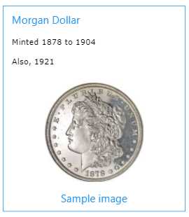
Figure 7: Mobile display without background column
CSS grid
The framework’s grid system works just as the responsive system (meaning all columns must be contained with a w3-row), but relies on w3-col and sizing (based on 12 columns) to determine the column sizes.
Column widths
Each column is 8.33 percent (one-twelfth) of the container width, and you can specify the number of columns to display for device sizes. If nothing is specified for a particular device size, it is assumed to be 12 columns:
- s1 – s12: Small (< 601 pixels)
- m1 – m12: Medium
- l1 – l12: Large (> 992 pixels)
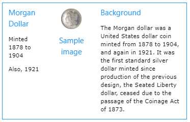
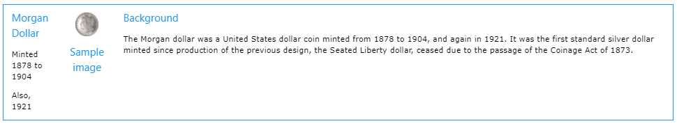
Suppose we change our coin example to the following code snippet.
Code Listing 8
<div class="w3-row w3-border w3-border-blue w3-margin"> <div class="w3-container w3-col s3 m2 l1"> <h4 class="w3-text-blue">Morgan Dollar</h4> <p>Minted 1878 to 1904</p> <p>Also 1921</p> </div> <div class="w3-container w3-col s3 m2 l1 w3-center"> <p><img src="morgan.jpg" style="width:60%"></p> <h4 class="w3-text-blue">Sample image</h4> </div> <div class="w3-container w3-col s6 m8 l10"> <h4 class="w3-text-blue">Background</h4> <p>The Morgan dollar ... </p> </div> </div> |
You can see the column widths changing with the device size.
Figure 8: Small size (< 601 pixels)
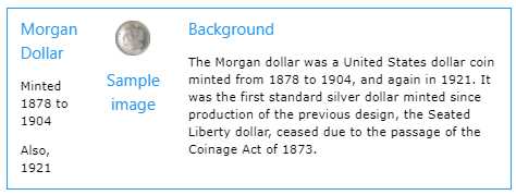
Figure 9: Medium size
Figure 10: Large size (> 992 pixels)
By setting the w3-col and appropriate sizing in the grid, you can easily have your website adapt its appearance to the device size.
Note that you can also use the w3-hide-size classes to hide columns on different devices; however, be sure to adjust your size classes to avoid creating empty gaps. In our example code, if we wanted to hide the description column on a small device, the previous two columns should use s6 sizing, rather than s3.
CSS display
The w3-display-container class allows you to display HTML elements at specific locations within other elements. For example, you might want to design a box where the close icon is always in the upper-right corner, while the Save and Cancel options always appear in the lower right. By using the w3-display-container class, you can position elements using class names that represent relative positions with the container.
Figure 11 shows where the class names place the elements within the container.
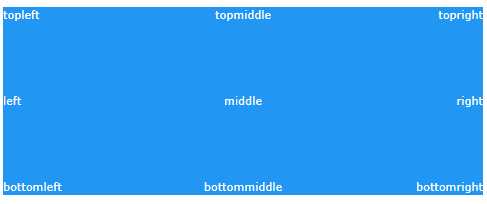
Figure 11: CSS display
For example, if we want to create a Save dialog box, with the top-right corner containing an X symbol to close the box, and the bottom middle the Save and Cancel buttons, we could use the following code snippet.
Code Listing 9
<div class="w3-display-container w3-margin w3-blue" style="height:250px"> <div class="w3-display-topright w3-xxlarge">×</div> <div class="w3-display-bottommiddle"> <button class="w3-btn w3-green w3-margin w3-border">Save</button> <button class="w3-btn w3-red w3-margin w3-border">Cancel</button> </div> </div> </div> |
You can still use other classes, such as w3-hide-size, to customize the appearance of a display container to different device sizes.
Summary
The W3.CSS framework provides a number of different layout options, allowing a lot of flexibility in designing your web application.
- 1800+ high-performance UI components.
- Includes popular controls such as Grid, Chart, Scheduler, and more.
- 24x5 unlimited support by developers.