
W3.CSS Succinctly®

CHAPTER 4
Helper Classes
There are a few classes included that can be attached to various elements to perform some basic formatting of the element’s appearance.
CSS round
By default, HTML elements appear as a square box. However, CSS allows you to set the border- radius property to create boxes with rounded corners. The W3.CSS framework provides several classes to easily create rounded corners.
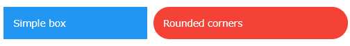
Figure 14: Square box and rounded box
Table 6 lists the rounding classes. The larger the pixel size of the border radius, the more pronounced the rounded corners will be.
Table 6: Rounding classes
Class name | Border radius size |
w3-round | 4 pixels |
w3-round-small | 2 pixels |
w3-round-medium | 4 pixels (same as round) |
w3-round-large | 8 pixels |
w3-round-xlarge | 16 pixels |
w3-round-xxlarge | 32 pixels |
Circle class
In addition to the rounded corners, the framework includes a w3-circle class to put the entire element in a circle (or oval), depending on the element size. You can nest circles within each other by adjusting the elements width using an inline style attribute.
CSS padding
The padding classes can be used to add a padding around the cell content. There are two types of padding classes. The numeric padding classes add top and bottom padding as specified by the class name. The size padding classes provide complete padding (all four sides) using size abbreviations.
Numeric padding
The numeric padding classes are:
- w3-padding-16: Adds 16 pixels top and bottom padding.
- w3-padding-24: Adds 24 pixels top and bottom padding.
- w3-padding-32: Adds 32 pixels top and bottom padding.
- w3-padding-48: Adds 48 pixels top and bottom padding.
- w3-padding-64: Adds 64 pixels top and bottom padding.
Size padding
The size padding classes add padding to all four sides: top, bottom, left, and right. The classes are:
- w3-padding: Adds 8 pixels top and bottom, and 16 pixels left and right (default).
- w3-padding-small: Adds 4 pixels top and bottom, and 8 pixels left and right.
- w3-padding-large: Adds 12 pixels top and bottom padding, 24 pixels left and right.
CSS margins
The margin classes allow you to add a 16-pixel margin to an element. The class allows margins to be added to all sides or to individual sides:
- w3-margin: Adds a 16-pixel margin to all sides.
- w3-margin-top: Adds a 16-pixel margin to top.
- w3-margin-right: Adds a 16-pixel margin to right side.
- w3-margin-bottom: Adds a 16-pixel margin to bottom.
- w3-margin-left: Adds a 16-pixel margin to left side.
- w3-section: Adds a 16-pixel margin to top and bottom.
You can combine classes if you only need margins on some edges. The w3-section class is a shorthand class, the same as adding classes w3-margin-top and w3-margin-bottom to the element.
CSS borders
The W3.CSS framework provides classes to place borders around elements. The are several border classes available.
Basic borders
The basic border classes allow you to add a border around the entire element or one or more sides. The classes are:
- w3-border: Adds borders to all sides (top, bottom, left, right) of the element.
- w3-border-top: Adds the border to the top of the element.
- w3-border-right: Adds the border to the right of the element.
- w3-border-bottom: Adds the border to the bottom of the element.
- w3-border-left: Adds the border to the left of the element.
- w3-border-0: Removes all borders from the element.
Border colors
You can add the w3-border-color classes to the border class (both classes are required) to change the border color. There are two class types for border colors:
- w3-border-color: Sets border to specified color (default is black).
- w3-hover-border-color: Sets border color to use when hovering over the element.
Thick borders
Thicker borders (6 pixels) can provide a nice visual touch to an element, as shown in Figure 15.
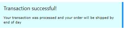
Figure 15: Thick border example
The following CSS classes (which can be combined with border colors) can be used to create thick borders around an element:
- w3-bottombar: Adds a thick border to the bottom of the element.
- w3-leftbar: Adds a thick border to the left side of the element.
- w3-rightbar: Adds a thick border to the right side of the element.
- w3-topbar: Adds a thick border to the top of the element.
CSS sizing
The W3.CSS framework provides a number of classes to change the size of elements:
- w3-tiny: Very small font, would make lawyers happy (10 pixels).
- w3-small: Smaller font (12 pixels).
- w3-medium: Default font of 15 pixels.
- w3-large: Font size of 18 pixels.
- w3-xlarge: Font size of 24 pixels.
- w3-xxlarge : Font size of 36 pixels.
- w3-xxxlarge: Font size of 48 pixels.
- w3-jumbo: Font size of 64 pixels.
These classes can be applied to any element, such as text, buttons, badges, and tables.
Summary
The helper classes and color classes, combined with the other base classes, provide a tremendous amount of control over your webpage elements.
- 1800+ high-performance UI components.
- Includes popular controls such as Grid, Chart, Scheduler, and more.
- 24x5 unlimited support by developers.