
W3.CSS Succinctly®

CHAPTER 11
Forms
Many web applications need to collect information from the user, and HTML provides a variety of elements to enter information into the site. The W3.CSS framework provides classes to create a consistent appearance for these elements.
Figure 44 shows a sample input form, formatted with W3 classes.

Figure 44: Sample input form
Text boxes
Text boxes are used to allow the user to enter freeform text into a form. The basic syntax is as follows.
Code Listing 57
<input type="text" class="w3-input"> |
The w3-input class provides the basic formatting for a text box, providing the necessary padding and borders.
Note: HTML5 introduces several new input types besides the basic text input. The following types are supported:
- date: Display a date editor.
- email: Get an email address.
- number: A numeric spinner.
- range: A slider between two numeric values.
- tel: Get a phone number.
- color: A color picker.
- datetime-local: Enter a date/time, and no time zone.
- month: Select a month and year.
- search: A text box for searching.
- time: A box to select a time and a.m. or p.m.
- url: A text box that expects input to look like a URL.
- week: Pick a week and year.
If a browser does not support one of the new types, it will fall back to text input. Also, many mobile devices will change the virtual keyboard to accommodate the input type.
Text box options
You can use the w3 helper classes to change the appearance of the input text box. For example, the following code snippet produces our rounded input boxes in the sample.
Code Listing 58
<input type="text" class="w3-input w3-border w3-round-xxlarge" name="first" placeholder="First Name"> |
A recent trend in text input is not to use borders at all around text. You can use the w3-border-0 class to achieve that look (shown in figure 45).
Figure 45: Borderless input
While text elements are very common and easy for the user to understand, the lack of constraints on what the user can enter makes it more difficult for the code to process. When possible, use the HTML5 types with constraints and provide placeholder examples of how the user should populate the text boxes.
Option buttons
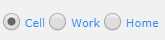
Option buttons (also referred to as radio buttons) present a list of choices to the user and allow them to pick only one. They appear as circular buttons with labels next to each option. Figure 46 shows sample option buttons.
Figure 46: Option buttons
The w3-radio class formats the option buttons. The following code snippet shows how to create a group of buttons.
Code Listing 59
<input type="radio" class="w3-radio" name="phoneType" value="cell" checked> <label>Cell</label> <input type="radio" class="w3-radio" name="phoneType" value="work"> <label>Work</label> <input type="radio" class="w3-radio" name="phoneType" value="home"> <label>Home</label> |
All elements within the option group must have the same name attribute value. This allows the browser to enforce only one item within the group being selectable.
Note: Option buttons were originally called radio buttons because most older cars had buttons on the radio, designed so that when one button was pushed, the other buttons would automatically pop up (see Figure 47). Many younger developers were not familiar with the meaning, since very few cars still use radio buttons—hence the new name, option buttons.
Figure 47: Radio buttons
Check boxes
Check boxes are like option buttons, except that the user can check more than one. The element for check boxes is a square, to distinguish them from option buttons. Figure 48 shows how check boxes appear on the form.
Figure 48: Check boxes
The following code creates the check boxes.
Code Listing 60
<input type="checkbox" class="w3-check" checked> <label>Overnight shipping</label> <input type="checkbox" class="w3-check" > <label>Insurance</label> <input type="checkbox" class="w3-check" > <label>Signature required</label> |
The w3-check class provides the formatting for check boxes.
Select elements
Check boxes and option buttons are good elements to use if your number of choices is relatively small. For a larger number of choices, you should consider a select box. To create the box, you declare the <select> element wrapper, and then include <option> elements. The following code snippet shows how to design a select list. The w3-select class provides the formatting. In the following example, we added a w3-border class to improve the appearance of the box.
Code Listing 61
<select class="w3-select w3-border" name="option"> <option value= "" disabled selected>Choose your option</option> <option value= "1">Reduced interest rate</option> <option value= "2">Longer payment terms</option> <option value= "3">Cash rebate</option> </select> |
Figure 49 shows a select box produced from this code snippet.
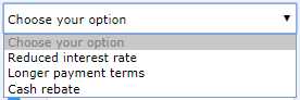
Figure 49: Select box
Adding labels
You can add labels around the input elements, using either text or icons and images. In the following code snippet, we are using the w3-row and w3-col classes to split the screen between the label and the input element.
Code Listing 62
<div class="w3-section w3-row"> <div class="w3-col" style="width:50px;"> <i class="w3-col fa fa-envelope-o"></i></div> <div class="w3-rest"> <input class="w3-input w3-border" type="email" name="email" placeholder="Email address" > </div> </div> |
This example uses the Font Awesome library to provide an envelope icon. You could also use the HTML Entity code ✉ to produce an envelope icon.
Summary
The following classes are used to format input elements:
- w3-input: Text input class
- w3-radio: Radio (option) buttons
- w3-check: Check boxes
- w3-select: Select list
- 1800+ high-performance UI components.
- Includes popular controls such as Grid, Chart, Scheduler, and more.
- 24x5 unlimited support by developers.