
W3.CSS Succinctly®

CHAPTER 5
Containers
The W3.CSS framework provides a variety of container styles to use in your application. Working with these containers will require some JavaScript; however, it is minimal and simple scripting.
CSS accordions
An accordion is used when you have several text box elements, typically a header bar and some content, but don’t want all the content exposed at once. The user will click on the header bar, and the text within that section will be shown (or hidden).

Figure 16: CSS accordion example
Accordion bars
The accordion bars are styled buttons, as shown in the following snippet.
Code Listing 10
<button onclick="openPanel('Airport');" class="w3-btn w3-block w3-pale-blue w3-border-blue w3-border w3-leftbar w3-left-align"> Airport departure and arrival information </button> |
The openPanel() JavaScript function will handle the opening and closing of the accordion content.
Building the sections
To create the section for the accordion, you will need to create a separate <div> for each section. The following code snippet shows a sample content <div>.
Code Listing 11
<div id="Airport" class="w3-container w3-hide"> <p>Airports</p> </div> |
Each <div> will have the w3-hide class applied so that the content is not visible. The JavaScript code will take care of displaying the content.
Navigation
To navigate between the accordions, you will need to employ some simple JavaScript. The code will have two tasks: one is to hide all of the inactive tabs (based on the class name), and the second is to make the selected tab visible.
Code Listing 12
function openPanel(id) { var x = document.getElementById(id); if (x.className.indexOf('w3-show') == -1) { x.className += ' w3-show' } else { x.className = x.className.replace(' w3-show',''); } } |
When the user clicks on the accordion button, the openPanel() function checks to see if the w3-show class is on the current item. If it is not present, it is added and the content becomes visible. If the w3-show class is already there, it is removed (which causes the original w3-hide class to take effect).
CSS tabs
Tabs function in a similar manner to accordions, where only one section of content is visible at a time. However, the navigation among sections is done via a series of buttons (tabs), typically across the top of the page.

Figure 17: CSS tabs example
Tab classes
There are two classes you need to work with in tabs:
- w3-bar: The container to hold the tab bar across the top.
- w3-bar-item: The button representing the tab.
Building the tabs
Code Listing 13
<div class="w3-bar w3-pale-blue w3-leftbar w3-border-blue w3-border"> <button onclick="openDiv('Airport');" class="w3-bar-item w3-button">Airport </button> <button onclick="openDiv('Hotel');" class="w3-bar-item w3-button">Hotel </button> <button onclick="openDiv('Rental');" class="w3-bar-item w3-button">Rental </button> </div> |
Building the sections
To create sections for the tabs, you will need to create a separate <div> for each section within the tabs. The following code snippet shows a sample group of <div> elements. You will need to define a class name for each of the tab sections—we used travel in our example code. The first <div> should be displayed, while the remaining <div> elements are hidden.
Code Listing 14
<div id="Airport class="travel"> <p>Airport details</p> </div> <div id="Hotel class="travel" style="display:none;"> <p>Hotel details</p> </div> <div id="Rental class="travel" style="display:none;"> <p>Rental details</p> </div> |
Navigation
To navigate between the tabs, you will need to employ some simple JavaScript. The code will have two purposes: the first is to hide all of the inactive tabs (based on the class name), and the second is to make the selected tab visible.
Code Listing 15
function openDiv(divName) { var x = document.getElementsByClassName('travel'); for (var i =0; i < x.length; i++) { x[i].style.display = 'none'; } document.getElementById(divName).style.display = 'block'; } |
When the user clicks on the tab, the JavaScript function is called and passed the divName to open.
Vertical tabs
Although tabs are typically horizontal, you can easily create vertical tabs with a few small changes to the layout.

Figure 18: Vertical tabs example
You need to change the w3-bar class to w3-bar-block and add the w3-sidebar class. In addition, you’ll need to set the width of the tab menu.
Code Listing 16
<div class="w3-sidebar w3-bar-block w3-pale-blue w3-border-blue w3-border" style="width:120px;"> |
You will also need to add margin-left style to the sections, as follows.
Code Listing 17
<div id="Airport" class="travel" style="margin-left:125px;"> |
Be sure to set the margin large enough to start past the width of the menu. You should add the margin-left style in the travel class, rather than inline.
CSS cards
A card is a container with a shadow around it to provide a paper-like appearance to an element. The framework provides a simple w3-card class to create a card element. The w3-card-4 is similar, except that the shadow around the card is larger (4 pixels rather than 2 pixels). By default, the card will be white, although you can add any w3-color class to create a colored card.
For example, the following code snippet would display the card shown in Figure 19 on a webpage.
Code Listing 18
<div class="w3-card-4 w3-cyan w3-padding w3-margin"> <p class="w3-text-white w3-large">Danielle Salsbury</p> <p>Tennis player extraordinaire</p> </div> |

Figure 19 : CSS card sample
CSS sidebar
A common website container is the sidebar menu, where the navigation options appear on the side of the screen, and the content appears in a larger area off to the other side. It is constructed very similarly to vertical tabs, but has additional options available to increase its flexibility.

Figure 20: Basic sidebar
Basic sidebar
To create the sidebar, you need to use the w3-sidebar and w3-bar-block classes, as well as set the width of the sidebar. Background colors and borders are optional, but generally the sidebar should be distinguished from the rest of the screen. The following code snippet shows the basic sidebar setup.
Code Listing 19
<div class="w3-sidebar w3-bar-block w3-border"> <a href="#" class="w3-bar-item w3-button">Airport</a> <a href="#" class="w3-bar-item w3-button">Hotel</a> ... </div> |
You will also need to set the left margin of the content elements large enough to be positioned past the right border of the sidebar.
Collapsible sidebar
A fairly common technique on websites, particularly mobile sites, is hiding the sidebar menu (providing more space for the main content), and only opening the menu when the user clicks an icon (typically the “hamburger” icon with three horizontal bars). With a little JavaScript, you can have the W3.CSS sidebar provide this behavior.
Creating the icon
You will need to add a header (or some container to show the menu icon). Be sure to provide an id for the menu icon (openNav in our example). The #9776 is the HTML entity code for the hamburger menu icon. The following code snippet shows the header and icon example code.
Code Listing 20
<div class="w3-container w3-pale-green"> <h4> <span id="openNav" class="w3-small w3-button" onclick="openMenu();">☰ </span> My travel plans</a> </h4> </div> |
When the user clicks on the icon, the openMenu() JavaScript function is called.
Creating the sidebar
The sidebar itself is created using the same code as the basic sidebar code, with a couple changes. First, the sidebar menu will need an id, since the JavaScript code will need to reference it. In addition, it initially will not be visible on the screen.
The other change is a new menu item, to call the JavaScript closeMenu() function to hide the sidebar when clicked.
Code Listing 21
<div class="w3-sidebar w3-bar-block w3-border" id="sideBAR" style="width:20%;display:none;"> <button class="w3-bar-item w3-button" onclick="closeMenu();">× </button> <a href="#" class="w3-bar-item w3-button">Airport</a> <a href="#" class="w3-bar-item w3-button">Hotel</a> ... </div> |
Opening and closing
The JavaScript functions to open and close the menu simply need to toggle the menu’s display style, to show or hide the menu. The following code snippet shows the necessary JavaScript.
Code Listing 22
function openMenu() { document.getElementsById('sideBAR').style.display = 'block'; } function closeMenu() { document.getElementsById('sideBAR').style.display = 'none'; } |
Keep in mind that the element name for the sidebar is case sensitive, so be sure the id name matches the id you’ve assigned to your sidebar menu.
Slide content to right
While the collapsible sidebar appears properly, there might be times when you want the content to shift to the right, rather than be overwritten by the sidebar menu. Fortunately, this is an easy change to the JavaScript function needed for the collapsible sidebar menu. The following JavaScript code will open the menu and adjust the screen content.
Code Listing 23
function openandMoveMenu() { document.getElementsById('main').style.marginLeft = '21%'; document.getElementsById('sideBAR').style.width = '20%'; document.getElementsById('sideBAR').style.display = 'block'; document.getElementsById('openNav').style.display = 'none'; } function closeMenu() { document.getElementsById('main').style.marginLeft = '1%'; document.getElementsById('sideBAR').style.display = 'none'; document.getElementsById('openNav').style.display = 'inline-block'; } |
You will need to adjust the margin and width percentages to match your sidebar menu width, and adjust the left margin of the content of the main portion of your screen.
CSS panels
The w3-panel class is very similar to the w3-container class, but includes a 16-pixel top and bottom margin to have the panel stand out a bit from the background. This makes the panel a good choice for things like notes and alerts.
The following code snippet illustrates a panel to display a warning message.
Code Listing 24
<div class="w3-panel w3-red w3-round-xxlarge w3-margin"> <h3 class="w3-text-yellow"><b>Warning</b></h3> <p>This action will delete hundreds of records and will be recorded in the audit trail</p> </div> |
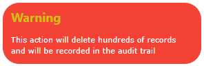
Figure 21: Warning panel
Summary
The W3.CSS framework provides a number of ways to present content and actions, and with minor JavaScript, you can have an easy-to-work system to provide the user with navigation between menus and content on your site.
- 1800+ high-performance UI components.
- Includes popular controls such as Grid, Chart, Scheduler, and more.
- 24x5 unlimited support by developers.