
W3.CSS Succinctly®

CHAPTER 10
Buttons and Labels
A button element on a webpage is typically used to initiate an action or toggle a feature. The basic HTML syntax is as follows.
Code Listing 50
<input type="button" value="button text" href="#" onclick="javascript function"> |
If the href attribute is specified, it represents a link that the user will go to when they click the button. You can also have a JavaScript function called when the button is clicked. Note that if the function returns FALSE, the href link will not be activated.
An alternate approach for buttons is the <button> element or an <a> anchor element. You can use any approach to create a clickable area on the screen.
CSS buttons
There are two basic classes available to style the button’s appearance in the framework. The w3-button class creates a button that will change color when you hover over it. The w3-btn class creates a button that will display a slight shadow effect when you hover over it. Both button classes default to a black button with gray hover effects. In addition, hovering over the button will change the cursor to a pointer, indicating that the user can click the button.
Button variations
You can use the w3-color attributes to change the background and hover colors of the buttons. For example, the following code snippet might be used to allow the user to save or discard updates.
Code Listing 51
<a href="save.aspx" class="w3-btn w3-green">Save changes</a> <a href="discard.aspx" class="w3-btn w3-red">Discard changes</a> |
Figure 38 shows sample colored buttons.
Figure 38: Sample buttons
Button colors
You can add the w3-color or w3-hover-color classes to set button colors or hover colors (the default hover color is gray).
Button shapes
The default shape of the buttons is a rectangle. You can use the w3-round classes to add rounded corners to the buttons. The following code snippet will produce the rounded buttons shown in Figure 39.
Code Listing 52
<div class="w3-container w3-margin"> <a href="#" class="w3-btn w3-green w3-round-xxlarge"> Save changes</a> <a href="#" class="w3-btn w3-red w3-round-xxlarge"> Discard changes</a> </div> |

Figure 39: Rounded buttons
Disabled buttons
Buttons have a visual effect, either background color change or shadowing, as well as the cursor changing to indicate the button is clickable. If a button needs to be disabled, you can add the w3-disabled class to the button. This will cause the button to have a grayed-out appearance and disable the cursor when the user moves the mouse over the button.
Tip: You might want to dynamically add the w3-disabled class via JavaScript when the button is clicked. This could provide a visual indication that the button has been pressed and the action is being performed. Remove the class when the work is complete.
Ripple effect
A ripple effect is a visual effect that indicates the button has been clicked, providing some feedback to the user. It is considered good UX design to make sure the user knows that the button has been clicked. You can add the w3-ripple class to any button to provide this effect.
CSS badges
A badge is a circular label, typically containing a number, which indicates how many items are found in some collection. The W3.CSS framework has a single class, w3-badge, that will create a circular badge with a black background.
You can use the w3-color and w3-size classes to control the color and size of the badge element. The following code snippet creates the badges shown in Figure 40.
Code Listing 53
<div class="w3-container w3-margin" style="width:18%;"> <p>w3-badge <span class="w3-badge w3-right">9</span></p> <p>w3-badge w3-red <span class="w3-badge w3-red w3-right">4</span></p> <p>w3-badge w3-red w3-large <span class="w3-badge w3-blue w3-right w3-large">2</span></p> </div> |
Figure 40: Badge examples
Badges within other elements
The w3-badge class can be used within other elements using a <span> tag. For example, we might have a list of customers and use the badge to indicate number of orders.
Code Listing 54
<div class="w3-container w3-margin" style="width:18%;"> <ul class="w3-ul w3-border"> <li>Christy <span class="w3-badge w3-right w3-margin-right">4</span></li> <li>Rachel <span class="w3-badge w3-right w3-margin-right">8</span></li> <li>Alyssa <span class="w3-badge w3-right w3-margin-right">3</span></li> </ul> </div> |
This code snippet produces the list shown in Figure 41.

Figure 41: Badges with list elements
CSS tags
Tags are labels on a site, typically used to label some element on the screen. The W3.CSS framework provides the w3-tag class to format the label. The following code snippet shows a tag that displays the status of the current operation.
Code Listing 55
<div class="w3-container> <p>Status: <span class="w3-tag w3-green">Processing</span></p> </div> |
Figure 42: Processing tag
Customizing the tags
You can use the various w3 helper classes to customize the appearance of a tag. For example, the following code snippet adds several helper classes to produce a warning tag.
Code Listing 56
<div class="w3-container"> <span class="w3-tag w3-red w3-center w3-round-large w3-padding"> The thermal printer should only be<br/> used to print prescriptions sheets. </span> </div> |
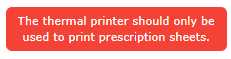
Figure 43: Warning tag
Summary
The button, badge, and tag classes make it easy to style your contents, and are summarized as follows:
- w3-button: Basic button with gray background on hover.
- w3-btn: Button with shadow effect on hover.
- w3-badge: Creates a circular “badge” effect.
- w3-tag: Creates a tag or label effect.
- 1800+ high-performance UI components.
- Includes popular controls such as Grid, Chart, Scheduler, and more.
- 24x5 unlimited support by developers.