
Vue.js Succinctly®

CHAPTER 3
Expanding the App: UI
Quick intro
In the previous chapter, we laid the foundation for our application by looking at its component structure, and looked at some of the fundamental constructs of Vue and useful directives, which are commonly used throughout most Vue applications. We also created the Docs component and made it work with the boilerplate data within App.vue, which we will later make dynamic.
We are now able to take these concepts further and add the remaining components our application requires—which is what we’ll do in this chapter.
Item.vue
To keep our code clean and organized, let’s take a step further and add a new component file called Item.vue, which will be responsible for displaying the information of an individual document. The Item component will be invoked from the Docs component.
Using VS Code, let’s go ahead and add the Item.vue file under the Components folder. I’ve added the standard boilerplate code to it, which looks as follows.
Listing 3-a: Item.vue
<template> <div> </div> </template> <script> export default { name: "Item" } </script> <style scoped> </style> |
So far, it’s nothing out of the ordinary, as you can see. Let’s go back to Docs.vue and import the Item component and bind it to the existing data.
Listing 3-b: Updated Docs.vue
<template> <div> <h1>DocExpire</h1> <div v-bind:key="item.id" v-for="item in items"> <Item v-bind:item="item"/> </div> </div> </template> <script> import Item from './Item'; export default { name: "Docs", props: ["items"], components: { Item } } </script> <style scoped> </style> |
Notice the changes to the Docs component highlighted in bold. We have now added a reference to the Item component directly within the markup: <Item v-bind:item="item"/>.
Notice how we are passing the item current object from the items array and binding that to the item property of the Item component.
Also notice how we have imported the Item component (Item.vue) using the import statement and declared it within the components object within Docs.vue.
Now let’s make the required modifications to Item.vue to accommodate for these changes.
Listing 3-c: Updated Item.vue
<template> <div> <h3>{{item.name}}</h3> <p>{{item.exp}}</p> </div> </template> <script> export default { name: "Item", props: ["item"] } </script> <style scoped> </style> |
As you can see, we’ve added the {{item.name}} expression to the HTML markup and declared the item property, which we pass from Docs.vue.
To completely understand what we’ve just done, let’s look at the following diagram.
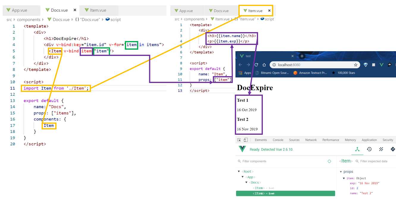
Figure 3-a: Relationship between Docs.vue and Item.vue
Now that we understand how both components relate to each other, we need find a visual way to differentiate between documents that have expired and those that are still valid (expire in the future).
To do that, we’ll have to add some CSS styling and make use of logic that shows one icon or another, depending whether the document has expired or not. But before we do that, let’s add some style to our application by using Google’s awesome Material Design library.
Vuetify
I’m a big fan of Material Design, and while writing Flutter Succinctly, I was pleased that Material Design was provided out of the box with the Flutter framework.
With Vue, Material Design is not part of the framework; however, there’s a Material Design Component framework that works great with Vue called Vuetify—which is what we’ll be using.
Before installing Vuetify, please back up your existing App.vue file, as Vuetify might overwrite it. To install Vuetify, all you need to do is run the following command on your project root folder.
Listing 3-d: How to Install Vuetify
vue add vuetify |
Once you have executed the command, you will be requested to choose a preset, with the following options.
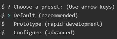
Figure 3-b: Vuetify Presets
In my case, I simply chose the Default (recommended) preset. Once you’ve chosen your preset option, Vuetify will be added to the project and the package.json file will be updated with a reference to it.
Once installed, the next thing we need to do is to add it to our existing application, so we can start to benefit from the Material Design styling.
To do that, open the main.js file found within the src folder of your project. Once you’ve opened main.js, add the following lines to the file.
import Vuetify from 'vuetify'
Vue.use(Vuetify)
This has been highlighted in bold the code listing below, which corresponds to the main.js file within the project src folder.
Listing 3-e: Updated main.js (Adding Vuetify)
import Vue from 'vue' import './plugins/vuetify' import App from './App.vue' import Vuetify from 'vuetify' Vue.use(Vuetify) Vue.config.productionTip = false new Vue({ render: h => h(App), }).$mount('#app') |
Now, we are ready to give a Material Design look and feel to our application. Vuetify is fully enabled and ready to be used.
Styling App.vue
Besides making our application look prettier, one of the key aspects of choosing Vuetify is to try to make the application look as close as possible to the one developed in Flutter Succinctly.
One of the distinct features about the Flutter app is that it includes a floating button, which is used to add new documents to the application.
Based on that concept, let’s modify our application accordingly, so we can end up with something that looks like this.
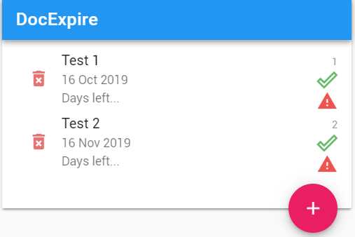
Figure 3-c: Our App’s UI (Using Vuetify)
Let’s start off by modifying App.vue with the following code.
Listing 3-f: Updated App.vue (Using Vuetify)
<template> <div id="app"> <v-app> <v-layout row> <v-flex xs12 sm6 offset-sm3> <v-card> <Docs :items="items"/> <v-card-text tyle="height: 100px; position: relative"> <v-btn big color="pink" dark absolute bottom right fab > <v-icon>add</v-icon> </v-btn> </v-card-text> </v-card> </v-flex> </v-layout> </v-app> </div> </template> <script> import Docs from './components/Docs'; export default { name: 'app', components: { Docs }, data: () => { return { items: [ { id: 1, name: "Test 1", exp: "16 Oct 2019" }, { id: 2, name: "Test 2", exp: "16 Nov 2019" } ] } } } </script> <style> </style> |
I’ve highlighted in bold the parts of the code that have been added. As you can see, it’s basically HTML markup that has changed. The rest of the App.vue code remains the same.
Notice the <Docs :items="items"/> syntax instead of <Docs v-bind:items="items"/>. This is because v-bind:items can be shortened to simply :items. From now on, to make the syntax simpler, we’ll use the : shortcut syntax instead of v-bind.
One great thing about Vuetify is that it comes with prebuilt Material Design components, which make the development of the app’s UI much faster and easier than using regular HTML markup.
To better understand the markup added to App.vue, and the UI that is visible on the screen, let’s look at the following diagram.
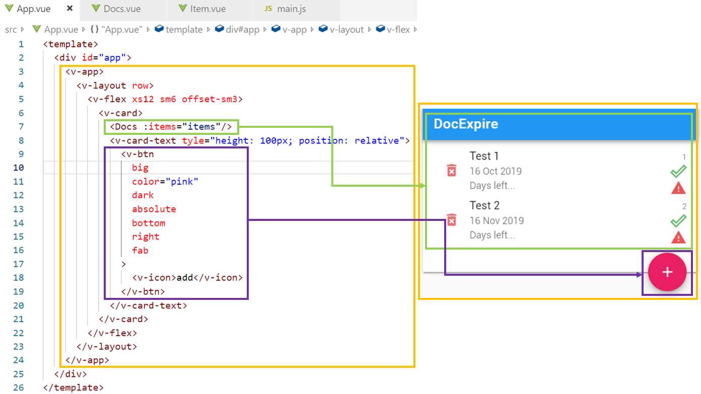
Figure 3-d: Relationship between App.vue and the UI
As you can see, there are two main distinct UI areas: one is the Docs component (highlighted in green), which encapsulates most of the UI, and then the floating button area (highlighted in purple).
The area highlighted in yellow in Figure 3-d defines the layout that is used to render the application; this is the reason why the v-layout, v-flex, and v-card Vuetify components are used—they define the point grid system Vuetify uses.
Styling Docs.vue
Just like we’ve done with App.vue, we need to do the same with Docs.vue and style it accordingly using Vuetify. Let’s go ahead and do that.
Listing 3-g: Updated Docs.vue (Using Vuetify)
<template> <div> <v-toolbar color="blue" dark> <v-toolbar-title>DocExpire</v-toolbar-title> <v-spacer></v-spacer> </v-toolbar> <v-list two-line> <template v-for="item in items"> <Item :key="item.id" :lgth="items.length" :item="item"/> </template> </v-list> </div> </template> <script> import Item from './Item'; export default { name: "Docs", props: ["items"], components: { Item } } </script> <style scoped> </style> |
As you might have noticed, we added the v-toolbar and v-list components to Docs.vue to give it the Material Design look and feel.
The following diagram illustrates the relationship between the Docs.vue markup and the UI. Let’s have a look.
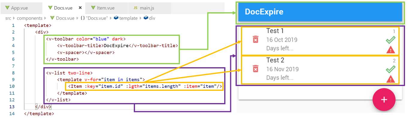
Figure 3-e: Relationship between Docs.vue and the UI
The markup is quite self-explanatory: the v-toolbar component creates the DocExpire toolbar, and the v-list component creates the list that will contain each of the Item components.
Styling Item.vue
Now that we’ve added Vuetify components to App.vue and Docs.vue, let’s style Item.vue as well. Here’s what the updated code looks like.
Listing 3-h: Updated Item.vue (Using Vuetify)
<template> <div> <v-list-tile avatar ripple> <v-btn flat icon color="red lighten-2"> <v-icon>delete_forever</v-icon> </v-btn> <v-list-tile-content> <v-list-tile-title class="text--primary"> {{ item.name }} </v-list-tile-title> <v-list-tile-sub-title> {{ item.exp }} </v-list-tile-sub-title> <v-list-tile-sub-title> Days left... </v-list-tile-sub-title> </v-list-tile-content> <v-list-tile-action> <v-list-tile-action-text> {{ item.id }} </v-list-tile-action-text> <v-icon color="green lighten-1">done_outline</v-icon> <v-icon color="red lighten-1">warning</v-icon> </v-list-tile-action> </v-list-tile> <v-divider v-if="item.id + 1 < lgth" :key="`divider-${item.id}`"> </v-divider> </div> </template> <script> export default { name: "Item", props: ["item", "lgth"] } </script> <style scoped> </style> |
The Item component contains the markup logic that displays each of the documents on the list, so to understand this better, let’s have a look at the following diagram that explains the relationship between the markup and the UI.
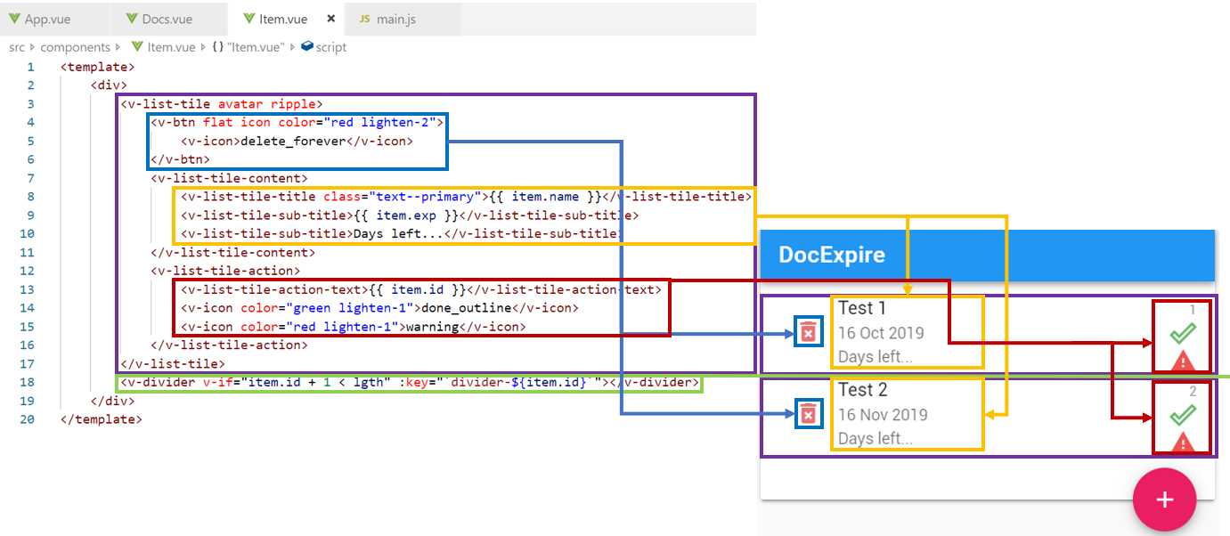
Figure 3-f: Relationship between Item.vue and the UI
As we can see, the v-btn component is responsible for creating the Delete button that appears on the left side of each document. This is highlighted in blue in Figure 3-f.
There is a v-list-tile-content component (highlighted in yellow) that encapsulates and displays the name of the document (item.name), the document’s expiration (item.exp), and the number of days left, which for now is static text, but we’ll modify it and make it dynamic later.
Finally, there is a v-list-tile-action component (highlighted in red) that encapsulates and displays the icons seen to the right of the text, for each document.
Notice that between each document (item), there is a v-divider component (highlighted in green). This divider is related to the Item component by the item.id property.
You’ve also probably noticed that there’s an additional property being passed from the code in Docs.vue to the Item component. This is the lgth property, which is used for adding a separator between each document.
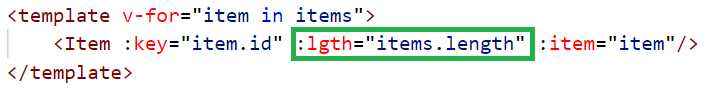
Figure 3-g: The lgth Property passed to the Item component
The lgth property is nothing more than the length of the items array, which indicates the number of documents that exist and are returned by the data function with App.vue.
The reason that we pass the lgth property to the Item component is that we only want to display the divider between items. So, if there are two items to display, there should be only one divider. This can be achieved by using the v-if directive with the following condition.
Figure 3-h: The v-if Directive Used for Showing the Divider
So, the divider will only be shown when item.id + 1 is less than the value of lgth (number of documents).
Now that we have styled our existing components, we still need to create a component that we can use when creating a new document or when modifying an existing one.
Creating Doc.vue
The component file that will be responsible for creating a new document or modifying an existing one is going to be called Doc.vue. So, in VS Code, go ahead and create this file under the components folder of your project.
To get a sense of what we will create, the figure that follows shows what the finished component’s UI looks like.
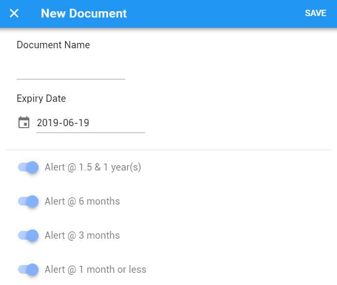
Figure 3-i: The Finished UI of the Doc Component
As you can see, this is UI is almost identical to the one from the Flutter application—from a functional point, it will be the same.
Now that we’ve seen the finished UI, let’s have a look at the code required to build it, which is shown in the listing that follows.
Listing 3-i: Doc.vue (Using Vuetify)
<template> <div> <v-dialog v-model="showModal" fullscreen hide-overlay transition="dialog-bottom-transition" scrollable > <v-card tile> <v-toolbar color="blue" dark> <v-btn icon dark @click="hide"> <v-icon>close</v-icon> </v-btn> <v-toolbar-title>{{item.name}}</v-toolbar-title> <v-spacer></v-spacer> <v-toolbar-items> <v-btn dark flat @click="save">Save</v-btn> </v-toolbar-items> </v-toolbar> <v-card-text> <v-list three-line subheader> <v-list-tile avatar> <v-list-tile-content> <v-list-tile-title> Document Name </v-list-tile-title> <v-list-tile-sub-title></v-list-tile-sub-title> <v-text-field ref="name" v-model="name" :rules="[() => !!name || 'Required field']" required > </v-text-field> </v-list-tile-content> </v-list-tile> <v-list-tile avatar> <v-list-tile-content> <v-list-tile-title> Expiry Date </v-list-tile-title> <v-list-tile-sub-title></v-list-tile-sub-title> <v-menu ref="menu" v-model="menu" :close-on-content-click="false" :nudge-right="40" :return-value.sync="date" lazy transition="scale-transition" offset-y full-width min-width="290px" > <template v-slot:activator="{ on }"> <v-text-field v-model="date" prepend-icon="event" readonly v-on="on" ></v-text-field> </template> <v-date-picker v-model="date" :min=date max="2099-12-31" no-title scrollable> <v-spacer></v-spacer> <v-btn flat color="primary" @click="menu = false">Cancel</v-btn> <v-btn flat color="primary" @click="$refs.menu.save(date)"> OK </v-btn> </v-date-picker> </v-menu> </v-list-tile-content> </v-list-tile> </v-list> <v-divider></v-divider> <v-list four-line subheader> <v-list-tile avatar> <v-list-tile-action> <v-switch v-model="alert1year" :label="`Alert @ 1.5 & 1 year(s)`" ></v-switch> </v-list-tile-action> </v-list-tile> <v-list-tile avatar> <v-list-tile-action> <v-switch v-model="alert6months" :label="`Alert @ 6 months`" ></v-switch> </v-list-tile-action> </v-list-tile> <v-list-tile avatar> <v-list-tile-action> <v-switch v-model="alert3months" :label="`Alert @ 3 months`" ></v-switch> </v-list-tile-action> </v-list-tile> <v-list-tile avatar> <v-list-tile-action> <v-switch v-model="alert1month" :label="`Alert @ 1 month or less`" ></v-switch> </v-list-tile-action> </v-list-tile> </v-list> </v-card-text>
<div style="flex: 1 1 auto;"></div> </v-card> </v-dialog> </div> </template> <script> export default { name: "Doc", props: ["item"], data: () => { return { name: "", date: new Date().toISOString().substr(0, 10), alert1year: true, alert6months: true, alert3months: true, alert1month: true, menu: false, showModal: false } }, methods: { show() { this.showModal = true; }, hide(){ this.showModal = false; }, save(){ this.showModal = false; } } } </script> <style scoped> </style> |
There’s quite a lot going on here—not only is the code building the UI, but it also has logic for displaying and using a date/month picker Vuetify component.
In the statement !!name, the double exclamation point characters convert any false-like value (0, null, undefined, false) to a strictly Boolean value.
Let’s break this code into smaller pieces to understand what is going on. First, we’ll have a look at the main toolbar and see which Vuetify components are being used.
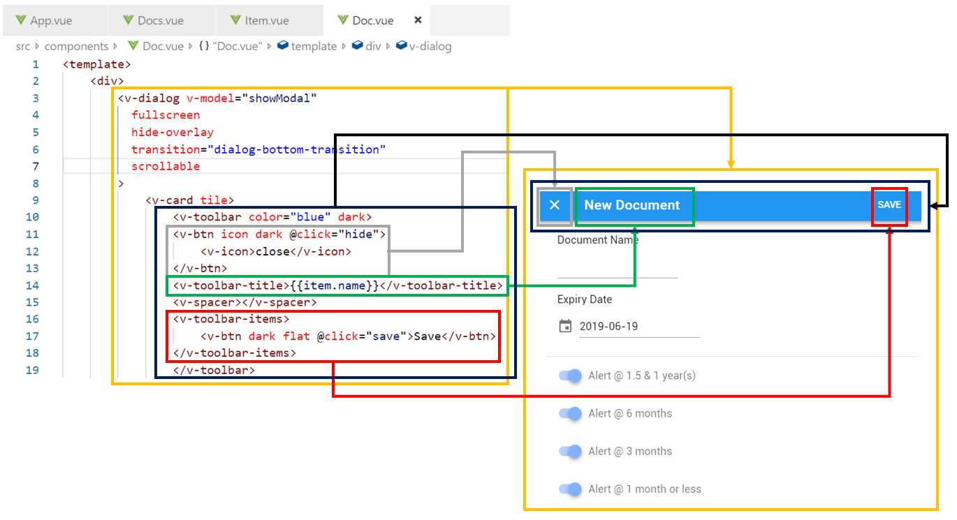
Figure 3-j: Relationship between the Toolbar Code and the UI (Doc.vue)
We can see that the v-dialog component wraps up the complete UI of the Doc.vue. Within v-dialog there’s a v-card, and within it we have the v-toolbar component—which is what we are going to focus on now.
The toolbar is made up of three main parts: The X button (v-btn), which closes the dialog and returns the control to the main screen, the toolbar title (v-toolbar-title), and the Save button (v-btn).
Now that we’ve covered the toolbar, let’s explore the part of the UI that renders the Document Name field.
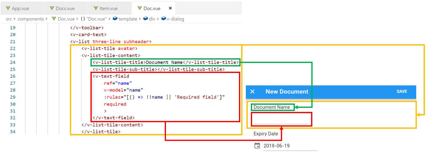
Figure 3-k: Relationship between the “Document Name” Code and UI (Doc.vue)
We can see that after the v-toolbar component, there’s a v-list component that encapsulates the remaining UI.
Within v-list there’s a v-list-tile component that is used for displaying the Document Name label and field.
Inside of v-list-tile there’s a v-tile-tile-content component that encapsulates the label and field components.
The v-list-tile-title component is the one that displays the label name, which is clearly highlighted in green in Figure 3-k.
The v-text-field component is the one that renders the textbox field. This component has some interesting properties and directives, which determine its functionality.
The ref and v-model directives are responsible for binding the v-text-field component to the name field.
The rules property is used for validating the data entered through the textbox. This executes a lambda function that performs the validation, which simply checks that the value of name is not empty. This is used in combination with the required property.
This covers the Document Name field. Now, let’s explore the Expiry Date field, which is quite interesting as it contains a date/month picker Vuetify component. When the focus is on the Expiry Date field, the picker is displayed—which we can see in the following figure.
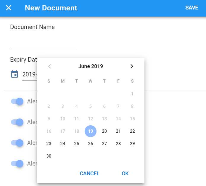
Figure 3-l: “Expiry Date” Picker (Doc.vue)
Figure 3-m illustrates how the date/month picker code relates to the actual component on the screen—let’s have a look.
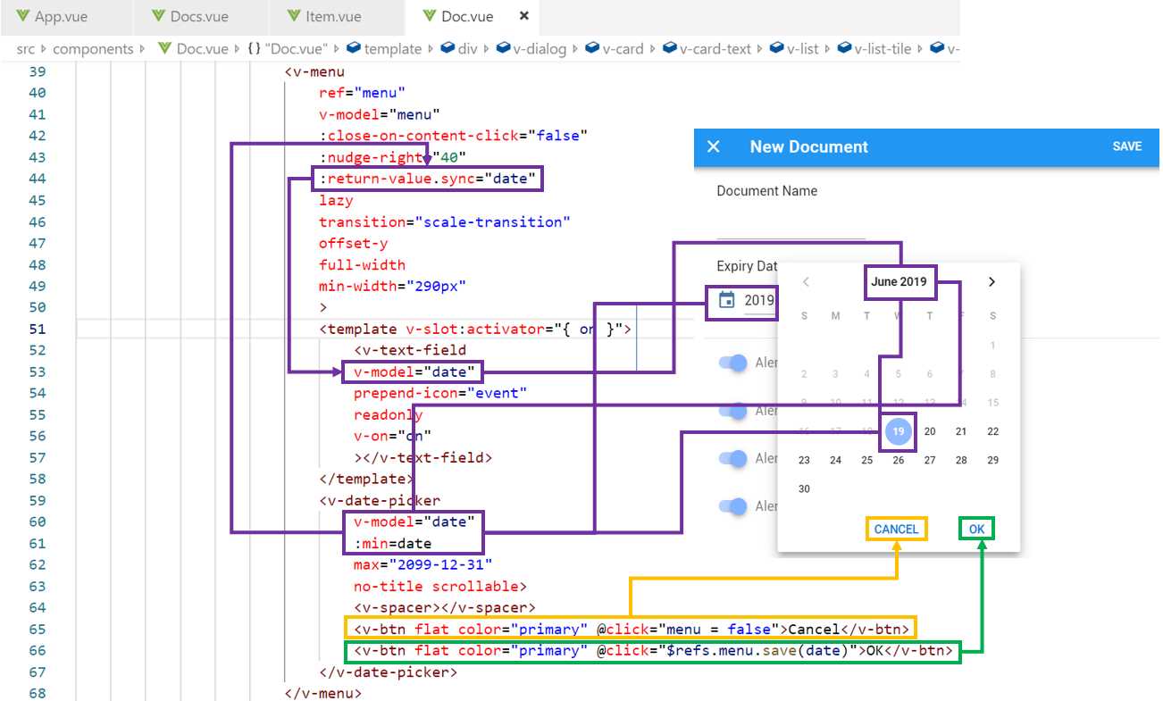
Figure 3-m: The Date/Month Picker and Date Relationship (Doc.vue)
We can see that the date/month picker component (v-date-picker) binds to date, which is returned by the Doc component’s data function. The v-date-picker component also binds to v-text-field through date.
Notice that date also binds to the min property of v-text-field, which means that the minimal date that can be selected is today’s date—this means that only dates that are either in the future or equal to today’s date can be selected using the picker. This ensure that documents cannot have an expiry date in the past unless the document was created in the past and the date has already expired.
The last part of the Doc component’s UI has to do with the four alert switches—let’s explore this markup code and see how it relates to the UI through the following diagram.
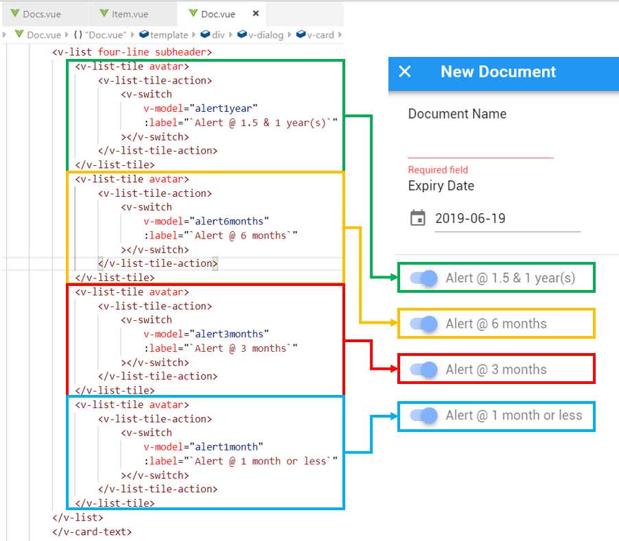
Figure 3-n: The Relationship between the Alert Switches and the UI (Doc.vue)
As we can see, each alert switch is represented by an individual v-switch component, which is contained within the v-list-tile-action and v-list-tile components—which makes them aligned and correctly positioned on the UI layout.
Each v-switch component has a binding to a variable through the v-model directive. These variables will store within the Doc component the values set through the v-switch components.
You might have noticed that the v-model directive has been used quite a lot within the Doc component. The v-model directive is used in Vue for two-way data binding—which means that if the data changes, the UI components referencing it update. If the UI component value changes, then the data also changes. This is a powerful feature that significantly speeds up development.
This concludes the UI aspects of the Doc component. However, to invoke it, we need to make some adjustments to App.vue (when creating a new document) and to Item.vue (when modifying an existing document)—which is what we’ll do next.
Adapting App.vue for Doc.vue
With the UI of the Doc component (Doc.vue) ready, we need to be able to invoke the Doc component, when creating a new document, by clicking on the floating button within App.vue.
To be able to do that, we need to adjust the code we have written for App.vue. The following code listing contains the adapted code that can invoke the Doc component—let’s have a look at what those changes are (highlighted in bold).
Listing 3-j: App.vue (Able to invoke Doc.vue)
<template> <div id="app"> <v-app> <Doc ref="modal" :item="newdoc" :items="items" /> <v-layout row> <v-flex xs12 sm6 offset-sm3> <v-card> <Docs :items="items"/> <v-card-text tyle="height: 100px; position: relative"> <v-btn @click="openModal" big color="pink" dark absolute bottom right fab > <v-icon>add</v-icon> </v-btn> </v-card-text> </v-card> </v-flex> </v-layout> </v-app> </div> </template> <script> import Docs from './components/Docs'; import Doc from './components/Doc'; export default { name: 'app', components: { Docs, Doc }, methods: { openModal() { this.$refs.modal.show(); } }, data: () => { return { newdoc: { id: -1, name: "New Document", exp: "", alert1year: true, alert6months: true, alert3months: true, alert1month: true }, items: [ { id: 1, name: "Test 1", exp: "2019-10-16", alert1year: false, alert6months: true, alert3months: false, alert1month: false }, { id: 2, name: "Test 2", exp: "2018-11-16", alert1year: false, alert6months: false, alert3months: false, alert1month: true } ] } } } </script> <style> </style> |
The first noticeable change is that <Doc ref="modal" :item="newdoc" :items="items" /> has been included within the markup. This means that the Doc component is now included, but it won’t be visible until it is invoked.
We’ll need to be able to invoke the show method from the Doc component to display it. To do that, we need to add the ref attribute to the Doc HTML element inside the template tag, so we can access it using the $refs property, as follows.
openModal() {
this.$refs.modal.show();
}
The openModal method simply invokes the show method from the Doc component, making it visible.
Notice that we are also passing two other properties to the Doc component: One is the newdoc object, which binds to the item property, and the other is the items array (which contains the list of documents), which binds to the items property.
The newdoc object is simply a JSON representation of a new document that contains default settings—it’s an empty placeholder for creating a new document, which we can see as follows.
newdoc: {
id: -1,
name: "New Document",
exp: "",
alert1year: true,
alert6months: true,
alert3months: true,
alert1month: true
}
By passing the newdoc object to the Doc component, we are telling Doc.vue that we want to create a new document and not modify an existing one.
Notice that besides the id, name, and exp properties, we now have also the alert1year, alert6months, alert3months, and alert1month properties—these will be used to set the values of the v-switch components within Doc.vue.
However, you might be asking yourself: Why do we need to pass the complete list of documents (the items array) to Doc.vue?
The reason is that when we add the logic that will be responsible for adding the new document to a database, we’ll need to add that new element to the items array. In other words, the new document will have to be added to the existing list of documents—and that will be done from Doc.vue, and not App.vue. This is why the items array is passed to the Doc component.
Notice that a click event handler has been added to the floating button (v-btn). This click event will execute the openModal method, which is responsible for invoking the show method from the Doc component.
<v-btn @click="openModal" …>
Next, we can see that we are importing the Doc component within the script section: import Doc from './components/Doc'; and that we have added Doc to the components object.
components: {
Docs, Doc
}
As for the items array, notice how I’ve added the alert1year, alert6months, alert3months, and alert1month properties to each of the records. For now, these are static records, but later we’ll make this dynamic.
Notice as well that I’ve changed the date format of the expiry date (exp) property to “yyyy-mm-dd” (for example, "2018-11-16") instead of “dd MMM yyyy”, as this will make the functionality of the application easier to write (without the need to convert dates from one format to another).
Adapting Docs.vue for Doc.vue
Although Docs.vue does not directly invoke Doc.vue, there is a minor change that is important for the overall functionality of the adapted version of Item.vue, which is required for it to work properly with Doc.vue.
Listing 3-k: Docs.vue (For Item.vue to be able to invoke Doc.vue)
<template> <div> <v-toolbar color="blue" dark> <v-toolbar-title>DocExpire</v-toolbar-title> <v-spacer></v-spacer> </v-toolbar> <v-list two-line> <template v-for="item in items"> <Item :key="item.id" :lgth="items.length" :item="item" :items="items"/> </template> </v-list> </div> </template> <script> import Item from './Item'; export default { name: "Docs", props: ["items"], components: { Item } } </script> <style scoped> </style> |
The minor change has been highlighted in bold in the preceding code. As you can see, we are passing the list of documents (items array) to Item.vue—which previously we didn’t have.
We are doing this because Item.vue will need to be able to update the items array when a document from the list is deleted, something we will see shortly with the updated code for Item.vue.
Adapting Item.vue for Doc.vue
There are some interesting changes that are required for Item.vue to be able to invoke Doc.vue. Remember that Item.vue needs to invoke Doc.vue when an existing document needs to be edited. Let’s have a look at the updated code for Item.vue, which can do this.
Listing 3-l: Item.vue (Able to invoke Doc.vue)
<template> <div> <Doc ref="modal" :item="item" :items="items" /> <v-list-tile avatar ripple> <v-btn @click="removeItem" flat icon color="red lighten-2"> <v-icon>delete_forever</v-icon> </v-btn> <v-btn @click="openModal" flat icon color="green lighten-2"> <v-icon>edit</v-icon> </v-btn> <v-list-tile-content> <v-list-tile-title class="text--primary"> {{ item.name }} </v-list-tile-title> <v-list-tile-sub-title> {{ item.exp }} </v-list-tile-sub-title> <v-list-tile-sub-title> {{daysLeft(item.exp)}} </v-list-tile-sub-title> </v-list-tile-content> <v-list-tile-action> <v-list-tile-action-text> {{ item.id }} </v-list-tile-action-text> <v-icon v-if="!hasExpired(item.exp)" color="green lighten-1">done_outline</v-icon> <v-icon v-else color="red lighten-1">warning</v-icon> </v-list-tile-action> </v-list-tile> <v-divider v-if="item.id + 1 < lgth" :key="`divider-${item.id}`"></v-divider> </div> </template> <script> import Doc from './Doc'; import moment from 'moment'; export default { name: "Item", components: { Doc }, props: ["item", "lgth", "items"], methods: { openModal() { this.$refs.modal.show(); }, removeItem() { let idx = this.items.indexOf(this.item); if (idx > -1) { this.items.splice(idx, 1); } }, daysLeft(dt) { let ends = moment(dt); let starts = moment(Date.now()); let years = ends.diff(starts, "year"); starts.add(years, "years"); let months = ends.diff(starts, "months"); starts.add(months, "months"); let days = ends.diff(starts, "days"); let rs = years + " years " + months + " months " + days + " days"; return this.hasExpired(dt) ? "Expired " + rs.replace(/-/g, '') + " ago": "Left: " + rs; }, hasExpired(dt) { return (Date.parse(dt) <= Date.now()) ? true : false; } } } </script> <style scoped> </style> |
The first thing we can see is that the Doc component has been added to the markup, even though it is not visible.
<Doc ref="modal" :item="item" :items="items" />
This is practically identical as to what was done within App.vue—where the Doc component was added to the markup, with the only difference that in this case, the item property binds to the existing item and not the newdoc object.
Notice how the items array is also passed to the Doc component—this is because when the Save button is clicked within Doc.vue, the document edited will need to be updated on the items array—which is something we’ll do later.
Next, we’ve added two event handlers: one that invokes removeItem, and another that calls the openModal method.
The removeItem method is executed when the red trash bin (delete_forever) icon is clicked, whereas the openModal method gets triggered when the green pencil (edit) icon is clicked.
The next change from the previous version of the code is that we have replaced the static text for the days left with dynamic content: {{daysLeft(item.exp)}}.
Basically, what we do here is to invoke the daysLeft method by passing to it the expiry date (exp) of the current item, which returns the number of years, months, and days before the document expires—or if the document has already expired, the number of years, months and days since that occurred.
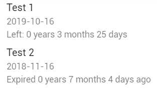
Figure 3-o: Years, Months, and Days (Item.vue)
The next change we see in the HTML markup is an interesting one. What we are doing is displaying either the icon that indicates that the document is active—has not expired (done_outline)—or we display the icon that indicates that the document has expired (warning).
<v-icon v-if="!hasExpired(item.exp)"
color="green lighten-1">done_outline</v-icon>
<v-icon v-else color="red lighten-1">warning</v-icon>
The way we do this is by using the v-if and v-else directives. The v-if directive basically means that the first v-icon component will be shown only if the document (item) has not expired—if the hasExpired method returns false.
Figure 3-p: The v-icon if the Document (item) has not expired
The second v-icon component will only be shown when the hasExpired method returns true, for the current item—when the document has expired.
Figure 3-q: The v-icon if the Document (item) has expired
Next, notice the following statement: import moment from 'moment';
This statement imports the Moment.js library—which is a great way to parse, validate, display, and manipulate dates in JavaScript. This is what we’ll use within the hasExpired method to check if the expiry date (exp) of the document has expired.
Before we can use this library, we need to install it. To do that, open the command prompt on your project’s root folder and type in the following command.
Listing 3-m: Command to Install Moment.js
npm install moment --save |
Once Moment.js has been successfully installed, we can use it in our code—which we will look at shortly.
Moving on, we can also see that the items array has been added to the props array. As explained previously, the items array is passed on to the Doc component.
Next, it’s time to look at the methods object and explore each of the methods declared there. The first one is the openModal method.
openModal() {
this.$refs.modal.show();
}
This method is identical to the one we declared within the App.vue methods object. It basically invokes the show method of Doc.vue—this way the Doc component can be displayed on the screen.
The next method is the removeItem method, which is responsible for removing the current document (item) if the user clicks on the delete_forever icon.
removeItem() {
let idx = this.items.indexOf(this.item);
if (idx > -1) {
this.items.splice(idx, 1);
}
}
This method finds the current document (item) with the list of documents (items array) by calling the indexOf method. If found (idx > -1), then the current document (item) is removed from the items array, using the splice method.
The daysLeft method is an interesting one, as it makes extensive use of the Moment.js library to determine the number of years, months, and days until a document expires or after it has expired. Let’s have a look.
daysLeft(dt) {
let ends = moment(dt);
let starts = moment(Date.now());
let years = ends.diff(starts, "year");
starts.add(years, "years");
let months = ends.diff(starts, "months");
starts.add(months, "months");
let days = ends.diff(starts, "days");
let rs = years + " years " + months +
" months " + days + " days";
return this.hasExpired(dt) ?
"Expired " + rs.replace(/-/g, '') +
" ago": "Left: " + rs;
}
The first two lines of code get the ends and starts dates by calling the moment function. The ends date is item.exp, which is passed to the daysLeft method as dt. The starts date is the current date, which is retrieved by calling Date.now.
The next five lines calculate the differences between both dates by years, months, and days.
Next, the current document’s expiry date (dt) is evaluated by the hasExpired method to see if the date has expired. The corresponding message, which will get displayed on the screen, is returned by the daysLeft method.
Finally, the hasExpired method, as its name implies, checks if the current document’s expiry date (dt) is before today’s date—if so, it would mean that the document has expired and true is returned—otherwise false is returned as a result. We can see this as follows.
hasExpired(dt) {
return (Date.parse(dt) <= Date.now()) ? true : false;
}
That concludes the review of the changes to Item.vue. Next, let’s explore some minor adaptations required for Doc.vue. All the changes to App.vue, Docs.vue, and Item.vue we’ve made work seamlessly with Doc.vue.
Adjustments to Doc.vue
We need to make some minor changes to Doc.vue so this can all work. Let’s have a look at the updated code.
Listing 3-n: Updated Doc.vue (which works with the rest of the updated code)
<template> <div> <v-dialog v-model="showModal" fullscreen hide-overlay transition="dialog-bottom-transition" scrollable > <v-card tile> <v-toolbar color="blue" dark> <v-btn icon dark @click="hide"> <v-icon>close</v-icon> </v-btn> <v-toolbar-title>{{item.name}}</v-toolbar-title> <v-spacer></v-spacer> <v-toolbar-items> <v-btn dark flat @click="save">Save</v-btn> </v-toolbar-items> </v-toolbar> <v-card-text> <v-list three-line subheader> <v-list-tile avatar> <v-list-tile-content> <v-list-tile-title>Document Name </v-list-tile-title> <v-list-tile-sub-title></v-list-tile-sub-title> <v-text-field ref="name" v-model="item.name" :rules="[() => !!item.name || 'Required field']" required > </v-text-field> </v-list-tile-content> </v-list-tile> <v-list-tile avatar> <v-list-tile-content> <v-list-tile-title>Expiry Date </v-list-tile-title> <v-list-tile-sub-title></v-list-tile-sub-title> <v-menu ref="menu" v-model="menu" :close-on-content-click="false" :nudge-right="40" :return-value.sync="date" lazy transition="scale-transition" offset-y full-width min-width="290px" > <template v-slot:activator="{ on }"> <v-text-field v-model="date" prepend-icon="event" readonly v-on="on" ></v-text-field> </template> <v-date-picker v-model="date" :min=today max="2099-12-31" no-title scrollable> <v-spacer></v-spacer> <v-btn flat color="primary" @click="menu = false">Cancel</v-btn> <v-btn flat color="primary" @click="$refs.menu.save(date)"> OK </v-btn> </v-date-picker> </v-menu> </v-list-tile-content> </v-list-tile> </v-list> <v-divider></v-divider> <v-list four-line subheader> <v-list-tile avatar> <v-list-tile-action> <v-switch v-model="item.alert1year" :label="`Alert @ 1.5 & 1 year(s)`" ></v-switch> </v-list-tile-action> </v-list-tile> <v-list-tile avatar> <v-list-tile-action> <v-switch v-model="item.alert6months" :label="`Alert @ 6 months`" ></v-switch> </v-list-tile-action> </v-list-tile> <v-list-tile avatar> <v-list-tile-action> <v-switch v-model="item.alert3months" :label="`Alert @ 3 months`" ></v-switch> </v-list-tile-action> </v-list-tile> <v-list-tile avatar> <v-list-tile-action> <v-switch v-model="item.alert1month" :label="`Alert @ 1 month or less`" ></v-switch> </v-list-tile-action> </v-list-tile> </v-list> </v-card-text>
<div style="flex: 1 1 auto;"></div> </v-card> </v-dialog> </div> </template> <script> export default { name: "Doc", props: ["item", "items"], data: () => { return { name: "", date: new Date().toISOString().substr(0, 10), today: new Date().toISOString().substr(0, 10), menu: false, showModal: false } }, methods: { show() { this.showModal = true; if (this.item.id > -1) { this.date = this.item.exp; } }, hide(){ this.showModal = false; }, save(){ this.showModal = false; } } } </script> <style scoped> </style> |
The first change we can see is that the min property of the v-date-picker component binds to today instead of date.
The reason for this change is that if date (which represents the document’s expiry date), when Doc.vue loads, has expired—then the minimum date that v-date-picker should allow needs to be today’s date—so no dates in the past can be selected as a new expiry date.
Let’s have a look at the following example to understand this better.
Figure 3-r: The min property of v-date-picker set to today’s date
The document’s expiry date that has been loaded is 16 November 2018, which is a date in past—in other words, this date has already expired.
Because the min property of the v-date-picker component is set to the value of today rather than the value of date, the v-date-picker component doesn’t allow dates in the past to be selected—which is why they appear grayed out.
This is exactly what we want—the expiration date for new or modified documents should only be equal to today’s date or a date in the future.
Next, we can see that the v-text-field component now binds to item.name rather than the name property, as it did previously. This ensures that the document’s name is loaded from the current document (item).
The next change we can see is that v-switch components now have a two-way data binding to their respective properties within the item object.
So, now we have <v-switch v-model="item.alert1year" … > instead of <v-switch v-model="alert1year" … >, and the same for the other v-switch components—with their respective item properties.
The reason for these changes for each v-switch component is that if any of those settings change, then those values should be automatically updated into their respective object properties, so they can be later persisted to the database.
Next, we can see that the items array has been added to the props array. We’ll need this later when persisting data to the database and then refreshing the list of documents (items) from within Doc.vue, which we will look at in the next chapter.
Following this, notice that the today property has been added with a default value to the data function within the script section.
The final change we can appreciate is within the show method, which adds a bit of logic that checks if a document already exists (item.id > -1), then assigns to date the document’s expiry date (item.exp); otherwise, the date property will have today’s date (for a new document).
Let’s now run our app and see the changes we have made in action. If your app is not running, execute npm run serve from the command prompt and refresh your browser page. When the app is running, you should see the following screen.
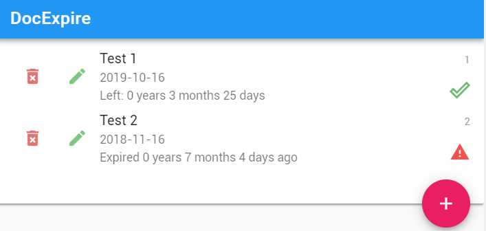
Figure 3-s: The App’s Main Screen (After all the changes done)
If we click on the pencil icon on one of the documents, the Doc component opens with the correct values loaded.
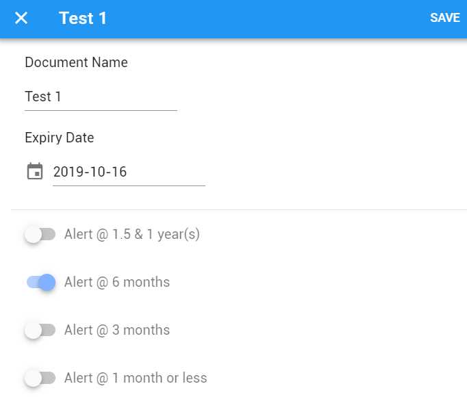
Figure 3-t: The document loaded with the correct data (After all the changes done)
If you click on the floating button, the same dialog window will open, but with the default data for a new document. If you click the delete_forever icon, the item will be deleted from the document list.
If you delete one of the documents and reload the browser page, then the list will be populated again with the two documents.
Summary
Now that all our changes are working, we almost have a fully working application. We're only missing four final parts, which are:
- Loading all the documents from the database.
- Saving a new document to the database.
- Editing an existing document and saving it to the database.
- Updating the database when a document is deleted.
These required changes are the final elements that our application needs to be fully functional. We’ll explore them in the next chapter.
- 80+ high-performance, modular, and responsive Vue UI components.
- Popular components like Data Grid, Charts, and Diagram.
- Incredibly lightweight and user-friendly.