
Vue.js Succinctly®

CHAPTER 2
App Basics
Quick intro
With our Vue environment set up, we are now ready to start inspecting our test application and modifying it—which is what we will do in this chapter. Let’s dive in.
Editor
I’ll be using Visual Studio Code (also known as VS Code) on Windows as my editor and Integrated Development Environment (IDE) of choice throughout this book—as it is easy to use and has great features. However, feel free to use any other editor you feel comfortable with.
If you decide to go with VS Code, I suggest you install the Vetur extension, which provides Vue tooling for VS Code—as we can see in the following figure.
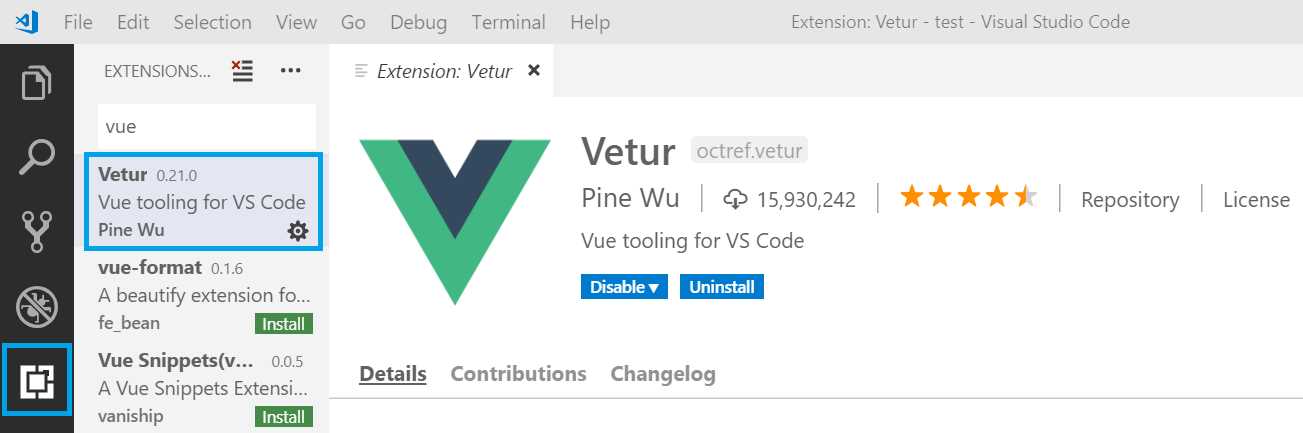
Figure 2-a: The Vetur Extension for VS Code Installed
With VS Code set up, let’s explore the default project and file structure created by the Vue CLI or Vue UI.
Default project structure
By default, the application project structure created by the Vue CLI or Vue UI contains three main folders:
- node_modules: The repository of node modules that the application will use during development and runtime.
- public: Contains the resultant files that can be deployed to a web server once the Vue app has been built.
- src: Contains the source files that we will be working on.
Let’s open VS Code and explore the folder structure of the test application we created—this is how it looks:
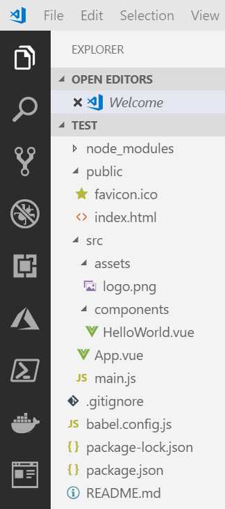
Figure 2-b: The Default Project Folder Structure
Notice that the src folder contains two subfolders: assets and components. There’s also an App.vue file in the root of the src folder, which is the application’s main component and entry point.
The assets subfolder, as its name implies, is where our application’s static assets will reside, such as logos, images, and anything else that is static.
The components folder is where we will spend most of our time. Vue applications are made up of components, which can be anything from a complete page or smaller parts of a page. Components in Vue are a great way of organizing code (as we’ll see later), which helps build scalable and maintainable applications.
On the application’s root folder—referred within the VS Code project structure as TEST—there are also some important files that have been created by the Vue CLI or Vue UI, such as package.json and babel.config.js.
The package.json file contains specific information on what runtime and development dependencies the application uses, and other configuration details on how to serve, build, and lint the app.
Let’s have a look at what the package.json file looks like.
Listing 2-a: The package.json File
{ "name": "test", "version": "0.1.0", "private": true, "scripts": { "serve": "vue-cli-service serve", "build": "vue-cli-service build", "lint": "vue-cli-service lint" }, "dependencies": { "core-js": "^2.6.5", "vue": "^2.6.10" }, "devDependencies": { "@vue/cli-plugin-babel": "^3.8.0", "@vue/cli-plugin-eslint": "^3.8.0", "@vue/cli-service": "^3.8.0", "babel-eslint": "^10.0.1", "eslint": "^5.16.0", "eslint-plugin-vue": "^5.0.0", "vue-template-compiler": "^2.6.10" }, "eslintConfig": { "root": true, "env": { "node": true }, "extends": [ "plugin:vue/essential", "eslint:recommended" ], "rules": {}, "parserOptions": { "parser": "babel-eslint" } }, "postcss": { "plugins": { "autoprefixer": {} } }, "browserslist": [ "> 1%", "last 2 versions" ] } |
The babel.config.js file contains configuration details that allow Babel to compile ECMAScript 2015+ code into a backwards-compatible version of JavaScript that can be executed by most browsers.
Listing 2-b: The babel.config.js File
module.exports = { presets: [ '@vue/app' ] } |
Now that we’ve explored the most relevant parts of our project’s folder structure, let’s start modifying the application to what we want to build.
Index.html, main.js, and App.vue
Vue is a single-page application (SPA) framework. For our project this means that it loads one file, which is the index.html file found under the public folder.
This file contains a placeholder that will be used to automatically inject the Vue application into it during runtime—let’s have a look.
Listing 2-c: The index.html File
<!DOCTYPE html> <html lang="en"> <head> <meta charset="utf-8"> <meta http-equiv="X-UA-Compatible" content="IE=edge"> <meta name="viewport" content="width=device-width,initial-scale=1.0"> <link rel="icon" href="<%= BASE_URL %>favicon.ico"> <title>test</title> </head> <body> <noscript> <strong>...Please enable it to continue.</strong> </noscript> <div id="app"></div> <!-- built files will be automatically injected --> </body> </html> |
The placeholder where the complied code will be injected is the div with the id of app—we can see this in the following code listing.
Listing 2-d: The div Placeholder (index.html)
<div id="app"> <!-- This is where the compiled code will be injected --> </div> |
In the src folder root, there is a main.js file, which is basically the entry point for Vue—let’s have a look at the contents of this file.
Listing 2-e: The main.js File
import Vue from 'vue' import App from './App.vue' Vue.config.productionTip = false new Vue({ render: h => h(App), }).$mount('#app') |
The first import statement basically imports the Vue library. The second import statement imports the app’s main component, which we will look at shortly.
Then we create a new Vue instance and mount that instance, which will be rendered inside the div element with the id of app.
Let’s now explore the out-of-the-box content of the App.vue file also found within the src root folder.
Listing 2-f: The App.vue File
<template> <div id="app"> <img alt="Vue logo" src="./assets/logo.png"> <HelloWorld msg="Welcome to Your Vue.js App"/> </div> </template> <script> import HelloWorld from './components/HelloWorld.vue' export default { name: 'app', components: { HelloWorld } } </script> <style> #app { font-family: 'Avenir', Helvetica, Arial, sans-serif; -webkit-font-smoothing: antialiased; -moz-osx-font-smoothing: grayscale; text-align: center; color: #2c3e50; margin-top: 60px; } </style> |
In Vue, files with the .vue extension are component files. This means that within a single file, we can find the HTML, the JavaScript and the style (CSS) for the component. These sections are clearly identified as follows.
Listing 2-g: Sections within a .vue File
<template> <!-- This is where the component’s HTML resides --> </template> <script> <!-- This is where the component’s JavaScript resides --> </script> <style> <!-- This is where the component’s CSS resides --> </style> |
To get a better understanding of how this component is rendered, let’s run the serve command from the Project dashboard.
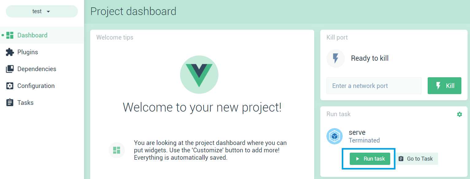
Figure 2-c: The serve Command (Project dashboard)
Click Run task, and then click Go to Task to get check the details of the application running within the Project dashboard. We can see this as follows.
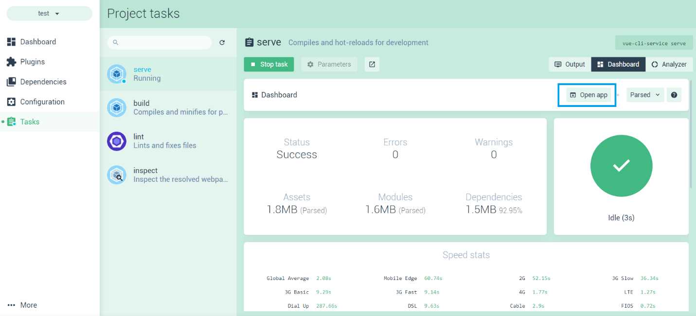
Figure 2-d: The App Runtime Details (Project dashboard)
To run the app, click Open app—this will open a new browser tab with the Vue application running.
In the following figure, I’ve put side by side VS Code with the App.vue source file, and the Vue app running on the browser, so we can see how Vue updates the app using hot reloading.
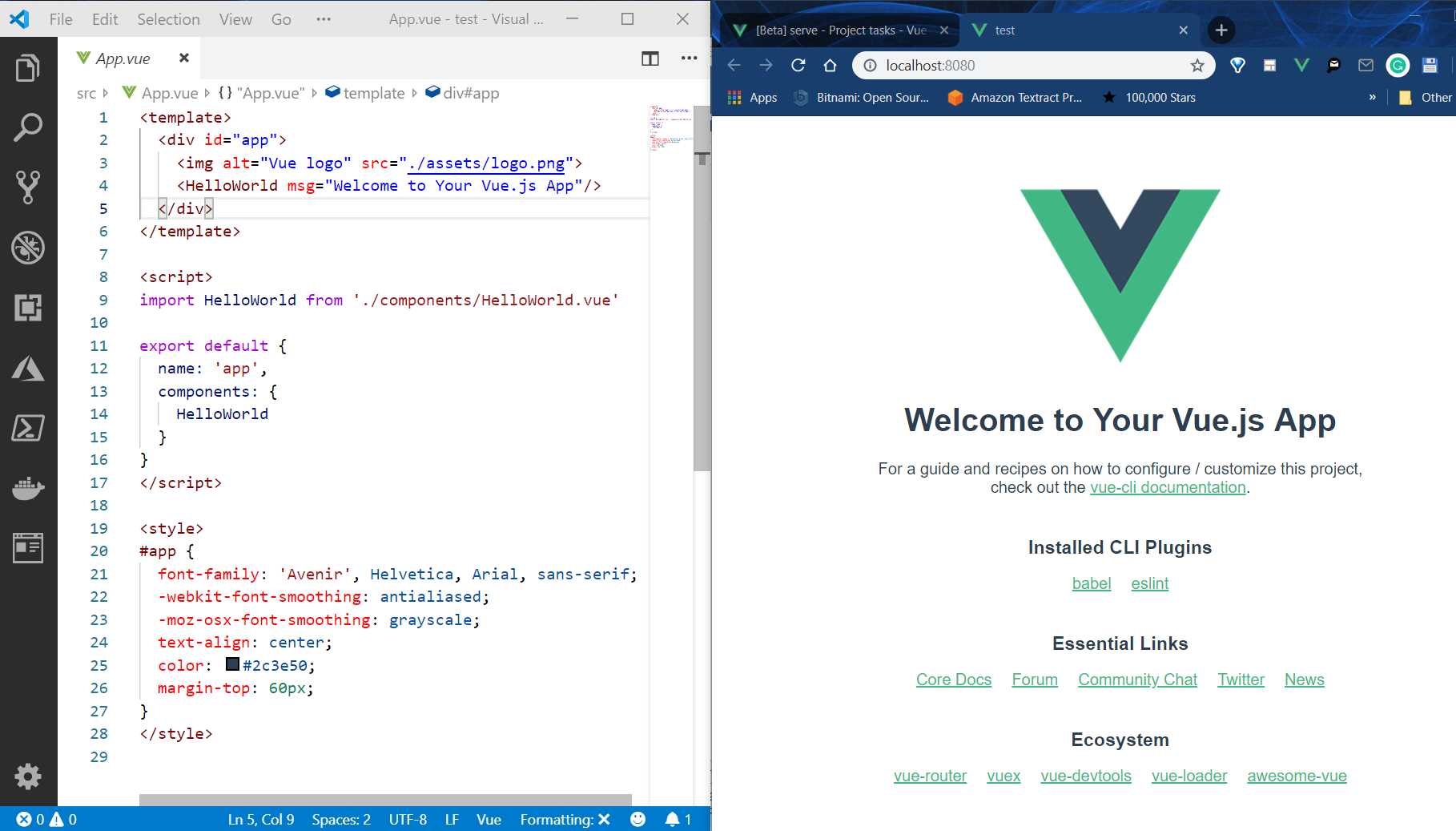
Figure 2-e: App.vue (Left) and The App Running (Right)
If I now make a change to App.vue and remove the Vue logo from the code, you’ll notice that Vue performs a hot reload of the application, and you’ll be able to see the changes getting applied immediately—which is awesome.

Figure 2-f: App.vue (Left) and the App Running (Right): Hot Reload
The HelloWorld component
Now that we have seen index.html, main.js, and App.vue, let’s quickly talk about the HelloWorld component.
With the App.vue file, just below the line where we had the reference to the logo, is the reference to the HelloWorld component.
Listing 2-h: The template section of App.vue
<template> <div id="app"> <HelloWorld msg="Welcome to Your Vue.js App"/> </div> </template> |
This HelloWorld component is imported within the script section of App.vue and then referenced within the components property of the export statement. We can see this as follows.
Listing 2-i: The script section of App.vue
<script> import HelloWorld from './components/HelloWorld.vue' export default { name: 'app', components: { HelloWorld } } </script> |
The import statement is responsible for telling Vue that this component resides within the components source folder, and it is available within the HelloWorld.vue file—which we can see as follows.
Listing 2-j: HelloWorld.vue
<template> <div class="hello"> <h1>{{ msg }}</h1> <p> For a guide and recipes on how to configure / customize this project,<br> check out the <a href="https://cli.vuejs.org" target="_blank" rel="noopener">vue- cli documentation</a>. </p> <h3>Installed CLI Plugins</h3> <ul> <li><a href="https://github.com/vuejs/vue- cli/tree/dev/packages/%40vue/cli-plugin-babel" target="_blank" rel="noopener">babel</a></li> <li><a href="https://github.com/vuejs/vue- cli/tree/dev/packages/%40vue/cli-plugin-eslint" target="_blank" rel="noopener">eslint</a></li> </ul> <h3>Essential Links</h3> <ul> <li> <a href="https://vuejs.org" target="_blank" rel="noopener"> Core Docs</a> </li> <li><a href="https://forum.vuejs.org" target="_blank" rel="noopener">Forum</a></li> <li><a href="https://chat.vuejs.org" target="_blank" rel="noopener">Community Chat</a></li> <li><a href="https://twitter.com/vuejs" target="_blank" rel="noopener">Twitter</a></li> <li><a href="https://news.vuejs.org" target="_blank" rel="noopener">News</a></li> </ul> <h3>Ecosystem</h3> <ul> <li><a href="https://router.vuejs.org" target="_blank" rel="noopener">vue-router</a></li> <li><a href="https://vuex.vuejs.org" target="_blank" rel="noopener">vuex</a></li> <li><a href="https://github.com/vuejs/vue-devtools#vue-devtools" target="_blank" rel="noopener">vue-devtools</a></li> <li><a href="https://vue-loader.vuejs.org" target="_blank" rel="noopener">vue-loader</a></li> <li><a href="https://github.com/vuejs/awesome-vue" target="_blank" rel="noopener">awesome-vue</a></li> </ul> </div> </template> <script> export default { name: 'HelloWorld', props: { msg: String } } </script> <!-- Add "scoped" attribute to limit CSS to this component only --> <style scoped> h3 { margin: 40px 0 0; } ul { list-style-type: none; padding: 0; } li { display: inline-block; margin: 0 10px; } a { color: #42b983; } </style> |
As we can see, the HelloWorld component is structured the same way as App.vue—which means that it has a template section for the HTML markup, a script section that contains the JavaScript code, and a style section for the CSS.
There are a couple of interesting things beyond the boilerplate HTML and CSS markup code, which I would like to explain.
The first one is {{ msg }} within the h1 tag—known as declarative rendering in Vue—which allows us to render data to the DOM using a template syntax.
Notice how the msg variable has been declared within the script section inside props—this is because msg is passed as a parameter to the HelloWorld component within App.vue. The following diagram illustrates this better.
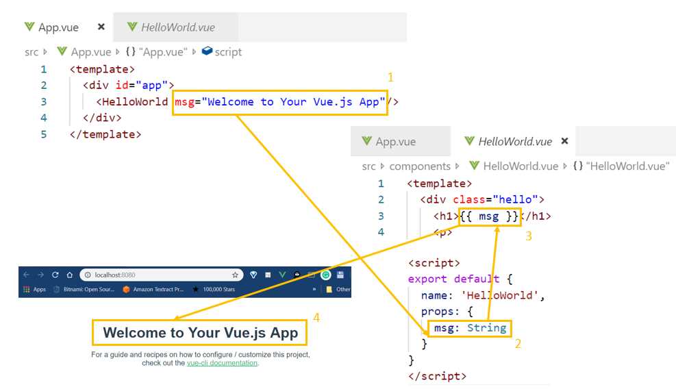
Figure 2-g: Declarative Rendering Props in Vue
As you can see, msg is passed as a parameter to the HelloWorld component—this is possible because msg is defined within the component’s properties (props). Then msg is rendered on the DOM using the template syntax: {{ msg }}, which displays the text on the UI.
The other interesting feature of the HelloWorld component is the scoped attribute for the style tag, which limits the CSS to be specific for that component only, and is not available to other components that are part of the application. This is very useful as individual components can have their own style.
The rest of the HTML markup with the template tag of the HelloWorld component is just boilerplate code, which we can remove—so let’s go ahead and do that. This is how the HelloWorld component code looks now:
Listing 2-k: Modified HelloWorld.vue
<template> <div class="hello"> <h1>{{ msg }}</h1> </div> </template> <script> export default { name: 'HelloWorld', props: { msg: String } } </script> <!-- Add "scoped" attribute to limit CSS to this component only --> <style scoped> h3 { margin: 40px 0 0; } ul { list-style-type: none; padding: 0; } li { display: inline-block; margin: 0 10px; } a { color: #42b983; } </style> |
Another thing that is very important is that within the template section there can only be one main element—the following listing describes the correct way of doing it.
Listing 2-l: Correct Main Element (template section)
<!-- This is correct --> <template> <div class="hello"> </div> </template> |
The following listing describes the incorrect way of doing it—there cannot be two main elements within a template section.
Listing 2-m: Incorrect Main Element (template section)
<!-- This is incorrect --> <template> <div class="hello"> </div> <div class="hello"> </div> </template> |
So, within any template section there can only be one main element. If you go to the App.vue file, you will notice that this is also the case—there’s only one main element within the template section.
App component structure
One of the fundamental aspects of any Vue application is how the app is structured and how the components that make up the application relate to each other, which is what we are going to explore next.
But before we do that, let’s clean things up a bit and get rid of boilerplate code within App.vue, so that we are left with the following.
Listing 2-n: Modified App.vue
<template> <div id="app"> </div> </template> <script> export default { name: 'app', components: { } } </script> <style> </style> |
Before we start to add any more code to App.vue, let’s set the stage for what we are going to build.
As mentioned earlier, we are going to build a web-based Vue equivalent of the mobile-based app that was written in Flutter Succinctly. This is an app that will keep track of important documents that have an expiry date, such as passports and credit cards. The following figure shows what the finished Flutter app looks like.
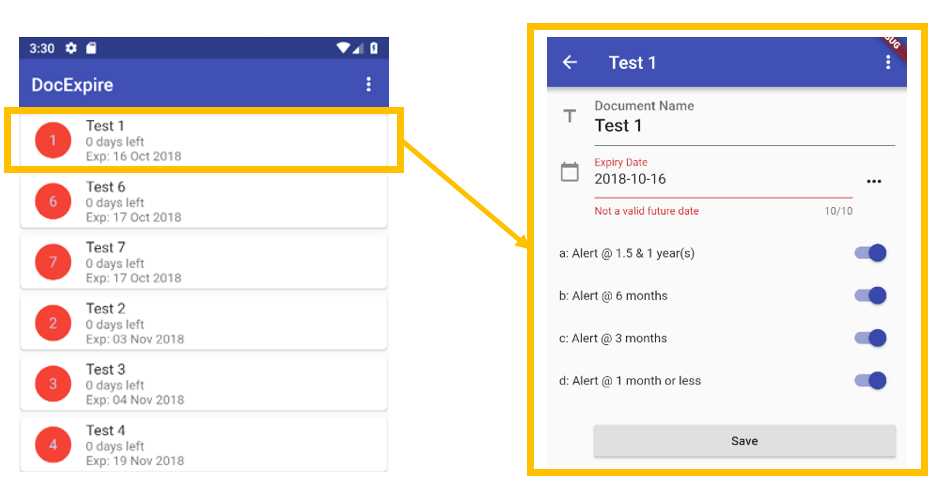
Figure 2-h: The Finished Flutter App
This app essentially has two screens: the main layout, which includes the list of all the documents that the application keeps track of, and a secondary screen, which is used to enter a new document or edit existing ones.
If we think of this application in terms of Vue components, we can come up with a component structure that looks as follows.

Figure 2-i: Relationships between Vue Components in the Finished Flutter App
By looking at the preceding diagram, we can see that App.vue is going to be the app’s main component file, which will display the list of documents (Docs.vue)—each of the documents on that list is going to be displayed as an item, through the Item.vue component file.
When an item is clicked, the document details will be displayed using Doc.vue—which will also be used when a new document is created.
Now that we know how our application will be structured from a component’s functional point of view, let’s talk about how we can organize the data related to this structure within App.vue.
Vue’s data within components
Within a Vue component, data is not provided as an object, but instead as a function—this is done so that each instance can maintain an independent copy of the returned data object. So, within a Vue component, data is not defined like this:
Listing 2-o: How Data is Not Defined (Within a Vue Component)
export default { ... data: { items: [] } } |
But instead like this:
Listing 2-p: How Data is Defined (Within a Vue Component)
export default { ... data: () => { return { items: [] } } } |
Now that we know how to define data in Vue components, let’s add some boilerplate data so that we can start to scaffold our application as it will eventually look and end up like. To do that, let’s add the following code to App.vue, which I’ve highlighted in bold.
Listing 2-q: Adding Boilerplate Data to App.vue
<template> <div id="app"> </div> </template> <script> export default { name: 'app', components: { }, data: () => { return { items: [ { id: 1, name: "Test 1", exp: "16 Oct 2019" }, { id: 2, name: "Test 2", exp: "16 Nov 2019" } ] } } } </script> <style> </style> |
Now that we’ve defined some data boilerplate code, let’s wrap this around a component, which we can use to display this data.
Docs component
Under the components folder within our application (which is the same folder that contains HelloWorld.vue), let’s create the Docs.vue file, which we will use to display the list of documents and embed this within the App.vue markup.
Listing 2-r: Docs.vue
<template> <div> <h1>DocExpire</h1> </div> </template> <script> export default { name: "Docs" } </script> <style scoped> </style> |
Now we can add a reference to the Docs component and embed it within App.vue as follows.
Listing 2-s: Updated App.vue referencing Docs
<template> <div id="app"> <Docs /> </div> </template> <script> import Docs from './components/Docs'; export default { name: 'app', components: { Docs }, data: () => { return { items: [ { id: 1, name: "Test 1", exp: "16 Oct 2019" }, { id: 2, name: "Test 2", exp: "16 Nov 2019" } ] } } } </script> <style> </style> |
The parts in bold are the references added for the Docs component. Notice how it was added to the template section as a single HTML entity: <Docs />. Then, within the scripts section, it was imported using the statement import Docs from './components/Docs'. Finally, it was added to the components object as Docs.
If you have your application still running, Vue will have reloaded it after making those changes and you should be able to see the following on the screen.
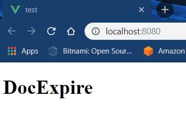
Figure 2-j: The App Running (After Changes)
If your app is running, you can run npm run serve from the command line, or run the app using the Vue UI as previously indicated.
Vue DevTools
This is a good time to talk about the Vue DevTools browser extension, which might come in handy during development, and I would recommend you to install it.
Once your have installed the extension, you’ll see the Vue DevTools icon on your browser. Let’s check it out.
Figure 2-k: The Vue DevTools Browser Icon
On Chrome, open the Developer tools (Ctrl+Shift+I on Windows) on the same page where the app is running. Once the Developer tools are opened, click on the Vue tab. This is how it looks on my machine.
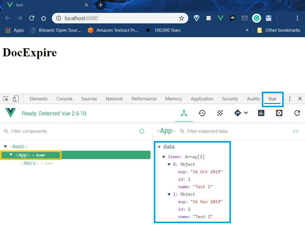
Figure 2-l: The Vue DevTools Opened
Vue DevTools is a great browser extension to use when you’re developing Vue apps. Not only does it help inspecting Vue components and their data—like we can see in the previous figure—but it can also be used to filter events, check state and routing, and inspect component rendering and frames per second.
Notice how when we’re using Vue DevTools, we can see the data contained within the App component: the items array and each of its elements.
Using Vue DevTools is quite straightforward, and we’ll cover some parts of it as we go. If you would like to know more details about it, here’s a good tutorial.
Getting the data into the Docs component
Now that we have seen briefly how to use Vue DevTools to inspect data, the goal is to get the data from those documents into the Docs component.
We can do this by using a directive called v-bind, which is used for data binding. Let’s have a look at how to implement this in App.vue.
Listing 2-t: Updated App.vue (Docs with v-bind)
<template> <div id="app"> <Docs v-bind:items="items"/> </div> </template> // The part of the code that follows remains the same |
Notice that by passing v-bind:items="items" to Docs, what we are saying is that we are binding the items array returned by the data function to a property called items—which we still have to create—within the Docs component.
So, to do that, let’s go over to Docs.vue and make the following modifications to the code.
Listing 2-u: Updated Docs.vue (items property added)
// The previous part of the code remains the same <script> export default { name: "Docs", props: ["items"] } </script> // The part of the code that follows remains the same |
Now that we have declared the items property, we need to be able to display each of the elements of the items array passed to the Docs component. To do that, we need to loop through them—this is done in Vue with another directive called v-for.
Listing 2-v: Updated Docs.vue (v-for added)
<template> <div> <h1>DocExpire</h1> <div v-for="item in items"> <h3>{{item.name}}</h3> <p>{{item.exp}}</p> </div> </div> </template> <script> export default { name: "Docs", props: ["items"] } </script> <style scoped> </style> |
What this means is that for each item in the items array, passed as the items property to the Docs component, we are displaying the item.name and item.exp properties of each item object.
If we saved the changes in VS Code and we look at the app running on the browser, we should see the following.
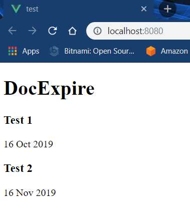
Figure 2-m: The Updated Vue App (List of Docs)
To have a better visual understanding of what we have just done with both the v-bind and v-for directives in App.vue and Docs.vue respectively, let’s have a look at the following diagram.
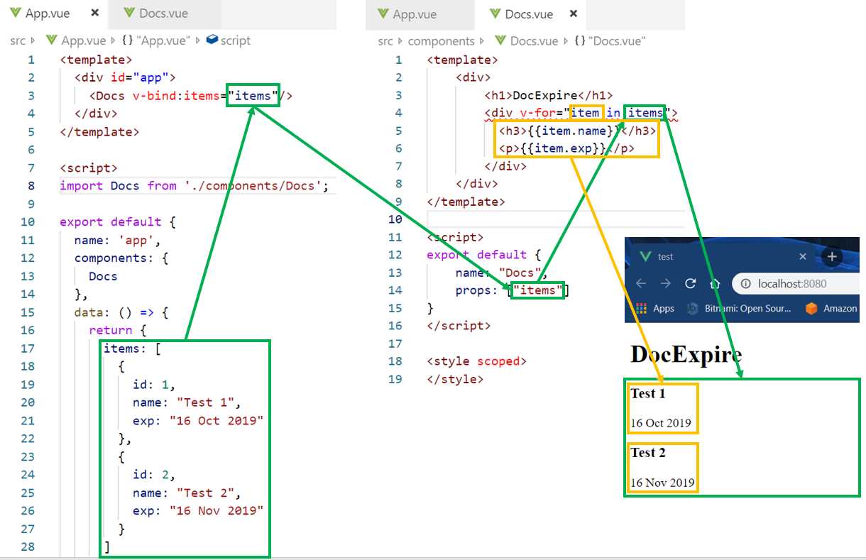
Figure 2-n: Relationship between v-bind (App.vue) and v-for (Docs.vue)
You can clearly see how the items array returned by the data function in App.vue binds to the Docs component and is passed as a property. Those items are looped and rendered using the v-for directive in Docs.vue.
If you installed the Vetur extension, you might have noticed the following syntax issue after you added the v-for directive.
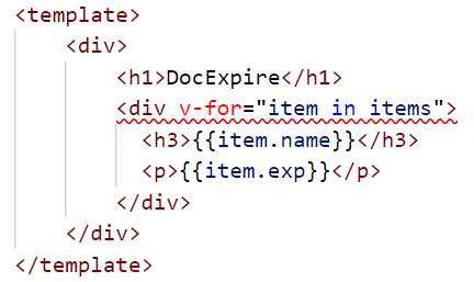
Figure 2-o: Syntax Issue v-for Directive
This is because we need to specify a key, which is a similar concept used in the React framework. We can achieve this by binding to a key as follows.
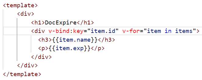
Figure 2-p: Syntax Issue v-for Directive with v-bind:key
Notice how the syntax error goes away once we specify item.id as the key, using v-bind:key directive.
Summary
We’ve covered quite a bit of ground and managed to lay out the foundations of our application, but we still need to add quite a lot of logic and further functionality.
In the next chapters, we’ll dig deeper and add application-specific functionality, and the rest of the components that our application will need, to create our web-based document expiration tool.
- 80+ high-performance, modular, and responsive Vue UI components.
- Popular components like Data Grid, Charts, and Diagram.
- Incredibly lightweight and user-friendly.