
Visual Studio 2013 Succinctly®

CHAPTER 4
XAML IntelliSense Improvements
XAML (eXtensible Application Markup Language) is a markup language used to design the user interface in technologies such as Windows Presentation Foundation (WPF), Silverlight, Windows Phone, and Windows Store Apps for Windows 8. If you have experience with at least one of these technologies, which I assume you have, you know that Visual Studio, especially in the latest versions, offers a pretty good designer. In addition, Microsoft offers another tool called Expression Blend, which is dedicated to professional designers and allows working on the user interface with professional tools without interfering with the managed code behind. As a developer, most of the time you will work with Visual Studio. Although the designer has reached a very good level of productivity, a lot of times you will need to write XAML code manually; this is a very common practice, for example when you need to resize elements in the UI with exact proportions or when you need to assign styles or set data-bindings to controls. When you edit the XAML manually, you use the XAML code editor, which implements the IntelliSense technology, allowing you to write code faster. However, IntelliSense for XAML has always lacked some important points, such as recognizing available data sources and resources when using data-binding or assigning styles. Finally, Visual Studio 2013 addresses this issue and introduces a lot of new goodies into the XAML code editor.All of these new features are available to all technologies based on XAML.
Note: In the first preview of Visual Studio 2013, the new features in the XAML code editor were only available to Windows Store Apps. This limitation has been removed in the Visual Studio 2013 Release Candidate.
XAML IntelliSense for data-binding and resources
In Visual Studio 2013 you can now take advantage of IntelliSense when assigning a data source to a binding expression or when you assign a resource such as a style.
Note: This feature only works with data sources and resources that you declare in XAML. If you create an instance of a collection in managed code (at runtime), this cannot be recognized by the IntelliSense. It also works with design-time information that you declare through the d: XML namespace.
Let’s use an example to see how this feature works.
The goal of the example is declaring a collection of objects and binding the collection to the user interface using the new IntelliSense features. Data will be shown inside a ListBox control. Create a new WPF Application project called Chapter 4, for the sake of consistency. Add a new folder to the project and call it Model. Add a new class to the folder, called Person. The code for the new class looks like the following.
Visual C#
namespace Chapter4.Model { public class Person { public string FirstName { get; set; } public string LastName { get; set; } public int Age { get; set; } } } |
Visual Basic
Namespace Model Public Class Person Public Property FirstName As String Public Property LastName As String Public Property Age As Integer End Class End Namespace |
Note: While Visual C# automatically adds a namespace definition for each subfolder you create in the project, Visual Basic doesn’t; it just recognizes objects under the root namespace. For the sake of consistency in both languages, we are adding a namespace declaration in Visual Basic so that we can use the same XAML with both.
This is a very simple class with only three properties, but we are focusing on the new tools now rather than on writing complex code. The next step is adding to the Model folder a new collection of Person objects, called People. The code is the following.
Visual C#
using System.Collections.Generic; using System.Collections.ObjectModel; namespace Chapter4.Model { //add a using System.Collections.ObjectModel; directive public class People: ObservableCollection<Person> { public People() { Person one = new Person {LastName="Del Sole", FirstName="Alessandro", Age=36}; Person two = new Person { LastName = "White", FirstName = "Robert", Age = 39}; Person three = new Person { LastName = "Red", FirstName = "Stephen", Age = 42 }; this.Add(one); this.Add(two); this.Add(three); } } } |
Visual Basic
Imports System.Collections.ObjectModel Namespace Model Public Class People Inherits ObservableCollection(Of Person) Public Sub New() Dim one As New Person() With {.LastName = "Del Sole", .FirstName = "Alessandro", .Age = 36} Dim two As New Person() With {.LastName = "White", .FirstName = "Robert", .Age = 39} Dim three As New Person() With {.LastName = "Red", .FirstName = "Stephen", .Age = 42} Me.Add(one) Me.Add(two) Me.Add(three) End Sub End Class End Namespace |
The People class inherits from ObservableCollection<Person>. The constructor of the People collection creates three instances of the Person class, and populates them with sample data. The reason why we are creating a collection this way is that IntelliSense for XAML does not support collections created at runtime. Instead, with this approach we can declare the collection in the application’s resources; every time a class is declared in the XAML resources, the constructor of the class is invoked, so in our case an instance of the collection is automatically created and populated when added to the XAML resources. Such an instance can then be data-bound to controls in the user interface. To do so, double-click the MainWindow.xaml file in Solution Explorer. When the designer and the XAML editor appear, first add the following namespace declaration within the Window tag.
<Window x:Class="Chapter4.MainWindow" xmlns="http://schemas.microsoft.com/winfx/2006/xaml/presentation" xmlns:x="http://schemas.microsoft.com/winfx/2006/xaml" xmlns:local="clr-namespace:Chapter4.Model" xmlns:controls="clr-namespace:Chapter4" Title="MainWindow" Height="350" Width="525"> |
This is necessary in order to reference the People and Person classes. The next step is declaring the data source as a resource, as shown in the following code.
<Window.Resources> <local:People x:Key="PeopleData"/> </Window.Resources> |
This is the point in which an instance of the People collection is declared, so we are ready to bind data to a ListBox control. As you know, in order to present information coming from a collection, the so-called item controls (like the ListBox) need to implement a DataTemplate. Let’s add a ListBox and its DataTemplate without pointing to any data source, by writing the following code within the Window tag.
<Grid> <ListBox Name="PeopleBox" > <ListBox.ItemTemplate> <DataTemplate> <Border BorderBrush="Black" BorderThickness="2"> <StackPanel Orientation="Vertical"> <TextBlock /> <TextBlock /> <TextBlock /> </StackPanel> </Border> </DataTemplate> </ListBox.ItemTemplate> </ListBox> </Grid> |
The data template simply presents the value of each property of the Person class with a TextBlock control, arranged inside a StackPanel container. The Border adorner is used for a better highlighting inside the designer, but it is optional. For a full demonstration of the new IntelliSense features, we can also add a new style for TextBlock controls. In Solution Explorer, double-click the App.xaml file. Within the Application.Resources tag, add the following style, which allows presenting text in red and with different size and weight for the current font.
<Application.Resources> <Style x:Key="MyTextBlockStyle" TargetType="TextBlock"> <Setter Property="Foreground" Value="Red"/> <Setter Property="FontSize" Value="16"/> <Setter Property="FontWeight" Value="SemiBold"/> </Style> </Application.Resources> |
Now you are ready to test the new amazing IntelliSense for XAML.
IntelliSense for data-binding
Switch back to the MainWindow.xaml file locate the ListBox control. As you know, item controls are populated by assigning their ItemsSource property with an instance of a collection, either at design-time (with XAML code) or at runtime (in managed code). We previously declared a data source as a resource, so a Source binding expression is needed to assign it as the ItemsSource property for the ListBox. To understand the benefit of XAML IntelliSense at this point, type the following code (not just copy/paste).
<ListBox Name="PeopleBox" ItemsSource="{Binding Source={StaticResource PeopleData}}"> |
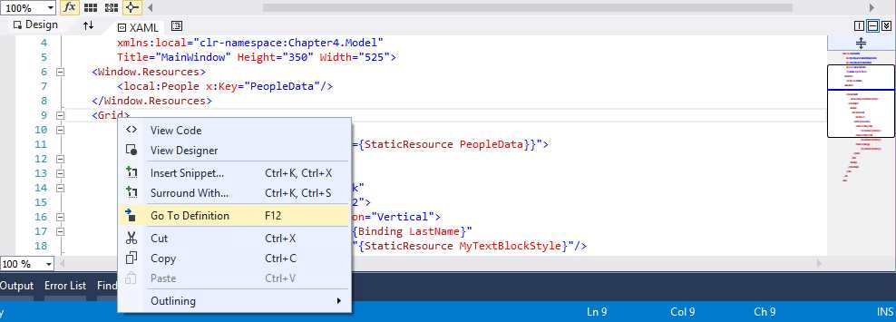
After you type StaticResource, you will see how the IntelliSense will show a list of available objects that can be used for data-binding, as demonstrated in Figure 14.
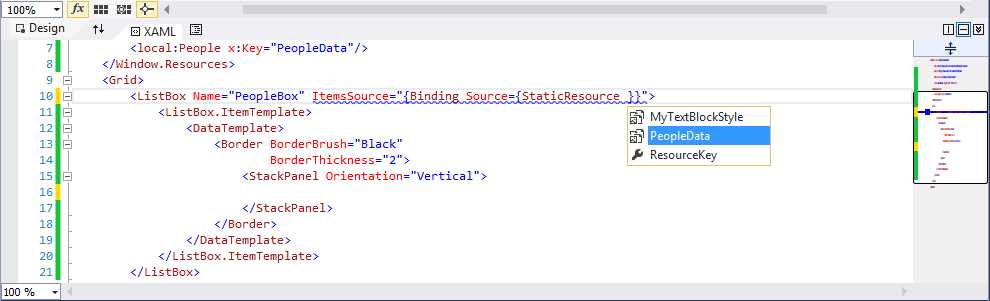
- IntelliSense for Data-Binding in Action
Select the PeopleData object to finalize data-binding. As in every other scenario where you write code, IntelliSense will help you complete the expression while you type. You can also select the data source with the arrows on your keyboard and then press Tab.
Tip: If you have multiple data-bound controls in the Window, you might want to bind the parent container’s DataContext property instead (in this case the Grid) and then assign the ItemsSource property with the {Binding} expression.
Similarly, you can bind TextBlock controls to properties of the collection with the help of IntelliSense, as demonstrated in Figure 15.
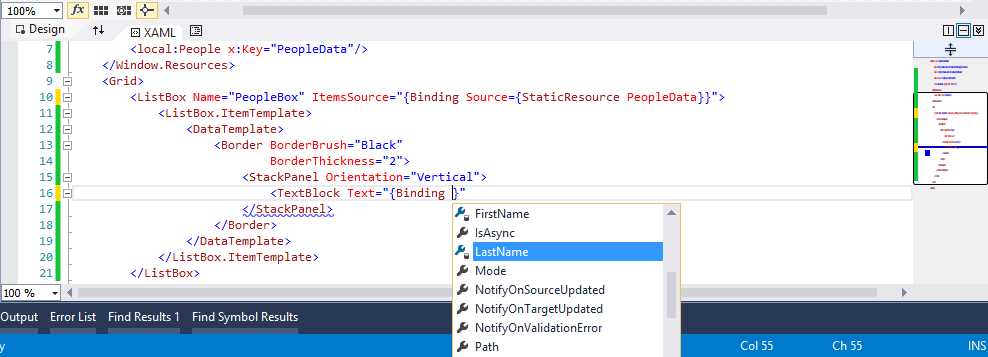
- IntelliSense shows properties that can be data-bound.
This is a tremendous benefit for several reasons. First, you can write code faster. Secondly, you do not need to remember the name or the casing of properties, thus minimizing the risk of typos. The complete code of the ListBox’s data template is the following.
<DataTemplate> <Border BorderBrush="Black" BorderThickness="2"> <StackPanel Orientation="Vertical"> <TextBlock Text="{Binding LastName}"/> <TextBlock Text="{Binding FirstName}"/> <TextBlock Text="{Binding Age}"/> </StackPanel> </Border> </DataTemplate> |
IntelliSense for resources
The next step is using IntelliSense to assign resources. We previously defined a style that must be now assigned to each TextBlock control in the Window. The code for the first TextBlock looks like the following. You might want to type the style assignment manually in order to see the XAML IntelliSense feature in action.
<TextBlock Text="{Binding LastName}" Style="{StaticResource MyTextBlockStyle}"/> |
As it happened for data-binding, when you are assigning the StaticResource expression the IntelliSense will show available resources, as shown in Figure 16.
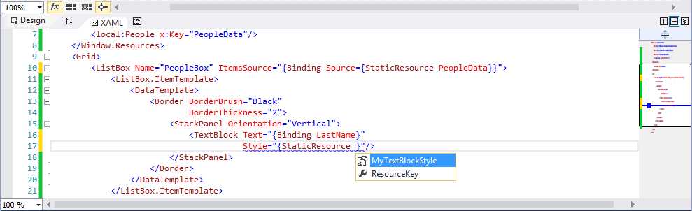
- IntelliSense shows available resources for the specified control.
It is worth mentioning that, in the case of styles, IntelliSense will only show styles valid for the control that you are working on, either defined in the application or defined in the .NET Framework or SDK extensions. This is an additional benefit, since you not only will avoid errors and will write code faster, but you will be also be picking up only resources that are specific for the selected element of the user interface. For the sake of completeness, Figure 17 shows how the designer looks at this point.
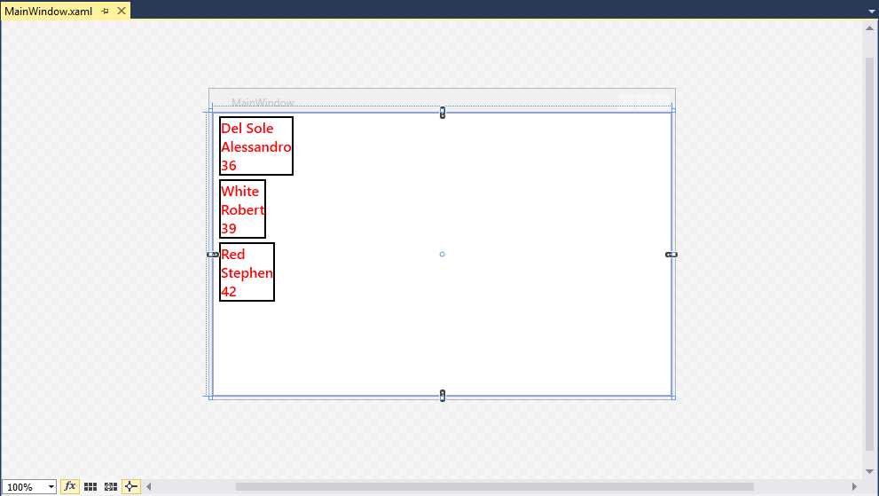
- The Designer after the Data and Style Assignments
You can run the application by pressing F5 to see how it displays data.
Go To Definition
Go To Definition is a feature that you already know from the managed code editor. With this feature, you can right-click an object’s name, select Go To Definition from the context menu, and see how the object is defined in the Object Browser window, if it is a built-in object from the .NET Framework, or in the appropriate code file if it is an object you wrote. This feature is now available to the XAML editor too, as demonstrated in Figure 18.
- Go To Definition is now available in the XAML code editor.
Tip: The keyboard shortcut for Go To Definition is also F12 in the XAML code editor.
Go To Definition is available for the following objects:
- Resources
- System types
- Local types (custom controls)
- Binding expressions
Let’s walk through every object to see the different behavior of Go To Definition.
Resources
In an XAML-based application, resources can be of two types: resources defined in an assembly (from .NET, from the SDK, or from a 3rd party library) and resources defined in the current application. In the first case, Go To Definition will open the Object Browser window pointing to the specified resource definition. For example, in the sample application created previously, place the cursor on the MyTextBlockStyle assignment in any of the TextBlock controls, then right-click and select Go To Definition (see Figure 19).

- Go To Definition Over the Style Defined in the Sample Application
At this point, the code editor will open the definition of the resource at the exact position in the appropriate code file; in our case, the style definition inside the App.xaml file. As you can see (Figure 20), the cursor is placed at the beginning of the definition and the Style tag is selected.

- Go To Definition opens the resource definition at the exact position.
System Types
Go To Definition works with types defined in the .NET Framework and SDK extensions. Since the source code of these types is not available, Visual Studio shows the definition inside the Object Browser window. For example, if you select Go To Definition on the Grid control in the MainWindow.xaml file of the sample application, the Object Browser will be opened, showing the control’s definition (see Figure 21).
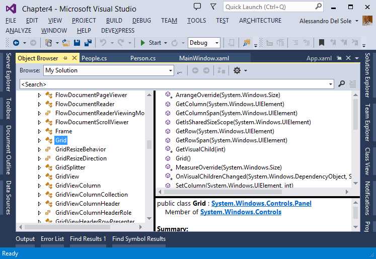
- Seeing a Control’s Definition with the Object Browser
Local Types
Go To Definition has a particular behavior with local types; these are user controls and custom controls created by developers.
Note: This is not a book about WPF and other XAML-based technologies, so I will not cover the difference between user controls and custom controls in detail. As a hint, user controls are the result of the composition of existing controls; custom controls extend existing built-in controls with additional functionalities in code, and provide templating, theming, and styling entry points. For further information, read the Control Authoring Overview in the MSDN Library.
To understand how it works, let’s make some edits to the sample application. In Solution Explorer, right-click the project name, select Add New Item. Then, in the Add New Item dialog, select the User Control (WPF) template and name the new control CustomBoxControl.xaml (see Figure 22).
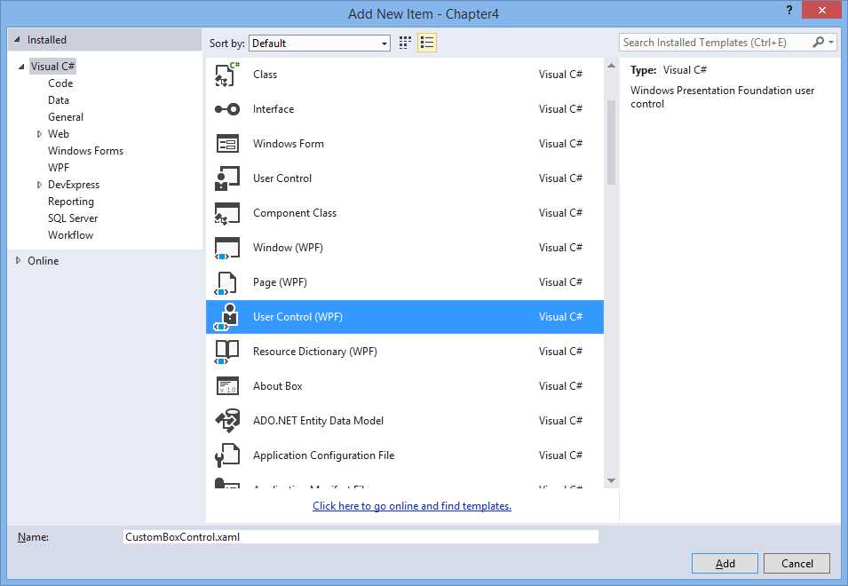
- Adding a New User Control
Cut and paste the ListBox definition from MainWindow.xaml to the new control, and repeat this step for the local XML namespace declaration. Finally, add a local resource that points to the People collection as you did in MainWindow.xaml. The full code of the user control looks like the following.
<UserControl x:Class="Chapter4.CustomBoxControl" xmlns="http://schemas.microsoft.com/winfx/2006/xaml/presentation" xmlns:x="http://schemas.microsoft.com/winfx/2006/xaml" xmlns:mc="http://schemas.openxmlformats.org/markup-compatibility/2006" xmlns:d="http://schemas.microsoft.com/expression/blend/2008" mc:Ignorable="d" xmlns:local="clr-namespace:Chapter4.Model" d:DesignHeight="300" d:DesignWidth="300"> <UserControl.Resources> <local:People x:Key="PeopleData"/> </UserControl.Resources> <Grid> <ListBox Name="PeopleBox" ItemsSource="{Binding Source={StaticResource PeopleData}}"> <ListBox.ItemTemplate> <DataTemplate> <Border BorderBrush="Black" BorderThickness="2"> <StackPanel Orientation="Vertical"> <TextBlock Text="{Binding LastName}" Style="{StaticResource MyTextBlockStyle}"/> <TextBlock Text="{Binding FirstName}" Style="{StaticResource MyTextBlockStyle}"/> <TextBlock Text="{Binding Age}" Style="{StaticResource MyTextBlockStyle}"/> </StackPanel> </Border> </DataTemplate> </ListBox.ItemTemplate> </ListBox> </Grid> </UserControl> |
In MainWindow.xaml, add the following XML namespace to include the user control.
xmlns:controls="clr-namespace:Chapter4" |
Then, add the user control as follows.
<Grid> <controls:CustomBoxControl/> </Grid> |
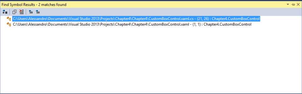
If you did everything correctly, the designer now should still look like in Figure 17. Now, right-click CustomBoxControl inside the Grid and select Go To Definition. As you can see (Figure 23), Visual Studio 2013 opens the Find Symbol Results window and shows two results, one for XAML and one for managed code.
- Adding a New User Control
The reason is that user controls (and custom controls as well) are made of two components, the XAML file defining the user interface and a code-behind file. You can then double-click the file you need and see the appropriate definition. The Find Symbol Result is a good choice, because you can also see the line number where the definition begins.
Binding expressions
Go To Definition also works with binding expressions. For instance, you can right-click the name of the data source or of the bound property inside a Binding expression and select Go To Definition. With data sources (collections) defined as static resources, Go To Definition moves you to the definition of the resource; with data sources defined in managed code, Go To Definition attempts to make a full symbol search in the code, showing search results in the Find Symbol Results window. In the case of data-bound properties, Go To Definition moves you to the code of the class that exposes such a property.
Automatic closing tag
When you add an item in XAML, the code editor automatically adds the closing tag. For instance, when you add a <Button> tag, Visual Studio adds the matching </Button> tag. This is not new, since it is the normal behavior in the earlier versions. The new feature is that if you add the slash before the > symbol in the first tag, the closing tag is automatically removed. In other words, in this code:
<Button Width="100" Height="50" Click="Button_Click" Name="Button1" Content="Click me!"></Button> |
If you type the slash before the > symbol, it automatically turns into the following code.
<Button Width="100" Height="50" Click="Button_Click" Name="Button1" Content="Click me!"/> |
This is another way the editor can help you write code faster.
IntelliSense matching
Continuing its purpose to make your coding experience better, Visual Studio 2013 adds another feature to the XAML code editor, known as IntelliSense matching. Basically, when you start typing the name of a control or resource, the IntelliSense will help you find the appropriate control as you type, even if you enter the wrong characters. For example, Figure 24 shows how IntelliSense understands you need a StackPanel even if you are typing it incorrectly.
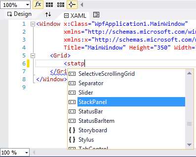
- IntelliSense Matching makes it easy to select controls as you type.
IntelliSense does an excellent job, depending on how many identifiers can match what you are typing. For instance, in a Windows Store App, if you type Abbb it will suggest the AppBar control, which is probably your choice.
Better support for comments
A common issue in previous versions of Visual Studio is that when you add a comment to a code block containing another comment, it causes the code editor to show an error message. Figure 25 shows how Visual Studio 2012 handles this kind of situation.
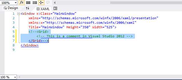
- Visual Studio 2012 does not recognize nested comments correctly.
The problem was that the code editor did not recognize comment closing tags correctly. Visual Studio 2013 addresses this issue, so when you add a comment to a code block containing another comment, the entire code block gets commented, as demonstrated in Figure 26.
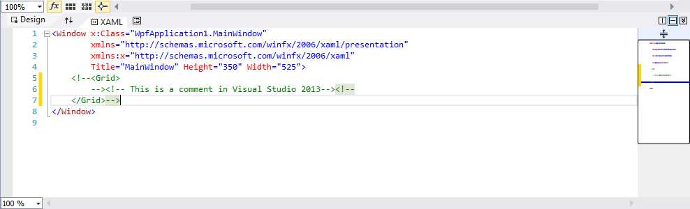
- Visual Studio 2013 correctly recognizes nested comments.
Reusable XAML code snippets
Reusable code snippets for IntelliSense have been a very popular feature since Visual Studio 2005, but have always been limited to managed languages, XML, and HTML/JavaScript in version 2012. With code snippets you can take advantage of a huge code library offered by Visual Studio or create your own code snippets, so that it is easier to reuse your code with the support of IntelliSense. The need of code snippets for XAML has always been very strong, so many developers used different techniques to store their reusable code. I wrote myself an extension for Visual Studio 2010 to support XAML code snippets. Visual Studio 2013 makes another step forward, introducing built-in support for code snippets in the XAML code editor.
To use code snippets, simply right-click in the code editor and select Insert Snippet or Surround With, as shown in Figure 27.
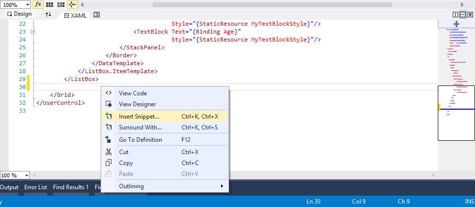
- Visual Studio 2013 provides support for XAML code snippets.
At this point, a list of available code snippets appears. You can select the code snippet you need from the list and the related code will be placed there (see Figure 28).
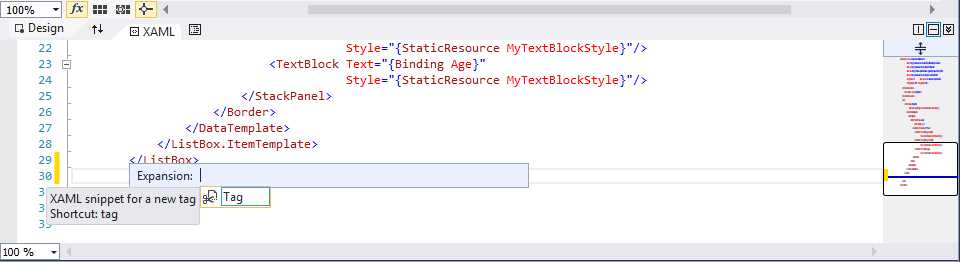
- Selecting a Code Snippet from the List
Note: This chapter is based on Visual Studio 2013 RTM released to the MSDN subscribers in October, 2013. In this release only one XAML snippet is supplied. At the time of this writing, we cannot predict if additional snippets will be provided, or if you will only be able to import your own, custom code snippets. This chapter does not explain how to build custom code snippet files, which is out of its scope. However, you can read this interesting article from Tim Heuer, which explains XAML code snippets from creation to deployment.
You can manage code snippet files with the Code Snippets Manager tool (available from the Tools menu), as you already did for other languages. This is the place where you can import, remove, and view detailed information about code snippet files. By adding XAML code snippets, Visual Studio 2013 bridges the gap with code editors for other languages.
Chapter summary
Without a doubt, adjusting the user interface and supplying data-bindings manually in XAML code is a very common task in any XAML-based technology, including WPF, Silverlight, Windows Phone, and Windows Store Apps, despite the existence of specialized tools for designing. Visual Studio 2013 finally provides important improvements to the XAML code editor, such as IntelliSense for recognizing data sources and styles; Go To Definition for system types, local types, custom, and user controls; commenting nested code blocks; better handling of closing tags, and IntelliSense matching to help you select controls quickly; and reusable code snippets, finally added to XAML completing the availability of this tool to all of the supported languages.
- 1800+ high-performance UI components.
- Includes popular controls such as Grid, Chart, Scheduler, and more.
- 24x5 unlimited support by developers.