
UWP Succinctly®

CHAPTER 2
The Essential Concepts: Visual Studio, XAML, and C#
The templates
When you launch Visual Studio 2015 for the first time and you choose to create a new project, you’ll notice many different categories. The ones that are interesting for our purposes belong to the Windows category. Here you will find the following subcategories:
- Universal contains the templates needed to create a Universal Windows Platform app.
- Windows 8 contains multiple subcategories for each previous version of the platform, like Windows 8.1, Windows Phone 8.1, or Silverlight apps for Windows Phone 8.0 and 8.1.
- Classic Desktop contains the templates to create classic desktop applications using technologies like Windows Forms or WPF, which are based on the standard .NET framework.
This book will cover only Universal Windows Platform apps, so the ones that can be created starting from the templates inside the Universal section. If you are required to create an application for prior Windows or Windows Phone versions, you can find different books written by me and published by Syncfusion in the Succinctly series.
Pages, XAML, and code-behind
Universal Windows Platform apps abandon the old windowing.based paradigm to use a new paradigm based on pages, which are organized in a hierarchical way. The user, when launching the app, lands on the main page. After that, he can move to the other pages, which contain different and specific content. For example, a news application can display a list of the most recent news in the main page. The user can tap one of the list items and navigate to a detail page, which will display the full text of the news. In addition, the application can have more pages: one for videos, one for photo galleries, one for a specific news category, etc.
All the pages inside an application are composed of two different files:
- The main one, which ends with the .xaml extension, contains the visual layout of the page and is written with a language called XAML, which is a XML dialect.
- The code-behind, which ends with the .xaml.cs extension, contains the code able to interact with the user interface and perform logic operations. To see this file in Solution Explorer, you’ll have to click the little arrow that is displayed near the XAML file. In fact, the code-behind file is displayed as a child of the XAML file in the tree structure. The language used in the code-behind depends on the projection you’re using. In the samples covered in this book, it will contain C# code and, thus, the file name ends with the .cs extension. If, for example, you had chosen VB.NET as the development language, the code-behind file would have been named xaml.vb.
The project’s structure
Regardless of the template you’re going to use, there are some files and folders that are essential for a Universal Windows Platform app and that are included in every project. Let’s look at the most important ones.
The App class
Initially, you may think of this file as representing one of the application pages. In fact, like any other page, it’s composed of a XAML (App.xaml) and a code-behind file (App.xaml.cs). The App class is a special one, since it’s the entry point of every UWP app. It takes care of initializing everything needed by the application to properly work, like initializing the Frame class that manages the different pages of the application or handling all the entry points to manage the application’s lifecycle.
One important feature of the App class is that its instance is kept alive until the app is closed or suspended. Every property declared in this class can be accessed for later usage when the application is running. Another consequence of this behavior is that the App class is the central point where you register all resources (like styles and templates), which can be used from the controls placed in the application’s pages. We’ll see in detail how to use this feature later in the current chapter.
The Assets folder
This folder typically contains all the visual assets (images, logos, icons, etc.) used in the application. It’s not a strict requirement; you can place such data in any other folder of the project. However, it’s a good practice to place everything under the Assets folder.
The manifest file
In the project, you’ll find a special file called Package.appxmanifest. It’s the manifest file and it’s very important: its purpose is to define all the main features of the application, like the standard visual assets (logos, tiles, etc.), the metadata (name, description, etc.), the capabilities, the integration with operating system, etc. Under the hood, it’s an XML file, but Visual Studio provides a visual editor, which is automatically loaded when you double-click it.
The manifest is composed of the following sections:
- Application: this section describes all the base metadata of the application, like the name, the default language, the supported orientations, and the push notifications configuration.
- Visual Assets: this section describes the visual layout of the application by defining all the default images used as logos for the Store as background for the default tile or as splash screen to display when the application is being loaded. Since Windows 10 supports multiple resolutions and screen sizes, this section will allow you to upload different formats for the same image. In the second book of the series, you’ll better understand how Windows 10 manages this scenario.
- Capabilities: this section is used to set up which features (hardware and software) the application is using, like the Internet connection, the geolocation services, access to the picture library, etc. In this book, you’ll find a special note every time we’re going to talk about a feature that requires enabling a specific capability to be used.
- Declarations: this section is used to extend the application, so that it can deeply interact with the operating system or with other applications. Every time we’re going to use some code that extends applications (like performing operations in the background or sharing content), we’ll need to set up the entry points in this section. We’ll detail this section later, when we talk about contracts and background execution.
- Content URLs: this section is specific for a control called WebView, which can be used to display web content inside the application (like a HTML page). This control offers developers a way to interact with the page by intercepting and calling specific JavaScript functions. This feature is enabled only for trusted websites, for which the URLs need to be added in this section. To improve security, only sites that use the HTTPS protocol are supported.
- Packaging: this last section can be used to customize some information about the package that you will publish on the Store, like the application name, the publisher name, or the version number. Much of the information detailed in this section is automatically set when you’re going to associate your app with the Store to publish it. You’ll find more details at the end of these e-books.
The XAML
XAML stands for Extensible Application Markup Language. It’s based on XML and it’s used to define the visual layout of a page, similar to the way HTML is used to define the layout of webpages.
Controls (like buttons or a block of text) are identified by an XML tag, which is inserted inside a page following a hierarchical structure. Tags can be inserted inside other tags to define a relationship. For example, this approach is widely used to define the layout of the page. There are some special controls (which we’ll detail in Chapter 3) that act as container for other controls and, consequently, they are nested one inside the other.
Here is what a page definition looks like:
Code Listing 4
|
x:Class="Styles.MainPage" xmlns="http://schemas.microsoft.com/winfx/2006/xaml/presentation" xmlns:x="http://schemas.microsoft.com/winfx/2006/xaml" xmlns:local="using:Styles" xmlns:d="http://schemas.microsoft.com/expression/blend/2008" xmlns:mc="http://schemas.openxmlformats.org/markup-compatibility/2006" mc:Ignorable="d">
<Grid> <StackPanel> <TextBlock Text="Hello world" /> </StackPanel> </Grid> </Page> |
Every page inherits from a base class called Page, the starting node. Every other tag placed inside it will define the page layout. You can see that there’s an attribute called x:Class in the page definition: it defines which is the code-behind class connected to the page. In the sample, it’s a class called MainPage, which belongs to a namespace called Styles.
Namespaces
Namespaces should already be familiar to developers; it’s a way to better organize your code by defining a logical path for your classes. This way (even if it’s not a suggested approach) you can also have two classes with the same name, given that they belong to two different namespaces. Namespaces are separated using a dot. For example, if you have a class called Person that belongs to the Entities namespace, it will be represented by the full definition Entities.Person. Usually, as default behavior, namespaces inside a project are mapped with folders. If you create a folder called Entities and you create a new class inside it, by default it will belong to the Entities namespace.
Namespaces in XAML behave in the same way. XAML controls are, in the end, standard classes that belong to a specific namespace. When you want to use a control inside a page, you must make sure that the proper namespace is added in the page definition. This is true especially for custom controls created by the developer or for third party controls that are included in external libraries. In fact, most of the native controls (buttons, text boxes, etc.) can be used without having to worry about the namespace.
Let’s see an example of how to use a namespace in XAML by including in our project the Microsoft Store Services SDK (which can be downloaded here) an external library that adds a series of controls and APIs to interact with the services provided by the Store. This library, among other things, includes a control to display advertising in your apps, called AdControl. However, since it’s part of an external library and not embedded into the Universal Windows Platform, we need to declare the namespace it belongs to before using it. This control is included in the namespace Microsoft.Advertising.WinRT.UI; consequently you’ll need to add the following declaration in the Page definition:
Code Listing 5
Every namespace starts with the xmlns prefix (XML Namespace), which is always required. Then you need to specify a unique identifier for the namespace, which will be used inside the page every time you need to gain access to a control or to a class that belongs to it (in the previous sample, it’s ad). Here is the sample code to display the advertising control inside a page:
Code Listing 6
<ad:AdControl x:Name="MyAdControl" /> |
As you can see, we’ve added as prefix to the name of the control (AdControl) the identifier we’ve previously assigned to the namespace (ad).
Properties and events
Every control can be customized in two ways: by defining properties and by subscribing to events. Each of them is identified with an attribute of the control, even if they have two different purposes.
Properties are used to determine the control’s aspect and behavior and they are set simply by assigning a value to the specific attribute. Let’s say that we want to display a text on the page by using a control called TextBlock. In this case, we’ll need to change the value of a property called Text, like in the following sample:
Code Listing 7
<TextBlock Text="Hello world" /> |
However, there are some properties that can’t be expressed with a simple string like in the previous sample. For example, if you want to define an image as the background of a control, you need to set a property called Background using the extended syntax, like in the following sample:
Code Listing 8
<Grid> <Grid.Background> <ImageBrush ImageSource="/Assets/Background.png" /> </Grid.Background> </Grid> |
The extended syntax is expressed with a node that is set as child of the control. The prefix is the same as the control’s name, followed by the name of the property, separated by a dot. In the example, since we need to set the Background property of a control called Grid, we use the expression Grid.Background.
There’s a special property offered by any control called x:Name. It’s a string that univocally identifies it in the page (you can’t have two controls with the same name). It’s important especially because it allows developers to access the control from code-behind. Thanks to this identifier, you’ll be able to read and set properties directly from the code.
For example, let’s say you have a TextBlock control and you assign it a unique identifier in the following way:
Code Listing 9
<TextBlock x:Name="MyText" /> |
In the code-behind, you’ll be able to interact with the control simply by using the value of the x:Name property. The following sample shows how to change the Text property in the code:
Code Listing 10
MyText.Text = "Hello world!"; |
Events, on the other hand, are used to determine how the user or the application is interacting with your control. Every time something happens that involves the control, an event is raised and you’ll be able to manage it in the code-behind. A very common event is Click, which is exposed by all the controls that offer direct interaction with the user, like the Button one. Every time the user presses the button (either with a click of a mouse or a tap of a finger), the Click event is raised. You will need to manage it with a specific method called an event handler. Visual Studio will help you to define this method in the proper way. After you write the name you want to assign to the event, Visual Studio will take care of creating the event handler in the code for you.
The following sample shows you how to define an event handler for the Click event of a Button control in XAML:
Code Listing 11
<Button Click="button_Click" /> |
Visual Studio will generate for you the following event handler:
Code Listing 12
private void button_Click(object sender, RoutedEventArgs e) { MyText.Text = "Hello world!"; } |
As you can see, event handlers are regular methods, but with a specific definition. They always include in the signature two parameters that, as developers, we can use to better handle the event. The first parameter is called sender and it’s a reference to the object that invoked the event (in our sample, it will contain a reference to the Button control); the second parameter, instead, offers some properties that are useful to understand the event’s context. We’ll see more detailed sample usages of this parameter in the next chapters. Inside the event handler, you simply need to write the code that you want to execute when the event is raised. In the previous sample, we set the Text property of our TextBlock control every time the Button is pressed.
Visual Studio offers a feature called IntelliSense, which can autocomplete the code while you’re writing it and offer some useful information about properties and events on the fly. IntelliSense also offers a useful visual reference to distinguish properties and events. The former are identified by a small wrench, the latter by a lightning icon.
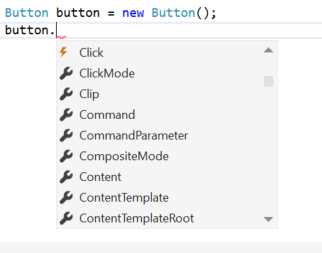
Figure 21: The different icons used to highlight properties and events.
Resources
If you have ever worked with web technologies like HTML, the resources concept will be familiar to you. Exactly like in the HTML world, you can share and reuse styles in multiple pages by using the CSS language. Resources can be used to define a control’s style and behavior and to reuse it in different pages of the application.
Resources are defined thanks to a property called Resources, which is offered by any control. Since XAML is based on a hierarchical structure, every nested control will be able to use the resources defined by its parent. For example, the following sample shows how to define some resources that will be available to a grid control and to any other control nested within it:
Code Listing 13
<Grid> <Grid.Resources> <!-- insert your resources here --> </Grid.Resources> </Grid> |
However, resources are more often defined with two different scopes: the page one and the application one.
Page resources are defined within the page itself, thanks to the Resources property offered by the Page class. This way, all the controls included in the page will be able to access the resources. Here is a sample of a page resources definition:
Code Listing 14
<Page x:Class="Styles.MainPage" xmlns="http://schemas.microsoft.com/winfx/2006/xaml/presentation" xmlns:x="http://schemas.microsoft.com/winfx/2006/xaml" xmlns:local="using:Styles" xmlns:d="http://schemas.microsoft.com/expression/blend/2008" xmlns:mc="http://schemas.openxmlformats.org/markup-compatibility/2006" mc:Ignorable="d"> <Page.Resources> <!-- insert here your resources --> </Page.Resources> </Page> |
Application resources, instead, are defined using the Resources property of the Application class that is defined in the App.xaml file. This way, the resources will be available to any control placed in any page or user control of the application. Here is a sample definition:
Code Listing 15
<Application x:Class="Styles.MainPage " xmlns="http://schemas.microsoft.com/winfx/2006/xaml/presentation" xmlns:x="http://schemas.microsoft.com/winfx/2006/xaml" xmlns:local="using:Styles">
<Application.Resources> <!-- insert your resources here --> </Application.Resources> </Application> |
Like controls are univocally identified by the x:Name property, resources are identified with the x:Key property. To apply a resource to a control’s property, you need to use a special XAML syntax called markup extension. It’s a way to describe, directly in XAML, complex operations that, otherwise, would require writing some logic in code. There are many markup extensions available in XAML and we’ll talk about some of them during this chapter.
The one that is used to apply a resource to a control is called StaticResource. Here is, for example, how to use it to apply a style to a TextBlock control:
Code Listing 16
<TextBlock Style="{StaticResource CustomStyle}" /> |
The resource is applied by including the StaticResource keyword inside braces, followed by the name of the resource (which is the value assigned to the x:Key property).
In some cases, especially if you have a lot of resources, the page or the application’s definition can be become too crowded and hard to read. XAML offers you a way to better manage resources by declaring them in a dedicated file, in the same way you can define CSS styles in another file in HTML and not just inline.
In XAML, these external files are called Resource Dictionaries. Visual Studio offers a specific template to create such files: just right-click in Solution Explorer on your project and choose Add -> New Item. You’ll find as one of the available templates a file type called Resource Dicitonary. Automatically, it will create a file with the following definition:
Code Listing 17
<ResourceDictionary xmlns="http://schemas.microsoft.com/winfx/2006/xaml/presentation" xmlns:x="http://schemas.microsoft.com/winfx/2006/xaml"> <!-- here you can place all your resources -->
</ResourceDictionary> |
Using this file is easy. You just have to include all your resources inside the ResourceDictionary tag, in exactly the same way you did when you added them as page or application resources. Then you need to include the Resource Dictionary file inside the main application by declaring it in the App.xaml file in the following way:
Code Listing 18
<Application.Resources> <ResourceDictionary> <ResourceDictionary.MergedDictionaries> <ResourceDictionary Source="Resources/Styles.xaml" /> </ResourceDictionary.MergedDictionaries> </ResourceDictionary> </Application.Resources> |
Resource dictionary files are added inside the MergedDictionaries property, offered by the ResourceDictionary class. In the previous sample, you can see that we’ve added just one file, but you can add as many as you want (for example, in case you want to split resources in different files, based on their type or use case).
Let’s see now, in detail, which kind of resources the XAML framework offers to developers.
Styles
Styles in XAML are similar to CSS styles. Their purpose is to collect multiple property definitions in one style so that all the properties are automatically changed when they’re applied to a control. This way, in case you change your mind and you want to edit one of the properties, you can do it just in one place (the style definition), instead of manually editing all the controls.
Here’s what a style looks like:
Code Listing 19
<Style TargetType="TextBlock" x:Key="RedStyle"> <Setter Property="Foreground" Value="Red" /> <Setter Property="FontSize" Value="30" /> </Style> |
Styles are identified by the Style control, which, other than the x:Key property we’ve already learned about, offers an attribute called TargetType, used to specify which kind of controls this style can be applied to. Inside the Style control, you can place as many Setter tags as you want. Each of them can change the value (using the Value attribute) of a specific property (defined by the Property attribute).
In the previous sample, we’ve defined a style which can be applied just to TextBlock controls and that changes two of its properties: the color (Foreground) and the text size (FontSize).
Styles offer a way to apply them not just to a specific control, but to any control whose type matches the one we’ve defined in the TargetType property. This way, you won’t have to manually apply the style using the StaticResource property, as it will be automatically applied. These styles are called implicit styles and they are defined simply by omitting the x:Key property, like in the following sample:
Code Listing 20
<Style TargetType="TextBlock"> <Setter Property="Foreground" Value="Red" /> <Setter Property="FontSize" Value="30" /> </Style> |
This way, all the TextBlock controls will automatically display the text using a bigger, red font. Implicit styles are applied based on the scope in which they’ve been defined. If they’ve been declared in a page, they will be automatically applied to all the controls in the page; otherwise, if they’ve been declared as application resources, they will be applied to all the controls in all the pages.
It’s important to remember the hierarchical nature of XAML. When it comes to styles, this means that inner styles always win over outer styles. If, for example, you have defined a style at the application level that changes all the TextBlock’s font colors to red, but then you define another style at the page level that changes the color to blue, the page one will win over the application one.
Data templates
Data templates are special resources that can be applied to some controls to define the visual layout. They are often used in combination with controls used to display collections of items, like ListView or GridView (we’ll talk about them in Chapter 3).
The data template simply contains the XAML used to render each item of the list. This way, the XAML will be automatically repeated and applied to every element of the list. Let’s say that you want to display a list of people—here’s what a data template for this purpose could look like:
Code Listing 21
<DataTemplate x:Key="PeopleTemplate"> <StackPanel> <TextBlock Text="Name" /> <TextBlock Text="{Binding Path=Name}" /> <TextBlock Text="Surname" /> <TextBlock Text="{Binding Path=Surname}" /> </StackPanel> </DataTemplate> |
For now, just ignore the Binding keyword. It’s a new markup extension, which will be covered in detail later in the chapter. For the moment, it’s important just to know that you’ll be able to display, with this data template, every person in the collection’s name and surname.
Data templates behave like any other resource. They can be defined inline inside the control, as page or application resources, or in a resource dictionary. Then, you can apply them using the StaticResource keyword. Typically, when you’re dealing with controls to display collections, data templates are assigned to a property called ItemTemplate, which defines the template used for each item in the collection, like in the following sample:
Code Listing 22
<ListView ItemTemplate="{StaticResource PeopleTemplate}" /> |
Brushes
Brushes are XAML elements that are used to define how a control is filled. For example, when you set the background color of a Button control, you’re using a brush. There are many kinds of brushes: the simplest one is called SolidColorBrush and it’s used to express a color. Most of the time, you’ll be able to apply this brush using the standard property’s syntax. It’s enough to assign the color’s name to the required property, since the XAML runtime will take care of creating a SolidColorBrush for you under the hood. For example, here is how to create a Rectangle shape with a red background:
Code Listing 23
<Rectangle Width="200" Height="200" Fill="Red" /> |
However, there are also more complex brushes that can be expressed only with the extended syntax. For example, you can apply a gradient instead of a simple color by using a LinearGradientBrush or a RadialGradiantBrush. They both have the same purpose, but while the first one uses a line as a separator between the colors, the second one applies a circular effect.
Here is how you can apply a gradient brush to the same Rectangle control we’ve seen before:
Code Listing 24
<Rectangle Width="200" Height="200"> <Rectangle.Fill> <LinearGradientBrush> <GradientStop Color="Blue" Offset="0" /> <GradientStop Color="Red" Offset="1" /> </LinearGradientBrush> </Rectangle.Fill> </Rectangle> |
Inside a gradient brush, we can insert multiple GradientStop controls. Each of them defines one of the colors that will be applied and you can specify the location where the gradient stops with the Offset property. Optionally, you can also apply two properties to the LinearGradientBrush called StartPoint and EndPoint to define the points’ coordinates where the gradient should start and end.
Finally, you can also apply an image as a brush by using an ImageBrush control, which also requires the extended syntax, as you can see in the following sample:
Code Listing 25
<Rectangle Width="200" Height="200"> <Rectangle.Fill> <ImageBrush ImageSource="background.png" /> </Rectangle.Fill> </Rectangle> |
Handling resources based on the theme
So far, we’ve seen just one way to apply resources to a control: by using the StaticResource keyword. However, the Universal Windows Platform offers another markup extension called ThemeResource, which can be used to automatically adapt a resource based on the device’s theme.
Let’s take a step back and see in detail how this feature works. Windows 10 supports the concept of theme, a set of resources applied globally to the entire operating system. Some themes are available just to meet the visual preferences of the user, like the dark theme (white text on dark backgrounds) and the white theme (dark text on white backgrounds). Some others, instead, offer people with visual handicaps a better user experience, like the high contrast one.
Developers need to keep in mind this feature when it comes to designing an application. Otherwise, there’s the risk that it will only look proper with one of the themes, making it unusable with the others. Let’s say that you have a TextBlock control in the page and you force the text’s color to be white: if a user has applied the white theme on their device, they won’t be able to read the text. Thanks to the ThemeResource keyword, you’ll be able to define multiple resources with the same name. The system will automatically apply the one that works best for the current theme.
Here is sample code:
Code Listing 26
<Application.Resources> <ResourceDictionary> <ResourceDictionary.ThemeDictionaries> <ResourceDictionary x:Key="Dark"> <SolidColorBrush Color="Red" x:Key="ApplicationTitle" /> </ResourceDictionary> <ResourceDictionary x:Key="Light"> <SolidColorBrush Color="Blue" x:Key="ApplicationTitle" /> </ResourceDictionary> </ResourceDictionary.ThemeDictionaries> </ResourceDictionary> </Application.Resources> |
As you can see, we’ve defined (as application resources) two resources with the same name. They’re both SolidColorBrush items and they have the same x:Key value, ApplicationTitle. However, the two brushes have a different value. The first one sets the color to Red, the second one to Blue.
Both of them have been added inside a ResourceDictionary property called ThemeDictionaries. An important difference is that each ResourceDictionary has a unique identifier, assigned with the x:Key property. This identifier tells the system which theme the resources are referring to by using a specific naming convention:
- Default, which is applied as the default theme.
- Dark, which is applied when the dark theme is used.
- Light, which is applied when the light theme is used.
- HighContrast, which is applied when the high contrast theme is used.
Now you just need to apply your resource in the same way you did before, but using the ThemeResource markup extension instead of the StaticResource one. Here is sample code that shows how to apply the previous style to a TextBlock control:
Code Listing 27
<TextBlock Text="Title" Foreground="{ThemeResource ApplicationTitle}" /> |
One of the most useful advantages of this markup extension is that it’s able to detect the theme change at runtime. This way, if the user changes the theme while the app is running, all the resources will be automatically adapted without having to restart it.
You can also force a theme for your application by applying the RequestedTheme property to the whole application (in the App.xaml file) or to a single page or control. This way, the resources will ignore the user’s theme and only follow the rules defined by the forced theme. The following sample shows how to force the entire application to use the Dark theme:
Code Listing 28
<Application x:Class="Qwertee.App" xmlns="http://schemas.microsoft.com/winfx/2006/xaml/presentation" xmlns:x="http://schemas.microsoft.com/winfx/2006/xaml" xmlns:local="using:Qwertee" RequestedTheme="Dark"> </Application> |
Animations
Animations are probably one of the most powerful resources in XAML. With a few lines of XAML code, you’ll be able to animate virtually any control in the page. For instance, you can make a control disappear, move to another position, or change the size, and so on.
Animations are rendered using a control called Storyboard, which offers different types of animations:
- DoubleAnimation is used when you want to animate the control by changing a numeric property (like the FontSize).
- ColorAnimation is used when you want to animate the control by changing a color property.
- PointAnimation is used when you want to animate the control by changing its coordinates.
Before seeing in detail how an animation works, let’s see sample code that defines a DoubleAnimation:
Code Listing 29
<Storyboard x:Name="Animation"> <DoubleAnimation Storyboard.TargetName="MyShape" Storyboard.TargetProperty="Opacity" From="1.0" To="0.0" Duration="0:0:5" /> </Storyboard> |
Please meet another XAML concept, called attached properties. They are special properties inherited from one control, but that can be applied to others. In this case, TargetName and TargetProperty are two attached properties. They are exposed by the Storyboard control, but they’re applied to the DoubleAnimation one. Their purpose is to define where the animation will be applied. TargetName defines the name of the control, while TargetProperty defines the name of the property whose value will be changed during the animation.
In the previous sample, we’re changing the Opacity property of a control identified by the name MyShape. The other three properties define the behavior of the animation. From and To are used to define the start and end values of the property, while Duration is used to express the animation’s length. In this case, we’re changing the control’s Opacity value from 1.0 to 0.0. The animation will last 5 seconds. The result will be that, after 5 seconds, the control will disappear.
With the previous code, the animation is equally distributed according to the specified length. However, XAML also offers a way to change this behavior by using one of the controls that ends with the suffix UsingKeyFrames. The following sample shows another approach to define a DoubleAnimation:
Code Listing 30
<Storyboard x:Name="Animation"> <DoubleAnimationUsingKeyFrames Storyboard.TargetName="MyShape" Storyboard.TargetProperty="Opacity" Duration="0:0:10"> <LinearDoubleKeyFrame KeyTime="0:0:3" Value="0.8" /> <LinearDoubleKeyFrame KeyTime="0:0:8" Value="0.5" /> <LinearDoubleKeyFrame KeyTime="0:0:10" Value="0" /> </DoubleAnimationUsingKeyFrames> </Storyboard> |
We’re using the alternative version of the control, called DoubleAnimationUsingKeyFrames. The difference is that, this time, we exactly specify the animation timings using the LinearDoubleKeyFrame control and its KeyTime and Value attributes. In the sample, the result is the same (the control disappears after 10 seconds), but not with different timings. After 3 seconds, the Opacity property will be set to 0.8, after 8 seconds to 0.5, and after 10 seconds to 0, making the control disappear.
Easing animations
There are animations that are pleasant to see for the user, but that can be hard to implement. Let’s say that you have a shape on the page and you want to simulate it falling towards the bottom of the screen. When the shape touches the bottom margin, it should bounce, like it’s a ball. This kind of animation can be complex to define, since it requires taking into consideration laws of physics like acceleration and gravity.
The XAML frameworks offer built-in animations, called easing animations, which can be used to implement such behaviors without dealing with all the complexity behind them. Let’s see how to implement the bouncing sample using one of these animations:
Code Listing 31
<Storyboard x:Name="EasingAnimation"> <PointAnimation From="0,0" To="0, 200" Duration="0:0:3" Storyboard.TargetName="Circle" Storyboard.TargetProperty="Center"> <PointAnimation.EasingFunction> <BounceEase Bounces="2" EasingMode="EaseOut" /> </PointAnimation.EasingFunction> </PointAnimation> </Storyboard> |
In this case, other than defining the animation in the regular way (in this sample, it’s a PointAnimation that moves a shape from one position of the screen to another), we set the EasingFunction property with one of the many built-in easing animations available. In the previous sample, we’re using a BounceEase control, which can be used to add a bouncing effect to the control. Every easing animation offers a set of specific properties to customize it. For example, the BounceEase one offers a property called Bounces to define how many bounces the control should perform at the end of the animation.
You can see a list of all the available easing functions in the MSDN documentation.
System animations
The Universal Windows Platform offers a built-in set of animations that covers many common scenarios (like fade-in or fade-out effects). You can identify them by the ThemeAnimation suffix. Using them is simple: you just add the control in a Storyboard tag. In the previous samples, we’ve seen how to manually apply a fade-out effect to a control by changing the Opacity property from 1 to 0. We can achieve the same result using a built-in animation called FadeOutThemeAnimation, like in the following sample:
Code Listing 32
<Storyboard x:Name="Fade" TargetName="MyShape"> <FadeOutThemeAnimation /> </Storyboard> |
You can see a list of all the available system animations here.
Controlling the animations
Animations are defined as resources, like we’ve seen for styles and data templates. The only difference is, instead of using the x:Key property to identify them, we need to use the x:Name one, in the same way we do for regular controls. Here is a sample of an animation defined as a page resource:
Code Listing 33
<Page x:Class="BLEConnection.MainPage" xmlns="http://schemas.microsoft.com/winfx/2006/xaml/presentation" xmlns:x="http://schemas.microsoft.com/winfx/2006/xaml" xmlns:d="http://schemas.microsoft.com/expression/blend/2008" xmlns:mc="http://schemas.openxmlformats.org/markup-compatibility/2006" mc:Ignorable="d"> <Page.Resources> <Storyboard x:Name="Animation"> <DoubleAnimation Storyboard.TargetName="MyShape" Storyboard.TargetProperty="Opacity" From="1.0" To="0.0" Duration="0:0:5" /> </Storyboard> </Page.Resources>
</Page> |
Thanks to the unique identifier, we can control the animation in the code in the same way we can interact with the controls placed in the page. The Storyboard controls offer some methods to play, stop, or resume the animation. The following sample shows two event handlers, connected to the Click event exposed by two buttons, that are used to start (with the Begin() method) and stop (with the Stop() method) the animation:
Code Listing 34
private void OnStartClicked(object sender, RoutedEventArgs e) { Animation.Begin(); } private void OnStopClicked(object sender, RoutedEventArgs e) { Animation.Stop(); } |
Transitions
Transitions are not very different from animations but, instead of being executeable at any time, they are performed only when a specific event happens, like a page is loaded or an element in a collection is deleted. The Universal Windows Platform offers native support to transitions. Instead of manually defining the animation, we will simply need to define which one to use by using the Transitions property that is offered by any control. Unlike animations, we won’t need to set up a Storyboard, since we don’t control the execution.
Here is a sample of transitions usage:
Code Listing 35
<Button Content="Transition test"> <Button.Transitions> <TransitionCollection> <EntranceThemeTransition /> </TransitionCollection> </Button.Transitions> </Button> |
The Transitions property accepts a TransitionCollection element. Its purpose is to support multiple transition effects in case you want to manage multiple events (for example, you want to apply both an entrance and an exit transition). In this sample, we’ve applied just an entrance effect by using the EntranceThemeTransition control.
As usual, since we’re working with XAML, transitions are propagated to every element nested inside a control. For example, if we had applied the EntranceThemeTransition to a Grid control, every other control placed inside it would inherit the entrance animation.
Another scenario in which transitions are often applied are collections. For example, you can have animation applied to every single item when the page is loaded, or when an item is removed or added to the list. This scenario is implemented in the same way we’ve seen for standard controls. The only difference is that, instead of using the Transitions property, we use the one called ItemContainerTransitions, which is supported by any control that can display collections of data. Transitions assigned to this property will be automatically applied to every item in the list. The following sample shows this behavior using an ItemsControl control:
Code Listing 36
<ItemsControl x:Name="People"> <ItemsControl.ItemContainerTransitions> <TransitionCollection> <EntranceThemeTransition /> <AddDeleteThemeTransition /> </TransitionCollection> </ItemsControl.ItemContainerTransitions> </ItemsControl> |
Most of the advanced controls offer built-in support for transitions. For instance, the previous sample (a collection of items with a transition effect applied when the items are deleted, added, or displayed in the page) is automatically implemented by controls like GridView or ListView, which will be covered in the next chapter.
Visual states
Most of the XAML controls support the concept of visual state. A control can assume many states and each of them can have a different visual representation. Let’s take as an example a Button control: by default, it’s displayed with light grey background and black text. If you move the mouse over it, a border will be applied to the button. Or, if you press it, its state changes again: the background becomes dark grey.
Visual states are an easy way to define the different states without having to rewrite the layout of the control from scratch for each state. Each control, in fact, has a base state plus a set of other visual states that are expressed by defining the differences from the original state. In the previous sample, the base template of a Button will contain the whole definition of the control. The visual state related to the “pressed” state, instead, will simply change the background and the text color of the original template.
Let’s see an example by adding a couple of TextBlock controls to a page:
Code Listing 37
<Grid> <StackPanel> <TextBlock Text="Text 1" x:Name="FirstText" /> <TextBlock Text="Text 2" Visibility="Collapsed" x:Name="SecondText" /> <Button Content="Change state" Click="OnChangeVisualStateClicked" /> </StackPanel> </Grid> |
You can see that the first TextBlock is visible when the page is loaded, while the second one is hidden, since the Visibility property is set to Collapsed. Our goal is to reverse this situation and to make the first TextBlock disappear, while making the second one visible. Here is how we can achieve this result without writing any code, just by using XAML and the visual states:
Code Listing 38
<Grid> <VisualStateManager.VisualStateGroups> <VisualStateGroup> <VisualState x:Name="Default" /> <VisualState x:Name="ChangedState"> <Storyboard> <ObjectAnimationUsingKeyFrames Storyboard.TargetName="FirstText" Storyboard.TargetProperty="Visibility"> <DiscreteObjectKeyFrame KeyTime="0" Value="Collapsed" /> </ObjectAnimationUsingKeyFrames> <ObjectAnimationUsingKeyFrames Storyboard.TargetName="SecondText" Storyboard.TargetProperty="Visibility"> <DiscreteObjectKeyFrame KeyTime="0" Value="Visible" /> </ObjectAnimationUsingKeyFrames> </Storyboard> </VisualState> </VisualStateGroup> </VisualStateManager.VisualStateGroups> <StackPanel> <TextBlock Text="Text 1" x:Name="FirstText" /> <TextBlock Text="Text 2" Visibility="Collapsed" x:Name="SecondText" /> <Button Content="Change state" Click="OnChangeVisualStateClicked" /> </StackPanel> </Grid> |
We’ve defined a VisualStateManager, which offers a property called VisualStateGroup. Inside it we can define the different visual states we want to manage in the page. In this sample, we’ve created two states: one called Default and one ChangedState. The first one includes an empty definition. It’s the base state, which simply displays the controls as they’ve been defined in the page. The second state, instead, contains a Storyboard with a set of animations. The first one is applied to the first TextBlock and changes the Visibility property to Collapsed to hide it. The second one is applied to the second TextBlock and changes the Visibility property to Visible, so that it can be displayed.
Once we’ve defined the visual states, we need to trigger them according to our requirements. One way is to do it in code-behind, by using the VisualStateManager class, like in the following sample:
Code Listing 39
private void OnChangeVisualStateClicked(object sender, RoutedEventArgs e) { VisualStateManager.GoToState(this, "ChangedState", true); } |
If you remember the previous XAML definition, we’ve inserted a Button control. When it’s pressed, the previous event handler is invoked to trigger the visual state change. The goal is achieved by using the GoToState() method offered by the VisualStateManager class, which requires three parameters: the control that is going to change its state (typically, it’s defined inside the same page, so it’s enough to use the this keyword), the name of the state to apply, and a Boolean parameter, which tells the VisualStateManager to apply or not an animation when the state changes.
The one we’ve just seen is a very simple example, but visual states are very useful especially when you must deal with complex controls. You can redefine a control’s visual states at anytime using the Visual Studio designer or Blend (a XAML designer tool that is installed together with Visual Studio). It’s enough to right-click on it and choose the option Edit template -> Create a copy. This way, the tool will generate a copy of all the default styles applied to the control, including one called Template, which contains a list of all the available visual states. If you try to perform this operation on a Button control, you’ll find the control can assume many visual states, like Pressed or Disabled.
Visual states play a key role in implementing one of the most important requirements for a Universal Windows Platform app: adaptive layout. Thanks to visual states, we’ll be able to define how the pages of our application will look based on the size of the screen, and to change the visual layout of the page based on the available space. For example, a page may show two controls side by side when the app is running on a big screen, but with a visual state, we can stack the two controls one below the other when the app is running on a smaller screen.
We’ll learn more about the techniques to implement an adaptive layout and to support different screens and devices properly in the next book of the series, dedicated to creating user interfaces.
Data binding
Data binding is one of the most powerful XAML features and it’s crucial to learn it if you want to get serious with Windows development. Data binding is a way to create a communication channel between the user interface and a data source (which can be a control or a property in the code). In addition, the XAML framework offers a notification mechanism (that will be detailed later) connected to data binding that can create a real-time channel. Every time something changes on one side of the channel, the other side is automatically notified and updated.
When you set up a binding, you create a communication channel that involves a source (the data source) and a target (the control in the user interface that is going to display the data to the user). As default behavior, the channel is created in OneWay mode. When the source changes, the target is automatically updated, but not the other way around. Binding is defined using a specific markup extension, called Binding, like in the following sample:
Code Listing 40
<TextBlock Text="{Binding Path=FirstName}" /> |
In this case, the source is specified inside the markup extension using the Path attribute (in the previous sample, it’s a property called Name). The target is the property to which the binding is assigned (in this case, the Text one). Specifying the Path attribute is optional—the following code works in exactly the same way:
Code Listing 41
<TextBlock Text="{Binding FirstName}" /> |
However, binding also offers a way to create a two-way communication channel. For example, the TextBox control can be used not only to display text, but also to receive text as input from the user. In this case, we need not only for changes from code to be reflected in the user interface, but also for us to be able to access a text from code when the user inserts one. To support this scenario, we need to explicitly set the Mode property of the binding, like in the following sample:
Code Listing 42
<TextBox Text="{Binding Path=FirstName, Mode=TwoWay}" /> |
There’s also a third Mode option, OneTime. With it, the binding will be evaluated only when the page is loaded for the first time. It’s useful when we want to connect data we are sure won’t change during the execution of the application.
Almost all the XAML controls can use the data binding. Most of their properties, in fact, are defined as dependency properties, which are special properties that, other than offering the standard mechanism to read and write their value, support notifications propagation.
Let’s see an example to better understand this concept. Look at the following code snippet:
Code Listing 43
<StackPanel> <Slider x:Name="Volume" /> <TextBlock x:Name="SliderValue" Text="{Binding ElementName=Volume, Path=Value}" /> </StackPanel> |
In this sample, we’ve connected the Text property of the TextBlock control to the Slider one. We’re still using the Binding markup extension, but with a different approach. Instead of just using the Path attribute, we added first the ElementName one. This way, we can refer to another control in the page. In this case, we refer to the Value property of the Slider control, which contains the slider’s value. Both Value and Text are dependency properties, so they can propagate notifications when something changes. The result will be that every time the user moves the slider on the screen, the TextBlock will automatically update itself to display the slider’s value.
Data binding with objects
One of the most powerful data binding features is the ability to connect visual controls to objects in our code. This approach is the base of many important XAML concepts and patterns, like Model-View-ViewModel. To explain it, however, we have first to introduce a new XAML property, called DataContext. Its purpose is to define the binding context of a control and, as many other XAML features are, it’s hierarchical. As soon as you define a control’s DataContext, every other nested control will get access to the same binding context.
Let’s see a sample: we’ll display the info about a person using the data binding approach, instead of manually setting the Text property of a TextBlock control. The info is stored in a class, which contains some basic info (name and surname):
Code Listing 44
public class Person { public string FirstName { get; set; } public string Surname { get; set; } } |
Here is, instead, the XAML we’re going to use to display such information on a page:
Code Listing 45
<StackPanel x:Name="Customer"> <TextBlock Text="First Name" /> <TextBlock Text="{Binding Path=FirstName}" /> <TextBlock Text="Surname" /> <TextBlock Text="{Binding Path=Surname}" /> </StackPanel> |
As you can see, name and surname are displayed using data binding. The two properties of the Person class are connected to the TextBlock control using the Binding markup expression. Let’s see now how to create a Person object and how to display it using this new approach:
Code Listing 46
public MainPage() { InitializeComponent(); Person person = new Person(); person.FirstName = "Matteo"; person.Surname = "Pagani"; Customer.DataContext = person; } |
When the page is created, we define a new Person object and we set it as DataContext of the Customer control, which is the StackPanel that contains the TextBlocks used to display name and surname. By doing this, we’ve defined, as binding context of the StackPanel, the Person object we’ve just created. This way, we can access the FirstName and Surname properties using binding.
The INotifyPropertyChanged interface
The previous code has a flaw. Unlike the sample we saw with the Slider control, if you change one of the properties of the Person class at runtime, during the app’s execution, the TextBlock controls won’t update themselves to display the new values. This happens because Name and Surname are simple properties and not dependency properties. If you want to enable notification’s propagation support, the Universal Windows Platform offers a specific interface, called INotifyPropertyChanged, which you should implement in your classes.
Let’s see how the Person class definition we’ve previously seen changes to properly support this interface:
Code Listing 47
public class Person : INotifyPropertyChanged { private string _firstName; private string _surname; public string FirstName { get { return _firstName; } set { _firstName = value; OnPropertyChanged(); } } public string Surname { get { return _surname; } set { _surname = value; OnPropertyChanged(); } } public event PropertyChangedEventHandler PropertyChanged; protected virtual void OnPropertyChanged([CallerMemberName] string propertyName = null) { PropertyChangedEventHandler handler = PropertyChanged; if (handler != null) { handler(this, new PropertyChangedEventArgs(propertyName)); } } } |
Thanks to the INotifyPropertyChanged interface, we are able to define an event called PropertyChanged, which is raised by the OnPropertyChanged() method. Every time we call it, we notify the user interface that the property’s value has changed.
The second step is to change the properties definition. They can’t be simple properties anymore, because we need to invoke the OnPropertyChanged() method every time the value changes. We do it in the setter of the property.
Now the notification’s mechanism offered by data binding will work properly. If you change the person’s name or surname while the app is running, you’ll correctly see the new values in the user interface.
Data binding and collections
Data binding plays a key role when you must deal with collections of data. Every control that can display a collection implements a property called ItemsSource, which contains the data to be shown in the page.
We’ve already seen previously in this chapter how to define a DataTemplate and how to use it with collections. Whenever you assign a set of data to the ItemsSource property, under the hood you’re setting the single item that belongs to the collection as DataContext of the ItemTemplate.
Let’s see a sample with a ListView control, which uses the DataTemplate we’ve previously seen as ItemTemplate:
Code Listing 48
<ListView x:Name="People" > <ListView.ItemTemplate> <DataTemplate> <StackPanel> <TextBlock Text="First Name" /> <TextBlock Text="{Binding Path=FirstName}" /> <TextBlock Text="Surname" /> <TextBlock Text="{Binding Path=Surname}" /> </StackPanel> </DataTemplate> </ListView.ItemTemplate> </ListView> |
And here is how we assign a collection of data to the ListView control in code:
Code Listing 49
public MainPage() { InitializeComponent(); List<Person> people = new List<Person> { new Person { FirstName = "Matteo", Surname = "Pagani" }, new Person { FirstName = "Angela", Surname = "Olivieri" } }; People.ItemsSource = people; } |
Since the collection is assigned as ItemsSource of the ListView control, the DataContext of the ItemTemplate becomes the single Person object. Consequently, we’re able to display the values of the FirstName and Surname properties using binding.
Another important class when it comes to managing collections and data binding is the ObservableCollection<T> one. It behaves like a regular collection but, under the hood, it implements the INotifyPropertyChanged interface. Consequently, every time the collection changes (a new item is added or removed, the item order changes, etc.), the control connected to it will automatically visually reflect the new changes.
It’s important to highlight that the ObservableCollection<T> class can notify you of only collection changes. If you want to be notified also when one of the properties of the items in the collection changes, you still need to manually implement the INotifyPropertyChanged interface in your class.
Converters
Sometimes it can happen that you have some data in your application but, when it comes to displaying it on the page, you don’t want to show it as it is, you want to perform some changes first. A common example is when you must deal with a DateTime object. If you want to display a list of news articles, it’s probably enough to display the date of the news and not the full representation with hours, minutes, seconds, and milliseconds.
Converters are special classes that can satisfy this requirement. They intercept the source data before it is sent to the target control. To properly work, these classes need to implement the IValueConverter interface, like in the following sample:
Code Listing 50
public class DateTimeConverter : IValueConverter { public object Convert(object value, Type targetType, object parameter, string language) { if (value != null) { DateTime date = (DateTime)value; //the following line formats the DateTime object to return just the date, without the time information return date.ToString("d); } return string.Empty; } public object ConvertBack(object value, Type targetType, object parameter, string language) { if (value != null) { DateTime date = DateTime.Parse(value.ToString()); return date; } return DateTime.Now; } } |
By implementing the IValueConverter interface, you’ll be forced to define two methods. Convert() is the one invoked when the source data is intercepted and needs to be modified before being sent to the target. The ConvertBack() method is invoked in the opposite scenario: when the target needs to send the data back to the source. This method is invoked only when you define a two-way binding, otherwise you’ll need to implement just the Convert() method.
Both methods will receive some information as input parameters that are needed to perform the conversion. The most important one is value, which contains the source data. Since binding can be applied to any object, the value’s type is a generic object. You’ll have to properly cast it to the type you’re expecting, based on your scenario.
The previous sample refers to the DateTime scenario we’ve previously introduced. The Convert() method takes care of returning just the date, while the ConvertBack() method takes the input string and converts it back into a DateTime object.
Converters are managed like regular resources. They need to be defined in the Resources property offered by controls, pages, or the application itself. Then you can apply them using the StaticResource markup extension to the Converter attribute in the binding expression. The following sample shows how to declare the previous declared converter as a resource and how to apply it to a TextBlock control:
Code Listing 51
<Page x:Class="SampleProject.MainPage" xmlns="http://schemas.microsoft.com/winfx/2006/xaml/presentation" xmlns:x="http://schemas.microsoft.com/winfx/2006/xaml" xmlns:d="http://schemas.microsoft.com/expression/blend/2008" xmlns:mc="http://schemas.openxmlformats.org/markup-compatibility/2006" mc:Ignorable="d"> <Page.Resources> <converters:DateTimeConverter x:Key="DateConverter" /> </Page.Resources>
<TextBlock Text="{Binding Path=BirthDate, Converter={StaticResource DateConverter}}" /> </Page> |
If you want to add a parameter (that will be assigned to the property called parameter included in the signature of the Convert() and ConvertBack() methods), you just need to add a ConverterParameter property to the markup extension, like in the following sample:
Code Listing 52
<Page x:Class="SampleProject.MainPage" xmlns="http://schemas.microsoft.com/winfx/2006/xaml/presentation" xmlns:x="http://schemas.microsoft.com/winfx/2006/xaml" xmlns:d="http://schemas.microsoft.com/expression/blend/2008" xmlns:mc="http://schemas.openxmlformats.org/markup-compatibility/2006" mc:Ignorable="d"> <Page.Resources> <converters:DateTimeConverter x:Key="DateConverter" /> </Page.Resources>
<TextBlock Text="{Binding Path=BirthDate, Converter={StaticResource DateConverter}, ConverterParameter=ShortDate}" /> </Page> |
It’s important to highlight that converters shouldn’t be abused. They can have a negative impact on performance, since the converter’s logic needs to be invoked every time the binding expression changes. In more complex cases, it’s better to directly modify the original property or to define a new property in the class to hold the value to display.
The DataTemplateSelector
Sometimes converters are used not just to change the data before it’s displayed, but also when you want to change the visual layout of a control based on the data (for example, you want to hide or display it or change one of its properties, like the color). However, due to the potential performance issues mentioned before, this approach isn’t always the best solution, especially if you need to deeply change the layout based on data.
For these scenarios, the Universal Windows Platform offers a better approach called DataTemplateSelector, which is a special class that can return a different DataTemplate based on our requirements. This way, we won’t have to create a layout with a lot of converters, we’ll simply define two (or more) different templates. Based on our needs, data will be rendered using the proper one.
To see how this feature works, let’s change the Person class we’ve seen before by adding a new property called Sex, which will tell us if the person is a male or a female:
Code Listing 53
public class Person { public string FirstName { get; set; } public string Surname { get; set; } public char Sex { get; set; } } |
Our goal will be to display a list of people with a different template based on the sex. The background will be blue for a male person, and it will be pink if she’s a female. To do this, we need to create a class that inherits from the DataTemplateSelector one, and will define the available DataTemplate objects and the condition that will be used to decide which one to apply. Here is a full sample:
Code Listing 54
public class PeopleTemplateSelector : DataTemplateSelector { public DataTemplate MaleTemplate { get; set; } public DataTemplate FemaleTemplate { get; set; } protected override DataTemplate SelectTemplateCore(object item, DependencyObject container) { Person person = item as Person; if (person != null) { if (person.Sex=='M') { return MaleTemplate; } else { return FemaleTemplate; } } return base.SelectTemplateCore(item, container); } } |
In our scenario, we’re going to use two templates. Consequently, the class defines two different DataTemplate objects, one for the male template and one for the female one. By implementing the DataTemplateSelector class, we are forced to define the SelectTemplateCore() method, which is invoked at runtime when the binding is performed. It’s the method that will tell the control that displays the data collection which template to use. For this purpose, the method receives, as input parameter, the current item of the collection as a generic object. The first step is to cast it to the type we’re working with (in our case, the Person class). Then we can check the condition we’re interested in and return the proper DataTemplate. In our sample, we check the value of the Gender property. If it’s equal to M, we return the MaleTemplate, otherwise we return the FemaleTemplate.
So far, we’ve defined just the logic of the PeopleTemplateSelector. Now we need to define the visual layout by specifying how the two templates will look. To do this, we simply define two DataTemplates as resources, as we would have normally done:
Code Listing 55
<Page.Resources> <DataTemplate x:Key="MaleTemplate"> <StackPanel Width="300" Background="LightBlue"> <TextBlock Text="{Binding Path=FirstName}" /> <TextBlock Text="{Binding Path=Surname}" /> </StackPanel> </DataTemplate> <DataTemplate x:Key="FemaleTemplate"> <StackPanel Width="300" Background="Pink"> <TextBlock Text="{Binding Path=FirstName}" /> <TextBlock Text="{Binding Path=Surname}" /> </StackPanel> </DataTemplate> </Page.Resources> |
As you can see, the two templates are basically the same, except for the background color applied to the StackPanel control. Now we need to define the PeopleTemplateSelector object we’ve previously created as a resource, too:
Code Listing 56
<Page.Resources> <DataTemplate x:Key="MaleTemplate"> <StackPanel Width="300" Background="LightBlue"> <TextBlock Text="{Binding Path=FirstName}" /> <TextBlock Text="{Binding Path=Surname}" /> </StackPanel> </DataTemplate> <DataTemplate x:Key="FemaleTemplate"> <StackPanel Width="300" Background="Pink"> <TextBlock Text="{Binding Path=FirstName}" /> <TextBlock Text="{Binding Path=Surname}" /> </StackPanel> </DataTemplate> <local:PeopleTemplateSelector x:Key="PeopleTemplateSelector" MaleTemplate="{StaticResource MaleTemplate}" FemaleTemplate="{StaticResource FemaleTemplate}" /> </Page.Resources> |
If you remember, in the PeopleTemplateSelector object we’ve defined a property for each DataTemplate we need to manage. Now we simply need to identify which DataTemplate to use for each property. Since they are just resources, we use the StaticResource markup extensions, as we would have done with any other resource.
The last step is to assign to the control we’re going to use to display the data collection the DataTemplateSelector. We can do it by using the ItemTemplateSelector property exposed by most of the collections’ controls. The following sample shows how to do it using a GridView control:
Code Listing 57
<GridView ItemTemplateSelector="{StaticResource PeopleTemplateSelector}" /> |
As you can see, in this case we don’t need to define the ItemTemplate property. The PeopleTemplateSelector object we’ve created will take care of assigning the proper ItemTemplate to every item, based on the logic we’ve written.
The new x:Bind approach
Data binding is extremely powerful, but it has a couple of downsides:
- It’s evaluated at runtime, and as such it can have a negative impact on the performance of the application. Binding, in fact, is achieved using reflection, which means that the XAML rendering engine must go through the whole XAML tree to find the right control and apply the proper value.
- Being evaluated at runtime, you won’t find errors until you execute the application. Do you remember the definition of the Person class we’ve previously seen, which contains the FirstName and Surname properties? Let’s say that, at some point, you create the following DataTemplate to be used with a ListView:
Code Listing 58
<ListView x:Name="People" > <ListView.ItemTemplate> <DataTemplate> <StackPanel> <TextBlock Text="First Name" /> <TextBlock Text="{Binding Path=FirstName}" /> <TextBlock Text="Surname" /> <TextBlock Text="{Binding Path=Surame}" /> </StackPanel> </DataTemplate> </ListView.ItemTemplate> </ListView> |
As I’ve highlighted in yellow, the sample code contains an error on purpose. The Person class has a property called Surname, but we called it Surame in the DataTemplate. However, since binding is evaluated at runtime, you won’t get any errors when you’ll compile the application in Visual Studio. You will notice the error only because, when the app is running, you’ll see the surname field empty and a message in the Output Windows reporting something wrong with a binding.
To solve both problems, the Universal Windows Platform has introduced a new markup expression called x:Bind that, instead, gets compiled during the build process. As such, it’s much faster, and if you make any typo like in the previous example, you will immediately notice it, because the build process will fail.
From a code point of view, the two markup expressions work in the same way, so it’s enough to replace Binding with x:Bind to start using it, like in the following sample:
Code Listing 59
<StackPanel x:Name="Customer"> <TextBlock Text="First Name" /> <TextBlock Text="{x:Bind Path=FirstName}" /> <TextBlock Text="Surname" /> <TextBlock Text="{x:Bind Path=Surname}" /> </StackPanel> |
However, there are some important differences to keep in mind.
Different context
We’ve seen that binding is handled through the DataContext property. When we use the Binding markup expression, the XAML infrastructure will look for the property in the DataContext we’ve set for the control or, if there isn’t one, will follow the hierarchical structure to reach the first one defined by a parent control.
Thus, for example, these properties could be declared in a completely different class of our project. This is one of the fundamental concepts behind the Model-View-ViewModel pattern. This pattern can remove the dependency between the presentation layer and the data layer simply because we can set a normal class (called ViewModel) as DataContext for the page, which will take care of defining the properties and the interaction logic. Since it’s a normal class (unlike the code-behind, which instead has a strong dependency from the XAML page), we can easily implement processes like unit testing, code isolation, etc.
x:Bind, instead, since it gets compiled, will use the code-behind class as DataContext. As such, in the previous example, we will have to declare the FirstName and Surname property in the code-behind class and not in a separate class, like in the following sample:
Code Listing 60
public sealed partial class MainPage : Page { public string FirstName { get; set; } public string Surname { get; set; } public MainPage() { this.InitializeComponent(); FirstName = "Matteo"; Surname = "Pagani"; } } |
If you want to get the best of both worlds (leveraging x:Bind but, at the same time, also setting the DataContext so that you can define your properties in a separate class), the solution is to create a property in the code-behind class that gets populated with the DataContext’s value. This way, you’ll be able to access all the properties offered by the DataContext using the x:Bind expression through this property.
Going through the details of the MVVM pattern would be out of context for this explanation, but let’s see a real example with a basic implementation and say that your XAML page has the following definition:
Code Listing 61
<Page x:Class="SampleProject.MainPage" xmlns="http://schemas.microsoft.com/winfx/2006/xaml/presentation" xmlns:x="http://schemas.microsoft.com/winfx/2006/xaml" xmlns:d="http://schemas.microsoft.com/expression/blend/2008" xmlns:mc=http://schemas.openxmlformats.org/markup-compatibility/2006 xmlns:mc="http://schemas.openxmlformats.org/markup-compatibility/2006" DataContext="{StaticResource MainViewModel}" mc:Ignorable="d"> <StackPanel> <TextBlock Text="First Name" /> <TextBlock Text="{Binding Path=FirstName}" /> <TextBlock Text="Surname" /> <TextBlock Text="{Binding Path=Surname}" /> </StackPanel> </Page> |
Since we have set a resource called MainViewModel (which is a class included in our project) as DataContext of the entire Page, we can access through standard binding the FirstName and Surname properties defined by this class. As such, the MainViewModel class could look like this:
Code Listing 62
public class MainViewModel { public string FirstName { get; set; } public string Surname { get; set; } } |
However, as already mentioned, if we simply swap the Binding expression with the x:Bind one, we will get a compile-time exception, because the DataContext property will be ignored and the compiler will look for the FirstName and Surname properties in the code-behind of this XAML page, which don’t exist. So, we can create a property in the code-behind to hold a reference to the MainViewModel instance, like in the following sample:
Code Listing 63
public sealed partial class MainPage : Page { public MainViewModel ViewModel { get; set; } public MainPage() { this.InitializeComponent(); ViewModel = DataContext as MainViewModel; } } |
We simply create a property, a MainViewModel type, and in the page’s constructor we store the value of the DataContext property of the page (we need to perform a cast first, since the DataContext property can be of any type, so it’s a generic object).
Now, we can start to leverage x:Bind simply by using the ViewModel property we’ve just created, like in the following sample:
Code Listing 64
<Page x:Class="SampleProject.MainPage" xmlns="http://schemas.microsoft.com/winfx/2006/xaml/presentation" xmlns:x="http://schemas.microsoft.com/winfx/2006/xaml" xmlns:d="http://schemas.microsoft.com/expression/blend/2008" xmlns:mc=http://schemas.openxmlformats.org/markup-compatibility/2006 xmlns:mc="http://schemas.openxmlformats.org/markup-compatibility/2006" DataContext="{StaticResource MainViewModel}" mc:Ignorable="d"> <StackPanel> <TextBlock Text="Name" /> <TextBlock Text="{x:Bind Path=ViewModel.FirstName}" /> <TextBlock Text="Surname" /> <TextBlock Text="{x:Bind Path=ViewModel.Surname}" /> </StackPanel> </Page> |
It’s enough to attach the ViewModel prefix to the name of the property of the MainViewModel class we want to use with a dot.
Different binding mode
By default, when we create a binding using the standard Binding expression, the applied Mode is OneWay, which means that every change in the source will be reflected in the target, but not vice versa. If we apply this concept to our previous sample, it means that every time we change the value of the Name or Surname property and we have properly implemented the INotifyPropertyChanged interface, the TextBlock control will automatically update its visual layout to reflect the new value.
With the x:Bind markup expression, instead, the default value is OneTime. This means that the binding expression will be evaluated only when the page gets created and then other changes won’t be propagated anymore. The goal of this mode is to save performance. During development, it often happens to create binding channels that continuously listen to changes, though, in the end, they are never really updated during the application’s lifecycle. In case we really need our changes in the source to be propagated to the target, we need to explicitly specify the Mode property of the x:Bind expression to OneWay, like in the following sample:
Code Listing 65
<Page x:Class="SampleProject.MainPage" xmlns="http://schemas.microsoft.com/winfx/2006/xaml/presentation" xmlns:x="http://schemas.microsoft.com/winfx/2006/xaml" xmlns:d="http://schemas.microsoft.com/expression/blend/2008" xmlns:mc=http://schemas.openxmlformats.org/markup-compatibility/2006 xmlns:mc="http://schemas.openxmlformats.org/markup-compatibility/2006" mc:Ignorable="d"> <StackPanel> <TextBlock Text="Name" /> <TextBlock Text="{x:Bind Path=FirstName, Mode=OneWay}" /> <TextBlock Text="Surname" /> <TextBlock Text="{x:Bind Path=Surname, Mode=OneWay}" /> </StackPanel> </Page> |
Handling DataTemplates
Another difference in using x:Bind comes when you need to create a DataTemplate. Since the template doesn’t rely on a code-behind class, the compiler doesn’t know where to look for the properties. Consequently, again, we can’t simply swap the Binding expression with the x:Bind one; we also need to specify the data type we’re going to express with the DataTemplate.
In the previous samples, we’ve seen how we create a DataTemplate that represents the content of a Person object:
Code Listing 66
|
<ListView.ItemTemplate> <DataTemplate> <StackPanel> <TextBlock Text="First Name" /> <TextBlock Text="{Binding Path=FirstName}" /> <TextBlock Text="Surname" /> <TextBlock Text="{Binding Path=Surname}" /> </StackPanel> </DataTemplate> </ListView.ItemTemplate> </ListView> |
Here is how we need to change it to use the new markup expression:
Code Listing 67
<ListView x:Name="People" > <ListView.ItemTemplate> <DataTemplate x:DataType="local:Person"> <StackPanel> <TextBlock Text="First Name" /> <TextBlock Text="{x:Bind Path=FirstName}" /> <TextBlock Text="Surname" /> <TextBlock Text="{x:Bind Path=Surname}" /> </StackPanel> </DataTemplate> </ListView.ItemTemplate> </ListView> |
We have added the property x:DataType to the DataTemplate, with a reference to the base entity we need to represent with the template (since Person isn’t a basic control of the Universal Windows Platform, we need to reference it using a custom namespace like we learned at the beginning of this chapter). With this change, we are now able to properly use the x:Bind expression instead of the Binding one.
New x:Bind features
So far, we’ve focused our attention on the main differences between using the standard Binding markup expression and the new x:Bind one. However, x:Bind doesn’t just bring to the table better performance and fewer chances to make errors, but also adds a set of features that aren’t options with standard binding. Let’s see the most important ones.
Binding with events
We’ve seen that the traditional Binding expression can just be used to connect properties of a XAML control with properties declared in a class. x:Bind also allows you to connect methods by applying the same binding syntax to an event instead of a property. Here is, for example, how we can bind a method to the Click event exposed by the Button control:
Code Listing 68
<Button Click="{x:Bind Path=SayHello}" /> |
The Universal Windows Platform will expect to find a method called SayHello defined in the code-behind. There are two supported ways to declare this method:
- By making it parameterless (which is a feature not supported with standard event handler subscription), like in the following sample:
Code Listing 68
public void SayHello() { Message = "Hello world"; } |
- By matching the signature of the original event handler, as if we are subscribing to the event in the regular way:
Code Listing 69
public void SayHello(object sender, RoutedEventArgs e) { Message = "Hello world"; } |
Improving performances with x:Phase and x:DeferLoadStrategy attributes
x:Phase is a new attribute that can be used in combination with controls whose properties are rendered using the x:Bind expression. This attribute is useful when you’re defining a DataTemplate that will be used with a collection control (like ListView) and you want to optimize performance. Let’s say, for example, that you have declared the following DataTemplate, which will be used as ItemTemplate of a ListView control that can potentially display thousands of items:
Code Listing 70
<DataTemplate x:DataType="local:Person"> <Grid> <Grid.ColumnDefinitions> <ColumnDefinition Width="1*" /> <ColumnDefinition Width="2*" /> </Grid.ColumnDefinitions>
<Image Grid.Column="0" Source="{x:Bind Path=Photo}" /> <StackPanel Grid.Column="1"> <TextBlock Text="{x:Bind Path=FirstName}" /> <TextBlock Text="{x:Bind Path=Surname}" /> </StackPanel> </Grid> </DataTemplate> |
As you can see, this template, other than just displaying some text data (name and surname), also displays a photo image, which can require more time to be rendered (especially if it’s stored on a remote server and not locally). This could affect the overall performance of the list when the user is scrolling it, because each item isn’t fully displayed until the image is downloaded and rendered.
To reduce this problem, we can leverage the x:Phase attribute to define the rendering order of the items in the template. Here is how we can change the previous DataTemplate to leverage this feature:
Code Listing 71
<DataTemplate x:DataType="local:Person"> <Grid> <Grid.ColumnDefinitions> <ColumnDefinition Width="1*" /> <ColumnDefinition Width="2*" /> </Grid.ColumnDefinitions>
<Image Grid.Column="0" Source="{x:Bind Path=Photo}" x:Phase="2" /> <StackPanel Grid.Column="1"> <TextBlock Text="{x:Bind Path=FirstName}" x:Phase="0" /> <TextBlock Text="{x:Bind Path=Surname}" x:Phase="1" /> </StackPanel> </Grid> </DataTemplate> |
We have added the x:Phase attribute to each control inside the DataTemplate and, by simply using an ordinal number, we have defined the rendering order. In the previous sample, the name and surname (which are plain strings) will be rendered first, while the image (which takes more time to be rendered) will be displayed last.
To further improve performance, we can leverage another property called x:DeferLoadStrategy, which we can use to enable lazy loading. The previous example, in fact, will give a more pleasant user experience, but the rendering performances will be the same. This is because x:Phase affects the Opacity of the control, not the Visibility. The difference between the two properties is that, when you set the Opacity of a control to 0, it’s still rendered in the XAML tree, but it isn’t visible. The Visibility property, when set to Collapsed, prevents the control from being added at all in the XAML tree. The consequence is that, when you leverage just the x:Phase property, the element is still rendered in the XAML tree and therefore consumes memory.
By setting the x:DeferLoadStrategy to Lazy, instead, the x:Phase attribute will affect the Visibility property of the control, helping to save memory when the control isn’t fully rendered yet.
Here is how the DataTemplate, updated to leverage this additional property, looks:
Code Listing 72
<DataTemplate x:DataType="local:Person"> <Grid> <Grid.ColumnDefinitions> <ColumnDefinition Width="1*" /> <ColumnDefinition Width="2*" /> </Grid.ColumnDefinitions> <Image Grid.Column="0" Source="{x:Bind Path=Photo}" x:Phase="2" x:DeferLoadStrategy="Lazy" x:Name="Photo" /> <StackPanel Grid.Column="1"> <TextBlock Text="{x:Bind Path=FirstName}" x:Phase="0" x:DeferLoadStrategy="Lazy" x:Name="FirstName"/> <TextBlock Text="{x:Bind Path=Surname}" x:Phase="1" x:DeferLoadStrategy="Lazy" x:Name="Surname" /> </StackPanel> </Grid> </DataTemplate> |
There’s just one important thing to highlight: to properly work, the x:DeferLoadStrategy attribute requires that each control is identified by the x:Name property. Otherwise, the XAML infrastructure won’t be able to find them when it comes time to start the rendering.
Generally speaking, the x:DeferLoadStrategy can be used not just with DataTemplates, but with every control placed in a XAML page. When you set the x:DeferLoadStrategy to Lazy, the control and its children won’t be rendered until someone tries to reference it in some way, like:
- Using binding.
- Using a Storyboard to start an animation.
- Using the FindName() method provided by the Universal Windows Platform in the code-behind class.
Look at the following sample XAML code:
Code Listing 73
<Grid x:Name="DeferredGrid" x:DeferLoadStrategy="Lazy"> <Grid.RowDefinitions> <RowDefinition Height="Auto" /> <RowDefinition Height="Auto" /> </Grid.RowDefinitions> <Grid.ColumnDefinitions> <ColumnDefinition Width="Auto" /> <ColumnDefinition Width="Auto" /> </Grid.ColumnDefinitions> <Rectangle Height="100" Width="100" Fill="#F65314" Margin="0,0,4,4" /> <Rectangle Height="100" Width="100" Fill="#7CBB00" Grid.Column="1" Margin="4,0,0,4" /> <Rectangle Height="100" Width="100" Fill="#00A1F1" Grid.Row="1" Margin="0,4,4,0" /> <Rectangle Height="100" Width="100" Fill="#FFBB00" Grid.Row="1" Grid.Column="1" Margin="4,4,0,0" /> </Grid> <Button x:Name="RealizeElements" Content="Realize Elements" Click="RealizeElements_Click" /> </Grid> |
Since the Grid identified by the name DeferredGrid has the x:DeferLoadStrategy attribute set to Lazy, none of the Rectangle controls defined inside it will be rendered in the XAML tree when the page is loaded. However, as soon as someone tries to get a reference to the DeferredGrid control, the Visibility will be automatically changed from Collapsed to Visible, forcing all the Rectangle controls to be rendered and added to the XAML tree.
In the sample code, you can see that there’s a Button control called RealizeElements. When it’s clicked, it will execute the following code:
Code Listing 74
private void RealizeElements_Click(object sender, RoutedEventArgs e) { this.FindName("DeferredGrid"); // This will realize the deferred grid } |
This is an example of an operation that will trigger the control’s rendering, since we’re calling the FindName() method to get a reference to the DeferredGrid one.
This approach will prove very useful when, in the next book of the series, we learn the different techniques that we can use to implement adaptive layout experiences in your app. Thanks to the x:DeferLoadStrategy attribute, we can completely avoid loading controls that aren’t displayed when there isn’t enough space on the screen.
Casting
We’ve already seen many samples of casting in the previous paragraphs. Casting means converting an object from one type to another. Of course, for the operation to be successful, the two types should be compatible. For example, we can easily cast an int into a double, but we can’t do the opposite because if the number is decimal, it can’t be implicitly converted into an integer.
In some other cases, we work with properties of the generic object type (like we’ve seen with the DataContext one), since they can accept multiple types as value. This way, with cast, we can convert the generic object to the type we expect, like we’ve seen when we talked about converters.
Casting is achieved by prefixing the type between parentheses to the variable. For example, here is how we can convert an integer number to a floating point type:
Code Listing 75
int a = 1; double b = (int) a; |
Until the Anniversary Update, casting was available only in the code-behind world. With this new update, you can leverage it also in XAML with the x:Bind expression to automatically convert the source binding from one type to another without requiring an explicit converter.
Let’s see a real example with a very common scenario: handling the visibility of a control. Most of the time, when you need to hide or display a control based on a condition in your logic, you have a mismatch between the C# code and the XAML. In C#, typically you express this condition using a bool property. In XAML, instead, the visibility of a control is handled by the Visibility property, which is an enumerator that accepts the values Visible or Collapsed. Therefore, in every project, you usually end up creating a converter that takes a bool value as input and returns the corresponding value of the Visibility enumerator.
Thanks to this new feature, we can instead simply apply a cast directly in XAML. For example, let’s say that in code-behind you have a bool property that you use to determine if the Internet connection is available or not.
Code Listing 76
public sealed partial class MainPage : Page { public bool IsInternetAvailable { get; set; } } |
Now you can simply use casting in XAML if you want to hide or display a control based on the value of this property. The following sample shows how to hide or display a Button in the XAML page based on the value of the IsInternetAvailable property:
Code Listing 77
<Button Content="This is a button" Visibility="{x:Bind ((Visibility)IsInternetAvailable)}" /> |
As you can see, the syntax is the same as we used in C#. After the x:Bind markup expression, we specify the property we want to connect, prefixed by the type we want to use for the conversion inside braces.
Invoking functions
Another feature that has been added in the Anniversary Update is x:Bind support to functions. Instead of binding a control’s property with a simple property in code, we can bind it to a function that gets automatically evaluated every time one of the parameters changes.
Let’s reuse the previous sample code where we added two properties in our code-behind class called FirstName and Surname, and then displayed it in the XAML page using two TextBlock controls and the x:Bind expression.
Now, let’s say that we want to add a new TextBlock that displays the full name of the user (which means the name and the surname together in the same string). In the past, we would have had to create a new property in code-behind, perform the string concatenation in the code, and then assign the result to this new property.
Starting from the Anniversary Update, we can now create a method that performs the operation and call it directly in XAML when we perform the binding. Here is what our code-behind looks like:
Code Listing 78
public sealed partial class MainPage : Page { public string FirstName { get; set; } public string Surname { get; set; } public MainPage() { this.InitializeComponent(); FirstName = "Matteo"; Surname = "Pagani"; } public string ComposeFullName(string name, string surname) { string fullname = $"{name} {surname}"; return fullname; } } |
We have added a new method called ComposeFullName()to the sample we saw previously in this chapter, which accepts as input parameters two strings. Inside this method, we simply leverage the new C# 6.0 feature to perform string concatenation (so we concatenate the name and the surname, adding a space in the middle) and we return the result.
Now we can invoke this new method directly in XAML when we set up the binding channel:
Code Listing 79
<TextBlock Text="{x:Bind ComposeFullName(FirstName, Surname)}" /> |
The benefit of this approach is that if, at some point during the app’s execution, the values of the FirstName and Surname properties should change, the ComposeFullName() method will be automatically invoked again and the TextBlock will display the updated result of the function.
Asynchronous programming
Asynchronous programming is one of the most important concepts when it comes to developing modern applications. In the past, most applications were developed using a synchronous approach. Until the running operation was completed, the application was basically frozen and the user didn’t have a chance to interact with it.
This approach doesn’t play well with modern applications. No one would buy a smartphone, a tablet, or a console that doesn’t allow to the user to answer a call, to reply to email, or to start a game until the current application has finished its task. The Universal Windows Platform offers two different ways to manage asynchronous programming: callbacks and the async and await pattern.
Callbacks
If you have worked in the past with other development platforms, you have probably used the callbacks approach. However, in the Universal Windows Platform, this approach is not widely used anymore, since most of the APIs rely on the async and await pattern. Still, there are some classes that are using this approach, especially when their purpose is to act as a listener to detect when something changes (for example, the geolocalization services use the callback approach to track a user’s movement).
Callbacks are delegate methods that are invoked when an asynchronous operation is ended or has detected a change from the previous value. With this approach, the code that starts the operation and the code that manages it is handled by two different methods. Let’s see some code, based on the example previously mentioned of the geolocalization services, which are managed using the Geolocator class:
Code Listing 80
private void OnStartGeolocator(object sender, RoutedEventArgs e) { Geolocator geolocator = new Geolocator(); geolocator.PositionChanged += geolocator_PositionChanged; Debug.WriteLine("Finding the user’s position…"); } void geolocator_PositionChanged(Geolocator sender, PositionChangedEventArgs args) { Latitude.Text = args.Position.Coordinate.Latitude.ToString(); Longitude.Text = args.Position.Coordinate.Longitude.ToString(); } |
As you can see, we’re using two different methods to properly track the user’s position. The OnStartGeolocator() one takes care of initialing the GeoLocator class and subscribing to the PositionChanged event; the real tracking is done by the geolocator_PositionChanged() event handler, which is invoked every time the user’s position changes.
Typically, the event handler used to manage the callback receives two parameters as input. The first one is called sender and it’s the object that triggered the event; the second one contains some useful parameters to understand what’s going on. In the previous sample, you can see that the second parameter’s type is PositionChangedEventArgs and it contains a Position property, with the coordinates of the user’s position.
The code we’ve just written is asynchronous. The message in the Visual Studio’s Output Windows (printed using the Debug.Writeline() method) is displayed immediately, right after the tracking has started. Only when a new position is detected will the callback’s method will be executed.
The async and await pattern
The callback approach has the downside of making the code harder to understand and manage for the developer. Unlike synchronous code, the execution flow isn’t linear, but jumps from one method to another. The async and await pattern has been introduced in C# 5.0 to solve this problem; the Universal Windows Platform heavily relies on this approach. Every API defining an operation that can require more than 50 milliseconds to be completed has been implemented using it.
When we use the async and await pattern, we write sequential code like it was synchronous. The compiler will execute one statement after the other. Under the hood, the compiler will add a bookmark every time you start an asynchronous operation and then will quit the current method. This way, the UI thread will be released and the application will continue to be fast and responsive. Once the asynchronous operation is terminated, the compiler will resume the execution from the previously set bookmark.
The async and await pattern is heavily based on the Task class, which is the base type returned by every asynchronous operation. A method can return two different types:
- Task, when it’s a void method that doesn’t return any value to the caller, but simply performs some operations.
- Task<T>, when the method returns a value to the caller. In this case, the compiler will wait until the operation is completed and then it will return the result (a T type) to the caller.
Let’s see a real sample code by using the same Geolocator class we previously used to explain the callback approach. In this case, we won’t subscribe to keep track of the user’s movement, but we will ask for a single position, using a method called GetGeopositionAsync() (notice the async suffix).
Code Listing 81
private async void OnGetPositionClicked(object sender, RoutedEventArgs e) { Geolocator geolocator = new Geolocator(); Geoposition geoposition = await geolocator.GetGeopositionAsync(); Latitude.Text = geoposition.Coordinate.Latitude.ToString(); Longitude.Text = geoposition.Coordinate.Longitude.ToString(); } |
We can see the two key features required to properly use an asynchronous method. The first one is that the method signature needs to contain the async keyword. Then we are able to add the await prefix before calling the asynchronous method (in our case, the GetGeopositionAsync()). Thanks to this keyword, the runtime will wait until the operation is completed before moving on. The result is that, until the geolocation services have returned the user’s position, the application won’t display the user’s coordinates on the page.
As you can see, this code is much simpler to read and write and it’s completely asynchronous. The operation will be executed on a different thread than the one that manages the user interface, keeping the application fast and responsive.
It’s important to highlight, as a rule, that every asynchronous operation needs to return a Task or a Task<T> object. If you declare an asynchronous method that simply returns void, the behavior could be unpredictable. The only exception is when you’re dealing with event handlers (like in the previous sample). Since they are “fire and forget” methods (you don’t need to wait until, for example, the Click event on a Button is completed to execute the operation), you can mark them as async void.
For example, if the previous sample code had been a simple method instead of an event handler, this would have been the proper way to write it:
Code Listing 82
private async Task GetPosition() { Geolocator geolocator = new Geolocator(); Geoposition geoposition = await geolocator.GetGeopositionAsync(); Latitude.Text = geoposition.Coordinate.Latitude.ToString(); Longitude.Text = geoposition.Coordinate.Longitude.ToString(); } |
As you can see, the method now returns a Task object, and consequently we can invoke it using the await prefix:
Code Listing 83
private async Task GetUserPosition() { await GetPosition(); } |
Or, if you wanted to write a method that simply returns the detected position to the caller, instead of directly setting the values of the two TextBlock controls, the method would have looked like this:
Code Listing 84
private async Task<Geoposition> GetPosition() { Geolocator geolocator = new Geolocator(); Geoposition geoposition = await geolocator.GetGeopositionAsync(); return geoposition; } |
The difference this time is that, instead of returning just a generic Task, it returns a Task<Geoposition> object. Then, you would have been able to update the TextBox controls directly from the calling method, like in the following example:
Code Listing 85
private async void OnGetPositionClicked(object sender, RoutedEventArgs e) { Geoposition geoposition = await GetPosition(); Latitude.Text = geoposition.Coordinate.Latitude.ToString(); Longitude.Text = geoposition.Coordinate.Longitude.ToString(); } |
The dispatcher
When you’re working with asynchronous code, typically the code is executed on multiple threads. This way, the UI thread is free to keep the interface fast and responsive. However, sometimes you need to interact with a page’s control from a secondary thread. The problem is that, if you try to do it, the application will crash with the following exception:
The application called an interface that was marshalled for a different thread.
(Exception from HRESULT: 0x8001010E (RPC_E_WRONG_THREAD))
The issue occurs because you can’t interact with the user interface from a background thread. If you’re using the async and await pattern, however, you don’t have to deal with this problem. The pattern automatically takes care of returning the result from the secondary thread to the main one. In fact, as you can see in the previous sample, we didn’t do anything special to display the user’s position on the screen. We’ve simply retrieved the coordinates using the GetGeopositionAsync() method and we’ve assigned the results to the Text property of a couple of TextBlock controls.
However, you don’t always have the chance to use the async and await pattern. Let’s consider the previous sample about using the callback approach:
Code Listing 86
The previous code will generate an exception at runtime. The callback’s method, in fact, is executed on a background thread, while the TextBlock controls we’re trying to update are managed by the UI thread.
For these situations, the Universal Windows Platform offers a class called Dispatcher, which takes care of forwarding the operation to the UI thread. Here is the proper way to define the previous sample:
Code Listing 87
private void OnStartGeolocator(object sender, RoutedEventArgs e) { Geolocator geolocator = new Geolocator(); geolocator.PositionChanged += geolocator_PositionChanged; Debug.WriteLine("Finding the user’s position…"); } void geolocator_PositionChanged(Geolocator sender, PositionChangedEventArgs args) { Dispatcher.RunAsync(CoreDispatcherPriority.Normal, () => { Latitude.Text = args.Position.Coordinate.Latitude.ToString(); Longitude.Text = args.Position.Coordinate.Longitude.ToString(); }); } |
The operations that need to be executed on the UI thread (in our case, assigning the user’s position to the Text property of a TextBlock control) are wrapped inside an anonymous method, which is passed as parameter of the RunAsync() method exposed by the Dispatcher class. The first parameter represents the priority of the operation: the suggested one is usually Normal. This way, the whole callback’s method will be executed on a background thread but the operations performed by the RunAsync() method will be executed on the UI thread. It’s important to forward with the Dispatcher just the operations that really need to interact with the page. If, for example, we had done additional operations to the user’s position before displaying the coordinates on the page (like converting the coordinates into a civic address), we ought to have performed them outside the dispatcher.
Handling multiple SDK versions
We’ve already seen this concept in the first chapter of this book. Since Windows 10 has introduced the concept of Windows as a Service, a Windows 10 machine can have multiple versions of the Universal Windows Platform, since every major update introduces a new SDK version, with an expanded set of APIs and features.
Now, when you create a new Universal project in Visual Studio 2015, you’ll be prompted with the following dialog:
Figure 22: The dialog displayed when you create a new Universal Windows Platform app in Visual Studio 2017.
Target version refers to the set of APIs you want to leverage in your application. For example, if you set as target Windows 10 Creators Update (10.0; build 15063), it means that you’ll also be able to get access to the new APIs added in this version.
Minimum version refers to the minimum Windows 10 version you want to support. If you set as minimum Windows 10 (10.0; build 10586), the application will run also on devices with Windows 10 November Update. Old devices that are still using the original Windows 10 version (build 10240) won’t be able to install this app, either from the Store or by manually side loading it.
Choosing the best combination depends on the type of project you’re working on. For example, let’s say that your application relies heavily on a feature called Applications extensions, which means that your application can act as container for extensions that can expand it. You can think of them like plugins that can add new features to your application. This feature has been added in the Anniversary Update and, without it, your application wouldn’t make much sense. In this case, the best choice is to limit the distribution to users who already have the Anniversary Update. Therefore, you’ll set both the Target and Minimum version to SDK 14393.
On the other side, let’s say that you have another application that relies on the Composition APIs, which are a set of classes and methods that we will see in the next book of the series. The set helps to create a better user interface by adding powerful and performant animations. These APIs have been introduced in Windows 10, but they have been further expanded in both the November and the Anniversary Updates. However, animations are hardly a core feature, so it wouldn’t be a wise choice to limit the number of users who can download your application just to leverage some additional animations. In a scenario like this, it makes more sense to set the Minimum version to SDK 10586 (so that we can provide all the core features to a broader set of users) and the Target version to SDK 15063 so that, by leveraging the API detection approach described in the previous chapter, we can still display the new animations to the users with an updated device.
One important thing to highlight is that the API detection approach works only in C# and not with XAML. This means that, if you’re planning to take advantage of some Anniversary Update features managed in XAML, you can’t filter them based on the version of the operating system. In this case, you’re forced to set the Minimum version and the Target version to the same SDK if you want to leverage them. A real example of this scenario is the x:Bind markup expression. As we’ve seen in this chapter, there are some features (like casting and functions support) that have been added in the Anniversary Update. Even if you set as Target version the 14393 SDK, until the Minimum version is set to a prior version, you’ll always get a build error when you compile the project if you try to leverage one of these new features.
- 70+ advanced UWP components for Windows Store apps.
- UI controls for LOB apps: Charts, DataGrid, Diagram, and more.
- Comprehensive features for building touch-friendly, Windows 10-style applications.