
UWP Succinctly®

CHAPTER 3
Creating the User Interface: the Controls
Creating the user interface is probably the most challenging difference compared to a Windows Store application for Windows 8.1 and Windows Phone 8.1. In the previous version of the platform, we could share most of the business logic, but in the end, we were working with two different projects, so it was easy to handle the differences between devices, because we were creating two completely different sets of XAML pages. Of course, this approach was easier to handle, but also more time-consuming, because it required us to create two completely different XAML pages, even if there were probably many similarities between them.
In this chapter, we’re going to explore the various controls the Universal Windows Platform includes to create the user interface. Most of these controls are already optimized for the concept of “Universal” and they may show different behaviors and layouts based on the device the app is running on. For example, controls based on the swipe gesture (like FlipView or Hub) automatically display a set of buttons on the left and right of the screen when the app is running on a device with a mouse and keyboard to make it easier for the user to move to the next or previous item.
Layout controls
Layout controls are special controls that, most of the time, don’t really display anything on the page. Their purpose is to define the layout of the page, and they usually act as a container of other controls.
StackPanel
The StackPanel control can be used to place the nested controls one below the other, which will automatically adapt to fit all the available space.

Figure 23: The StackPanel control.
You can also choose to align the nested controls horizontally by setting the Orientation property to Horizontal, like in the following sample:
Code Listing 88
<StackPanel Orientation="Horizontal"> <TextBlock Text="First Text" /> <TextBlock Text="Second Text" /> </StackPanel> |
Grid
The Grid control is used to create table layouts where nested controls are organized in rows and columns. Here is a sample code:
Code Listing 89
|
<Grid.RowDefinitions> <RowDefinition Height="50" /> <RowDefinition Height="Auto" /> </Grid.RowDefinitions> <Grid.ColumnDefinitions> <ColumnDefinition Width="1*" /> <ColumnDefinition Width="2*" /> </Grid.ColumnDefinitions> <TextBlock Text="Text placed in the first row of the second column" Grid.Row="0" Grid.Column="1" /> </Grid> |
The layout is defined using the RowDefinitions and ColumnDefinitions properties. Each of them can contain one or more RowDefinition or ColumnDefinition elements, based on the number of rows and columns you want to create. For every table element, you can specify a fixed height or width, or use relative values like * to create proportional sizes, or Auto, which adapts the row or column to its content. Using relative values is a very common pattern when designing the user interface of a Universal Windows Platform application. This way, the layout can automatically adapt to the screen size and to the resolution of the device.
In the previous code, you can see an example of all three scenarios:
- The first row has a fixed height of 50 pixels, no matter what the size of the content.
- The second row is set to Auto: the row’s height will always fit the row’s content.
- The two columns are using a proportional approach. We’re ideally splitting the width of the screen in three parts: the first column will use 1/3 of the space (1*), the other one the 2/3 left (2*).
To define the cell where a control is placed, you need to use two special attached properties, called Grid.Row and Grid.Column, which can be added to any control. These properties simply contain the row and column numbers where the control is placed, starting from 0 as base index (so, if you’ve defined two columns, they will be identified by the indexes 0 and 1).

Figure 24: The Grid control.
Canvas
The Canvas control gives maximum flexibility to the developer, since it uses a fixed placement. Using the attached properties Canvas.Top and Canvas.Left, which can be applied to any control, you can set the exact distance (in pixels) where the control should be placed, starting from the top left.
However, you need to be careful using this control. Since it provides a fixed placement, it can’t automatically adapt the content to the screen’s size and resolution, making hard to create a layout that is pleasant to see both on a small tablet and on a big monitor. Since this is the case, unless you’re dealing with a very specific scenario, it’s strongly advised not to use it in a Universal Windows Platform application.
Code Listing 90
<Canvas Width="640" Height="480" Background="White"> <Rectangle Canvas.Left="30" Canvas.Top="30" Fill="Red" Width="200" Height="200" /> </Canvas> |
The previous samples show a Rectangle control placed at the coordinates 30,30 starting from the top left.
VariableSizedWrapGrid
The VariableSizedWrapGrid control can automatically split the layout into multiple rows and columns. Unlike in the Grid control, you won’t have to manually specify the number of rows and columns to create, you’ll just have to set the maximum number of items to place in a row or in a column and its size.
Here’s sample code to better understand how it works:
Code Listing 91
<VariableSizedWrapGrid MaximumRowsOrColumns="2" ItemHeight="200" ItemWidth="200"> <Rectangle Fill="Red" /> <Rectangle Fill="Blue" /> <Rectangle Fill="Orange" /> <Rectangle Fill="Green" /> <Rectangle Fill="Brown" /> </VariableSizedWrapGrid> |
As you can see, we’ve set the size of a single item (using the ItemHeight and ItemWidth properties) and the maximum number of rows and columns to create (using the MaximumRowsOrColumns property). Inside the VariableSizedWrapGrid control, we’ve placed five Rectangle controls. The result will be that, since we’ve set two as the maximum number of items, they will be automatically split into two rows.
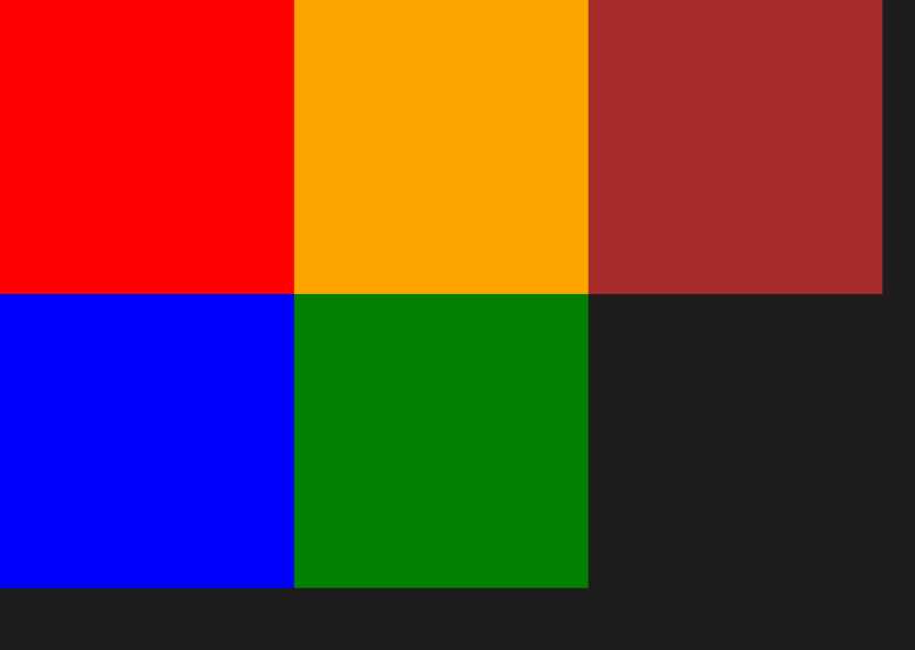
Figure 25: A set of Rectangle controls placed inside a VariableSizedWrapGrid control.
As default behavior, the nested items are split into rows. As you can see from the previous figure, the control has aligned the five rectangles into two rows. If you want to change this behavior and split items based on columns, it’s enough to set the Orientation property to Horizontal, like in the following sample:
Code Listing 92
<VariableSizedWrapGrid MaximumRowsOrColumns="2" ItemHeight="200" ItemWidth="200" Orientation="Horizontal"> <Rectangle Fill="Red" /> <Rectangle Fill="Blue" /> <Rectangle Fill="Orange" /> <Rectangle Fill="Green" /> <Rectangle Fill="Brown" /> </VariableSizedWrapGrid> |
ScrollViewer
The ScrollViewer control acts as a container like the previous controls, but it doesn’t try to arrange the layout of the nested controls. This means that it needs to be used in combination with other layout controls.
The ScrollViewer control is used when you need to display content that takes more space than the screen’s size. The following sample shows how to manage a long text that doesn’t fit the screen. Thanks to the ScrollViewer control, the user will be able to scroll the text down to keep reading it.
Code Listing 93
<ScrollViewer> <TextBlock TextWrapping="Wrap" Text="This can be a long text" /> </ScrollViewer> |
Border
The Border control, as the name says, can wrap nested controls inside a border. By using the BorderThickness and BorderBrush properties, you can set the border’s thickness and color. The following sample shows an Image control wrapped inside a red border, with a 5-pixel thickness:
Code Listing 94
<Border BorderThickness="5" BorderBrush="Red"> <Image Source="/Assets/Image.jpg"/> </Border> |
As default behavior, the BorderThickness value is applied to every side of the border. However, you can also customize it by specifying a different thickness for each side (in the following order: left, top, right, bottom), like in the following sample:
Code Listing 95
<Border BorderThickness="10, 15, 20, 15" BorderBrush="Red"> <Image Source="/Assets/Image.jpg"/> </Border> |

Figure 26: A Border control with a different thickness for each side.
With the goal of improving performance and reducing the number of controls you must add in the XAML tree, the November Update has added built-in support for borders for many layout controls like StackPanel or Grid. This way, for example, if you want to apply a border to a StackPanel, you don’t have to embed it into a Border control anymore like in the previous sample, you can leverage the BorderBrush and BorderThickness properties exposed directly by the control, like in the following sample:
Code Listing 96
<StackPanel BorderBrush="Red" BorderThickness="2"> <TextBlock Text="Text 1" /> <TextBlock Text="Text 2" /> </StackPanel> |
RelativePanel
All the controls we’ve seen so far should be familiar to you if you already have some previous development experience with XAML based technologies, like WPF, Silverlight, or Windows Store apps. The Universal Windows Platform has added a new layout control, which was born specifically to support adaptive layout scenarios, since it makes it easier to reposition controls placed on a page.
The control is called RelativePanel and takes its name from the fact that, for every child control, we can specify:
- The relationship between the control and the panel itself.
- The relationship between one control and the other.
The children controls are simply placed inside the RelativePanel one. Then you can leverage a set of attached properties to specify, for each control, its position in relation to the panel or other controls. Since they’re attached properties, you can simply use them with any control by using the syntax RelativePanel.NameOfTheProperty.
Let’s see an example of both approaches.
Relationships with the panel
The RelativePanel control allows you to define the position of the children controls relative to the panel itself. For example, you can specify that a control should always been aligned to the bottom or to the right side of the panel. This approach makes it easier to create adaptive layout experiences since, no matter what the size of the screen, the child control will always respect the relationship we’ve established. Let’s see a sample code:
Code Listing 97
<RelativePanel> <Button Content="Button 1" RelativePanel.AlignBottomWithPanel="True" RelativePanel.AlignLeftWithPanel="True" /> <Button Content="Button 2" RelativePanel.AlignBottomWithPanel="True" RelativePanel.AlignHorizontalCenterWithPanel="True" /> <Button Content="Button 3" RelativePanel.AlignBottomWithPanel="True" RelativePanel.AlignRightWithPanel="True" /> </RelativePanel> |
The RelativePanel control offers an attached property (bool type) that follows the naming convention AlignPositionWithPanel, where position is one of the different sides of the panel. In the previous code, you can see different samples. When the property RelativePanel.AlignBottomWithPanel is set to True, the control will be placed at the bottom side of the panel; when the RelativePanel.AlignHorizontalCenterWithPanel property is set to True, the control will be horizontally aligned in the center of the panel.
The advantage of this approach is that, since the position of the controls is relative to the panel, it doesn’t matter if the device the app is running on has a big or a small screen, the controls will always stick to the chosen position.
The following images show the previous XAML code in action:
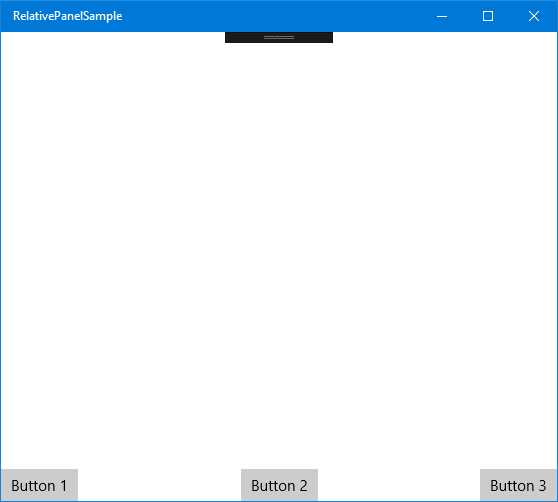
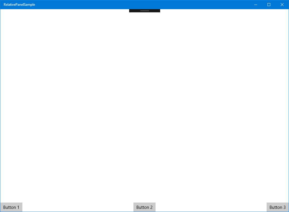
Figure 27: The controls inside the RelativePanel are positioned based on the relation with the panel itself.
As you can see from the two images, despite the application running in two windows with different sizes, the three buttons are always placed in the same position: one on the left, one in the middle, and one on the right. Additionally, all of them are placed on the bottom of the screen. If we are on a desktop and we start resizing the window, the three buttons will continue to respect the same position.
Relationships with other controls
Another powerful feature offered by the RelativePanel is the ability to define the positions of children controls in relation to other controls, using the name as a qualifier to identify the relation. Let’s see an example first:
Code Listing 98
<RelativePanel> <Rectangle x:Name="Rectangle1" RelativePanel.AlignHorizontalCenterWithPanel="True" Width="200" Height="200" Fill="Red" /> <Rectangle x:Name="Rectangle2" Fill="Yellow" Width="200" Height="200" RelativePanel.RightOf="Rectangle1" /> <Rectangle Fill="Green" x:Name="Rectangle3" Width="200" Height="200" RelativePanel.AlignHorizontalCenterWith="Rectangle1" RelativePanel.Below="Rectangle1" /> </RelativePanel> |
As you can see, we’re exploring two other different types of attached properties offered by the RelativePanel control. The first one is AlignPositionWith, which allows you to align a control in relation to another control’s position. In this sample, the Rectangle control identified by the name Rectangle3 is aligned horizontally based on the position of the control with name Rectangle1.
The other kind of supported relationship is related to the control’s position instead of the alignment. We can leverage attached properties like RelativePanel.Below, RelativePanel.RightOf, etc., to define that a control should be rendered in a specific place, based on the position of another control. In the previous sample, the Rectangle identified by the name Rectangle2 is placed to the right of the Rectangle identified by the name Rectangle1; additionally, the Rectangle3 control is placed below Rectangle1.
The image below shows the result of this code:
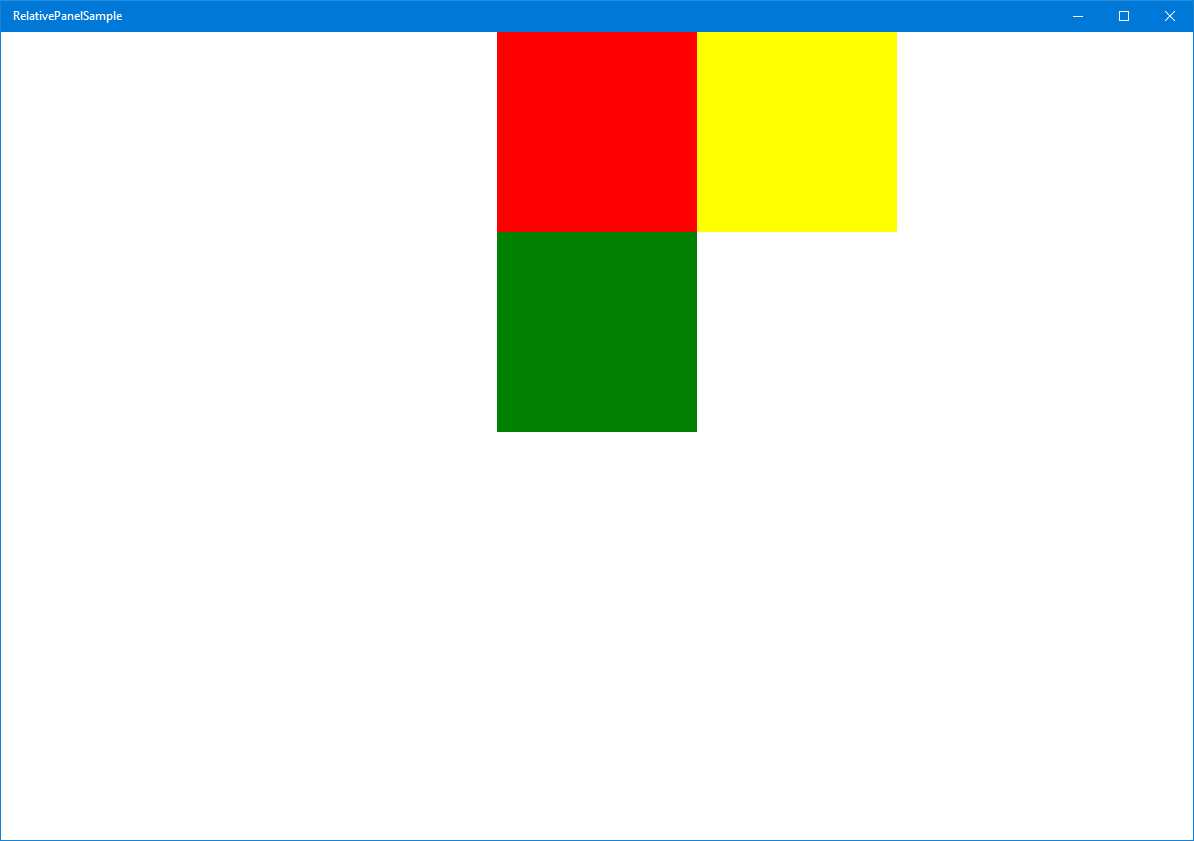
Figure 28: The controls inside the RelativePanel are positioned based on relationships with the other controls.
You’ll notice, also, that you have the freedom to mix both kinds of approaches. In the previous sample code, we’re leveraging the relationships both between the panel and the children controls (Rectangle1 is horizontally centered in the panel) and among the controls themselves (Rectangle2 is placed to the right of Rectangle1).
The freedom you have to change relationships among the controls inside a RelativePanel makes it a key control when it comes to adapting the layout of the application to different screens. As we’re going to see in detail when I talk more deeply about adaptive layout in the second book of the series, one of the most-used techniques is called reposition, which means that we move the position of the controls based on the size of the screen. For example, we could decide that, when the screen is small, the three rectangles should be displayed one below the other instead of in the current layout. This goal is very easy to achieve with the RelativePanel control, since it’s enough to change the relationships among the children (for example, every Rectangle could leverage the attached property RelativePanel.Below so that we can place all of them one below the other).
Output controls
In this category, we’ll see all the controls used to display information to the user, like texts, images, etc.
TextBlock
The TextBlock control is most widely used to display text on a page. The most important property is called Text and contains the text that will be displayed. In addition, you can customize the text’s look and feel, thanks to properties like FontSize (to change the dimensions) or FontStyle (to change the font’s type). Another property often used is called TextWrapping. When it’s set to Wrap, it makes sure that the text is wrapped in multiple lines in case it’s too long.
Code Listing 99
<TextBlock Text="This is a long text" TextWrapping="Wrap" /> |
Another interesting property is called TextTrimming. When this feature is enabled, if the text is too long, it will be automatically trimmed and ellipses will be added at the end, so the user can understand that the text is cut off. You can apply two types of trimming: CharacterEllipsis (the text is cut at character level) or WordEllipsis (the text is cut at word level).
Code Listing 100
<TextBlock Text="This is a trimmed text" TextTrimming="CharacterEllipsis" /> |
You also have the chance to apply different styles to various parts of the text without having to split it into multiple TextBlock controls, thanks to the Run control. It’s enough to add one or more Run controls inside a TextBlock control; each of them will contain a part of the text. You can also use the LineBreak control if you want to manually split the text into multiple lines.
Code Listing 101
<TextBlock> <Run Text="First line" /> <LineBreak /> <Run Text="Second line in bold" FontWeight="Bold" /> </TextBlock> |
RichTextBlock
The RichTextBlock control is a more powerful version of TextBlock, since it offers more flexibility to the developer. You’ll be able to create complex layouts by:
- Splitting the text into multiple paragraphs using the Paragraph control.
- Changing the style of a text portion using tags likes Bold, Italic, or Underline.
- Adding other XAML controls using the InlineUIContainer control.
Let’s see a sample XAML code:
Code Listing 102
|
<Paragraph> <Bold>This is a bold text</Bold> </Paragraph> <Paragraph> <Italic>This is an italic text</Italic> </Paragraph> <Paragraph> <Underline>This is an underlined text</Underline> </Paragraph> <Paragraph> <InlineUIContainer> <Image Source="/Assets/image.jpg" Width="200" /> </InlineUIContainer> </Paragraph> </RichTextBlock> |
The RichTextBlock control contains multiple Paragraph controls, each one with some text that is formatted in different ways. In addition, we’ve used the InlineUIContainer control to display an image at the bottom of the text.
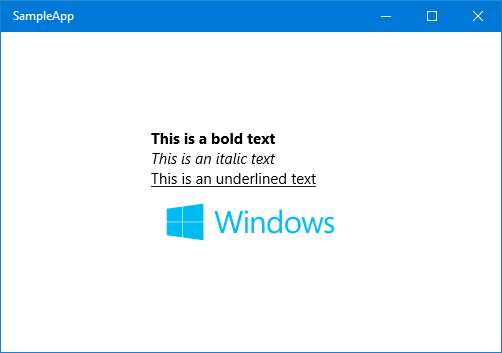
Figure 29: The RichTextBlock control.
Image
The Image control is used, as the name says, to display an image on a page. The image path is set using the Source property, which supports different kinds of sources. The image can be stored on a remote address, in the application’s package, or in the local storage. We’ll see in detail in the next book of the series the different ways we can access the various kinds of storages using a URL address.
The following sample code shows an Image control that displays a remote image:
Code Listing 103
<Image Source="http://www.website.com/image.png" /> |
The Image control also offers built-in support for the crop feature, so that you can easily display just a small part of the image. This feature is implemented using the Clip property, which accepts a RectangleGeometry control, defining the crop area, like in the following sample:
Code Listing 104
<Image Source="http://www.website.com/image.png"> <Image.Clip> <RectangleGeometry Rect="0, 0, 100, 100" /> </Image.Clip> </Image> |
The crop is defined with four values. The first two identify the X and Y coordinates of the area’s starting point (0,0 represents the top left corner of the image) while the other two represent the size of the crop area (in the sample, the rectangle’s size is 100x100).
Another important property is called Stretch, which is used to define how the image will fill the available space:
- Uniform: the default value, the image is resized to fit the control’s size by keeping the original ratio, so that it doesn’t look distorted.
- Fill: the image is stretched to use all the available space, even if it means ignoring the ratio and creating a distorted effect if the control has a different size.
- UniformToFill: a combination of the previous modes, the image is automatically cropped to create a new image that keeps the same ratio of the original one but still fills all the available space.
- None: the image is displayed using the original size, regardless of the size of the control.
Input controls
In this category, we’ll see in detail all the main controls that are used to receive input from the user.
TextBox and PasswordBox
The TextBox control is the simplest available to get text input from the user. It works in a similar way to the TextBlock control, except that the Text property isn’t used just to set the text to display, but also to grab the text inserted by the user.
A useful property offered by the control is called PlaceholderText. It defines a placeholder text that can be displayed inside the box as a hint for the users, so they can better understand what kind of input we’re expecting. As soon as the user starts to type text into the box, the placeholder text will disappear.
Another important scenario to keep in mind is that Universal Windows Platforms apps can be used on a device with a touch screen. In this case, instead of a real keyboard, the user will insert the text using a virtual keyboard. As developers, we have the chance to customize the virtual keyboard so that it’s optimized for the kind of input we’re asking for from the user. This customization is achieved using the InputScope property, which can assume many values, like:
- URL to display a keyboard optimized to enter web addresses.
- Number to display a keyboard optimized to enter numbers.
- EmailSmtpAddress to display a keyboard optimized to enter an email address.
We can also enable or disable the autocorrection feature (using the IsSpellCheckEnabled property) or the text prediction one, which suggests words to users while they’re typing on the keyboard (using the IsTextPredictionEnabled property).
Here is a sample code to define a TextBox control:
Code Listing 105
<TextBox IsSpellCheckEnabled="True" IsTextPredictionEnabled="True" PlaceholderText="Placeholder Text" Text="Input text" /> |
The Universal Windows Platform also offers a custom TextBox control called PasswordBox. It works exactly like a TextBox but, by default, it replaces the inserted text with dots so that other people who are looking at the screen can’t read it. As you can imagine, it’s perfect for scenarios where we’re asking for sensitive data, like passwords or credit card numbers. Since the text is automatically hidden, the PasswordBox control doesn’t offer as many ways to customize it as the TextBox control. The only important available option is called IsPasswordRevealButtonEnabled; when it’s set to True, it adds a button at the end of the box that, when it’s pressed, temporarily displays the text clearly so the user can check that they inserted the correct password.
DatePicker and TimePicker
The DatePicker and TimePicker controls are used to manage dates and times in an application.
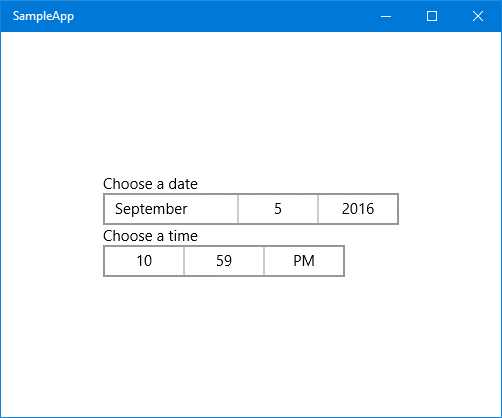
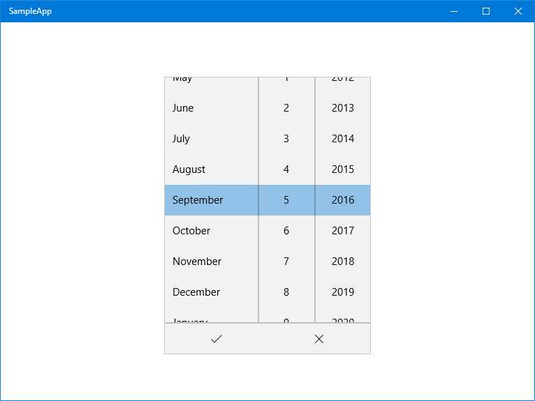
Figure 30: The top image shows both the DatePicker and the TimePicker controls. The bottom image shows the expanded DatePicker.
As default behavior, the DatePicker control displays all the date fields: the day, the month, and the year. It’s possible to hide one of them by using the properties called YearVisible, MonthVisible, or DayVisible. If one or more fields is hidden, the control will automatically return the current value to the application (so, for example, if you hide the year, the control will return the current year).
Code Listing 106
<DatePicker x:Name="Date" YearVisible="False" /> |
You can also define the date range by using the MinYear and MaxYear properties. This can be useful for many scenarios, for example, if you’re asking the user’s birthday; in this case, it would be useless to display years prior to 1900 or later than the current year. However, these properties can’t be set in XAML, only in code-behind, since their type is DateTimeOffset, which can’t be expressed in XAML.
Code Listing 107
protected override void OnNavigatedTo(NavigationEventArgs e) { DateTime minYear = new DateTime(1900, 1, 1); Date.MinYear = new DateTimeOffset(minYear); Date.MaxYear = new DateTimeOffset(DateTime.Now); } |
If you want to retrieve the date selected by the user in the code-behind, you need to use the Date property, like in the following sample, which shows the date using a pop-up message:
Code Listing 108
private async void OnGetDateClicked(object sender, RoutedEventArgs e) { DateTimeOffset selectedDate = Birthday.Date; MessageDialog dialog = new MessageDialog(selectedDate.ToString()); await dialog.ShowAsync(); } |
The TimePicker control works in a similar way but, unlike the DatePicker one, it’s composed of only two elements: hours and minutes. You can customize the time range using the MinuteIncrement property. This way, instead of displaying all the possible values for the minute field (from 0 to 59), it will show only the specified range.
Let’s look at, for example, the following implementation:
Code Listing 109
<TimePicker MinuteIncrement="15" /> |
By using the previous XAML code, the minute drop-down will display just the values 00, 15, 30, and 45.
The value selected by the user in the TimePicker control is stored in the Time property using a TimeSpan object. The following sample shows a method that displays the selected time converted into hours to the user using a pop-up message:
Code Listing 110
private async void OnGetDateClicked(object sender, RoutedEventArgs e) { TimeSpan timeSpan = StartTime.Time; MessageDialog dialog = new MessageDialog(timeSpan.TotalHours.ToString()); await dialog.ShowAsync(); } |
Both controls also support setting a header, which is displayed above the control, by leveraging the Header property.
CalendarDatePicker and CalendarView
CalendarDatePicker and CalendarView are two new controls added in Windows 10 that make it easier for developers to work with dates.
The goal of the CalendarDatePicker is the same as the DatePicker we’ve previously seen. It allows the user to choose a date. However, in this case, it offers a more pleasant user experience. We can’t limit the user selection to just the subset of info that comprise a date (like just the day and the month) because it displays a full calendar view, like the one you see when you click on the current date and time in the Windows 10 taskbar.
By default, the control displays just a placeholder that invites the user to select a date (which can be customized using the Placeholder property). Once the user taps on it, the control displays the full calendar below the placeholder, as you can see in the following image.
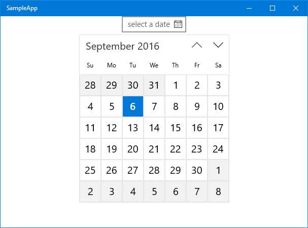
Figure 31: The CalendarDatePicker control.
The control can be customized in multiple ways and even deeply restyled thanks to the CalendarViewStyle property. A couple of additional interesting options to customize it are:
- DisplayMode: can be set to Year, Decade, or Month. By default, the calendar picker opens, displaying the current month with all its days. By changing this property to another value, you can change the startup experience. For example, by setting it to Year, the calendar will open and display a list of the latest years, and then will switch to the monthly view only once the user has chosen a specific year.
- IsTodayHighlighted: a bool property that, when set to True, automatically highlights the current day in the calendar. This property is enabled by default and you can see an example in the previous image.
- IsOutOfScopeEnabled: another bool property enabled by default. When it’s set to True, all the items out of scope from the current selection are displayed with a different background. Also in this case, the previous image shows a real example. Since September is the selected month, all the days that belong to the previous (August) or the next (October) months are displayed with a gray background instead of a white one.
From an interaction point of view, the CalendarDatePicker control works in a very similar way to the DatePickerOne. You can restrict the displayed date range by leveraging the MinDate and MaxDate properties and, from code-behind, you can get the selected date using the Date property.
Here is a sample XAML code on how to insert it into your pages:
Code Listing 111
<CalendarDatePicker DisplayMode="Month" IsTodayHighlighted="True" IsOutOfScopeEnabled="True" /> |
The CalendarView control, from a user experience point of view, offers the same UI as the CalendarDatePicker one, with many customization options in common (like the opportunity to highlight the current day or to change the background color of out-of-scope days).
However, it isn’t meant to be just a simple selector. In fact, there are some major differences:
- By default, the CalendarDatePicker displays just a selector and the full calendar is displayed only when the user taps on it. The CalendarView, instead, always shows the full calendar.
- The CalendarView offers a deep way to customize every part of the calendar, like the style of the out-of-scope days, of the current day, etc.
- By leveraging the SelectionMode property, you can allow users to select multiple dates instead of just one.
Due to these differences, the way you retrieve the selected date is also different:
- Since the user can choose multiple dates, they are all stored in a property called SelectedDates, which is a collection. In cases of single selection, it will contain just one element.
- If you want to intercept when the user has selected one or more dates, you can leverage the SelectedDatesChanged event.
The following sample shows how to declare in XAML a CalendarView control that invokes the SelectedDatesChanged event every time the user clicks on a date:
Code Listing 112
<CalendarView x:Name="Calendar" SelectedDatesChanged="OnSelectedDates" /> |
Here is, instead, how the definition of the event handler looks:
Code Listing 113
private async void OnSelectedDates(CalendarView sender, CalendarViewSelectedDatesChangedEventArgs args) { DateTimeOffset selectedDate = Calendar.SelectedDates.FirstOrDefault(); MessageDialog dialog = new MessageDialog(selectedDate.ToString("d")); await dialog.ShowAsync(); } |
By leveraging the SelectedDates property exposed by the CalendarView control, we simply retrieve the first result in the collection (by default, the control is configured to support single date selection) and we display it to the user with a dialog using the MessageDialog class.
Another important feature offered by CalendarView control is that we can customize the look and feel of each day based on our logic. For example, if we are writing a birthday reminder application, we could highlight in a different way the days in which one of our friends has a birthday. To reach this goal, we need to leverage another event offered by the control called CalendarViewDayItemChanging, which is triggered every time the XAML tree is rendering one of the visible calendar’s cells.
Code Listing 114
<CalendarView x:Name="Calendar" CalendarViewDayItemChanging="OnCalendarViewDayItemChanging" /> |
Here is what the event handler looks like:
Code Listing 115
private void OnCalendarViewDayItemChanging(CalendarView sender, CalendarViewDayItemChangingEventArgs args) { if (args.Item.Date.Date == new DateTimeOffset(new DateTime(2016, 9, 10))) { args.Item.Background = new SolidColorBrush(Colors.Red); } } |
As you’ll notice, the event handler includes a parameter of the CalendarViewDayItemChangingEventArgs type, and contains a property called Item, a CalendarViewDayItem type. This object represents the cell that is being rendered and, as such, contains all the information about it, both from a visual (like the background or the font size) and a logic (like the represented date) point of view.
This being the case, we can combine both kinds of information to achieve our goal. In the previous example, we use the Date property to check if the current rendered date is a special one that we need to handle (for example, it’s the birthday of a friend) and then we can leverage the UI properties to change its look and feel (in this sample, we leverage Background to change the color to red using a SolidColorBrush).
The following image shows you the result, assuming that 10 Sept., 2016, is the special date we want to highlight. Of course, a real application would have a more complex logic, so we would probably have to handle not just one date, but a list of them, and they would be stored in a more complex infrastructure, like a database or a REST service.

Figure 32: The CalendarView controls shows a date with a different look and feel than the others.
Button and ToggleButton
The Button control is the simplest one available to interact with a user. When it’s pressed, it raises the Click event, which you can manage in code-behind. The button’s content is defined by the Content property, which can contain a simple text, like in the following sample:
Code Listing 116
<Button Content="Click me" Click="OnButtonClicked" /> |
However, the Content property can also be expressed with the extended syntax. In this case, you can use any XAML control to define the button’s layout. The following sample shows how to define a Button control using an image:
Code Listing 117
<Button Click="OnButtonClicked"> <Button.Content> <Image Source="image.png" /> </Button.Content> </Button> |
The Universal Windows Platform also offers another kind of button control, called ToggleButton. It works and behaves like a regular button, but it’s able to manage two different kind of states: enabled and disabled. Consequently, the control also offers a property called IsChecked, of the bool type. When the button is enabled, its value is true; otherwise, the value is false.
The following sample code shows a simple usage of the control:
Code Listing 118
<ToggleButton Content="This is a CheckedButton" IsChecked="True" /> |

Figure 33: The two different states that a ToggleButton control can assume.
RadioButton and CheckBox
The RadioButton and CheckBox controls are very similar and are both used to offer multiple choices to the user. They share many features, like:
- The text displayed near the control is set using the Content property.
- To check if the control has been selected, you need to use the IsChecked property.
- If you want to intercept when the user taps on the control, you can use the Checked and Unchecked events.
The biggest difference between the RadioButton and CheckBox controls is that the former can be defined as part of a group. In this case, the user will be able to enable only one of them. If they try to enable another one, the previously enabled control will be automatically deactivated. The CheckBox control doesn’t apply this logic: the user can enable as many of them as they like.
The RadioButton’s grouping is achieved using the Group property. By assigning to a set of RadioButton controls the same value, the user will be able to enable just one of them at a time. Here is a sample on how to use both controls:
Code Listing 119
<StackPanel> <CheckBox Content="First option" /> <CheckBox Content="Second option" /> <CheckBox Content="Third option" />
<RadioButton Content="First option" GroupName="Options" /> <RadioButton Content="Second option" GroupName="Options" /> <RadioButton Content="Third option" GroupName="Options" /> </StackPanel> |
Inking
One of the most innovative features of Windows 10, which has been expanded release by release, is inking support. Most of the 2-in-1 devices available on the market (like the Surface Pro) support digital pens so that the user can write on the screen of her device like she would do on a sheet of paper. The Universal Windows Platform includes a set of controls and APIs to add inking support in your application.
The basic one is called InkCanvas and it’s simply a canvas where the user, using a digital pen, can write and draw anything. Adding it in a page is simple, as you can see in the following sample:
Code Listing 120
<StackPanel> <InkCanvas x:Name="Ink" Width="1200" Height="500" /> </StackPanel> |
The InkCanvas control includes a property called InkPresenter, which is fundamental to configure the behavior of the canvas. By default, the InkCanvas control works only with a digital pen (like the one that comes with the Surface Pro). If you try to draw something with your finger or with a mouse, nothing will happen. However, you can change this behavior thanks to the InputDeviceTypes property of the InkPresenter object, like in the following sample:
Code Listing 121
protected override void OnNavigatedTo(NavigationEventArgs e) { Ink.InkPresenter.InputDeviceTypes = CoreInputDeviceTypes.Mouse | CoreInputDeviceTypes.Pen | CoreInputDeviceTypes.Touch; } |
With the previous code, when the page is loaded, we allow the user to draw on the canvas with any supported method: pen, mouse, and touch screen. However, as we’re going to see in the next sections, the InkPresenter is much more than just a way to configure the InkCanvas control. It’s the primary access to interact with the canvas and to perform advanced operations.
Storing the content of the canvas in an image
One of the InkPresenter features allows you to save the content of an InkCanvas control into a GIF image. The InkPresenter object, in fact, grants access to all the available strokes, which is everything that has been drawn into the canvas. To achieve this, we have added a button to the page whose Click event is connected to the following event handler:
Code Listing 122
private async void OnSaveImage(object sender, RoutedEventArgs e) { IReadOnlyList<InkStroke> strokes = Ink.InkPresenter.StrokeContainer.GetStrokes(); if (strokes.Count > 0) { FileSavePicker savePicker = new FileSavePicker(); savePicker.SuggestedStartLocation = PickerLocationId.PicturesLibrary; savePicker.FileTypeChoices.Add( "GIF", new List<string> { ".gif" }); savePicker.DefaultFileExtension = ".gif"; savePicker.SuggestedFileName = "InkSample"; // Show the file picker. StorageFile file = await savePicker.PickSaveFileAsync(); if (file != null) { IRandomAccessStream stream = await file.OpenAsync(FileAccessMode.ReadWrite); // Write the ink strokes to the output stream. using (IOutputStream outputStream = stream.GetOutputStreamAt(0)) { await Ink.InkPresenter.StrokeContainer.SaveAsync(outputStream); await outputStream.FlushAsync(); } stream.Dispose(); } } } |
The first step is to check if the user has actually drawn something in the canvas. We do this by using the InkPresenter object and by calling the GetStrokes() method of the StrokesContainer property. This method will return a collection of all the strokes drawn in the canvas. We move on with the saving procedure only if the collection actually contains at least one element.
The rest of the code leverages the Storage APIs to ask the user where they want to save the image file and to effectively write the content of the canvas in the file’s stream. In this chapter, I won’t describe in detail the usage of the storage APIs, like FileSavePicker or StorageFile, but they will be the main topic of one of the chapters of the second book. For this demo, you just need to know two important things:
- The FileSavePicker API allows the user to choose a folder in which to save a file. With this approach, the user will be able to choose a folder and a name to which he can save the content of the canvas. The default options (configured using the SuggestedStartLocation and SuggestedFileName properties) are to create a file called InkSample.gif inside the Pictures library of the computer.
- The StorageFile class, the OpenAsync() method, and the IRandomAccessStream interface are used to get write access to the stream of the file selected by the user, so that we can store the content of the canvas.
We again use the InkPresenter object when we are ready to write the data into the file selected by the user. The StrokeContainer property offers another method called SaveAsync(), which requires as parameter the stream to write the data to.
At the end of the operation, we will have on our device a GIF file with the content of the InkCanvas control, no matter if it was a drawing, a text, etc.
Recognizing text and shapes
The InkCanvas control can be used to write not just drawings, but also text and shapes. The Creators Update has added a new class called InkAnalyzer to perform ink recognition, so that the control can interpret the handwriting of the user and decode it into text or shapes.
To accomplish this task, I’ve added to the page a couple of additional controls: a Button to perform the recognition and a couple of TextBlock controls to display the number of identified results and the list of them.
Code Listing 123
<StackPanel Margin="12"> <InkCanvas x:Name="Ink" Width="1200" Height="500" /> <Button Content="Recognize" Click="OnRecognizeInk" /> <TextBlock x:Name="Results" /> </StackPanel> |
Here is the code that is invoked when the user clicks on the Button control:
Code Listing 124
private async void OnRecognizeInk(object sender, RoutedEventArgs e) { InkAnalyzer analyzer = new InkAnalyzer(); var strokes = Ink.InkPresenter.StrokeContainer.GetStrokes(); if (strokes.Count > 0) { analyzer.AddDataForStrokes(strokes); var result = await analyzer.AnalyzeAsync(); if (result.Status == InkAnalysisStatus.Updated) { Results.Text = analyzer.AnalysisRoot.RecognizedText; } } } |
Recognition is performed by the InkAnalyzer class, which belongs to the Windows.UI.Input.Inking.Analysis namespace. First you need to load, inside the object, the strokes you want to recognize, by calling the AddDataForStrokes() method. In the previous sample, we can get the collection of all the strokes drawn by the user by calling the GetStrokes() method on the StrokeContainer collection of the InkPresenter object.
Then we call the AnalyzeAsync() method and, if we get in the Status property of the result that something has changed (thanks to the InkAnalysysStatus enumerator), we can access to the AnalysisRoot.RecognizedText property to get the text that has been identified.
The most interesting thing of this method is that it can recognize not just texts, but also shapes, as you can see from the following image:
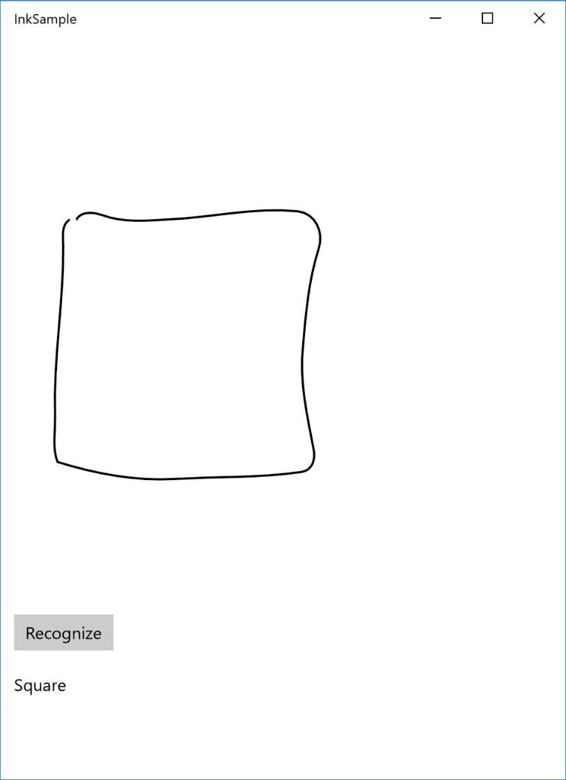
Figure 34: An InkCanvas with a square and, below, the name of the shape identified using the InkAnalysis class
Empowering the canvas with the InkToolbar
The Anniversary Update has added a new control that makes it easier to create a richer experience for the user by providing a set of tools to perform advanced operations with the InkCanvas control, like changing the stroke color, using a ruler, etc. It’s a very powerful control, yet very simple to add, as you can see in the following sample:
Code Listing 125
<StackPanel> <InkToolbar TargetInkCanvas="{x:Bind Ink}" /> <InkCanvas x:Name="Ink" Width="1200" Height="500" /> </StackPanel> |
As you can see, it’s enough to add an InkToolbar control in the page and, by using the x:Bind markup expression we’ve learned in the previous chapter, we specify the name of the InkCanvas control we want to connect. That’s all! Now the users will see a toolbar that will allow them to customize the drawing experience, like:
- Changing the color and the thickness of the pen.
- Using different kinds of pencils.
- Drawing straight lines using a drawer, which can be moved around the canvas using your fingers.
The following image shows the InkToolbar placed at the top of the canvas:

Figure 35: The InkToolbar control allows advanced customization of the drawing experience.
Show the operation status
A very common requirement when you develop an application is to show to the user the status of an operation in progress. We need to notify them that something is going on and, until the operation is finished, the application may not be fully ready to use. The Universal Windows Platform includes two controls to achieve this goal.
ProgressRing
The ProgressRing control is used for loading operations that are preventing the user from interacting with the application. Until the operation is finished, there isn’t anything else for the user to do, so they just need to wait (for example, a news reader is loading the latest news and, until the operation is completed, the user doesn’t have any content to interact with). The control simply displays a spinning ring, which will notify the user that an operation is in progress.
Using this control is very simple. The animation is controlled by the IsActive property, which is a bool type. When its value is true, the progress ring will spin; when it’s false, the progress ring will be hidden. Typically, you’re going to show it before the operation starts; then, you’ll hide it once the job is finished. Here is a sample XAML declaration of this control:
Code Listing 126
<ProgressRing x:Name="Progress" /> |
Here is, instead, how you ideally manage a loading operation in code (for example, downloading some data from Internet) using a ProgressRing control:
Code Listing 127
protected override void OnNavigatedTo(NavigationEventArgs e) { Progress.IsActive = true; //start loading the data Progress.IsActive = false; } |
ProgressBar
The ProgressBar control, unlike the ProgressRing, can be used in scenarios where the operation happens in the background and the user can keep interacting with the application even while the operation is in progress. The ProgressBar control is rendered with a bar that is filled using the Value property. You can assign a numeric value from 0 (empty bar) to 100 (full bar). This feature also makes the control useful for operations where you can estimate its status, like downloading a file from the Internet.
For example, during a download operation you can determine how many bytes have been downloaded of the total file size and calculate the percentage to set in the Value property. This way, the user can be continuously updated on the download status.
Otherwise, the ProgressBar control can be used to notify the user that an operation is in progress without displaying the exact status. By setting the IsIndeterminate property to true, the bar will be replaced by a series of dots that will continuously move from the left to the right of the screen. This way, you’ll achieve a user experience closer to the one offered by the ProgressRing control:
Code Listing 128
<ProgressBar x:Name="Progress" IsIndeterminate="True" /> |
Displaying collections of data
One of the most common requirements in mobile applications is to display a collection of data. We’ve already seen in Chapter 2 how this scenario can be easily implemented using binding and data templates. In this section, we’ll see the most important controls available in the Universal Windows Platform to display collections.
GridView and ListView
GridView and ListView are the two controls most used to display data collections in Universal Windows Platform apps, since they’re both able to provide a look and feel that is consistent with the platform’s guidelines. Both controls offer the same features and properties. The main difference is that the GridView control can be scrolled horizontally, using a grid structure; the ListView control, instead, is rendered using a traditional list that the user can scroll from top to bottom.
Showing flat collections
The simplest way to use these controls is to display flat data collections. In this case, they behave like every other standard control to display lists, which means:
- You need to define a DataTemplate for the ItemTemplate property, which defines the layout used to render each element of the collection.
- You need to assign the data collection you want to display to the ItemsSource property.
You need to manage the item selected by the user using one of the ways that will be detailed later. The following XAML code shows a sample definition of a flat collection displayed with a ListView control:
Code Listing 129
<ListView x:Name="List" SelectionChanged="List_OnSelectionChanged"> <ListView.ItemTemplate> <DataTemplate> <StackPanel> <TextBlock Text="{Binding Path=Name}" /> <TextBlock Text="{Binding Path=Surname}" /> </StackPanel> </DataTemplate> </ListView.ItemTemplate> </ListView> |
The ItemTemplate of this list is configured to display a collection of objects with two properties called Name and Surname. Here is a sample definition of this object:
Code Listing 130
public class Person { public string Name { get; set; } public string Surname { get; set; } } |
And here is how, in the code-behind, we create a sample collection of Person objects and we assign it to the ListView control:
Code Listing 131
protected override void OnNavigatedTo(NavigationEventArgs e) { List<Person> people = new List<Person> { new Person { Name = "Matteo", Surname = "Pagani" }, new Person { Name = "Angela", Surname = "Olivieri" } }; List.ItemsSource = people; } |
The GridView control is widely used in Universal Windows Platform apps because it makes it easier to create adaptive layout experiences. The control is able, in fact, to automatically implement a reflow experience, which means that the items are automatically moved to new rows or moved back to the original row based on the size of the screen.
This approach is clearly visible when you launch your application on a desktop. As soon as you start resizing the window, you will notice that the items will move back and forth based on the available space, helping you to always deliver a great user experience, no matter which device is running the app.
Showing grouped collections
One of the most interesting features offered by ListView or GridView controls is grouped collections support. You’ll be able to display a collection of data grouped in different categories. The user will be able, other than just scrolling through the list, also to quickly jump from one category to another.
Many native Windows 10 applications take advantage of this approach. For example, if you open the People application, you will notice that contacts are grouped in different categories based on the initial letter of the name. By tapping on a letter, a new view that displays all the available letters is opened, so that the user can quickly jump from one group of contacts to another.
Let’s see a real example by changing the Person class we’ve previously defined a bit:
Code Listing 132
public class Person { public string Name { get; set; } public string Surname { get; set; } public string City { get; set; } } |
We’ve added a new property called City; we’ll use it to group our collection of people by the city where they live.
To achieve our goal. we need to introduce a new class offered by the Windows Runtime, called CollectionViewSource, which acts as a proxy between the data collection and the control that will display it (in our case, a GridView or a ListView control). Instead of connecting the ItemsSource property of the control directly to our collection, we’ll connect it to this proxy object, which offers many advanced features, like automatic grouping support.
The CollectionViewSource can be defined in XAML as a regular resource. The following sample shows a CollectionViewSource object defined as page resource:
Code Listing 133
<Page.Resources> <CollectionViewSource x:Name="People" IsSourceGrouped="True" /> </Page.Resources> |
As you can see, thanks to the IsSourceGrouped property, we can easily specify that the data stored in this collection will be grouped. The next step is to connect our data to this proxy class. The procedure is like the one we’ve seen for a flat list, except that this time we need to specify the group criteria. We can easily do this thanks to LINQ and to the GroupBy() extension. Here is an example:
Code Listing 134
protected override void OnNavigatedTo(NavigationEventArgs e) { List<Person> people = new List<Person> { new Person { Name = "Matteo", Surname = "Pagani", City = "Como" }, new Person { Name = "Ugo", Surname = "Lattanzi", City = "Milan" }, new Person { Name = "Roberto", Surname = "Freato", City = "Milan" }, new Person { Name = "Massimo", Surname = "Bonanni", City = "Rome" } }; var groups = people.GroupBy(x => x.City); People.Source = groups; } |
We’ve grouped the collection by the property called City by applying the GroupBy() extension method to the original collection. Then, we’ve assigned the resulting grouped collection to the Source property of the CollectionViewSource object we previously defined as resource in the page.
We’re done working on the code. However, our goal is not achieved yet, since we need to define the visual layout of the collection. By default, in fact, neither the GridView nor the ListView control know how to visually display the groups. The ItemTemplate property defines what a single item will look like, but not how the entire group will be rendered. Consequently, we need to apply some changes to the XAML definition of the control.
The following sample shows a GridView control configured to display our grouped collection:
Code Listing 135
<GridView ItemsSource="{Binding Source={StaticResource People}}"> <GridView.ItemTemplate> <DataTemplate> <StackPanel> <TextBlock Text="{Binding Path=Name}" /> <TextBlock Text="{Binding Path=Surname}" /> </StackPanel> </DataTemplate> </GridView.ItemTemplate> <GridView.GroupStyle> <GroupStyle HidesIfEmpty="True"> <GroupStyle.HeaderTemplate> <DataTemplate> <Border Background="LightGray"> <TextBlock Text="{Binding Key}" Foreground="Black" Margin="10" FontSize="22"/> </Border> </DataTemplate> </GroupStyle.HeaderTemplate> </GroupStyle> </GridView.GroupStyle> </GridView> |
The first thing you’ll notice is that we’re setting the ItemsSource property in a different way. Since the CollectionViewSource object has been defined as resource, we assign it using the StaticResource markup extension.
Then we need to set up the different visual styles of the list:
- The first one shouldn’t be a surprise: as we have done to manage a flat list, we define the ItemTemplate, the template used to render every single item of the collection. We’re using the same one we’ve previously seen that displays the name and the surname of the person.
- The second one is the GroupStyle element, which defines the behavior of the group. By setting the HidesIfEmpty property to True, we make sure that a group isn’t displayed if there are no elements in it. In our case, we don’t want the Milan group to be displayed if there are no people from Milan in the collection.
- The GroupStyle control offers an important property called HeaderTemplate. It’s the template used to render the group header displayed at the beginning of each group. This goal is achieved by adding a TextBlock control connected to the Key field. What is it? When we’ve grouped the collection using the GroupBy() method, we’ve basically created another collection with one element for each group (the user’s city). Each element contains the list of items that belong to the group (the people who live in that city) and a key (the Key property) with the name of the group. With this DataTemplate, we’ll simply display a text with the name of the city, followed by the list of people who live there.
The following image shows how the previous code is rendered in a real application.

Figure 36: A grouped GridView.
As mentioned previously, the ListView control works in exactly the same way. By simply changing the previous code by replacing all the references to the GridView control, we will be able to turn the grid into a traditional vertical list, like in the following image.

Figure 37: A grouped ListView
As you can see, the orientation difference is applied not to the groups, but to the elements inside them. In both cases, the groups are displayed vertically, one below the other. However, the elements inside (each Person object) are placed horizontally or vertically, based on the control’s type.
If we also want to change the orientation of the groups, we need to change the ItemsPanel of the control, the panel used to render each group. For this scenario, we can leverage the ItemWrapGrid panel, which allows us to automatically split the groups into multiple rows and columns, based on the kind of orientation we want to leverage.
Here is what our updated XAML code looks like:
Code Listing 136
<GridView ItemsSource="{Binding Source={StaticResource People}}"> <GridView.ItemTemplate> <DataTemplate> <StackPanel Width="200"> <TextBlock Text="{Binding Path=Name}" /> <TextBlock Text="{Binding Path=Surname}" /> </StackPanel> </DataTemplate> </GridView.ItemTemplate> <GridView.ItemsPanel> <ItemsPanelTemplate> <ItemsWrapGrid MaximumRowsOrColumns="3" /> </ItemsPanelTemplate> </GridView.ItemsPanel> <GridView.GroupStyle> <GroupStyle HidesIfEmpty="True"> <GroupStyle.HeaderTemplate> <DataTemplate> <Border Background="LightGray"> <TextBlock Text="{Binding Key}" Foreground="Black" Margin="10" FontSize="22"/> </Border> </DataTemplate> </GroupStyle.HeaderTemplate> </GroupStyle> </GridView.GroupStyle> </GridView> |
Highlighted in yellow, you can see the new property we have added. We have set the ItemsPanel property of the GridView control by leveraging as template the ItemsWrapGrid control. With the MaximumRowsOrColumns number we can specify the maximum number of rows or columns we want to display before the control starts splitting the groups into a new row or column.

Figure 38: A GridView using an ItemsWrapGrid as the panel’s template.
Handling the item selection
The most common requirement when you work with a collection of data is to manage selection. The user taps on an item and we want to detect which has been selected so that we can perform additional operations (like redirecting the user to a detail page). There are four ways to manage selection and you can choose your favorite one by setting the SelectionMode property:
- Single: the default mode, the user can select only one item, which is highlighted until another item is selected.
- Multiple: this mode allows the user to select multiple items. Every time they tap on an item, it’s automatically added to the list of selected items.
- Extended: a combination of the previous two modes. The single tap triggers a standard selection, while a right-click with the mouse will add it to the list of selected items.
- None: disables the selection. No items can be selected and the SelectionChanged event is not triggered.
Except for the last one, these modes always trigger the SelectionChanged event when the user taps on one item. The only difference is that, in the case of single selection, we can use just the SelectedItem property of the control, which contains the selected item. Otherwise, in cases of multiple selection, we can use the SelectedItems property, a collection that contains all the flagged items.
The following sample shows how to use the SelectedItem property when the SelectionChanged event is triggered to display the name of the selected person with a pop-up:
Code Listing 137
private async void List_OnSelectionChanged(object sender, SelectionChangedEventArgs e) { Person selectedPerson = List.SelectedItem as Person; if (selectedPerson != null) { MessageDialog dialog = new MessageDialog(selectedPerson.Name); await dialog.ShowAsync(); } } |
It’s important to highlight that, since the GridView or ListView controls can display any collection of data, the SelectedItem property is a generic object. Before accessing its properties, we need to cast it to the type we’re expecting (in our case, it’s a collection of Person objects).
The following sample shows a similar scenario, but with multiple selection enabled. In this case, we display to the user the number of items they selected in the list.
Code Listing 138
private async void List_OnSelectionChanged(object sender, SelectionChangedEventArgs e) { int selectedItems = List.SelectedItems.Count; MessageDialog dialog = new MessageDialog(selectedItems.ToString()); await dialog.ShowAsync(); } |
The GridView and ListView controls also offer an alternative way to manage the selection, which is useful when we don’t have to perform any special operation on the selected item, but just want, for example, to redirect the user to another page when the item is clicked. In this mode, the items are treated like buttons. When you tap on one of them, an event called ItemClick will be triggered and it will contain, as parameter, the item that has been selected.
To enable this mode, you’ll have to set the IsItemClickEnabled property to True and then subscribe to the ItemClick event. Usually, when you enable this mode, it’s also useful to set the SelectionMode to None, to avoid overlapping the two selection modes and to avoid having both the ItemClick and the SelectionChanged events triggered.
Managing the ItemClick event in the code-behind is easy, as you can see in the following sample:
Code Listing 139
private async void List_OnItemClick(object sender, ItemClickEventArgs e) { Person person = e.ClickedItem as Person; if (person != null) { MessageDialog dialog = new MessageDialog(person.Name); await dialog.ShowAsync(); } } |
The event handler’s parameter (an ItemClickEventArgs type) contains a property called ClickedItem, with a reference to the selected item. As usual, since the control can display any type of data, the ClickedItem property contains a generic object, so we need to perform a cast before using it.
Semantic Zoom
The Semantic Zoom is a feature that is part of the native experience delivered by Windows and that offers to the users two different ways to browse a collection of data. There’s a traditional one, with all the details (like the one we’ve just seen talking about the GridView and ListView controls), and a “high level” one, which gives the users a glance at all the available groups, allowing them to quickly jump from one to another.
The Universal Windows Platform’s SemanticZoom control is easy to understand:
Code Listing 140
<SemanticZoom> <SemanticZoom.ZoomedInView> <!-- standard visualization --> </SemanticZoom.ZoomedInView> <SemanticZoom.ZoomedOutView> <!-- groups visualization --> </SemanticZoom.ZoomedOutView> </SemanticZoom> |
The SemanticZoom control can manage two different statuses, represented by two specific properties. ZoomedInView defines the layout that displays the traditional list with all the details. ZoomedOutView defines the layout that displays all the groups. Inside these properties, you can’t define any arbitrary XAML. Only controls that support the ISemanticZoomInformation interface can properly work with this feature. The Windows Runtime offers three native controls that support this interface: GridView, ListView, and Hub.
When it comes to managing the ZoomedInView, it’s no different from what we’ve learned about the GridView or the ListView controls. In this view, we need to manage the traditional list, so we’re going to create a collection of data, define it as a CollectionViewSource object and connect it to the ItemsSource property of the control. The ZoomedInView property will contain a block of XAML code like the following one:
Code Listing 141
<Page.Resources> <CollectionViewSource x:Name="People" IsSourceGrouped="True" /> </Page.Resources> <SemanticZoom> <SemanticZoom.ZoomedInView> <GridView ItemsSource="{Binding Source={StaticResource People}}"> ... </GridView> </SemanticZoom.ZoomedInView> </SemanticZoom> |
As you can see, the GridView control is simply connected to the CollectionViewSource object, which has been defined as a page resource.
The ZoomedOutView, however, needs to be managed in a different way. When it’s enabled, we don’t need to display all the items in the collection, but just the groups the data is divided into. To achieve our goal, the CollectionViewSource offers a property called CollectionGroups, which contains all the groups the data is split into. Do you remember the sample we saw previously with a list of people grouped by the city they live in? In our case, the CollectionGroups property will contain just the list of cities.
Here is how a sample definition of the ZoomedOutView property looks:
Code Listing 142
<SemanticZoom> <SemanticZoom.ZoomedOutView> <ListView ItemsSource="{Binding Source={StaticResource People}, Path=CollectionGroups}"> ... </ListView> </SemanticZoom.ZoomedOutView> </SemanticZoom> |
We’re using, again, a ListView control to display the list of groups but, instead of binding the ItemsSource property directly with the CollectionViewSource object, we bind it to the specific CollectionGroups property.
The last step is to define the visual layout of the ZoomedOutView mode. We’re using a standard ListView control, so we simply need to define the ItemTemplate property with a proper DataTemplate, like in the following sample:
Code Listing 143
<SemanticZoom> <SemanticZoom.ZoomedOutView> <ListView ItemsSource="{Binding Source={StaticResource People},Path=CollectionGroups}"> <ListView.ItemTemplate> <DataTemplate> <Border Background="LightGray" Width="300" Padding="5"> <TextBlock Text="{Binding Group.Key}" Foreground="Black" TextAlignment="Center" FontSize="22" /> </Border> </DataTemplate> </ListView.ItemTemplate> </ListView> </SemanticZoom.ZoomedOutView> <SemanticZoom.ZoomedInView> <GridView ItemsSource="{Binding Source={StaticResource People}}"> ... </GridView> </SemanticZoom.ZoomedInView> </SemanticZoom> |
It’s a standard DataTemplate: the only thing to highlight is that the TextBlock control is connected to a property called Group.Key, which contains the name of the group that we want to display (in our case, the city).
The following image shows what happens in the app when you zoom out from the standard list:
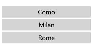
Figure 39: The group list displayed using the SemanticZoom control.
FlipView
The FlipView control offers another way to display a collection of items that is useful when you want to focus the user’s attention on the selected item, like in a photo gallery. In fact, when you use the FlipView control, only the selected item is visible and it occupies all the available space. The user needs to swipe to the left or right (or use the buttons that are displayed on both sides of the screen when the app is running on a device with mouse and keyboard) to display the other items in the collection.
Except for this difference, the FlipView control behaves like a GridView or ListView control:
- You need to set the ItemTemplate property to define the layout of the selected item.
- You need to assign the collection of items to the ItemsSource property.
You can subscribe to the SelectionChanged event to be notified every time the user swipes to the left or right to display another item. If you need to discover which item is currently displayed, you can use the SelectedItem property.
The following XAML code shows a sample definition of a FlipView control used to display an images gallery:
Code Listing 144
<FlipView x:Name="Images"> <FlipView.ItemTemplate> <DataTemplate> <Grid> <Image Source="{Binding Image}" Stretch="UniformToFill"/> <Border Background="#A5000000" Height="80" VerticalAlignment="Bottom"> <TextBlock Text="{Binding Title}" FontFamily="Segoe UI" FontSize="26" Foreground="#CCFFFFFF" Padding="15,20"/> </Border> </Grid> </DataTemplate> </FlipView.ItemTemplate> </FlipView> |
Navigation controls
This category includes all the controls that can be used to define the navigation experience of your application, meaning the way the user will be able to move across the different sections and pages of your application. One navigation approach isn’t better than another, as it all depends on your scenario and the kind of content you want to display.
Hub
The Hub control is often used to define the main page of an application, and it’s composed of different sections placed one next to the other. The user can swipe to the left or right of the screen to see the previous or next section. To help users understand the sections concept, a section doesn’t take up the whole space on the page: the right margin is used to display a glimpse of the next section, so that the user can understand that there’s more content to see and discover.
Typically, the Hub control isn’t used to contain huge amounts of data, but to provide a subset of it and to give quick access to the different sections of the applications. For example, in a news reader application you won’t use the Hub control to display all the available news; this task can be assigned to a specific page of the application. However, a section of the Hub control could display just the most recent news and then provide a link to see all of them.
Figure 40: The Hub control displayed on different kinds of Windows 10 devices.
Here is a sample Hub control’s definition:
Code Listing 145
<Hub Header="Page title"> <HubSection Header="First section"> <DataTemplate> <Image Source="/Assets/image.png" /> </DataTemplate> </HubSection> <HubSection Header="Second section"> <DataTemplate> <StackPanel> <TextBlock Text="Some content" /> </StackPanel> </DataTemplate> </HubSection> </Hub> |
The Hub control can include a title displayed at the top. It’s set using the Header property, which accepts a simple string. You can also fully customize the header by defining a new template thanks to the HeaderTemplate property.
As we’ve previously mentioned, the Hub control is split into different sections. Each of them is identified by the HubSection control. Every section has unique features:
- The HubSection control offers a property called Header, which contains the section’s title and is displayed at the top of every section.
- The content of the section is defined using a DataTemplate. It’s important to highlight that, despite this behavior, the Hub control isn’t able to display a collection of data. You’ll notice, in fact, that the ItemsSource property is missing.
Using a DataTemplate to define the section’s look and feel provides some challenges, compared to defining the layout of a simple page. In fact, since it’s a DataTemplate, we can’t simply assign a name to a control using the x:Name property and then access to it in code-behind. The controls, in fact, aren’t part of the page, but are included in the DataTemplate connected to the HubSection.
Let’s see a real example to better understand the issue. Take as an example the following XAML code:
Code Listing 146
|
<HubSection Header="First section"> <DataTemplate> <TextBlock x:Name="Name" /> </DataTemplate> </HubSection> </Hub> |
Normally, if you wanted to update the TextBlock’s content from code, you would write an event handler like the following one:
Code Listing 147
However, this code won’t compile since the TextBlock control identified by the keyword Name is defined inside a DataTemplate, so it can’t be directly accessed. The solution is to use binding, as we’ve learned in Chapter 2.
The previous Hub control definition needs to be changed in the following way:
Code Listing 148
|
<HubSection Header="First section"> <DataTemplate> <TextBlock Text="{Binding Name}" /> </DataTemplate> </HubSection> </Hub> |
We need also to change the code in code-behind to properly set the control’s DataContext so that it can find a property called Name to resolve the binding expression:
Code Listing 149
|
{ this.InitializeComponent(); Person person = new Person(); person.Name = "Matteo"; MainHub.DataContext = person; } |
Another feature supported by the Hub control is interactive headers. When we enable it, a link labelled See more is made visible near the header that the users can tap on, so that we can perform additional operations or navigations. For example, a section could display just a couple pieces of news but, by tapping on the header, the users can be redirected to another page of the application where they can read all the available news.
To enable this feature, you’ll need to set the IsHeaderInteractive property to true on every HubSection control you want to manage this way. Then, you need to implement the SectionHeaderClick event that is offered directly by the Hub control.
The following sample shows a Hub control where the first section has been configured to support interactive headers:
Code Listing 150
The following code shows how to manage the SectionHeaderClick event, so that we can be notified every time the user taps on a header:
Code Listing 151
private async void Hub_OnSectionHeaderClick(object sender, HubSectionHeaderClickEventArgs e) { MessageDialog dialog = new MessageDialog(e.Section.Header.ToString()); await dialog.ShowAsync(); } |
The event handler offers a parameter (a HubSectionHeaderClickEventArgs type) containing a property called Header, the HubSection control that triggered the event. You can use it to determine which section has been tapped and perform the proper navigation. In the previous sample, we just display the header of the selected section with a pop-up message.
The Hub control was introduced in Windows 8, but Windows 10 has added a new feature. You can change the orientation by using the Orientation property. By default, the Hub control spans horizontally, but you can change this property to Vertical, so all the sections will be displayed one below the other instead of one after the other.
The Store app, for example, uses this approach to display the various categories of apps in the main page, as you can see in the following image:
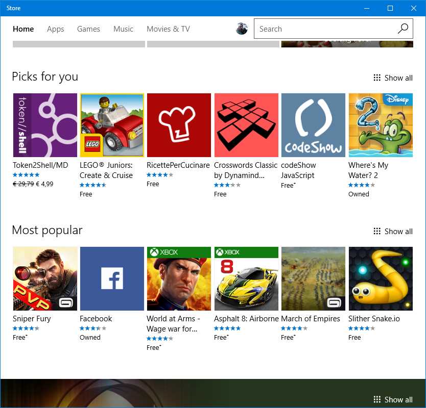
Figure 41: The Hub control configured to use a vertical orientation.
In the previous image, Picks for you and Most popular are two HubSections of a Hub control and they are displayed one below the other. You ‘ll notice, also, that the IsHeaderInteractive property has been set to True. You can see the Show all link at the end of each section that redirects the user to another page of the app listing all the apps in the selected category.
Pivot
The Pivot control (which, before Windows 10, was available only on the phone) offers a user experience like the one delivered by the tab control in other mobile platforms. The Pivot is split into different sections that the user can see by swiping to the left or right of the screen (or by clicking on the arrows at the two sides if they’re visible; this is another control that delivers an optimized experience if the app is running on a device with a mouse and keyboard). In this case, however, every section will fit the entire size of the page. To help the user understand that there are other sections, a top bar will display the names of the other sections, with the current one highlighted in a different color.
The Pivot control is typically used in two different scenarios:
- You need to show the user the same type of information, but refer to different contexts. The MSN News application by Microsoft is a good example. All the pivot’s sections display the same type of information (news), but filtered by different categories (politics, financial, science, etc.).
- You need to show the user different information types, but they’re related to the same context. The built-in People application is a good example. When you tap on a contact, you can see all their details, like phone number, photos posted on social networks, the latest interactions, etc. All this information is stored in different sections of the page.

Figure 42: The MSN News app uses a Pivot control (at the top) to allow users to switch from one news category to another.
The following sample shows how to use the Pivot control in a XAML page:
Code Listing 152
<Pivot Title="Page title"> <PivotItem Header="First header"> <StackPanel> <TextBlock Text="Some content" /> </StackPanel> </PivotItem> <PivotItem Header="Second section"> <StackPanel> <TextBlock Text="Some other content" /> </StackPanel> </PivotItem> </Pivot> |
The Pivot control has a property called Title, which defines the title of the page. Every section, on the other hand, is identified by a PivotItem control, which is nested inside the main Pivot one. Each of them can have its own title, which is the header displayed in the top bar. The property to set is called Header.
Except for these features, the PivotItem control acts as a simple container. You can place inside it any other XAML control you want and it will be rendered in the page when the current section is active.
The Pivot control can also be useful to create guided procedures (like a configuration wizard). It offers, in fact, a property called IsLocked that prevents the user from moving to another section when it’s set to true. This way you can unlock the next section only when the user has fulfilled all the required fields in the current one.
The Pivot control can also be heavily customized to make it more like a tab control. For example, the built-in Alarms & Clock app in Windows 10 uses this approach to define the different sections, as you can see in the following image.
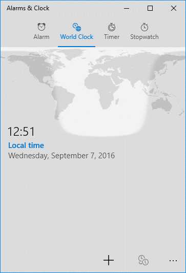
Figure 43: The Alarms & Clock app uses a customized Pivot to create a tabs effect.
However, this kind of customization isn’t built in to the control; you’ll need to make many changes to its template. You can find a working sample in the official Windows 10 repository on GitHub.
SplitView
The SplitView control is another new feature added in Windows 10, and it allows you to create “hamburger menu” experiences in your application easily. What is a hamburger menu? It’s a panel that, typically, is placed on the left side of the screen and can be activated anytime by tapping a button. This button is usually identified by three lines, one below the other, which reminds you of a hamburger.
The panel is typically a way to give the user quick access to different sections of the applications. Unlike other navigations approaches (like the ones you can implement with the Hub or the Pivot controls), a hamburger menu is available across every page of the application. Consequently, no matter which page the user is visiting, they’ll always be able to quickly jump to another section of the app.
Many Windows 10 built-in apps leverage this control. The following image shows Groove Music, the Windows 10 music player, which uses a hamburger menu to give quick access to the various sections of the application, like Albums, Artists, Songs, Settings, etc.

Figure 44: The hamburger menu implemented in the Groove Music app.
However, by default, the SplitView control doesn’t offer any built-in feature to implement these kinds of experiences. In fact, it just offers a way to split a page into a panel and the main content. Inside each part, you can define your own layout by leveraging any XAML control. Here is a very simple definition of the SplitView control:
Code Listing 153
<SplitView DisplayMode="Inline" PanePlacement="Left" IsPaneOpen="True"> <SplitView.Pane> <TextBlock Text="This is the panel" FontSize="24" HorizontalAlignment="Center" VerticalAlignment="Center" /> </SplitView.Pane>
<TextBlock HorizontalAlignment="Center" VerticalAlignment="Center" FontSize="24" Text="This is the content" /> </SplitView> |
The content of the panel is included inside a property called Pane, while the content of the page (in the previous sample, made by a TextBlock) is included directly as children of the SplitView control. In the sample, you can see some of the most important properties offered by the control:
- DisplayMode defines the way the panel is displayed.
- Inline means that the panel, when it’s open, takes space from the content area.
- CompactInline means that, when the panel is closed, a small portion is still visible. When it’s opened, it behaves like the Inline property, so it takes space from the content area.
- Overlay means that the panel, when it’s open, overlaps the content area, without stealing space.
- CompactOverlay means that, when the panel is closed, a small portion is still visibile. When it’s opened, it behaves like the Overlay property, so it overlaps the content area.
- PanePlacement can be used to position the panel on the left or right sides of the screen.
- IsPaneOpen defines if the panel is visible or not. The outcome of this property is strictly connected to the DisplayMode. With regular display modes, if this property is set to False, it won’t be visible at all. With compact display modes, a small portion will be visible and expanded only when the property is set to True.
The following image shows how the previous XAML code is rendered:

Figure 45: The SplitView control.
The approach provided by the SplitView control has some pros and some cons. The biggest advantage is that it’s very flexible. As you can see, you can define the panel with any XAML control, you can customize the position, you can customize the behavior, etc. The downside is that, if you want to provide a standard hamburger menu experience like the one we’ve seen in the Groove Music app, you must do everything on your own. The framework doesn’t provide built-in controls to create the hamburger button (the one placed at the top to show/hide the panel), or to define the various sections, etc.
As a result, there are many third-party libraries that introduced their own implementation of the hamburger menu based on the SplitView control, which makes it easier to recreate the user experience of the built-in Windows 10 applications.
At the time of writing, the most useful implementations you can leverage in your applications are:
- The HamburgerMenu control in the UWP Community Toolkit, an open-source project created by Microsoft with the goal of expanding the features offered by the Universal Windows Platform by offering additional controls and services. Being an open-source project, it allows every member of the community to support and improve it. Additionally, being a third-party library and not something embedded into the platform, it can be updated much more frequently than the Universal Windows Platform. The starting page of the toolkit is here. From there, you can access the documentation, the GitHub repository, and a sample app (published on the Store) where you can try out the various controls. Specifically, you can find documentation and sample code about the HamburgerMenu control on this page.
- The HamburgerMenu control in Template 10, another open-source project created by Microsoft with the goal of providing better-structured and easier-to-use templates as starting points to create Universal Windows Platform apps. Being an open-source project, it’s available on GitHub. The repository contains many samples and, additionally, you can install an extension for Visual Studio 2015 that adds a set of new templates in the Universal category of the Windows section. One of them contains a sample implementation of the HamburgerMenu control and so is a great starting point if you’re planning to leverage this navigation approach in your application. You can read the full documentation here.
Additionally, both toolkits allow you to solve one of the challenges with the SplitView control. By default, a Universal Windows Platform app is embedded into a Frame, which is a container of all the pages of the application. Thanks to the Frame class, you can leverage a set of APIs to move from one page to the other. The problem in using the SplitView control is that, since by default you leverage a single empty Frame in the app, you need to find a way to have the same menu applied across every page and, at the same time, keep the navigation flow consistent. Both toolkits offer a way to turn the Frame from an empty container to a container with the HamburgerMenu control. This way, all the other pages of your application will be hosted inside this container and they will share the same menu.
You’ll see more details in the second book of the series, where we’re going to discuss in the detail how to handle navigation in Universal Windows Platform apps.
I won’t describe in detail in this chapter how to use the two mentioned HamburgerMenu controls. It would be out of the scope of this book, since they’re part of an open-source project that is continuously evolving and, therefore, this information may quickly become outdated.
Managing the application bar: CommandBar
The application bar is one of the key controls in Windows and it’s widely used by many applications. It provides a bar, which can contain different interactive elements (like buttons) that typically provide a set of options to interact with the content that is currently being displayed.
For example, the built-in Mail & Calendar app leverages an application bar when you’re reading mail to provide the most-used functionalities, like Reply, Reply All, Forward, etc., or when you’re using the Calendar, to give a quick way to create a new appointment, to move to the current date, etc.
To create an application bar, the Universal Windows Platform offers a control called CommandBar, which is defined at page level and can be placed in two positions:
- At the top of the screen, by leveraging the TopAppBar property of the Page class.
- At the bottom of the screen, by leveraging the BottomAppBar property of the Page class.
Figure 46: The Mail & Calendar app leverages both approaches based on the platform. On a mobile device, the application bar is placed at the bottom (top image), on the desktop it is placed at the top (bottom image).
Regardless of the position, a CommandBar offers two kinds of commands:
- PrimaryCommands are the most important ones and they are always visible. They are displayed with an icon and a label, which contains a brief description of the function.
- SecondaryCommands are related to secondary functions. By default, they’re hidden, displayed only when the user expands the application bar by tapping on the three dots placed at the right side. They don’t have an icon, but just a textual description.
The following sample defines a CommandBar placed at the bottom of the page:
Code Listing 154
<Page x:Class="SampleApp.MainPage" xmlns="http://schemas.microsoft.com/winfx/2006/xaml/presentation" xmlns:x="http://schemas.microsoft.com/winfx/2006/xaml" xmlns:d="http://schemas.microsoft.com/expression/blend/2008" xmlns:mc="http://schemas.openxmlformats.org/markup-compatibility/2006" mc:Ignorable="d"> <Page.BottomAppBar> <CommandBar> <CommandBar.PrimaryCommands> <!-- primary commands --> </CommandBar.PrimaryCommands> <CommandBar.SecondaryCommands> <!-- secondary commands --> </CommandBar.SecondaryCommands> </CommandBar> </Page.BottomAppBar> <Grid> <!-- page content --> </Grid> </Page> |
The CommandBar supports three different types of commands:
- A button, which is identified by the AppBarButton class.
- A toggle button (which can maintain the on/off state), identified by the AppBarToggleButton class.
- A separator, which is useful to group the commands in different sections, identified by the AppBarSeparator.
The buttons’ visual layout is defined thanks to two important properties: Label and Icon. Label is the text that is displayed below the button. Icon is the image displayed inside the button and it works in a different way than a standard Image control. By default, you can’t simply specify an image path, but one of the symbols that belongs to the Segoe UI font family. You can find a list of all the available symbols in the MSDN documentation.
The following sample shows an AppBarButton control with a Save icon:
Code Listing 155
<Page.BottomAppBar> <CommandBar> <CommandBar.PrimaryCommands> <AppBarButton Label="Save" Icon="Save" /> </CommandBar.PrimaryCommands> </CommandBar> </Page.BottomAppBar> |
However, if you can’t find the right icon for you, there’s still a way to use your own images as icons by using the extended syntax to define the Icon property, like in the following sample:
Code Listing 156
<Page.BottomAppBar> <CommandBar> <CommandBar.PrimaryCommands> <AppBarButton Label="Save"> <AppBarButton.Icon> <BitmapIcon UriSource="/Assets/image.png" /> </AppBarButton.Icon> </AppBarButton> </CommandBar.PrimaryCommands> </CommandBar> </Page.BottomAppBar> |
When it comes to managing the user interaction with the application bar’s commands, there are no differences from a regular Button control. They expose, in fact, a Click event that you can subscribe in code-behind to perform some operations when the button is clicked. The following code shows a complete CommandBar sample:
Code Listing 157
<Page.BottomAppBar> <CommandBar> <CommandBar.PrimaryCommands> <AppBarButton Label="refresh" Click="OnButton1Clicked" Icon="Refresh" /> <AppBarSeparator /> <AppBarToggleButton Label="add" Click="OnButton2Clicked" Icon="Favorite" /> </CommandBar.PrimaryCommands> <CommandBar.SecondaryCommands> <AppBarButton Label="save" Click="OnButton3Clicked" Icon="Save" /> </CommandBar.SecondaryCommands> </CommandBar> </Page.BottomAppBar> |
The Anniversary Update has added a new feature in the CommandBar control to make it easier to create adaptive layouts. We’ve seen, so far, that when you add items to the bar, you must split them between primary and secondary commands. However, this approach has a downside when it comes to creating a user interface that can adapt to multiple devices and screen sizes. No matter how much space your application can use, secondary commands will always be hidden unless the user taps on the three dots.
The Anniversary Update has added a new property called IsDynamicOverflowEnabled. When it’s set to True, you can start adding items inside the CommandBar control without categorizing them as primary or secondary commands. Then, automatically, the CommandBar will try to render most of them as primary and, if there isn’t space left anymore, it will move them to secondary.
You can influence which commands are less important for your scenario by assigning a numeric value to the DynamicOverflowOrder property offered by each control that you can place inside the CommandBar. Let’s look at the following sample implementation:
Code Listing 158
<Page.BottomAppBar> <CommandBar IsDynamicOverflowEnabled="True"> <AppBarButton Label="Favorite" Icon="Favorite" /> <AppBarButton Label="Pin" Icon="Pin" /> <AppBarButton Label="Website" Icon="World" /> <AppBarButton Label="Buy" Icon="Shop" DynamicOverflowOrder="1" /> <AppBarButton Label="Trailer" Icon="Play" DynamicOverflowOrder="2" /> <AppBarButton Label="Similar shows" Icon="People" DynamicOverflowOrder="3" /> </CommandBar> </Page.BottomAppBar> |
As you can see, this CommandBar contains six AppBarButton controls. Three of them have the the DynamicOverflowOrder property set to a numeric value, which means that, as soon as the window starts to shrink, they will be the first to be moved to secondary commands, based on the order we’ve defined (so the Buy button will be the first to be moved, followed by the Trailer and Similar Shows ones).
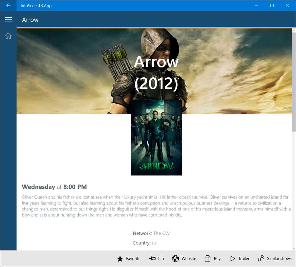
Figure 47: The two images show the same page, but displayed at two different screen sizes. Automatically, some of the buttons in the application bar have been moved to secondary commands in the smaller window.
StatusBar (Windows Mobile only)
The StatusBar is a control currently available only on the mobile platform, since it’s the system tray placed at the top where the operating system shows some important information, like the time, the signal strength, etc. To get access to this control, you first need to add a reference to the Windows Mobile Extensions for Mobile library that you can find when you right-click on your project, choose Add reference, and move to the section Universal Windows -> Extensions. The Universal Windows Platform allows developers to interact with this bar to perform additional operations.
However, since it’s a control available only for mobile, you can’t interact with it directly from the XAML. We need to manage it in code-behind, by using the StatusBar class (part of the Windows.UI.ViewManagement namespace), which offers a method called GetForCurrentView() that returns a reference to the bar.
However, remember that you need to leverage the capability detection approach described in Chapter 1 before using any of these APIs. In fact, if you tried to call one of the following APIs on a desktop or on a console, you would get an exception, since this control isn’t implemented on these platforms.
As such, most of the time you’re going to write code like the following:
Code Listing 159
private void CustomizeSystemTray() { var api = "Windows.UI.ViewManagement.StatusBar"; if (ApiInformation.IsTypePresent(api)) { StatusBar statusBar = StatusBar.GetForCurrentView(); //do something with the status bar } } |
Here are some of the main operations you can do once you have a reference to the current bar.
Hiding and showing the status bar
As a developer, you’re able to hide the status bar so that the application can use all the available space on the screen. This feature can be useful also if your application is using a custom theme, which would look bad mixed together with the top bar, since by default it keeps the same theme color of the phone (black or white).
However, you must be cautious in using this feature. Hiding the status bar means that some important information will be hidden unless the user decides to pull down the Action Center from the top of the screen. Consequently, for example, if your application uses the data connection heavily, it’s not a good idea to hide the status bar because the user won’t be able to tell immediately if issues are being caused by a network problem (like she doesn’t have cellular signal).
To hide the status bar, it’s enough to call the HideAsync() method, like in the following sample:
Code Listing 160
private async void OnChangeSystemTrayClicked(object sender, RoutedEventArgs e) { StatusBar statusBar = StatusBar.GetForCurrentView(); await statusBar.HideAsync(); } |
If you want to display it again, just call the ShowAsync() method:
Code Listing 161
private async void OnChangeSystemTrayClicked(object sender, RoutedEventArgs e) { StatusBar statusBar = StatusBar.GetForCurrentView(); await statusBar.ShowAsync(); } |
Changing the look and feel
If you don’t want to hide the bar, but you still don’t want your application to look bad because the status bar color doesn’t mix well with your theme, the StatusBar control offers more choices.
One approach is to change the bar’s opacity. This way, you’ll be able to make it transparent, so that the various indicators (time, signal strength, etc.) will still be visible, but they will be displayed over your application’s theme, without interfering with it. To achieve this, you need to set the BackgroundOpacity property with the opacity value you prefer, like in the following sample:
Code Listing 162
private void OnChangeSystemTrayClicked(object sender, RoutedEventArgs e) { StatusBar statusBar = StatusBar.GetForCurrentView(); statusBar.BackgroundOpacity = 0.4; } |
Another approach that needs to be used in combination with the BackgroundOpacity property is to change the background color by setting the BackgroundColor property, like in the following sample:
Code Listing 163
private void OnChangeSystemTrayClicked(object sender, RoutedEventArgs e) { StatusBar statusBar = StatusBar.GetForCurrentView(); statusBar.BackgroundOpacity = 1.0; statusBar.BackgroundColor = Colors.Red; } |
Showing a progress bar
Previously in this chapter, we learned how to use controls such as ProgressBar and ProgressRing to display the status of a running operation to the user. However, there’s another alternative on Windows 10. Instead of showing a progress bar inside the page, you can display it in the status bar at the top of the screen. In this case, you need to use the ProgressIndicator control, which, like the ProgressBar, supports two kind of animations. The default is an indeterminate one, which is used to keep track of operations for which you aren’t able to determine the exact duration. Otherwise, if you want to display a standard progress bar, you can fill the ProgressValue property with a value between 0 (empty bar) and 1 (full bar).
Regardless of the behavior you choose, you can also add a text using the Text property, which is displayed below the progress bar, like in the following sample:
Code Listing 164
Once you’ve configured the ProgessIndicator property exposed by the StatusBar control, you can display it by calling the ShowAsync() method or hide it by using the HideAsync() one.
Showing a dialog
Another common requirement in an application is to show a dialog message, for example, to ask the user for a confirmation that he wants to proceed with an operation.
There are two kinds of dialogs that can be leveraged in a Universal Windows Platform app: dialogs and flyouts.
Dialogs
Dialogs have a modal approach, they are usually displayed in the middle of the screen, and they force the user to make a choice. The dialog won’t go away until the user has selected one of the available options.
The simplest dialog control is called MessageDialog and is typically used to display a warning or a message that the user can acknowledge simply by pressing the Close button.
Code Listing 165
private async void OnShowDialog(object sender, RoutedEventArgs e) { MessageDialog dialog = new MessageDialog("Internet connection not available. Try again later.", "Error"); await dialog.ShowAsync(); } |
We create a new MessageDialog object, passing as parameters the content (required) and the title (optional). In the end, we call the ShowAsync() method to show the dialog.
The following image shows the result of the previous code:
Figure 48: A simple MessageDialog.
A more customizable type of dialog is the ContentDialog class, which can offer customized content and multiple buttons. Typically, it’s used when you want to present a choice to the user. Look at the following code:
Code Listing 166
private async void OnShowDialog(object sender, RoutedEventArgs e) { ContentDialog dialog = new ContentDialog(); dialog.Title = "Cancel item"; dialog.Content = "Do you want to cancel the selected item?"; dialog.PrimaryButtonText = "Ok"; dialog.SecondaryButtonText = "Cancel"; ContentDialogResult result = await dialog.ShowAsync(); if (result == ContentDialogResult.Primary) { //delete the item } else { //cancel the operation } } |
We create a new ContentDialog object and, other than assigning a Title and Content like with the MessageDialog class, we also set the text of the two buttons that will be displayed in the dialog by using the PrimaryButtonText and the SecondaryButtonText properties.
In this case, when we call the ShowAsync() method, we also get back a result that is an enumerator of type ContentDialogResult. Thanks to this return value, we can understand which button has been pressed and act in the proper way. The following image shows the previous code in action:

Figure 49: A simple ContentDialog.
If you want, you can also have deeper control over the look and feel of the ContentDialog layout by leveraging a specific item template available in the Universal Windows Platform. In this case, instead of leveraging the base ContentDialog class in C# code like we did before, we can use the full power of XAML to define the aspect of the dialog.
To achieve this result, you can right-click on your project and choose Add -> New item -> ContentDialog. You will get a new XAML file with the following definition:
Code Listing 167
<ContentDialog x:Class="SampleApp.CustomContentDialog" xmlns="http://schemas.microsoft.com/winfx/2006/xaml/presentation" xmlns:x="http://schemas.microsoft.com/winfx/2006/xaml" xmlns:local="using:SampleApp" xmlns:d="http://schemas.microsoft.com/expression/blend/2008" xmlns:mc="http://schemas.openxmlformats.org/markup-compatibility/2006" mc:Ignorable="d" Title="Cancel Item" PrimaryButtonText="Ok" SecondaryButtonText="Cancel" PrimaryButtonClick="ContentDialog_PrimaryButtonClick" SecondaryButtonClick="ContentDialog_SecondaryButtonClick"> <Grid> <!-- content of the dialog --> </Grid> </ContentDialog> |
As you can see, it isn’t a regular page, since the root node is called ContentDialog. However, it behaves like one. It has a XAML file (with the user interface definition) and a .cs file (which handles the logic and contains C# code). You can also see how the properties that we previously set in code (like Title or PrimaryButtonText) can now be set directly in XAML.
The main differences compared to the previous approach are:
- The Content can be expressed, instead of with a simple string, with the full XAML stack. We can place any XAML content we want inside the Grid and, therefore, completely customize the look and feel of the dialog.
- By default, the dialog offers two events raised when the user clicks on the two buttons (PrimaryButtonClick and SecondaryButtonClick). This way, other than just knowing which button has been pressed, we can also include some additional logic (for example, if the user presses the button to confirm that he wants to cancel the selected item, we could store some data in the local settings).
The following sample shows a completely customized ContentDialog, where the Content isn’t just a plain string, but is made by various XAML controls, like a StackPanel, an Image, and a TextBlock:
Code Listing 168
<ContentDialog x:Class="SampleApp.CustomContentDialog" xmlns="http://schemas.microsoft.com/winfx/2006/xaml/presentation" xmlns:x="http://schemas.microsoft.com/winfx/2006/xaml" xmlns:local="using:SampleApp" xmlns:d="http://schemas.microsoft.com/expression/blend/2008" xmlns:mc="http://schemas.openxmlformats.org/markup-compatibility/2006" mc:Ignorable="d" Title="Question" PrimaryButtonText="Yes" SecondaryButtonText="No" PrimaryButtonClick="ContentDialog_PrimaryButtonClick" SecondaryButtonClick="ContentDialog_SecondaryButtonClick"> <Grid> <StackPanel Orientation="Horizontal"> <Image Source="/Assets/image.jpg" Width="100" /> <TextBlock Text="Do you like this logo?" /> </StackPanel> </Grid> </ContentDialog> |
To display this dialog, you just need to create a new instance of the custom dialog you’ve created and then call the ShowAsync() method. As you can see from the x:Class attribute, this dialog is connected to a code-behind class called CustomContentDialog, so here is how we can display it in C# code:
Code Listing 169
private async void OnShowDialog(object sender, RoutedEventArgs e) { CustomContentDialog dialog = new CustomContentDialog(); ContentDialogResult result = await dialog.ShowAsync(); if (result == ContentDialogResult.Primary) { //handle the positive feedback } else { //handle the negative feedback } } |
Flyouts
Flyouts are like dialogs, but they should be used to display transient information. They aren’t modal, but they have a light dismiss behavior (which means that if the user clicks or taps outside the dialog, it will be automatically be dismissed, without forcing them to make a choice). A flyout is typically defined thanks to the Flyout property exposed by most of the XAML controls that handle the interaction with the user. The Button control is one of these, like you can see in the following sample:
Code Listing 170
<Button Content="Delete item"> <Button.Flyout> <Flyout> <StackPanel> <TextBlock Text="Do you really want to delete it?" /> <StackPanel Orientation="Horizontal"> <Button Content="Yes" Click="OnDelete" /> <Button Content="No" Click="OnCancel" /> </StackPanel> </StackPanel> </Flyout> </Button.Flyout> </Button> |
Inside the Flyout property exposed by the Button control, we define a Flyout control that simply contains other XAML controls. In this case, we’re asking the user if he really wants to delete an item when he presses the button. The difference from the ContentDialog control sample we’ve seen before is that, this time, the user won’t be forced to make a choice. It’s enough for them to click outside the flyout to hide the dialog. We don’t need to invoke any C# code to display the flyout. It will be enough to press the button to show it. Here is how the previous code looks in a sample app:
Figure 50: A Flyout control.
The main difference from the standard usage of the Button control is that, in this case, we won’t handle the Click event of the Button control. Its purpose will be just to display the flyout. It will be up to the two buttons contained in the flyout (Yes and No) to handle the Click event and to perform the expected logic (like deleting the item if the user has pressed Yes or canceling the operation if she has pressed No).
Context menus
The Universal Windows Platform offers a special version of the Flyout control, called MenuFlyout, that can be used to create context menus, which allow you to perform additional operations on a selected item. This concept is widely used on the desktop. When you right-click with the mouse on an item, you are prompted with a list of options you can choose from.
Every XAML control supports this kind of flyout thanks to the ContextFlyout property. The following sample shows a MenuFlyout added to a TextBlock control:
Code Listing 171
<TextBlock Text="This is an item"> <TextBlock.ContextFlyout> <MenuFlyout> <MenuFlyoutItem Text="Open" Click="OnOpen" /> <MenuFlyoutItem Text="Edit" Click="OnEdit" /> <MenuFlyoutSeparator /> <MenuFlyoutItem Text="Delete" Click="OnDelete" /> <ToggleMenuFlyoutItem Text="Is active" /> </MenuFlyout> </TextBlock.ContextFlyout> </TextBlock> |
As you can see, a MenuFlyout can contain different kinds of items:
- MenuFlyoutItem is simply an item of the list that has a Text property (the label) and a Click event (to handle the operation to perform when you select it).
- MenuFlyoutSeparator adds a separator that can be used to group different options in multiple categories.
- ToggleMenuFlyoutItem behaves like a ToggleButton control and can assume two statuses, active or inactive, based on the value of the IsChecked property.
The following image shows an application that implements the previous code:
Figure 51: A MenuFlyout control.
- 70+ advanced UWP components for Windows Store apps.
- UI controls for LOB apps: Charts, DataGrid, Diagram, and more.
- Comprehensive features for building touch-friendly, Windows 10-style applications.