
Uno Platform Succinctly®

CHAPTER 3
XAML Fundamentals
Overview
The Extensible Application Markup Language (XAML) is an XML-based markup language that Microsoft maintains and is used for declarative programming similar to HTML.
Some of the UI systems that are based on XAML are UWP, WPF, Xamarin.Forms, and the topic of this book, the Uno Platform. XAML is used for declaring UI elements with data binding.
XAML has some differences across different UI systems, but the XAML flavor used in Uno is closest to UWP XAML, which means most UWP XAML resources can be used with Uno.
All the code changes will be done exclusively on the AppUno.Shared project files.
XAML pages
Using the Visual Studio 2019 Solution Explorer, navigate to the AppUno.Shared project and double-click the MainPage.xaml file. The file looks as follows.
Listing 3-a: The MainPage.xaml File – AppUno.Shared Project
<Page x:Class="AppUno.MainPage" xmlns="http://schemas.microsoft.com/winfx/2006/xaml/presentation" xmlns:x="http://schemas.microsoft.com/winfx/2006/xaml" xmlns:local="using:AppUno" xmlns:d="http://schemas.microsoft.com/expression/blend/2008" xmlns:mc="http://schemas.openxmlformats.org/markup-compatibility/2006" mc:Ignorable="d"> <Grid Background="{ThemeResource ApplicationPageBackgroundThemeBrush}"> <TextBlock Text="Hello, world!" Margin="20" FontSize="30" /> </Grid> </Page> |
The preceding content of MainPage.xaml is what a typical XAML page looks like, and it is nothing more than a markup representation of the UI object model.
Note: The name MainPage is the default and most familiar naming convention for an Uno app's main page, found in Uno and XAML tutorials you'll find on the web. So, we'll stick to that naming convention for simplicity. Here's one example of many.
In this example, we can see that the page content has a Grid component, and inside it is a TextBlock component.
The Grid component is not visible when the application runs, and only the TextBlock component can be seen. The following diagram illustrates this.
To run the application, set the AppUno.UWP project as the startup project by right-clicking it and choosing Set as Startup Project.
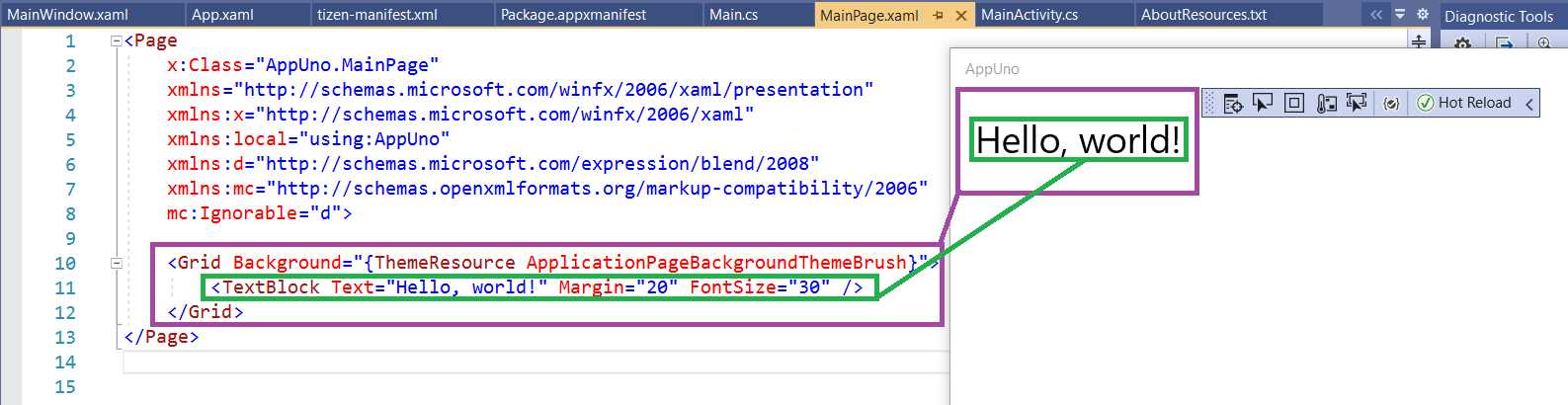
Figure 3-a: The Relationship Between the XAML Component and the App's UI
We can see the TextBlock component rendered when the application runs, but not the Grid component.
The Grid component is a layout panel that arranges the controls inside, depending on the panel's behavior.
The TextBlock is a component that displays text and is accessible as a variable by giving it a name, as seen in the following listing.
Listing 3-b: The MainPage.xaml File – Giving the TextBlock a Name
<Page x:Class="AppUno.MainPage" xmlns="http://schemas.microsoft.com/winfx/2006/xaml/presentation" xmlns:x="http://schemas.microsoft.com/winfx/2006/xaml" xmlns:local="using:AppUno" xmlns:d="http://schemas.microsoft.com/expression/blend/2008" xmlns:mc="http://schemas.openxmlformats.org/markup-compatibility/2006" mc:Ignorable="d"> <Grid Background="{ThemeResource ApplicationPageBackgroundThemeBrush}"> <TextBlock Text="Hello, world!" Margin="20" FontSize="30" x:Name="tb"/> </Grid> </Page> |
We have given the TextBlock component the name tb by using x:Name. Now we can reference this variable in the code-behind, which is found on the MainPage.xaml.cs file.
Using the code-behind, we can access the variables that reference components we have declared in the XAML and respond to events.
Let's change the value of the Text property of the TextBlock component by using the code-behind. To do that, open the MainPage.xaml.cs file and replace the existing code as follows. The code change is highlighted in bold.
Listing 3-c: The MainPage.xaml.cs File – Changing the TextBlock Text
using System; using System.Collections.Generic; using System.IO; using System.Linq; using System.Runtime.InteropServices.WindowsRuntime; using Windows.Foundation; using Windows.Foundation.Collections; using Windows.UI.Xaml; using Windows.UI.Xaml.Controls; using Windows.UI.Xaml.Controls.Primitives; using Windows.UI.Xaml.Data; using Windows.UI.Xaml.Input; using Windows.UI.Xaml.Media; using Windows.UI.Xaml.Navigation; namespace AppUno { public sealed partial class MainPage : Page { public MainPage() { this.InitializeComponent(); this.tb.Text = "New text"; } } } |
Notice how we can access the Text property of the TextBlock (tb) component and assign a new value to it.
If we now run the AppUno.UWP project by clicking on the Run button, the text displayed by the application is different, modified by the code-behind.

Figure 3-b: AppUno.UWP Running (Changed Text)
Grid component
With the basics of how XAML works covered, let's talk about arranging items on the screen to create a user interface. The Grid component facilitates this.
A Grid component is a type of layout panel, and it is used to arrange other UI controls within it as a grid.
Most XAML-based applications rely on using the Grid or StackPanel components to organize other controls. While the StackPanel component organizes controls next to each other (horizontally) or on top of each other (vertically), the Grid component organizes controls into cells that belong to a row and column.
We need to add the row and column definitions to split the Grid component into rows and columns. The updated MainPage.xaml.cs code is highlighted in bold in the following listing.
Listing 3-d: The MainPage.xaml File – Adding a Grid
<Page x:Class="AppUno.MainPage" xmlns="http://schemas.microsoft.com/winfx/2006/xaml/presentation" xmlns:x="http://schemas.microsoft.com/winfx/2006/xaml" xmlns:local="using:AppUno" xmlns:d="http://schemas.microsoft.com/expression/blend/2008" xmlns:mc="http://schemas.openxmlformats.org/markup-compatibility/2006" mc:Ignorable="d"> <Grid Background="{ThemeResource ApplicationPageBackgroundThemeBrush}"> <Grid.RowDefinitions> <RowDefinition Height="1*" /> <RowDefinition Height="1*" /> </Grid.RowDefinitions> <Grid.ColumnDefinitions> <ColumnDefinition Width="1*" /> <ColumnDefinition Width="1*" /> </Grid.ColumnDefinitions>
<TextBlock Text="1" Margin="20" FontSize="30" x:Name="tb"/> <TextBlock Text="2" Margin="20" FontSize="30" x:Name="tb2" Grid.Row="1"/> <TextBlock Text="3" Margin="20" FontSize="30" x:Name="tb3" Grid.Column="1"/> <TextBlock Text="4" Margin="20" FontSize="30" x:Name="tb4" Grid.Row="1" Grid.Column="1"/> </Grid> </Page> |
What we have done here is first added the row and column definitions. Notice that two rows are defined, contained within Grid.RowDefinitions. The column definitions are included within Grid.ColumnDefinitions.
Each RowDefinition includes a Height property that has a value of 1*. The asterisk tells the Grid component to separate the rows by ratio to be equally divided.
Therefore, the Grid component has two rows, each row taking the total height (which is indicated by the value 1), and each row occupying the same height (which is what * means).
The column's definition follows the same logic. Instead of the Height property, the Width property is used.
Each column definition uses the Width property with a value of 1*. The asterisk tells the Grid component to separate the columns by ratio to be equally divided.
Following that, I copied the TextBlock component three times and renamed each of the TextBlock component copies. For those copies, I also added the Grid.Row and Grid.Column properties to indicate in which row or column each should appear.
Notice that in XAML, rows and columns are zero-based, which means that the first row and column start with zero instead of one. So, Grid.Row="1" Grid.Column="1" indicates the second row and second column, respectively.
So, before we execute the AppUno.UWP application, let's look at the following diagram to understand the relationship between the XAML code and what is seen on the screen when the application runs.
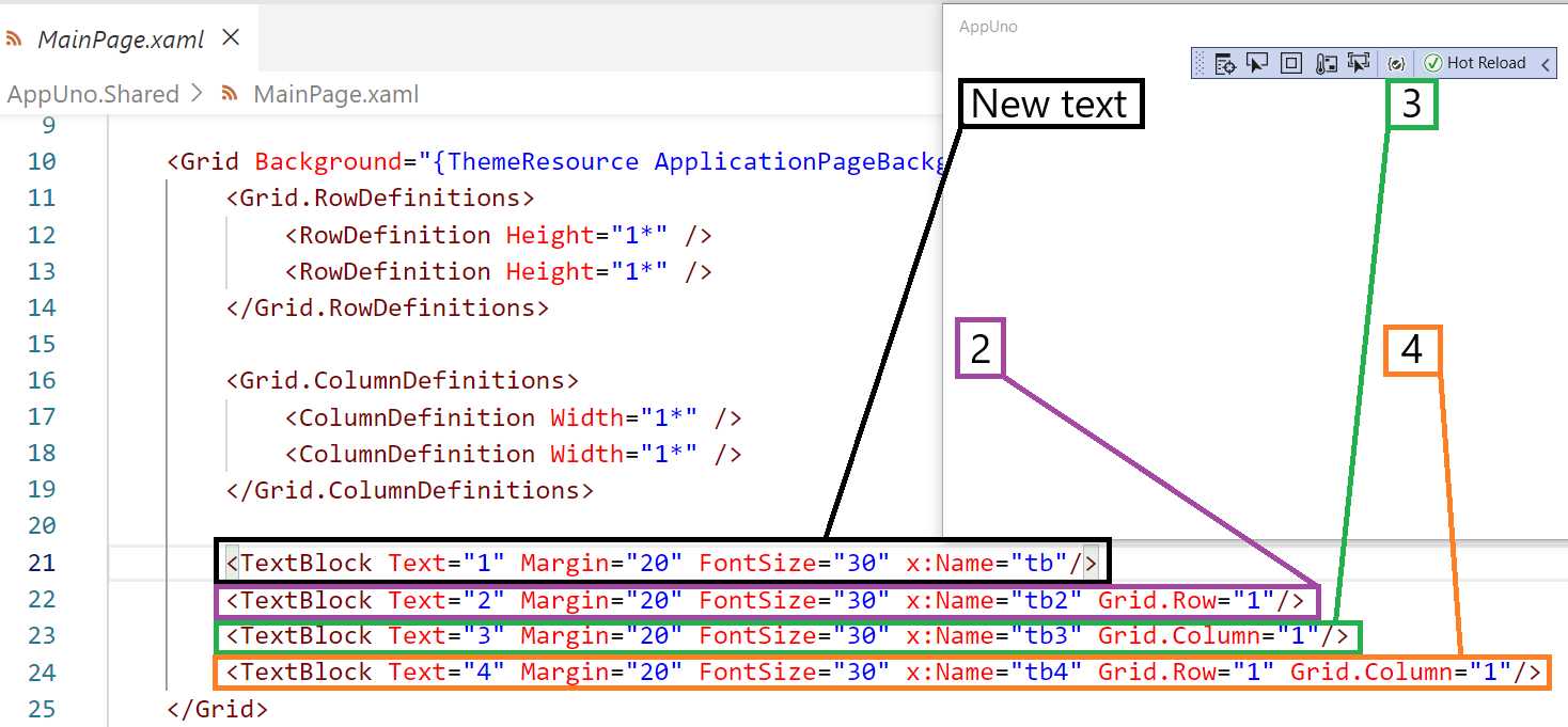
Figure 3-c: Relationship Between the XAML Code and Grid Layout
As we can see, the first TextBlock component corresponds to the element with New text, and then the second TextBlock corresponds to the part with the value 2.
The third TextBlock corresponds to element 3, and the fourth TextBlock corresponds to the part with the value 4.
The order of how these elements are rendered on the screen is controlled by the Grid.Row and Grid.Column properties. When either Grid.Row or Grid.Column is not specified, the default value is used, which is zero.
If we now run the AppUno.UWP application by clicking the Run button, we should see the following result.
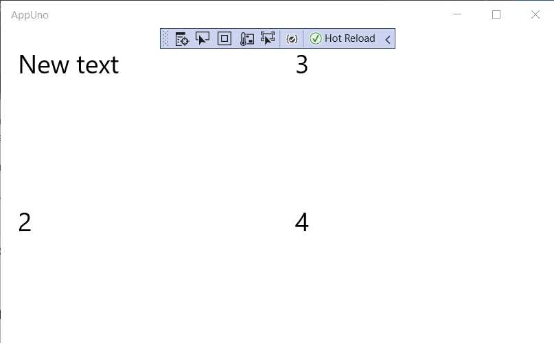
Figure 3-d: The AppUno.UWP Application Running (Using a Grid Component)
Notice that each element is positioned on the top-left corner of each container cell—the default position within a container. It is possible to change this position to another value by using the HorizontalAlignment and VerticalAlignment properties and setting their values to Center.
Let's add these to each of the TextBlock components to see how the application renders them. The updated code has been highlighted in bold in the following listing.
Listing 3-e: The MainPage.xaml File – Centering Elements Using a Grid
<Page x:Class="AppUno.MainPage" xmlns="http://schemas.microsoft.com/winfx/2006/xaml/presentation" xmlns:x="http://schemas.microsoft.com/winfx/2006/xaml" xmlns:local="using:AppUno" xmlns:d="http://schemas.microsoft.com/expression/blend/2008" xmlns:mc="http://schemas.openxmlformats.org/markup-compatibility/2006" mc:Ignorable="d"> <Grid Background="{ThemeResource ApplicationPageBackgroundThemeBrush}"> <Grid.RowDefinitions> <RowDefinition Height="1*" /> <RowDefinition Height="1*" /> </Grid.RowDefinitions> <Grid.ColumnDefinitions> <ColumnDefinition Width="1*" /> <ColumnDefinition Width="1*" /> </Grid.ColumnDefinitions>
<TextBlock Text="1" Margin="20" FontSize="30" x:Name="tb" HorizontalAlignment="Center" VerticalAlignment="Center"/> <TextBlock Text="2" Margin="20" FontSize="30" x:Name="tb2" Grid.Row="1" HorizontalAlignment="Center" VerticalAlignment="Center"/> <TextBlock Text="3" Margin="20" FontSize="30" x:Name="tb3" Grid.Column="1" HorizontalAlignment="Center" VerticalAlignment="Center"/> <TextBlock Text="4" Margin="20" FontSize="30" x:Name="tb4" Grid.Row="1" Grid.Column="1" HorizontalAlignment="Center" VerticalAlignment="Center"/> </Grid> </Page> |
If you still have the application running, all you need to do is make the changes to your code and save it.
If the hot reload feature is active, you should see the updates on the application's screen immediately, without having to re-run the application. In my case, this looks as follows.
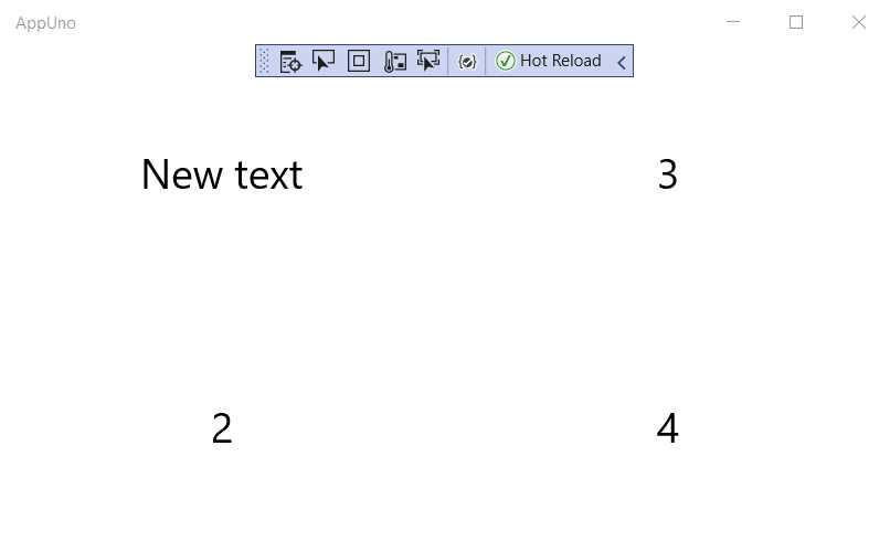
Figure 3-e: The AppUno.UWP Application Running (Using a Grid Component with Centered Elements)
One of the significant features of using the HorizontalAlignment and VerticalAlignment properties is that even if the application is resized, its components will retain their aspect ratio.
It is also possible to set specific cell sizes in a Grid component by indicating a fixed Width and Height for the RowDefinition or ColumnDefinition in question, which is done by removing the asterisk from the value.
You can also use the HorizontalAlignment and VerticalAlignment properties on the Grid component itself. Let's give that a try—the changes are highlighted in bold in the following listing.
Listing 3-f: The MainPage.xaml File – Grid Alignment
<Page x:Class="AppUno.MainPage" xmlns="http://schemas.microsoft.com/winfx/2006/xaml/presentation" xmlns:x="http://schemas.microsoft.com/winfx/2006/xaml" xmlns:local="using:AppUno" xmlns:d="http://schemas.microsoft.com/expression/blend/2008" xmlns:mc="http://schemas.openxmlformats.org/markup-compatibility/2006" mc:Ignorable="d"> <Grid HorizontalAlignment="Center" VerticalAlignment="Center" Background="{ThemeResource ApplicationPageBackgroundThemeBrush}"> <Grid.RowDefinitions> <RowDefinition Height="1*" /> <RowDefinition Height="1*" /> </Grid.RowDefinitions> <Grid.ColumnDefinitions> <ColumnDefinition Width="1*" /> <ColumnDefinition Width="1*" /> </Grid.ColumnDefinitions>
<TextBlock Text="1" Margin="20" FontSize="30" x:Name="tb" HorizontalAlignment="Center" VerticalAlignment="Center"/> <TextBlock Text="2" Margin="20" FontSize="30" x:Name="tb2" Grid.Row="1" HorizontalAlignment="Center" VerticalAlignment="Center"/> <TextBlock Text="3" Margin="20" FontSize="30" x:Name="tb3" Grid.Column="1" HorizontalAlignment="Center" VerticalAlignment="Center"/> <TextBlock Text="4" Margin="20" FontSize="30" x:Name="tb4" Grid.Row="1" Grid.Column="1" HorizontalAlignment="Center" VerticalAlignment="Center"/> </Grid> </Page> |
If you still have the application running, all you need to do is make the changes to your code and save it.
If the hot reload feature is active, you should see the updates on the application's screen immediately without having to re-run the application. In my case, this looks as follows.
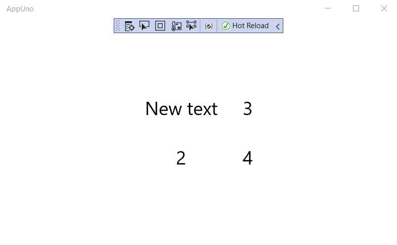
Figure 3-f: The AppUno.UWP Application Running (Using a Centered Grid Component)
Notice how the Grid component appears centered on the screen of the application, and it no longer adjusts to the dimensions of the screen.
Furthermore, we can add many RowDefinitions and ColumnDefinition elements as needed to create any grid-like interface required.
StackPanel component
The difference between the StackPanel and the Grid component is that the StackPanel includes controls on top of each other.
The default orientation of the StackPanel is vertical. Let’s have a look at a basic example.
Listing 3-g: The MainPage.xaml File – StackPanel
<Page x:Class="AppUno.MainPage" xmlns="http://schemas.microsoft.com/winfx/2006/xaml/presentation" xmlns:x="http://schemas.microsoft.com/winfx/2006/xaml" xmlns:local="using:AppUno" xmlns:d="http://schemas.microsoft.com/expression/blend/2008" xmlns:mc="http://schemas.openxmlformats.org/markup-compatibility/2006" mc:Ignorable="d"> <StackPanel Background="{ThemeResource ApplicationPageBackgroundThemeBrush}"> <TextBlock Grid.Row="0" Grid.RowSpan="2" Margin="20" FontSize="30" x:Name="tb" HorizontalAlignment="Center" VerticalAlignment="Center"/> <TextBlock Text="3" Margin="20" FontSize="30" x:Name="tb3" Grid.Column="1" HorizontalAlignment="Center" VerticalAlignment="Center"/> <TextBlock Text="4" Margin="20" FontSize="30" x:Name="tb4" Grid.Row="1" Grid.Column="1" HorizontalAlignment="Center" VerticalAlignment="Center"/> </StackPanel> </Page> |
If you still have the application running, all you need to do is make the changes to your code and then save it. You should see the updates on the application's screen. In my case, this looks as follows.
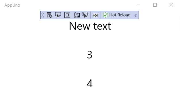
Figure 3-g: The AppUno.UWP Application Running (Using StackPanel Component)
We can see that the TextBlock controls defined within the StackPanel are now stacked, one after the other.
Notice as well that row or column definitions are no longer required. However, we can change the default orientation, so let's do that. The code change is highlighted in bold in the following listing.
Listing 3-h: The MainPage.xaml File – StackPanel (Horizontal Orientation)
<Page x:Class="AppUno.MainPage" xmlns="http://schemas.microsoft.com/winfx/2006/xaml/presentation" xmlns:x="http://schemas.microsoft.com/winfx/2006/xaml" xmlns:local="using:AppUno" xmlns:d="http://schemas.microsoft.com/expression/blend/2008" xmlns:mc="http://schemas.openxmlformats.org/markup-compatibility/2006" mc:Ignorable="d"> <StackPanel Orientation="Horizontal" Background="{ThemeResource ApplicationPageBackgroundThemeBrush}"> <TextBlock Grid.Row="0" Grid.RowSpan="2" Margin="20" FontSize="30" x:Name="tb" HorizontalAlignment="Center" VerticalAlignment="Center"/> <TextBlock Text="3" Margin="20" FontSize="30" x:Name="tb3" Grid.Column="1" HorizontalAlignment="Center" VerticalAlignment="Center"/> <TextBlock Text="4" Margin="20" FontSize="30" x:Name="tb4" Grid.Row="1" Grid.Column="1" HorizontalAlignment="Center" VerticalAlignment="Center"/> </StackPanel> </Page> |
If you still have the application running, all you need to do is make and save the changes to your code, and you will see the screen updated. In my case, this looks as follows.
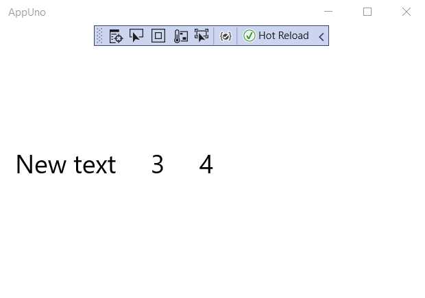
Figure 3-h: The AppUno.UWP Application Running (StackPanel with Horizontal Orientation)
As you have seen, the only change was to add the Orientation parameter and set its value to Horizontal.
The StackPanel component is excellent for aligning controls from the left, making any text quickly read like a book.
It's also possible to nest StackPanel components and alternatively combine that with the Grid component. All combinations are technically possible as long as it renders the UI correctly for your application as you intend it to be.
Let's create a layout that includes three input fields and adjust the code to achieve that. The changes are highlighted in bold.
Listing 3-i: The MainPage.xaml File – Nested StackPanels (Data Entry Layout)
<Page x:Class="AppUno.MainPage" xmlns="http://schemas.microsoft.com/winfx/2006/xaml/presentation" xmlns:x="http://schemas.microsoft.com/winfx/2006/xaml" xmlns:local="using:AppUno" xmlns:d="http://schemas.microasoft.com/expression/blend/2008" xmlns:mc="http://schemas.openxmlformats.org/markup-compatibility/2006" mc:Ignorable="d"> <StackPanel> <StackPanel Orientation="Horizontal" Background="{ThemeResource ApplicationPageBackgroundThemeBrush}"> <TextBlock Text="Name" Margin="20" FontSize="30" x:Name="laName" Grid.Column="1" HorizontalAlignment="Center" VerticalAlignment="Center"/> <TextBox Text="" Margin="20" FontSize="30" x:Name="Name" Grid.Row="1" Grid.Column="1" HorizontalAlignment="Center" VerticalAlignment="Center"/> </StackPanel>
<StackPanel Orientation="Horizontal" Background="{ThemeResource ApplicationPageBackgroundThemeBrush}"> <TextBlock Text="Age" Margin="20" FontSize="30" x:Name="laAge" Grid.Column="1" HorizontalAlignment="Center" VerticalAlignment="Center"/> <TextBox Text="" Margin="20" FontSize="30" x:Name="Age" Grid.Row="1" Grid.Column="1" HorizontalAlignment="Center" VerticalAlignment="Center"/> </StackPanel> <StackPanel Orientation="Horizontal" Background="{ThemeResource ApplicationPageBackgroundThemeBrush}"> <TextBlock Text="Sex" Margin="20" FontSize="30" x:Name="laSex" Grid.Column="1" HorizontalAlignment="Center" VerticalAlignment="Center"/> <TextBox Text="" Margin="20" FontSize="30" x:Name="Sex" Grid.Row="1" Grid.Column="1" HorizontalAlignment="Center" VerticalAlignment="Center"/> </StackPanel> </StackPanel> </Page> |
Also, open the MainPage.xaml.cs file and remove the following line from the MainPage constructor method, as we no longer need it: this.tb.Text = "New text";.
If you still have the application running, all you need to do is make the changes to your code and save it, and you will see the screen updated. In my case, this looks as follows.
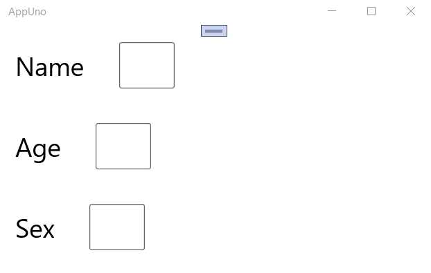
Figure 3-i: The AppUno.UWP Application Running – Nested StackPanels (Data Entry Layout)
As we can see, there are now three input fields that appear vertically stacked, each with its corresponding label next to the input field, horizontally stacked. Let’s have a look at how we achieved this.
We first defined a StackPanel component vertically aligned to its container (the default orientation), the outermost StackPanel.
Within that outermost StackPanel, we defined three StackPanel components horizontally aligned, each of them containing a label (TextBlock) and an input field (TextBox). This is why each label and respective input field appear next to each other.
To understand this better, let's look at the following diagram. By looking at how the colors match the code and the finished UI, we can identify the relationship between the XAML markup and controls on the screen.
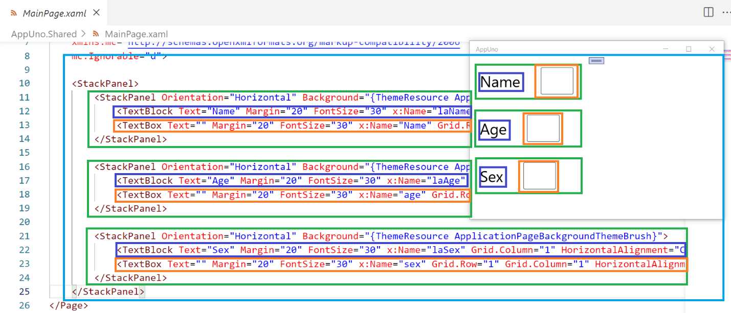
Figure 3-j: The Relationship between the XAML and UI – AppUno.UWP App Running
Notice as well that each of the TextBlock and TextBox components have been given a unique name. This is a good practice, in case we need to manipulate those components with the code-behind.
XAML styles
So far, the controls and layout we have rendered on the screen do not use any colors or style. That's not bad; however, all applications look better when they have a bit of styling.
Styles allow you to set properties across multiple controls of the same type instead of assigning those properties one by one for each component. Styles are nothing more than resources that are referenced through the application. We can create a consistent user experience for a specific set of controls used by the application using styles.
To use styles, we need to use setters which set properties on a control, but we need to define the resource before doing that. Let's have a look at how this is done. The code changes are highlighted in bold in the following listing.
Listing 3-j: The MainPage.xaml File – Using a Page Style
<Page x:Class="AppUno.MainPage" xmlns="http://schemas.microsoft.com/winfx/2006/xaml/presentation" xmlns:x="http://schemas.microsoft.com/winfx/2006/xaml" xmlns:local="using:AppUno" xmlns:d="http://schemas.microasoft.com/expression/blend/2008" xmlns:mc="http://schemas.openxmlformats.org/markup-compatibility/2006" mc:Ignorable="d"> <Page.Resources> <Style x:Key="st" TargetType="TextBlock"> <Style.Setters> <Setter Property="Foreground" Value="Blue"/> </Style.Setters> </Style> </Page.Resources> <StackPanel> <StackPanel Orientation="Horizontal" Background="{ThemeResource ApplicationPageBackgroundThemeBrush}"> <TextBlock Style="{StaticResource st}" Text="Name" Margin="20" FontSize="30" x:Name="laName" Grid.Column="1" HorizontalAlignment="Center" VerticalAlignment="Center"/> <TextBox Text="" Margin="20" FontSize="30" x:Name="Name" Grid.Row="1" Grid.Column="1" HorizontalAlignment="Center" VerticalAlignment="Center"/> </StackPanel>
<StackPanel Orientation="Horizontal" Background="{ThemeResource ApplicationPageBackgroundThemeBrush}"> <TextBlock Text="Age" Margin="20" FontSize="30" x:Name="laAge" Grid.Column="1" HorizontalAlignment="Center" VerticalAlignment="Center"/> <TextBox Text="" Margin="20" FontSize="30" x:Name="Age" Grid.Row="1" Grid.Column="1" HorizontalAlignment="Center" VerticalAlignment="Center"/> </StackPanel> <StackPanel Orientation="Horizontal" Background="{ThemeResource ApplicationPageBackgroundThemeBrush}"> <TextBlock Text="Sex" Margin="20" FontSize="30" x:Name="laSex" Grid.Column="1" HorizontalAlignment="Center" VerticalAlignment="Center"/> <TextBox Text="" Margin="20" FontSize="30" x:Name="Sex" Grid.Row="1" Grid.Column="1" HorizontalAlignment="Center" VerticalAlignment="Center"/> </StackPanel> </StackPanel> </Page> |
If the application is running, all you need to do is make the changes to your code and save it to see the screen updated. In my case, this looks as follows.
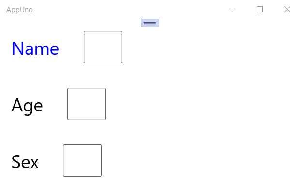
Figure 3-k: Style Applied to a TextBlock Component (Locally and Explicitly)
We have defined a style and then assigned that style to the application's first TextBlock component using this property: Style="{StaticResource st}". The style name is st, and it is defined with the following code:
<Style x:Key="st" TargetType="TextBlock">
<Style.Setters>
<Setter Property="Foreground" Value="Blue"/>
</Style.Setters>
</Style>
We can add more styles between the <Page.Resources> and <Page.Resources/> tags. Currently, this style is only applicable to the current page, which corresponds to the MainPage.xaml file.
However, we can create styles that apply to all the pages of an application, which is achieved by adding them to the App.xaml file of the AppUno.Shared project. Let's do that. The changes are highlighted in bold in the following listing.
Listing 3-k: The App.xaml.cs File – Using a Global Explicit Style
<Application x:Class="AppUno.App" xmlns="http://schemas.microsoft.com/winfx/2006/xaml/presentation" xmlns:x="http://schemas.microsoft.com/winfx/2006/xaml" xmlns:local="using:AppUno"> <Application.Resources> <Style x:Key="st" TargetType="TextBlock"> <Style.Setters> <Setter Property="Foreground" Value="Blue"/> </Style.Setters> </Style> </Application.Resources> </Application> |
We have moved the style resource from the MainPage.xaml file to the App.xaml file. The old content was removed, and the new style from MainPage.xaml was added between the <Application.Resources> and </Application.Resources> tags.
After making this adjustment, the MainPage.xaml file should now look as follows. As you can see, the content between the <Page.Resources> and <Page.Resources/> tags and the tags themselves are gone.
Listing 3-l: The Updated MainPage.xaml.cs File (Using a Resource)
<Page x:Class="AppUno.MainPage" xmlns="http://schemas.microsoft.com/winfx/2006/xaml/presentation" xmlns:x="http://schemas.microsoft.com/winfx/2006/xaml" xmlns:local="using:AppUno" xmlns:d="http://schemas.microasoft.com/expression/blend/2008" xmlns:mc="http://schemas.openxmlformats.org/markup-compatibility/2006" mc:Ignorable="d"> <StackPanel> <StackPanel Orientation="Horizontal" Background="{ThemeResource ApplicationPageBackgroundThemeBrush}"> <TextBlock Style="{StaticResource st}" Text="Name" Margin="20" FontSize="30" x:Name="laName" Grid.Column="1" HorizontalAlignment="Center" VerticalAlignment="Center"/> <TextBox Text="" Margin="20" FontSize="30" x:Name="Name" Grid.Row="1" Grid.Column="1" HorizontalAlignment="Center" VerticalAlignment="Center"/> </StackPanel>
<StackPanel Orientation="Horizontal" Background="{ThemeResource ApplicationPageBackgroundThemeBrush}"> <TextBlock Text="Age" Margin="20" FontSize="30" x:Name="laAge" Grid.Column="1" HorizontalAlignment="Center" VerticalAlignment="Center"/> <TextBox Text="" Margin="20" FontSize="30" x:Name="Age" Grid.Row="1" Grid.Column="1" HorizontalAlignment="Center" VerticalAlignment="Center"/> </StackPanel> <StackPanel Orientation="Horizontal" Background="{ThemeResource ApplicationPageBackgroundThemeBrush}"> <TextBlock Text="Sex" Margin="20" FontSize="30" x:Name="laSex" Grid.Column="1" HorizontalAlignment="Center" VerticalAlignment="Center"/> <TextBox Text="" Margin="20" FontSize="30" x:Name="Sex" Grid.Row="1" Grid.Column="1" HorizontalAlignment="Center" VerticalAlignment="Center"/> </StackPanel> </StackPanel> </Page> |
If the application is running, all you need to do is save the changes to your code, save both the App.xaml and MainPage.xaml files, and see the application's UI updated. In my case, this looks as follows.
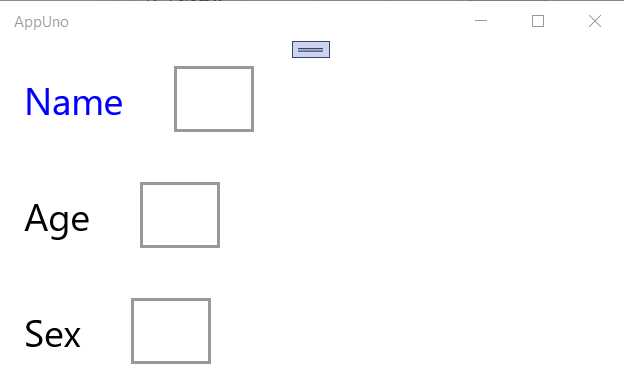
Figure 3-l: Style Applied to a TextBlock Component (Globally and Explicitly)
Referencing a style by its key, in this case x:Key="st", is known as explicit styling, and it is specific to the UI element that references that key.
However, if we remove the key, it becomes an implicit style, and as such, the Style resource applies to all the components of that same type—in this case, the TextBlock components, because the style's TargetType value is TextBlock.
Let’s go back to the App.xaml file and remove the key from the Style resource. The updated code follows.
Listing 3-m: The App.xaml.cs File – Using a Global Implicit Style
<Application x:Class="AppUno.App" xmlns="http://schemas.microsoft.com/winfx/2006/xaml/presentation" xmlns:x="http://schemas.microsoft.com/winfx/2006/xaml" xmlns:local="using:AppUno"> <Application.Resources> <Style TargetType="TextBlock"> <Style.Setters> <Setter Property="Foreground" Value="Blue"/> </Style.Setters> </Style> </Application.Resources> </Application> |
We need to do one more modification, and that is to remove Style="{StaticResource st}" from the first TextBlock component on the MainPage.xaml file.
Listing 3-n: The Updated MainPage.xaml File (Without the Resource)
<Page x:Class="AppUno.MainPage" xmlns="http://schemas.microsoft.com/winfx/2006/xaml/presentation" xmlns:x="http://schemas.microsoft.com/winfx/2006/xaml" xmlns:local="using:AppUno" xmlns:d="http://schemas.microasoft.com/expression/blend/2008" xmlns:mc="http://schemas.openxmlformats.org/markup-compatibility/2006" mc:Ignorable="d"> <StackPanel> <StackPanel Orientation="Horizontal" Background="{ThemeResource ApplicationPageBackgroundThemeBrush}"> <TextBlock Text="Name" Margin="20" FontSize="30" x:Name="laName" Grid.Column="1" HorizontalAlignment="Center" VerticalAlignment="Center"/> <TextBox Text="" Margin="20" FontSize="30" x:Name="Name" Grid.Row="1" Grid.Column="1" HorizontalAlignment="Center" VerticalAlignment="Center"/> </StackPanel>
<StackPanel Orientation="Horizontal" Background="{ThemeResource ApplicationPageBackgroundThemeBrush}"> <TextBlock Text="Age" Margin="20" FontSize="30" x:Name="laAge" Grid.Column="1" HorizontalAlignment="Center" VerticalAlignment="Center"/> <TextBox Text="" Margin="20" FontSize="30" x:Name="Age" Grid.Row="1" Grid.Column="1" HorizontalAlignment="Center" VerticalAlignment="Center"/> </StackPanel> <StackPanel Orientation="Horizontal" Background="{ThemeResource ApplicationPageBackgroundThemeBrush}"> <TextBlock Text="Sex" Margin="20" FontSize="30" x:Name="laSex" Grid.Column="1" HorizontalAlignment="Center" VerticalAlignment="Center"/> <TextBox Text="" Margin="20" FontSize="30" x:Name="Sex" Grid.Row="1" Grid.Column="1" HorizontalAlignment="Center" VerticalAlignment="Center"/> </StackPanel> </StackPanel> </Page> |
If the application is running, all you need to do is save the App.xaml and MainPage.xaml file changes, and see the application's UI updated. In my case, this looks as follows.
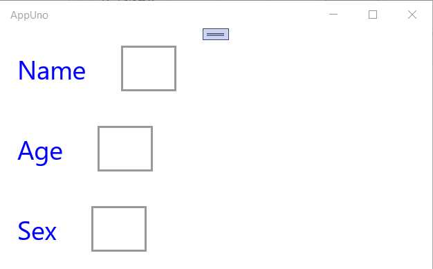
Figure 3-m: Style Applied to all TextBlock Components (Globally and Implicitly)
We can now see that the Style resource has been applied to all TextBlock components; therefore, the style is implicit.
If you've used UWP styling before, these concepts will be familiar to you, and you'll feel right at home. However, there are some differences between Uno UI and UWP, so it's good to go over this article to understand those differences.
Data binding: model
Uno applications rely extensively on data binding, which provides the UI a way to retrieve and display data from the application's model. This is called one-way data binding. Uno also can synchronize the data from the UI to the model and vice-versa, known as two-way data binding.
To use data binding, we can use the {x:Bind} or {Binding} markup extensions, which work primarily the same way; however, there are some slight differences between them.
To see data binding in action, let's add a new C# class file to the AppUno.Shared project. To do that, if the application is still running, make sure you stop it first.
Note: Because you will stop the application, I recommended that later you clean and build the complete AppUno solution.
With Solution Explorer opened, right-click the AppUno.Shared project, then click Add > New item. The following window will open.
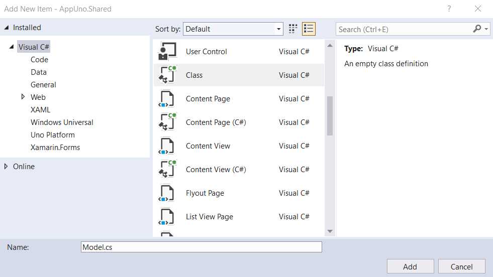
Figure 3-n: The Add New Item Window
Select the Class option and give it a name—I'll call the file Model.cs. Click Add.
Sometimes you might want to create a folder within your project to keep files related to each other. For example, you could have created a Model folder and placed the Model.cs file within that folder. This is a common and good practice, primarily for code organization.
However, for the sake of simplicity, I will skip creating a folder and instead generate the Model.cs file directly. Once the file is created, we can see it under the AppUno.Shared project.
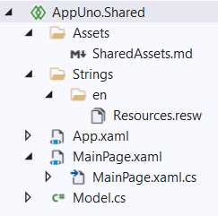
Figure 3-o: The Model.cs File – AppUno.Shared Project
Let's open the Model.cs file by double-clicking it within the Solution Explorer, and replace the default code with the following.
Listing 3-o: The Model.cs File
using System.ComponentModel; namespace AppUno { public class Model: INotifyPropertyChanged { private string name; private int age; private string sex; public string Name { get => name; set { name = value; PropertyChanged?.Invoke( this, new PropertyChangedEventArgs(nameof(Name))); } }
public int Age { get => age; set { age = value; PropertyChanged?.Invoke( this, new PropertyChangedEventArgs(nameof(Age))); } } public string Sex { get => sex; set { sex = value; PropertyChanged?.Invoke( this, new PropertyChangedEventArgs(nameof(Sex))); } } public event PropertyChangedEventHandler PropertyChanged; } } |
The first thing we did was use the System.ComponentModel namespace, which is used for implementing the behavior of components and controls during runtime.
The Model class is declared within the AppUno namespace, which is the namespace that is used within the various AppUno projects. The Model class inherits from the INotifyPropertyChanged interface, which notifies clients subscribed when property values change. This is an essential characteristic of data binding.
Following that, we declared three private variables, each corresponding to a UI element: one for name, another for age, and one for sex. These variables are private, meaning they are not exposed and cannot be manipulated or changed outside the class.
These variables are used by the Name, Age, and Sex properties, respectively—which are the ones that will be used to do the data binding in the XAML code, as we will see shortly.
The Model class uses the PropertyChanged event; a PropertyChangedEventHandler will be raised when the property changes on the component. Therefore, the Name, Age, and Sex properties must invoke this event when a new value is assigned.
The Name property retrieves the value from the name variable and assigns the new value to the name variable, invoking the PropertyChanged event:
PropertyChanged?.Invoke(this, new PropertyChangedEventArgs(nameof(Name)));
The Age property retrieves the value from the age variable and assigns the new value to the age variable, invoking the PropertyChanged event:
PropertyChanged?.Invoke(this, new PropertyChangedEventArgs(nameof(Age)));
Likewise, the Sex property retrieves the value from the sex variable. It assigns the new value to the sex variable, invoking the PropertyChanged event:
PropertyChanged?.Invoke(this, new PropertyChangedEventArgs(nameof(Sex)));
So, with the data binding code in place within the Model.cs file, we need to modify the XAML markup to ensure that the TextBox components (input fields) bind to these properties.
Data binding: XAML
Let's open the MainPage.xaml file and add the bindings to the TextBox components. The code changes are highlighted in bold in the following listing.
Listing 3-p: Adding Bindings – MainPage.xaml
<Page x:Class="AppUno.MainPage" xmlns="http://schemas.microsoft.com/winfx/2006/xaml/presentation" xmlns:x="http://schemas.microsoft.com/winfx/2006/xaml" xmlns:local="using:AppUno" xmlns:d="http://schemas.microasoft.com/expression/blend/2008" xmlns:mc="http://schemas.openxmlformats.org/markup-compatibility/2006" mc:Ignorable="d"> <StackPanel> <StackPanel Orientation="Horizontal" Background="{ThemeResource ApplicationPageBackgroundThemeBrush}"> <TextBlock Text="Name" Margin="20" FontSize="30" x:Name="laName" Grid.Column="1" HorizontalAlignment="Center" VerticalAlignment="Center"/> <TextBox Text="{Binding Name}" Margin="20" FontSize="30" x:Name="Name" Grid.Row="1" Grid.Column="1" HorizontalAlignment="Center" VerticalAlignment="Center"/> </StackPanel>
<StackPanel Orientation="Horizontal" Background="{ThemeResource ApplicationPageBackgroundThemeBrush}"> <TextBlock Text="Age" Margin="20" FontSize="30" x:Name="laAge" Grid.Column="1" HorizontalAlignment="Center" VerticalAlignment="Center"/> <TextBox Text="{Binding Age}" Margin="20" FontSize="30" x:Name="Age" Grid.Row="1" Grid.Column="1" HorizontalAlignment="Center" VerticalAlignment="Center"/> </StackPanel> <StackPanel Orientation="Horizontal" Background="{ThemeResource ApplicationPageBackgroundThemeBrush}"> <TextBlock Text="Sex" Margin="20" FontSize="30" x:Name="laSex" Grid.Column="1" HorizontalAlignment="Center" VerticalAlignment="Center"/> <TextBox Text="{Binding Sex}" Margin="20" FontSize="30" x:Name="Sex" Grid.Row="1" Grid.Column="1" HorizontalAlignment="Center" VerticalAlignment="Center"/> </StackPanel> </StackPanel> </Page> |
The changes done are simple. Each TextBox component binds to a property of the Model class.
On the first TextBox component, we bind the Text parameter to the Name property of the Model as follows: Text="{Binding Name}".
On the second TextBox component, we bind the Text parameter to the Age property of the Model as follows: Text="{Binding Age}".
On the third TextBox component, we bind the Text parameter to the Sex property of the Model as follows: Text="{Binding Sex}".
By doing this, we now have a way to assign the values entered through these TextBox (input field) components to the Model properties.
But before we can see this working, there's one more modification we need to do, and that is to initialize the DataContext object within the MainPage.xaml.cs file. This change is highlighted in bold in the following listing.
Listing 3-q: Initializing the DataContext Object – MainPage.xaml.cs
using Windows.UI.Xaml.Controls; namespace AppUno { public sealed partial class MainPage : Page { public MainPage() { this.InitializeComponent(); DataContext = new Model { Name = "Ed", Age = 20, Sex = "M" }; } } } |
The initialization of the DataContext object is achieved by creating an instance of the Model class and assigning values to its properties.
If you now build and run the AppUno.UWP project, we should see the following result.
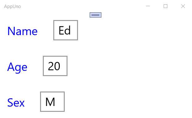
Figure 3-p: AppUno.UWP Running
We can see that by the values assigned to the DataContext object and through data binding, each of the TextBox components has a value set when the application runs.
Two-way data binding
What we have implemented is one-way data binding. Now, let's implement two-way data binding—which is quickly done by adding the Mode parameter and setting its value to TwoWay. The changes are highlighted in bold in the following listing.
Listing 3-r: Two-way Data Binding – MainPage.xaml
<Page x:Class="AppUno.MainPage" xmlns="http://schemas.microsoft.com/winfx/2006/xaml/presentation" xmlns:x="http://schemas.microsoft.com/winfx/2006/xaml" xmlns:local="using:AppUno" xmlns:d="http://schemas.microasoft.com/expression/blend/2008" xmlns:mc="http://schemas.openxmlformats.org/markup-compatibility/2006" mc:Ignorable="d"> <StackPanel> <StackPanel Orientation="Horizontal" Background="{ThemeResource ApplicationPageBackgroundThemeBrush}"> <TextBlock Text="Name" Margin="20" FontSize="30" x:Name="laName" Grid.Column="1" HorizontalAlignment="Center" VerticalAlignment="Center"/> <TextBox Text="{Binding Name, Mode=TwoWay}" Margin="20" FontSize="30" x:Name="Name" Grid.Row="1" Grid.Column="1" HorizontalAlignment="Center" VerticalAlignment="Center"/> </StackPanel>
<StackPanel Orientation="Horizontal" Background="{ThemeResource ApplicationPageBackgroundThemeBrush}"> <TextBlock Text="Age" Margin="20" FontSize="30" x:Name="laAge" Grid.Column="1" HorizontalAlignment="Center" VerticalAlignment="Center"/> <TextBox Text="{Binding Age, Mode=TwoWay}" Margin="20" FontSize="30" x:Name="Age" Grid.Row="1" Grid.Column="1" HorizontalAlignment="Center" VerticalAlignment="Center"/> </StackPanel> <StackPanel Orientation="Horizontal" Background="{ThemeResource ApplicationPageBackgroundThemeBrush}"> <TextBlock Text="Sex" Margin="20" FontSize="30" x:Name="laSex" Grid.Column="1" HorizontalAlignment="Center" VerticalAlignment="Center"/> <TextBox Text="{Binding Sex, Mode=TwoWay}" Margin="20" FontSize="30" x:Name="Sex" Grid.Row="1" Grid.Column="1" HorizontalAlignment="Center" VerticalAlignment="Center"/> </StackPanel> </StackPanel> </Page> |
As you can see, we have added Mode=TwoWay to the binding clause of each TextBox component.
To understand this better and see it in action, let's add a TextBlock component before the closing tag of the last StackPanel component on the MainPage.xaml file as follows:
<TextBlock Text="{Binding Sex}" Margin="20" FontSize="30" x:Name="laSex2" Grid.Column="1" HorizontalAlignment="Center" VerticalAlignment="Center"/>
Notice that we are binding the Text property to the Sex property of the Model. Therefore, the updated MainPage.xaml file should now look as follows. The changes are highlighted in bold.
Listing 3-s: Two-way Data Binding – Updated MainPage.xaml
<Page x:Class="AppUno.MainPage" xmlns="http://schemas.microsoft.com/winfx/2006/xaml/presentation" xmlns:x="http://schemas.microsoft.com/winfx/2006/xaml" xmlns:local="using:AppUno" xmlns:d="http://schemas.microasoft.com/expression/blend/2008" xmlns:mc="http://schemas.openxmlformats.org/markup-compatibility/2006" mc:Ignorable="d">
<StackPanel> <StackPanel Orientation="Horizontal" Background="{ThemeResource ApplicationPageBackgroundThemeBrush}"> <TextBlock Text="Name" Margin="20" FontSize="30" x:Name="laName" Grid.Column="1" HorizontalAlignment="Center" VerticalAlignment="Center"/> <TextBox Text="{Binding Name, Mode=TwoWay}" Margin="20" FontSize="30" x:Name="Name" Grid.Row="1" Grid.Column="1" HorizontalAlignment="Center" VerticalAlignment="Center"/> </StackPanel>
<StackPanel Orientation="Horizontal" Background="{ThemeResource ApplicationPageBackgroundThemeBrush}"> <TextBlock Text="Age" Margin="20" FontSize="30" x:Name="laAge" Grid.Column="1" HorizontalAlignment="Center" VerticalAlignment="Center"/> <TextBox Text="{Binding Age, Mode=TwoWay}" Margin="20" FontSize="30" x:Name="Age" Grid.Row="1" Grid.Column="1" HorizontalAlignment="Center" VerticalAlignment="Center"/> </StackPanel>
<StackPanel Orientation="Horizontal" Background="{ThemeResource ApplicationPageBackgroundThemeBrush}"> <TextBlock Text="Sex" Margin="20" FontSize="30" x:Name="laSex" Grid.Column="1" HorizontalAlignment="Center" VerticalAlignment="Center"/> <TextBox Text="{Binding Sex, Mode=TwoWay}" Margin="20" FontSize="30" x:Name="Sex" Grid.Row="1" Grid.Column="1" HorizontalAlignment="Center" VerticalAlignment="Center"/> <TextBlock Text="{Binding Sex}" Margin="20" FontSize="30" x:Name="laSex2" Grid.Column="1" HorizontalAlignment="Center" VerticalAlignment="Center"/> </StackPanel> </StackPanel> </Page> |
If you have the application running and save the changes to the MainPage.xaml file, you should see the following.
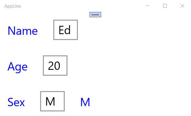
Figure 3-q: Modified AppUno.UWP Running
Notice that there's a new label (TextBlock) with the value M after the Sex input field (TextBox).
If we now change the value of the Sex input field to F and press Tab to move out of the field, the two-way data binding will update the value of the new label to F.
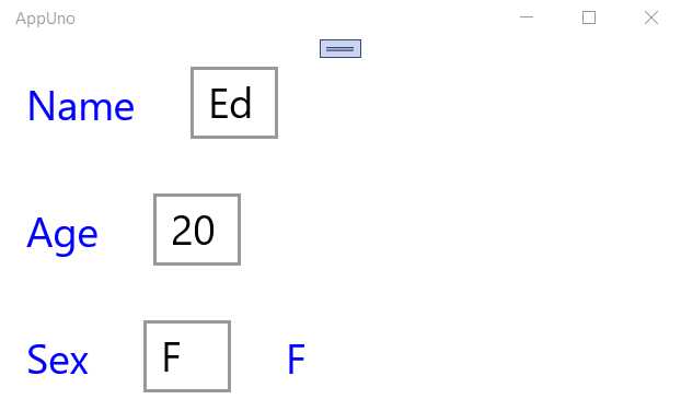
Figure 3-r: Modified AppUno.UWP Running (Updated Value)
Excellent—that worked like a charm!
Summary
Throughout this chapter, we explored some of the essential aspects of XAML and how it can be used to create the UI of an Uno application.
XAML is quite a broad topic, and I could easily write an entire book on it. I invite you to learn more about XAML by reading the official documentation. I also suggest checking out UWP Succinctly and More UWP Succinctly, which cover how to use XAML for creating UWP apps.
We will explore how to reconstruct a sample Uno single-page application from the ground up in a subsequent chapter.
- 1800+ high-performance UI components.
- Includes popular controls such as Grid, Chart, Scheduler, and more.
- 24x5 unlimited support by developers.