
Twitter Bootstrap 4 Succinctly®

CHAPTER 8
The House of Cards
As you may have gathered by now, a lot of the old section, well, and general header and footer components have been removed. It was these sectioning and layout components that attracted many developers, myself included, to adopt Bootstrap in the first place.
Fear not, though—the old way might be gone, but in its place comes an all-powerful, Flexbox-driven replacement with near-infinite ways to use it.
The Twitter card component
A card is a generic block-level component with specific styling geared for very specific use cases, such as a photo thumbnail with a description and a call to action below it, as Code Listing 67 shows.
Code Listing 67: A very basic Twitter card
<!-- Page content goes here --> <div class="container"> <div class="row"> <div class="col"> <br /> <div class="card" style="width: 18rem;"> <img class="card-img-top" src="http://via.placeholder.com/500x500" alt="Card image cap"> <div class="card-body"> <h5 class="card-title">Flying Cats</h5> <p class="card-text">The newest thing in pet owning circles, ………</p> <a href="#" class="btn btn-primary">Learn More</a> </div> </div> </div> </div> </div> |
With very little markup, Code Listing 67 produces the card shown in Figure 66. Note that in the listing I've substituted the link to the cat picture I used with a link to the placeholder service mentioned in the chapter on images. Feel free to add in your own 500 × 500 image to replace the gray 500 × 500 filler image that you’ll see.
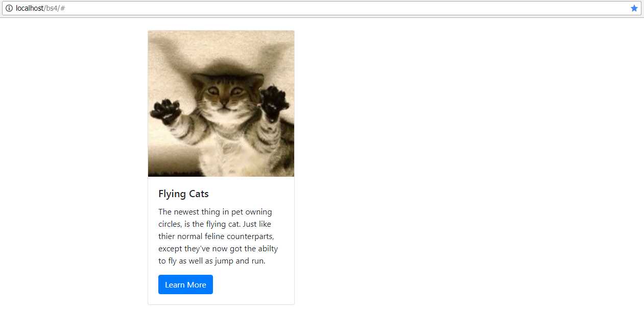
Figure 66: A basic Twitter card
As you can see from Code Listing 67, the structure is very much like everything else we’ve seen so far. We have an outer parent with a single class, card in this case, followed by a number of inner elements that each have more specific purposes, such as card-img-top, card-text, and card-body.
Because cards are all block-level attributes, the BS4 development team recommends using the BS4 grid layout classes to position and size the cards. This gives you absolute flexibility, and it ensures that your layouts will always allow BS4 to look after all your responsive resizing tasks for you.
We don’t have space here to cover everything the card component can do, but I will show you a few notable examples.
Headers and footers
Headers and footers can be added to your cards by just adding an extra <div> element in the appropriate place.
Code Listing 68: Adding a header to your card
<!-- Page content goes here --> <div class="container"> <div class="row"> <div class="col"> <br /> <div class="card"> <div class="card-header"> Information about "Peter Shaw" </div> <div class="card-body"> <h5 class="card-title">Hello my name is SHAWTY</h5> <p class="card-text">This is some text telling you all about me and what I'm doing.</p> <a href="#" class="btn btn-primary">Click Here to Learn More</a> </div> </div> </div> </div> </div> |
The header is simply added as a nested <div>, immediately after the opening tag for the card itself, and then given a class of card-header. The rest of the markup is the same as the example in Code Listing 67. Note that the screenshot shows the card expanding to the full width of the col holding it. If that <div> was changed to something along the lines of col-md-3, then the card would take up exactly a quarter of the space available (remember, there are 12 cells across by default).
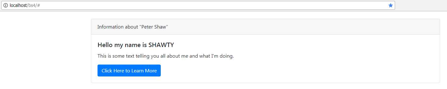
Figure 67: A Twitter card with a header
If you change the class to card-footer and place the <div> just before the closing tag of the card container, you’ll get the same effect, but at the bottom of the container.
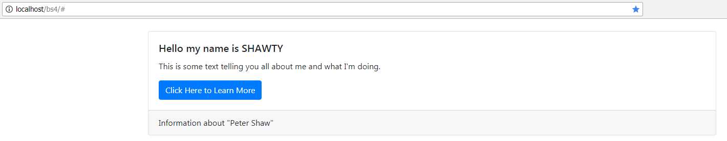
Figure 68: A Twitter card with a footer
Card colors
Just as with everything else in BS4, you can use the color classes to add contextual color to your cards. bg-success, bg-light, bg-info, and the rest allow you to set the background color of the card.
Code Listing 69, while a bit on the long side, should give you a good feel for the different color combinations you can use.
Code Listing 69: Some of the different color combinations a card can use
<div class="container"> <br /> <div class="row"> <div class="col-lg-3"> <div class="card text-white bg-primary mb-3" style="max-width: 18rem;"> <div class="card-header">Header</div> <div class="card-body"> <h5 class="card-title">Primary card title</h5> <p class="card-text">Some quick example text to build on the card title and make up the bulk of the card's content.</p> </div> </div> </div> <div class="col-lg-3"> <div class="card text-white bg-secondary mb-3" style="max-width: 18rem;"> <div class="card-header">Header</div> <div class="card-body"> <h5 class="card-title">Secondary card title</h5> <p class="card-text">Some quick example text to build on the card title and make up the bulk of the card's content.</p> </div> </div> </div> <div class="col-lg-3"> <div class="card text-white bg-success mb-3" style="max-width: 18rem;"> <div class="card-header">Header</div> <div class="card-body"> <h5 class="card-title">Success card title</h5> <p class="card-text">Some quick example text to build on the card title and make up the bulk of the card's content.</p> </div> </div> </div> <div class="col-lg-3"> <div class="card text-white bg-danger mb-3" style="max-width: 18rem;"> <div class="card-header">Header</div> <div class="card-body"> <h5 class="card-title">Danger card title</h5> <p class="card-text">Some quick example text to build on the card title and make up the bulk of the card's content.</p> </div> </div> </div> </div> <div class="row"> <div class="col-lg-3"> <div class="card text-white bg-warning mb-3" style="max-width: 18rem;"> <div class="card-header">Header</div> <div class="card-body"> <h5 class="card-title">Warning card title</h5> <p class="card-text">Some quick example text to build on the card title and make up the bulk of the card's content.</p> </div> </div> </div> <div class="col-lg-3"> <div class="card text-white bg-info mb-3" style="max-width: 18rem;"> <div class="card-header">Header</div> <div class="card-body"> <h5 class="card-title">Info card title</h5> <p class="card-text">Some quick example text to build on the card title and make up the bulk of the card's content.</p> </div> </div> </div> <div class="col-lg-3"> <div class="card bg-light mb-3" style="max-width: 18rem;"> <div class="card-header">Header</div> <div class="card-body"> <h5 class="card-title">Light card title</h5> <p class="card-text">Some quick example text to build on the card title and make up the bulk of the card's content.</p> </div> </div> </div> <div class="col-lg-3"> <div class="card text-white bg-dark mb-3" style="max-width: 18rem;"> <div class="card-header">Header</div> <div class="card-body"> <h5 class="card-title">Dark card title</h5> <p class="card-text">Some quick example text to build on the card title and make up the bulk of the card's content.</p> </div> </div> </div> </div> </div> |
When rendered, you should see something similar to the following figure.

Figure 69: Different card color combinations
As with the navigation bars, the authority on using the card component can be found in the BS4 documentation, and like the navbar, there’s much more you can use a card for. There are special classes to include a navbar in the header of a card, so you can make small tab-driven and pill-driven content panels. There are also text alignment classes, and the ability to line up buttons and text to produce stunning dialogs. For now, however—in this book at least—it’s time for us to move on.
- 1800+ high-performance UI components.
- Includes popular controls such as Grid, Chart, Scheduler, and more.
- 24x5 unlimited support by developers.