
Twitter Bootstrap 4 Succinctly®

CHAPTER 7
Navigating around the World
I mentioned in the previous chapter that BS4 had a better way of providing sets of button links to use for navigation within an application. In this chapter, we’ll see the navigation tools that BS4 provides to web application developers. Using these navigation tools is a simple process, but in this chapter, you’ll start to see some large chunks of HTML code.
A basic navigation set
Many web developers will be familiar with using a <ul> tag that contains embedded <li> tags to provide a list of items that are then styled to be used in a navigation system.
The following code listing is the simplest form of navigation we can do in BS4 using a standard <ul> construction.
Code Listing 60: A very basic navigation set
<!-- Page content goes here --> <div class="container"> <div class="row"> <div class="col"> <ul class="nav"> <li class="nav-item"> <a class="nav-link active" href="activelink">Active</a> </li> <li class="nav-item"> <a class="nav-link" href="link2">Link 2</a> </li> <li class="nav-item"> <a class="nav-link" href="link3">Link 3</a> </li> <li class="nav-item"> <a class="nav-link disabled" href="disabledlink">Disabled</a> </li> </ul> </div> </div> </div> |
As you can see in Code Listing 60, the code is like much of what we’ve learned so far put together in a very standard way. BS4 adds its magic by way of the nav, nav-item, and nav-link classes.
The active link won’t look any different in this chunk of code because we’ve done this so simply, but as you’ll see soon, adding the active class in some cases does have a big impact.
If you add Code Listing 60 into the template we’ve been using and render it, your browser should look like this:
Figure 59: Basic navigation produced by the code in Code Listing 60
A point worth noting again here is the Disabled link. Just as with the warning in the chapter on buttons, the disabled link is only styled to look so. Clicking on it will still follow the underlying link, so you’ll need to handle that in your framework if you’re going to prevent it from going anywhere.
If Code Listing 60 is a little too much HTML for your liking, note that you don’t have to do things that way. Because BS4 is Flexbox-first, you can also do the exact same thing using this simpler chunk of code:
Code Listing 61: A simpler way of creating the same output as Code Listing 60
<!-- Page content goes here --> <div class="container"> <div class="row"> <div class="col"> <nav class="nav"> <a class="nav-link active" href="activelink">Active</a> <a class="nav-link" href="link2">Link 2</a> <a class="nav-link" href="link3">Link 3</a> <a class="nav-link disabled" href="disabledlink">Disabled</a> </nav> </div> </div> </div> |
If you change your template to use that code, rather than the code in Code Listing 60, and then refresh, the output should be exactly the same.
This highlights that as with most things in IT, there is always more than one way to achieve what you need to, and everythin’ I've shown you in this book so far is only the beginning of where your journey with BS4 is heading.
When you’re dealing with navigation collections like the ones in Code Listings 60 and 61, you might often need them to be centered or even right-aligned.
Anyone who’s spent any time in HTML will know that this is often easier to describe than implement.
BS4, however, will make you wonder just why you ever made a fuss about it. Because of BS4’s love of Flexbox, you can simply add justify-content-center, justify-content-end, or the default justify-content-start to your outer parent holding the collection of navigation items.
Code Listing 62 highlights this.
Code Listing 62: Aligning your navigation collections
<!-- Page content goes here --> <div class="container"> <div class="row"> <div class="col"> <p>Left (Start) aligned</p> <nav class="nav"> <a class="nav-link active" href="activelink">Active</a> <a class="nav-link" href="link2">Link 2</a> <a class="nav-link" href="link3">Link 3</a> <a class="nav-link disabled" href="disabledlink">Disabled</a> </nav><hr/> <p>Center aligned</p> <nav class="nav justify-content-center"> <a class="nav-link active" href="activelink">Active</a> <a class="nav-link" href="link2">Link 2</a> <a class="nav-link" href="link3">Link 3</a> <a class="nav-link disabled" href="disabledlink">Disabled</a> </nav><hr /> <p>Right (End) aligned</p> <nav class="nav justify-content-end"> <a class="nav-link active" href="activelink">Active</a> <a class="nav-link" href="link2">Link 2</a> <a class="nav-link" href="link3">Link 3</a> <a class="nav-link disabled" href="disabledlink">Disabled</a> </nav> </div> </div> </div> |
If you put this code into your template, then you should see the following output if your classes and layout are correct.
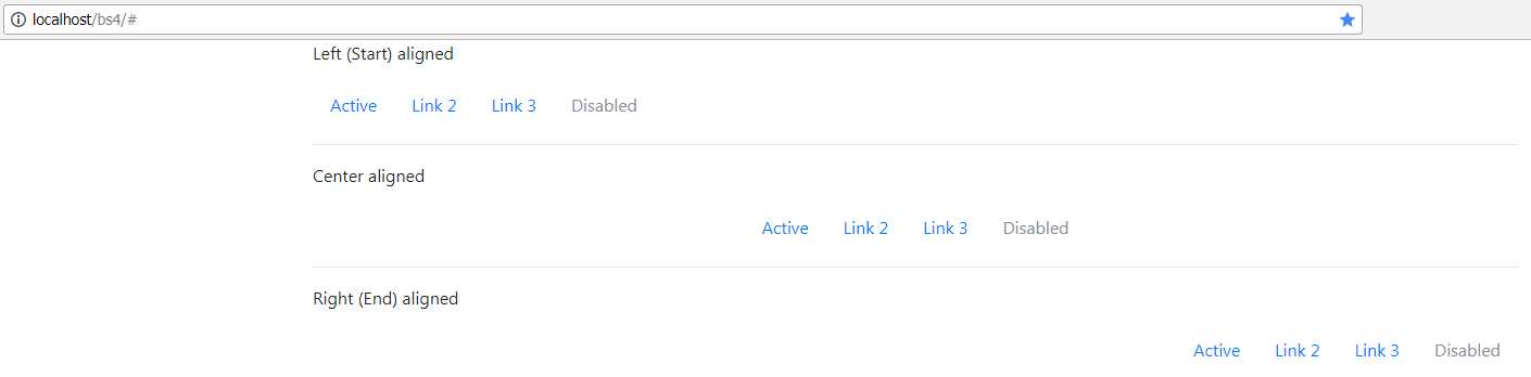
Figure 60: Aligned navigation collections
If you want your navigation collection to run vertically instead of horizontally, then you need to replace any of the justify classes with flex-column.
Code Listing 63: Making your navigation collection vertical
<!-- Page content goes here --> <div class="container"> <div class="row"> <div class="col"> <nav class="nav flex-column"> <a class="nav-link active" href="activelink">Active</a> <a class="nav-link" href="link2">Link 2</a> <a class="nav-link" href="link3">Link 3</a> <a class="nav-link disabled" href="disabledlink">Disabled</a> </nav> </div> </div> </div> |
If you change the extra class on your parent container so that it looks like the snippet of code in Code Listing 63, you’ll see that your nav items now run top to bottom. The modifier classes for left, center, right, and vertical will work on both the simple nav bar as shown in Code Listing 63, and on the <ul>/<li> layout that we opened the chapter with.
Actively marking the current entry
We’ve been adding the active class to the examples we’ve done so far, but as of yet, you’ve not seen much of a change in the nav item marked as being the active one.
To make use of it, we need to add an outer container, such as a tab or pill set. When we do this in BS4, we’ll suddenly see that we get some extra graphical goodness on our navigation collection, extra goodness that looks more like you would expect a navigation collection to look.
Code Listing 64 shows both of our layouts for navigation, and as you can see, both have a nav-tabs class on the parent container.
Code Listing 64: Highlighting the active choice using a tabbed navigation collection
<!-- Page content goes here --> <div class="container"> <div class="row"> <div class="col"> <br /> <nav class="nav nav-tabs"> <a class="nav-link active" href="activelink">Active</a> <a class="nav-link" href="link2">Link 2</a> <a class="nav-link" href="link3">Link 3</a> <a class="nav-link disabled" href="disabledlink">Disabled</a> </nav> <br /><br /> <ul class="nav nav-tabs"> <li class="nav-item"> <a class="nav-link active" href="activelink">Active</a> </li> <li class="nav-item"> <a class="nav-link" href="link2">Link 2</a> </li> <li class="nav-item"> <a class="nav-link" href="link3">Link 3</a> </li> <li class="nav-item"> <a class="nav-link disabled" href="disabledlink">Disabled</a> </li> </ul> </div> </div> </div> |
If you render Code Listing 64 in your browser, you’ll see something a little odd.
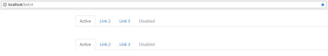
Figure 61: Nav tabs with both a flex layout and a traditional <ul>/<li> construction
When you use a simple nav element to create a tabbed collection, a line is drawn across the bottom of the container, whereas with the <ul>/<li> way of doing things, there is a gap. I’m not sure why this is, and at the time of writing this book, I’ve not been able to find an answer for it. My advice here would be to use the appropriate construction, depending on if you want to see a gap or not. Whichever way you look at it, the active class serves to highlight the chosen option, and if you swap the classes appropriately in your framework, you’ll find that you can track things very easily.
You can easily change the tabs to pills by changing the nav-tabs class to nav-pills, as Code Listing 65 shows.
Code Listing 65: Changing our tabs to pills
<!-- Page content goes here --> <div class="container"> <div class="row"> <div class="col"> <br /> <nav class="nav nav-pills"> <a class="nav-link active" href="activelink">Active</a> <a class="nav-link" href="link2">Link 2</a> <a class="nav-link" href="link3">Link 3</a> <a class="nav-link disabled" href="disabledlink">Disabled</a> </nav> <br /><br /> <ul class="nav nav-pills"> <li class="nav-item"> <a class="nav-link active" href="activelink">Active</a> </li> <li class="nav-item"> <a class="nav-link" href="link2">Link 2</a> </li> <li class="nav-item"> <a class="nav-link" href="link3">Link 3</a> </li> <li class="nav-item"> <a class="nav-link disabled" href="disabledlink">Disabled</a> </li> </ul> </div> </div> </div> |
When you render Code Listing 65 in your browser, you’ll notice that both the nav element and the <ul>/<li> construction render the same, so both can be used interchangeably. I suspect that the extra line in the tab version will be addressed at some point in the future as a bug. It may have been changed already in a newer version of BS4 than the one I’m using for these examples.
There’s a lot more you can do with standard navigation layouts, including justifying each entry so that they all take up equal space, and reacting to JavaScript events. The rest of the documentation can be found in the BS4 docs.
Full navigation bars
Navigation collections in BS4 are only the tip of the iceberg—BS4 provides a set of components designed specifically for providing rich navigation experiences at the top or the bottom of any design you create using the toolkit.
These can contain text, links, titles, drop-down menus, forms, and lots of other things.
Rather than trying to build my own sample, I’ll use the opening sample directly from the BS4 documents and modify it slightly.
Code Listing 66: Standard BS4 nav bar example
<!-- Page content goes here --> <div class="container"> <div class="row"> <div class="col"> <nav class="navbar navbar-expand-lg navbar-light bg-light"> <a class="navbar-brand" href="#">BS4 Succinctly</a> <button class="navbar-toggler" type="button" data-toggle="collapse" data-target="#navbarSupportedContent" aria-controls="navbarSupportedContent" aria-expanded="false" aria-label="Toggle navigation"> <span class="navbar-toggler-icon"></span> </button> <div class="collapse navbar-collapse" id="navbarSupportedContent"> <ul class="navbar-nav mr-auto"> <li class="nav-item active"> <a class="nav-link" href="#">Home <span class="sr-only">(current)</span></a> </li> <li class="nav-item"> <a class="nav-link" href="alink">Link</a> </li> <li class="nav-item dropdown"> <a class="nav-link dropdown-toggle" href="#" id="navbarDropdown" role="button" data-toggle="dropdown" aria-haspopup="true" aria-expanded="false"> Dropdown </a> <div class="dropdown-menu" aria-labelledby="navbarDropdown"> <a class="dropdown-item" href="action">Action</a> <a class="dropdown-item" href="action2">Another action</a> <div class="dropdown-divider"></div> <a class="dropdown-item" href="somethingelse">Something else here</a> </div> </li> <li class="nav-item"> <a class="nav-link disabled" href="disabledlink">Disabled</a> </li> </ul> <form class="form-inline my-2 my-lg-0" action="dosearch"> <input class="form-control mr-sm-2" type="search" placeholder="Search" aria-label="Search" name="searchterm"> <button class="btn btn-outline-success my-2 my-sm-0" type="submit">Search</button> </form> </div> </nav> </div> </div> </div> |
The output produced by Code Listing 66 should look something like this once you put it in your template and load it into your browser.
Figure 62: Standard nav bar produced by Code Listing 66
At first look, the code in Code Listing 66 is absolutely terrifying, and easily qualifies as one of the most complex examples in the book. However, once you start to break it down, it’s much easier to understand.
The main container is the nav element at the top of the layout. This serves as the actual container that everything else is held by. It’s also the main point where most of your actual navigation bar styling is performed.
The first style to note is the navbar-expand-lg class. With this applied, any element or container width in BS4 that is lg (large) or greater will expand the navigation bar to show all its links and buttons.
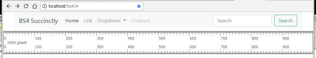
Try it with the example loaded and resize your browser window width.
You’ll find that around the 1,000 pixel mark, the navigation bar will toggle automatically between full and folded modes.
Figure 63: At about 1,000 pixels the menu will expand
Figure 64: At just a little below 1,000 pixels, the menu bar collapses
As you can see in Figures 63 and 64, the “large” breakpoint is around the 1,000 pixel mark, and so the addition of the navbar-expand-lg modifier class causes the toggle at that breakpoint.
Changing the modifier for expand to be one of sm, md, or xl will allow that breakpoint to be set so the navigation bar collapses at “small,” “medium,” or “extra-large” breakpoints. The actual number of pixels each of these takes depends a lot on which device your application is running on, and what the physical screen size is. The introductory chapters in the BS4 documentation contain a detailed description of how all of this is worked out. Keep in mind that using the correct modifiers will always maintain consistency, however, and you’ll generally not need to be aware of pixel sizes.
As a rule of thumb, I always set the breakpoint to the point just before I can’t display all my links in the navigation bar, or when things start to look too squashed.
If my links fit on an extra-large width layout, but look like rubbish at anything below that, then the extra-large breakpoint is where I flip it. Basically, experiment and see what works best for you.
Note: For those who are wondering, the ruler you can see in Figures 63 and 64 is a small Windows desktop app I downloaded from a website called silver-software a long time ago. The website seems long gone now, but I haven’t had the heart to uninstall it, as it’s been a great little tool. I’m sure one of the download sites will still have it somewhere, should you wish to look for it.
The next two classes, navbar-light and bg-light, set the colors of the navigation bar. There are a lot of different combinations here, and any color that’s used anywhere else can also be used here. For example, try changing the navbar-light to navbar-dark, and bg-light to bg-primary, to get a navigation bar that looks like the one in the following figure.
Figure 65: Navigation bar styles are easy to change
The next element is the <div> holding the navbar-brand, which forms the title of our menu bar. This can be changed for any icon that can be rendered using font-awesome or glyph icons; there’s an example on the navbar page in the BS4 docs showing you how to achieve this.
After the brand text, you’ll see a button marked with the class navbar-toggler. This is the button you see appear (with the three stripes) when the navbar collapses, as shown in Figure 64. It’s this button that opens and closes the menu when you click on it. The attributes to pay close attention to here are the data-* attributes.
Back in the chapter on alerts, I mentioned these attributes as being the primary mechanism that BS4 uses to hook up JavaScript behaviors without you having to touch any JavaScript code. In the navbar, these attributes do exactly the same thing. In particular, if you look at the data-target attribute, you’ll see that it contains an ID selector. If you look just below this at the first <div> element after the button, you’ll see that the ID of that <div> tag matches the selector.
This marks the target element for the collapse operation, and anything that’s inside that outer <div> will be content that is collapsed down into the menu bar when it collapses.
Inside the <div> that’s marked to collapse, you’ll see that the rest of the content is mostly made up of a <ul> element and a number of nested <li> elements. Each element holds a navbar item and can be one of the following:
- Navigation link
- Drop-down link
- Form
- Standard button
- Static text
You can add other things too, but for those you need to create the containers and layouts yourself. Using the built-in styles to create any of the items I’ve just listed will ensure that anything inside the navbar will maintain the same vertical or central axis, so nothing will ever look as though it’s not aligned and will automatically hide when a collapse operation is in effect.
I’m not going to list all the different variations that can used; instead, you should take a look at the BS4 docs, where you’ll find plenty of examples of the different styles and combinations available.
- 1800+ high-performance UI components.
- Includes popular controls such as Grid, Chart, Scheduler, and more.
- 24x5 unlimited support by developers.