
Twitter Bootstrap 4 Succinctly®

CHAPTER 5
Feeding the User with Status
Providing feedback for the user is an important part of any web application. The first set of components we’ll be looking at will be alerts, badges, popovers, and tooltips.
Alerts
Alerts are simple. They’re a single <div> tag with a role attached (for ARIA reasons) and a couple class names added to them. Alerts are a block element by nature and will expand to fill the space available to them, so if you need to control their size, then you either need to customize your CSS and parent element to constrain them, or you need to use the BS4 grid system to ensure they appear where you want them to.
Alerts are also contextual and use the same color naming as other color-related features you’ve seen so far in this book. The following HTML listing demonstrates all the different alert styles available.
Code Listing 45: BS4 alert styles with inline links
<!-- Page content goes here --> <div class="container"> <div class="row"> <div class="col"> <div class="alert alert-primary" role="alert"> I'm your PRIMARY alert, I'm the one you should use for general notifications. <a href="#" class="alert-link"> This is a LINK</a> </div> <div class="alert alert-secondary" role="alert"> I'm your SECONDARY alert, I'm the one you should use for general notifications that may be slightly less important. <a href="#" class="alert-link"> This is a LINK</a> </div> <div class="alert alert-success" role="alert"> I'm your SUCCESS alert, I'm the one you should use when something went well. <a href="#" class="alert-link"> This is a LINK</a> </div> <div class="alert alert-danger" role="alert"> I'm your DANGER alert, I'm the one you should use when something didn't go well. <a href="#" class="alert-link"> This is a LINK</a> </div> <div class="alert alert-warning" role="alert"> I'm your WARNING alert, I'm the one you should use when something might possibly not go well. <a href="#" class="alert-link"> This is a LINK</a> </div> <div class="alert alert-info" role="alert"> I'm your INFO alert, I'm the one you should use when something wants to tell you something, but expects it to be ignored. <a href="#" class="alert-link"> This is a LINK</a> </div> <div class="alert alert-light" role="alert"> I'm your LIGHT alert. I'm a general purpose alert. <a href="#" class="alert-link"> This is a LINK</a> </div> <div class="alert alert-dark" role="alert"> I'm your DARK alert. I'm a general purpose alert. <a href="#" class="alert-link"> This is a LINK</a> </div> </div> </div> </div> |
When you render Code Listing 45 in the browser, you’ll notice that I've also added some anchor links in there. The BS4 framework provides an inline style specifically to be added to an <a> tag so that you can place links inside an alert box and give them the same look and feel as the surrounding text. You don’t have to use these, and if you omit them, you’ll see the usual primary color (blue by default) for the link text instead, but using the premade styles means that everything will match and look well-balanced.
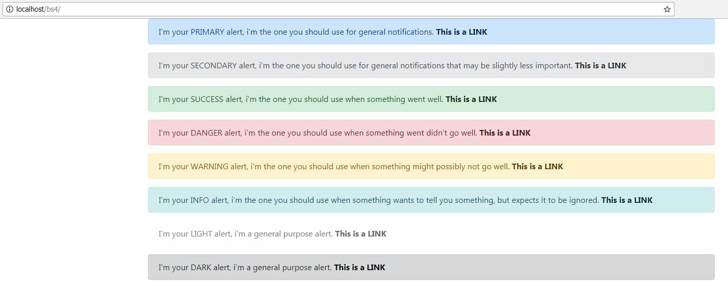
Figure 45: Alerts produced by Code Listing 45
You may also notice in Code Listing 45 that I haven’t formatted the inner content in the alerts using HTML. If you don’t use HTML, the alert will still be formatted to look OK, and some default padding will be added around it, suitable for one continuous line that will wrap as needed. It doesn’t have to be that way though—you can (and maybe should, depending on your needs) use headers, paragraphs, and other typography features to make your alerts stand out a bit more.
Code Listing 46: A rather fancy BS4 alert box
<!-- Page content goes here --> <div class="container"> <div class="row"> <div class="col"> <div class="alert alert-primary" role="alert"> <h4>That Totally Rocks!</h4> <p>The thing that just occured in your application was totally awesome. It was made all the more awesome with a little help from Bootstrap, but it was awesome nevertheless.</p> <hr /> <p>When doing awesome stuff, you can make awesome alerts that contain regular stuff using all the other Bootstrap features too.</p> <div class="row"> <div class="col"> <p>This is a <a href="#" class="alert-link">Link</a> to some further information.</p> </div> <div class="col"> <button class="btn btn-primary float-right">Click this button to do more</button> </div> </div> </div>
</div> </div> </div> |
Code Listing 46 shows one way you might add some extra markup to your alert to make it look a bit more fully featured. Don’t worry about the few classes in there that you haven’t seen yet; you’ll see them in detail soon. Figure 46 shows what our snazzy alert looks like.
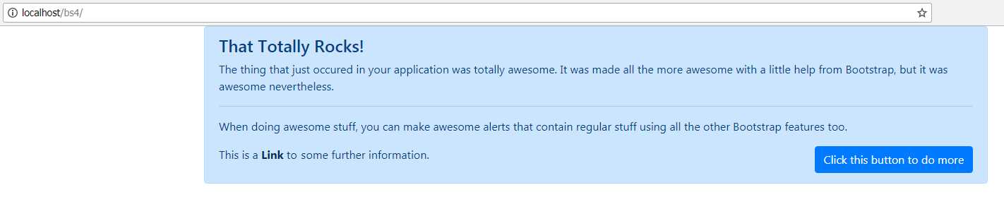
Figure 46: A snazzy alert box
Up to this point, everything you’ve done using the alert box you can do without needing to use any of the BS4 JavaScript library. The alert library, however, includes a close button and some extra JavaScript functionality to make it look even better.
Change the code from Code Listing 46 so that it looks like the following:
Code Listing 47: A snazzy alert box with a close icon and closing animation
<!-- Page content goes here --> <div class="container"> <div class="row"> <div class="col"> <div class="alert alert-primary alert-dismissible fade show" role="alert"> <button type="button" class="close" data-dismiss="alert" aria-label="Close"> <span aria-hidden="true">×</span> </button> <h4>That Totally Rocks!</h4> <p>The thing that just occurred in your application was totally awesome. It was made all the more awesome with a little help from Bootstrap, but it was awesome nevertheless.</p> <hr /> <p>When doing awesome stuff, you can make awesome alerts that contain regular stuff using all the other Bootstrap features too.</p> <div class="row"> <div class="col"> <p>This is a <a href="#" class="alert-link">Link</a> to some further information.</p> </div> <div class="col"> <button class="btn btn-primary float-right">Click this button to do more</button> </div> </div> </div> </div> </div> </div> |
If you render this in your browser, you should see that the alert box now has a small Close icon in its top-right corner. Furthermore, if you click the icon, you’ll see that the alert closes with a rather nice and simple fade effect.
The extra functionality was provided by simply adding the alert-dismissible, fade, and show classes to the main alert <div> container, and by adding an extra <button> tag using the data-dismiss="alert" attribute to link the two. show makes sure the alert appears when the page is rendered, and fade provides the fade animation (both are optional). The dismissible class, however, is required.
Note: Data-what? One of the many new things added in HTML5 is the data-xxxx attribute. When you start to use Bootstrap components, particularly the JS features, you’ll start to use these more and more. Essentially a data attribute is a way for the person creating the HTML markup to add user-defined data to an HTML tag. This data can be used later in some JavaScript code, possibly written by a completely different person, to influence the behavior of the code. For example, a designer could add the name of the primary color used here, and the JavaScript programmer could then use that to program the JavaScript to use that color elsewhere. In this case, the Bootstrap JS library sees the dismiss data item, sees that the value is equal to alert, and then uses that information to look for a parent element that is set up as an alert. If it finds one, it hooks up the functionality to allow the designer to add a close feature to the alert box, without ever having to program any JavaScript whatsoever.
As we move through the different components, you’ll start to see more of these HTML blocks being set up to use data attributes; it’s the primary method that BS4 uses to enable non-programmers to add programmed features to their designs.
Like other components that use the JavaScript library, the alert library also has some calls that you can use to make the alert visible or to hide it from other parts of your application. I’m not going to cover those in this book, as the explanations and code examples in the official docs do a much better job than I can, and since this book is about using BS4 mainly for styling, I don’t want it to get too complicated.
You can find the official docs at the Bootstrap website.
Badges
Badges are designed to provide contextual information to a primary notification object. For example, the tab for the inbox section of a web-based email service might show the number of new or unread messages in the folder. A good real-world example is the Twitter web app, in which you have a small number next to the notifications item in the top navigation bar, showing you how many new notifications you have.
Badges are typically used inline on a <span> tag and will size themselves to match the surrounding element sizes. There are a couple of different variations, such as Dark and Light, and like many of the classes provided by BS4, they have contextual color variants too.
There’s no JavaScript functionality available for badges (meaning they will work without including Bootstrap.js), but they will disappear if they are applied to an element that has no content in it. This is achieved by using the :empty CSS selector and setting it to display:none when applied. :empty only works when the inner text is completely empty, so things like spaces and carriage returns will not be considered empty.
Code Listing 48 shows all the various features available for badges.
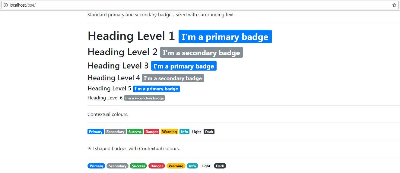
Code Listing 48: Showing off the BS4 badge component
<!-- Page content goes here --> <div class="container"> <div class="row"> <div class="col"> <p>Standard primary and secondary badges, sized with surrounding text.</p> <hr /> <h1>Heading Level 1 <span class="badge badge-primary">I'm a primary badge</span></h1> <h2>Heading Level 2 <span class="badge badge-secondary">I'm a secondary badge</span></h2> <h3>Heading Level 3 <span class="badge badge-primary">I'm a primary badge</span></h3> <h4>Heading Level 4 <span class="badge badge-secondary">I'm a secondary badge</span></h4> <h5>Heading Level 5 <span class="badge badge-primary">I'm a primary badge</span></h5> <h6>Heading Level 6 <span class="badge badge-secondary">I'm a secondary badge</span></h6> <hr/> <p>Contextual colors.</p> <hr /> <div> <span class="badge badge-primary">Primary</span> <span class="badge badge-secondary">Secondary</span> <span class="badge badge-success">Success</span> <span class="badge badge-danger">Danger</span> <span class="badge badge-warning">Warning</span> <span class="badge badge-info">Info</span> <span class="badge badge-light">Light</span> <span class="badge badge-dark">Dark</span> </div> <hr /> <p>Pill-shaped badges with contextual colors.</p> <hr /> <div> <span class="badge badge-pill badge-primary">Primary</span> <span class="badge badge-pill badge-secondary">Secondary</span> <span class="badge badge-pill badge-success">Success</span> <span class="badge badge-pill badge-danger">Danger</span> <span class="badge badge-pill badge-warning">Warning</span> <span class="badge badge-pill badge-info">Info</span> <span class="badge badge-pill badge-light">Light</span> <span class="badge badge-pill badge-dark">Dark</span> </div> </div> </div> </div> |
I was going to add some JavaScript into Code Listing 48 to toggle the content so the reader could see the effect of no content, but it’s much easier if I just encourage you to experiment. Once you put this code into your template file, try removing and emptying the text inside some of the tags and then refreshing the page. You’ll see that not only does the badge vanish, but also the space it would have used collapses too, closing the gap.
If you render Code Listing 48 in your browser, you should see something like the following figure.
Figure 47: A demonstration of the badge component as produced by Code Listing 48
Tooltips and popovers
Tooltips are useful little bits of information, usually only one or two words that appear when you hover over a control or click a help button of some kind. To use them in Bootstrap, not only do you need the Bootstrap.js file, but you also need to ensure that you have Popper.js loaded.
Popovers are usually a little bit fuller than a tooltip, and have a title area and usually a paragraph of text. Both, however, are very similar in their operation.
Note: Popper.js is a third-party JavaScript library used to manage popups in layers in a web application. BS4 uses this rather than writing its own implementation, as it has a proven track record and is known to be cross-platform. You can find out more at https://popper.js.org/.
If you recall from the introduction, the initial BS4 template included three lines of JavaScript at the bottom of the file.
Code Listing 49: The bottom three lines in our initial template
<!-- Optional JavaScript --> <!-- jQuery first, then Popper.js, then Bootstrap JS --> <script src="https://code.jquery.com/jquery-3.2.1.slim.min.js" integrity="sha384-q8i/X+965DzO0rT7abK41JStQIAqVgRVzpbzo5smXKp4YfRvH+8abtTE1Pi6jizo" crossorigin="anonymous"></script> <script src="https://cdnjs.cloudflare.com/ajax/libs/popper.js/1.14.0/umd/popper.min.js" integrity="sha384-cs/chFZiN24E4KMATLdqdvsezGxaGsi4hLGOzlXwp5UZB1LY//20VyM2taTB4QvJ" crossorigin="anonymous"></script> <script src="https://stackpath.bootstrapcdn.com/bootstrap/4.1.0/js/bootstrap.min.js" integrity="sha384-uefMccjFJAIv6A+rW+L4AHf99KvxDjWSu1z9VI8SKNVmz4sk7buKt/6v9KI65qnm" crossorigin="anonymous"></script> |
As you can see in Code Listing 49, we include jQuery, then we include Popper.js, and finally we include the Bootstrap.js library.
If you don’t intend to use tooltips and popovers, then you don’t need to include Popper.js.
Another thing you need to be aware of is that tooltips and popovers must be initialized by hand once your page has finished loading. According to the BS4 documentation, this is for performance reasons’ I've never tested this, however, and the few time’ I've used them, performance has always been more than acceptable.
What all this means is that in your page-ready functionality, either by using jQuery’s onReady handler, or by using the events and functions provided by whichever framework you’re using, you will need to include the following small snippet of JavaScript to initialize any tooltips before you can use them.
Code Listing 50: JavaScript required to initialize tooltips and popovers
$(function () { $('[data-toggle="tooltip"]').tooltip() $('[data-toggle="popover"]').popover() }) |
Code Listing 50 shows the jQuery way of doing things with an anonymous function. If you’re using a framework such as Angular or Aurelia, then the only lines you need are the middle ones that end with tooltip or popover. Essentially, all you need to do is call the appropriate function on each HTML5 element that has a tooltip or popover attribute. Please also note that if you are using a framework, you don’t have to do the initialization using the jQuery approach shown in Code Listing 50. As long as you’re able to get a list of elements that include the data-toggle attribute, and then call the either the tooltip or popover function on them, that, too, will work.
Because of the sheer number of variations there are on how to do this, I’m not going to attempt to give you a sample—I’ll leave it up to the Bootstrap 4 documentation to show you how to apply tooltips to your elements.
You can find the relevant BS4 documentation by following these links:
Here’s a screenshot of the tooltips and popovers, as seen on the BS4 documentation site.
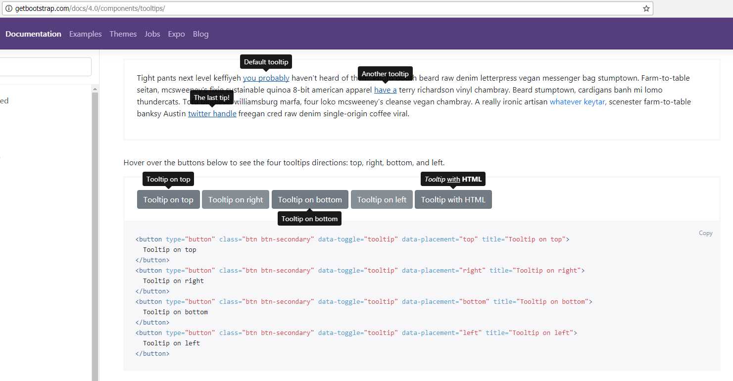
Figure 48: Tooltips demo on the Bootstrap documentation site
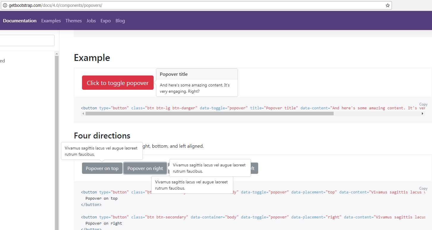
Figure 49: Popovers demo on the Bootstrap documentation site
The main difference between popovers and tooltips as far as their interactivity is concerned is that tooltips will be removed from the element automatically, usually when the mouse pointer is moved away, or a touch-up event is fired. Popovers will remain in place until explicitly told to move.
Whichever you choose, displaying them on your elements is pretty much the same in both cases.
Set data-toggle equal to tooltip for tooltips, and set it to popover for popovers.
To set the content, set the title attribute for tooltips, and set data-content for a popover.
Both tooltips and popovers use data-placement equal to top, bottom, left, or right to determine the position they appear in. Remember that you have to initialize the JavaScript by hand in a manner appropriate for the framework or page design you are using.
There are a few other lesser -used options too; if you’re interested in them, everything you need can be found in the documentation.
- 1800+ high-performance UI components.
- Includes popular controls such as Grid, Chart, Scheduler, and more.
- 24x5 unlimited support by developers.