
Twitter Bootstrap 4 Succinctly®

CHAPTER 2
Content is King
No modern website or web application is complete without content. From grids of products for sale, to witticisms and block quotes of people spanning far and wide across our digital world, content is the stuff we fill our pages with, the thing that we use to define our images, headings, sections, and much more.
Most developer types don’t really think about content when producing web layouts, and to be fair, most of them are happy to just put in some kind of placeholder and let the designers deal with it afterwards.
BS4, like its predecessors, makes it easy to make your UI look great with very little work. To start with, many of the common things like headings, lists, <pre> tags, and forms are already defined for you. In many cases, you don’t even need to specify any classes of any kind—just using the correct semantic tags in the correct order is enough.
Note: Semantic tags are part of the HTML5 standard that set out to make tags in an HTML document self-documenting. We’re all familiar with an <h1> being a heading tag level 1, or a <p> tag being a paragraph, but under HTML5 we now have tags such as <section>, <article>, and <aside> to mark the content inside them as particular document entities. <form>, <input>, and other similar tags are also designed with the same goal in mind, so that software or scripts working with the content can make some assumptions about what a specific piece of content is being used for.
As you’ll see in this chapter, BS4 can make even the simplest of text blocks look great, even if it’s just placeholder content you’re producing.
Headings
Nothing special here—headings have always been (and always will be) specified using the standard <hx> HTML tag. The x is typically a value from 1 to 6, giving you six different levels of heading.
A good example of the use of headings is in this book. If you look at the header “Headings” at the beginning of this section, and then scroll up to the start of this chapter and look at the chapter title, you can see heading levels 1 and 2 from my Microsoft Word template in play.
Add the following body code to your BS4 template file.
Code Listing 11: Content headings
<!-- Page content goes here --> <div class="container"> <div class="row"> <div class="col"> <h1>Heading Level 1</h1> <h2>Heading Level 2</h2> <h3>Heading Level 3</h3> <h4>Heading Level 4</h4> <h5>Heading Level 5</h5> <h6>Heading Level 6</h6> </div> </div> </div> |
If all goes OK, then your browser should display this:
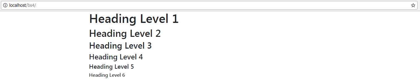
Figure 9: The heading levels produced by Code Listing 11
If you’ve used previous versions of Bootstrap, then you might notice that the fonts in the previous example look like the default browser sans-serif fonts, rather than the custom font that BS3 and BS2 used.
This is intentional, as the BS authors decided that it was much better to return to a native font stack. There are two main reasons for this. First, a native font stack will always render faster than a custom one, and second, it’s not up to BS to dictate what font your design should use—it’s the decision of the designer, and always should be.
Because there are so many different methods to manage font loading in modern web development, maintaining a font stack that works exactly the way everyone using BS4 might want to use it would be a monumental task. It’s simpler to let those working on the project decide what to use instead, and have BS4 concentrate on layout and sizing.
Headings aren’t just boring and straightforward, however. BS4 includes a heading style for larger, more prominent headings, too.
Change the code in Code Listing 11 so that it looks like this:
Code Listing 12: Headings using the display size class
<!-- Page content goes here --> <div class="container"> <div class="row"> <div class="col"> <h1 class="display-1">Heading Level 1.1</h1> <h1 class="display-2">Heading Level 1.2</h1> <h1 class="display-3">Heading Level 1.3</h1> <h1 class="display-4">Heading Level 1.4</h1> </div> </div> </div> |
You’ll now see your headings become much larger, but also thinner and easier to read.
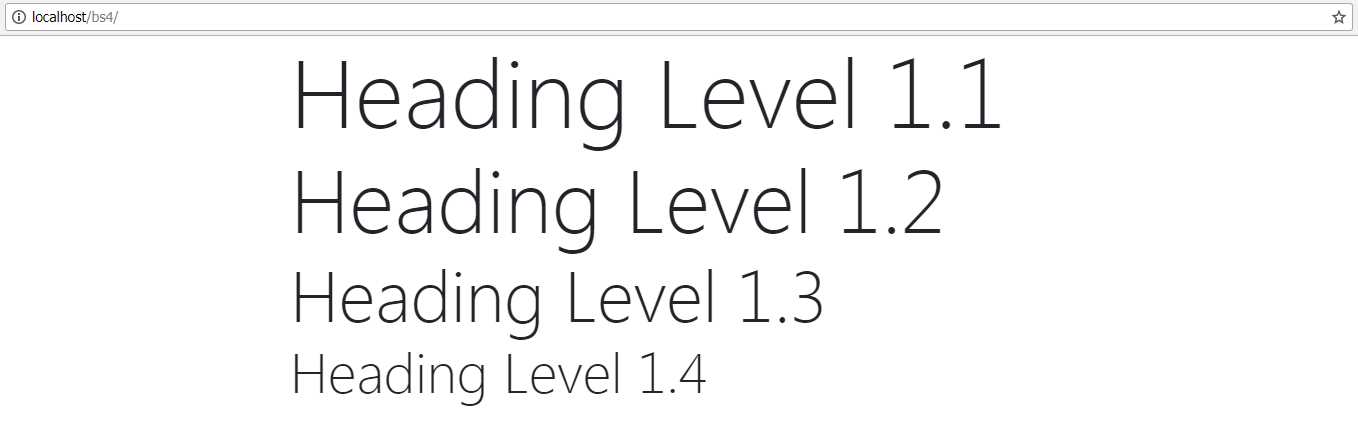
Figure 10: The output from Code Listing 12 showing the display class being added to a header tag
You can apply the display size classes to any of the <h> tags you like. In fact, you can apply them to any block-level element, but the content using them will always take on the same size. So, an <h1> and an <h2> tag using the display-1 class will be indistinguishable from each other when rendered in the browser.
If you need to keep your HTML5 valid (something you should always try to do), then there are places where you might want to use a heading tag but are unable to because it would mean having invalid HTML content.
One example of this might be when you want to mark off a section using a <span> tag, but that section might need to use its own <h>-style tags in its content.
Under HTML5, it’s invalid to place a block element inside of an inline element, and a <span> tag is an inline element.
Fear not: BS4 has your back covered here, as the following example shows.
Code Listing 13: An <h1> tag created in both invalid and valid formats showing the hx BS4 class
<!-- Page content goes here --> <div class="container"> <div class="row"> <div class="col"> <span> <h1>This is an invalid heading</h1> <span>This is an inner paragraph. The paragraph is in an inner span, so it's valid.</span> </span> </div> </div> <div class="row"> <div class="col"> <span> <span class="h1">This is a valid heading</span><br/> <span>This is an inner paragraph. The paragraph is in an inner span, so it's valid.</span> </span> </div> </div> </div> |
If you render that in the browser, you’ll see the following output.
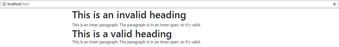
Figure 11: The output from Code Listing 13
To the inexperienced eye, nothing looks out of place, and most non-technical users wouldn’t think twice about it. However, if you look at the code in Visual Studio, you’ll see a green squiggly.

Figure 12: Visual Studio showing that the HTML code is invalid.
Note: The green squiggly in Figure 12 is specific to Visual Studio 2017 (the editor I’m using while writing this book). If you are using a different editor, the highlighting and error notifications may be different, or in some cases, may not even be shown at all. As this is just a warning, it’s nothing major. If you are keen to ensure your HTML code is 100 percent valid, there are many validation tools and online services you may wish to explore.
There are other instances where this comes in handy too, such as in headers in tables, or inside field groups next to form inputs. BS4 provides <h1> to <h6> classes, and each of them is sized to match the size that would be given, should the actual <hx> tag be used instead.
Lists
Just like heading tags, lists are also handled in place. When you use the correct tags in the correct order, BS4 will simply handle it for you, as the following example shows.
Code Listing 14: Standard list items
<!-- Page content goes here --> <div class="container"> <div class="row"> <div class="col"> <ul> <li>List Item 1</li> <li>List Item 2</li> <li> List Item 3<ul> <li>List Item 3a.</li> <li>List Item 3b.</li> <li>List Item 3c.</li> </ul> </li> <li>List Item 4</li> <li>List Item 5</li> </ul> </div> </div> </div> |
This should produce the following output.

Figure 13: The output produced by listing 14
As you can see, the nesting is properly handled, and the font is sized, indented, and balanced correctly.
Change the <ul> tags to <ol> tags in Code Listing 14, and you’ll see the same is also true of an ordered list.
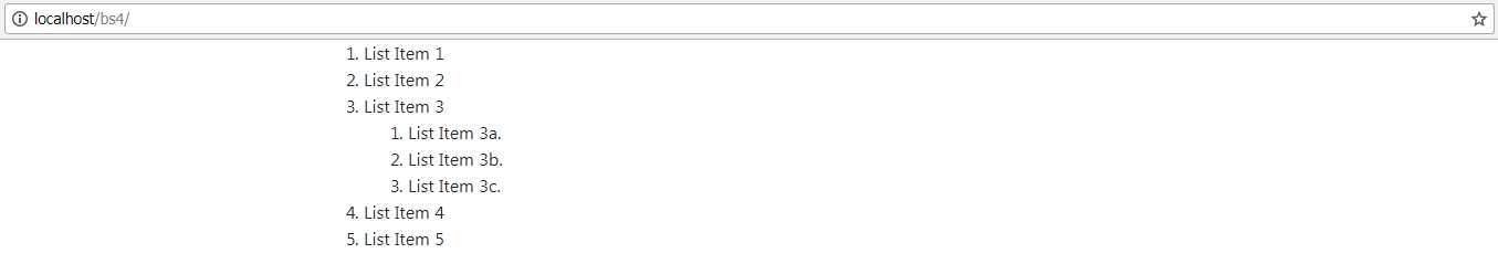
Figure 14: The output produced by Code Listing 14, with the <ul> tags changed to <ol> tags
If you wish, you can remove the list styling and just have BS4 handle the spacing and margins for you. Change Code Listing 14 to add the extra list-unstyled class, so that it looks like the code in Code Listing 15.
Code Listing 15: Standard list items with the un-styled class
<!-- Page content goes here --> <div class="container"> <div class="row"> <div class="col"> <ul class="list-unstyled"> <li>List Item 1</li> <li>List Item 2</li> <li> List Item 3<ul> <li>List Item 3a.</li> <li>List Item 3b.</li> <li>List Item 3c.</li> </ul> </li> <li>List Item 4</li> <li>List Item 5</li> </ul> </div> </div> </div> |
Note that all we changed was the class on the first <ul> tag, nothing else. The inner <ul> tag is a new set of list items, so it automatically has the styles turned back on, leading to a list that should look like the image in Figure 15.
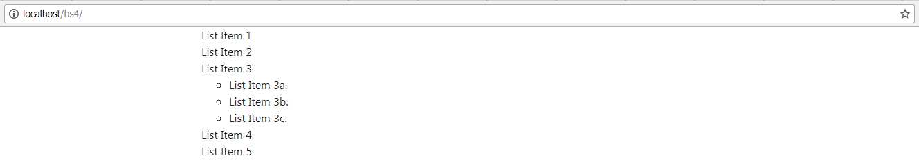
Figure 15: The output produced by a normal list tag with the un-styled class added
Using the class list-unstyled in this way allows you to not worry about the inner parts of your lists maintaining their styling while still allowing you to treat the parent list differently.
One more class you have at your disposal when it comes to regular list tags is the list-inline class. As its name suggests, this class puts all your list items in a single line, which you could use if you needed a horizontal navigation bar or drop-down list, for example.
Using the inline class is a little more involved, as not only do you need to apply the inline class to the <ul>, but you also need to apply a class to each of the <li> elements, as Code Listing 16 shows.
Code Listing 16: Standard list using the inline classes
<!-- Page content goes here --> <div class="container"> <div class="row"> <div class="col"> <ul class="list-inline"> <li class="list-inline-item">List Item 1</li> <li class="list-inline-item">List Item 2</li> <li class="list-inline-item">List Item 4</li> <li class="list-inline-item">List Item 5</li> </ul> </div> </div> </div> |
Pop the body code in Code Listing 16 into your template and render it in the browser. You should now see that each of your elements is inline horizontally, rather than stacked vertically as they were previously.
Figure 16: List items displayed using the inline styles
The last thing I’d like to show you before we move on is the default definition list layout. Definition lists are quite useful because they can convey useful information, such as lists of names and descriptions, or abbreviations along with their meanings. As with most of the other semantic tags, this gives meaning to the content, allowing automated processes to make better sense of it.
Add the following code to your template file.
Code Listing 17: Standard definition list
<!-- Page content goes here --> <div class="container"> <div class="row"> <div class="col"> <dl> <dt>HTML</dt> <dd>Hypertext Markup Language, a variation of XML that defines the structure of a webpage to the client displaying it.</dd> <dt>CSS</dt> <dd>Cascading Style Sheets, not exactly a language, but a list of instructions telling the HTML client how to style the layout defined in the HTML code.</dd> <dt>JavaScript</dt> <dd>The scripting language used inside of HTML documents to add interactivity and programmed features.</dd> <dt>Style Sheet</dt> <dd>A plain text file that is usually separate from the HTML document and holds CSS definitions to apply to the document.</dd> </dl> </div> </div> </div> |
Next, render it in your browser.
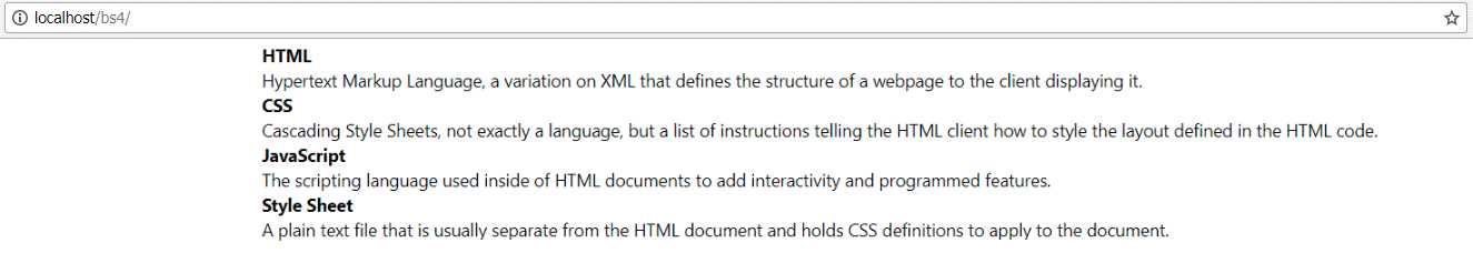
Figure 17: Standard definition list produced by Code Listing 17
Again, there are no extra classes required, just standard markup, but BS4 formats and lays out margins and such automatically for you.
In the actual BS4 docs, there’s a longer example that shows the use of grids, columns, and rows to produce a side-by-side list, and some nested examples. The only classes that needed to be added were the classes to define the column layout.
Other typography features
As well as heading and list tags, paragraphs and other standard text elements are also treated in more or less the same way. By adding a <p> tag to your content and filling it in, BS4 will automatically set it up with the default layout to work with the rest of the styles.
Like the heading tags, paragraphs will not be given a custom font, but you can still make some easy changes by using them in combination with other tags.
The main tags to be used in combination with the paragraph are:
- <mark>: Used to highlight text as though it was marked with a highlighter.
- <s>: Used to strike out text.
- <del>: Used to put a line of deletion through text.
- <small>: Used to decrease the size of the text slightly, and mark it as less important.
- <strong>: Makes text bold.
- <em>: Used to emphasize a piece of text, but without making it more important than the rest of the paragraph.
- <u>: Underlines the text.
- <ins>: Adds an underline to the text inside of it, with the intention of marking it as an addition to the original text.
As with all the previous examples, change the body code in your template to the following:
Code Listing 18: Standard paragraph typography styles
<!-- Page content goes here --> <div class="container"> <div class="row"> <div class="col"> <p><mark>Highlighted</mark> text is easy to achieve by using the <mark>mark tag</mark>. Again, semantics are important.</p> <p><s>Using an "S" tag inside a paragraph will strike the text through, indicating that the text is no longer correct or accurate.</s></p> <p><del>Using the "DEL" tag has a similar effect to "S", but the meaning is different, in that the text is to be or has been deleted.</del></p> <p><small>The "SMALL" tag is mostly used for the small print, and will be liked by legal folks :-)</small></p> <p><strong>And "STRONG" is used to make text bolder so it stands out.</strong></p> <p><em>Whereas the "EM" tag is designed to emphasize text by making it appear italic.</em></p> <p><u>The "U" tag will underline your text.</u></p> <p>And finally, "INS" is designed to make it look like text <ins>has been inserted</ins> into a paragraph.</p> </div> </div> </div> |
And render it in your browser:
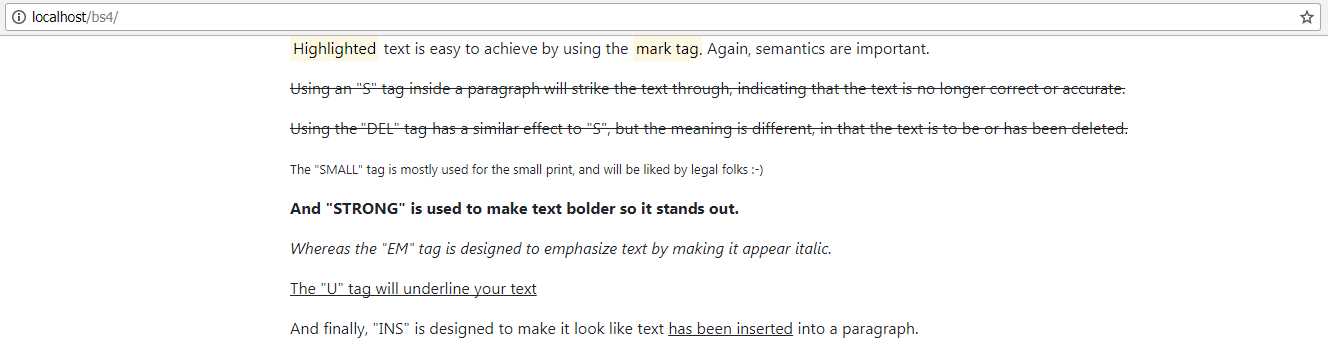
Figure 18: Standard typography styles
As with most of what we’ve seen so far, you can see straightaway that it’s all semantic.
The <u> and <ins> tags both give exactly the same style, but to anything looking at the page content, it would be able to tell that one is an insertion, while another is simply decorative. The <s> and <del> tags work the same way, allowing you to use custom CSS to visually style things for differentiation, but without running the risk of hurting the semantics on your page.
Note: Google will give a page that follows semantic rules a better ranking in its search index than a page that does not, especially if you use things like correctly marked-up postal addresses and site names. In fact, much of the information that Google displays to the right of a search page comes from it being able to look inside your page code and understand which parts refer to names, addresses, maps, dates, times, etc. Using semantic tags is not just about helping Bootstrap, it’s about the world stage and your visibility, too.
If you add the lead class to a paragraph tag, BS4 will render that paragraph in a larger font to make it look like an opening or lead paragraph. Add the code in Code Listing 19 to your page to see this in action.
Code Listing 19: The paragraph lead class
<!-- Page content goes here --> <div class="container"> <div class="row"> <div class="col"> <p class="lead">I am the lead paragraph in this document. My size is increased to make me look more prominent compared to the rest of the text below me.</p> <p>I'm just a standard paragraph tag. I'm not more important than the one above me, but I'm also not the start of the text on this page or in this document.</p> </div> </div> </div> |
Code Listing 19 should give you the output shown in Figure 19, where you can clearly see which of the two paragraphs is intended to be the opening one.
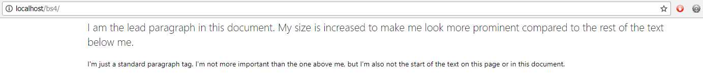
Figure 19: Paragraphs in the lead and non-lead style as produced by Code Listing 19
Once we start to move away from marking things up using semantic tags, and into using just the styling classes that BS4 provides us, we can start to take advantage of things like justified and aligned text, and contextual colors that can be automatically swapped with custom BS4 color palettes and custom BS4 CSS builds.
Text alignment comes in four different flavors: left, center, right, and justified. left sticks the text to the left of the parent container, right positions it to the right of the parent container, and center positions it in the center with equal space on either side. justified alignment tries to make each line in the paragraph equal to the width of the parent container.
Notice that I describe this in terms of the parent container. The text utilities in previous versions of Bootstrap were not particularly suited to being used at anything other than row level or page level, and would often look slightly out of place when used. With BS4 using Flexbox behind the scenes for its layout, the text utilities now use the new CSS rules and styles available to align text within the rows, columns, and regular <div> tags that you would now use in your page layouts.
This makes the layout of items much more flexible, but more importantly, it also makes it simpler to make reusable chunks of content and nest them to quite deep levels.
The code in Code Listing 20 gives you an example of the alignment utilities in action.
Code Listing 20: BS4 alignment classes
<!-- Page content goes here --> <div class="container"> <div class="row"> <div class="col"> <p class="text-justify">...trimmed...</p> <p class="text-left">Left Aligned Text</p> <p class="text-center">Center Aligned Text</p> <p class="text-right">Right Aligned Text</p> <p class="text-justify">...trimmed...</p> </div> </div> </div> |
I've trimmed down the amount of text in the justified paragraphs to make it fit in the book, but feel free to add lots of new text in the place of …trimmed…. The more text you add, the better the effect will be. I used the Blind Text Generator to generate the text for my example.
Once you have some text in and the code from Code Listing 20 added to your BS4 template, you should see something similar to Figure 20.
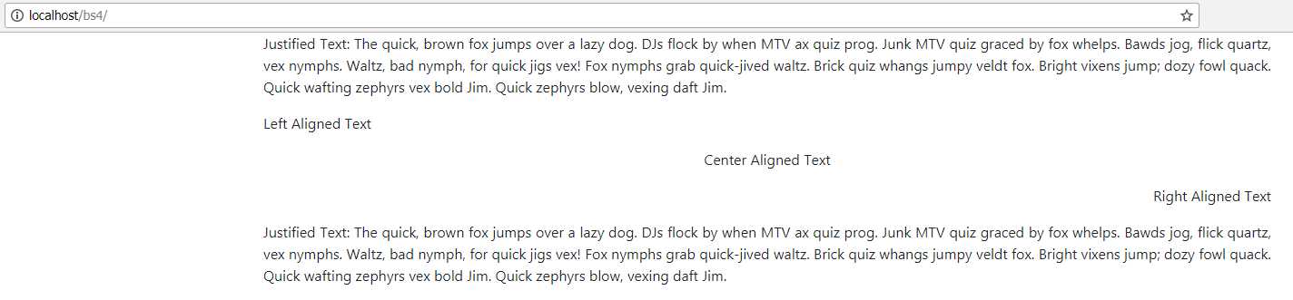
Figure 20: Output produced by the alignment classes code listing
The text utilities also have classes to control wrapping and overflow. By adding the overflow class, you allow the text to break outside the boundaries of the parent container, and if that container is the page, potentially disappear off the edge of the page. To be fair to the BS4 development team, I’m sure they had some specific use cases in mind for this, but as of yet, I've not actually found a use for it.
The truncation class, on the other hand, has many uses.
The basic idea of the truncation class is to take a string that’s far too big for its container, shorten it to fit within the width, and then append three dots to the end to show that it’s been shortened. Code Listing 21 shows both classes being used.
Code Listing 21: Wrapping and truncating classes
<!-- Page content goes here --> <div class="container"> <div class="row"> <div class="col" style="background-color: lightblue"> <p class="text-nowrap">...trimmed...</p> <p class="text-truncate">...trimmed...</p> </div> </div> </div> |
Again, as with the justification example, you’ll need to replace the trimmed text with something more substantial. Once you do, you should see something similar to Figure 21.
Figure 21: The output from Code Listing 21
As you can see in Figure 21, the first string with no wrapping flows straight outside the row, the container, and eventually off the right edge of the page. The truncated paragraph reaches the edge of the container and is then terminated.
If the container becomes wider or narrower, the truncated text will be altered to fit as much as it can inside the container.
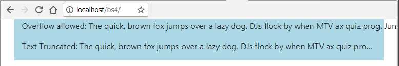
Figure 22: The output from Code Listing 21 in a narrower window
The last of the actual transformation and styling utilities include classes to force lowercase, uppercase, and capitalized text, as well as setting bold, normal, lightweight, and italic text.
The bold, normal, light, and italic styles should only be used in cases where semantic layout is not important. If you need to make the client or browser scripting aware of the fact text is bold or italic, then you must use the semantic tag approach shown earlier in this chapter. The classes here are for decoration only, and will mean nothing to most screen readers and page scripts.
Code Listing 22 shows the remaining classes in use.
Code Listing 22: The remaining text utility classes
<!-- Page content goes here --> <div class="container"> <div class="row"> <div class="col"> <p class="text-lowercase">All of the text IN THIS PARAGRAPH should be forced to be in LOWERCASE ONLY, no MaTtEr WHat the Case Of The TEXT is.</p> <p class="text-uppercase">All of the text IN THIS PARAGRAPH should be forced to be in UPPERCASE ONLY, no MaTtEr WHat the Case Of The TEXT is.</p> <p class="text-capitalize">All of the text IN THIS PARAGRAPH should be forced to INITIAL CAPITALS while leaving the case of every OTHer lEtTeR set to what it was.</p> <p class="font-weight-bold">All of the text in this paragraph should be BOLD.</p> <p class="font-weight-normal">All of the text in this paragraph should be NORMAL.</p> <p class="font-weight-light">All of the text in this paragraph should be LIGHTWEIGHT.</p> <p class="font-italic">All of the text in this paragraph should be ITALIC.</p> </div> </div> </div> |
In my version of Chrome, Code Listing 22 renders as shown in Figure 23.

Figure 23: Output produced by Code Listing 22
Text colors
If you’ve done any work with Bootstrap, even the earlier versions, you might be aware that one of the best features is its color classes.
While the naming has changed significantly in BS4 compared to previous versions, the color classes still allow you to maintain color palette consistency throughout your layouts and designs. This is done by creating classes that are named by function, rather than by a color name. These classes are customizable by using Sass as your CSS build tool, or by creating a custom BS4 build using the tools available on the Bootstrap website.
The custom class will then appear with the exact same color each time it is used, meaning you don’t have to remember hex values to use the colors your design needs.
You can also swap color palettes very easily using various techniques, knowing that any changes will instantly change site-wide without any extra work.
You can see the 10 color classes available by adding the code in Code Listing 23 into your template and loading it into your browser.
Code Listing 23: BS4 color classes
<!-- Page content goes here --> <div class="container"> <div class="row"> <div class="col"> <p class="text-primary">.text-primary</p> <p class="text-secondary">.text-secondary</p> <p class="text-success">.text-success</p> <p class="text-danger">.text-danger</p> <p class="text-warning">.text-warning</p> <p class="text-info">.text-info</p> <p class="text-light bg-dark">.text-light</p> <p class="text-dark">.text-dark</p> <p class="text-muted">.text-muted</p> <p class="text-white bg-dark">.text-white</p> </div> </div> </div> |
Once this is opened in your browser, you should see the following output.
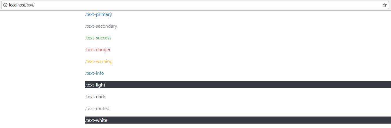
Figure 24: The BS4 default color classes
The example in Code Listing 23 and the accompanying figure is the exact same example that’s available in the BS4 documentation.
The light and white colors have been rendered on a dark background, since they wouldn’t otherwise be visible on the page.
As you can see, each of the classes has a contextual name, which gives you an idea of its intended use. danger, for example, will always be red in the default color scheme.
You can easily remap the default colors to new shades, but in order to do this, you must be working with the Sass sources directly. There are 10 extra color swatches, and nine extra levels of gray from strength 100 to 900 in steps of 100, allowing you to produce a very nice grayscale effect.
In the default download of BS4, however, none of the extra colors and grays are enabled by default. You can find out how to add the extra colors in the documentation.
If you’re including the CSS from a CDN or direct download as we are here, then you’re restricted only to the contextual colors.
The colors are not just for regular text either; there are a number of contextual classes to set background colors, too. Code Listing 24 shows an example of these.
Code Listing 24: BS4 background color classes
<!-- Page content goes here --> <div class="container"> <div class="row"> <div class="col"> <div class="bg-primary text-white">.bg-primary</div> <div class="bg-secondary text-white">.bg-secondary</div> <div class="bg-success text-white">.bg-success</div> <div class="bg-danger text-white">.bg-danger</div> <div class="bg-warning text-dark">.bg-warning</div> <div class="bg-info text-white">.bg-info</div> <div class="bg-light text-dark">.bg-light</div> <div class="bg-dark text-white">.bg-dark</div> <div class="bg-white text-dark">.bg-white</div> </div> </div> </div> |
When rendered in Chrome, you should get a series of <div> tags, each with a different background color, as shown in Figure 25.
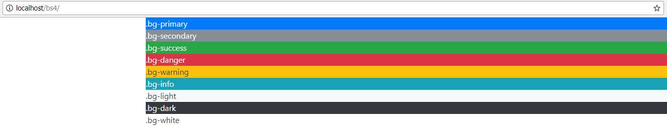
Figure 25: BS4 background colors as produced in Code Listing 24
As was shown in the foreground colors example, you can mix the background classes and the foreground classes to get any combination you need, and as with the text colors, you can change the palette (if you use Sass directly).
Tip: If you’re using a recent version of Visual Studio, Sass style sheets can be handled and built on the fly at project build time. If you’re using an older version, there are some really good plug-ins in the Visual Studio Marketplace that will allow you to add Sass to your project with the same ease you add regular CSS.
Block quotes and abbreviations
Adding abbreviations and block quotes to a BS4-enabled document is so simple that no explanations are required. Both of them are tag oriented: abbreviations use the <abbr> semantic tag, and block quotes use <blockquote>. Code Listing 25 shows the body code to put into your template to demonstrate the classes.
Code Listing 25: Abbreviation and block quote example
<!-- Page content goes here --> <div class="container"> <div class="row"> <div class="col"> <p><abbr title="Bootstrap Version 4">BS4</abbr> has lots of features to help you create stunning page and application layouts. Use industry standard <abbr title="Hypertext Markup Language Version 5">HTML5</abbr> markup along with cutting-edge <abbr title="Cascading Style Sheets Version 3">CSS3</abbr> features to make web apps that almost jump out of the screen.</p> <hr/> <blockquote class="blockquote"> <p class="mb-0">It's the same for users too, you just keep doing what it looks like you’re supposed to be doing, no matter how crazy it seems.</p> </blockquote> </div> </div> </div> |
I've added a <hr> tag between the two parts so you can see where the block quote is.
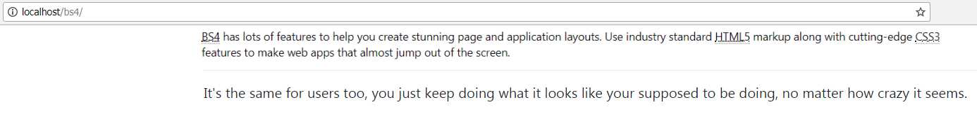
Figure 26: Output from the abbreviation and block quote example
As you can see from Figure 26, the abbreviated words are underlined with a dotted line, and if you hover over them, a tooltip with the full title text will appear.
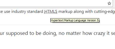
Figure 27: Code Listing 25 with one of the abbreviation tooltips displayed
Unfortunately, on a Windows screenshot, you can’t see the pointer, which changes to a question mark and pointer symbol inviting you to hover or click on the item.
Adding a source to a quote is as simple as adding an extra line. Change the code in Code Listing 25 to match Code Listing 26. The output should look the same as Figure 28.
Code Listing 26: Listing 25 changed to add a block quote source
<!-- Page content goes here --> <div class="container"> <div class="row"> <div class="col"> <p><abbr title="Bootstrap Version 4">BS4</abbr> has lots of features to help you create stunning page and application layouts. Use industry standard <abbr title="Hypertext Markup Language Version 5">HTML5</abbr> markup along with cutting-edge <abbr title="Cascading Style Sheets Version 3">CSS3</abbr> features to make web apps that almost jump out of the screen.</p> <hr/> <blockquote class="blockquote"> <p class="mb-0">It's the same for users too, you just keep doing what it looks like you're supposed to be doing, no matter how crazy it seems.</p> <footer class="blockquote-footer">Kevin Flynn in <cite title="Source Title">Tron</cite> (1982)</footer> </blockquote> </div> </div> </div> |
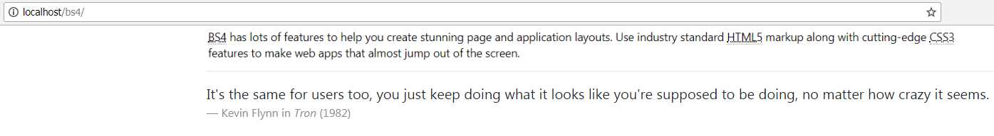
Figure 28: The example from Code Listing 25 with a block quote source added
Displaying computer code
If you’ve read any kind of technical blog, you know that many of them have specific markup for displaying snippets of computer code, or inline styles to highlight things like key strokes, math formulas, and other similar things.
BS4 has five different classes available to help you mark up this kind of content in your pages. You can easily display inline code and blocks of code, variables, user input instructions, and expected output from a text mode computer application.
There is, however, no syntax highlighting that will color-code text depending on its language or layout—you’ll need to add that yourself. There are plenty of JS-based toolkits available that are BS4-friendly and will work with a multitude of different languages.
The easiest markup to use is for an inline code snippet. This simply highlights the given code snippet in line with the regular flow of text, be it a paragraph, span, or <div>.
Change your template’s body to the following:
Code Listing 27: Inline code example
<!-- Page content goes here --> <div class="container"> <div class="row"> <div class="col"> <p>This is a normal paragraph, but within it I’ve marked up a <code><p></code> tag, and a <code><div></code> tag.</p> </div> </div> </div> |
As you can see, it’s again a case of using the correct semantic tags. As in previous examples, once BS4 sees these tags it marks up and, in this case, applies a slight color and font change to the text so that it stands out from the surrounding text. Once you render it in the browser, you should see something like the following output.
Figure 29: Inline code produced by Code Listing 27
The <code> tag can also be used to format multiple code lines, but unlike the inline version, your text color and font won’t change. Your text will, however, preserve things like white space, line breaks, and indentation.
To use multiple-line code blocks, wrap your one and only <code> tag inside a <pre> tag, as Code Listing 28 shows.
Code Listing 28: Using the <code> tag inside a multiline block
<!-- Page content goes here --> <div class="container"> <div class="row"> <div class="col"> <pre><code> <p>Sample text here...</p> <p>And another line of sample text here...</p> </code></pre> </div> </div> </div> |

Figure 30: Output from code block in Code Listing 28
Note that the code chosen for display inside the tag has its < and > symbols in the tags converted to < and >.
This is a requirement of the HTML spec, not Bootstrap, and the same applies anywhere in an HTML5 page layout. If you need to display angle brackets, then you must do so using the correct ampersand-based formats.
There isn’t space in this book to go into a full description of encoding things like angle brackets. If you wish to follow up on this subject and general HTML5 topics, two really good sources are HTML5 Doctor and Mozilla Developer Network (MDN).
Moving on, we can also use the <var> tag for displaying variables. Its usage is identical to using a code block inline, and it’s designed to be used inline, as opposed to being used in a code block.
The <var> tag will italicize the text inline, while keeping the surrounding base format. Code Listing 29 shows this in action.
Code Listing 29: Variable markup example
<!-- Page content goes here --> <div class="container"> <div class="row"> <div class="col"> <p>This is a paragraph with some var tags inline: <var>y</var> = <var>m</var><var>x</var> + <var>b</var></p> <h1>This is a header with some var tags inline: <var>y</var> = <var>m</var><var>x</var> + <var>b</var></h1> </div> </div> </div> |
Rendered in the browser using the template, you should see the following output.
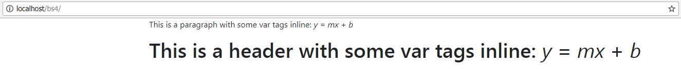
Figure 31: Variable markup output from Code Listing 29
As you can see, no matter what the surrounding markup is, the variable font will be narrower and italicized, but it will retain the size and font of the markup they’re used in. This includes other BS4 classes such as lead on paragraphs, and the color and alignment utility classes.
The last group of code-related content formatting highlights keyboard input and expected output. Like code blocks, this comes in the form of two HTML5 tags, and no classes.
If you want to show a user that they’re expected to press some keys or type some input, you can use the <kbd> tag. For the expected output, the <samp> tag is used.
Code Listing 30 shows how to use these two tags. Change your template code so that you have the following code.
Code Listing 30: Using keyboard and sample output tags
<!-- Page content goes here --> <div class="container"> <div class="row"> <div class="col"> <p>In order to use the terminal you need to enter <kbd>cmd</kbd> in your run application field.</p> <p>After you have entered cmd, you need to click OK or press <kbd>Enter</kbd> to activate the console.</p> <p>If everything works OK, you should be greeted with something similar to:</p> <p class="font-weight-bold"> <samp>Microsoft Windows [Version 6.1.7601]</samp><br/> <samp>Copyright (c) 2009</samp><br /><br/> <samp>C:\Users\user></samp><br /> </p> <p>If you type <kbd>dir</kbd> and press <kbd>Enter</kbd> you should now get a listing of your files.</p> </div> </div> </div> |
I've added an extra font-weight-bold class to the paragraph containing the output just to make it easier to see which section is which. Once you load the page into your browser, you should see the following output.
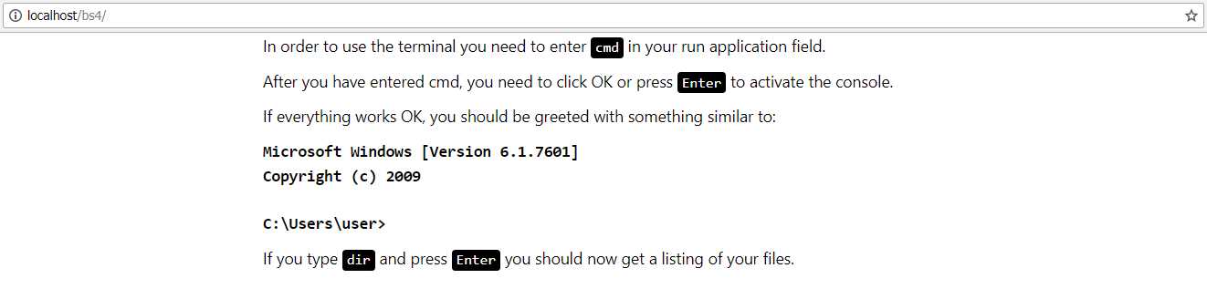
Figure 32: The output produced by Code Listing 30
- 1800+ high-performance UI components.
- Includes popular controls such as Grid, Chart, Scheduler, and more.
- 24x5 unlimited support by developers.