
Twitter Bootstrap 4 Succinctly®

CHAPTER 10
Bootstrap’s Batman Utility Belt
Finally, we come to the small fry, the scraps left at the bottom of the barrel that everyone always ignores.
In BS4’s case, however, these scraps are immensely powerful and pack a heck of a punch for their weight. As you’ll see in this chapter, just when you thought you’d seen it all, there are still many surprises to be had.
Display utilities
One big thing that’s changed since BS3 is the display classes. In BS3, display classes were limited to a single set of hidden and show classes that were tied to breakpoints.
What this meant was that you could only “hide” or “show” for a given breakpoint. For example, for the class list of visible-xs visible-lg, the element would be visible only at large or extra-small breakpoints. There was no default, for example, at the other breakpoints.
If you needed to hide other elements at the same time, you typically ended up with a class list that was very long, and had lots of hides and shows, making it very difficult to read.
There were variations on display for block and inline, but these usually ended up with names such as visible-xs-block-12 or hidden-lg-inline-6, or even worse combinations.
In BS4, this has been changed drastically, mostly thanks to the new Flexbox-first mentality.
The new class names are simpler, and there are more of them, covering a wider range of use cases.
As a general rule of thumb, there is now a d-* class type for every display mode you can think of, and each of them can have the usual breakpoint applied to them if needed so that they only take effect at a given screen size.
The best part is that you now no longer need to use the size modifiers. If you want an element to show at all screen sizes, and be a block element, then you simply use d-block, rather than visible-xs-block visible-sm-block visible-lg-block visible-xl-block, as you would have done with BS3.
Having one class also makes manipulation in script much easier. If you want to show or hide an element on a page, it’s a simple matter of toggling d-block and d-none.
The values available for d-{value} are:
- none
- inline
- inline-block
- block
- table
- table-cell
- table-row
- flex
- inline-flex
If you’re at all familiar with the standard CSS display modes, you’ll realize that each of these relate to a display: {value} style rule. If you want to use the rule so that they only work at certain breakpoints, then d-{breakpoint}-{value} will achieve that for you. For example, d-sm-block will mean that the element this rule is attached to will display as a block element only when the screen width is within the small breakpoint size. The standard breakpoint values are xs for extra small, sm for small, lg for large, and xl for extra large. The BS4 docs have a very good description of the sizes here.
The size modifiers are useful when you have elements you want to remove from a layout as the screen gets narrower. For example, on a small screen you might not want to use a large hero-style banner at the top of your page, so a d-sm-none d-xs-none will quickly remove it without having to also make sure you take into account the opposite rules to show the element when you need it (everything shows by default at md size).
There is one further size modifier that only applies to the display utilities, and that’s the print modifier. If you have elements that you only want to show when the page is sent to the printer, you can use print as the value instead of one of the size classes. For example, if you had a menu bar that you didn’t want to appear when printing a table below it, you can add the class d-print-none, the result being that only the table below the menu bar would be printed.
All of the display types can be modified with print, which means you can also create parts of your page that only show when being printed. A good use for this is to print out the link of a URL so that when printed, the destination of a link is shown next to the linked text, but is hidden when displayed in the browser.
I haven’t given you any examples of the display utilities as it’s quite difficult to produce meaningful screen grabs when there’s nothing shown on a page. The associated page in the Utilities section of the docs has plenty of them, however.
Borders
One thing that BS3 definitely didn’t have was classes to manipulate the borders of an element. BS4 not only has them, but also allows you to use them to apply the same contextual colors that can be used for alerts, text, and backgrounds. You can use them in two modes: additive and subtractive.
When you use them in additive mode, you’re adding a border to the element, which means if the element you apply them to already has existing borders, you won’t see any difference. A border class will add the border all the way around the element, while border-{value}, with {value} being top, right, bottom, or left, will add the border only to the specified side. You can combine them too, so border-left border-top will add the border on both the top and the left of the element they are being applied to.
Subtractive, as the name suggests, removes the specified side from an already existing element, and is achieved by adding a -0 after any of the additive versions. For example, if you have an element and you only want the top, left, and bottom sides to have a border, you can either use border-top border-left border-bottom, which is purely additive, or you can use border border-right-0, which as you can see, is fewer characters than the additive version.
The reason there are both additive and subtractive versions is purely so you can find the best combination for the layout you’re trying to produce while trying to ensure you keep your class lists as small as possible.
For those of you wanting to reproduce the old well component from BS3, you can easily do that as shown in the following listing.
Code Listing 74: Using the border utilities to produce a well with an elastic middle
<!-- Body content goes here --> <div class="container"> <br/> <div class="row" style="height: 100px;"> <div class="col-1 bg-light border border-right-0"> Left </div> <div class="col bg-light border-top border-bottom text-center"> Middle </div> <div class="col-1 bg-light border border-left-0"> Right </div> </div> </div> |
Technically, you don’t need three <div> elements to produce a well, you just need to apply border and bg-light class rules to a single <div> to get the same effect. However, if you use the same approach that I used in Code Listing 74, then you can change the width of the center portion and still maintain the same side and end caps, should you need to.
Rendering Code Listing 74 in the browser should give you something similar to the following figure.
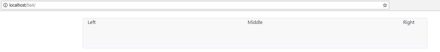
Figure 75: A well-style component produced by Code Listing 74
The border color can be changed by adding a border-{color} after the rest of the classes, with {color} being one of the common color names: primary, secondary, success, danger, warning, info, light, dark, or white. Change the rules on the left, middle, and right <div> elements in Code Listing 74 and add border-danger as the last class name, and you should see your output change to the following when you press F5 to refresh.
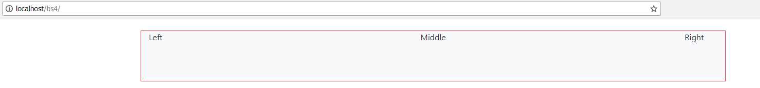
Figure 76: Our well-style component with border-danger added to the border classes
As you can probably guess, you can also change all the bg-{color} class styles, allowing you to change the background color, and if you choose to, add text-{color} classes to change the text color.
Finally, you can add a rounded or rounded-{type} to the element to round the corners on the element. {type} can be top, right, bottom, or left to add the rounding to only the specified side, or it can be circle to turn the element into a circle, or a 0 to remove the rounding.
Adding rounding-left to the left and rounding-right to the right <div> element in our example in Code Listing 74 will give us the following output.
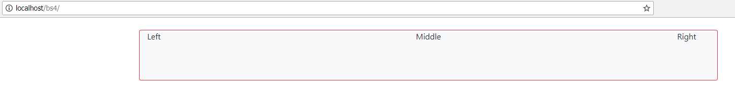
Figure 77: Our well component with rounded left and right edges
The border utilities can be applied to every component and element in the BS4 toolkit, from buttons to input fields, to cards and navbars, block, inline, or otherwise.
Flex utilities
As you’ve already seen, you can make any container a flex container by simply adding d-flex to its class list. d-flex is another display utility, and is the one you’ll likely use the most to enable your containers to be Flexbox oriented. BS4 greatly simplifies using Flexbox, but the Flexbox standard as a whole goes way beyond that.
We don’t have time to describe everything that Flexbox can do—for that I recommend the “What the Flexbox?!” series of tutorials by Wes Bos. The series is simple to understand and will fill in any gaps in knowledge you have on what I’m about to cover.
The Flexbox (flexible box) display model is a recent answer (along with the grid layout) to a long-standing problem with CSS layout: having block elements that adapt to the available screen size.
In the era of desktop PC-only browsers, this wasn’t a huge problem, but as we started using ever smaller devices for our daily tasks, the sheer range of different sizes started to become a big issue in web application design. Flexbox was created to help ease this problem by allowing user interface designs to adapt themselves to different widths and orientations, without resorting to the many JavaScript and server-side rendering techniques developed over the years.
Various CSS rules to control the positioning of elements, such as sticking to the start, sticking to the end, or spacing child elements out over the width of a parent have been added to the CSS specification to manage how the browser responds to layouts. BS4 wraps many of these rule sets in CSS classes, making it simple to just add the class to an element and to achieve the required behavior.
You’ve already met d-flex, which enables Flexbox on a block-level element. d-inline-flex does exactly the same thing, but enables Flexbox for inline style elements such as spans. You can further modify each of these two class names to include a breakpoint size of xs, sm, lg, or xl in the same manner as you’ve seen with other classes.
The effect of using the sizing classes is exactly the same as elsewhere. For example, d-sm-flex will enable Flexbox on an element only when the screen size is in the small breakpoint range, and will disable it (default) at any other size. Like others, they can be combined, so d-sm-flex d-lg-inline-flex will enable block-level Flexbox for small layouts, inline Flexbox for large layouts, and default for anything else.
Flexbox containers can also specify the direction the content is intended to work in. This direction can be row or column, or reverse variations of the two. Adding flex-row, flex-row-reverse, flex-column, or flex-column-reverse allows you to specify the direction, and again, like d-*, you can use the different size modifiers as required to control when it’s used.
There are alignment utilities such as align-items-start, align-items-middle, and align-items-right, that are used to ensure that any child elements you have inside a Flexbox container are aligned to a specific position. This extends to also allowing items to be vertically positioned when using column mode.
Wrap classes allow you to move elements to the next line and continue rendering if the child element’s width becomes too wide for the display. This is especially useful for designing things like thumbnail pages for photo albums and similar designs.
I’ll finish this section on using the Flexbox utilities by showing you an example that will give you what some folks call the “golden layout,” with a header, content, a footer, and left and right sidebars.
Code Listing 75: The golden layout, sort of
<!-- Body content goes here --> <style> body, html { height: 100vh; width: 100vw; } </style> <div class="container-fluid d-flex flex-column p-0" style="height: 100%; width: 100%;"> <div class="bg-info" style="height: 100px;"> <h1 class="text-dark text-center">Page Title</h1> </div> <div class="h-100 d-flex flex-row"> <div class="col-2 m-2 bg-light border">Left Sidebar Area</div> <div class="col text-center">Main Page and Content Area</div> <div class="col-2 m-2 bg-light border">Right Sidebar Area</div> </div> <div class="bg-success" style="height: 50px;"> <div class="container text-white">Page footer information</div> </div> </div> |
Unfortunately, Code Listing 75 does contain a few style attributes and tags, but these are more for the vertical sizing than anything else. While Flexbox helps us greatly, we still need to resort to using height to specifically fix an element height. More to the point, the height has to bubble all the way back up to the parent elements. None of this would work as expected without setting the HTML and body elements to the size of the browser viewport, as children of those elements would have no idea what 100 percent of the overall size is.
There are a few different ways of achieving this. What I've given you here can certainly be tidied up and done better, but as it stands you can drop it into the template we’ve been using for the rest of the book. If you do this and render it, you should get something similar to the following figure.

Figure 78: The layout produced by Code Listing 75
Sizing, margins, and padding
Sizing and getting the padding and margins right are an important part of making your designs look balanced. BS4 provides a lot of classes designed to make it easy for you to get this important aspect right.
Width and height have four variations for 25, 50, 75, and 100 percent. To use them, it’s simply a case of specifying a h or a w for height or width, followed by a hyphen and then the percentage number. For example, w-25 will give you 25 percent width, h-50 a height of 50 percent, and w-50 h-25 a width of 50 percent with a height of 25 percent.
If you want a pixel-based specific height, you are going to need to use style attributes as we did for the layout in Code Listing 75. Remember that percentage heights are relative to the parent, so 100 percent will be all of the space available provided by the element above the one you’re sizing. If the parent is 200 pixels, then 25 percent will be 50 pixels, 50 percent will be 100 pixels, 75 percent will be 150 pixels, and 100 percent will be the full 200. If you don’t get the parent height sized correctly, you’ll get some strange sizing errors. Take this from someone who’s spent more time than he would like tracking these things down—you really don’t want them.
The padding and margin classes have a fairly straightforward notation once you’ve seen a few examples. The BS4 docs show the notation as {property}{sides}-{size}. property is the thing you want to set, and is m for margin and p for padding.
{sides} are the sides you want to apply the property to, and {size} is the sizing factor. If you don’t specify sides, then the sizing is applied to all four sides of the element.
{sides} can be t, b, l, or r for top, bottom, left, and right, or they can be x for left and right and y for top and bottom.
{size} can be 1, 2, 3, 4, or 5, with 1 being the default BS4 spacing value multiplied by 0.25 and 5 as the default being multiplied by 3. The multipliers for 2, 3, and 4 are 0.5, 1, and 1.5.
Lastly, you can specify auto to assign automatic sizing on the property you’re setting.
So, if you want your element to have the BS4 default spacing around all four sides as a margin, you would use m-3. If you wanted your element to have a quarter of the default spacing on the left, but three times the default on the right, and for it to be padding, you would use pl-1 pr-3.
If you want an element to be centered with equal margins, then mx-auto will provide an automatically sized margin to the left and right of an element simultaneously.
There’s more
You have utilities for close and arrow icons, and embedded content such as videos and iframes. There are float controls, clearfixes, image replacements, and more. We just don’t have the space to cover all of them in this book. The BS4 docs are the definitive source of anything we haven’t covered.
- 1800+ high-performance UI components.
- Includes popular controls such as Grid, Chart, Scheduler, and more.
- 24x5 unlimited support by developers.