
Twitter Bootstrap 4 Succinctly®

CHAPTER 3
An Image is Worth a Thousand Words
No webpage would be complete without the ability to add images and pictures to it. BS4 has an wide array of tools and classes available to help you position your images just right.
Because the <img> tag is a block-level object, we can already say that lining <img> tags up onto regular grids and positioning them alongside written content is extremely easy given the row, column, and grid structures we’ve already seen.
Bootstrap goes even further than that, though. It includes premade block-level structures composed of <div>s, whose sole purpose is to allow you to create card-like structures, or lists of media where thumbnails and content are perfectly aligned.
As we’ll see in this chapter, a Bootstrap-controlled picture is not just worth a thousand words—it’s an entire lifetime of artistic opportunities with the ability to communicate just about any message you need to.Gone are the days of folks looking at your designs and being able to say, “Oh, I see you used Bootstrap.”
Note: Many of the image examples the are used in the Bootstrap documentation use holder.js, which can be added to your projects by following the instructions on the holder GitHub page. For the examples in this book, however, I’m going to keep things simple and use the excellent online placeholder service. Feel free to substitute any images or other services you prefer to use by swapping the URLs that look like http://via.placeholder.com/350x150 for the ones you prefer to use.
Responsive images and thumbnails
We’ll start by looking at the responsive image classes provided by BS4. BS4 is designed to be mobile first, so everything it does, it does with the assumption that you’re designing for a mobile experience. With images, this means that every image you place under control of Bootstrap is automatically set up so that it will move, adapt, and scale with the display it’s being viewed on.
This also means that in many cases, sizing your images is not dependent on the image tag itself, but is the responsibility of the parent container. This doesn’t mean that the image classes are not important—you still have to use them to achieve the best output—but it does mean that you no longer have to have specific image sizes for different parts of your layout. In many cases you can use the same imagery multiple times in multiple places, even at different sizes and scales.
Image quality and size does still need to be considered, however, so it’s not a complete get-out-of-jail-free card.
The simplest usage of a basic responsive image class is a standard <img> tag with the img-fluid class applied to it, as Code Listing 31 shows.
Code Listing 31: Using the responsive image class
<!-- Page content goes here --> <div class="container"> <div class="row"> <div class="col"> <img src="http://via.placeholder.com/1152x250" class="img-fluid" /> </div> </div> </div> |
Before I show you the rendered output, there’s one thing I’d like to point out. Because the image service I use requires me to specify a size for the image placeholder, I cannot create small images and have them size upwards to consume the parent space. This is not an issue if you’re generating your own images, but it does make it a bit of a challenge to demonstrate the feature to the reader.
What I've done for the example in Code Listing 31 is made the image wider than the parent container (in this case, just a standard BS row enclosed in a centered container).
BS4 will attempt to reduce the size of the image to fit, which you can see in Figure 33. I've used the excellent Web Developer tools by Chris Pederick in ruler mode to show the actual width of the image versus the width I asked for.
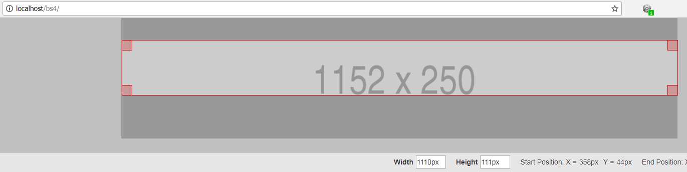
Figure 33: The output from Code Listing 31 with the Web Developer ruler enabled to display the image’s actual width
As you can see from the code and the output, I requested an image 1,152 pixels wide, but received a 1,110-pixel-wide image instead.
In many cases, if you don’t specify any sizing, then the image will size to the exact space available. If you’re just using one measurement, then BS4 will size things so that the ratio is maintained. In the example for Code Listing 31, I could have also shown that the height had been reduced from 250 pixels down to 242 to maintain the ratio of the requested size.
When adjusting and testing sizes, it’s definitely better to try different sizes rather than just going straight for what you think a good size will be. Fixing sizes in BS4-controlled layouts can often lead you to grief and mis-sized images that don’t look like they fit correctly.
Making smaller image thumbnails for lists and such is also very easy to do; you just use the img-thumbnail class in place of the img-fluid class.
Code Listing 32: Using the image thumbnail class
<!-- Page content goes here --> <div class="container"> <div class="row"> <div class="col"> <img src="http://via.placeholder.com/250x250" class="img-thumbnail" /> </div> </div> </div> |
The main difference between the img-thumbnail and the img-fluid classes is that with the thumbnail, a thin border and spacing is applied around the image, giving it an attractive framed look.
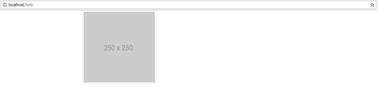
Figure 33: Our image with the thumbnail class applied
The border can also be tweaked using the border utilities, which we’ll cover in a later chapter. You can set highlights and colors, and use a number of premade, rounded corner settings to design the frame just the way you want it.
Images can easily be aligned left or right by adding the float-left or float-right classes to them as follows.
Code Listing 33: Aligning images
<!-- Page content goes here --> <div class="container"> <div class="row"> <div class="col"> <img src="http://via.placeholder.com/250x250" class="img-thumbnail float-left" /> <img src="http://via.placeholder.com/250x250" class="img-thumbnail float-right" /> </div> </div> </div> |
You might be wondering why BS4 chooses to use floats for this task when we’ve already established that it uses Flexbox throughout, and there are more than enough features in Flexbox to allow any type of alignment we would wish to use.
The answer is that the alignment classes are designed to align within a parent container. So, if you had a content area that held images and other content too, and you wanted that content to flow around the image, the best tool for the job is float. (This is what float was originally designed for.) Code Listing 34 shows how you might do this. The image in Figure 34 shows you what to expect from Code Listing 33. When we reach the chapter on the rest of the utility classes that we’ve not yet covered, we’ll see the extra Flexbox classes that could potentially help us align things in this scenario.
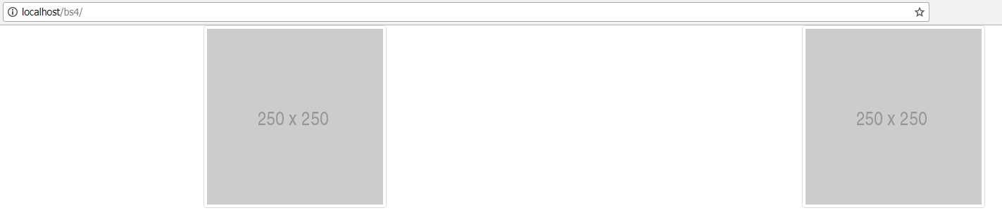
Figure 34: Images aligned using the float classes
One last note on the float classes: the BS4 toolkit has settings applied to it, so that if you do use the floats where they are intended, they actually apply things like clear fixes where needed. This is so that you don’t have to worry about the floats throwing off any of your alignment and causing problems.
Code Listing 34: An example of how you might use the alignment classes with content in a parent container to allow text to wrap an image
<!-- Page content goes here --> <div class="container"> <div class="row"> <div class="col-sm-6"> <img src="http://via.placeholder.com/100x100" class="img-thumbnail float-left" /> <p>--- Snipped ---</p> <p>--- Snipped ---</p> </div> <div class="col-sm-6"> <img src="http://via.placeholder.com/100x100" class="img-thumbnail float-right" /> <p>--- Snipped ---</p> <p>--- Snipped ---</p> </div> </div> </div> |
Code Listing 34, like the others with large chunks of text, has had the text replaced with ---Snipped---, allowing you to substitute your own long text for the full effect.
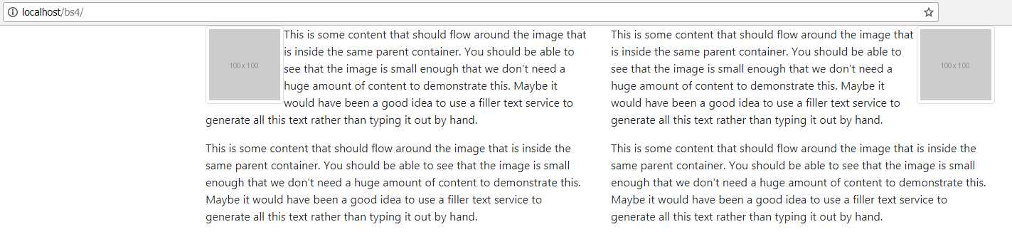
Figure 35: The output from Code Listing 34, showing alignment with text and images
If you want to center an image without the Flexbox utilities, the quickest way is to wrap the entire <img> tag inside a <div> tag, and then apply the text-center alignment class to it, as seen earlier in the text alignment section.
If you’re using the picture element, then you’ll need to apply the BS4 classes to the inner <img> tags, and not to the outer <picture> tags. If you try to apply the classes to the <picture> tags, the alignments won’t work as expected. Unfortunately, this means that if you have multiple <img> sources inside your picture element, then you will have to mark up each one separately.
Media lists
Media lists are great. There, I said it!
A lot of layouts today require you to create some kind of conversation or item and thumbnail-style list of items. BS4 (and BS3) has the perfect tool for this job, called a media list. The concept is simple: you have vertically stacked rows, each with a small, perfectly aligned thumbnail image, a header, and a small text body.
Unfortunately, it does require a bit of nesting to get the right setup, but it’s an ideal way to list all sorts of things, from product items to emails in a web email inbox, and beyond.
To create a single media list item, put the following code in your Bootstrap template.
Code Listing 35: A single simple media list object
<!-- Page content goes here --> <div class="container"> <div class="row"> <div class="col"> <div class="media"> <img src="http://via.placeholder.com/70x70" /> <div class="media-body"> <h4>My Media Item</h4> <p>This is a paragraph of text associated with my media item, telling you what it's all about.</p> </div> </div> </div> </div> </div> |
Render your template in the browser.

Figure 36: A media list item as produced by Code Listing 35
You’ll notice that the text is pushed right up to the thumbnail. You can improve this spacing by using one of the BS4 spacing classes on the inner <img> tag. In this case, we’ll use mr-3 (I’ll cover this more in the utilities chapter).
Code Listing 36: A single simple media list object with spacing added
<!-- Page content goes here --> <div class="container"> <div class="row"> <div class="col"> <div class="media"> <img src="http://via.placeholder.com/70x70" class="mr-3" /> <div class="media-body"> <h4>My Media Item</h4> <p>This is a paragraph of text associated with my media item, telling you what it's all about.</p> </div> </div> </div> </div> </div> |
Re-rendering your page now, you’ll see the text and image have better spacing.

Figure 37: Better spacing applied to the image
You can also place the image after the <div> containing the media-body class. This will automatically align the image to the right of the container.
Code Listing 37: Media body with the image following it
<!-- Page content goes here --> <div class="container"> <div class="row"> <div class="col"> <div class="media"> <div class="media-body"> <h4>My Media Item</h4> <p>This is a paragraph of text associated with my media item, telling you what it's all about.</p> </div> <img src="http://via.placeholder.com/70x70" class="mr-3" /> </div> </div> </div> </div> |

Figure 38: Image is now right-aligned, just by moving the thumbnail position
There are a number of other things you can do too, such as having two images, one on each side of the text, or aligning the bottom of the image to the bottom of the text in the container. All of these extras are done using the Flexbox utilities and other spacing stuff that we’ll cover later.
Applying captions
By using the HTML5 <figure> and <figurecaption> tags, you can add perfectly aligned captions to your images, allowing you to annotate things correctly.
Because we are venturing back into semantic meaning again here, as well as adding alt attributes to our images, you should also try to use the figure-related tags and classes where possible so that screen readers and other assistive technologies can better describe your images.
Please remember that the idea is to describe your image, not to tell the screen reader what can be seen on the screen. While this may seem easy, it’s quite harder than many people realize.
It’s easy to say “a picture of a football,” but it’s a lot harder to say “a typical football, with black and white regular hexagon-shaped patches stitched together with strong binding.” In most cases, users of your application who are using a screen reader will thank you for the longer descriptions.
Code Listing 38: Using <figure> and <figcaption> to add captions to your images
<!-- Page content goes here --> <div class="container"> <div class="row"> <div class="col"> <figure> <img src="addalink/toyourfootball/image.here.png" /> <figcaption class="figure-caption">Figure 1: A typical football, with black and white regular hexagon-shaped patches stitched together with strong binding.</figcaption> </figure> </div> </div> </div> |
The football image I used in this example was linked online, so rather than upset anyone, you’ll need to add your own image link in the code. Here’s how mine looked when rendered in the browser:
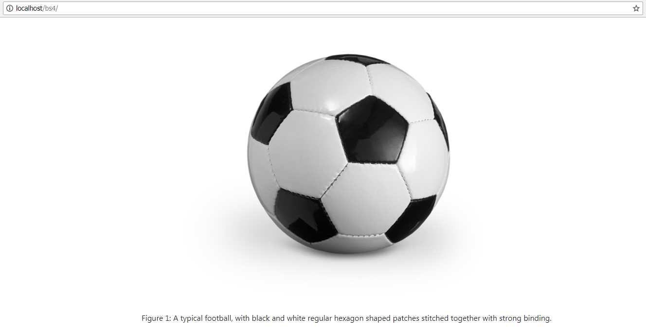
Figure 39: Our caption example for a football
- 1800+ high-performance UI components.
- Includes popular controls such as Grid, Chart, Scheduler, and more.
- 24x5 unlimited support by developers.