
Twitter Bootstrap 3 Succinctly®

CHAPTER 6
Changed JavaScript Features
When it comes to JavaScript in BS3, not much has changed, vast majority of the changes we've seen so far have revolved around the CSS and components sections. There is however a reason for this.
Most of BS2's and for that matter BS3's JavaScript functionality, comes in the form of data attributes. In most of the cases, we've seen already how to use these in the various sections on components, which really leaves very little that's only specific to JavaScript only.
In this chapter therefore I'm just briefly going to run through most of what's available, and where there is no other description elsewhere in the book, show a brief example on how to use the API available.
The JS facilities available in BS2 and BS3 are very extensible, and even a full book probably couldn't cover everything that's possible, I therefore strongly encourage you to go to getbootstrap.com and read through the section on JavaScript there is a lot more available that I have space available for in this short guide.
Modals
The first thing that anyone mentions when the subject of JavaScript comes up in bootstrap, are its modal dialog boxes, and to be honest it's little surprise.
BS3's modal boxes are one of the easiest implementations (and one of the richest) seen in any of the modern browser HTML5 frameworks.
Using them is easy, but unfortunately does require quite a big chunk of markup.
The following code gives you a very basic example:
<div class="modal fade" id="myModal" tabindex="-1" role="dialog" aria-labelledby="myModalLabel" aria-hidden="true">
<div class="modal-dialog">
<div class="modal-content">
<div class="modal-header">
<button type="button" class="close" data-dismiss="modal" aria-hidden="true">×</button>
<h4 class="modal-title" id="myModalLabel">Modal title</h4>
</div>
<div class="modal-body">
Modal Body
</div>
<div class="modal-footer">
<button type="button" class="btn btn-default" data-dismiss="modal">Close</button>
<button type="button" class="btn btn-primary">Some Action</button>
</div>
</div>
</div>
</div>
Code snippet 72: Basic modal example
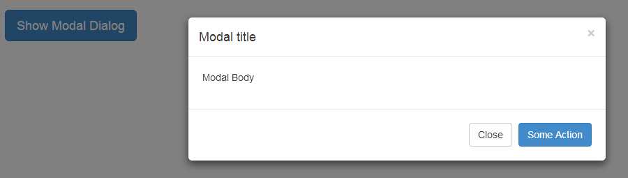
- Modal example produced by snippet 72
In order to show a modal, you first need to have a trigger target. In snippet 72, this is the button marked 'Show Modal Dialog'. For a trigger action to work it must have a toggle and target data attribute assigned to it, the toggle must have the value "modal" to show that it targets a modal dialog. The target must have the ID selector of the outermost <div> assigned to it.
In snippet 72 the outer most <div> has an ID="myModal" on it which means the data attribute for 'target' should have "#myModal" as its value.
Your trigger doesn't have to be a button, it can be anything that can accept (or is set up to accept) a mouse click, as long as the toggle and target data attributes are provided.
Once we get into the modal itself, you'll see the structure consists of a number of quite deeply nested <div>s. Because of this nesting it's recommended that you create and place your dialog/modal definitions as close to the body root as possible, if you do not, then there is a chance that other components and html structures could cause layout problems that you did not anticipate.
You'll also notice that again, there is a common theme of marking things up to make them friendly to screen readers, and again I can't stress this enough you should make every effort to make sure your markup is as friendly to accessibility tools as possible.
A modal starts with an outer <div> and the class 'modal' applied to it, optionally you can also add 'fade' which will give the modal a nice smooth transition when showing and hiding. This outer div should be the one on which you set your Z-Order and anything else in the way of global modal customizations you wish to make.
The next <div> in should have a class of 'modal-dialog' added to it, that <div> should then be followed immediately by a third <div> with the class of 'modal-content' assigned to it, it's inside this third <div> where you actually place your modal content definition.
Once you have the modal content shell defined, you can then place in 3 further <div> elements with the following classes 'modal-header', 'modal-body' and 'modal-footer'. These three inner sections should NOT be nested, but rather added to the markup as siblings of each other, and are used to define the content for the three main sections of the dialog.
You can see from the code in snippet 72 that we include a closing cross (Exactly the same as we did for alert boxes), the only difference between this closing cross and the one we saw previously is that the dismiss data attribute has a value of "modal" and not "alert", any clickable element placed within the inner modal markup, that has this data attribute, with this value, will close the dialog when clicked.
Apart from the close icon, the rest of the modals inner content is just normal BS3 markup and CSS. Anything you can use elsewhere you can use inside a modal, and if it's too tall for the screen, you'll get an inner container that automatically switches to a scrollable element.
There are also two optional width sizes too, these are added to the inner 'modal-dialog' <div> and are 'modal-lg' and 'modal-sm', the large size class expands the width of the modal to half the screen width (Ideal for tables and lists) whereas the small size shrinks the default width to approximately half of its original size (Ideal for things like yes/no prompts).
You can also initialize the modal using the JavaScript API in a standard JQuery like fashion, if you want to alter the default options behavior then using the JQ constructor is the only way to do it.
$('#myModal').modal({
backdrop: true/false,
keyboard: true/false,
show: true/false,
remote: 'path to url that returns content'
});
Code snippet 73: Setting the default options on a modal using JavaScript
The options that can be changed are as follows:
- backdrop - Boolean true or false to include or not include the shaded background on the page when the modal is shown, if the value 'static' is specified, then the background is shown but does NOT close the modal when clicked on as it does if 'true' is used.
- keyboard - Boolean true or false, allows or does not allow the escape key to close the modal.
- show - Boolean true or false, automatically shows or does not show the dialog as soon as it’s initialized.
- remote - string containing a url to get the inner content for the dialog body, if this is supplied then the dialog will ask the url to supply a chunk of html to be used in the body of the modal.
There are also a number of events that are raised for certain actions too, however showing an example of this is beyond the scope of this chapter.
Tabs
If you recall back in the section on basic navigation I mentioned that the tab component can be wired up with extra markup to actually handle the swapping of content panes for you.
To mark-up a set of tabs that change automatically using JavaScript, you first need to create a <ul> in the same manner as shown in the navigation components section, this <ul> must have <a> elements embedded inside each of its <li> elements, with the href of each anchor pointing to the ID of each associated <div> set up to hold a tab panel. You also need to make sure that each anchor has a toggle data attribute assigned to it and that its value is set to 'tab'.
Once you've created the navigation set, you then need to create an outer <div> and assign the class 'tab-content' to it. Inside of this <div> you then need to create several separate sibling <div>s each with a class of 'tab-pane' and an ID attribute matching the associated tab in the navigation set, optionally you can also add 'fade in' to fade tabs when they change, and 'active' to mark which of the tabs is currently been shown.
The following code shows an example of this:
<ul class="nav nav-tabs">
<li class="active"><a href="#tab1" data-toggle="tab">Tab 1</a></li>
<li><a href="#tab2" data-toggle="tab">Tab 2</a></li>
<li><a href="#tab3" data-toggle="tab">Tab 3</a></li>
</ul>
<div class="tab-content">
<div class="tab-pane active" id="tab1">
<h1>We self-actualize, we believe, we are reborn</h1>
<p>By refining, we live ...</p>
</div>
<div class="tab-pane" id="tab2">
<h1>We exist as four-dimensional superstructures</h1>
<p>Today, science tells us that the ...</p>
</div>
<div class="tab-pane" id="tab3">
<h1>The goal of morphogenetic fields is to plant ...</h1>
<p>You and I are life forms of the quantum soup ...</p>
</div>
</div>
Code snippet 74: Automatic tabs example
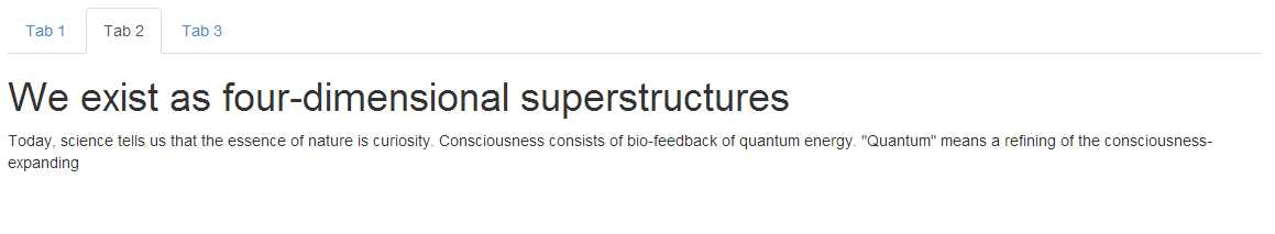
- Tab set produced by code snippet 74
The tab control doesn't have a constructor that takes options the way modal does, but it does have an API call so that you can tell which tab to show programmatically, to do this you just need use jQuery to select the appropriate selector then call "tab('show')" on it. When this is done your tabs will automatically make the referenced tab the selected one. As with modals (and others) there are events available to tell you when things change, the details and parameters of each call can be found in the BS3 docs.
Tooltips and Popovers
Everyone loves tooltips, simple little pop up tags that can be used for help and many other simple descriptive tasks.
Using a tooltip in BS3 is incredibly easy. Simply assign a data attribute of toggle with the value 'tooltip' to any standard HTML element that you wish the tooltip to display for, to define the text for the tooltip add a title attribute containing the desired text, and optionally add a data attribute called placement containing the value 'left', 'top', 'bottom' or 'right' as required depending on which direction you would like the tooltip to show.
The following code will create a simple button with a tooltip attached to its top:
<button id="mybutton" type="button" class="btn btn-default" data-toggle="tooltip" data-placement="top" title="I am a tooltip!!">The button with a tooltip</button>
Code snippet 75: BS3 button with a tool tip
There is however one small caveat that applies to tooltips, but does not apply to any other element, and that is, you need to initialize tooltips yourself. You can at the same time pass various options into then (just as with modals) but you *MUST* do this step, if you do not your tooltips will not appear.
To initialize the button shown above, place the following line of JavaScript somewhere in your page so that it's run once the DOM is ready and the button is created:
$('#mybutton').tooltip();
It's entirely up to you how you select each of your buttons, you could for example select them all via their element type, but you must call 'tooltip()' on every element that has a tooltip attached.
If everything works as expected, you should see something like this:
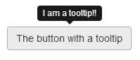
- Button with accompanying tooltip
Close behind the humble tooltip comes the popover, and like the tooltip they must be initialized manually with a call to 'popover()' , the main difference between a popover and a tooltip is that popovers can hold more contents than a tooltip.
A tooltip typically only has a simple single line of text, where as a popover as well as being larger can contain multiple html elements ranging from paragraphs to buttons and images.
The second difference is that the element has to be clicked before a popover will display where as a tooltip is automatic on hover.
You create a popover in much the same way as a tooltip, except that the popup content is defined inside a data attribute called 'content' and the title attribute is used to give the popover a mini title area (similar to the way the header area is used on a panel component), the following code shows how to define a simple popover:
<button id="mybutton" type="button" class="btn btn-default" data-container="body" data-toggle="popover" data-placement="bottom" data-content="I am the pop over contents, and I'm awesome." title="Popover Title">
I am a button with a pop over
</button>
Code snippet 76 : BS3 button with a popover
As with the tooltip, somewhere in your document start-up you also need to ensure you initialize the component using something like:
$('#mybutton').popover();
As with the tooltip, you can pass an object containing options in here, however there are a lot so again I'd encourage you to read the BS3 docs to learn them all.
If everything worked you should be able to render your page and see:
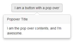
- BS3 button with a popover attached
Collapsible panels
One of the things sadly removed from BS3 was the readymade accordion component.
In its place however, has been added something altogether better: the collapsible panel.
Using these panels it's still just as easy to create a standard accordion, but since they are now also separately useable standalone components allowing you to do things like create folding information areas, toolbars and much more.
One thing to note however, if you're doing a custom build you must also make sure that you include the transition helper JavaScript plug-in, the BS3 docs have more information that should be read if you are doing a custom build.
To create an accordion from collapsible panels you simply have to create an outer <div> with a class of 'panel-group' and give it an ID, then inside of that a series of <div> tags marked up as show previously in the section on panel components, with each panel div being a single self-contained panel.
Once you have your panels laid out you simply then just need to add a 'panel-title' inside a 'panel-header', this header should contain an <a> tag two data attributes assigned, one called toggle and one called parent.
The toggle attribute should have a value of 'collapse' and the parent attribute should hold the ID of the outer <div> holding the panel group, and a href with the ID of the target panel body that should be the object of the collapsing behavior. Each of the target panels should have the classes 'panel-collapse' and 'collapse' assigned to them.
The following code shows how to achieve this:
<div class="panel-group" id="newAccordion">
<div class="panel panel-default">
<div class="panel-heading">
<h4 class="panel-title">
<a data-toggle="collapse" data-parent="#newAccordion" href="#panelOne">
Consciousness is the richness of truth, and of us
</a>
</h4>
</div>
<div id="panelOne" class="panel-collapse collapse in">
<div class="panel-body">
Aromatherapy may be the solution to what's ...
</div>
</div>
</div>
<div class="panel panel-default">
<div class="panel-heading">
<h4 class="panel-title">
<a data-toggle="collapse" data-parent="#newAccordion" href="#panelTwo">
The planet is radiating four-dimensional superstructures
</a>
</h4>
</div>
<div id="panelTwo" class="panel-collapse collapse">
<div class="panel-body">
It is time to take chi to the next level ...
</div>
</div>
</div>
<div class="panel panel-default">
<div class="panel-heading">
<h4 class="panel-title">
<a data-toggle="collapse" data-parent="#newAccordion" href="#panelThree">
Reality has always been radiating messengers whose souls are opened by stardust
</a>
</h4>
</div>
<div id="panelThree" class="panel-collapse collapse">
<div class="panel-body">
Self-actualization requires exploration ...
</div>
</div>
</div>
</div>
Code snippet 77: How to create an accordion replacment using collapsable panels
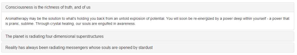
- Accordion replacement produced by snippet 77
As mentioned, panels don't need to be grouped, they can be used in a singular fashion using just a single element as the trigger for the folding to happen. For example, if you want to collapse a panel just using a simple button, just ensure that your button has a data attribute of toggle with the value 'collapse' and a data attribute called target with the selector for the target panel as its value.
Carousel
To round this chapter off, the last JavaScript plug in I'm going to introduce is the newly designed carousel.
BS2 had a carousel, but like the accordion, this has now been removed and greatly simplified to make it easier to use.
Typically the carouse plug-in is used at the top of a page to provide a rotating banner of images, and in BS2 this was the only thing that the carousel could be used for. In BS3 however, any content that can be placed inside the carousels panels will be rotated, so this could be images, text, svg and much more.
The following code shows a basic example of how to construct a carousel:
<div id="carousel-example-generic" class="carousel slide" data-ride="carousel">
<ol class="carousel-indicators">
<li data-target="#carousel-example-generic" data-slide-to="0" class="active"></li>
<li data-target="#carousel-example-generic" data-slide-to="1"></li>
<li data-target="#carousel-example-generic" data-slide-to="2"></li>
</ol>
<div class="carousel-inner">
<div class="item active">
<img data-src="holder.js/1140x500/sky" />
<div class="carousel-caption">
<h3>You and I are beings of the planet</h3>
<p>Spacetime is a constant. Will requires exploration</p>
</div>
</div>
<div class="item">
<img data-src="holder.js/1140x500/vine" />
<div class="carousel-caption">
<h3>Nothing is impossible</h3>
<p>Stardust requires exploration. You and I are storytellers of the cosmos</p>
</div>
</div>
<div class="item">
<img data-src="holder.js/1140x500/lava" />
<div class="carousel-caption">
<h3>You and I are beings of the planet</h3>
<p>Spacetime is a constant. Will requires exploration</p>
</div>
</div>
</div>
<a class="left carousel-control" href="#carousel-example-generic" data-slide="prev">
<span class="glyphicon glyphicon-chevron-left"></span>
</a>
<a class="right carousel-control" href="#carousel-example-generic" data-slide="next">
<span class="glyphicon glyphicon-chevron-right"></span>
</a>
</div>
Code snippet 78: BS3 carousel
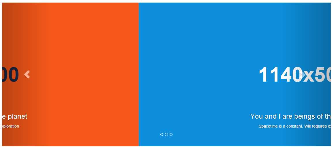
- Carousel produced by code snippet 78
There are a few more low key JavaScript objects but most of them are not directly usable from normal user code, and are generally only used in special circumstances, the BS3 docs has everything I've missed and if you're going to dig deeply into the JS facilities available a long read and understanding of how everything is hooked together is definitely a requirement.
One final note, BS3 JS plug-ins are nothing more than regular jQuery plug-ins (BS uses jQuery under the hood). This means that it should be very easy to take your favorite jQuery plug-in from places like unheap.com and adapt them to work with BS3 quite easily, and don't forget there is still a huge amount of add-ons available out there already especially to be used with the framework, most of which are only a Google away.
Customizing Bootstrap 3
And so finally we get to the last chapter in the book, and that’s how to create custom color sets.
If you recall right back at the beginning, when we were going through the major changes, I mentioned that the BS authors had provided an additional file which made sure that BS3 looked just like BS2 rather than using its flat look.
Throughout this book we've used the default BS3 flat look, if however you download the prebuilt JavaScript version of BS3 from the get bootstrap site (www.getbootstrap.com) you'll find inside the archive you download, there is a new file called 'bootstrap-theme.css'
If you link this file into your project immediately after your inclusion of the core 'bootstrap.css' file, you'll find straight away that even though you’re now using the new BS3 way of doing things, the look and feel of your application still resembles BS2.
The authors realized that one of the main barriers to the adoption of BS3 in new applications was the inability to style it in a custom manner, but with ease.
If you were a user of Less, or even SaSS (as BS3 now has SaSS bindings) then this wasn't an issue. You simply opened up the Less sources, tweaked the variables and Mixins you needed and ran things through the less compiler to get your new CSS script.
Unfortunately not everyone used Less, in fact many developers and designers only had the ability to download and include the plain old pre-compiled CSS and JS files, so a better way had to be found.
The first change that was made was to open up the entire Less sources to an in page customization tool directly on the Boot Strap main site, this isn't a new thing, you where able to use this page before in a limited way. As of BS3 however, the Less customization tool has had a complete overhaul, and you can now redefine EVERYTHING that BS3 uses, from font sizes and typefaces, right through to grid sizes, trigger points and basic contextual color sets.
In fact, there is now nothing that cannot be changed before you decide to download your new customized CSS as the following image shows:
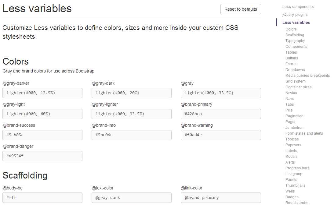
- Screenshot of the top half of the new customization tool
Because of the sheer size of the tool it's impossible to show the entire thing in this book, but it's easy enough to access. Simply go to getbootstrap.com then click on 'Customize' in the top menu bar, you'll also see that you have many other options such as which JS plug-ins and tool-kits to include, which components to include and base style that you may not want.
For example, if all you want to use is the grid system, and nothing else, then you can simply select only the grid system, and unselect all the other components.
The BS3 site will then generate just the required code to include and no more, this is a boon for those people who have the "But all Boot Strap sites look the same" opinion, because it now means that your site absolutely does not have to look the same, you really can just use the bits you need, and use your own stuff for everything else.
There is however another way you can customize your build, actually there's two..
The first way is to take the additional 'bootstrap-theme' CSS style sheet, make a copy then change the styles as you see fit in there, this is not as easy as using the customization tools, but it's also not as difficult as the second way.
Most of the class names and settings you'll want to change to stamp your personal mark in BS3 are already separated out in the BS2 theme, so the quickest way to experiment is simply to put together a prototyping page with the main controls and elements on you want to change, then link in your copy of the BS2 theme.
If you’re using Node and something like bower, it gets even easier because you can use live reload, then just watch your sample page change in near real-time as you tweak your custom version of the theme sheet.
The second way is slightly more involved, and as described in the BS3 docs comes in 2 flavors light customizations and heavy customizations.
An example of a light customization is adding a contextual color class to the button element, for example if you wanted to add 'btn-sky' alongside the 'btn-info', 'btn-primary' etc classes, you might define a single style sheet to hold the following rules:
.btn-sky, .btn-sky:hover, .btn-sky:active
{
color: #000000;
text-shadow: 0 -1px 0 rgba(0, 0, 0, 2);
background-color: #AAD4FF;
border: 1px solid black;
}
.btn-sky
{
background-repeat: repeat-x;
background-image: linear-gradient(top, #00FFFF 0%, #FFFF00 100%);
}
.btn-sky:hover
{
background-position: 0 -10px;
}
Code snippet 79: Light customisation, adding a new contextual class to the BS3 button classes
Which when added and linked in correctly, should look something like this:
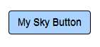
- Output from code snippet 80, when used with the customization in snippet 79
When used with a normal button tag in the following manner:
<button class="btn btn-sky">My Sky Button</button>
The hardest part of using this method is going through the base CSS style sheets to find the names you wish to override, it's not exactly difficult, just long winded.
Once you have one such as the button above, or you've found a copied out an alert, panel, list or other class, then you can easily make a template that can be reused whenever you want to add a custom class of that type.
Heavy customizations are not to dissimilar to light customizations, but the major difference here, is that you override the entire class.
So for example, you find all the classes related to 'btn', copy them out modify them and include them separately.
The new architecture inside the BS3 framework now means that once you know the target selectors, and their siblings, creating an override is easy, and as has already been pointed out the bootstrap-theme file already contains much of what you might want to modify anyway, and if that's not an option, then sites such as bootswatch.com:
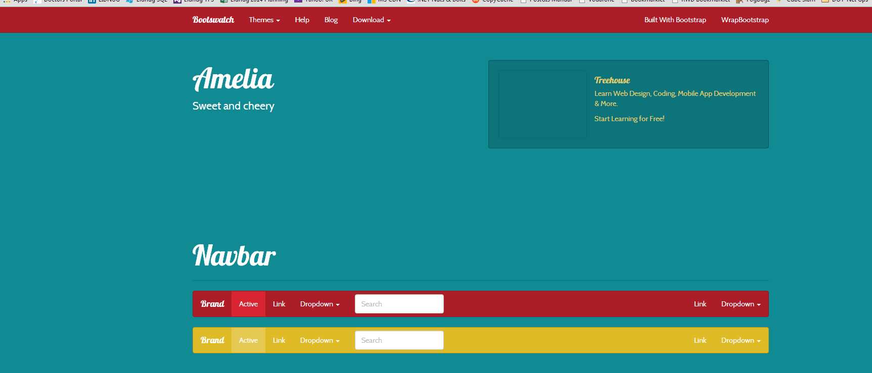
- Screen shot of the sweet and cherry theme from Bootswatch.com
Many others have thousands of themes, free and paid for to choose from, so there's no excuse for your Bootstrap site to look the same as everyone else's.
Closing notes
Well that’s it folks, that’s all I have for this book, I knew when I started writing the BS2 guide that it wouldn't be too long before BS3 went main stream, unfortunately it took a little longer than expected to get it out into the wild, but when it was released it was met with so much enthusiasm that I knew I simply had to start of a follow up covering BS3 straight away.
After a brief discussion with the marketing team at Syncfusion (Hi Guys!) we decided that the way forward was to try and get this written in about a month, and buy and large I did it, what you hold in your hand now did not exist at the beginning of May 2014, and was nothing more than a few scribbled down ideas on the notepad on my desk.
If you'd like to reach out and ask me any questions about the book I can generally be found hanging about on twitter as @shawty_ds
You can also generally find me on linked in (https://www.linkedin.com/profile/view?id=36236951) or in the Linked .NET (Lidnug) users group (https://www.linkedin.com/groups/LinkedNET-Users-Group-LIDNUG-43315) that I help run on there.
I hope you enjoy this book and that it helps you become a better developer using Bootstrap 3, in this new world of responsive web design, BS3 is a framework that shouldn't be taken lightly, it represents a lot of research by one of the biggest social media companies in existence and is used to power most of their public facing sites.
Until next time, keep calm and carry on bootstrapping.
- 80+ high-performance, responsive JavaScript UI controls.
- Popular controls like DataGrid, Charts, and Scheduler.
- Stunning built-in themes.
- Lightweight and user-friendly.