
Twitter Bootstrap 3 Succinctly®

CHAPTER 5
Changed Components Features
Glyphicon changes
The biggest news in the components provided by BS3 is the glyphicons icon set.
When V3.0 beta was first released, the glyphicons font that forms the core of the icon set in BS3 was removed. The community in general was up in arms about this, especially when the icon set was split into its own repository.
The split however was only short lived, and from the production release onwards glyphicons was reinstated into the main branch, but with one big new bonus.
No longer is the icon set made up of a set of bitmapped pngs in white and black, it's now a full scale vector based font set, with ttf, svg, wot and other formats. Because it's a vector now, it can easily be colored using standard CSS-based color techniques, and it can be scaled to any size required now too.
In the current build of BS3 there are 200 or more icons to choose from covering lots of different use cases, to use an icon you simply add the class 'glyphicon' and a 'glyphicon-xxxxx' to select the actual icon you want to use, then you add this to a span class that's nested inside of the element you wish to display the icon in.
One caveat you must obey with glyphicons is that you cannot mix the icon content with any other element. You must make sure that the icon class is applied only to its own element and with enough padding around it to ensure sufficient space between it and any other content next to it.
The following code gives you a simple over view on how to use the glyphicon classes:
<h1>This is header text
<small>with some small text and an icon <span class="glyphicon glyphicon-home"></span></small>
</h1>
<p>This is a normal paragraph, which again like the header has an icon inline with it
<span class="glyphicon glyphicon-headphones"></span>
</p>
<div style="background-color: beige; width: 200px; height: 200px; padding: 4px;">
<p>This is an absolute size div with a scaled up icon in it</p>
<span class="glyphicon glyphicon-road" style="font-size: 150px;"></span>
</div>
<p class="text-success">This is a normal paragraph, with a different color applied to it
<span class="glyphicon glyphicon-cog"></span>
</p>
Code snippet 32: BS3 glyphicons sample
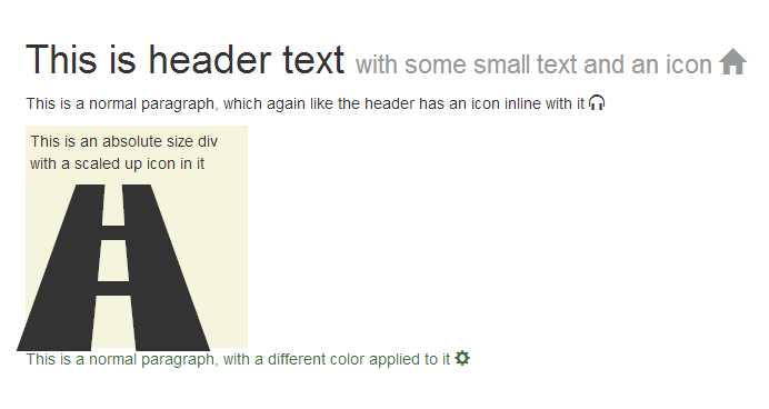
- Output produced by code snippet 32
There's far too many to list all the available icons here, but if you go to http://getbootstrap.com/components/#glyphicons-how-to-use, there's a grid complete with all the class names required to get the icon you need.
The icons work correctly in any container you add them too, and they respect the sizing classes to, so for example if you add one inside a <button> element, that has a 'btn-lg' class attached to it, the icon will scale as required to match the button size.
Button Changes
Where buttons from a component point of view are concerned in BS3, the changes are very minimal, there are a couple of new classes and recommendations made, but aside from that everything you did in BS2 should still work as expected except that the new look and feel will be observed, as described in the previous chapter.
From a component point of view the 'btn-group' and 'btn-toolbar' classes are still the same, but it is now recommended that where possible you try to ensure that you group buttons using 'btn-group' and when marking up toolbars, you should try to make sure you have a role of 'toolbar' applied to them to assist screen readers and other equipment.
One thing you need to be aware of however. Due to changes in how BS3 handles button groups, and if you are using tooltips or popovers on your buttons, you will now have to add the option 'container: body' to the tooltip or popover when you create it. The container doesn't have to be 'body' however, it can be any container in which the popover/tooltip/button arrangement is nested, the container needs to be there however, this unfortunately means that you now also have no option but to create popovers and tooltips using JavaScript.
In line with the rest of the new sizing classes comes the new 'btn-group-lg', 'btn-group-sm' and 'btn-group-xs' just like with the other size classes there is NO 'btn-group-md' as that is the default size with no extra styling added.
The following code shows a basic example of button grouping, toolbars and different sizes.
<div class="btn-toolbar" role="toolbar">
<div class="btn-group btn-group-lg">
<button type="button" class="btn btn-default">Left</button>
<button type="button" class="btn btn-default">Middle</button>
<button type="button" class="btn btn-default">Right</button>
</div>
<div class="btn-group">
<button type="button" class="btn btn-primary">Left</button>
<button type="button" class="btn btn-primary">Middle</button>
<button type="button" class="btn btn-primary">Right</button>
</div>
<div class="btn-group btn-group-sm">
<button type="button" class="btn btn-success">Left</button>
<button type="button" class="btn btn-success">Middle</button>
<button type="button" class="btn btn-success">Right</button>
</div>
<div class="btn-group btn-group-xs">
<button type="button" class="btn btn-warning">Left</button>
<button type="button" class="btn btn-warning">Middle</button>
<button type="button" class="btn btn-warning">Right</button>
</div>
</div>
Code snippet 33: Simple button group, toolbar and group sizing example.
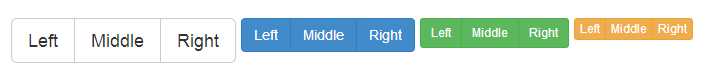
- Output generated by code snippet 33
Button nesting is also still performed in the same manner as it was in BS2, thus allowing you to add drop down button menus inside groups of normal buttons, as the following code shows:
<div class="btn-group">
<button type="button" class="btn btn-default">Left</button>
<button type="button" class="btn btn-default">Middle</button>
<div class="btn-group">
<button type="button" class="btn btn-primary dropdown-toggle" data-toggle="dropdown">
Right
<span class="caret"></span>
</button>
<ul class="dropdown-menu">
<li><a href="#">Menu Link 1</a></li>
<li><a href="#">Menu Link 2</a></li>
</ul>
</div>
</div>
Code snippet 34: Nested buttons
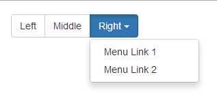
- Output generated by code snippet 34
Notice in the last code snippet that I altered the button color of the drop down button, all you need to do in order to achieve this is just add individual button colors on the classes for individual buttons, this works across all button groups & toolbars, not just when nesting them, meaning that you can vary the colors of the buttons in your group depending on your usage.
Two new classes when it comes to button layouts are the 'btn-group-vertical' and the 'btn-group-justified' classes.
Previously in BS2 it was very difficult to stack your buttons vertically, or to make them take up the full width of the available space while maintaining a balanced size. Using these 2 new classes in BS3, now solves both of these tricky situations in one go, be aware though to make the justified groups work correctly you need to mark your button groups up with a little extra mark up than you might expect.
The next code sample shows how to use vertical groups:
<div class="btn-group-vertical btn-group-lg">
<button type="button" class="btn btn-default">Top</button>
<button type="button" class="btn btn-default">Middle</button>
<button type="button" class="btn btn-default">Bottom</button>
</div>
<div class="btn-group-vertical">
<button type="button" class="btn btn-primary">Top</button>
<button type="button" class="btn btn-primary">Middle</button>
<button type="button" class="btn btn-primary">Bottom</button>
</div>
<div class="btn-group-vertical btn-group-sm">
<button type="button" class="btn btn-success">Top</button>
<button type="button" class="btn btn-success">Middle</button>
<button type="button" class="btn btn-success">Bottom</button>
</div>
<div class="btn-group-vertical btn-group-xs">
<button type="button" class="btn btn-warning">Top</button>
<button type="button" class="btn btn-warning">Middle</button>
<button type="button" class="btn btn-warning">Bottom</button>
</div>
Code snippet 35 : Vertical button groups
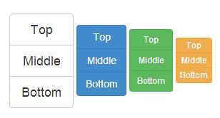
- Output produced by code snippet 35
As mentioned a moment ago, marking up the justification classes is a little more involved, but this is simply just to smooth out some of the few browser inconsistencies that unfortunately still exist. If you use the pattern shown in the code below to mark up your justified groups, then you should find that none of these inconsistencies present a problem for you:
<div class="btn-group btn-group-justified" style="padding-top: 4px;">
<div class="btn-group">
<button type="button" class="btn btn-default">Left</button>
</div>
<div class="btn-group">
<button type="button" class="btn btn-default">Middle</button>
</div>
<div class="btn-group">
<button type="button" class="btn btn-default">Right</button>
</div>
</div>
<div class="btn-group btn-group-justified" style="padding-top: 4px;">
<div class="btn-group">
<button type="button" class="btn btn-primary">Left</button>
</div>
<div class="btn-group">
<button type="button" class="btn btn-primary">Middle 1</button>
</div>
<div class="btn-group">
<button type="button" class="btn btn-primary">Middle 2</button>
</div>
<div class="btn-group">
<button type="button" class="btn btn-primary">Right</button>
</div>
</div>
<div class="btn-group btn-group-justified" style="padding-top: 4px;">
<div class="btn-group">
<button type="button" class="btn btn-success">Left</button>
</div>
<div class="btn-group">
<button type="button" class="btn btn-success">Middle 1</button>
</div>
<div class="btn-group">
<button type="button" class="btn btn-success">Middle 2</button>
</div>
<div class="btn-group">
<button type="button" class="btn btn-success">Middle 3</button>
</div>
<div class="btn-group">
<button type="button" class="btn btn-success">Middle 4</button>
</div>
<div class="btn-group">
<button type="button" class="btn btn-success">Right</button>
</div>
</div>
Code snippet 36 : BS3 justified button sample
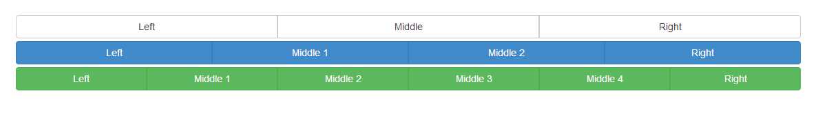
- Output produced by snippet 36
The golden rule with the mark up is that each individual button has to be wrapped in its own <div> with a 'btn-group' class applied to it, each of this single groups then need to be wrapped in an outer div which has both 'btn-group' and 'btn-group-justified' applied to it.
One thing to remember if you're using justified groups however. Because the buttons are rendered out as a block element the button group sizing classes won't work as expected, and this shouldn't really come as a surprise, because they won't work on single buttons that have the 'btn-block-level' class added either, just as inline elements marked up and styled using block can't be fluidly controlled in general.
If your buttons are made up of <a> tags, then the best bit is, you don't need all this extra mark up, you just need the outer div with the 'btn-group-justified' class added to it, and regular buttons inside of it.
Creating a drop down button with a menu attached is still created in the exact same manner as it is in BS2, you create an outer div with a 'btn-group' class applied to it, immediately inside this you create a regular set of button styling classes applied to it, along with a class of 'dropdown-toggle' and a data attribute called toggle with the value of 'dropdown' applied to it. Immediately after the button element but before you close the group div, you then define the actual menu using a standard unordered list with a class of 'dropdown-menu' and a role or 'menu' applied to it.
Note: HTML5 Data attributes
One of the new toys that the HTML 5 specification brings to the table is something called data attributes. BS3 (and for that matter BS2) use these attributes in many different places, to allow Elements and JavaScript functions to be joined together without the developer ever having to write a single line of JS. Data attributes allways take the form of 'data-name' where name is the name the developer using it wishes to assign to that attribute. Using data- ensures that the attributes you define will never interfear with anything the WHATWG standards body will ever add to the spec, and so mean that the developer has utmost flexability in what he or she wishes to use them for.
In most cases these data attributes are used in cases similar to the way BS3 uses them, in order to pass information from the element, into the JS routines working on it. They can be used to pass in ID names, options, parameters for sizes and many other things, meaning that you often don't actually have to write any boiler plate code in your app, through the course of the rest of this chapter you'll be introduced to many more of these data attributes, but I'll mention them by name rather than the full attribute, EG: I'll describe it as 'a data attribute called popup' rather than 'an attribute called data-popup'
In order for the button dropdowns to work, you MUST have the dropdown JS plug-in added to your BS3 build. If you've just downloaded the default set then this won't be a problem, but if you've done a custom build, or even compiled from the less sources yourself, you'll need to make sure it's present.
The following code shows a basic drop down button example:
<div class="btn-group">
<button type="button" class="btn btn-success dropdown-toggle" data-toggle="dropdown">
A dropdown button <span class="caret"></span>
</button>
<ul class="dropdown-menu" role="menu">
<li><a href="#">1st Link</a></li>
<li><a href="#">2nd Link</a></li>
<li><a href="#">3rd Link</a></li>
<li class="divider"></li>
<li><a href="#">1st Link after divider</a></li>
</ul>
</div>
Code snippet 37: Dropdown button example
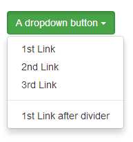
- Output generated by code snippet 37
By making a simple modification to code snippet 37, you can easily turn the button into a split drop down, where the action of the button remains a single action in its own right, but still allowing the menu to drop down when the caret is clicked.
Simply add another button element just before the button element, then move the text (but NOT the caret) from the (now) second button into the first so the new button tag looks like this:
<button type="button" class="btn btn-success">A dropdown button</button>
If you then re-render the output in your browser you should see the following:
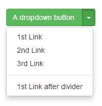
- Output generated by code snippet 37 after it's been amended to produce a split dropdown
The final thing to mention before moving on are the sizing and drop-up variations.
The sizing is simple, the sizing classes mentioned in the CSS chapter work just as expected with drop down buttons, exactly in the same manner as they do on normal buttons, 'lg' for large, no 'md' and 'sm' and 'xs' for small and extra small.
Drop-up is a class name that you apply to the outer element with the 'btn-group' class on, when constructing a drop-down or split drop down button, which as its name implies, causes the menu to pop upwards rather than downwards.
A final note on drop downs
Drop downs don't by any stretch of the imagination need to be only attached to buttons, ANY element that can be wrapped in an outer parent, to which you can apply a class of 'dropdown' to can then have an element inside of it with a data attribute of toggle and the value of 'dropdown', which will cause that element to become the trigger for the dropdown to display.
Input group changes
In short, there have been no changes to the input group functionality between BS2 and BS3.
Input groups are still marked up exactly the same way as previous with the same caveats, namely:
- You cannot add multiple additions on one side, only one on each end.
- Multiple elements in one input group are not supported.
- You cannot mix input groups with other components; you must nest them.
- If you’re attaching tooltips and popovers you must add a container option as previously mentioned under button changes
- Where possible avoid using input groups with select lists esp when targeting webkit based browsers
To create an input group simply wrap your input control and its [pre|suf]fix (which will generally be a span) in a div or other block level element with a class type of 'input-group' applied to it, and then make sure that the additional span has a class of 'input-group-addon' applied to it.
For example, the following code will create an input box for a Twitter handle, and an input box for money where you’re not entering a decimal part.
<div class="input-group">
<span class="input-group-addon">@</span>
<input type="text" class="form-control" placeholder="Username">
</div>
<br/>
<div class="input-group">
<input type="text" class="form-control">
<span class="input-group-addon">.00</span>
</div>
Code snippet 38: BS3 input addons using input groups
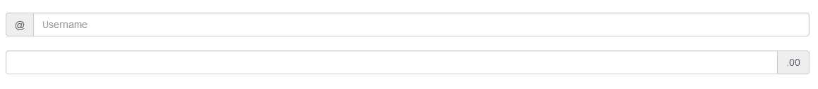
- The output produced by code snippet 38
The normal sizing classes also apply to these, just as they apply to other form inputs too so adding 'input-group-lg' and 'input-group-sm' (again there is no md as this is the default) to the outer input group will size the entire control set accordingly.
One thing that’s not new in BS3 but has been made easier to do however is to add checkboxes, radio buttons and regular buttons and dropdowns to input groups.
Each of these requires a bit more markup than just using a regular span but the resulting effect is that you can add interactivity to your fields, for example to create your own file upload control, or a button that creates a random password.
The following code shows how to achieve this:
<div class="input-group">
<span class="input-group-addon">
<input type="checkbox"> Keep Email Private
</span>
<input type="email" class="form-control" placeholder="Please enter email address">
</div>
<br/>
<div class="input-group">
<span class="input-group-addon">
<input type="radio"> Make Default
</span>
<input type="text" class="form-control" placeholder="Enter an address here">
</div>
<br/>
<div class="input-group">
<span class="input-group-btn">
<button class="btn btn-default" type="button">Check User Name</button>
</span>
<input type="text" class="form-control" placeholder="Please enter a user name here">
</div>
<br/>
<div class="input-group">
<input type="text" class="form-control" placeholder="Enter the password you would like to use">
<span class="input-group-btn">
<button class="btn btn-success" type="button">Create Random Password</button>
</span>
</div>
Code snippet 39: Input groups using buttons and radios
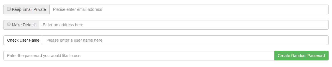
- Output produced by code snippet 39
Navigation Changes
The navigation components have had their own share of changes too, but much like the other groups this is mostly to tie common class names together and basically tidy things up so they are more meaningful.
There are 2 main sections when it comes to the navigation components, basic navigation and nav-bars.
Out of the two of them it's the nav-bars that have had the greatest changes.
For a start, in BS2 all you really had where nav-bars, there was no button classes, text classes only really the brand-label.
This lead to a massive avalanche of questions on places like stack overflow, with many developers asking "How do a centrally line text up in a nav-bar" or "How do I stop my buttons from increasing the height of my nav-bar"
BS3 has now introduced many new classes designed especially for this kind of scenario, which we'll introduce soon, first tough, let's look at what's different in the basic navigation components.
Basic Navigation
First things first, the navigation list component that was in BS2 is gone. Not just deprecated, but sliced out, taken away never to be seen again, and this is a good thing.
While it was easy to work with (You created an unordered list, added a sprinkle of bootstrap magic and where good to go), it was messy, didn't work the same way in all browsers, and well it did have a few rendering problems.
What do we have in its place?
We have "List groups", however they are for a little later on, for now where just going to cover what remains, as it will set the ground work for using List groups a little later on.
So what is the base class then? Well it may surprise you to learn that it's simply a class called 'nav', which along with 'nav-tabs', 'nav-pills' and 'nav-stacked' can be used to make tab, pill and sidebar based navigation structures in the same way, you used to make nav lists in BS2.
The mark-up used is now much simpler, and you don't need to be careful of any extra padding or browser quirks, and you certainly don't need any custom stuff to get anything done.
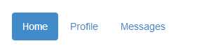
To use tabs, simply take an unordered list, add a 'nav' and 'nav-tabs' class, as the following code shows:
<ul class="nav nav-tabs">
<li class="active"><a href="#">Home</a></li>
<li><a href="#">Profile</a></li>
<li><a href="#">Messages</a></li>
</ul>
Code snippet 40: Tab based navigation
- Output produced by code snippet 40
The mark up needed now consists of nothing more than a handful of <li> elements, the only place the classes need to be applied is on the outer <ul> itself. You'll see also, that we have an 'active' class on the first <li> in the list, to show us which is the active tag.
If you want BS3 to provide the entire tab's experience (That is to actually change the content as required) then there's more work you need to do, and for that as we'll see in JavaScript section, you need to use one of the JS add-ons to make this happen, if however you want to handle the tab switching and content yourself, all you need to do to switch tabs is move the active class from one <li> to the next.
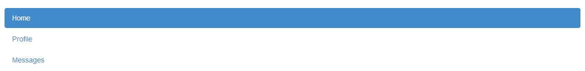
Things are no more complicated with pills, just exchange the 'nav-tabs' in code snippet 40 for 'nav-pills' and you should see things change to this:
- Output from code snippet 40 when changed to 'pill' mode
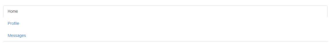
and if we add 'nav-stacked' to either of them, our navigation will stack neatly one on top of each other:
- Code snippet 40, changed to 'pill' mode and with nav-stacked added
As with just about all the other components and changes in the framework, you'll note it now renders as a block element occupying 100% of the available space.
Like the others, you simply just need to use the grid system, and other available classes to make sure it takes up only the space you need. By rendering everything in this way, any parent container that changes size because of differing screen resolutions will now ensure that their children also resize as needed and will do so responsively.
By the way, this does also work with tabbed navigation, but the output is most likely not what you would expect:
- Code snippet 40, rendered as stacked tabs
In fairness though it wasn't really designed to work that way, tabs generally run left to right, and while BS2 did have some classes for putting tabs on the side and along the bottom of elements, these have been removed in BS3.
The JavaScript plug-in for doing full tab based outputs still has the ability to position the tabs, but the general navigation no longer does.
As with the changes made in the button components, the navigation aids also now have a new justified class added to them called 'nav-justified' and just as with the button version, it will cause a navigation class to span the full width of a container giving each sibling an equal size.
If we take the code in snippet 40 and add 'nav-justified' to the 2 classes already there, we get the following result:
- Navigation tabs from code snippet 40 with full width justification applied
Another thing the navigation aids have in common with the button classes and components are the state based changes, used to show a given state as well as the ability to take drop down menus and sub navigation.
Simply adding a class of 'disabled' to the <li> inside of a navigation set will disable and dim that link with the 'muted-text' look. Remember though, it does not actually disable the link, the link will still be clickable and it will be up to you to code things so the link does not react.
To add a drop down to any pill or tab based navigation item, just use the same layout and classes as shown in the section on buttons, nest an <a> inside an <li> followed by another <ul> with the appropriate classes and data attributes to make it all work.
In a bit of a cross-over between the basic navigation and navigation bars, we also have breadcrumbs and page/pagination navigation aids.
Breadcrumbs are typically used to mark your position in a sites hierarchy, and as we've seen above, using them is simply a case of adding them to an unordered list as the following code shows:
<ul class="breadcrumb">
<li><a href="#">Home</a></li>
<li><a href="#">Library</a></li>
<li class="active">Data</li>
</ul>
Code snippet 41: BS3 breadcrumb navigation example
- Output produced by code snippet 41
The final one before we move onto full navigation bars are the pagination controls, these controls take a huge amount of the grunt work out of lining up a bar with previous and next before and after, and a sequence of numbers in the middle.
Typically used where you have a data heavy site and want to display records a page at a time rather than all at once, pagination bars are both simple to use and easy to line up with the rest of your output.
Just as with the other basic elements, creating them is as simple as adding the appropriate classes to an unordered list as the following code shows:
<ul class="pagination">
<li><a href="#">«</a></li>
<li><a href="#">1</a></li>
<li><a href="#">2</a></li>
<li><a href="#">3</a></li>
<li><a href="#">4</a></li>
<li><a href="#">5</a></li>
<li><a href="#">»</a></li>
</ul>
Code snippet 42: BS3 Pagination bar
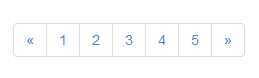
- Output produced by code snippet 42
Applying 'active' and 'disabled' classes where needed to individual <li> elements within the list enables you to mark links as disabled and selected just as with the other basic navigation aids.
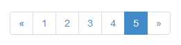
- Output produced by code snippet 42 with active and disabled classes added
Pagination controls can be sized just as easily as the other controls using the new sizing options, and like the others they now all follow the same naming scheme, using 'pagination-lg' and 'pagination-sm'. As with some of the others, there is no 'pagination-xs' and no hint that there should be one, likewise there's no '-md' size either due to that being the default.
To use them simply just add the appropriate sizing class along size the pagination class on the parent <ul> holding the list, as the following code shows:
<ul class="pagination pagination-lg">
<li><a href="#">«</a></li>
<li><a href="#">1</a></li>
<li><a href="#">2</a></li>
<li><a href="#">3</a></li>
<li><a href="#">4</a></li>
<li class="active"><a href="#">5</a></li>
<li class="disabled"><a href="#">»</a></li>
</ul>
<br/>
<ul class="pagination">
<li><a href="#">«</a></li>
<li><a href="#">1</a></li>
<li><a href="#">2</a></li>
<li><a href="#">3</a></li>
<li><a href="#">4</a></li>
<li class="active"><a href="#">5</a></li>
<li class="disabled"><a href="#">»</a></li>
</ul>
<br/>
<ul class="pagination pagination-sm">
<li><a href="#">«</a></li>
<li><a href="#">1</a></li>
<li><a href="#">2</a></li>
<li><a href="#">3</a></li>
<li><a href="#">4</a></li>
<li class="active"><a href="#">5</a></li>
<li class="disabled"><a href="#">»</a></li>
</ul>
Code snippet 43 : Using different sizes for the pagination component
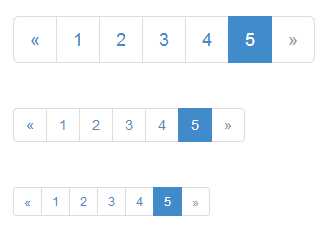
- Output produced by code snippet 43
The pagination classes have one final trick up their sleeve, and that's the generation of previous and next page buttons.
You'll see that in many wiki or blog style sites, there is usually an "older", "newer" or "previous","next" button pair at the foot of a page.
To make the default version of this, simply create a <ul> as you have in this entire section, and add a class of 'pager' to it like so:
<ul class="pager">
<li><a href="#">Previous</a></li>
<li><a href="#">Next</a></li>
</ul>
Code snippet 44: Simple BS3 pager
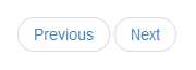
- Output from code sample 44
Automatically a pager will place its buttons in the center of the available space as seen in figure 44, however you can also justify them left and right by adding the 'previous' and 'next' classes to the inner <li> elements.
If you change code snippet 44 so that the <li> holding the previous button has a class of 'previous' assigned, and the <li> holding the next button has a class of 'next', then re-render the output, you should see your browser change to the following:
- Code snippet 44 with optional 'previous' and 'next' classes applied
You'll see that again as with everything else, it expands responsively to fill 100% of the available space, and as with everything previous you can easily control this using grids, spans and other containers where needed.
Navbar navigation
If there's one thing that BS3 does way better than any of the other frameworks I've seen out there, it's navigation bars.
Whether it's a drop down menu, a title with sign-in/out controls or just a decoration, there's no denying that navigation bars in bootstrap are all powerful.
Unfortunately in BS2 there was quite a bit lacking, there were many hacks published to allow things to be lined up, and some of the CSS used was a little ropey around the edges, but since BS3 all of this has now changed.
The basic navigation bar now starts life as a collapsed item in your pages display. This means that if the first display is a mobile device, then your design will start out with a nicely collapsed menu bar, ready to be expanded exactly as a mobile user would expect. In BS2 things where entirely opposite, and you had to take extra steps to collapse the display before making it visible.
The navigation bar will progressively become visible as the display width increases, until the entire unit in full has enough space to render horizontally across the page.
Be careful though, even with a non-fluid column width of 1024pk, and a fluid width of your entire display, it is still possible to run out of space. When this happens it's possible that you'll end up with some major content overflow scenarios. For example, it's not difficult to push your navigation bar to be two or more rows in height.
The recommended way to ensure this doesn't happen is to use custom styling to ensure you control the width of your elements and/or to use the responsive visibility classes to control what is and is not shown for different screen sizes.
If you’re using less you can now also customize the @grid-float-breakpoint variable to control the trigger point that your navigation bar collapses, or you can just customize the appropriate media queries in the base CSS.
Navigation bars require JavaScript to be enabled to work correctly, if it's not enabled, the bar should still display, but the collapsing will refuse to work correctly, you also need to ensure that if you've done a custom build, that you've included the collapse JavaScript plug-in too.
The following code snippet shows how to create a basic empty collapsible navigation bar:
<nav class="navbar navbar-default" role="navigation">
<div class="container-fluid">
<div class="navbar-header">
<button type="button" class="navbar-toggle" data-toggle="collapse" data-target="#bs-example-navbar-collapse-1">
<span class="sr-only">Toggle navigation</span>
<span class="icon-bar"></span>
<span class="icon-bar"></span>
<span class="icon-bar"></span>
</button>
</div>
<div class="collapse navbar-collapse" id="bs-example-navbar-collapse-1">
</div><!-- /.navbar-collapse -->
</div><!-- /.container-fluid -->
</nav>
Code snippet 45: Simple empty BS3 collapsable navigation bar
- Blank nav bar produced by code snippet 45
It may not look much, but this bar will collapse and expand as needed for different sizes, and all we need to do now is to add some content to it. Let's start with branding.
If you're going to brand your navigation using the 'navbar-brand' class on an <a> link, then BS3 best practice is that you group this element with the 'navbar-toggle' element that builds the 3 line collapse icon. This ensures that when collapsing the text shrinks down as far as it can before becoming invisible and stacking vertically.
To make this change, in code snippet 45, simply add:
<a class="navbar-brand" href="#">BS3</a>
Immediately after the closing button tag that holds the three <span> elements with a class of 'icon-bar' and then refresh your browser. The result should now look like this:
- Blank nav bar with a brand added
If you hover over the brand text, you'll see that it's also an active link, generally used to return to a site’s home page. You can also put an image in here too, but there are no specific classes here to help you. I've done this in some designs, but unfortunately it still takes a bit of manual fiddling around, if you make the image about the same height as the <h1> element things stay lined up nicely, otherwise the best way I've found to make it work is put some padding in front of the element holding the band name, then absolute position your logo with suitable bottom margins/padding so that it does not hide any content below.
Moving on from the brand class, we also have specific classes for forms, buttons and text in the form of the following class names.
- navbar-nav - for creating a main <ul> of navigation links and dropdowns
- navbar-form - for creating inline miniature forms
- navbar-btn - for marking button components up to be navbar friendly
- navbar-text - for including independent lines of text in your bar
- navbar-link - for adding independent links that are not part of the regular navigation items
You can use them all together, or on their own as needed or you can combine them with the new emerging web components specification and create a single bar that takes a configuration and draws what it needs as it needs.
The following code snippet expands snippet 45 to include some navigation links:
<nav class="navbar navbar-default" role="navigation">
<div class="container-fluid">
<div class="navbar-header">
<button type="button" class="navbar-toggle" data-toggle="collapse" data-target="#bs-example-navbar-collapse-1">
<span class="sr-only">Toggle navigation</span>
<span class="icon-bar"></span>
<span class="icon-bar"></span>
<span class="icon-bar"></span>
</button>
<a class="navbar-brand" href="#">BS3</a>
</div>
<div class="collapse navbar-collapse" id="bs-example-navbar-collapse-1">
<ul class="nav navbar-nav">
<li class="active"><a href="#">Menu 1</a></li>
<li><a href="#">Menu 2</a></li>
</ul>
</div><!-- /.navbar-collapse -->
</div><!-- /.container-fluid -->
</nav>
Code snippet 46: Previous example expanded to include basic links
- Output produced by code snippet 46
As with all the other navigation and link classes and elements, you'll see we've employed the 'active' class to mark the first link as active, and like the others you can apply the 'disabled' and other similar classes to mark up items as you need too.
Creating a menu that drops down from any of the buttons is just as easy, all you have to do is use the same pattern of markup as you do when creating drop downs on buttons, except you wrap it in a 'navbar-nav' parent element like so:
<nav class="navbar navbar-default" role="navigation">
<div class="container-fluid">
<div class="navbar-header">
<button type="button" class="navbar-toggle" data-toggle="collapse" data-target="#bs-example-navbar-collapse-1">
<span class="sr-only">Toggle navigation</span>
<span class="icon-bar"></span>
<span class="icon-bar"></span>
<span class="icon-bar"></span>
</button>
<a class="navbar-brand" href="#">BS3</a>
</div>
<div class="collapse navbar-collapse" id="bs-example-navbar-collapse-1">
<ul class="nav navbar-nav">
<li class="dropdown">
<a href="#" class="dropdown-toggle" data-toggle="dropdown">Menu 1 <b class="caret"></b></a>
<ul class="dropdown-menu">
<li><a href="#">Sub Menu 1</a></li>
<li><a href="#">Sub Menu 2</a></li>
<li><a href="#">Sub Menu 3</a></li>
<li class="divider"></li>
<li><a href="#">Sub Menu 4</a></li>
<li class="divider"></li>
<li><a href="#">Sub Menu 5</a></li>
</ul>
</li>
</ul>
</div><!-- /.navbar-collapse -->
</div><!-- /.container-fluid -->
</nav>
Code snippet 47: Navigation bar expanded to hold a drop down menu button
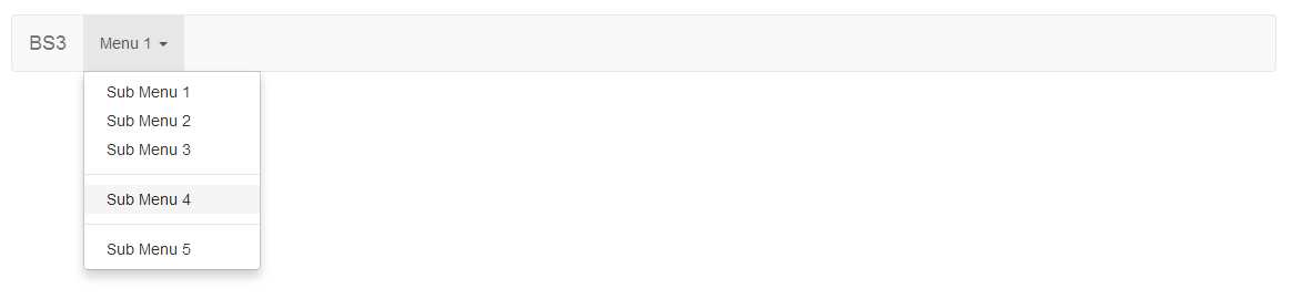
- Drop down menu produced by code snippet 47
You can combine each of these too, so it's simple to have dropdown and non-dropdown links in one 'navbar-nav' <ul> just by marking up each <li> element as needed.
Another common requirement in navigation bars is the obligatory sign-in form, generally used to sign-in to a protected area on a site.
BS3 makes these even easier to construct using the 'navbar-form' class. So far however, we've seen that all our elements are left aligned in the navigation bars inner content area, sign-in forms are usually right aligned, and the BS3 team know this, and have provided the 'navbar-right' class in order to allow you to do just such a thing as the following code shows:
<nav class="navbar navbar-default" role="navigation">
<div class="container-fluid">
<div class="navbar-header">
<button type="button" class="navbar-toggle" data-toggle="collapse" data-target="#bs-example-navbar-collapse-1">
<span class="sr-only">Toggle navigation</span>
<span class="icon-bar"></span>
<span class="icon-bar"></span>
<span class="icon-bar"></span>
</button>
<a class="navbar-brand" href="#">BS3</a>
</div>
<div class="collapse navbar-collapse" id="bs-example-navbar-collapse-1">
<form class="navbar-form navbar-right">
<div class="form-group">
<input type="text" class="form-control" placeholder="Sign-in name">
</div>
<div class="form-group">
<input type="password" class="form-control" placeholder="Password">
</div>
<button type="submit" class="btn btn-default">Sign In</button>
</form>
</div>
</div>
</nav>
Code snippet 48: BS3 navigation bar with a sign-in form right aligned
- Nav bar with sign-in form, produced by code snippet 48
In common with the sign in pattern shown in code snippet 48, it's often also required that when a person is signed in to your application, that they have their name shown instead of the form, and optionally a link and/or button to sign-out or change options.
The button, text, and link classes have all of this covered as shown below:
<nav class="navbar navbar-default" role="navigation">
<div class="container-fluid">
<div class="navbar-header">
<button type="button" class="navbar-toggle" data-toggle="collapse" data-target="#bs-example-navbar-collapse-1">
<span class="sr-only">Toggle navigation</span>
<span class="icon-bar"></span>
<span class="icon-bar"></span>
<span class="icon-bar"></span>
</button>
<a class="navbar-brand" href="#">BS3</a>
</div>
<div class="collapse navbar-collapse" id="bs-example-navbar-collapse-1">
<div class="navbar-right">
<p class="navbar-text">Signed in as <strong>Peter Shaw</strong></p>
<a href='#' class="navbar-link">Options</a>
<button class="btn btn-primary navbar-btn">Sign Out</button>
</div>
</div>
</div>
</nav>
Code snippet 49: Swapping the sign-in form for an information display
- Navbar with information display produced by code snippet 49
The navigation bar itself also has a few clever tricks, you can place your navigation bar inside a 'container' or other alignment class, then add 'navbar-fixed-top' to it, your navigation bar will stick to the top of its container, and align itself perfectly with it as in the following image:
- Navbar from snippet 49 with the 'navbar-fixed-top' class applied to it
You can also add 'navbar-fixed-bottom' which will stick your navigation bar to the bottom of the page, and you can add 'navbar-static-top' which will stick the bar to the top of the container, but will allow it to scroll away when the page content scrolls.
Finally, if you want a darkened navigation bar, then you can use the 'navbar-inverse' class, which will invert the color set used by the entire component:
- Navbar from snippet 49 with the inverse class set
Labels and Badges changes
This is going to be a very, very short section because there have only been two changes to the labels, and one big one to the badges.
In BS2 to make a label, we simply gave it a 'label-xxxx' class name. xxxx was replaced with the state the label was to portray, under BS3 we now have a two-part class definition, and a rename from 'error' to 'danger' for the red color class so that the naming now matches everything else, and that's it pretty much.
There are also no sizing classes/options for these in BS3 as labels take on the size of the surrounding container, EG: if you create a span with an appropriate label class, then wrap it in a <h1> the size of that label will be much larger than the rest.
The following code snippet demonstrates this:
<h1><span class="label label-default">Default</span></h1>
<h2><span class="label label-primary">Primary</span></h2>
<h3><span class="label label-success">Success</span></h3>
<h4><span class="label label-info">Info</span></h4>
<h5><span class="label label-warning">Warning</span></h5>
<h6><span class="label label-danger">Danger</span></h6>
Code snippet 50: BS3 label example with different sizes
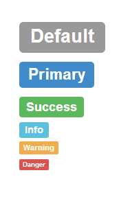
- Output produced by code snippet 50
Badges on the other hand, well remember I said there's been one big change?
In BS3 badges no longer have contextual color classes. That is there is now no longer a 'label-success' or 'label-warning' as there is with the labels above and with other elements.
This means you can't now color badges in the same way you could in BS2, and any label you create can only be rendered using the standard grey color, well at least officially you can't.
If you apply an 'alert-xxxxx' alongside a 'label' class on the span being used for your label, then the label will take on the coloring of that alert class, and while this is not a supported way of doing things, it does work and allows you to use the labels as you did in BS2.
To mark up a standard label all you need to do is add a 'label' class to a <span> and you’re ready to go:
<span class="label">This is a label</span>
Code snippet 51: standard label example
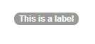
- Label produced by code snippet 51
If you want to hack your labels to use the different colors, then you can do so as follows:
<span class="badge">Normal</span>
<span class="badge alert-success">Success</span>
<span class="badge alert-info">Info</span>
<span class="badge alert-warning">Warning</span>
<span class="badge alert-danger">Danger</span>
Code snippet 52: Label example hacked to use non standard coloring
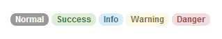
- Output produced by code snippet 52
One nice feature the badge component does still keep however is its use of the 'empty:' pseudo selector allowing it to automatically vanish from display if its inner text is empty. This helps with the internal changes designed to work on List groups and Pill lists, because it now means that it's immensely easy to create things like inbox notification lists where the values disappear when the <span> contents are removed, as the following example shows.
<div class="col-md-4">
<ul class="nav nav-pills nav-stacked">
<li class="active">
<a href="#">
<span class="badge pull-right">42</span>
Inbox
</a>
</li>
<li class="active">
<a href="#">
<span class="badge pull-right">10000</span>
Spam
</a>
</li>
<li class="active">
<a href="#">
<span class="badge pull-right"></span>
Lottery Wins
</a>
</li>
</ul>
</div>
Code snippet 53: BS3 list styling for badges
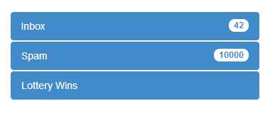
- Output produced by code snippet 53
If you examine the code, you'll see that the last option in the list has no value inside its span tag, which because of the 'empty:' pseudo selector, causes the browser not to render it, however the second you put anything in there using JS or any method that can manipulate the DOM, that badge will pop right back into existence without missing a beat. Notice also the use of the 'pull-right' alignment class to make sure the label sits on the right side of the element making everything look nice and aligned.
List group Changes
Technically this is not a change as List groups are a new thing added in BS3, designed to replace the BS2 navigation lists, list groups have far more capabilities that their BS2 counterpart.
Once you start to use them, you'll realize that these things are more like a fully styleable list item box, and to be honest all it would take to create a fully styleable list box would in fact be to wrap them in their own div and set the overflow to scroll appropriately.
A basic list group component can be created with markup similar to the following:
<ul class="list-group">
<li class="list-group-item">Cheese</li>
<li class="list-group-item">Burger</li>
<li class="list-group-item">Bun</li>
<li class="list-group-item">Pickles</li>
<li class="list-group-item">Tomato</li>
</ul>
Code snippet 54: Basic BS3 List Group
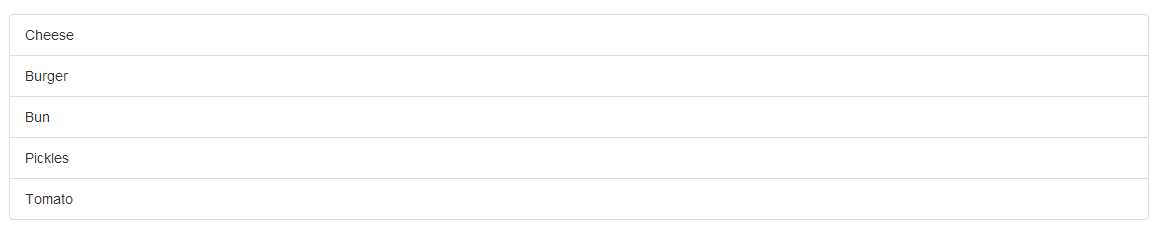
- Output produced by code snippet 54
As you saw previously in the badges section, you can add badges to lists and other objects, and if you add them to a list group, they line up perfectly:
<ul class="list-group">
<li class="list-group-item"><span class="badge pull-right">4</span>Cheese</li>
<li class="list-group-item"><span class="badge pull-right">2</span>Burger</li>
<li class="list-group-item"><span class="badge pull-right">1</span>Bun</li>
<li class="list-group-item"><span class="badge pull-right"></span>Pickles</li>
<li class="list-group-item"><span class="badge pull-right">2</span>Tomato</li>
</ul>
Code snippet 55: List group with badges attached
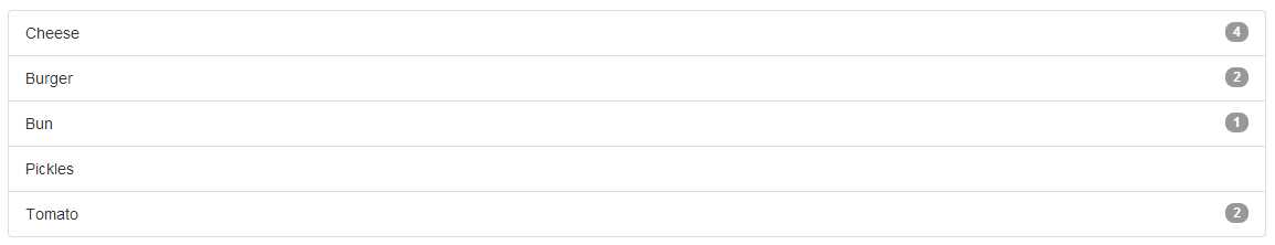
- Output from code snippet 55
The most observant of you may be thinking, ok so list groups look good, but there just still <ul>s underneath the surface, there's really nothing that special about them.
Well maybe you’re right about that, or maybe we need to experiment a bit more.
List groups unlike the classes we saw in the navigation sections cannot just be applied to an unordered list. A list group can be applied to any parent container, and when done so the styling will cause all of the children of that container to become linked, take a look at the following example:
<div class="list-group">
<a class="list-group-item">Cheese</a>
<a class="list-group-item">Burger</a>
<a class="list-group-item">Bun</a>
<a class="list-group-item">Pickles</a>
<a class="list-group-item">Tomato</a>
</div>
Code snippet 56: List group created using <a> tags
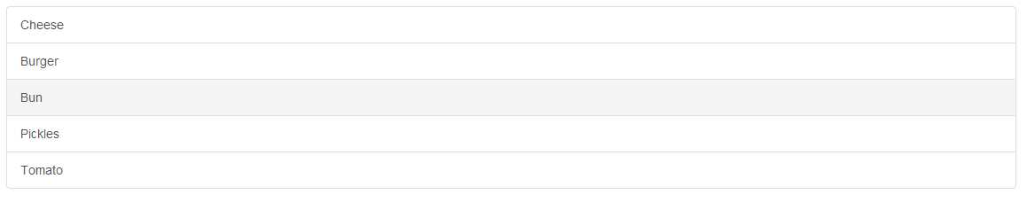
- Output produced by code snippet 56
As code snippet 56 shows, we can create a list of links using nothing more than a <div> surrounding the list, and that list then instantly becomes a list style menu which a light grey hover effect, however because the inner tags are <a> tags we can now go even further:
<div class="list-group">
<a class="list-group-item active">
<strong>Cheese</strong>
<p>A delicious slice of ...</p>
<img src="images/cheese.jpg" />
</a>
<a class="list-group-item">
<strong>Burger</strong>
<p>Prime Aberdeen angus beef ...</p>
<img src="images/burger.jpg" />
</a>
<a class="list-group-item">
<strong>Bun</strong>
<p>A freshly baked soft sesame seed bun ...</p>
<img src="images/bun.jpg" />
</a>
<a class="list-group-item">
<strong>Pickles</strong>
<p>The finest pickles from the finest purveyors ...</p>
<img src="images/pickle.jpg" />
</a>
<a class="list-group-item">
<strong>Tomato</strong>
<p>Fresh organic tomatoes picked directly from the vine ...</p>
<img src="images/tomato.jpg" />
</a>
</div>
Code snippet 57: List group expanded to use more than just simple lists
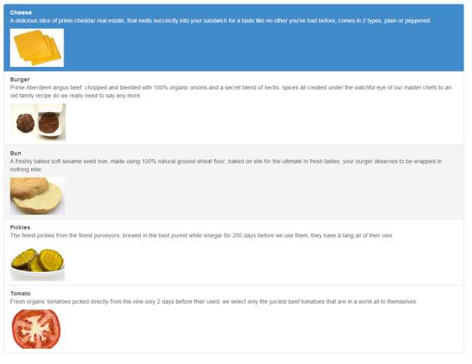
- Output produced by code snippet 57
Notice that we still get the full cell hover effect when your mouse hovers over a link, and by simply just adding the 'active' class as we have with others we can mark an item as being the active one, and all while maintaining a single set of borders and the appearance of each item behaving just like a regular <ul> element.
But, why stop there?
Just as with any other element in BS3, list groups also have their own contextual classes to give them meaning in the standard color set:
<div class="list-group">
<a class="list-group-item list-group-item-success">
<strong>Cheese</strong>
<p>...</p>
<img src="images/cheese.jpg" />
</a>
<a class="list-group-item list-group-item-success">
<strong>Burger</strong>
<p>...</p>
<img src="images/burger.jpg" />
</a>
<a class="list-group-item list-group-item-success">
<strong>Bun</strong>
<p>...</p>
<img src="images/bun.jpg" />
</a>
<a class="list-group-item list-group-item-danger">
<strong>Pickles</strong>
<p>...</p>
<img src="images/pickles.jpg" />
</a>
<a class="list-group-item list-group-item-warning">
<strong>Tomato</strong>
<p>...</p>
<img src="images/tomato.jpg" />
</a>
</div>
Code snippet 58: BS3 list group with contextual color classes
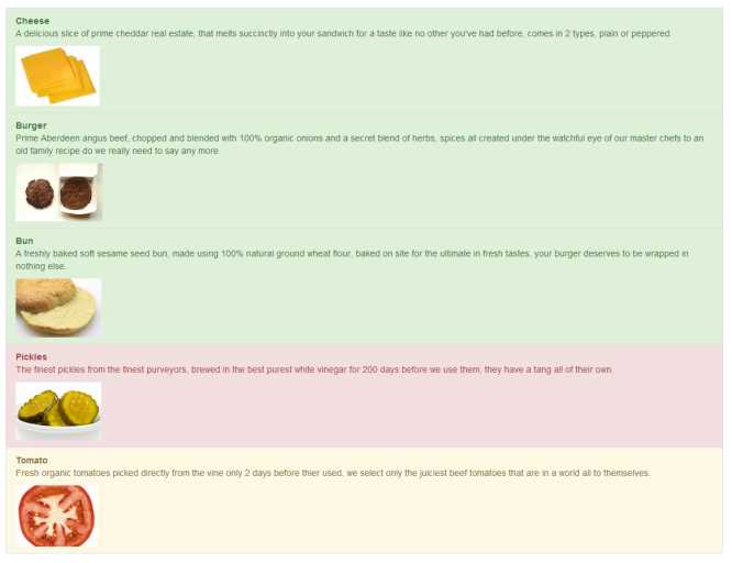
- Output produced by code snippet 58
As you can see, what use is a burger without cheese and a bun, tomatoes I can take or leave, but please hold the pickle!
Media objects and custom thumbnail changes
We covered the basic thumbnail changes for the styling back in the chapter on CSS, but what we didn’t did into are the changes in the surrounding components.
What we didn't cover however was the amalgamation that now exists in BS3 allowing us to combine the thumbnail classes with the grid classes to create easy to use image lists. The most basic way we can use them, is to use the 'row' class and grid spans along with the basic thumbnail classes to make perfectly lined up thumbnails as the following shows:
<div class="row">
<div class="col-md-3">
<a href="#" class="thumbnail">
<img data-src="holder.js/100%x180" />
</a>
</div>
<div class="col-md-3">
<a href="#" class="thumbnail">
<img data-src="holder.js/100%x180" />
</a>
</div>
<div class="col-md-3">
<a href="#" class="thumbnail">
<img data-src="holder.js/100%x180" />
</a>
</div>
<div class="col-md-3">
<a href="#" class="thumbnail">
<img data-src="holder.js/100%x180" />
</a>
</div>
</div>
Code snippet 59: Basic thumbnails with grid classes
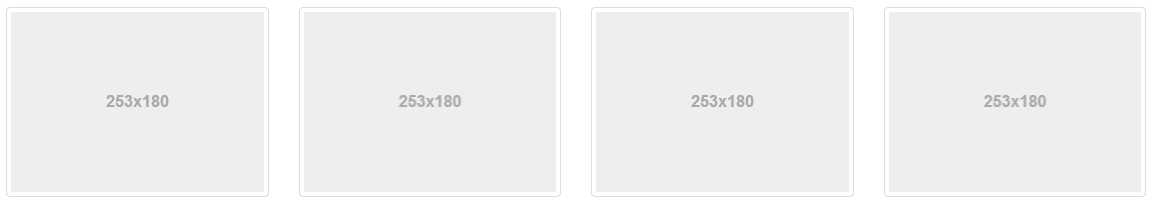
- Thumbnails produced by code snippet 59
For those who are wondering I'm using 'holder.js' to produce the image place holders, I'll let you Google the location it'll come up as the first available, it's a great tool for reserving image space especially when doing mockups for clients.
The above is nothing really special, if you've been reading the rest of this book, you've likely already figured out how easy it was to do this, long before we even got here, however if we add a little more markup and work with the same idea, producing something like the following is very easy:
<div class="row">
<div class="col-md-3">
<div class="thumbnail">
<img data-src="holder.js/100%x180" />
<div class="caption">
<h3>Ecstasy requires exploration</h3>
<p>The planet is radiating pulses. This life is nothing short of a blossoming oasis of transformative potentiality outside of the being.</p>
<p>
<a href="#" class="btn btn-success" role="button">Like</a>
<a href="#" class="btn btn-danger" role="button">Dislike</a>
</p>
</div>
</div>
</div>
<div class="col-md-3">
<div class="thumbnail">
<img data-src="holder.js/100%x180" />
<div class="caption">
<h3>We exist as frequencies</h3>
<p>This life is nothing short of a blossoming uprising of frequency aspiration. Potential is the richness of conscious living, and of us.</p>
<p>
<a href="#" class="btn btn-success" role="button">Like</a>
<a href="#" class="btn btn-danger" role="button">Dislike</a>
</p>
</div>
</div>
</div>
<div class="col-md-3">
<div class="thumbnail">
<img data-src="holder.js/100%x180" />
<div class="caption">
<h3>To traverse the myth is to become one</h3>
<p>It can be difficult to know where to begin. The totality is calling to you via sub-atomic particles. Can you hear it?</p>
<p>
<a href="#" class="btn btn-success" role="button">Like</a>
<a href="#" class="btn btn-danger" role="button">Dislike</a>
</p>
</div>
</div>
</div>
<div class="col-md-3">
<div class="thumbnail">
<img data-src="holder.js/100%x180" />
<div class="caption">
<h3>We reflect, we heal, we are reborn</h3>
<p>Through reiki, our essences are nurtured by purpose. You will soon be guided by a power deep within yourself.</p>
<p>
<a href="#" class="btn btn-success" role="button">Like</a>
<a href="#" class="btn btn-danger" role="button">Dislike</a>
</p>
</div>
</div>
</div>
</div>
Code snippet 60: BS3 thumbnails with extra content
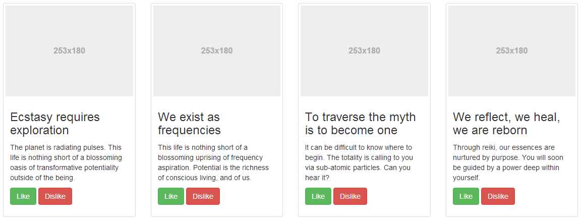
- Output produced by code snippet 60
Producing vertical lists is just as easy, but instead of using the thumbnail classes, we now need to use the media object classes, these classes and the associated markup create a layout similar to the above but instead of placing the text underneath the thumbnail, the text is lined up to the right.
The primary design motive here is in comment and message lists with an avatar image, but they can be used for news items, product lists and many other things.
To mark up a media object simply use an outer div with a class of 'media' then inside of that use the 'media-object', 'media-body' and 'media-heading' classes to mark up the individual bits as the following example shows:
<div class="media">
<a class="pull-left" href="#">
<img class="media-object" data-src="holder.js/64x64" />
</a>
<div class="media-body">
<h4 class="media-heading">To follow the journey is to become one with it</h4>
<p>The goal of ultrasonic energy is to plant the seeds of awareness rather than stagnation. You and I are beings of the quantum matrix. Purpose is a constant.</p>
</div>
</div>
Code snippet 61: Mark up for a single BS3 media object
- Media object produced by code snippet 61
As you can probably already imagine, it wouldn't take much to add these into a List group, or some other structure built up using the BS3 grid system. BS3 however actually makes it much easier than that by providing a dedicated media object list class and supported markup.
By changing your markup just a little, you can generate full lists of media objects as follows:
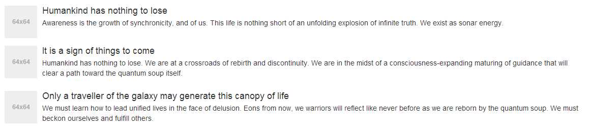
<ul class="media-list">
<li class="media">
<a class="pull-left" href="#">
<img class="media-object" src="holder.js/64x64" />
</a>
<div class="media-body">
<h4 class="media-heading">Humankind has nothing to lose</h4>
<p>Awareness is the growth of synchronicity, and of us. This life is nothing short of an unfolding explosion of infinite truth. We exist as sonar energy.</p>
</div>
</li>
<li class="media">
<a class="pull-left" href="#">
<img class="media-object" src="holder.js/64x64" >
</a>
<div class="media-body">
<h4 class="media-heading">It is a sign of things to come</h4>
<p>Humankind has nothing to lose. We are at a crossroads of rebirth and discontinuity. We are in the midst of a consciousness-expanding maturing of guidance that will clear a path toward the quantum soup itself.</p>
</div>
</li>
<li class="media">
<a class="pull-left" href="#">
<img class="media-object" src="holder.js/64x64" >
</a>
<div class="media-body">
<h4 class="media-heading">Only a traveller of the galaxy may generate this canopy of life</h4>
<p>We must learn how to lead unified lives in the face of delusion. Eons from now, we warriors will reflect like never before as we are reborn by the quantum soup. We must beckon ourselves and fulfill others.</p>
</div>
</li>
</ul>
Code snippet 62: Full media object list
- Full media object list generated by code snippet 62
If you nest the <li>s and <ul>s inside the media list, BS3 will automatically indent them to give the effect of a parent/child hierarchy. You can also use different combinations of 'pull-right' and 'pull-left' where needed to position the image on the opposite side for example or line things up slightly different, you can combine them with panels (Which we'll see shortly) and other similar structures to put borders and other contextual hints around the entire list and wrap them inline to produce composite components.
Panel Changes
Again like list groups panels are not really a change, they are a new addition to BS3, and what an addition they are.
Where all familiar with things like forms for example, being in group boxes, are sections of a website being logically divided up from each other. BS3 panels allow you to easily control this logical separation.
You can have plain old panels, panels with headers, panels with titles in headers, panels with footers and like everything else, panels with their own set of contextual colors.
A basic panel is constructed using just 2 <div> elements and 3 CSS classes:
<div class="panel panel-default">
<div class="panel-body">
Panel content goes here
</div>
</div>
Code snippet 63: Basic panel object
However, it's not much good without a title, and really as it stands in code snippet 63, it's nothing more than a div with padding and a border around it.
If we add a third <div> element however, and give that <div> a class of 'panel-heading' then we start to get something a bit more interesting:
<div class="panel panel-default">
<div class="panel-heading">Panel Header</div>
<div class="panel-body">
Panel content goes here
</div>
</div>
Code snippet 64: Basic panel object with a panel header
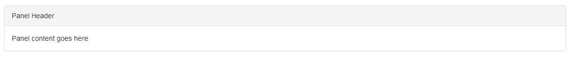
- Panel produced by code snippet 64
Your panel header doesn't have to be just a simple div either, you can include <hx> tags along with any other regular tag, such as an <img> and things will resize as required:
<div class="panel panel-default">
<div class="panel-heading">
<h1 class="panel-title">Panel Header</h1>
<p>Panel sub header</p>
</div>
<div class="panel-body">
<p>Panel content goes here</p>
<p>Panel content goes here</p>
<p>Panel content goes here</p>
</div>
</div>
Code snippet 65: Panel with a h1 tag as a panel title
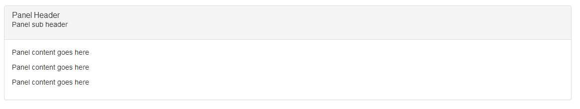
- Output produced by code snippet 65
You can also apply a panel footer too by adding a <div> element after your panel body an applying the class 'panel-footer'. If you want to give your panels meaning you can also use the contextual colors that are used for everything else, you do this simply by replacing the 'panel-default' class in the previous code snippets with 'panel-primary', 'panel-success', 'panel-info', 'panel-warning' or 'panel-danger'.
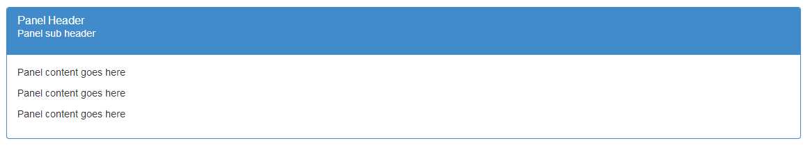
- Output produced by code snippet 65, with the type set to 'panel-primary'
One thing to be careful of though, if you're using 'panel-footer' and contextual colors, the footer will NOT adopt the panels color scheme. This is deliberate as the BS3 developers felt that contextually only the contents of the panel where important, any buttons, controls or footer information to respond to that information did not need to be highlighted in the same way thus allowing the developer freedom to add different contextual colors for different controls as required.
Panels can also work fluidly with list groups and tables. If you join a table with a panel inside of the parent div, you get a panel as shown previously, and a seamless join to the table below it as the following shows:
<div class="panel panel-primary">
<div class="panel-heading">
<h1 class="panel-title">Panel Header</h1>
<p>Panel sub header</p>
</div>
<div class="panel-body">
<p>Panel content goes here</p>
<p>Panel content goes here</p>
<p>Panel content goes here</p>
</div>
<table class="table">
<thead>
<tr>
<th>#ID</th>
<th>Name</th>
<th>Twitter Handle</th>
</tr>
</thead>
<tbody>
<tr>
<td>1</td>
<td>Peter Shaw</td>
<td>@shawty_ds</td>
</tr>
<tr>
<td>2</td>
<td>Digital Solutions UK</td>
<td>@digitalsolut_uk</td>
</tr>
</tbody>
</table>
</div>
Code snippet 66: panel from snippet 65 colored as primary and with a table applied
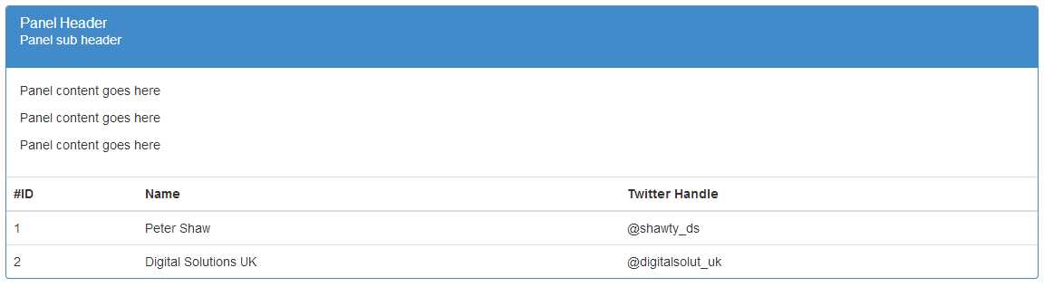
- Output produced by code snippet 66
If you remove the <div> containing the panel body from your markup, the whole thing will collapse down leaving just the panel header and border, and leading straight into the table, great for just providing tables with headers if that’s what you need.
Adding a list group into your panel is also just as easy and performed in exactly the same way, I'll leave that as an exercise to the reader to play with however.
Changes to whatever's left
Before we finally leave the chapter on components behind there's just four more things to cover, the jumbotron, alert boxes, progress bars and wells.
The jumbotron is not a new element, but its use in BS2 was slightly more messy than it now is in BS3, creating a jumbotron is very simple, you simply use a <div> with the class 'jumbotron' applied and then some optional markup inside. What markup you use is entirely up to you, but to get the intended effect the recommended markup is shown below:
<div class="jumbotron">
<h1>Bootstrap 3</h1>
<p>Don't you just love this framework? It's elegant, simple to use, and frees you from so much boilerplate code.</p>
<p><a class="btn btn-primary btn-lg" role="button">Heck yes I do</a></p>
</div>
Code snippet 67: BS3 jumbotron example
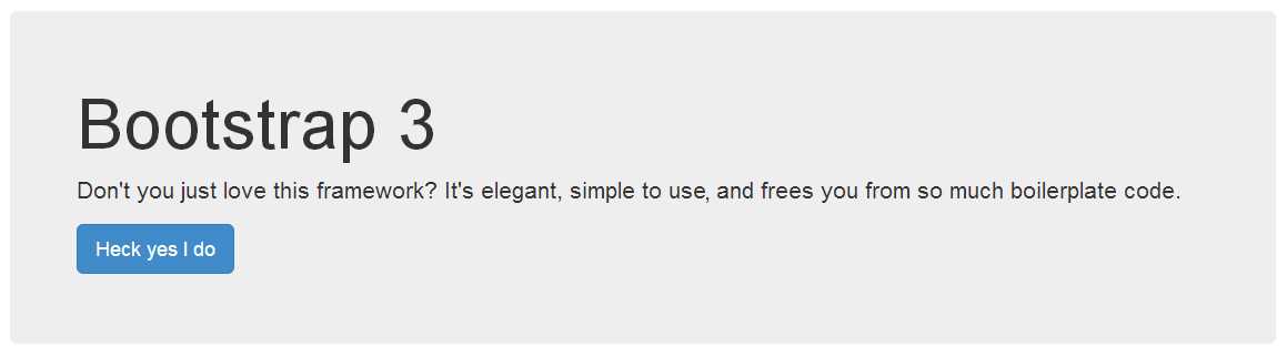
- Jumbotron produced by code snippet 67
And that’s it, that’s all there is to the jumbotron, you can remove the rounded corners and make it full width by swapping the order and moving it outside its container, but there are no special classes or optional colors for this, it's designed to be big, bold and catch your attention.
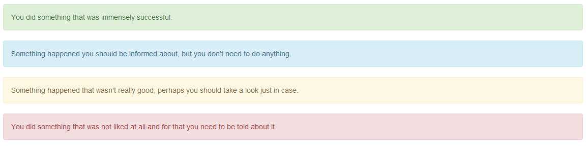
Speaking of catching attention, we also have a number of alert classes, and the only real change between the BS2 version and BS3 is the renaming of the class name 'alert-error' to 'alert-danger' other than that the markup to produce alerts is still as simple as using a standard <div> with the appropriate contextual classes added:
<div class="alert alert-success">You did something ...</div>
<div class="alert alert-info">Something happened you ...</div>
<div class="alert alert-warning">Something happened that wasn't ...</div>
<div class="alert alert-danger">You did something that was not liked ...</div>
Code snippet 68: Contextual alert classes
- Alert boxes produced by code snippet 68
If you want to add links in your alerts using a standard <a> tag, make sure you apply the class 'alert-link' to the anchor tag, this will ensure that the link coloring remains consistent with the contextual color class being used.
You can also add a cross/dismiss icon to the alert, allowing the user to close it and make it vanish from the display. To do this we need to add a <button> element marked up with a sprinkle of data attributes and extra classes as follows:
<div class="alert alert-danger alert-dismissable">
<button type="button" class="close" data-dismiss="alert" aria-hidden="true">×</button>
<strong>YO!</strong> You got that operation very, very wrong indeed.
</div>
Code snippet 69: A dismissable alert box
- Dismissible alert produced by code snippet 69
We added the extra class 'alert-dismissable' to the outer <div> and then used a dismiss data attribute to connect the JavaScript action for this to the alerts dismiss method using a simple button.
If alerts provide operational feedback, then there's one other feedback related component that's a must have and that's our humble progress bar.
No feedback element has produced so much hatred or salutation as this humble little colored bar. From BS2 to BS3 the only changes made here are like the alert classes, renaming of the contextual colors to match the overall scheme renames elsewhere in the framework.
The base html markup to produce them still remains exactly the same:
<div class="progress">
<div class="progress-bar" role="progressbar" aria-valuenow="60" aria-valuemin="0" aria-valuemax="100" style="width: 60%;">
<span class="sr-only">60% Complete</span>
</div>
</div>
Code snippet 70: Basic progress bar
- Progress bar produced by snippet 70
One thing you really should pay attention too however (and something that I have re-iterated at various points in this book) is the attributes and extras used to make this element friendly to screen readers and similar equipment.
Since a progress bar often tends to be purely graphical in nature, it means nothing to someone who's unable to read the screen. Most other elements have at least enough text to give the reader an idea of what's there, progress bars need all the help they can get. You'll see from the above example that we've added extra aria values to report on what percentage the value is at, and we've also marked up a span that's for screen readers only, specifically to give an audible report.
If we remove the 'sr-only' class however, it makes our bar look a bit better to those who can see it too:
- Progress bar with the 'sr-only' class removed from the inner span
It goes without saying too that you can add 'progress-bar-success', 'progress-bar-info', ' progress-bar-warning' and 'progress-bar-danger' to the inner <div> with the 'progress-bar' class, in order to take advantage of the contextual colors available.
You can also add 'progress-striped' and/or 'active' to the outer <div> alongside the 'progress' class in order to get striped and animated effects on your progress bars. A stacked progress bar effect can be obtained by placing multiple 'progress-bar' <div>s inside of the outer 'progress' container and setting their values appropriately.
The final element that's left, is the humble 'well', no changes to this since BS3 but it does now have an extra class to add to it called 'well-sm' there's no magic involved here. If you want a simple boxed off area with a shaded background, simply create a <div> element and add the 'well' class to it then add your content inside. Wells are useful for sidebar's and/or footers, or anything to simple to warrant being put in a full panel or other fenced off area, there are no contextual colors or special actions either, simple, effective and easy to use:
<div class="well">Hello World!</div>
Code snippet 71: Simple well example

- Well example produced by snippet 71
- 1800+ high-performance UI components.
- Includes popular controls such as Grid, Chart, Scheduler, and more.
- 24x5 unlimited support by developers.