
Twitter Bootstrap Succinctly®

CHAPTER 3
Twitter Bootstrap Scaffolding
As mentioned previously, TWB provides a grid allowing you to line up and set up columns in your document very easily.
Anyone who's ever tried to do columns in an HTML page, especially equal height and equal spaced, will know just what a chore it is.
TWB makes this easy by dividing the horizontal space on the page into 12 equal columns; these columns can be further divided down into multiples of those 12 columns, but your total can never add up to more than 12.
You don't, however, have to be stuck with 12 columns. If you do a customized download as mentioned in the last chapter, one of the options you can change using “Less” is the number of columns in your CSS.
To give you an idea of how this works, here's a screenshot of the nine-column grid as shown on the TWB website:
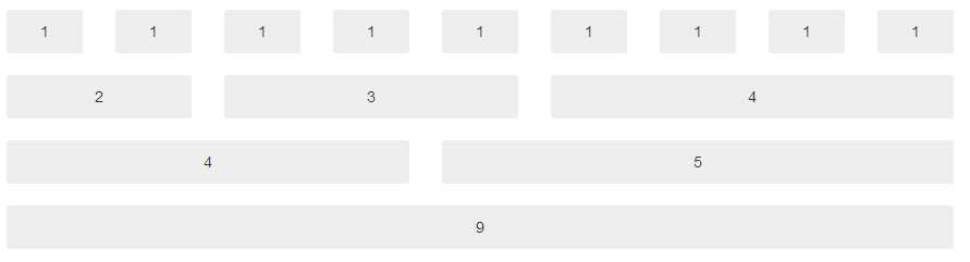
Nine-column grid from the Twitter Bootstrap documentation
To use this grid system, it's as simple as using the various spanX classes defined in the TWB main CSS file.
If you have the 12-column standard grid, then you'll have classes named span1 through span12. If you've customized your copy, then you'll have spanX up to the maximum number of columns you specified.
The one thing to remember, however, no matter how many columns you have, your display will always adapt to have a 940-pixel parent container, and a 724 or 1170-pixel grid width depending on your viewport size.
Any viewport width that is 767 pixels or less will always become a fluid layout, and columns will start to stack vertically and flow down the page instead of across, even without the responsive features enabled.
Making Hello World Look Better
Open up the helloworld.html file you created in the last chapter, and find the line that looks like this:
<h1>Hello World</h1> |
Change this line so that it now looks like the following:
<div class="container"> <div class="row"> <div class="span12"> <h1>Hello World</h1> </div> </div> </div> |
You don't have to make your indenting identical, but it will help you to read things clearly.
If you save this and hit F5 on your browser, you should see your Hello World text jump the center of the browser but with a slightly left offset.
What you've just done is created a standard TWB parent container (a page if you like), then in that container a row (much like a row in a table), and finally within that row, you've created a default, left-aligned single column spanning the whole 12 columns of the default grid.
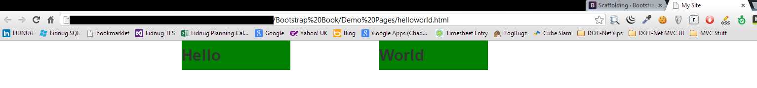
If you now change your code to the following:
<div class="container"> <div class="row"> <div class="span6"> <h1>Hello</h1> </div> <div class="span6"> <h1>World</h1> </div> </div> </div> |
You should now see that your Hello World text has split into two parts, with a large gap between the words. The change you made has now put both words into their own separate six-column grid spanning the entire 12 column row, or in simple terms, you've just created two equal-width columns that will stretch to "balance" and fit the size and flow of your document.
Of course, you don't have to create them equal; you can specify span widths of anything you like, just as long as the total adds up to the total number of columns you have available. For example, try the following:
<div class="container"> <div class="row"> <div class="span3"> <h1>Hello</h1> </div> <div class="span9"> <h1>World</h1> </div> </div> </div> |
You should see that the word "World" now jumps closer to the left but everything still looks to be in a nicely scaled proportion.
Let's add some style rules so we can see what's happening. Add the following code after the "Link" tag that includes the TWB CSS file but before the closing "Head" tag in your webpage:
<style> .span3 { background-color: red; }
.span9 { background-color: green; }
</style> |
If everything has worked as expected, you should see the following when you refresh your browser after saving the modified file:
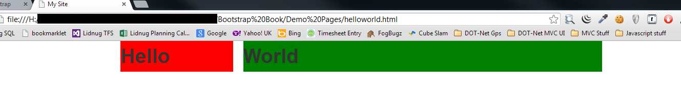
Helloworld.html modified to show a background color on the grids
You'll notice straight away exactly where the grids you specified using the span tags are defined. Try changing the spans in the two divs to different values and see what the effect is. Remember, though, if you want to see the background colors, you will also need to change the names on the style rules to match the ones used in your grids.
If you start changing the numbers in your spanX classes now, you'll easily see how everything is divided up. Remember, though, that you'll also need to change the style rules to match.
spanX-enabled columns can also be nested so that columns are balanced inside other columns. When you do this, however, you no longer have your 12-column grid. Your grid size instead becomes the width of the parent grid minus 1.
Revisiting our three and nine-column example we did just a moment ago, change your code so that it's now changed from the following:
<div class="container"> <div class="row"> <div class="span3"> <h1>Hello</h1> </div> <div class="span9"> <h1>World</h1> </div> </div> </div> |
To the following:
<div class="container"> <div class="row"> <div class="span6"> <h1>Twitter Bootstrap</h1> <div class="span3"> <h2>Hello</h2> </div> <div class="span3"> <h2>World</h2> </div> </div> </div> </div> |
And change the style rules in the head section of your page to the following:
<style> .span6 { background-color: red; } .span3 { background-color: green; } </style> |
Save your document and hit refresh. If everything's worked as expected, you should see the following:
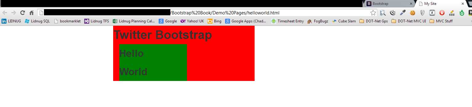
Hello World example revised to nest rows
Why have the columns stacked on top of each other?
When you nest your spans, you need to also allow some room for the padding and other parts of the CSS to expand. If there's not enough room in your nested span, then TWB will attempt a responsive render and stack the columns as best it can.
In the segment of code you just wrote, if you change the following:
<div class="span6"> |
To the following:
<div class="span7"> |
Remember to change the style name too, then save and refresh your page. You should see things spread out a bit better and it should look something like the following:
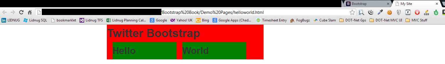
Hello World example revised to nest rows without stacking
There are some CSS rules in the style sheets that you use to make changes to this, including fluid spans (which we'll see in just a moment). But, for the most part, it's usually easier and faster to just plan your layout to always take an extra column into account when needed.
As well as a standard grid and nesting, we can also offset columns to create space where there is no content or to make space for something else you may wish to place using your own CSS rules.
Just like using the spanX classes, columns are offset by adding offsetX to the class, usually alongside the spanX controlling the width. Let's make one more change to our Hello World example.
Change the body code to:
<div class="container"> <div class="row"> <div class="span3"> <h2>Hello</h2> </div> <div class="span3 offset2"> <h2>World</h2> </div> </div> </div> |
And your styles in the header to:
<style> .span3 { background-color: green; } </style> |
When you save and refresh, you should see the following:
Hello World example showing column offsets
As you can see, there is now a two-column gap between the first and second three-column spans.
Offsets, just like normal spans, can also be nested. TWB will always keep a balanced look and feel no matter what rules you use.
Fluid Grids
The next trick that TWB has up its sleeve in the scaffolding system comes in the form of fluid grids. Fluid grids are just like the fixed grids we've already seen but, rather than use fixed pixel widths for its column layouts, it bases all sizing information on percentages.
This means that a fluid grid will use all the space it has available to display, usually to the full width of your browser window.
Let's create a new HTML document based on the template I mentioned earlier. Save this in your project folder as fluidhelloworld.html. Once that's done, add the following body code and styles as you have done previously:
<style> .span6 { background-color: green; } </style> <div class="container-fluid"> <div class="row-fluid"> <div class="span6"> <h2>Hello</h2> </div> <div class="span6"> <h2>World</h2> </div> </div> </div> |
You'll notice that this code sample is not that much different from the previous one. In fact, if you look closely, the only two changes are to change container to container-fluid and row to row-fluid.
If you save and refresh your page, you should see the following:
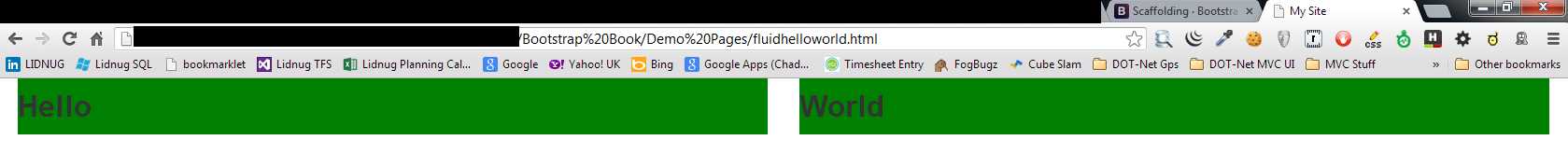
Hello World example using fluid scaffolding layout
Immediately, you can see that your two span6 columns have expanded to the entire width of the browser window. Using container-fluid makes your root container use the entire width available but still be divided up into 12 columns.
Everything that you have tried before with nesting and offsets all work in exactly the same way as with a fixed grid. You can even combine them to get the best of both worlds.
For example, you could have a container that contained row-fluids making the inner content elastic. The parent framework would be neatly centered in the page and handled responsively where required.
A common use for the container-fluid layout is to divide your page into a regular content and sidebar type arrangement using the following body code:
<div class="container-fluid"> <div class="row-fluid"> <div class="span2"> <!--Sidebar content--> </div> <div class="span10"> <!--Body content--> </div> </div> </div> |
Responsive Design
And now, finally, we come to the scaffolding section, the one you've all been waiting for.
Twitter Bootstrap is not only a good general purpose CSS framework, it's also a Responsive Design framework. To enable the responsive features, however, you need to include the responsive CSS style sheet just after you include the main one in your page header, like so:
<!DOCTYPE html> <html> <head> <meta http-equiv="X-UA-Compatible" content="IE=9; IE=8; IE=7; IE=EDGE" /> <meta charset="utf-8" /> <title>My Site</title> <meta name="viewport" content="width=device-width, initial-scale=1.0"> <link href="css/bootstrap.css" rel="stylesheet" type="text/css" /> <link href="css/bootstrap-responsive.css" rel="stylesheet" type="text/css" /> </head> <body> <!-- document code goes here --> <script src="js/jquery-2.0.2.js" type="text/javascript"></script> <script src="js/bootstrap.js" type="text/javascript"></script> </body> </html> |
Code Sample 2: Twitter Bootstrap basic code enabled for responsive features
Note: Twitter Bootstrap 3 will be mobile-first in design. This means that you will no longer need to make sure that you add the responsive features CSS, as the responsive features will be available by default. However, everything has new class names in Version 3 so a lot of reading will be needed to know what's what.
When you enable the responsive features, it's very important that you also include the proper meta tag in the head of your page. This is the tag you can see in Code Sample 2 with the name "viewport." The responsive features in TWB will not work correctly unless this metatag is set to an appropriate value.
So, what exactly does it mean to enable responsive features?
In recent years, as JavaScript and CSS have gotten more powerful, it's become possible to actually have facilities built directly into the webpage rendering engine that can assist with page formatting for different sized screens. The best part about it is that these facilities no longer need to be implemented in many separate different files with large amounts of JavaScript and jQuery code needed to tie everything together.
Instead, all the developer needs to do is create his or her page as usual, for one single display type, and then add in some extra CSS rules to control what happens when a smaller display is encountered.
These facilities are enabled through the use of something called media queries.
TWB handles all of this for you transparently. You, as the developer, don't need to know which queries do what and how, or how some rules override other rules at specific times depending on what's being displayed.
Just as with the basic grid system, most of the responsive features in TWB are enabled simply by specifying certain class names on the appropriate elements in your document.
Please remember, however, that even though many devices and browsers are very powerful these days, you still don't want to be enabling features that you don't need. If your app is never going to be seen on anything other than a desktop PC with a widescreen, then there's no point in enabling the responsive parts of TWB. Plus, in some cases, doing so may even slow things down or cause some unexpected output.
In order for Responsive Design to work correctly, certain display width boundaries have to be used. For TWB these are defined as follows:
Display Type | Layout Width | Column Width | Gutter Width |
|---|---|---|---|
Large Display | 1200px and up | 70px | 30px |
Default | 980px and up | 60px | 20px |
Portrait Tablets | 768px and up | 42px | 20px |
Phones to Tablets | 767px and below | Fluid columns only available | |
Phones | 480px and below | Fluid columns only available | |
There are three categories of class names for the responsive features. These are phone, tablet, and desktop.
In each of these three categories, each has a "hidden" and "visible" class that makes sure a given element is either only visible in a given category or is always hidden in a given category.
Rather than type out a lengthy description here, the best way to show you how the classes work is to just direct you to look at "scaffolding" page in the TWB docs at http://getbootstrap.com/2.3.2/scaffolding.html.
If you scroll down to the bottom of the document, you'll see a well-laid-out table, with green squares showing the various combinations of class and device size that's easy to understand.
However, in simple terms:
- class="visible-phone" will only ever be visible on a phone-sized display whereas class="hidden-phone" will always be hidden on a phone-sized display.
- visible-tablet/hidden-tablet and visible-desktop/hidden-desktop work in exactly the same way.
By adding these classes to your spans and containers for your gridded layouts, you can make sure that sidebars are hidden on phones, but shown on desktops and all manner of other combinations. How you combine them is simply a matter of deciding what needs to appear where.
To finish this chapter off with a simple example, paste the following code into a template (as shown in Code Sample 1):
<div class="container-fluid"> <div class="row-fluid"> <div class="span2 visible-tablet visible-desktop"> <!--Sidebar content--> </div> <div class="span10 hidden-phone"> <!--Body content--> </div> <div class="span12 visible-phone"> <!--Body content--> </div> </div> </div> |
Code Sample 3: Responsive elements
In the previous sample, on anything from 768px upwards, you'll get a 10-column fluid content area with a two-column fluid side bar. Because they are fluid, they'll expand to fit the full area available for the layout to render into.
Below 768px, the display will change to a 12-column fluid grid, the full width of the display with no side bar visible.
Or, in Twitter Bootstrap terms, on desktops and tablets, you'll have your 10/2 sidebar content division the whole width of the display; on phones you'll have only a 12/0 content area visible full width.
If you display this in your desktop browser and resize the width of the viewport, you should see quite quickly the effect it has on different display widths.
- 1800+ high-performance UI components.
- Includes popular controls such as Grid, Chart, Scheduler, and more.
- 24x5 unlimited support by developers.