
Twitter Bootstrap Succinctly®

CHAPTER 8
Twitter Bootstrap JavaScript
TWB's JavaScript features are all extensions built on top of jQuery. Most of them can be used simply by using the various "data-" attributes you've already seen used in this book. Unfortunately, there's just not enough room in 100 pages to give a complete top-to-bottom coverage of both the CSS framework and JavaScript framework in their entirety. So, for this chapter, I'm only going to pick the most commonly used features available.
I strongly encourage you, however, to go read the JavaScript section in the Twitter Bootstrap docs from top to bottom. I can guarantee that there will be far more there than I can fit in the pages I have remaining in this e-book.
The page for the 2.3.2 docs can be found at http://getbootstrap.com/2.3.2/javascript.html presently but be aware that this may change.
As I commented at the beginning of the book, Version 3 is on the horizon. I don't know just yet what plans the authors have for the 2.3.2 branch.
The Basics
As previously mentioned, TWB makes extensive use of data attributes to perform its no-code magic. And, while the data attribute API is great, sometimes you might just find you need to turn it off, especially if you're using other toolkits that don't play well with the framework or with jQuery.
If you need to turn the data API off, you can do so for the entire document by using a top-level block element such as "<body>" simply by doing the following:
$('body').off('.data-api') |
You don't have to turn the entire data API off if you don't want to. However, if all you want to do is turn part of it off, you can do that simply by using the namespace of the section you wish to turn off:
$('body').off('.alert.data-api') |
This will turn off just the data API for the alerts components.
In addition to the data API, TWB also has a programmatic API. This one is accessed and used in a fluent manner just like anything else in jQuery. For example, to show a modal you've defined, you could use the following:
$('#myDialog').modal('show') |
Or you can toggle a button state as follows:
$('#okButton').button('toggle') |
You'll see a few more examples very soon when I cover the actual JavaScript components.
Like any good JavaScript library, TWB also includes a no-conflict option to allow things to work in harmony with other toolkits such as Prototype and Dojo.
You can turn the conflict system on and off on a particular component quite easily, as follows:
var bsButton = $.fn.button.noConflict() |
The reason for the var is so you can turn it back off again at a later point should you wish to:
$.fn.button = bsButton |
The final part of the basics to know is the events structure used by Twitter Bootstrap.
TWB events are typically of a two-part form. The first event signifies something is about to happen and the second event signifies something has happened.
For example, a modal may generate a "show" event followed by a "shown" event or a button might generate a "click" event followed by a "clicked" event.
Any of the events can be canceled by returning "event.preventDefault" just as you would if you were using normal jQuery, as the following shows:
$('#myDialog').on('show', function(event) { return event.preventDefault(); } |
This will prevent the modal referenced with id = "myDialog" from actually showing:
The Components
As I mentioned previously, we won't be covering all of these. But, just to give you an idea of what's available, here is a full list of all the JavaScript components provided by Bootstrap:
- Transitions
- Modal dialogs
- Dropdown menus
- Scroll spy
- Tabs
- Tooltips
- Popovers
- Alert boxes
- Buttons
- Collapsible sections
- Carousels
- Type ahead
- Fixed panels
As you'll note from previous chapters, we've already covered some of the items on this list. So, for the remainder of this book, we'll limit our descriptions to "Modal dialogs," "Tooltips," and “Popovers.”
Modal Dialogs
One of the most impressive and easy-to-use features in TWB is the modal dialog component.
In fact, since I started to use them, development of UI-based alerts and input boxes has become so easy I rarely need to think about it.
Like many of the components provided by TWB, using the modal feature efficiently is all about correctly structuring your HTML 5 code.
There are five primary class names used in the construction of a modal, all of which are expected in a certain order of divs. Open a new template file and add the following body text to it:
<div class="container-fluid"> <div class="row-fluid"> <div class="page-header"> <h1>Twitter Bootstrap <small>Modal Dialog example</small></h1> </div> <div class="modal hide"> <div class="modal-header"> <button type="button" class="close" data-dismiss="modal">×</button> <h3>Modal header</h3> </div> <div class="modal-body"> <p>I am some content that sits inside this dialog box</p> </div> <div class="modal-footer"> <a href="#" class="btn" data-dismiss="modal">Close</a> <a href="#" class="btn btn-primary">Save changes</a> </div> </div> </div> </div> |
Code Sample 40: Basic modal dialog
If you save and load that into your browser, you'll notice straight away that you see nothing except the title.
Just as you might expect, modal dialogs are hidden by default. If you remove the hide class from the main outer div surrounding everything, you'll see the modal appear in your page. But, as it's not correctly active, you won't be able to do anything with it.
Your outer div must have a class of "modal" and, if you don't want it to appear inline in your document, the optional "hide" class, too.
Following that, you need to define three div sections with three classes, as follows:
- "modal-header"
- "modal-body"
- "modal-footer"
Each of the sections is exactly as the class defines it: header, body, and footer.
In the header, you'll see that we've added a data-dismiss button exactly as we did in the section on alerts. If you remember, in that section we had the word "alert" as the parameter. This time, we use "modal" so the framework knows what element we are trying to close.
Aside from that, everything else is quite standard. If we wanted to make the close button close our dialog, we would simply style it as you can see above, and then add a data-dismiss attribute just as we did for the close icon.
We can trigger the display of our dialog from any element we wish; we just have to make sure that our parent div with the class "modal hide" has a suitable ID for us to target.
Change the following line in Code Sample 40:
<div class="modal hide"> |
To the following:
<div class="modal hide" id="myDialog"> |
Then, somewhere just before that opening div tag, insert a button tag as follows:
<a href="#myDialog" class="btn" data-toggle="modal">Open a Modal Dialog</a> |
If all goes well and you refresh the page and click the button, you’ll see the following:
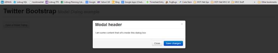
Basic modal dialog example
As you'll see when you click the button and, for that matter, the close button, the modal appears and disappears quite abruptly. If you add the optional class "fade" to the main parent div (alongside "modal hide"), you'll see you get a much nicer opening and closing effect.
You don't have to use an anchor tag to open a modal, either. Any element in your document that can accept a click can be used; all you have to do is add a "data-target" attribute into the mix as follows:
<button class="btn" data-toggle="modal" data-target="#myDialog">Open a Modal Dialog</button> |
The button tag could just as easily have been an image, header, paragraph, or anything else for that matter.
You can control the modal from standard JavaScript, too. You can pass a JSON object into your modal using the following:
$('#myDialog').modal({ … options json here … }) |
With the following options defined:
- backdrop: True, false or static. If true or false, then shaded backdrop either will or will not be displayed. If static, the shaded backdrop will be displayed but prevent clicks on the backdrop from closing the modal.
- keyboard: True or false to enable or disable keyboard interaction.
- show: True or false to show the dialog as soon as it's activated or keep it hidden.
- remote: If this is specified, then when the dialog is opened, jQuery will be used to perform an AJAX load from the URL specified in the parameter, allowing you to dynamically populate your dialogs at runtime.
Finally, you can also call the following methods on a modal using the following:
$('#myDialog').modal('… method name here …') |
To make the modal react from external JavaScript, the methods available are as follows:
- toggle: If the dialog is open close it, otherwise open it.
- show: Shows the dialog, has no effect if already open.
- hide: Closes the dialog, has no effect if it's already closed.
The modal will also fire the "show," "shown," "hide," and "hidden" events which can be handled as shown at the beginning of this chapter.
Tooltips
Love them or hate them, tooltips are immensely useful in many scenarios, from attaching helpful labels to input controls, right through to those monstrous things that advertisers like to put in the middle of a paragraph that pop up when you least expect them.
In Twitter Bootstrap, using them couldn't be easier. All you need to do is use the data attributes you've seen so far in exactly the same way as the other data API examples you've tried up to now.
There is one small caveat, though, that's specific to tooltips: the fact that you have to initialize them manually.
Unlike everything else, to make use of tooltips, you'll need to manually activate any tooltips you create in a document.ready handler or something similar once your document has loaded.
The reasons for doing this are not really clear and the documentation offers no explanation either. The best way to make your tooltips work is with something like the following:
<p>This is some text with an embedded <a href="#" rel="tooltip" data-original-title="I Am Tooltip!">Tooltip</a> in line with the code</p> |
Then, you can simply just execute the following to activate them all:
$(document).ready(function() { $('[rel=tooltip]').tooltip(); }); |
From that point on, your tooltips should just simply pop up when you hover over them.
You can also use the alternative way of targeting the selectors:
$('#someelementid').tooltip({ selector: "a[rel=tooltip]" }) |
This is more useful if you have all your tooltips inside a main parent element such as a modal dialog or page article. The "#someelementid" selector would typically be the ID of a div or other block-level element.
As is common with the other components, just about everything is controlled from data attributes. The following list of attribute names should be prefixed with "data-" and added to the anchor or other inline element being used to house the tip. For example, "animation" would become "data-animation". These options can also be passed using ".tooltip" as a JSON object containing initialization parameters at initialize time:
- animation: True or false to enable or disable animation effects.
- html: True or false to allow HTML to be inserted directly into the tooltip.
- placement: "Top," "bottom," "left," or "right" to choose the pop up direction of your tooltip.
- selector: Used as described above in the initial options to define the master selector.
- title: Default tooltip title.
- trigger: "Click," "hover," "focus," or "manual" determines what action makes the tooltip appear.
- delay: Milliseconds delay before the tooltip is shown, if show is automatic. Can also be specified as delay: { show: x, hide: x } to set show and hide values independently.
Just like the modal dialogs, there are a number of fluent API calls that can be called on tooltips also.
Like others, you must use jQuery's selector engine to call them.
You can call a method using the following:
$('#someElement').tooltip('… method name …') |
Valid methods are:
- 'show'
- 'hide'
- 'toggle'
- 'destroy'
Popovers
Popovers are not much different than tooltips. However, where tooltips are designed for quick help tips, popovers are more like mini dialog boxes with a title bar and content area.
They are designed to house more than a small snippet of text and are often used for image, video, and page previews, or extended explanations of snippets of text.
Because popovers are an extension of tooltips, to use them you need to make sure you have the tooltip module installed. If you're using the full "bootstrap.js" file, this isn't something you need to worry about. If, however, you've produced a custom build and included only the modules you need, you need to ensure tooltips are part of that build.
Unlike tooltips, you don't need to manually initialize them in a document.ready handler. You can just attach them to an element using plain old data attributes as follows:
<a href="#" class="btn" data-toggle="popover" data-placement="top" data-content="Popover content goes here." title="Popover on top">Popover on top</a> |
Just as with tooltips, you can see that you can set the title, placement, and content of the popover (and allow it to be generated dynamically) using exactly the same methods as with tooltips.
Should you so wish, however, you can also build your popovers yourself directly in HTML code:
<div class="popover left"> <div class="arrow"></div> <h3 class="popover-title">Popover left</h3> <div class="popover-content"> <p>Pop over content goes here.</p> </div> </div> |
Code Sample 41: Basic popover
Personally, I prefer the dynamic approach but, if you build them using HTML, you can keep them separate from the element they are assigned to and attach or detach them as needed.
As you've seen, and in a similar fashion to tooltips, you can set the options to a popover as a JSON object and create it using the fluent API. Or can prefix each of the options and add them to the element to which it's attached by prefixing them with "data-."
Popovers understand everything listed under tooltips with the same parameters, along with two extra options as follows:
- content: Used to set the actual inner content of the popover, and
- container: Used to attach the popover only to a certain parent container.
The same four methods, "show," "hide," "toggle," and "destroy" are also all available. They are called in exactly the same way as for tooltips except you use ".popover" rather than ".tooltip".
All the Rest
As I've already mentioned, there's much more available in the JavaScript section. And, from what I’ve read in some of the Version 3 documentation, it appears that even more has been added in there, too.
The JavaScript features in Twitter Bootstrap could easily take up an entire book just on their own. So, what's still left to cover?
Well, you know the basics of dropdowns, buttons, tabs, and alerts as we covered them in the components section. In this section, we covered modals, tooltips, and popovers. This leaves the following still to be introduced:
- Transitions
- Scroll spy
- Collapse
- Carousel
- Typeahead
- Affix
Transitions are used to produce the fading and sliding effects you've seen in things such as Modal dialogs.
Scroll spy you've seen if you've been browsing the Bootstrap documentation while we've gone through this book; it's the module that keeps the blue highlight on the correct content’s entry on the left of the page as you scroll down.
Collapse is commonly used to create accordions, but anything that needs a collapsible panel is a target for this module.
Carousel is used to create a rotating slideshow, and can create some very impressive effects when used with a hero unit.
Typeahead is exactly as its name suggests: attach it to any type of input for instant predictable text pop-ups.
Lastly, affix does exactly what it says: it affixes an element to a given position on a page and keeps it there no matter how much the page scrolls.
In the next and final chapter, we'll look at some of the extensions that are available for Bootstrap, giving you even more choice in how you put it to use.
- 80+ high-performance, responsive JavaScript UI controls.
- Popular controls like DataGrid, Charts, and Scheduler.
- Stunning built-in themes.
- Lightweight and user-friendly.