
Twitter Bootstrap Succinctly®

CHAPTER 7
Components
If you've been reading the Twitter Bootstrap docs as we've been moving through this book, you will have undoubtedly seen that the main menu has a section called components.
Personally, I think the separation that the TWB team has provided here is a little bit misleading as you can find sections on multiple things in multiple menus.
The buttons, for example, are mostly listed under the Base CSS section, but button groups are in components and radio/check box groups are in JavaScript.
My whole take on this, however, is that a component in Twitter Bootstrap is something that's just a bit more than adding a simple class to an element to style it in a certain way. Components are created from collections of elements put together in a particular way and use a particular sequence of classes in order to produce a final composite product.
That said, some of the features listed under the components section in the docs are enabled by simply adding a single class—elements such as labels, badges, and progress bars fall into this category.
Anyway, enough debating. Let's kick off this chapter with dropdown menus.
Dropdown Menus
A basic dropdown menu is produced using a standard, unordered list element with the class "dropdown-menu" applied to it as follows:
<ul class="dropdown-menu"> <li><a tabindex="-1" href="#">Menu 1</a></li> <li><a tabindex="-1" href="#">Menu 2</a></li> <li><a tabindex="-1" href="#">Menu 3</a></li> <li class="divider"></li> <li><a tabindex="-1" href="#">Menu 4</a></li> </ul> |
However, because of the way dropdowns work, you need another element to trigger it to pop up. You saw an example of this in the last chapter with dropdown buttons.
To change the code we've just seen into a correctly formatted dropdown, we need to wrap the entire UL in a div or some other container that is marked with the "dropdown" class, and then within that div, we need to add an element that will act as the menus trigger, like so:
<div class="dropdown"> <!-- Trigger element, a button, text, etc. goes here --> <ul class="dropdown-menu"> <li><a tabindex="-1" href="#">Menu 1</a></li> <li><a tabindex="-1" href="#">Menu 2</a></li> <li><a tabindex="-1" href="#">Menu 3</a></li> <li class="divider"></li> <li><a tabindex="-1" href="#">Menu 4</a></li> </ul> </div> |
The commented part in that last sample shows where you would add the trigger element which, in most cases, will normally be a simple link or button element. But it could just as easily be a div styled in some way unique to your app or a standard header tag. All that matters is that the element is marked with the correct classes and data attribute to make it trigger the dropdown and show it on screen.
Start a new template file in the same manner you have been throughout this book, and then add the following body code:
<div class="container-fluid"> <div class="row-fluid"> <h1>Twitter Bootstrap</h1> <h3>Dropdown Menu Example</h3> <div class="dropdown"> <button class="btn dropdown-toggle" data-toggle="dropdown">Menu</button> <ul class="dropdown-menu"> <li><a tabindex="-1" href="#">Menu 1</a></li> <li><a tabindex="-1" href="#">Menu 2</a></li> <li><a tabindex="-1" href="#">Menu 3</a></li> <li class="divider"></li> <li><a tabindex="-1" href="#">Menu 4</a></li> </ul> </div> </div> </div> |
Code Sample 22: Dropdown menu
Once you save the file and render it in a browser, you'll see something similar to the first dropdown button you created in the last chapter. If, however, you now click on the button and allow the menu to display, you should see something like the following:

Twitter Bootstrap popup menu example
Immediately, you should be able to see that the menu has a shadow behind it, a vertical divider, proper padding and formatting, and highlighting of the menu items as you hover your mouse cursor over them.
We can also give menu items on a menu a disabled appearance by applying the "disabled" class alongside any other classes on the <li> element for that option.
If we now change the list item element for Menu 2 from the following:
<li><a tabindex="-1" href="#">Menu 2</a></li> |
To the following:
<li class="disabled"><a tabindex="-1" href="#">Menu 2</a></li> |
Then save and refresh the page, we should now see that when the menu is popped up, option number 2 is now disabled:

Dropdown menu with disabled menu item
You'll also be able to see that the highlight bar and other such effects just don’t appear when you hover over the disabled option, and you're not able to click on the option to select it.
Submenus
You can also nest and cascade submenus in a TWB dropdown simply by nesting an <a> tag to act as the trigger element and then adding <ul> tags and their associated <li> elements inside of standard <li> tags in your upper-level parent container before finally applying the class "dropdown-submenu" as the following code shows:
<div class="container-fluid"> <div class="row-fluid"> <h1>Twitter Bootstrap</h1> <h3>Dropdown Sub Menu Example</h3> <div class="dropdown"> <button class="btn dropdown-toggle" data-toggle="dropdown">Menu</button> <ul class="dropdown-menu"> <li><a tabindex="-1" href="#">Menu 1</a></li> <li><a tabindex="-1" href="#">Menu 2</a></li> <li><a tabindex="-1" href="#">Menu 3</a></li> <li class="divider"></li> <li class="dropdown-submenu"> <a tabindex="-1" href="#">Sub Menu</a> <ul class="dropdown-menu"> <li><a tabindex="-1" href="#">Sub Menu 1</a></li> <li><a tabindex="-1" href="#">Sub Menu 2</a></li> <li><a tabindex="-1" href="#">Sub Menu 3</a></li> </ul> </li> </ul> </div> </div> </div> |
Code Sample 23: Nested submenu example
If you change the body code in your dropdown page to that in Code Sample 22, and then save and refresh your page, you should be able to expand the menu and submenu as the following image shows:

Dropdown menu with submenus example
Navigation Components
I would guess most of you have been waiting for this part of the book. Why do I say that? Well, when I first started to use Twitter Bootstrap, the one thing I was drawn to almost immediately was its great-looking navigation bars.
However, navigation bars are only one of the many navigation aids that TWB provides to help make the navigation in your app much more of a first-class citizen.
There are classes for tabs, pills, link lists, side menus, and more.
Most of the features provided are just as easy to use as everything else you've seen so far.
One thing to note before we dive in, nearly all of TWB's navigation aids are based on creating your link lists using standard UL/LI tags (just as with the dropdown menus in the last section). So, nesting and correct tag order is a must, as you'll get some pretty funky side effects if you miss a closing tag in some places.
Tabs
Tabs are tabs, nothing special, nothing complicated. Simple, elegant, but very functional tabs allow you to break a single screen up into multiple pages.
There are two main classes you need to know: "nav" and "nav-tabs." Another class that you'll use repeatedly is "active." This is illustrated in the following set of tabs:

Basic tabs navigation example
Use the following code to create them:
<div class="container-fluid"> <div class="row-fluid"> <h1>Twitter Bootstrap</h1> <h3>Navigation Example</h3> <ul class="nav nav-tabs"> <li class="active"> <a href="#">Tab 1</a> </li> <li><a href="#">Tab 2</a></li> <li><a href="#">Tab 3</a></li> </ul> </div> </div> |
Code Sample 24: Basic tabs code
Using tabs doesn't stop there. Rather than just use them as a navigation aid, you can actually tie them fully together to provide a full paged content setup which, when linked correctly, will see the tab bar actually change the pages for you—without any extra JavaScript or other handling code that’s usually associated with swapping tab panels.
To make a full set of tabbed pages, however, you need to obey a few rules:
- Every LI tag in your parent tab bar must have a href that references a div ID with the content inside of it.
- Every div that has contents for a page must have a unique ID that can be seen by the tab bar.
- Each div with content must immediately follow the <ul> holding the tab bar, and this ul plus all associated div tags must be wrapped in a parent div with the class of "tabbable" applied to it, and
- The collection of content divs must be wrapped in a single div tag immediately following the <ul> with the "tab-content" class applied to it.
Note, also, that each individual tab content div has the class "tab-pane" applied to it, and that by default the first tab has an "active" class to match the selected "active" class in the actual tab bar itself.
Once you have the required structure set up, the correct classes applied, and all your IDs matching, the final thing you need to make sure of is that you have data-toggle attributes on each of the anchor tags in your list items. This is so that the TWB JavaScript knows to toggle your tabs for you.
Start a new template document and add the following body code to it:
<div class="container-fluid"> <div class="row-fluid"> <h1>Twitter Bootstrap</h1> <h3>Tab Page Example</h3> <div class="tabbable"> <ul class="nav nav-tabs"> <li class="active"><a href="#tab1" data-toggle="tab">Tab 1</a></li> <li><a href="#tab2" data-toggle="tab">Tab 2</a></li> </ul> <div class="tab-content"> <div class="tab-pane active" id="tab1"> <p>This is the page content for Tab Page 1</p> </div> <div class="tab-pane" id="tab2"> <p>This is the page content for Tab Page 2</p> </div> </div> </div> </div> </div> |
Code Sample 25: Tab pages example
Save and load the page into your browser. You should find the following when you render it:

Tab page example
If you click on tab number two, you should find that the content changes to whatever content you included in tab number two. You should also see that the active classes update in the same way:

Tab page example show the second tab
Tab pages can also be made to fade in and out of existence when switching by including the "fade" class to any div that also has "tab-pane" applied to it.
Lastly, tabs are not just limited to being shown along the top of the content. On the master parent div element (the one with the class "tabbable"), you can add any of the following to change the position of the tabs:
- tabs-below: Places the tabs below the content.
- tabs-left: Places the tabs to the left of the content.
- tabs-right: Places the tabs to the right of the content.
I'll leave experimenting with those, however, as an exercise to the reader.
Pills
Pills are very much like tabs and are created in exactly the same way with the same structure. The only difference is that pills look like small, rounded rectangles rather than page tabs, and they use a different class, "nav-pills," rather than "nav-tabs" as we did in the previous examples.
If you go back to Code Sample 25 and change the line:
<ul class="nav nav-tabs"> |
To the following:
<ul class="nav nav-pills"> |
Then save and refresh the page in your browser, you should see the example change to look like the following:

Pills navigation example
Before we finish up with tabs and pills, we can also add the "disabled" class just as we have elsewhere to mark a tab or pill as disabled. We can use the utility classes "pull-left" and "pull-right" to align our tabs and pills to the left or right. Finally, we can also add the "nav-stacked" class to the parent <ul> holding each list, which will convert each of our tabs or pills to a block-level element and then stack them vertically on top of each other as the following images show:

Stacked tabs example

Stacked pills example
You'll notice that you get the appropriate hover effects for each of the entries, too.
Before we move on, please note also that, just as described in the section on dropdown menus, tabs and pills can both act as dropdown menu trigger targets when placed in the correct structure and with the correct data-toggles applied.
Navigation Lists
Navigation lists are designed for sidebars and other similar cases and couldn't be easier to construct.
All you simply have to do is create a standard, unordered list element, and then add the classes "nav" and "nav-list" to the parent <ul> tag.
Just as with the pills and nav lists, you can also add an "active" class to individual <li> items to show which of the items should be marked as the currently active entry.
You can also add the "nav-header" class on a list item. Doing so will give the item a slightly different style but, importantly, will remove it from the hover effects and selection clicks the other items will use. In some ways it's similar to adding a "disabled" class to an item which will, like other navigation aids, mark the item as un-selectable. The nav header, however, is slightly different; the idea is that you use a nav header item to separate related function groups in your sidebar menu so that you can maintain a logical structure.
You can also mark an item with the "divider" class to show the item as a horizontal divider (in the same way as you might add a divider on a dropdown menu).
Start a new template and add the following body code to it:
<div class="container-fluid"> <div class="row-fluid"> <h1>Twitter Bootstrap</h1> <h3>Navigation List Example</h3> <div class="span2"> <ul class="nav nav-list"> <li class="nav-header">Pages</li> <li class="active"><a href="#">Home</a></li> <li><a href="#">Profile</a></li> <li><a href="#">Settings</a></li> <li class="nav-header">Library</li> <li><a href="#">E-books</a></li> <li><a href="#">Paper books</a></li> <li class="divider"></li> <li><a href="#">Borrower List</a></li> </ul> </div> </div> </div> |
Code Sample 26: Navigation list
Save and load it into your browser, and you should get something that looks as follows:

Navigation list example
As you can see from the code in Code Sample 26, we've wrapped the entire thing in a span2-based scaffolding element. Without that, everything would just span the width of the entire page. Nav lists are designed to be block-level vertical lists for creating static menus.
Navigation Bars
Now, we come to what's probably one of Twitter Bootstrap’s most impressive features: the humble navigation bar.
TWB's navigation bar features make the creation of menu bars across the top of sites and pages so easy, it's almost like magic.
Just as with all the navigation aids preceding it, two divs, a ul, and an anchor tag or two are all it takes to create a beautifully styled and functional navigation bar at the top of your page.
Add a few more components and optional classes, and you can create navigation bars with login and search forms embedded in them, navigation bars with dropdown menus, and a great many other combinations; the limit is your imagination.
You can also pin your bar to the top or bottom of your page, make it fluid or fixed, use it with the scaffolding classes, and much more.
Create a new template file and add the following body code:
<div class="container-fluid"> <div class="row-fluid"> <h1>Twitter Bootstrap</h1> <h3>Navigation Bar Example</h3> <div class="navbar"> <div class="navbar-inner"> <a class="brand" href="#">My Application</a> <ul class="nav"> <li class="active"><a href="#">Menu 1</a></li> <li><a href="#">Menu 2</a></li> <li><a href="#">Menu 3</a></li> <li><a href="#">Menu 4</a></li> <li><a href="#">Menu 5</a></li> <li><a href="#">Menu 6</a></li> </ul> </div> </div> </div> </div> |
Code Sample 27: Basic navigation bar
Save and load the file in your browser, and you should see:

Twitter Bootstrap navigation bar example
In just 13 lines of HTML (six of which were the menu options themselves), you've created a great-looking navigation bar that sits nicely, lined up with everything else on the page.
You can add dividers between your menu items in exactly the same way as you do in other navigation aids. But, instead of just adding a list item with a "divider" tag, you need to add a list item with a "divider-vertical" tag (and no other content inside the list item tag itself).
If you want to add a form to your navigation bar, you can do so by using the following code sample:
<form class="navbar-form pull-right"> <input type="text" class="span4" placeholder="User Name"> <input type="text" class="span4" placeholder="Password"> <button type="submit" class="btn">Login</button> </form> |
Code Sample 28: Navigation bar form
Note that I'm showing just the form item needed and not the full menu structure. If you insert this in Code Sample 26, just after the last </ul> but before the </div> tag, you should see something that looks like this:

- Navigation bar with inline form example
In a similar fashion, you can change the "navbar-form" class for a "navbar-search" or "navbar-query" class and get a search form (as shown in the chapter on forms), which will style the form inputs with the specialist styles to make them more round and search box-like.
If you want to add dropdown menus, all you need to do is mark your <ul>-based lists up in an appropriate nested fashion using the same markup you saw earlier to create a dropdown.
Add the following unordered list to your menu example after the first unordered list but before the opening form tag that creates your inline login form:
<ul class="nav"> <li class="dropdown"> <a href="#" class="dropdown-toggle" data-toggle="dropdown"> Options <b class="caret"></b> </a> <ul class="dropdown-menu"> <li><a href="#">Option menu 1</a></li> <li><a href="#">Option menu 2</a></li> <li><a href="#">Option menu 3</a></li> </ul> </li> </ul> |
Code Sample 29: Dropdown button for navigation bar
Save and refresh the page in your browser. If you've added the dropdown in the correct place, you should see a new menu option appear with a dropdown arrow next to it. Clicking the option should cause a menu to drop down underneath:

Navigation bar with dropdown menu
If you want to add simple text to your navigation bar, just create a paragraph tag at the appropriate place in your code as we have done with the other elements. Then, add a class of "navbar-text" to the element and watch as everything lines up neatly.
Before we finish with navigation bars, there are a few extra optional display classes you can use to affect your navigation bar in different ways.
The first of these is the "navbar-fixed-top" class which, as the name states, fixes your bar to the very top of your page.
Be aware, however, this fixing is not quite what you might expect. Fixed top navigation bars are overlaid on top of any content already present and are designed to stay in place when you scroll your page upwards, styling on top of whatever content scrolls beneath them.
This means that when your page is scrolled right to the top, you'll likely need some suitable padding or a margin on the top of your body or parent page element so that the top of your document is not lost underneath the navigation bar.
On the navbar you created previously, change the classes on the main navbar parent from:
<div class="navbar"> |
To the following:
<div class="navbar navbar-fixed-top"> |
And refresh the page.
If everything has appeared as expected, then you'll see straight away how the menu obscures the top of the page. The navigation bar should display something like the following:

Navigation bar with fixed-top applied
The opposite of the fixed top optional class is "navbar-fixed-bottom" which, as expected, will do exactly the opposite and fix the menu bar to the bottom of the page.
If you use the class "navbar-static-top" rather than "navbar-fixed-top", the navigation bar will remain at the top of the page but will scroll away with the content when the page is scrolled up (rather than overlaying the content and remaining in place like the fixed one).
Creating a Responsive Navigation Bar
If you want to create a navigation bar that collapses correctly on tablet and mobile phone screens, you need to alter the structure of your HTML 5 code slightly and add a new anchor tag in to provide the collapse icon.
The first thing to do is to add a third div inside the two divs already present at the outermost layer of your menu. Give this a class of "container" or "container-fluid" (the same as the classes used in the chapter on scaffolding).
Once you've added this third div, you then need an anchor tag immediately after it to act as the collapse icon once the navigation bar is shrunk down.
After that, if you have a brand element in your bar and want that to remain shown, simply put another div immediately after it. This time, apply a class containing "nav-collapse collapse" to the element, and all your regular navigation bar content should then go inside this collapsible div.
To convert the navigation bar we've built so far into a collapsible bar, change the body code in your template to the following:
<div class="container-fluid"> <div class="row-fluid"> <h1>Twitter Bootstrap</h1> <h3>Navigation Bar Example</h3> <div class="navbar"> <div class="navbar-inner"> <div class="container"> <a class="btn btn-navbar" data-toggle="collapse" data-target=".nav-collapse"> <span class="icon-bar"></span> <span class="icon-bar"></span> <span class="icon-bar"></span> </a> <a class="brand" href="#">My Application</a> <div class="nav-collapse collapse"> <ul class="nav"> <li class="active"><a href="#">Menu 1</a></li> <li><a href="#">Menu 2</a></li> <li><a href="#">Menu 3</a></li> <li><a href="#">Menu 4</a></li> <li><a href="#">Menu 5</a></li> <li><a href="#">Menu 6</a></li> </ul> <ul class="nav"> <li class="dropdown"> <a href="#" class="dropdown-toggle" data-toggle="dropdown"> Options <b class="caret"></b> </a> <ul class="dropdown-menu"> <li><a href="#">Option menu 1</a></li> <li><a href="#">Option menu 2</a></li> <li><a href="#">Option menu 3</a></li> </ul> </li> </ul> <form class="navbar-form pull-right"> <input type="text" class="span4" placeholder="User Name"> <input type="text" class="span4" placeholder="Password"> <button type="submit" class="btn">Login</button> </form> </div> </div> </div> </div> </div> </div> |
Code Sample 30: Responsive navigation bar
As you have done throughout this book, save the file and hit reload in your browser. You should see something that looks like the following:

Responsive navigation bar example
You may notice that this doesn't appear any different from the previous navigation bar. However, if you now resize your browser window or display this on a device with a reduced size screen display, you should see something entirely different.
If I display the page in the Electric Plum iOS device simulator, for example, this is what I get in iPad landscape mode:

Responsive navigation bar displayed in an iOS device emulator for iPad
If I change the emulator to display the page in portrait iPhone mode, I get this:

Responsive navigation bar displayed in an iOS device emulator for iPhone
If I then click the now displaying collapse icon, my menu will expand vertically and display my menu items, dropdowns and login form just as it did previously:

Responsive navigation bar displayed in an iOS device emulator for iPhone with the menu in an un-collapsed state
And just to prove it works the same way if I resize the browser window on my desktop:

Responsive navigation bar shown in an un-collapsed state in a resized desktop browser
Before we leave the navigation stuff behind, I'll briefly mention the two components we've not yet covered. These are the breadcrumbs and pagination links components.
If you've ever seen a path of links at the top of a page that shows you where you are in the document, then you've seen a breadcrumb trail. To create breadcrumbs in Twitter Bootstrap, simply create an unordered list as you have done already, and then apply a class of "breadcrumb" to the <ul> element acting as a parent container.
For breadcrumbs, set the "active" class on the link that represents the page you are currently on; this will mark that link with a grey color which is then used to differentiate between links you can click on to go backwards in your page tree. A standard breadcrumb list looks like the following:
Twitter Bootstrap breadcrumb component
Pagination is a little bit different from the navigation aids we've seen so far. You don't apply the class to the <ul> tag but to a <div> tag that wraps the entire unordered list as the following shows:
<div class="pagination"> <ul> <li><a href="#">Prev</a></li> <li><a href="#">1</a></li> <li><a href="#">2</a></li> <li><a href="#">3</a></li> <li><a href="#">4</a></li> <li><a href="#">5</a></li> <li><a href="#">Next</a></li> </ul> </div> |
Code Sample 31: Pagination list
This will produce the following pagination bar when rendered in the browser:
Basic pagination example
As with all other navigation components, there are "disabled" and "active" classes that can be applied to the individual list items as well as different sizes of pagination which can be controlled with "pagination-large," "pagination-small," or "pagination-mini" added to the class name list of the div element surrounding the pagination list.
Label and Badge Components
Twitter Bootstrap contains useful classes to produce nicely formatted labels and badges for things such as status counts and important tags on post items.
The colors on each of the classes use the same sort of naming scheme as we've already seen elsewhere, as the following code sample shows:
<div class="container-fluid"> <div class="row-fluid"> <h1>Twitter Bootstrap</h1> <h3>Labels and Badges Example</h3> <br />Labels<br /> <span class="label">Default</span> <span class="label label-success">Success</span> <span class="label label-warning">Warning</span> <span class="label label-important">Important</span> <span class="label label-info">Info</span> <span class="label label-inverse">Inverse</span> <br /><br />Badges<br /> <span class="badge">1</span> <span class="badge badge-success">2</span> <span class="badge badge-warning">4</span> <span class="badge badge-important">6</span> <span class="badge badge-info">8</span> <span class="badge badge-inverse">10</span> </div> </div> |
Code Sample 32: Labels and badges
Displayed in a browser, the previous code should look like the following:

Labels and badges example
Hero Units and Page Headings
Under the typography section of components, you'll find two elements that are designed to make your opening page statement stand out from the crowd.
Both of them are designed with very different purposes in mind. We’ll start with the page heading.
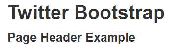
If you recall from all the examples we've done in the book so far, I've had a common header above all of them. You can see this in the last image (Figure 69) just above where the text says in an H1 tag "Twitter Bootstrap" followed in an H2 tag by "Labels and Badges example."
Even though I knew this page header component was available, I've deliberately not used it so far in the book, purely so I could introduce it now and give you a better idea of its intended use.
Using it couldn't be simpler either. Start a new template document and add the following body of HTML code to your page:
<div class="container-fluid"> <div class="row-fluid"> <h1>Twitter Bootstrap</h1> <h3>Page Header Example</h3> <div class="page-header"> <h1>Twitter Bootstrap <small>Page header example</small></h1> </div> </div> </div> |
Code sample 33: Page header
If everything is good, you should see a page with two headers, one in the old style (that I've been using throughout this book) which should look like:
- Old style header
And one below it using the new style page header, which should look like:
- New style header
As you can see, it's a simple as wrapping an H1 tag inside a div that has the class "page-header" applied to it. The grey text to the left is created by nesting that content inside a nested small tag; the whole thing then has a nice underline added to it.
There are no optional classes for the page header but it will obey any spanX or other scaffolding classes it's placed in, so you can place and resize the content as you need to.
The next of the typographic components is the “hero unit.”
Hero units are much loved by the digital marketing enthusiast.
When you see these webpages with an extremely large call to action space at the top of the page, right before any useful content, that large area is the part that the TWB authors call a hero unit:

Hero unit example
As you can see from Figure 72, the hero unit is a block-level element so it will expand to fill any space available to it.
The code to produce the hero unit seen in the previous figure is as follows:
<div class="container-fluid"> <div class="row-fluid"> <div class="page-header"> <h1>Twitter Bootstrap <small>Page header and Hero Unit example</small></h1> </div> <div class="hero-unit"> <h1>I am a hero unit</h1> <p>and this is my tagline content. This content could be a story summary, or a snippet of useful info, no matter what it is, the idea is that it draws the user in and makes them want to press the button....</p> <p> <a class="btn btn-primary btn-large">Press This Button</a> </p> </div> </div> </div> |
Code Sample 34: Hero unit code
Like the page header, the hero unit is a very simple, multiple HTML element setup and has no extra optional classes.
Thumbnails and Media Objects
Twitter Bootstrap's thumbnail component is designed for a grid-like display of multiple images, such as a gallery page.
However, the actual component and its structure are actually very flexible. And, due to its use of the scaffolding and grid system, it can create some wonderfully balanced layouts with images and text content.
Just like the navigation components, the thumbnail components are created using an unordered list with nested list items containing the thumbnails embedded inside.
Create a new template document and add the following body of HTML to it:
<div class="container-fluid"> <div class="row-fluid"> <div class="page-header"> <h1>Twitter Bootstrap <small>Thumbnails & Media Objects example</small></h1> </div> <ul class="thumbnails"> <li class="span4"> <a href="#" class="thumbnail"> <img data-src="js/holder.js/300x200" alt=""> </a> </li> </ul> </div> </div> |
Code Sample 35: Thumbnail image
Some of you will notice that I've used an extra bit of JavaScript in there called holder.js. This is not an official part of Twitter Bootstrap, but nevertheless is one bit of JavaScript that I believe all web developers should have by default in their project templates.
You add the following script line:
<script src="js/holder.js" type="text/javascript"></script> |
Alongside all your other scripts, just above anywhere you need an image place holder, you simply swap your normal:
src="somefile.ext" |
For:
data-src="js/holder.js/300x200" |
Set the 300x200 to whatever size you want the thumbnail to be. You can download holder.js from its repository on GitHub or use the copy that's in the samples zip file to go with this book, if you wish. However, you can use any suitable image you have available.
Once you save and load the file, you should see something like the following:

Basic thumbnail example
Because thumbnails respect the grid system in Twitter Bootstrap, adding more list items to the above code sizes everything proportionately and with no effort, other than adding a little extra markup following the same structure:

Multiple thumbnail example
If you want to add other content to your thumbnails, then all you need to do is change your anchor tags to div tags, and then include the content after your image or its placeholder.
Change the body content in your thumbnails example so it looks like the following:
<div class="container-fluid"> <div class="row-fluid"> <div class="page-header"> <h1>Twitter Bootstrap <small>Thumbnails & Media Objects example</small></h1> </div> <ul class="thumbnails"> <li class="span4"> <div class="thumbnail"> <img data-src="js/holder.js/300x200" alt=""> <h3>This is a caption</h3> <p>and here is a paragraph of text all about our image in the thumbnail above </div> </li> <li class="span4"> <div class="thumbnail"> <img data-src="js/holder.js/300x200" alt=""> <h3>This is a caption</h3> <p>and here is a paragraph of text all about our image in the thumbnail above </div> </li> <li class="span4"> <div class="thumbnail"> <img data-src="js/holder.js/300x200" alt=""> <h3>This is a caption</h3> <p>and here is a paragraph of text all about our image in the thumbnail above </div> </li> </ul> </div> </div> |
Code Sample 36: Multiple thumbnails with extra content
Save and refresh, and you should be presented with:

Multiple thumbnails with extra content
The thumbnail classes also support another type of component called a media object.
Media objects are designed for list-like displays, such as those used by Twitter itself in a timeline or in a list of comments below a blog post with an avatar next to each.
Unlike the thumbnails, however, you don't create this using unordered lists and list items. You create a media object list using standard divs, nesting where needed. Add the following code to your thumbnails example, just underneath the <ul> holding the three horizontal thumbnails:
<div class="media"> <a class="pull-left" href="#"> <img class="media-object" data-src="holder.js/64x64"> </a> <div class="media-body"> <h4 class="media-heading">Media heading</h4> <p>a paragraph of text to go with the media heading above that's rendered as a h4 tag, this is just a paragraph</p> </div> </div> |
Save and render your page and you should see the media object appear just below your thumbnails:

Thumbnails with media object
Add two more just below the first one, and you'll see that they all line up and stack correctly on top of one another:

Multiple media objects
If you nest your media object divs inside the "media-body" of a parent, you'll also find they nest and indent correctly, too:
<div class="media"> <a class="pull-left" href="#"> <img class="media-object" data-src="holder.js/64x64"> </a> <div class="media-body"> <h4 class="media-heading">Media heading</h4> <p>Media Objects paragraph</p> <div class="media"> <a class="pull-left" href="#"> <img class="media-object" data-src="holder.js/64x64"> </a> <div class="media-body"> <h4 class="media-heading">Nested Media heading</h4> <p>A nested objects paragraph of text</p> </div> </div> </div> </div> |
Code Sample 37: Nested media object
When rendered, it should display the following:

Nested media object
Alerts
As you've seen many times so far, Twitter Bootstrap has a number of standard colors for things such as text, buttons, and labels.
These standard colors also extend to a component specifically for creating on-screen alerts, such as the ones you see when you delete a post or enter incorrect authentication information in a login dialog.
A TWB alert is a block-level element so it will stretch to fill whatever space is available to it in its parent element. This means that size and position can easily be controlled using the scaffolding system:

Alerts example
The image in Figure 79 was produced using the following HTML 5 code:
<div class="container-fluid"> <div class="row-fluid"> <div class="page-header"> <h1>Twitter Bootstrap <small>Alerts example</small></h1> </div> <div class="alert alert-warning"> <button type="button" class="close" data-dismiss="alert">×</button> <strong>Warning!</strong> This is a warning alert. </div> <div class="alert alert-error"> <button type="button" class="close" data-dismiss="alert">×</button> <strong>Error!</strong> This is an error alert. </div> <div class="alert alert-success"> <button type="button" class="close" data-dismiss="alert">×</button> <strong>Success!</strong> This is a successful alert. </div> <div class="alert alert-info"> <button type="button" class="close" data-dismiss="alert">×</button> <strong>Info!</strong> This is an info alert. </div> </div> </div> |
Code Sample 38: Alerts code
You'll notice that each of them has a small, close icon on the right-hand side that's used to close the alert. This works using another of Twitter Bootstraps magic data attributes called "data-dismiss."
In the case of the above code, the line you're interested in is any of the button tags inside the alert div:
<button type="button" class="close" data-dismiss="alert">×</button> |
I've highlighted the data dismiss attribute in bold. You'll meet this again shortly in the dialogues section, but like any other of TWB's data attributes you'll need the TWB main JavaScript file loaded to make them work correctly.
Without that data attribute, the button will function just like a regular button and won't close the alert dialog.
If you add the "alert-block" optional class to the class list of your alert div, you'll get slightly bigger padding on the bottom and top, designed to hold longer messages that may remain on screen for a longer length of time.
Progress Bars
A basic blue progress bar can be created quite simply using the following markup:
<div class="progress"> <div class="bar" style="width: 60%;"></div> </div> |
Code Sample 39: Basic progress bar
The width on the inner "bar" class denotes the percent complete that the bar should show.
If you render this in a template page, you should see the following:

Progress bar example
If you add the optional class "progress-striped" to the outer div, the progress bar will appear striped:

Striped progress bar example
You can also add the "active" optional class, which will then make the stripes appear to be animated so the bar has some movement.
You can also stack progress bars by providing multiple divs with the "bar" class applied to them inside the master div, holding the "progress" class as follows. Change the code in Code Sample 36 so that it looks like the following:
<div class="progress"> <div class="bar bar-success" style="width: 35%;"></div> <div class="bar bar-warning" style="width: 20%;"></div> <div class="bar bar-danger" style="width: 10%;"></div> </div> |
If you load it into the browser, you should see the following:

Stacked progress bar
There are two things to note in the above example. First, all the percent values must add up to 100 percent. Second, you provide each segment a different color by using one of the pre-made bar color classes we'll see in just a moment.
Just a word of warning on browser compatibility first, though: the TWB progress bar classes use CSS3 gradients to achieve the color effect you see, especially on the striped bars.
Because of this, Internet Explorer 7 to Internet Explorer 9 won't display things as expected, and older versions of Firefox will also have an issue with the display. Functionally, however, everything else still works as expected.
If you’re coloring individual bars, then you need to add one of the optional color classes to the parent progress div as follows:
- progress-info: A standard blue progress bar.
- progress-success: A green progress bar for successful operations.
- progress-warning: A yellow progress bar designed for warning operations.
- progress-danger: A red progress bar designed for dangerous operations.
All the Rest
So far, we've covered a huge array of styles and components in this section, and yet, there are still more in here.
If you want to make something appear in a shaded well, you can use the "well" class on a block-level element such as a sidebar to do so. You can also control the amount of padding around the contents by using "well-large" and "well-small."
There are also many utility classes, some of which you've already seen such as "pull-left" and "pull-right" to float things.
There's also the "clearfix" class that you use to clear floats when you want to reset your document flow.
You can also use the <code> tag to display text that you would like to show as computer code inline with other text paragraphs.
In the next chapter, we’re going to take a look at some of the JavaScript-driven features available in the framework.
- 1800+ high-performance UI components.
- Includes popular controls such as Grid, Chart, Scheduler, and more.
- 24x5 unlimited support by developers.