
Statistics Using Excel Succinctly®

CHAPTER 3
Descriptive Statistics
Basic Terminology
Before exploring descriptive statistics, we define the following statistical concepts which will be used throughout the rest of the book.
Sample: a subset of the data from the population which we analyze in order to learn about the population. A major objective in the field of statistics is to make inferences about a population based on properties of the sample.
Random sample: a sample in which each member of the population has an equal chance of being included and in which the selection of one member is independent from the selection of all other members.
Random variable: a variable which represents values from a random sample. We will use letters at the end of the alphabet, especially x, y and z, as random variables.
Independent random variable: a random variable that is chosen, and then measured or manipulated, by the researcher in order to study some observed behavior.
Dependent random variable: a random variable whose value depends on the value of one or more independent variables.
Discrete random variable: a random variable that takes a discrete set of values. Such random variables generally take a finite set of values (heads or tails, brands of cars, etc.), but they can also include random variables that take a countable set of values (0, 1, 2, 3, …).
Continuous random variable: a random variable that takes an infinite number of values even in a finite interval (height of a building, temperature, etc.).
Statistic: a quantity which is calculated from a sample and is used to estimate a corresponding characteristic (i.e. parameter) about the population from which the sample is drawn.
In the rest of this chapter we define some statistics which are commonly used to characterize data. In particular, we define metrics of central tendency (e.g., mean and median), variability (e.g., variance and standard deviation), symmetry (i.e. skewness) and peakedness (i.e. kurtosis).
We also provide some important ways of graphically describing data and distributions, including histograms and box plots.
Measures of Central Tendency
We consider a random variable x and a data set S= {x1, …, xn} of size n which contains possible values of x. The data can represent either the population being studied or a sample drawn from the population.
We seek a single measure (i.e. a statistic) which somehow represents the center of the entire data set S. The commonly used measures of central tendency are the mean, median and mode. Besides the normally studied mean (also called the arithmetic mean) we also touch briefly on two other types of mean: the geometric mean and the harmonic mean.
These measures are summarized in Table 1 where R is an Excel range which contains the data elements in the sample or population S.
Table 1: Measures of Central Tendancy
Statistic | Excel 2007 | Excel 2010/2013 |
|---|---|---|
Arithmetic Mean | AVERAGE(R) | AVERAGE(R) |
Median | MEDIAN(R) | MEDIAN(R) |
Mode | MODE(R) | MODE.SNGL(R), MODE.MULT(R) |
Geometric Mean | GEOMEAN(R) | GEOMEAN(R) |
Harmonic Mean | HARMEAN(R) | HARMEAN(R) |
Mean
We begin with the most commonly used measure of central tendency, the mean. The mean (also called the arithmetic mean) of the data set S is defined by
1ni=1nxi
The mean is calculated in Excel using the worksheet function AVERAGE.
Example: The mean of S = {5, 2, -1, 3, 7, 5, 0, 2} is (2 + 5 – 1 + 3 + 7 + 5 + 0 + 2) / 8 = 2.875.
We achieve the same result by using the formula =AVERAGE(C3:C10) in Figure 7.

- Examples of central tendency in Excel
When the data set S is a population the Greek symbol µ is used for the mean. When S is a sample, then the symbol x is used.
Median
If you arrange the data in S in increasing order the middle value is the median. When S has an even number of elements there are two such values; the average of these two values is the median.
The median is calculated in Excel using the worksheet function MEDIAN.
Example: The median of S = {5, 2, -1, 3, 7, 5, 0} is 3 since 3 is the middle value (i.e. the 4th of 7 values) in -1, 0, 2, 3, 5, 5, 7. We achieve the same result by using the formula =MEDIAN(B3:B10) in Figure 7.
Note that each of the functions in Figure 7 ignores any non-numeric values, including blanks. Thus the value obtained from =MEDIAN(B3:B10) is the same as that for =MEDIAN(B3:B9).
The median of S = {5, 2, -1, 3, 7, 5, 0, 2} is 2.5 since 2.5 is the average of the two middle value 2 and 3 of -1, 0, 2, 2, 3, 5, 5, 7.This is the same result as =MEDIAN(C3:C10) in Figure 7.
Mode
The mode of the data set S is the value of the data element that occurs most often.
Example: The mode of S = {5, 2, -1, 3, 7, 5, 0} is 5 since 5 occurs twice, more than any other data element. This is the result we obtain from the formula =MODE(B3:B10) in Figure 7. When there is only one mode, as in this example, we say that S is unimodal.
If S = {5, 2, -1, 3, 7, 5, 0, 2}, the mode of S consists of both 2 and 5 since they each occur twice, more than any other data element. When there are two modes, as in this case, we say that S is bimodal.
The mode is calculated in Excel by the formula MODE. If range R contains unimodal data then MODE(R) returns this unique mode, but when R contains data with more than one mode, MODE(R) returns the first of these modes. For our example this is 5 (since 5 occurs before 2, the other mode, in the data set). Thus MODE(C3:C10) = 5.
If all the values occur only once then MODE returns an error value. This is the case for S = {5, 2, -1, 3, 7, 4, 0, 6}. Thus MODE(D3:D10) returns the error value #N/A.
Excel 2010/2013 provide an array function MODE.MULT, which is useful for multimodal data by returning a vertical list of modes. When we highlight C19:C20 and enter the array formula =MODE.MULT(C3: C10) and then press Ctrl-Alt-Enter, we see that both modes are displayed.
Excel 2010/2013 also provide the function MODE.SNGL which is equivalent to MODE.
Geometric mean
The geometric mean of the data set S is defined as follows
ni=1nxn
This statistic is commonly used to provide a measure of average rate of growth, as described in the next example.
The geometric mean is calculated in Excel using the worksheet function GEOMEAN.
Example: Suppose the sales of a certain product grow 5% in the first two years and 10% in the next two years, what is the average rate of growth over the 4 years?
If sales in year 1 are $1 then sales at the end of the 4 years are (1 + .05)(1 + .05)(1 + .1)(1 + .1) = 1.334. The annual growth rate r is that amount such that 1+r4.= 1.334. Thus, r is equal to .33414.= .0747.
The same annual growth rate of 7.47% can be obtained in Excel using the formula GEOMEAN(H7:H10) – 1 = .0747.
Harmonic Mean
The harmonic mean of the data set S is calculated by the formula
ni=1n1xi
This statistic can be used to calculate an average speed, as described in the next example.
The harmonic mean is calculated in Excel using the worksheet function HARMEAN.
Example: If you go to your destination at 50 mph and return at 70 mph, what is your average rate of speed?
Assuming the distance to your destination is d the time it takes to reach your destination is d/50 hours and the time it takes to return is d/70 hours, for a total of d/50 + d/70 hours. Since the distance for the whole trip is 2d, your average speed for the whole trip is
2dd50+d70=2150+170=58.33
This is equivalent to the harmonic mean of 50 and 70, and so can be calculated in Excel as HARMEAN(50,70), which is HARMEAN(G7:G8) from Figure 7.
Measures of Variability
We consider a random variable x and a data set S = {x1, …, xn} of size n which contains possible values of x. The data set can represent either the population being studied or a sample drawn from the population.
The mean is the statistic used most often to characterize the center of the data in S. We now consider the following commonly used measures of variability of the data around the mean, namely the standard deviation, variance, squared deviation and average absolute deviation.
In addition we also explore three other measures of variability that are not linked to the mean, namely the median absolute deviation, range and inter-quartile range.
Of these statistics the variance and standard deviation are most commonly employed.
These measures are summarized in Table 2 where R is an Excel range which contains the data elements in the sample or population S.
Table 2: Measures of Variability
Statistic | Excel 2007 | Excel 2010/2013 | Symbol |
|---|---|---|---|
Population Variance | VARP(R) | VAR.P(R) | σ2 |
Sample Variance | VAR(R) | VAR.S(R) | s2 |
Population Standard Deviation | STDEVP(R) | STDEV.P(R) | σ |
Sample Standard Deviation | STDEV(R) | STDEV.S(R) | s |
Squared Deviation | DEVSQ(R) | DEVSQ(R) | SS |
Average Absolute Deviation | AVEDEV(R) | AVEDEV(R) | AAD |
Median Absolute Deviation | See below | See below | |
Range | MAX(R)-MIN(R) | MAX(R)-MIN(R) | |
Inter-quartile Range | =QUARTILE(R, 3) – QUARTILE(R, 1) | See below | IQR |
Variance
The variance is a measure of the dispersion of the data around the mean. Where S represents a population the population variance (symbol σ2) is calculated from the population mean µ as follows:
1ni=1nxi-μ2
Where S represents a sample the sample variance (symbol s2) is calculated from the sample mean x as follows:
1n-1i=1nxi-x2
The sample variance is calculated in Excel using the worksheet function VAR.S. The population variance is calculated in Excel using the function VAR.P. In versions of Excel prior to Excel 2010 these functions are called VAR and VARP.
Example: If S = {2, 5, -1, 3, 4, 5, 0, 2} represents a population, then the variance = 4.25. This is calculated as follows.
First, the mean = (2+5-1+3+4+5+0+2)/8 = 2.5, and so the squared deviation SS = (2–2.5)2 + (5–2.5)2 + (-1–2.5)2 + (3–2.5)2 + (4–2.5)2 + (5–2.5)2 + (0–2.5)2 + (2–2.5)2 = 34. Thus the variance = SS/n = 34/8 = 4.25.
If instead S represents a sample, then the mean is still 2.5, but the variance = SS/(n–1) = 34/7 = 4.86. These can be calculated in Excel by the formulas VAR.P(B3;B10) and VAR.S(B3:B10), as shown in Figure 8.

- Examples of measures of variability in Excel
Standard Deviation
The standard deviation is the square root of the variance. Thus the population and sample standard deviations are calculated respectively as follows:
σ=1ni=1nxi-μ2 s= 1n-1i=1nxi-x2
The sample standard deviation is calculated in Excel using the worksheet function STDEV.S. The population variance is calculated in Excel using the function STDEV.P. In versions of Excel prior to Excel 2010 these functions are called STDEV and STDEVP.
Example: If S = {2, 5, -1, 3, 4, 5, 0, 2} is a population, then the standard deviation = the square root of the population variance, i.e. 4.25 = 2.06. If S is a sample, then the sample standard deviation = square root of the sample variance = 4.86 = 2.20.
These are the results of the formulas STDEV.P(B3:B10) and STDEV.S(B3:B10), as shown in Figure 8.
Squared Deviation
The squared deviation (symbol SS for sum of squares) is most often used in ANOVA and related tests. It is calculated as
i=1nxi-x2
The squared deviation is calculated in Excel using the worksheet function DEVSQ.
Example: If S = {2, 5, -1, 3, 4, 5, 0, 2}, the squared deviation = 34 This is the same as the result of the formula DEVSQ(B3:B10) as shown in Figure 8.
Average Absolute Deviation
The average absolute deviation (AAD) of data set S is calculated as
1ni=1nxi-x
The average absolute deviation is calculated in Excel using the worksheet function AVEDEV.
Example: If S = {2, 5, -1, 3, 4, 5, 0, 2}, the average absolute deviation = 1.75. This is the same as the result of the formula AVEDEV(B3:B10) as shown in Figure 8.
Median Absolute Deviation
The median absolute deviation (MAD) of data set S is calculated as
Median {|xi-x|: xi∈S}
where x = median of the data elements in S.
If R is a range which contains the data elements in S then the MAD of S can be calculated in Excel by the array formula:
=MEDIAN(ABS(R-MEDIAN(R)))
Even though the value is presented in a single cell it is essential that you press Ctrl-Shft-Enter to obtain the array value, otherwise the result won’t come out correctly.
Example: If S = {2, 5, -1, 3, 4, 5, 0, 2}, the median absolute deviation = 2 since S = {-1, 0, 2, 2, 3, 4, 5, 5}, and so the median of S is (2+3)/2 = 2.5. Thus MAD = the median of {3.5, 2.5, 0.5, 0.5, 0.5, 1.5, 2.5, 2.5} = {0.5, 0.5, 0.5, 1.5, 2.5, 2.5, 2.5, 3.5}, i.e. (1.5+2.5)/2 = 2.
This metric is less affected by extremes in the data (i.e. the tails) because the data in the tails have less influence on the calculation of the median than they do on the mean.
Range
The range of a data set S is a crude measure of variability and consists simply of the difference between the largest and smallest values in S.
If R is a range which contains the data elements in S then the range of S can be calculated in Excel by the formula:
=MAX(R) – MIN(R)
Example: If S = {2, 5, -1, 3, 4, 5, 0, 2}, then the range = 5 – (-1) = 6.
Inter-quartile Range
The inter-quartile range (IQR) of a data set S is calculated as the 75th percentile of S minus the 25th percentile. The IQR provides a rough approximation of the variability near the center of the data in S.
If R is a range which contains the data elements in S then the IQR of S can be calculated in Excel by the formula:
=QUARTILE(R, 3) – QUARTILE(R, 1)
Example: If S = {2, 5, -1, 3, 4, 5, 0, 2}, then IQR = 4.25 – 1.5 = 2.75.
As we will see shortly, in Excel 2010/2011/2013 there are two ways to calculate the quartiles, using QUARTILE.INC, which is equivalent to QUARTILE, and QUARTILE.EXC. Using this second approach we calculate IQR for S to be 4.75 – 0.5 = 4.25.
The variance, standard deviation, average absolute deviation and median absolute deviation measure both the variability near the center and the variability in the tails of the distribution of the data. The average absolute deviation and median absolute deviation do not give undue weight to the tails. On the other hand, the range only uses the two most extreme points and the interquartile range only uses the middle portion of the data.
Ranking
Table 3 summarizes the various ranking functions that are available in all versions of Excel for a data set R. We describe each of these functions in more detail in the rest of the section, plus we describe additional ranking functions that are only available in Excel 2010/2013.
Table 3: Ranking Functions
Excel Function | Definition | Notes |
|---|---|---|
MAX(R) | The largest value in R (maximum) | =LARGE(1,R) |
MIN(R) | The smallest value in R (minimum) | =SMALL(1,R) |
LARGE(n, R) | The nth largest element in R | LARGE(COUNT(R),R) = MIN(R) |
SMALL(n, R) | The nth smallest element in R | SMALL(COUNT(R),R) = MAX(R) |
RANK(c, R, d) | The rank of element c in R. | If d = 0 (or omitted) then the ranking is in decreasing order; otherwise it is in increasing order. |
PERCENTILE(R, p) | Element in R at the pth percentile. | 0 ≤ p ≤ 1. If PERCENTILE(R,p) = c then p% of the data elements are less than c. |
PERCENTRANK(R, c) | Percentage of elements in R below c. | If PERCENTRANK(R,c) = p then PERCENTILE(R, p) = c. |
QUARTILE(R, n) | Element in R at the nth quartile | n = 0, 1, 2, 3, 4 |
MIN, MAX, SMALL, LARGE
MIN(R) = the smallest value in R and MAX(R) = the largest value in R
SMALL(n, R) = the nth smallest value in R and LARGE(n, R) = the nth largest value in R.
Here n can take on any value from 1 to the number of elements in R, i.e. COUNT(R).
Example: For range R with data elements {4, 0, -1, 7, 5}
MIN(R) = -1, MAX(R) = 7
LARGE(1, R) = 7, LARGE(2, R) = 5, LARGE(5, R) = -1
SMALL(1, R) = -1, SMALL(2, R) = 0, LARGE(5, R) = 7
RANK
All versions of Excel contain the ranking function RANK. For versions of Excel starting with Excel 2010 there is also the equivalent function RANK.EQ.
RANK(c, R, d) = the rank of data element c in R. If d = 0 (or is omitted) then the ranking is in decreasing order, i.e. a rank of 1 represents the largest data element in R. If d ≠ 0 then the ranking is in increasing order and so a rank of 1 represents the smallest element in R.
Example: For range R with data elements {4, 0, -1, 7, 5}
RANK(7, R) = RANK(7, R, 0) = 1
RANK(7, R, 1) = 5
RANK(0, R) = RANK(0, R, 0) = 4
RANK(0, R, 1) = 2
RANK.AVG
Excel’s RANK and RANK.EQ functions do not take care of ties. E.g., if the range R contains the values {1, 5, 5, 0, 8}, then RANK(5, R) = 2 because 5 is the 2nd highest ranking element in range R. But 5 is also the 3rd highest ranking element in the range, and so for many applications it is useful to consider the ranking to be 2.5, namely the average of 2 and 3.
Versions of Excel starting with Excel 2010 address this issue by providing a new function RANK.AVG which takes the same arguments as RANK but returns the average of equal ranks as described previously.
For versions of Excel prior to Excel 2010, you need to use the following formula to take care of ties in a similar fashion:
= RANK(c, R) + (COUNTIF(R, c) – 1) / 2
Example: Using the RANK.AVG function find the ranks of the data in range E17:E23 of Figure 9.

- Average ranking
The result is shown in column F of Figure 9. E.g., the average rank of 8 (cell E21 or E22) is 1.5, as shown in cell F21 (or F22) and calculated using the formula =RANK.AVG(E21,E17:E23). If instead you want the ranking in the reverse order (where the lowest value gets rank 1) then the results are shown in column G. This time using the formula =RANK.AVG(E21,E17:E23,1) we see that the rank of 8 is 6.5 as shown in cell G21.
PERCENTILE
For any percentage p (i.e. 0 ≤ p ≤ 1 or equivalently 0% ≤ p ≤ 100%), PERCENTILE(R, p) = the element at the pth percentile This means that if PERCENTILE(R, p) = c then p% of the data elements in R are less than c.
If p = k/(n–1) for some integer value k = 0, 1, 2, ... n–1 where n = COUNT(R), then PERCENTILE(R, p) = SMALL(R, k+1) = the k+1th element in R. If p is not a multiple of 1/(n-1), then the PERCENTILE function performs a linear interpolation as described in the following example.
Example: For range R with data elements {4, 0, -1, 7, 5}, R’s 5 data elements divide the range into 4 intervals of size 25%, i.e. 1/(5-1) = .25. Thus,
PERCENTILE(R, 0) = -1 (the smallest element in R)
PERCENTILE(R, .25) = 0 (the second smallest element in R)
PERCENTILE(R, .5) = 4 (the third smallest element in R)
PERCENTILE(R, .75) = 5 (the fourth smallest element in R)
PERCENTILE(R, 1) = 7 (the fifth smallest element in R)
For other values of p we need to interpolate. For example
PERCENTILE(R, .8) = 5 + (7 – 5) * (0.8 – 0.75) / 0.25 = 5.4
PERCENTILE(R, .303) = 0 + (4 – 0) * (0.303 – 0.25) / 0.25 = .85
Of course, Excel's PERCENTILE function calculates all these values automatically without you having to figure things out.
PERCENTILE.EXC
Starting with Excel 2010, Microsoft introduced an alternative version of the percentile function named PERCENTILE.EXC.
If n = COUNT(R) then for any integer k with 1 ≤ k ≤ n
PERCENTILE.EXC(R, k/(n+1)) = SMALL(R, k), i.e the kth smallest element in range R
For 0 < p < 1, if p is not a multiple of 1/(n+1) then PERCENTILE.EXC(R, p) is calculated by taking a linear interpolation between the corresponding values in R. For p < 1/(n+1) or p > n/(n+1), no interpolation is possible, and so PERCENTILE.EXC(R, p) returns an error.
Excel 2010/2013 also provide the new function PERCENTILE.INC which is equivalent to PERCENTILE.
Example: Find the 0 – 100 percentiles in increments of 10% for the data in Figure 10 using both PERCENTILE (or PERCENTILE.INC) and PERCENTILE.EXC.
![]()
- Data for Percentile calculations
The result is shown in Figure 11. E.g., the score at the 60th percentile is 58 (cell P10) using the formula =PERCENTILE(B3:M3,O10), while it is 59 (cell S10) using the formula =PERCENTILE.EXC(B3:M3,R10).

- PERCENTILE vs. PERCENTILE.EXC
PERCENTRANK and PERCENTRANK.EXC
PERCENTRANK (or PERCENTRANK.INC) and PERCENTRANK.EXC are the inverses of PERCENTILE and PERCENTILE.EXC. Thus PERCENTRANK(R, c) = the value p such that PERCENTILE(R, p) = c. Similarly, PERCENTRANK.EXC(R, c) = the value p such that PERCENTILE.EXC(R, p) = c.
Example: Referring to Figures 10 and 11, we have:
PERCENTRANK(B3:M3,54) = .4
PERCENTRANK.EXC(B3:M3,S12) = .8
QUARTILE and QUARTILE.EXC
For any integer n = 0, 1, 2, 3 or 4, QUARTILE(R, n) = PERCENTILE(R, n/4). If c is not an integer, but 0 ≤ c ≤ 4, then QUARTILE(R, c) = QUARTILE(R, INT(c)). Thus
QUARTILE(R, 0) = PERCENTILE(R, 0) = MIN(R)
QUARTILE(R, 1) = PERCENTILE(R, .25)
QUARTILE(R, 2) = PERCENTILE(R, .5) = MEDIAN(R)
QUARTILE(R, 3) = PERCENTILE(R, .75)
QUARTILE(R, 4) = PERCENTILE(R, 1) = MAX(R)
Example: For range R with data elements {4, 0, -1, 7, 5}
QUARTILE(R, 0) = PERCENTILE(R, 0) = -1
QUARTILE(R, 1) = PERCENTILE(R, .25) = 0
QUARTILE(R, 2) = PERCENTILE(R, .5) = 4
QUARTILE(R, 3) = PERCENTILE(R, .75) = 5
QUARTILE(R, 4) = PERCENTILE(R, 1) = 7
Starting with Excel 2010 Microsoft introduced an alternative version of the quartile function named QUARTILE.EXC. This function is defined so that QUARTILE.EXC(R, n) = PERCENTILE.EXC(R, n/4). Excel 2010/2013 also provide the new function QUARTILE.INC, which is equivalent to QUARTILE.
Shape of the Distribution
Symmetry and Skewness
Skewness as a measure of symmetry. If the skewness of S is 0 then the distribution of the data in S is perfectly symmetric. If the skewness is negative, then the graph is skewed to the left, while if the skewness is positive then the graph is skewed to the right (see Figure 12 and 14 which follow for examples).
Excel calculates the skewness of S using the formula:
ni=1nxi-x3n-1)(n-2)s3
where x is the mean and s is the standard deviation of S. To avoid division by zero, this formula requires that n > 2.
When a distribution is symmetric, the mean = median, when the distribution is positively skewed mean > median and when the distribution is negatively skewed mean < median.
Excel provides the SKEW function as a way to calculate the skewness of S, i.e. if R is a range in Excel containing the data elements in S then SKEW(R) = the skewness of S.
There is also a population version of the skewness given by the formula
1ni=1nxi-xσ2
This version has been implemented in Excel 2013 using the function, SKEW.P.
It turns out that for range R containing the data in S = {x1, …, xn}
SKEW.P(R) = SKEW(R)*(n–2)/SQRT(n(n–1))
where n = COUNT(R).
Kurtosis
Kurtosis as a measure of peakedness (or flatness). Positive kurtosis indicates a relatively peaked distribution. Negative kurtosis indicates a relatively flat distribution.
Kurtosis is calculated in Excel as follows:
n(n+1)i=1nxi-x4n-1n-2(n-3)s4-3n-12n-2(n-3)
where x is the mean and s is the standard deviation of S. To avoid division by zero, this formula requires that n > 3.
Excel provides the KURT function as a way to calculate the kurtosis of S, i.e. if R is a range in Excel containing the data elements in S then KURT(R) = the kurtosis of S.
Graphic Illustrations
We now look at an example of these concepts using the chi-square distribution.
- Example of skewness and kurtosis
Figure 12 contains the graph of two chi-square distributions. We will study the chi-square distribution later, but for now note the following values for the kurtosis and skewness:

- Comparison of skewness and kurtosis
The red curve (df = 10) is flatter than the blue curve (df = 5), which is reflected in the fact that the kurtosis value of the blue curve is lower.
Both curves are asymmetric, and skewed to the right (i.e. the fat part of the curve is on the left). This is consistent with the fact that the skewness for both is positive. But the blue curve is more skewed to the right, which is consistent with the fact that the skewness of the blue curve is larger.
Example: Calculate the skewness and kurtosis for the data in range A4:A16 of Figure 14.
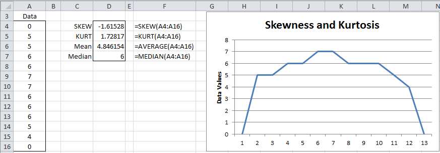
- Calculation of skewness and kurtosis in Excel
Descriptive Statistics Data Analysis Tool
Excel provides the Descriptive Statistics data analysis tool which produces a summary of the key descriptive statistics for a data set.
Example: Produce a table of the most common descriptive statistics for the scores in column A of Figure 15.

- Output from Descriptive Statistics data analysis tool
The output from the tool is shown on the right side of Figure 15. To use the tool, select Data > Analysis|Data Analysis and choose the Descriptive Statistics option. A dialog box appears as in Figure 16.

- Descriptive Statistics dialog box
Now click on Input Range and highlight the scores in column A (i.e. cells A3:A14). If you include the heading, as is done here, check Labels in first row. Since we want the output to start in cell C3, click the Output Range radio button and insert C3 (or click on cell C3). Finally click the Summary statistics checkbox and press the OK button.
Note had we checked the Kth Largest checkbox, the output would also contain the value for LARGE(A4:A14,k) where k is the number we insert in the box to the right of the label Kth Largest. Similarly, checking the Kth Smallest checkbox outputs SMALL(A4:A14,k). The Confidence Interval for Mean option generates a confidence interval using the t distribution as explained in chapter 7.
Graphical Representations of Data
Frequency Tables
When you have a lot of data, it can be convenient to put the data in bins, usually of equal size, and then create a graph of the number of data elements in each bin. Excel provides the FREQUENCY(R1, R2) array function for doing this where R1 = the input array and R2 = the bin array.
To use the FREQUENCY array function, enter the data into the worksheet and then enter a bin array. The bin array defines the intervals that make up the bins. E.g., if the bin array = 10, 20, 30, then there are 4 bins, namely data with values x ≤ 10, data with values x where 10 < x ≤ 20, data with values x where 20 < x ≤ 30, and finally data with values x > 30. The FREQUENCY function simply returns an array consisting of the number of data elements in each of the bins.
Example: Create a frequency table for the 22 data elements in the range A4:B14 of Figure 17 based on the bin array D4:D7 (the text "over 80" in cell D8 is not part of the bin array).

- Example of the FREQUENCY function
To produce the output, highlight the range E4:E8 (i.e. a column range with one more cell than the number of bins) and enter the formula
=FREQUENCY(A4:B11,D4:D7)
Since this is an array formula, you must press Ctrl-Shft-Enter. Excel now inserts frequency values in the highlighted range. Here E4 contains the number of data elements in the input range with value in the first bin (i.e. data elements whose value is ≤ 20). Similarly, E5 contains the number of data elements in the input range with value in the second bin (i.e. data elements whose value is > 20 and ≤ 40). The final output cell (E8) contains the number of data elements in the input range with value > the value of the final bin (i.e. > 80 for this example).
Histogram
A histogram is a graphical representation of the output from the FREQUENCY function described previously. You can use Excel’s chart tool to graph the output or alternatively you can use the Histogram data analysis tool to accomplish this directly.
To use Excel’s Histogram data analysis tool, you must first establish a bin array (as for the FREQUENCY function described previously) and then select the Histogram data analysis tool. In the dialog box that is displayed you next specify the input data (Input Range) and bin array (Bin Range). You can optionally include the labels for these ranges (in which case you check the Labels check box).
For the data in Figure 17, the Input Range is A4:B14 and the Bin Range is D4:D7 (with the Labels checkbox unchecked). The output is displayed in Figure 18.

- Example of the Histogram data analysis
Caution should be exercised when creating histograms to present the data in a clear and accurate way. For most purposes it is important that the intervals be equal in size (except for an unbounded first and/or last interval). Otherwise a distorted picture of the data may be presented. To avoid this problem generally equally-spaced intervals should be used.
Box Plots
Another way to characterize data is via a box plot. Specifically, a box plot provides a pictorial representation of the following statistics: maximum, 75th-percentile, median (50th-percentile), 25th-percentile and minimum.
As we shall see subsequently, box plots are especially useful when comparing samples and testing whether data is symmetric.
Example: Create box plots for the three brands shown in range A3:C13 of Figure 19 using Excel’s charting capabilities.

- Box Plot data
Select the range containing the data, including the headings (A3:C13). Now create the table in the range E3:H8. The output in column F corresponds to the raw data from column A. Column G corresponds to column B and column H corresponds to column C. In fact once you construct the formulas for the range F4:F8, you can fill in the rest of the table by highlighting the range F4:H8 and pressing Ctrl-R.
The formulas for the cells in the range F4:F8 are as follows:
Table 4: Formulas in the Box Plot table
Cell | Content |
|---|---|
F4 | =MIN(A4:A13) |
F5 | =QUARTILE(A4:A13,1)-F4 |
F6 | =MEDIAN(A4:A13)-QUARTILE(A4:A13,1) |
F7 | =QUARTILE(A4:A13,3)-MEDIAN(A4:A13) |
F8 | =MAX(A4:A13)-QUARTILE(A4:A13,3) |
Note that alternatively you can replace the QUARTILE function in Table 4 by the QUARTILE.EXC function.
Once you have constructed the table, you can create the corresponding box plot as follows:
- Select the data range E3:H7. Notice that the headings are included on the range, but not the last row.
- Select Insert > Charts|Column > Stacked Column
- Select Design > Data|Switch Row/Column if necessary so that the x axis represents the brands
- Select the lowest data series in the chart (i.e. Min) and set fill to No fill (and if necessary set border color to No Line) to remove the lowest boxes. This is done by right clicking on any of the three Min data series boxes in the chart and selecting Format Data Series… On the resulting dialog box, choose Fill|No fill.
- Repeat the previous steps for the lowest visible data series (i.e. Q1-Min); i.e. right click on the Q1-Min data series and select Format Data Series… > Fill|No fill. Alternatively right click on the Q1-Min data series and press Ctl-Y.
- With the Q1-Min data series still selected, choose Layout > Analysis|Error Bars > More Error Bar Options. On the resulting dialog box (Vertical Error Bars menu), click on the Minus and Percentage radio buttons and insert a percentage error of 100%.
- Click on the Q3-Med data series (the uppermost one) and choose Layout > Analysis|Error Bars > More Error Bar Options. On the resulting dialog box (Vertical Error Bars menu), click on the Plus and Custom radio buttons and then click on the Specify Value button. Now specify the range F8:H8, i.e. the last row of the table you created previously, in the dialog box that appears (in the Positive Error Values field).
- Remove the legend by selecting Layout > Labels|Legend > None.
The resulting box plot is

- Box Plot
For each sample, the box plot consists of a rectangular box with one line extending upward and another extending downward (usually called whiskers). The box itself is divided into two parts. In particular, the meaning of each element in the box plot is described in Table 5.
Table 5: Box Plot Elements
Element | Meaning |
|---|---|
Top of upper whisker | Maximum value of the sample |
Top of box | 75% percentile of the sample |
Line through the box | Median of the sample |
Bottom of the box | 25% percentile of the sample |
Bottom of the lower whisker | Minimum of the sample |
From the box plot (see Figure 20) we can see that the scores for Brand C tend to be higher than for the other brands and those for Brand B tend to be lower. We also see that the distribution of Brand A is pretty symmetric at least in the range between the 1st and 3rd quartiles, although there is some asymmetry for higher values (or potentially there is an outlier). Brands B and C look less symmetric. Because of the long upper whisker (especially with respect to the box), Brand B may have an outlier.
The approach described in this section works perfectly for non-negative data. When a data set has a negative value, you need to add -MIN(R) to all the data elements where R is the data range containing the data. This will shift the y-axis up by –MIN(R). E.g., if R ranges from -10 to 20, the range described in the chart will range from 0 to 30.
We can also convert the box plot to a horizontal representation of the data (as in Figure 21) by clicking on the chart and selecting Insert > Charts|Bar > Stacked Bar.

- Horizontal Box Plot
Outliers
One problem that we face in analyzing data is the presence of outliers, i.e. a data element that is much bigger or much smaller than the other data elements.
For example, the mean of the sample {2, 3, 4, 5, 6} is 4, while the mean of {2, 3, 4, 5, 60} is 14.4. The appearance of the 60 completely distorts the mean in the second sample. Some statistics, such as the median, are more resistant to such outliers. In fact, the median for both samples is 4. For this example it is obvious that 60 is a potential outlier.
One approach for dealing with outliers is to throw away data that is either too big or too small. Excel provides the TRIMMEAN function for dealing with this issue.
TRIMMEAN(R, p) – calculates the mean of the data in the range R after first throwing away p% of the data, half from the top and half from the bottom. If R contains n data elements and k = the largest whole number ≤ np/2, then the k largest items and the k smallest items are removed before calculating the mean.
Example: Suppose R = {5, 4, 3, 20, 1, 4, 6, 4, 5, 6, 7, 1, 3, 7, 2}. Then TRIMMEAN(R, 0.2) works as follows. Since R has 15 elements, k = INT(15 * .2 / 2) = 1. Thus the largest element (20) and the smallest element (1) are removed from R to get R′ = {5, 4, 3, 4, 6, 4, 5, 6, 7, 1, 3, 7, 2}. TRIMMEAN now returns the mean of this range, namely 4.385 instead of the mean of R which is 5.2.
Missing Data
Another problem faced when collecting data is that some data may be missing. For example, in conducting a survey with ten questions, perhaps some of the people who take the survey don’t answer all ten questions.
The principal way Excel deals with missing data is to ignore the missing data elements. E.g., in the various functions in this chapter (AVERAGE, VAR.S, RANK, etc.) any blank or non-numeric cells are simply ignored.
- 1800+ high-performance UI components.
- Includes popular controls such as Grid, Chart, Scheduler, and more.
- 24x5 unlimited support by developers.