
Statistics Using Excel Succinctly®

CHAPTER 10
Correlation and Covariance
Basic Definitions
The sample covariance between two sample random variables x and y is a measure of the linear association between the two variables and is defined by the formula
covx,y= i=1nxi-xyi-yn-1
The covariance is similar to the variance, except that the covariance is defined for two variables (x and y) whereas the variance is defined for only one variable. In fact, cov(x, x)=var(x).
The correlation coefficient between two sample variables x and y is a scale-free measure of linear association between the two variables, and is defined by the formula
r=covx,ysxsy
If necessary we can write r as rxy to explicitly show the two variables. We also use the term coefficient of determination for r2.
If r is close to 1 then x and y are positively correlated. A positive linear correlation means that high values of y are associated with high values of x, and low values of y are associated with low values of x.
If r is close to -1 then x and y are negatively correlated. A negative linear correlation means that high values of y are associated with low values of x, and low values of y are associated with high values of x.
When r is close to 0 there is little linear relationship between x and y, i.e. x and y are independent.
Scatter Diagram
To better visualize the association between two data sets x1, …, xn and y1, …, yn we can employ a chart called a scatter diagram (also called a scatter plot).
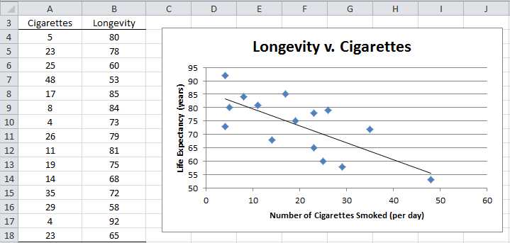
Example: A study is designed to check the relationship between smoking and longevity. A sample of 15 men 50 years or older was taken and the average number of cigarettes smoked per day and the age at death were recorded, as summarized on the left side of Figure 66. Create a scatter diagram to show the level of association between the number of cigarettes smoked and a person’s longevity.
- Scatter Diagram
This is done as follows:
- Highlight the range A4:B18.and select Insert > Charts|Scatter.
- The Design, Layout and Format ribbons now appear to help you refine the chart. At any time you can click on the chart to get access to these ribbons.
The resulting chart is shown on the right side of Figure 66, although initially the chart does not contain a chart title or axes titles. We add these as follows:
- To add a chart title click on the chart, select Layout > Labels|Chart Title and then choose Above Chart and enter the title Longevity v. Cigarettes.
- The title of the horizontal axis can be added in a similar manner by selecting Layout > Labels|Axis Titles > Primary Horizontal Axis Title > Title Below Axis and entering Number of Cigarettes Smoked (per day).
- The title of the vertical axis is added by selecting Layout > Labels|Axis Titles > Primary Vertical Axis Title > Rotated Title and entering the Life Expectancy (years)
- The default legend is not particularly useful and so you can delete it by selecting Layout > Labels|Legend > None.
Also since the smallest value of Longevity is 53, the chart will display better if we raise the horizontal axis. This is done as follows:
- Double click on the vertical axis (0 to 100). The Format Axis dialog box will appear as shown in Figure 67. Make sure the Axis Options tab is selected and change the Maximum field from Auto to Manual and then enter the value 50. Click on the Close button.
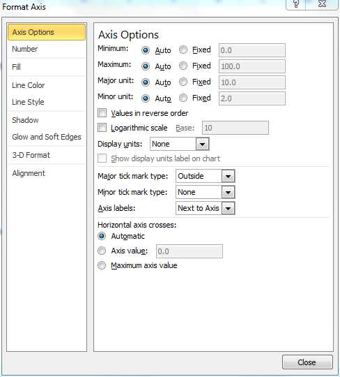
- Format Axis dialog box
Finally we add the straight line that best fits the data points as follows:
- Select Layout > Analysis|Trendline > Linear Trendline
If desired you can move the chart within the worksheet by left clicking on the chart and dragging it to the desired location. You can also resize the chart, making it a little smaller or bigger, by clicking on one of the corners of the chart and dragging the corner to change the dimensions. To ensure that the aspect ratio (i.e. the ratio of the length to the width) doesn’t change it is important to hold the Shift key down while dragging the corner.
It appears from the scatter diagram in Figure 66 that there is a negative linear correlation between longevity and cigarette smoking.
Excel Functions
Excel supplies the following worksheet functions for ranges R1 and R2 with the same number of elements:
COVARIANCE.P(R1, R2) = the population covariance between the data in range R1 and the data in range R2.
COVARIANCE.S(R1, R2) = the sample covariance between the data in range R1 and the data in range R2.
CORREL(R1, R2) = the correlation coefficient between the data in range R1 and the data in range R2.
RSQ(R1, R2) = the coefficient of determination between the data in ranges R1 and R2; this is equivalent to the formula =CORREL(R1, R2) ^ 2.
Note that no distinction needs to be made between the population and sample correlation coefficients since they have the same values.
COVARIANCE.P and COVARIANCE.S are only valid in versions of Excel starting with Excel 2010. For previous releases, Excel only supplies a function for the population covariance, namely COVAR(R1, R2), which is equivalent to COVARIANCE.P. The sample covariance can be calculated using the formula
=n * COVAR(R1, R2) / (n – 1)
where n = the number of elements in R1 (or R2).
For the data shown in Figure 66, the covariance is -97.44 and the correlation coefficient is -0.71343. These values are calculated by the formulas
=COVARIANCE.S(A4:A18,B4:B18)
=CORREL(A4:A18,B4:B18)
Excel Functions with Missing Data
Note that in computing CORREL(R1, R2) (or any of the covariance functions described in this chapter), any pairs for which one or both of the elements in the pair are non-numeric are simply ignored.
Example: Calculate the correlation between smoking and longevity based on the data in Figure 68.
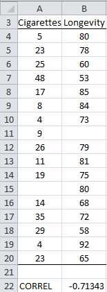
- Correlation coefficient with missing data
The data in Figure 68 is identical to that in Figure 66 except that two sample elements have been added (in rows 11 and 15) where one of the elements in the pair is blank. Since these elements are ignored, =CORREL(A4:B20) yields the value -.71343, the same as we calculated from the data in Figure 66.
Hypothesis Testing
It would be useful to know whether there is a significant correlation between smoking and longevity. A correlation of 0 would indicate that smoking and longevity are independent (i.e. no association exists). Since the observed correlation coefficient of -.71343 is pretty far from 0, it appears from the data that there is a negative correlation, but we would like to know whether or not this is significant or due to random effects.
It turns out that when the population correlation is 0, written ρ = 0 (i.e. x and y are independent), then for sufficiently large values of the sample size n, the sample correlation r will be approximately normally distributed, and so we can use a t test with n – 2 degrees of freedom where
t= rsr and sr=1-r2n-2
Here sr is the standard error of r.
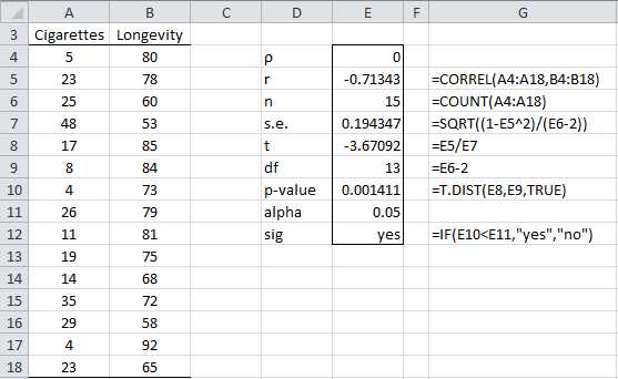
Example: Determine whether there is a significant correlation between smoking and longevity.
The analysis is shown in Figure 69.
- Hypothesis testing of the correlation coefficient
Based on the results in Figure 69 (p-value = 0.001411 < .05 = α) we reject the null hypothesis that ρ = 0, and conclude that there is a significant correlation between smoking and longevity. It is important to note that such a correlation doesn’t imply that we can claim that smoking causes lower longevity. For example, perhaps there is some other factor that causes a person to smoke and to have a shorter life expectancy.
If ρ ≠ 0, then the approach described previously won’t work since even for large values of n, the sample correlation r is not approximately normally distributed. Fortunately there is a transformation of the correlation coefficient which will address this defect.
For any r define the Fisher transformation of r as follows:
r'=12ln1+r1-r=ln1+r-ln1-r2
For n is sufficiently large, the Fisher transformation r' of the correlation coefficient r for samples of size n has a normal distribution with standard deviation
sr'=1n-3
Excel provides functions that calculate the Fisher transformation and its inverse.
FISHER (r) = .5 * LN((1 + r) / (1 – r))
FISHERINV(z) = (EXP(2 * z) – 1) / (EXP(2 * z) + 1)
Example: Test whether the correlation coefficient for the data in Figure 66 is significantly different from -0.5.
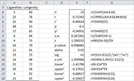
- Hypothesis testing using the Fisher transformation
From Figure 70, we see that there is no significant difference between the population correlation coefficient and -.5 (p-value = 0.098485 > .05 = α). While this is not particularly useful information, the calculation of the 95% confidence interval for the population correlation coefficient is. This confidence interval is calculated as follows:
ρ'=r'±zcrit∙s.e.
ρlower=FISHERINVρlower' ρupper=FISHERINV(ρupper')
We see that the 95% confidence interval is (-.889,-.354). Note that 0 doesn’t lie in this interval, once again demonstrating that the correlation coefficient is significantly different from 0 (as already shown previously). Since -.5 is in this interval, we can’t rule out that the actual mean value of the correlation coefficient is -.5 (with 95% confidence).
Data Analysis Tools
Excel provides the Correlation data analysis tool to calculate the pairwise correlation coefficients for a number of variables.
Example: Calculate the pairwise correlation coefficients and covariance for the data in Figure 71.
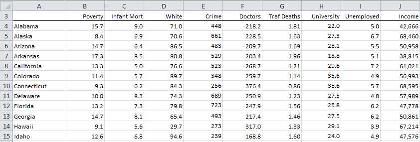
- Sample data
We use Excel’s Correlation data analysis tool by pressing Data > Analysis | Data Analysis and selecting Correlation from the menu that is displayed. The dialog box shown in Figure 72 appears.
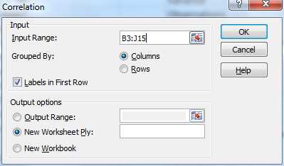
- Dialog box for the Correlation data analysis tool
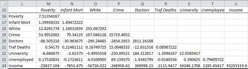
Using Excel’s Correlation data analysis tool we can compute the pairwise correlation coefficients for the various variables shown in the table in Figure 71. The results are shown in Figure 73.
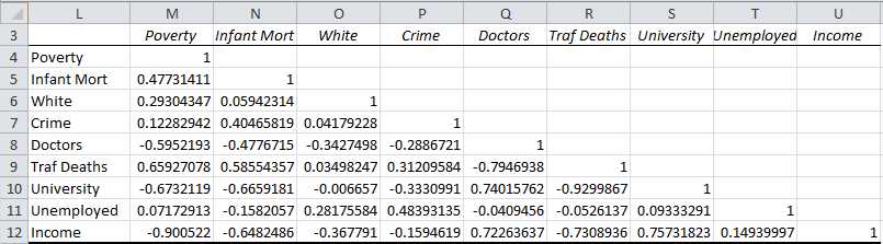
- Pairwise correlation coefficients
Similarly we use Excel’s Covariance data analysis tool to obtain the covariances as shown in Figure 74.
- Pairwise covariances
- 1800+ high-performance UI components.
- Includes popular controls such as Grid, Chart, Scheduler, and more.
- 24x5 unlimited support by developers.