
Statistics Fundamentals Succinctly®

CHAPTER 2
Variability
Calculate measures of spread
While measures of center describe where values in a data set gather, measures of spread describe a data set’s variability (how spread out values are).
Consider this simple example that illustrates why we might want to know variability in the real world—the task of deciding which clothes to bring on your vacation. Let’s say the average temperature in your destination city is 74°F. Based on this number alone, you would probably bring only shorts and T-shirts. But what if the high is 102°F and the low is 34°F? After knowing this range, you would probably want to bring a coat and a bathing suit as well.
Throughout this chapter you’ll learn common methods to measure spread.
Range
In the temperature example, the range is a useful measure of spread. To calculate it, subtract the minimum value from the maximum value: 102°F – 34°F = 68°F. That’s a pretty big difference in temperature! Range is the simplest measure of spread. It can tell part of the story, but, like many statistics in isolation, range can sometimes be deceiving.
For example, let’s say you want to buy a house. You analyze the property values of other houses in the area and find that in one particular neighborhood, the houses have the following values:
$355,000
$299,995
$323,500
$286,350
$333,290
$410,280
$810,975
The range is pretty large ($810,975-$286,350 = $324,625). You can see from looking at the data that one of the houses has a much larger property value than the others ($810,975) and that the other property values are in the $200K-$400K range. So, rather than using a simple range as a measure of spread, you might consider the interquartile range (IQR).
IQR
We know now that the median splits the data in half. Using this same method, we can split the data into fourths, so that 25% of the data is less than the first value, 25% is between the first and second value, 25% is between the second and third value, and 25% is greater than the third value. In doing this, we will find three values we’ll use to calculate the IQR.
The first value is called the first quartile, abbreviated Q1; the second value is the median, also known as the second quartile and abbreviated Q2; and the third value is the third quartile, abbreviated Q3. The difference between Q3 and Q1 (in other words, the middle 50% of the data set) is the IQR, and statisticians often calculate this in order to reduce the impact that outliers can have on the range calculation.
To make this calculation, we need to place the values in numerical order.
After ordering the data, we first find the median. Then, we find the median of each half of the data (Q1 and Q3). Note that the calculation of Q1 and Q3 do not include the median value.
Table 1: The data set we’ll use to find the IRQ for a range of neighborhood housing prices.
Quartile | House Value |
$286,350 | |
Q1 | $299,995 |
$323,500 | |
Q2 | $333,290 |
$410,280 | |
Q3 | $355,000 |
$810,975 |
In this example, IQR = Q3–Q1 = $355,000 - $299,995 = $55,005.
Outliers are formally defined as any values that are either less than Q1 - 1.5(IQR) or greater than Q3 + 1.5(IQR). In this case, a value is an outlier if it is less than $299,995 – 1.5($55,005) = $217,487.5 or greater than $355,000 + 1.5($55,005) = $437,507.5. In this case, the only outlier is $810,975. Outliers are represented by dots on a box plot.
A box plot visualizes where the minimum and maximum values, Q1, Q2, Q3, and any outliers are in relation to each other. Note that the minimum and maximum values are the smallest and largest values that are not considered outliers.
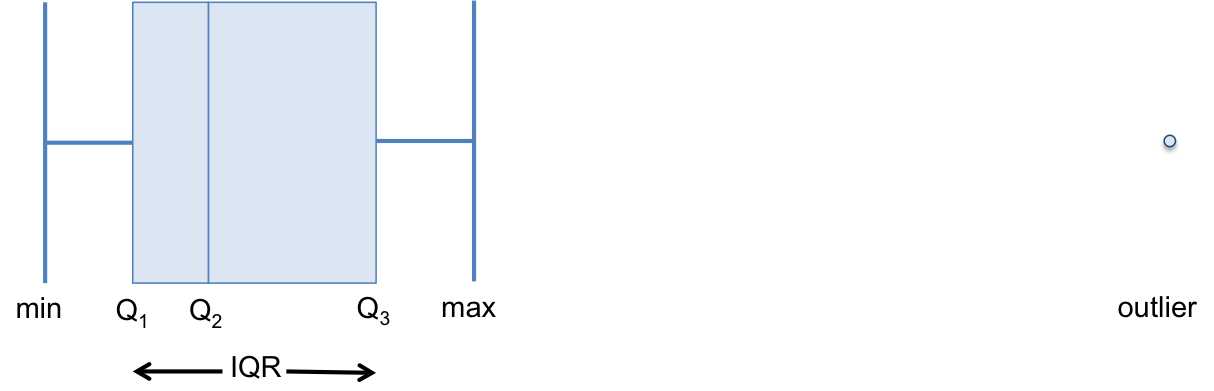
Figure 4: Box plots visualize where the minimum value, first quartile (cutoff of smallest 25% of values), second quartile (i.e. median), third quartile (cutoff of largest 25% of values), maximum value, and outliers are in relation to each other.
You’ll now use R to find the minimum value, first quartile, second quartile, third quartile, and maximum value in order to graph a box plot.
Code Listing 3
> summary(income2011) #outputs the min, Q1, Q2, Q3, max, and mean Min. 1st Qu. Median Mean 3rd Qu. Max. 0 10000 24000 27300 38000 250000 > boxplot(income2011) #creates a box plot
> IQR(income2011) #calculates the IQR [1] 28000 |

The IQR can be a useful statistic for spread, but notice that the IQR only takes two values (Q1 and Q3) into account. In other words, any of the other values can change (as long as they remain between or outside Q1 and Q3—whatever they were originally) and the IQR will stay the same.
Therefore, we tend to use the standard deviation, which takes every value in the data set into account, more commonly than the IQR.
Standard deviation
Before learning what the standard deviation is or how it’s calculated, let’s first consider how we might use every value in a data set to compute a single statistic that measures spread.
Consider this sample data set: {11, 10, 4, 12, 15, 8, 14, 6}.
Now look at each individual value’s deviation from the mean (i.e. the distance between each value and the mean, equal to ![]() ). For this data set, the mean (
). For this data set, the mean (![]() ) is 10.
) is 10.
Table 2: Finding each individual value’s deviation from a mean of 10.
xi |
|
11 | 1 |
10 | 0 |
4 | -6 |
12 | 2 |
15 | 5 |
8 | -2 |
14 | 4 |
6 | -4 |
You can calculate the average deviation to find the average difference that a value lies from the mean. Makes sense, right? However, if you calculate the average deviation, you get 0. You can see that algebraically the sum of the deviations is equal to 0 (and therefore the average is 0 as well):
![]()
And we know that S(nxi - Sxi) = 0 because

The average deviation is equal to 0, so it isn’t much help as a statistic for spread. To solve this problem, you could use the average absolute deviation, where each absolute deviation is ![]() . (The notation || takes the absolute value of a number.)
. (The notation || takes the absolute value of a number.)
Table 3: The average absolute deviation is found using the data set: {11, 10, 4, 12, 15, 8, 14, 6}
and each absolute deviation.
xi |
|
11 | 1 |
10 | 0 |
4 | 6 |
12 | 2 |
15 | 5 |
8 | 2 |
14 | 4 |
6 | 4 |
If you take the average absolute deviation, you get 3. So the average distance of each value from the mean is 3.
The average absolute deviation works as a measure of spread, but the standard deviation is used more commonly. Instead of taking the absolute value of each deviation, with the standard deviation we square each deviation (remember that squaring a number will always produce a positive value), find the average squared deviation, and then take the square root. If we look at just one of the values in the data set (6), we can visualize the deviation and squared deviation.
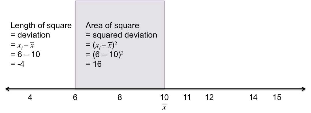
Figure 5: This figure visualizes the deviation ![]() by the side length of the square, and the squared deviation
by the side length of the square, and the squared deviation ![]() by the area of the square.
by the area of the square.
If we calculate each squared deviation and take the average, we get a measure of spread called the variance (s2). In our example, the variance is 12.75.

The numerator of the expression for variance is often referred to as the sum-of-squares (SS). This should make sense, as this is the sum of each squared deviation.
If we take the square root of the variance, we get the standard deviation (s):

Essentially, this is finding the side length of the average squared deviation.
Using Figure 6, we can visualize each value in the data set (4, 6, 8, 10, 11, 12, 14, 15), the mean (10), each squared deviation (purple squares), the variance (orange square), and the standard deviation (side length of the orange square).

Figure 6: This figure visualizes each deviation from the mean (10) by the side lengths of each square; each squared deviation by the area of each square; and the average squared deviation by the orange square.
Let’s calculate the standard deviation in our example.
Table 4: The standard deviation is found using the data set, the absolute deviation, and
the square of each absolute deviation.
xi |
|
|
11 | 1 | 1 |
10 | 0 | 0 |
4 | 6 | 36 |
12 | 2 | 4 |
15 | 5 | 25 |
8 | 2 | 4 |
14 | 4 | 16 |
6 | 4 | 16 |

So, here the standard distance between each value and the mean is 3.57.
This calculation for standard deviation is used for a population (i.e. when we have all values of a certain variable). However, often we don’t have data for the entire population, so we have to use a sample (a smaller subset) to draw conclusions. Frequently, the sample will have a smaller variance than the population because randomly chosen values are likely to be closer to the measures of center. Therefore, to better approximate s (the standard deviation of the population), we subtract 1 from the denominator to make the whole calculation slightly larger. We denote this approximation s, and refer to it as the sample standard deviation.

By default, R calculates the sample standard deviation. However, you can calculate the population standard deviation with simple algebra.
Code Listing 4
> sqrt(sum((income2011-mean(income2011))^2)/length(income2011)) [1] 24531.3 > sd(income2011) #outputs the sample standard deviation (s) [1] 24532.78 |
The standard deviation and sample standard deviation are used for a variety of statistical tests that enable you to draw conclusions and make decisions based on what the data tells you. You’ll begin learning these tests in Chapter 4, but for now you should know that the mean and the standard deviation can help you determine if a value is likely or unlikely to occur. If you know that most values in a data set are a certain distance from the mean, and you get a value that is a lot farther from the mean, you know something weird is going on.
Before getting into statistical testing, we’ll look into the shape of distributions—one more factor to consider when getting to know your data.
- 1800+ high-performance UI components.
- Includes popular controls such as Grid, Chart, Scheduler, and more.
- 24x5 unlimited support by developers.