
Statistics Fundamentals Succinctly®

CHAPTER 3
Distributions
Visualize the shape of data
Measures of center and spread tell part of the story. We also need to look at the shape of the distribution by creating histograms. Histograms are a special type of bar graph that shows the frequency of values in a data set that lie between evenly spaced intervals. A distribution, on the other hand, is a theoretical curve that models a histogram’s shape. We can use these curves to calculate estimated probabilities on which to base our conclusions.
We’ll now look at examples of normal, uniform, skewed, and bimodal distributions. One of the most important is the normal distribution.
Normal distribution
In a perfectly normal distribution, the mean, median, and mode are equal, and they are exactly in the middle of the data set, with frequencies symmetrical (the same number of values occurs on either side of the median). While real-life data sets are never perfectly normally distributed, we can model them with a theoretical normal curve.

Figure 7: The normal distribution (depicted by the black curve) can be used to model relatively normal data sets (visualized by the green histogram).
This curve has the equation

where m is the mean and s is the standard deviation.
The area under the normal curve is equal to the probability; thus, the total area under the curve is equal to 1. This should make sense intuitively if you look at the histogram. Using Figure 7 as an example, what is the probability that if you randomly select a value in the data set, it will be in one of the bins depicted by the green bars? The probability is 100%.
Now a slightly more complex question: How would you calculate the probability of randomly selecting a value from the data set that is in one of the five leftmost bins? You would sum the frequency of values in each of those bins and divide by the total frequency. Do you see now why the area under the normal curve is the probability? Therefore, the equation for the curve that models a data set’s distribution is called the probability density function (PDF).
A perfectly normal distribution with m = 6 and s = 2.1 has the following equation for its PDF:
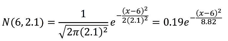
If we graph this, we get Figure 8.
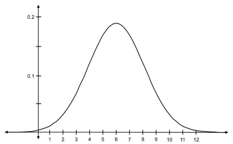
Figure 8: This curve is the PDF for a normal distribution with a mean of 6 and a standard deviation of 2.1.
Let’s look at the probability of randomly choosing a value that is less than 4: ![]()
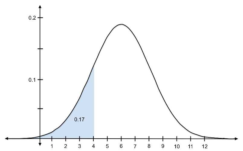
Figure 9: The probability of randomly selecting a value less than 4 from a distribution with ![]() = 6 and s = 2.1 is 0.17.
= 6 and s = 2.1 is 0.17.
Here is the probability of randomly choosing a value between 5 and 8: ![]()
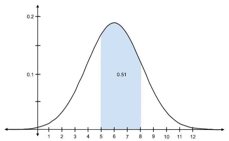
Figure 10: The probability of randomly selecting a value between 5 and 8 from a distribution with ![]() = 6 and s = 2.1 is 0.51.
= 6 and s = 2.1 is 0.51.
We find these probabilities by integrating the PDFs. (For anyone who doesn’t remember calculus all too well, taking the integral is the opposite of taking the derivative. Integrating gives us a function that, when plugged into values of x, results in the cumulative area under the original curve up to x.) However, we don’t need to continue integrating each PDF in order to calculate probabilities. To make things easier on ourselves, we can standardize the normal distributions by converting each into a standard normal distribution with mean 0 and a standard deviation 1. This special normal distribution is denoted N(0,1). If we replace m and s, we get:

We then use a special table that gives us cumulative probabilities under the standard normal curve. You will learn how to standardize normal distributions and calculate probabilities in Chapter 4.
In this e-book, we'll focus on normal distributions, but first let’s explore some other common distributions.
Uniform distribution
Data is uniformly distributed when the probability of randomly selecting a particular value is about the same as that for another value. In other words, when the frequency in each bin is the same. Therefore, the theoretical uniform distribution is perfectly horizontal.
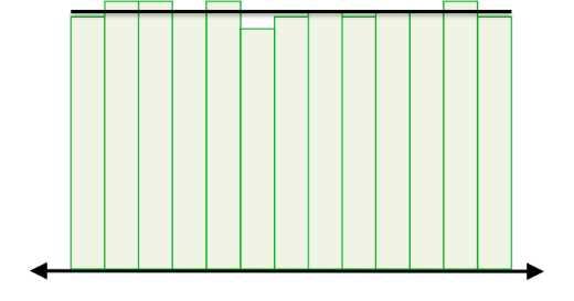
Figure 11: This is a uniform distribution because the frequency in each bin remains relatively constant.
The equation is written as ![]() , where
, where ![]() is the minimum value and b is the maximum value.
is the minimum value and b is the maximum value.
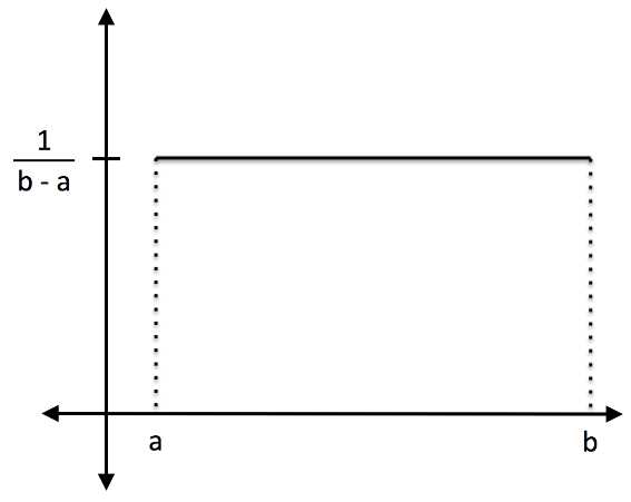
Figure 12: This line is the PDF for a uniform distribution with minimum a and maximum b.
You can see from looking at the uniform distribution that the area under the curve is 1. The probability of randomly selecting a value less than q is:
![]()
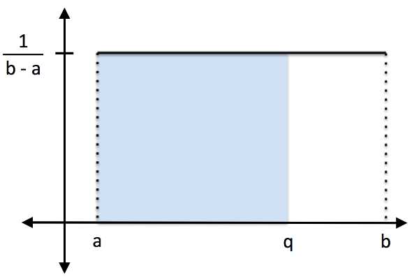
Figure 13: The probability of randomly selecting a value less than q from a uniform distribution with minimum a and maximum b is (q-a)/(b-a).
The outcomes of rolling a die offer a good example of a uniform distribution. Each number has an equal probability of being selected, so if you rolled 600 times, you should get around 100 of each value (unless of course, the die was rigged).
Skewed and bimodal distributions
Skewed and bimodal distributions are also very common. Income is one example of a heavily skewed distribution—the wealthiest 10% of Americans own 75% of all wealth in America.[1]
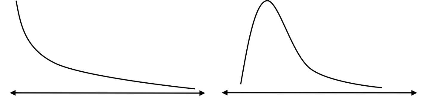
Figure 14: Skewed distributions have the highest frequencies occurring on one end of the range.

Figure 15: Bimodal distributions have the highest frequencies occurring in two areas of the range.
Visualizing data and calculating descriptive statistics (measures of center and spread) are important precursors to any analysis. Most of the statistical analyses presented here is used when we have normally distributed data, but in Chapters 5 and 6 you’ll also learn how to draw conclusions about samples drawn from data of any distribution.
- 1800+ high-performance UI components.
- Includes popular controls such as Grid, Chart, Scheduler, and more.
- 24x5 unlimited support by developers.