
SQL Server Analysis Services Succinctly®

CHAPTER 7
Using Client Tools
The whole point of creating an Analysis Services database is to allow users to query the cube to quickly get answers to business questions. In this chapter, I introduce you to the tools in the Microsoft Business Intelligence stack and show you how to connect to Analysis Services using each of these tools. I also describe the key classes in the ADOMD.NET library that you can use to create your own client tool.
Tools in the Microsoft Business Intelligence Stack
You can use a variety of tools in the Microsoft Business Intelligence stack to query an Analysis Services database. Some tools are intended primarily for reporting the data from a cube with minimal interaction from the user, whereas other tools are intended primarily for exploring the cube. In this section, I explain the basics for connecting the following tools to a cube and displaying its data:
- Microsoft Excel
- Microsoft SQL Server Reporting Services
- Microsoft SharePoint Server
Microsoft Excel
Excel is a popular tool among business analysts who are often already familiar with its features. After connecting to a cube, pivot tables and pivot charts facilitate exploration of the data in a cube without requiring knowledge of the MDX query language.
To connect to a cube in an open Excel workbook, click Get External Data on the Data tab of the ribbon, click From Other Sources, and then select From Analysis Services. In the Data Connection Wizard, type the Analysis Services server name and provide credentials if you are not using Windows Authentication to connect with your own account. On the next page of the wizard, select the database in the drop-down list and then select the cube to query in the list of cubes and perspectives, as shown in Figure 93. On the final page of the wizard, change the file name and provide a friendly name if desired, and save the Office Data Connection (ODC) file to your local machine or use the Browse button to save it to a network or a SharePoint data connections library.
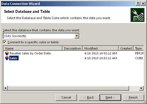
- Analysis Services Data Connection in Excel
Note: Although these instructions and screenshots are specific to Excel 2013, similar functionality is available in Excel 2007 and Excel 2010.
In the Import Data dialog box that appears, you can choose to create a PivotTable Report, a PivotChart, or a Power View Report. For this example, let’s say you want to create a PivotTable. On the right side of the screen, the PivotTable Fields list is displayed with measures organized by measure group at the top of the list. You can scroll through the list to locate dimensions, with user-defined hierarchies listed first and attribute hierarchies listed under the More Fields folder. You add fields to the report by selecting the field’s check box. As you make your selections, measures are displayed in the Values area, non-date attributes are displayed in the Rows area, and date attributes are displayed in the Columns area, as shown in Figure 94. If you want to add a filter, you must drag the field from the field list to the Filters area.
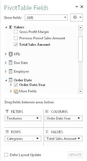
- PivotTable Fields List in Excel
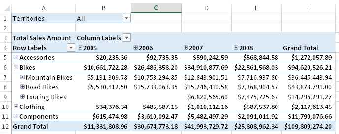
As you make selections (unless you select the Defer Layout Update check box at the bottom of the fields list), a query executes to retrieve data from the cube and display the results according to the layout you define in the fields list. If you add a user-defined hierarchy to rows or columns, you can click the plus sign next to a label to view the data in the level below, as shown in Figure 95. If you add a filter to the report, you can use the filter’s drop-down list above the pivot table to make a new selection and update the contents of the report.
- PivotTable Fields List in Excel
Tip: You can add multiple fields to the Filters, Columns, Rows, or Values area of the layout section in the PivotTable Fields List. After adding a field to the layout section, you can also drag it to a different area to rearrange the report layout.
Microsoft SQL Server Reporting Services
Reporting Services is a business intelligence component included as part of SQL Server to support the reporting life cycle, from report development to management to user access. Although reports can be interactive, either by allowing users to filter content through changing report parameter values or to drill from summary to detail data in the same or separate reports, reports are much more static and less interactive than with an exploratory tool like Excel. You must plan in advance the type of interactivity you want to support, and then explicitly build that interactivity.
On the other hand, Power View in SharePoint is a new feature in the latest version of Reporting Services in SharePoint integrated mode that supports interactive, ad hoc reporting. The initial release did not support connections to Analysis Services in multidimensional mode, but SQL Server 2012 Service Pack 1 Cumulative Update 4 adds this capability. However, Power View in Excel 2013 is not currently compatible with multidimensional Analysis Services.
To create reports that can be published to a Reporting Services server, you can use either of two tools: Report Designer in SSDT or Report Builder. Report Designer is a tool intended for the professional report developer who often works with multiple reports at once, whereas Report Builder is intended for the less technically savvy user who works with one report at a time. You can access Report Designer by creating a report server project in SSDT, but you download Report Builder from the Report Manager web application (typically at http://<server>/reports). Working with the layout in each environment is similar, but the user interface differs slightly between the two. In Report Designer, you use menus, toolbars, and a toolbox to perform commands and work with report items, but in Report Builder you use a ribbon interface much like you do in Office products. Report Builder also includes several wizards to walk you through the process of building items in a report.
Note: This section includes only basic information for connecting to Analysis Services as a data source. Report development in Reporting Services is covered in more detail in the Windows Azure SQL Reporting Succinctly e-book available from Syncfusion. Although the focus of the e-book is the Windows Azure version of reporting, the functionality described for report development also applies to the on-premises version of SQL Server Reporting Services.
Report Designer
To create a new report in Report Designer, right-click the Reports folder of a report server project in the Solution Explorer window, point to Add, and then click New Item. In the Report Data folder, right-click the Data Sources folder and select Add Data Source. In the Data Source Properties dialog box, provide a name for the data source, select Microsoft SQL Server Analysis Services in the Type drop-down list, and provide a connection string (or use the Edit button to open the user interface to generate the connection string), as shown in Figure 96.
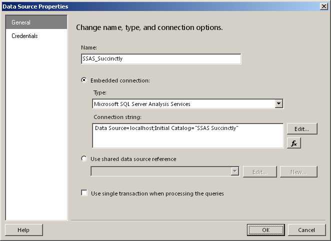
- Analysis Services Data Connection in Report Designer
Next, create a dataset to hold the query definition. Right-click the Datasets folder in the Report Data pane, and select Add Dataset. In the Dataset Properties dialog box, select the Use A Dataset Embedded In My Report radio button, select the data source in the drop-down list, and click Query Designer. In the Query Designer, you can select a different perspective or cube by clicking the ellipsis button in the top left corner and changing the current selection. Then you can drag items from the metadata panel on the left into the query data panel on the right (if you have a simple query), as shown in Figure 97. You can add a dimension to the filter pane at the top of the query designer, and select the Parameters check box at the far right of the row to allow the user to interactively change the filter value at report run-time.
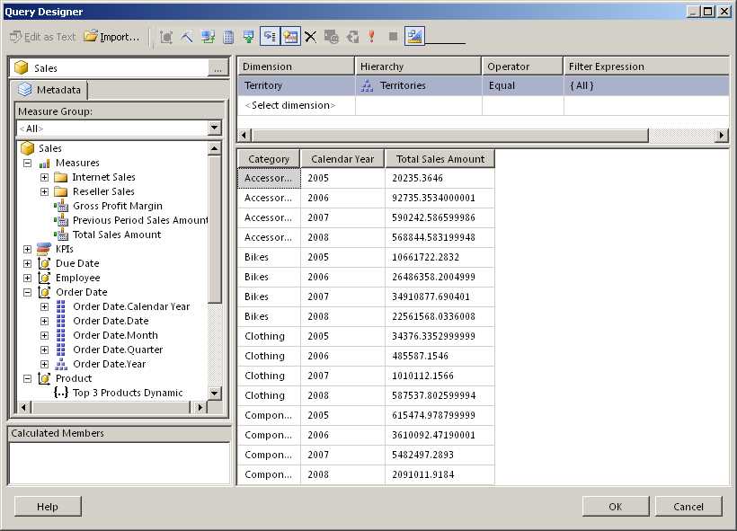
- Analysis Services Query Designer
Tip: You can click the last button in the Query Designer toolbar to switch the design mode from graphical to text. In text design mode, you can write the MDX query to generate the desired results. However, unlike an MDX query that you can write in SSMS or other third-party tools, your query must reference only measures on the COLUMNS axis. You can use non-measure dimensions only on the ROWS axis of your query.more.
After creating the dataset, you can design the report layout. For example, you can create a chart from the cube data by dragging the Chart report item from the toolbox to the report design surface. Select a chart type, such as a column chart, and then click the chart placeholder that appears on the design surface to open the Chart Data pane. Click the plus sign that appears in each section of the Chart Data pane to assign a field to that section, as shown in Figure 98. Click the Preview tab to execute the dataset query and view the rendered report. Further adjustments can be made to fine-tune the appearance of the chart, such as changing the chart and axis titles, changing the color palette of the chart, or resizing the chart, to name just a few options.
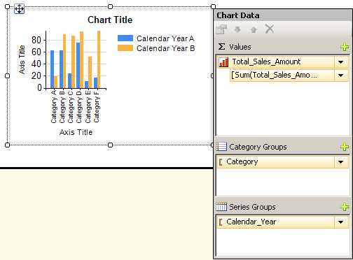
- Chart Report Item in Report Designer
Report Builder
After launching Report Builder, you can bypass the wizards prompting you to build a new report and develop a new report much like you can in Report Designer. You follow the same steps described in the previous section to add a new data source and a new dataset. Once the dataset is created, you can create any type of report item by using the Insert tab of the ribbon—a table, matrix, list, or chart, for example—and add fields from the dataset to that report item. To preview the report, click Run on the Home tab.
Power View in SharePoint
If you have a report server configured in SharePoint integrated mode, and have installed the required service pack, you can use Power View to interactively explore data in a multidimensional Analysis Services database. You can learn more about configuring the environment and working with Power View by reviewing the following TechNet article: SQL Server 2012 with Power View for Multidimensional Models.
Note: At the time of this writing, Power View for Multidimensional Models is available only as part of a cumulative update and distributed as a hotfix. Accordingly, it may not be suitable for a production environment until it is released in the next service pack for SQL Server 2012.
Microsoft SharePoint Server
SharePoint Server 2013 (like its predecessors SharePoint Server 2010 and Microsoft Office SharePoint Server 2007) includes several business intelligence features that support connections to Analysis Services:
- Excel Services
- Dashboard Filters
- PerformancePoint Services
Excel Services
You can publish an Excel workbook containing pivot tables and pivot charts to SharePoint to enable multiple users to interact with the same workbook. In SharePoint Server 2013, much of the same interactivity available in the desktop client application is also available in the browser. In earlier versions of SharePoint, users can only drill, filter, or sort, but cannot change the contents of the pivot table or pivot chart.
When creating an Excel workbook that you intend to publish, it is a good idea to publish the ODC file associated with the Analysis Services connection to SharePoint as a separate file rather than embed the connection information in the workbook. To modify the connection, click Connections on the Data tab of the ribbon, select the applicable connection, and then click Properties. In the Connection Properties dialog box, click the Definition tab, and then click Export Connection File. In the File Save dialog box, type the URL for the Data Connections library in the File Name box, press Enter, and then type a name for the ODC file to save it. A Web File Properties dialog box is displayed asking for a title, description, and keywords for the ODC file. After you save the file, you can select the Always Use Connection File check box in the Connection Properties dialog box in Excel.
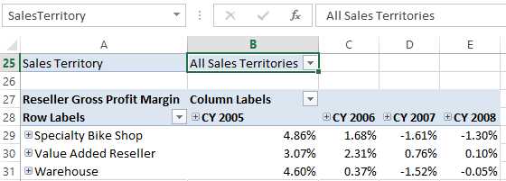
If a pivot table has a filter defined, you can convert the filter to a parameter so that you can connect it to a filter in a dashboard if necessary. To do this, click the workbook cell containing the filter value and then in the box to the left of the formula bar, replace the cell reference by typing a name for the cell, as shown in Figure 99.
- Cell Name Assignment
When you are ready to publish the workbook to Excel Services, click File > Save As > SharePoint, and then click Browse. Navigate to the document library in which you want to store the workbook, type a name for the workbook, but before you click Save, click Browser View Options in the Save As dialog box. In the Browser View Options, click the Parameters tab, click Add, and then select the check box next to the cell name you defined for the filter. This cell name becomes the parameter that you reference when you create a dashboard filter as described in the next section of this chapter.
Dashboard Filters
If you create a dashboard (also known as a Web Part Page) in SharePoint, you can combine content from various sources that in turn draw data from Analysis Services. For example, you might create a dashboard that includes any combination of Reporting Services reports, Excel workbooks, and PerformancePoint content such as scorecards, analytic charts, or analytic grids. If these items use Analysis Services multidimensional databases as a source, you can add an SQL Server Analysis Services Filter Web Part to the dashboard and thereby allow users to filter the related content with one selection.
Let’s assume that you have an existing dashboard in SharePoint 2013 with a Reporting Services report and an Excel workbook in it, both of which have the same Analysis Services database as a source, and you have permission to edit the dashboard. Also assume that both the report and the workbook have a parameter configured to filter by Sales Territory. Open the dashboard, click the Page button in the ribbon, and then click Edit Page. In one of the dashboard zones, click the Add a Web Part link, click Filters in the Categories list, select SQL Server Analysis Services Filter in the Parts list, and then click Add. To configure the filter, click the Open the Tool Pane link in the newly added Web Part. Assuming you do not have a Status List Web Part on the page, select SharePoint Data Connection Library as the data connection source, click the button to the right of the data connection text box, navigate to the Data Connections folder, select the ODC file associated with the Analysis Services database that the report and workbook have in common, and select Insert. If you don’t have an Analysis Services database yet, follow the instructions in the Microsoft Excel section of this chapter to create one and save it to the Data Connections folder in SharePoint.
In the Dimension drop-down list, select the Sales Territory dimension. Next, in the Hierarchy drop-down list, select the user-defined hierarchy or the attribute hierarchy that matches the hierarchy used in the report and workbook parameters, and then click OK to save the configuration and close the tool pane.
Your next step is to connect the filter to the report and workbook. To do this, click the arrow icon that appears in the top right corner of the Filter Web Part. (You might need to click the Web Part to display the icon.) In the submenu, point to Connections > Send Filter Values To, and then click the report title, as shown in Figure 100.

- Connection between Filter Web Part and Report Viewer Web Part
In the Configure Connection dialog box, select the parameter to which the filter value applies and click Finish. Repeat the previous steps to connect the filter to the workbook. In the case of the workbook, the dialog box that is displayed asks for a connection, which you should set as Get Values for Multiple Parameters. Click the Configure Connection tab in the dialog box, select the applicable parameter in the workbook, and click Finish. Click the Stop Editing button in the ribbon to finalize your changes, and then click the Browse button to review the finished dashboard. You can test the filter by clicking the icon to the right of the filter box and making a selection of one or more dimension members. When you click OK, the filter is applied to the report and the workbook.
PerformancePoint Services
PerformancePoint Services is a shared service application available in SharePoint that allows you to create scorecards and analytical reports that use Analysis Services data as a source. You can create a multipage dashboard in PerformancePoint Services that you can store in a SharePoint dashboard library or you can use Web Parts to display the scorecards and analytical reports in a standard SharePoint dashboard. You can learn more about working with PerformancePoint Services by reviewing Create Dashboards by using PerformancePoint Services (SharePoint Server 2013).
Regardless of the type of dashboard you want to create, you start by creating a data source object in PerformancePoint Services. To do this, click the PerformancePoint Content link in the Quick Launch panel on the left side of the SharePoint site, open the PerformancePoint tab on the ribbon, and click the Dashboard Designer button. On the Create tab of the Dashboard Designer ribbon, click Data Source, which is available only when you have the Data Connections folder selected in the Workspace Browser pane. Select the Analysis Services template and click OK. In the Connection Settings, type the server name, select the database in the drop-down list, and then select the cube in the next drop-down list.
Next, select an authentication method. Make sure the cube security grants read permission to the unattended service account for PerformancePoint Services if you keep the default setting here. Otherwise, you can set up an application ID to use Secure Store Service for the stored account option, or configure user security to use the per-user identity option. You can provide a name for the data source by editing the name in the Workspace Browser or by typing it in the Properties tab.
On the Time tab, you map the members of your Date dimension (called a Time dimension in most Microsoft products) to the standard references that PerformancePoint Services understands. Select the applicable dimension in the Time Dimension drop-down list. Then, click the Browse button in the Reference Member section and choose a date for the beginning of the year that exists in the Date dimension. Any year suffices. In the Hierarchy Level drop-down list, select the level to which the date you selected belongs. Next, in the Reference Date section, click the icon to use a calendar to find a date that corresponds to the dimension member you selected. Lastly, map each member level from your date dimension to a standard time aggregation description, such as Year, Quarter, Month, and so on. When finished, click the Save icon above the ribbon to store the data source in the PerformancePoint Services content library in SharePoint.
Now you’re ready to use the data source. Click PerformancePoint Content in the Workspace Browser. To create a scorecard using KPIs defined in the selected cube, click Scorecard on the Create tab of the ribbon and then select the Analysis Services template. In the wizard, select the data source you created, click Next, and then select the option to import the KPIs. Select the check box for each KPI to import and click Next. You can optionally add filters to modify the measures in the KPI and define members to display on the scorecard’s columns. A basic scorecard will be displayed when you complete the wizard.
You can expand the Dimensions node in the Details pane to locate dimensions to add to the scorecard. To achieve the result shown in Figure 101, drag the Categories user-defined hierarchy to the Gross Profit cell in the scorecard, but position the cursor toward the right edge of the cell to display the “Last child” tooltip, and then release the mouse button. In the Select Members dialog box, select the individual categories to include in the scorecard and click OK. On the Edit tab of the ribbon, click the Update button to display the KPI values by category. You can expand each category to drill down to the subcategory and then to the product level to view additional KPI values.
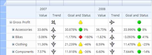
- Scorecard with Analysis Services KPIs
Note: If you get an error during the KPI import process, you might need to install the Microsoft Analysis Management Objects (AMO) from SQL Server 2008. If the version 10.0.0.0 of Microsoft.AnalysisServices does not exist in the Windows\assembly folder on the SharePoint server, you can download the AMO installer on the Microsoft SQL Server 2008 Service Pack 2 Feature Pack page after expanding the Install Instructions section. After installation completes successfully, open a command prompt as an administrator and run iisreset.
Tip: Notice that an item appears in the PerformancePoint Content folder for each KPI that you import. You can configure the format for the value, goal, and trend amounts by selecting the KPI and then clicking the respective Number Format cell in the editor.
You can also control whether a column displays an image, a value for trend or status, or a variance. Right-click the cell in the scorecard and select Metric settings on the Values page of the dialog box. You can specify the name of the metric, and the KPI amount—such as actual, target, trend, or variance—to display.
Another way to interact with an Analysis Services cube in PerformancePoint is to create an analytic chart or analytic grid. In fact, although you can use many different data source types for a scorecard, you can use only an Analysis Services data source for the analytic reports. The process to create either of these reports is similar. On the Create tab of the Dashboard Designer, select the button for the type of report you want to create. In the example that follows, I use Analytic Chart. Next, select the data source for Analysis Services. You then drag dimensions and measures to the Series, Bottom Axis, or Background areas below the report layout, as shown in Figure 102. For the Bottom Axis, the default report displays the All level of the hierarchy. To view the next level in the hierarchy, you must click the arrow icon next to the hierarchy name to display the Select Members dialog box, and then select the members to display. An alternative to explicitly selecting members is to right-click the All member and then click Select Children. That way if new members are added later to the dimension, those members automatically appear in the report. Be sure to clear the selection of the Default Member.
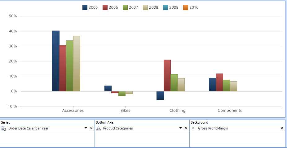
- Analytic Chart
Tip: You can right-click the report and select the Format Report option to reposition the legend. It can appear across the top of the report or along the right edge of the report.
An analytic report is interactive, allowing you to drill down or pivot the report. You can double-click a label in the legend or on the horizontal axis if the label is part of a user-defined hierarchy. You can also right-click the chart item (such as a bar) and choose the option to Drill Down To when you want to switch the current view to an alternate dimension, or you can choose the option to Show Only or Remove when you want to filter the report to keep or hide selected items. Sorting and filtering options are also available on the submenu when you right-click the report. You can even change a bar chart to a grid, line chart, or pie chart by right-clicking the report, selecting Report Type, and choosing one of the available options.
Custom Applications (ADOMD.NET)
If you want to embed reporting and analysis using Analysis Services as a data source in a custom application, you can use the ADOMD.NET object model. If you have experience with ADO.NET, working with ADOMD.NET will be very similar. You can build an interface that allows the user to interactively explore a cube, or you can embed an MDX query into your application. In this example, I show you how to build a simple Windows Form application in Visual Basic to query a cube.
The first step is to create a new Windows Forms project in Visual Studio. Then, drag a DataGridView control from the Toolbox onto the form. In the DataGridView task list, click the Dock in Parent Container link to complete the form.
Next, you need to add a reference to the ADOMD.NET client library. To do this, right-click your project name in Solution Explorer, select Add Reference, click the Browse tab, navigate to the Program Files\Microsoft.NET\ADOMD.NET\110 folder, and double-click Microsoft.AnalysisServices.AdomdClient.dll.
Now it’s time to add code that uses the ADOMD.NET library. Double-click the title bar of the form to create an event handler for the load event. Add the following code as the first line (above the class declaration):
|
Imports Microsoft.AnalysisServices.AdomdClient |
In the load event, add the following code to create a simple connection string that uses Windows authentication and assigns it to an AdomdConnection object:
|
Dim ssasConn As New AdomdConnection("Data Source=localhost;Catalog=SSAS Succinctly") |
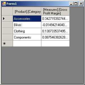
Next, add in the code to define an MDX query that you assign to an AdomdDataAdapter. An ADOMD.NET data adapter is similar to the ADO.NET data adapter except that it requires an AdomdConnection object as the second argument on creation.
|
Dim dataAdapter As New AdomdDataAdapter("select [Measures].[Gross Profit Margin] on columns, [Product].[Category].[Category].Members on rows from [Sales]", ssasConn) |
Now you need a dataset that you fill from the AdomdDataAdapter:
Dim ds As New DataSet() dataAdapter.Fill(ds) |
And lastly, you assign the results to the DataGridView control to display in your form:
|
DataGridView1.DataSource = ds.Tables(0) |
Note: Although ADO.NET and ADOMD.NET are similar frameworks and use similar objects, the CellSet object is unique to ADOMD.NET. You can store not only the results of an MDX query in this object, but also metadata for the objects returned by the query. You can then create an interface that allows the user to explore a cube in a manner similar to a pivot table or the query designer in Reporting Services.
Press F5 to run the application, and view the results as shown in Figure 103. Of course, you can do many more complex operations once you have the data stored in a data adapter. You can also format the data more nicely. Nonetheless, this simple example provides the key elements of code necessary to access data from an Analysis Services database.
- Sample ADOMD.NET Application
Note: To deploy your application, you must include the ADOMD.NET redistributable package as part of your application’s installation process. You can download the package from the Microsoft SQL Server 2012 Feature Pack page after expanding the Install Instructions section.
- Seamless integration with SSAS cubes
- Flexible data access through MDX or REST APIs
- Powerful data analysis with multidimensional slicing and dicing
- Real-time insights for informed decision-making