
SharePoint 2013 App Model Succinctly®

CHAPTER 10
Creating User Experience (UX) for Apps
When creating an app for SharePoint, both the look and feel of the app play a fundamental role to its success with users. We need to ask ourselves if the look and feel of our app is consistent with the look and feel of SharePoint; is the experience of using our app consistent with respect to the standard mechanisms of SharePoint?
Look and Feel
Again, the look and feel of an app is very important. If our app has a look and feel that’s consistent with SharePoint, it will provide a better user experience.
Using Default Styles
You can refer to the style sheet of a SharePoint site in the SharePoint app. The interesting thing is that if you change the theme or style sheet of your SharePoint site, it automatically applies the new style sheet in your app without changing the style reference sheet in your app.
This will inherit all styles, and you can use all the classes and selectors present within the SharePoint style sheet, and then apply a style consistent with the SharePoint site.
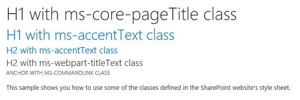
- Using default styles
<h1 class="ms-core-pageTitle">H1 with ms-core-pageTitle class</h1> <h1 class="ms-accentText">H1 with ms-accentText class</h1> <h2 class="ms-accentText">H2 with ms-accentText class</h2> <div> <h2 class="ms-webpart-titleText">H2 with ms-webpart-titleText class</h2> <a class="ms-commandLink" href="#">Anchor with ms-commandLink class</a> <br /> <p> This sample shows you how to use some of the classes defined in the SharePoint website's style sheet. </p> </div> |
There are basically three different ways to reference a SharePoint style sheet, depending on what kind of app we're developing:
- Use the default master page of the app: In this case, we can use this technique only if we are making SharePoint-hosted apps because the master page is already the reference to the style sheet of your SharePoint site.
- Reference and use the chrome control: In this case, we can use a client-side control, provided by SharePoint, which allows us to apply in semi-automatic mode a layout similar to that of the default master page of SharePoint. It is used usually when you realize the app-hosted provider because they cannot directly use the SharePoint master pages. We will explain further details about this mode later.
- Reference the style sheet manually: You can manually reference the style sheet file in all cases, such as when you are making a page and don’t want to use the master page of the SharePoint chrome control.
We can reference the style sheet manually by adding a tag link and creating a href that contains the URL of the web host, retrieving it dynamically. This is great because we want to render the tag’s link directly on the server side, placing it on the page before use in the body:
<link rel="stylesheet" href="{host web URL}/_layouts/15/defaultcss.ashx" /> |
Alternatively, we can dynamically load the client-side tags link, always referring to the web host, as follows:
(function () { var hostWebUrl; var ctag; // Get the URI decoded app web URL. var hostWebUrl = decodeURIComponent( getQueryStringParameter("SPHostUrl")); // Get the ctag from the SPClientTag token. var ctag = decodeURIComponent( getQueryStringParameter("SPClientTag")); // Create defaultcss.ashx URL. var defaultCssUrl = hostWebUrl + "/_layouts/15/defaultcss.ashx?ctag=" + ctag; // Dynamically create the link element. var link = document.createElement("link"); link.setAttribute("rel", "stylesheet"); link.setAttribute("href", defaultCssUrl); // Append the link element in the document head. var head = document.getElementsByTagName("head"); head[0].appendChild(link); })(); // Function to retrieve a query string value function getQueryStringParameter(paramToRetrieve) { var params; var strParams; params = document.URL.split("?")[1].split("&"); strParams = ""; for (var i = 0; i < params.length; i = i + 1) { var singleParam = params[i].split("="); if (singleParam[0] == paramToRetrieve) return singleParam[1]; } } |
The only problem with this method occurs when the link is loaded within the page. Since the HTML of the page displays what the CSS will actually be linked to, the page will be a light flash on the page because styles are applied only when the CSS is actually loaded. One technique to fix this would be to hide the body of the HTML page and have it display only when the loading of CSS is done.
Using the Chrome Control
As mentioned before, this technique allows you to create a layout that is very similar to that of SharePoint without using the master page.
It's very convenient to use the chrome control to create HTML pages for the SharePoint-hosted applications or for the provider-hosted applications that can not use the master page in SharePoint in any way.
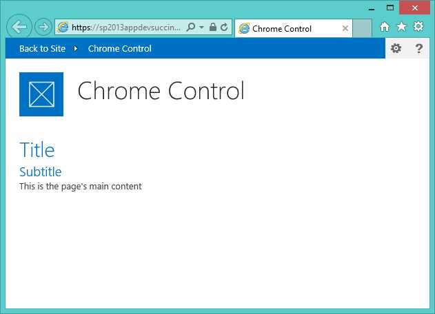
- Chrome control in action
The chrome control contains a bar at the top of the page that includes a link called “Back to Site,” which lets you return to the web host. On the right, the Settings menu and Help button are visible only because they were passed to the configuration.
Another advantage is that we are automatically linked to the style of our SharePoint site, allowing us to use all the basic styles.
To use it we need to write JavaScript code that will be executed by the client-side page load.
We need to reference a file called SP.UI.Controls.js in SharePoint and then write code to initialize it.
The following is hypothetical body content to put into a page:
<body style="display: none"> <!-- Chrome control placeholder --> <div id="chrome_ctrl_placeholder"></div> <div style="margin: 0px 20px 0px 20px"> <!-- The chrome control also makes the SharePoint Website --> <!-- style sheet available to your page. --> <h1 class="ms-accentText">Title</h1> <h2 class="ms-accentText">Subtitle</h2> <div id="MainContent"> This is the page's main content. </div> </div> </body> |
The div with the ID chrome_ctrl_placeholder serves as a placeholder to hold the HTML rendering of the chrome control.
To load and initialize the chrome control, we can write some JavaScript like this:
<script src="//ajax.aspnetcdn.com/ajax/4.0/1/MicrosoftAjax.js" type="text/javascript"></script> <script src="../Scripts/jquery-1.9.1.min.js"></script> <script type="text/javascript"> "use strict"; $(document).ready(function () { //Get the URI decoded URL. var hostweburl = decodeURIComponent( getQueryStringParameter("SPHostUrl")); var scriptbase = hostweburl + "/_layouts/15/"; // Load the js file and continue to renderChrome function $.getScript(scriptbase + "SP.UI.Controls.js", renderChrome) });
//Function to prepare the options and render the control function renderChrome() { // Create options object to initialize Chrome control var options = { "appIconUrl": "../Images/AppIcon.png", "appTitle": "Chrome Control", "appHelpPageUrl": "help.html?" + document.URL.split("?")[1], "onCssLoaded": "chromeLoaded()", "settingsLinks": [ { "linkUrl": "link1.html?" + document.URL.split("?")[1], "displayName": "Link 1" }, { "linkUrl": "link2.html?" + document.URL.split("?")[1], "displayName": "Link 2" } ] }; // Create new chrome control. var nav = new SP.UI.Controls.Navigation( "chrome_ctrl_placeholder", options); // Show chrome control nav.setVisible(true); } // Callback for the onCssLoaded event function chromeLoaded() { // When the chrome control has loaded, display the page body. $("body").show(); } // Function to retrieve a query string value. function getQueryStringParameter(paramToRetrieve) { var params = document.URL.split("?")[1].split("&"); var strParams = ""; for (var i = 0; i < params.length; i = i + 1) { var singleParam = params[i].split("="); if (singleParam[0] == paramToRetrieve) return singleParam[1]; } } </script> |
This example involves dynamic loading, initialization script and then, when we automatically load the SharePoint style sheet, it will be made visible to the body of the page.
App Shapes
When creating apps, we can choose several ways in which the user will use the app itself.
In total, there are three modes:
- Immersive Full Page
- Client Web Part (App Part)
- Custom Action
Immersive Full Page
Immersive Full Page is the default mode; each app must contain at least one page that is also the main page. When you click on the app, SharePoint redirects the request to the main page of the app, which is actually the entry point of the app.
Client Web Part
This mode allows you to implement the concept of web parts by using the apps. It is also called an App Part. Once the app is installed, if there are parts of the app, the user can choose them and insert them inside your SharePoint pages by selecting them from the catalog of app parts.
It is simple to create an app part. Visual Studio provides a project item called a Web Part Client.
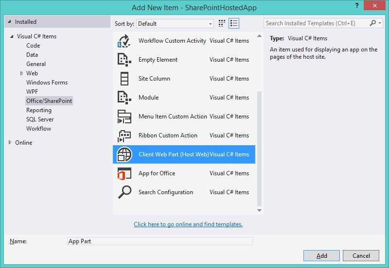
- Add client web part
At this point, Visual Studio will prompt you to ask if you want to create a new page or select a previously created page:

- Create new client web part page
This is because an app part is am HTML page that will be displayed in an IFrame on the page that will host it.
Once added to the project, we can see that the pages have been created under the module "Pages" and a new Item of the project that contains the necessary configuration for the app part has been added.

- App part files
Inside the Element.xml, we can configure our app part in terms of Name, Title, Description, Size, and Properties that we can create. This allows users to configure the app parts as we could with the classic web part.
The properties are passed to the page through the query string using a convention that puts the name of the property in the URL of the page, with a "_" before and after the name.
For example, if we want to create a property of type string with name the "Property1", what we write is:
<?xml version="1.0" encoding="utf-8"?> <Elements XMLns="http://schemas.microsoft.com/sharepoint/"> <ClientWebPart Name="AppPart" Title="AppPart Title" Description="AppPart Description" DefaultWidth="300" DefaultHeight="200"> <!-- Content element identifies the location of the page that will render inside the client web part Properties are referenced on the query string using the pattern _propertyName_ Example: Src="~appWebUrl/Pages/ClientWebPart1.aspx ?Property1=_property1_" --> <Content Type="html" Src="~appWebUrl/Pages/AppPart.aspx ?{StandardTokens}&_property1_" /> <!-- Define properties in the Properties element. Remember to put Property Name on the Src attribute of the Content element above. --> <Properties> <Property Name="Property1" Type="string" DefaultValue="Default Value" PersonalizationScope="shared" RequiresDesignerPermission="false" WebBrowsable="true" WebDisplayName="Property 1" WebCategory="Custom Property" WebDescription="Custom Property called Property 1"/> </Properties> </ClientWebPart> </Elements> |
We can create the following property types:
- String
- Int
- Boolean
- Enum
In order to retrieve the value of the property, just go to the page to retrieve the corresponding value in the query string.
In this example, we have created an app part in a design type that’s SharePoint-hosted, but the same example applies in a project that’s provider-hosted. In this case, the page was not local and was a remote web app.
The page that Visual Studio creates is an .aspx page that contains a special SharePoint control:
<WebPartPages:AllowFraming ID="AllowFraming" runat="server" /> |
This control enables SharePoint to host this page within an IFrame by eliminating the HTTP header X-Frame-Options from the page response. Otherwise, it would not be possible to use this page in an IFrame.
On the same page, we see that there is JavaScript that allows dynamic loading of a corev15.css file to incorporate SharePoint foundation styles:
if (hostUrl == '') { document.write('<link rel="stylesheet" href="/_layouts/15/1033/styles/themable/corev15.css" />'); } |
Once the app is deployed, we can add our app part by editing the page and then selecting the app part from the catalog:

- Insert App Part
Once you have selected and inserted into the page (previously put into edit), our app part will show the following:

- Example of app part inserted on page
If we need to resize the app part to fit its contents, you must use a mechanism like this:
function Resize() { var width = 500; var height = 300; var senderId = null; var hostUrl = null; if (window.parent == null) return; // Extracts the host URL and sender ID. var params = document.URL.split("?")[1].split("&"); for (var i = 0; i < params.length; i = i + 1) { var param = params[i].split("="); if (hostUrl == null) { hostUrl = decodeURIComponent(param[1]); } if (i == (params.length - 1)) senderId = decodeURIComponent(param[1]); } // *********************************************
// Use the postMessage api to resize the App part. var message = "<Message senderId=" + senderId + " >" + "resize(" + widthSelected + "," + height + ")</Message>"; window.parent.postMessage(message, hostUrl); } |
By invoking the function resize(), basically it lets us extract the necessary parameters from the query string, and then we can use the postMessage API to send a message that is formatted in this manner:
<message senderId={SenderId}>resize({width}, {height})</message> |
Therefore, you can inform the host page to resize with the specified size.
Custom Action
Another type of interaction you can have with an app is the custom action. There are two types of custom actions available to the app:
- Ribbon custom action
- Menu Item custom action
In the first case, we can insert a button on the ribbon bar with a range of possible configurations. In the second case, we can insert a custom action within the context of the menu item within the list:
- Custom ribbon action

- Menu item custom action
We can add a custom action and Ribbon List Item custom action thanks to available project templates shown in Figure 40:

- Add custom action
In both cases, we have to configure the kind of site that includes the custom item we insert, or a set of fundamental parameters, such as the label and landing page. In the case of a custom Ribbon action, the location of within the Ribbon control can be specified as shown in Figure 41.

- Menu item custom action settings

- Ribbon custom action settings
Every custom action creates the destination URL that will be the core page, plus a series of query string parameters like the following example:
?HostUrl={HostUrl}&Source={Source}&ListURLDir={ListUrlDir}&ListID={ListId}&ItemURL={ItemUrl}&ItemID={ItemId} |
In this way, in the target page, we will be able to recover through query string parameters like HostWeb, list ID, Items selected IDs, etc.
Summary
In this chapter, we learned how to architect our app from the UX point of view, whether we are creating a SharePoint-hosted or a provider-hosted app.
We learned that the use of the app part promotes the integration of our app in the SharePoint site where it will be used, while the use of custom action allows us to insert an extension point list level or library that is managed by the app itself.
- 1800+ high-performance UI components.
- Includes popular controls such as Grid, Chart, Scheduler, and more.
- 24x5 unlimited support by developers.