
Razor Components Succinctly®

CHAPTER 2
Component Fundamentals
Having bootstrapped and made some changes to our Blazor Server application, we are now ready to move our attention to Razor components and how to work with them.
Throughout this chapter, we will cover the fundamental aspects of components, how they work, and how they are rendered, so that we can start to add them to our bootstrapped application.
Component basics
Looking at our bootstrapped application, note that the left sidebar is a component called NavMenu. It is highlighted in the following figure.
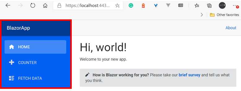
Figure 2-a: The NavMenu Component (Rendered in the App’s UI)
This component is defined within the project structure and can be easily found using Solution Explorer. It resides in the Shared folder of the project.
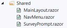
Figure 2-b: The NavMenu Component (Project Structure)
By exploring the project structure, we can see that our application has components residing in two folders: Pages and Shared.
The Pages folder contains components that are rendered as webpages within our application. The Shared folder contains components that can be used by multiple pages.
For example, the Index.razor page component renders the application’s main page (also known as the index page) as seen in Figure 2-a.
If we open the Index.razor file, we’ll notice two things. The first thing is that it starts with a @page directive—this tells Blazor that this is a page component.
The second thing to notice is that there’s a SurveyPrompt tag being referenced in the HTML markup—this tag refers to a separate component with the same name.
Let’s have a look at the source code of the Index.razor file.
Code Listing 2-a: Index.razor
@page "/" <h1>Hello, world!</h1> Welcome to your new app. <SurveyPrompt Title="How is Blazor working for you?" /> |
So, what is happening here? The @page directive is followed by a relative web address, which is the route of the webpage (/).
Next, we find the h1 tag, followed by some text, and after, the reference to the SurveyPrompt component.
By referencing the SurveyPrompt component within the index page, we are extending the HTML markup within the Index.razor file, given that SurveyPrompt is now an extended HTML tag.
So, one way to think of components within Blazor is that they are a way to extend HTML and reuse code within different parts of the application.
Let’s quickly have a look at the source code of the SurveyPrompt component. To do that, go to Solution Explorer and open the SurveyPrompt.razor file, which resides in the Shared folder.
Code Listing 2-b: SurveyPrompt.razor
<div class="alert alert-secondary mt-4" role="alert"> <span class="oi oi-pencil mr-2" aria-hidden="true"></span> <strong>@Title</strong> <span class="text-nowrap"> Please take our <a target="_blank" class="font-weight-bold" href="https://go.microsoft.com/fwlink/?linkid=2112271"> brief survey</a> </span> and tell us what you think. </div> @code { // Demonstrates how a parent component can supply parameters. [Parameter] public string Title { get; set; } } |
As we can see, the source code for the SurveyPrompt component contains the HTML markup part and the C# code part, which is distinguishable by the @code directive.
The HTML markup contains a div with span tags, text, and a link to an external survey page. Notice that the Title property is referenced within the HTML markup.
The Title property within the markup binds to a C# property with the same name, which is passed as a parameter to the SurveyPrompt component when it is referenced from the Index.razor file as follows:
<SurveyPrompt Title="How is Blazor working for you?" />
Within Razor files, it is possible to combine HTML markup, CSS styles, and also C# code. Other web application frameworks such as Vue also allow developers to combine into a single file HTML markup, styles, and code.
We’ll explore this topic further a bit later, as well as how to best organize our component’s code.
Component reusability
A component is just a reusable piece of code or UI. Reusability is not only something that helps applications scale, but it also helps the long-term maintainability of an application.
So, the simplest way to demonstrate code reusability in our application is to reference the SurveyPrompt component within another page.
Let’s reference the SurveyPrompt component within the Counter.razor file. To do that, go to Solution Explorer and open the Counter.razor file, which resides in the Pages folder.
Once you open the file, you should see the following code.
Code Listing 2-c: Counter.razor
@page "/counter" <h1>Counter</h1> <p>Current count: @currentCount</p> <button class="btn btn-primary" @onclick="IncrementCount">Click me</button> @code { private int currentCount = 0; private void IncrementCount() { currentCount++; } } |
Now, let’s copy the following line and paste it after the </button> tag:
<SurveyPrompt Title="How is Blazor working for you?" />
The code should now look as follows. The added line is highlighted in bold.
Code Listing 2-d: Counter.razor (with the SurveyPrompt Component Added)
@page "/counter" <h1>Counter</h1> <p>Current count: @currentCount</p> <button class="btn btn-primary" @onclick="IncrementCount">Click me</button> <SurveyPrompt Title="How is Blazor working for you?" /> @code { private int currentCount = 0; private void IncrementCount() { currentCount++; } } |
If we now run the application by pressing Ctrl+F5, we should see the following result after clicking the COUNTER option in the app’s navigation menu.
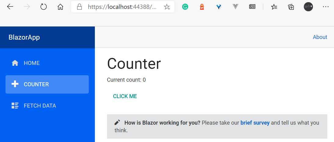
Figure 2-c: The Updated Counter Page (Using the SurveyPrompt Component)
By doing this, we have reused the SurveyPrompt component, which we have embedded within the Index.razor and Counter.razor files.
Creating a new component
Now that we’ve seen how we can reuse an existing component, let’s create a new one that we can embed in the Counter.razor file.
So, let’s go to Solution Explorer, right-click the BlazorApp project name, click Add, and then select New Folder. Once done, name the folder Components.
Right-click on the Components folder, click Add, and then click Razor Component. Give the component file a name—for example, TestButton.razor.

Figure 2-d: Adding a New Razor Component
To finish creating the component, click Add. Once the TestButton.razor file has been created, open the file and replace the existing code with the following.
Code Listing 2-e: TestButton.razor (With New Code)
<Button Class="custom-css" Style="margin: 10px;" Variant="@ButtonVariant.Contained" Color="@Color.Primary"> This is a Test button :) </Button> @code { } |
Congrats! We’ve just created our first component. However, we cannot visualize it yet, as this component is not part of any of our app’s pages.
To visualize it, we need to embed it in one of the existing pages, so let’s add it to the Counter.razor file.
But before do that, we need to reference the BlazorApp.Components namespace in the _Imports.razor file, as follows. The change is highlighted in bold.
Code Listing 2-f: Adding BlazorApp.Components to _Imports.razor
// Previous references… @using BlazorApp.Shared @using BlazorApp.Components // Further references… |
By doing this, we can embed and use the TestButton component in any part of our Blazor application.
So now, let’s go to Solution Explorer, open the Counter.razor file that resides within the Pages folder, and add the following line of code, just before the @code directive.
<TestButton />
The updated source code for the Counter.razor file should look like the following code listing. The change is highlighted in bold.
Code Listing 2-g: Updated Counter.razor
@page "/counter" <h1>Counter</h1> <p>Current count: @currentCount</p> <button class="btn btn-primary" @onclick="IncrementCount">Click me</button> <SurveyPrompt Title="How is Blazor working for you?" /> <TestButton /> @code { private int currentCount = 0; private void IncrementCount() { currentCount++; } } |
If you previously executed the application by pressing Ctrl+F5 and the app is still visible in the browser, then hot reloading should be working. If you click on the COUNTER option on the app’s navigation menu, you should see some changes.
If not, run the application again by pressing Ctrl+F5. Once the app is running, you should see the new button below the SurveyPrompt component.

Figure 2-e: The New Button Component (Counter.razor)
Awesome—we’ve now seen how to add a new component to our Blazor Server application.
How components are rendered
The Blazor framework comes in two flavors. One is called Blazor Server, where the components are rendered on the server and a SignalR connection is used to communicate between the server and client. The following figure illustrates how the Blazor Server model works.

Figure 2-f: The Blazor Server Model
Blazor Server apps are hosted on an ASP.NET Core server using the ASP.NET Razor syntax. Using this model, web browsers act as thin clients, meaning that the bulk of the processing load is done on the server.
The client's web browser downloads a small page and updates its UI over a SignalR connection.
The second flavor of the framework is Blazor WebAssembly, where C# code is sent to the client (browser) to be interpreted.
To do that, Blazor ensures the browser has a runtime that is created using WebAssembly, which is a binary format designed to run very fast in browsers. The following figure illustrates how the Blazor WebAssembly model works.
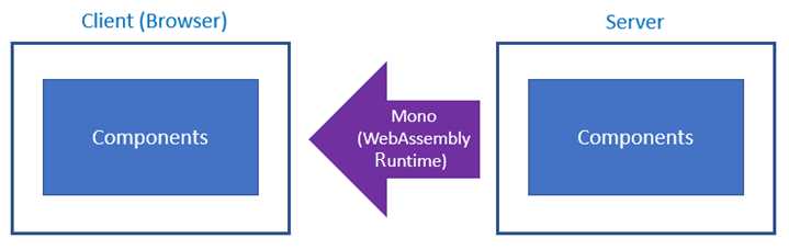
Figure 2-g: The Blazor WebAssembly Model
Using the Blazor WebAssembly model, single-page apps are downloaded to the client's web browser before running.
The size of the download is larger than that of Blazor Server apps, and the processing is entirely done on the client hardware.
Using this model, the application type typically enjoys faster response times than using the Blazor Server model. This client-side framework is written in WebAssembly, as opposed to JavaScript.
A key element to understand is that although these models of Blazor are different from one another, they both execute an application by rendering a root component called app.
The app component is referenced within the _Host.cshtml file, which resides in the Pages folder. For our Blazor Server application, the app component is described as follows.
<app>
<component type="typeof(App)" render-mode="ServerPrerendered" />
</app>
Notice that render-mode is set to ServerPrerendered, which means that the components are prerendered on the server and sent to the client through a SignalR connection.
Therefore, the app is always the root component of your application, regardless of the Blazor model you use.
The app component is identical for both the Server and WebAssembly versions of Blazor, and all the components that are part of the application will be rendered through this root component.
Therefore, the app component can render child components, and these child components can render other child components.
This means that a Blazor application’s structure is made up of pages, which are made up of one or more components, and these components are made up of other child components.

Figure 2-h: Blazor App Structure
Now that we have explored how components are rendered in Blazor, it’s time to look at some of the differences between Blazor Server components and Blazor WebAssembly components.
Component differences between models
What components can or cannot do differs between Blazor Server apps and Blazor WebAssembly apps.
For example, say that in our Blazor Server app we create a component that is responsible for accessing the file system.
On the server, that component will have access to the file system of the server. Later, we want to use that same component in a Blazor WebAssembly application.
At first, you might naturally think that because this component has access to the local file system of the server, this component will have access to the local file system of the client when it is integrated into a Blazor WebAssembly application.
However, that’s not the case. Giving the browser access to the file system would be a major security risk, so that won’t work.
So, from a functional perspective, the component responsible for accessing the file system, which worked great in the server application, won’t work in the client app.
Nevertheless, the way the component is structured internally, and the component’s features, are identical for both Blazor Server and WebAssembly applications.
All the topics covered in this book will be for the Blazor Server application we previously bootstrapped.
However, because the book is about component features and not details that are specific to any of the Blazor models, almost everything will apply to both Blazor Server and WebAssembly apps, one-to-one.
Page routing and rendering
The App.razor file that resides within the project’s root folder is referred to as the app Router component. Let’s have a look at its code.
Code Listing 2-h: App.razor
<!--New--> <MaterialScripts /> <MaterialStyles /> <!--New--> <ThemeProvider Theme="@Theme.Light" /> <Router AppAssembly="@typeof(Program).Assembly"> <Found Context="routeData"> <RouteView RouteData="@routeData" DefaultLayout="@typeof(MainLayout)" /> </Found> <NotFound> <LayoutView Layout="@typeof(MainLayout)"> <p>Sorry, there's nothing at this address.</p> </LayoutView> </NotFound> </Router> |
We can see that within the App.razor file, there is a reference to the Router component and some other components that are part of the Blazor framework, such as Found, NotFound, and RouteView.
The Router component doesn’t render any UI element by itself, so its purpose is to look within the given assembly for pages—which, as you know, are Blazor components with the @page directive, which contain routing information.
If a match between the URL and the routing configuration of a page is found, the RouteView component is used to render the page, passing along the routeData and layout page (DefaultLayout) to be used. This can be better understood by looking at the following diagram.
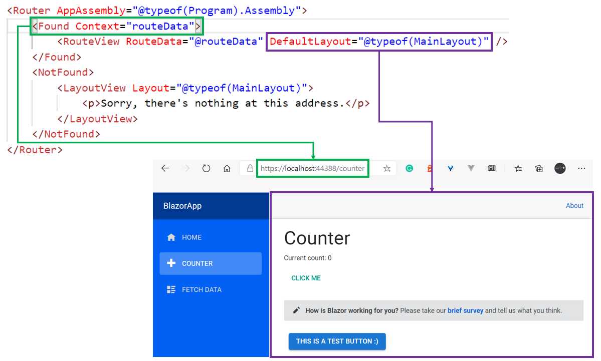
Figure 2-i: How the Router Component Renders a Page (If a Match Is Found)
On the contrary, if a match is not found, then a LayoutView component is used, which takes a page and renders the HTML markup provided as the body for it.
In the following diagram, we can see that the URL points to a page called bla, which doesn’t exist. Therefore the request gets routed to the NotFound component.
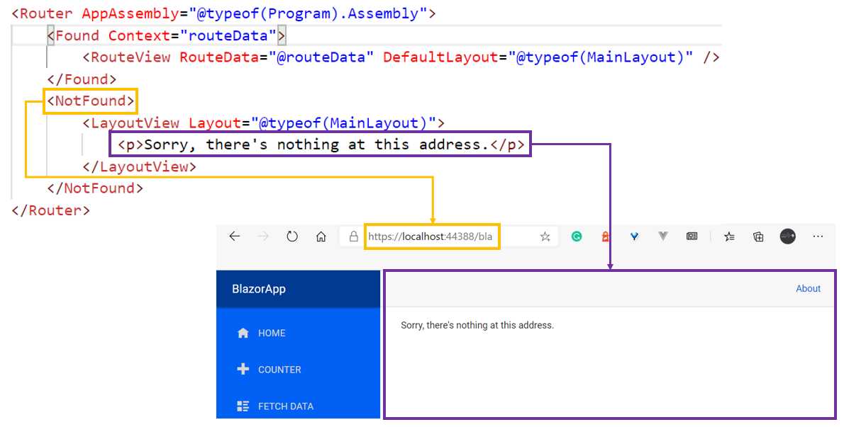
Figure 2-j: How the Router Component Renders a Page (If a Match Is Not Found)
Now, let’s say that a new request comes in at the root. The Router component will search for a page component that has a @page directive specifying root, which in this case is the page component contained within the Index.razor file. The following diagram illustrates this.
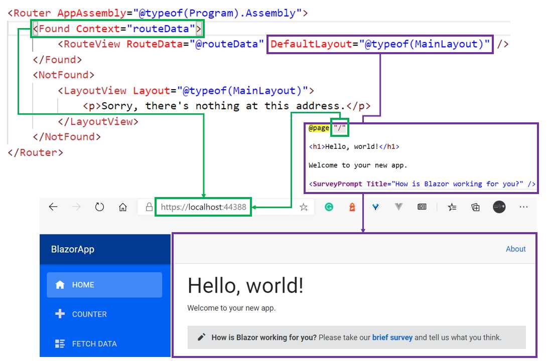
Figure 2-k: How the Router Component Renders a Page (Accessing the Site’s Root Page, Index.razor)
As we can see in the Router component, when a route is found, every page rendered will use MainLayout.razor to render the page’s child content (the content of the page to be rendered) at the location marked with the Body property.
What this means in practice is that if Index.razor is the page component that is displayed, its markup content is injected into the section of MainLayout.razor that includes the Body property. The following diagram illustrates this process.
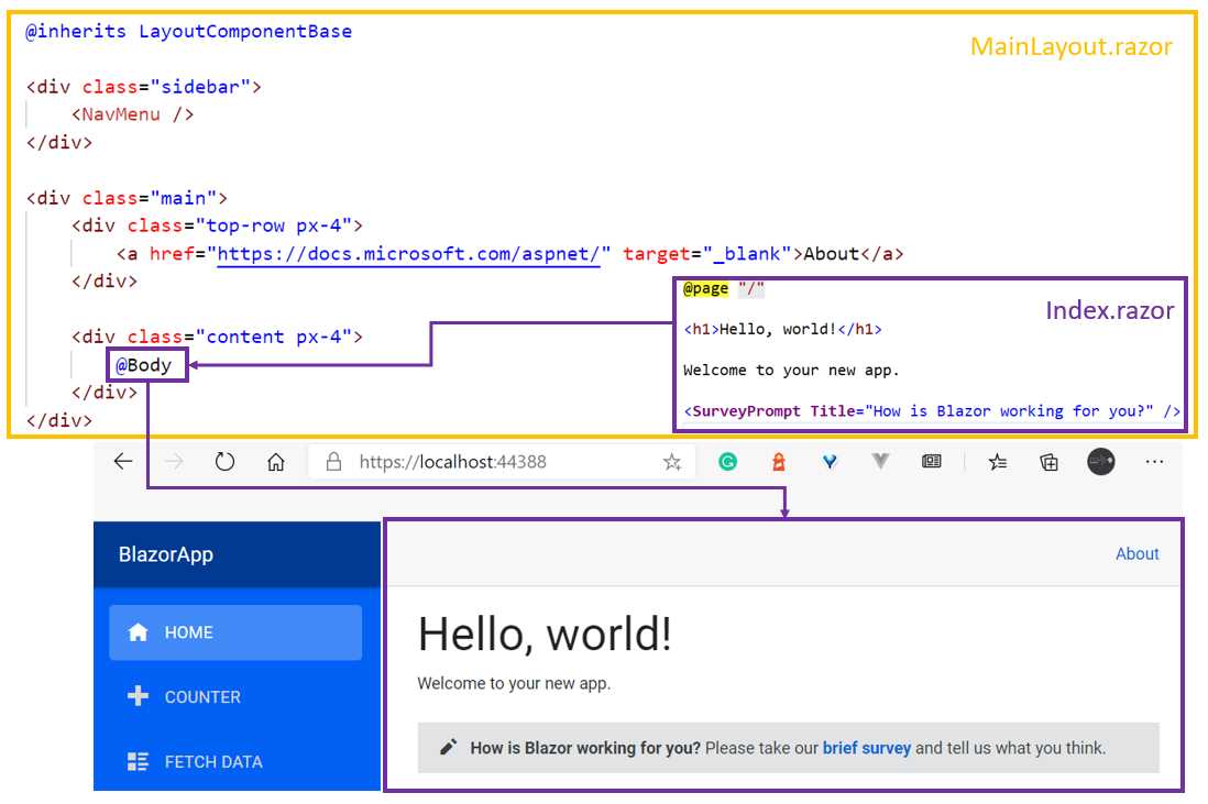
Figure 2-l: How a Page Is Injected into MainLayout.razor
We can see how the MainLayout.razor file also includes a reference to the NavMenu component, which corresponds to the blue menu found on the left-hand side of the application’s UI.
Now that we know how the app’s components are rendered, let’s move our attention next to how we can organize our component’s code better.
Component code organization
One of the great things about files using the .razor extension is that HTML markup and C# code can be combined into a single file. For someone who’s starting fresh in Blazor or web development, this is quite appealing, as it means there are fewer files to maintain within a project.
Not only can you combine HTML markup and C# code into a single file, but you can have multiple code segments in your component, which is very powerful.
Despite the power and apparent simplicity of these capabilities, when components become more complex, it might not be such a good idea to have the HTML markup and C# code combined into a single file, which is an opinion that some people might share and some might not.
My approach to code organization when working and writing components is that the code should not be mixed with the HTML markup. As a component grows in complexity, having a separation of concerns between the HTML and C# code is something that you might find useful and come to appreciate as your codebase expands.
A way to achieve this is by giving the component file a companion, known as a code-behind file. This can be done by going to Solution Explorer and creating a new C# class file next to the component file.
Let’s do that for the TestButton.razor file that resides in the Components folder. So, right-click on the Components folder name within Solution Explorer, and then click Add, followed by New Item. From the list, choose Class.
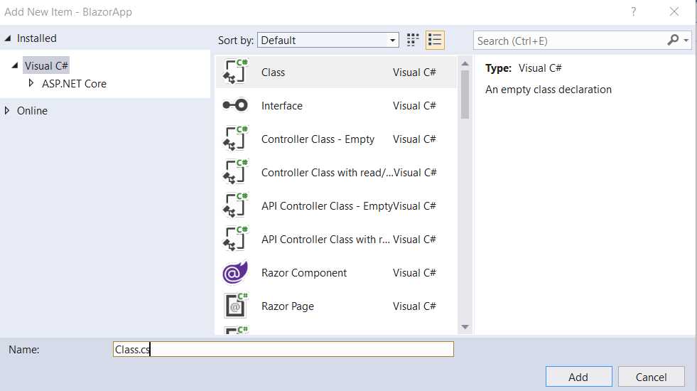
Figure 2-m: Creating a Code-Behind File (Visual Studio)
Let’s give the class a name, which in theory can be any name. However, it is good to follow a certain naming convention, which will help make things easier as we go. A particularly good convention to follow is to give the class the name of the component, followed by the Base suffix (or prefix if you prefer; whichever you choose, be consistent with the naming convention when trying this out).
So, in this case, we would name this class file TestButtonBase.cs, as can be seen in the figure that follows.
Figure 2-n: Code-Behind File Name (Visual Studio)
Once the file has been created, we can see it in Solution Explorer as follows.

Figure 2-o: The TestButtonBase.cs File (Components Folder)
Now, to understand why we are doing this, there’s one thing to be aware of that is not particularly obvious to someone who’s coming newly to Blazor from another framework.
Hidden code-behind
Every component file within the project has a C# code-behind file that is not visible (i.e. not shown within the Visual Studio solution).
We can see this by going into Solution Explorer, and at the project level (which has the BlazorApp name on it), right-click and then click on the Open Folder in File Explorer option. This will open the folder where the project resides on disk.
Once you do that, in the folder search box, type *g.cs, and shortly after you should get some results. Scroll down and locate the TestButton.razor.g.cs file shown in the following figure.

Figure 2-p: Hidden Code-Behind Files (Project Folder, Windows Explorer)
Just out of curiosity, let’s open this file with Notepad, Notepad++, or any other text editor of your preference to see what the code looks like.
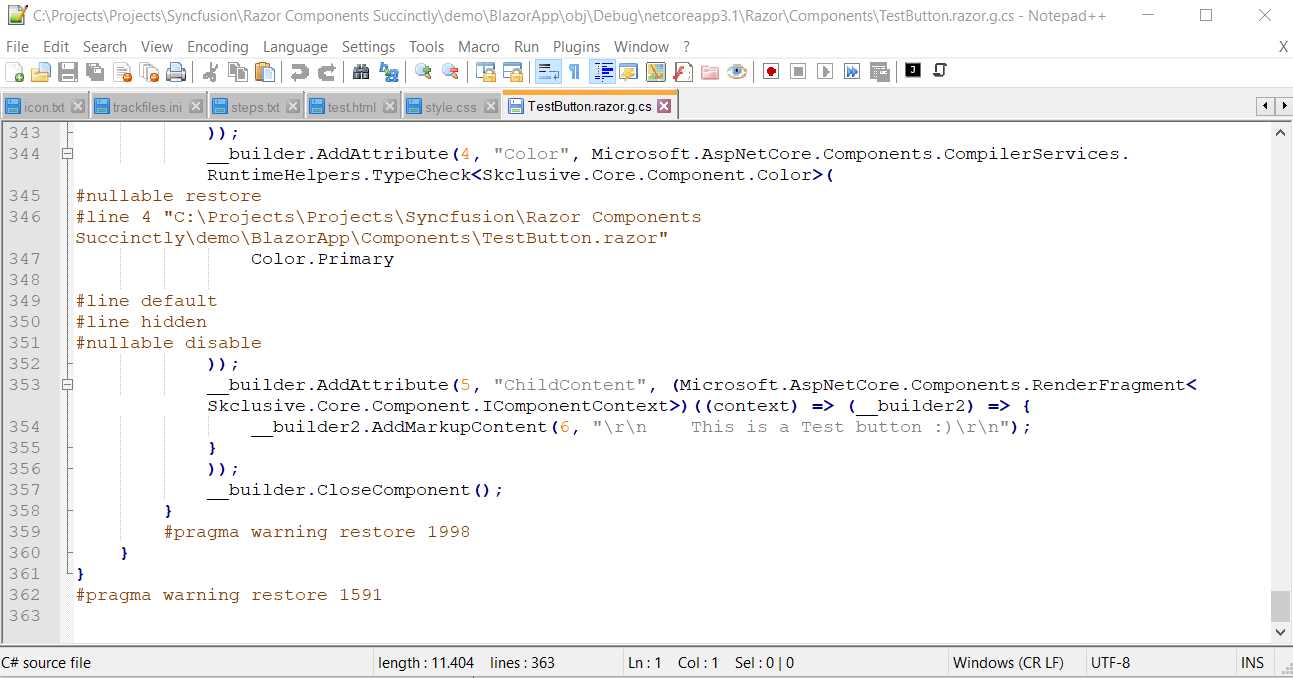
Figure 2-q: The TestButton.razor.g.cs Hidden Code-Behind File in Notepad++
If you scroll down, you’ll notice that this file was machine-generated and it is not very easy to read or follow, even though it is C# code.
There’s one very important thing to note: the generated TestButton class inherits from the ComponentBase class, which in my case can be seen in the following figure, on line 327.
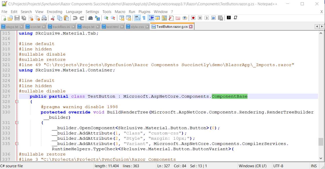
Figure 2-r: The Generated Class (Inheriting from ComponentBase)
So, you might be asking yourself—what does all this have to do with the fact that we have created a new file called TestButtonBase.cs?
Component inheritance
To get a hint of why we are doing this, let’s open the TestButtonBase.cs file with Solution Explorer by double-clicking on it and viewing its content.
Code Listing 2-i: The New TestButtonBase.cs File (Source Code)
using System; using System.Collections.Generic; using System.Linq; using System.Threading.Tasks; namespace BlazorApp.Components { public class TestButtonBase { } } |
There’s nothing particularly interesting about the previous code. Have you guessed where we are going with this? If so, great. If not, no worries. Let’s take a step back and analyze this from a different angle.
The reason for creating a TestButtonBase.cs file (adding the Base suffix to the name TestButton), is that we are going to organize the C# code for the TestButton component in a way that this component inherits from the TestButtonBase class, rather than ComponentBase, as it is now. Let’s look at the following diagram to understand how the class hierarchy is now.
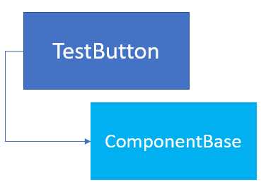
Figure 2-s: Out-of-the-Box TestButton Component Inheritance
So, what do we do with the ComponentBase class inheritance? Well, you might have guessed by now, but let’s look at the following diagram first.
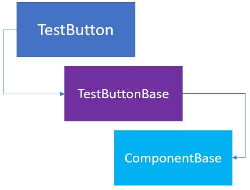
Figure 2-t: The New TestButton Component Inheritance
In essence, the TestButtonBase class we created with the TestButtonBase.cs code-behind file must inherit from the ComponentBase class for everything to work—so, let’s add that to our code. The changes are highlighted in bold.
Code Listing 2-j: The New TestButtonBase.cs File (Updated Source Code)
using Microsoft.AspNetCore.Components; namespace BlazorApp.Components { public class TestButtonBase : ComponentBase { } } |
Notice that the ComponentBase class resides within a specific namespace, so that’s why I have added it with the following statement.
using Microsoft.AspNetCore.Components;
Another thing we can do is rename the file from TestButtonBase.cs to TestButton.razor.cs.
If the file nesting option is enabled within Solution Explorer in Visual Studio, the TestButton.razor.cs file will appear under the TestButton.razor file, as shown in the figure that follows.
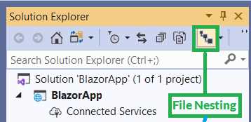
Figure 2-u: The File Nesting Option Enabled in Visual Studio (Solution Explorer)

Figure 2-v: TestButton.razor.cs Nested Under TestButton.razor
So, the purpose of this exercise and using either approach, TestButtonBase.cs or TestButton.razor.cs, is that we want to keep the HTML markup free from C# code, so if our component becomes too complex in the future, all the code is easier to read and maintain.
Razor file nesting
Because I like the file nesting feature that Solution Explorer provides, I prefer to use and keep the TestButton.razor.cs file rather than TestButtonBase.cs, but that’s just my personal preference. From my point of view, it keeps the C# code-behind nicely organized under the HTML markup code file.
You are free to use TestButtonBase.cs if you prefer that convention going forward, and add the Base suffix to other components. I’ll use the nested option instead.
I went through this exercise and created the TestButtonBase.cs file to show you how to get to the TestButton.razor.cs file and add that extra layer of inheritance needed for C# code-behind to work.
So, to wrap this up for the TestButton component, there are two things we still need to do. First, we need to remove the @code directive and code block from the TestButton.razor file.
Second, we need to make sure that the TestButton component within the TestButton.razor file inherits from the TestButtonBase class. To do that, we need to add the @inherits directive to the code of the TestButton.razor file.
We can see the updated code of the TestButton.razor file in the following code listing.
Code Listing 2-k: The Updated TestButton.razor Code
@inherits TestButtonBase <Button Class="custom-css" Style="margin: 10px;" Variant="@ButtonVariant.Contained" Color="@Color.Primary"> This is a Test button :) </Button> |
If we now run the application in Visual Studio by pressing Ctrl+F5, and then navigate to the Counter page, we should see the following.

Figure 2-w: The Counter Page
So, from a UI perspective, nothing has changed. All we have done is organize our component’s code differently using a code-behind approach with additional class inheritance.
Perhaps the greatest advantage of this approach—using inherited classes as the code-behind for components—is that you can add as many class layers as needed, especially when there’s common functionality for various components.
Partial classes
There’s also another way to create code-behind component classes, which is to use partial classes. By using partial classes, we can create part of the class in another file. During compilation, partial classes in different files will be merged into a single class. Placing a class definition in two files is useful when you intend for one part of the definition to never be edited, and the other part to be edited if needed.
Let’s create a partial class for our TestButton component and try that instead of using the previous approach.
Within Solution Explorer, click on the Components folder, right-click, then click Add, select New Item, and choose Class from the list of items. Let’s call it TestButtonPartial.cs and then click the Add button.
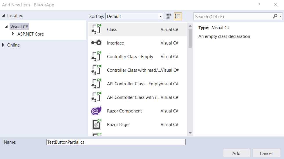
Figure 2-x: Adding TestButtonPartial.cs
Once the file has been created, you’ll see the following code when you open the file.
Code Listing 2-l: The Default Code of TestButtonPartial.cs
using System; using System.Collections.Generic; using System.Linq; using System.Threading.Tasks; namespace BlazorApp.Components { public class TestButtonPartial { } } |
To make this work, we need to make some changes. First, it is important that this code and the code from TestButton.razor are part of the same namespace, which in this case they are.
Both files were created in the same folder. Therefore, the namespace is the same for both: BlazorApp.Components.
The second thing we need to ensure is that the name of the class TestButtonPartial is renamed to TestButton and that the partial reserved word is added to the class declaration. So, then, the code would look as follows.
Code Listing 2-m: The Modified Code of TestButtonPartial.cs
namespace BlazorApp.Components { public partial class TestButton { protected string TxtValue { get; set; } = "This is a partial class :)"; } } |
Notice that the using statements have been removed because they are not required.
To make this example a bit more realistic and be able to appreciate how partial classes can be used, let’s change the hard-coded text contained within the HTML markup of TestButton.razor and replace it with a property called TxtValue. The code with these changes follows, with the changes highlighted in bold.
Code Listing 2-n: Code Changed to TestButton.razor
<Button Class="custom-css" Style="margin: 10px;" Variant="@ButtonVariant.Contained" Color="@Color.Primary"> @TxtValue </Button> |
Notice as well that the @inherits directive has been removed from TestButton.razor. TestButton.razor is no longer using the TestButtonBase inherited class contained within TestButton.razor.cs we previously created, and instead will use the partial TestButton class contained within TestButtonPartial.cs.
To test this, just rename TestButton.razor.cs to _TestButton.razor.cs, so you can be sure that TestButton.razor will not use the TestButtonBase class but the partial TestButton class from TestButtonPartial.cs instead.
Now, let’s run the project by pressing Ctrl+F5. When navigating to the Counter page, we should see the TestButton component with the text that was assigned to the TxtValue property of the TestButton partial class contained within TestButtonPartial.cs.
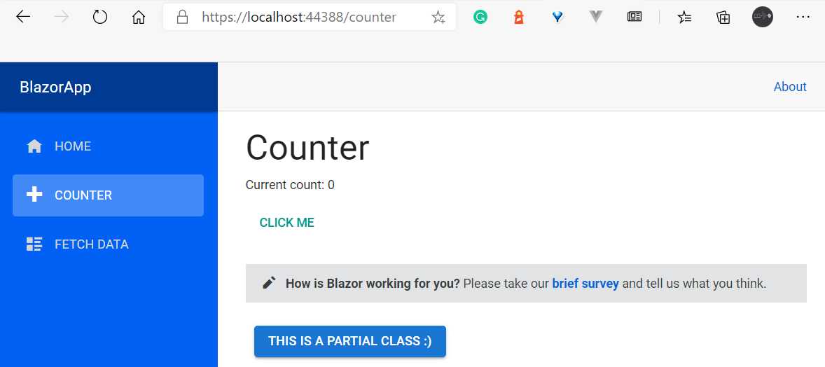
Figure 2-y: The TestButton Component (Using a Partial Class)
Switching back
Now that we have seen that it is possible to have the C# code of a component in a partial class, let’s switch back to how things were.
So, open Solution Explorer and rename TestButtonPartial.cs to _TestButtonPartial.cs. Then, rename _TestButton.razor.cs back to TestButton.razor.cs.
Next, open TestButton.razor.cs and replace the existing code with the following.
Code Listing 2-o: Updated TestButton.razor.cs
using Microsoft.AspNetCore.Components; namespace BlazorApp.Components { public class TestButtonBase: ComponentBase { protected string TxtValue { get; set; } = "Using TestButtonBase :)"; } } |
Furthermore, make sure that the updated code for the TestButton.razor file is as follows.
Code Listing 2-p: Updated TestButton.razor
@inherits TestButtonBase <Button Class="custom-css" Style="margin: 10px;" Variant="@ButtonVariant.Contained" Color="@Color.Primary"> @TxtValue </Button> |
Now, run the project by pressing Ctrl+F5 and you should be able to see the following changes after navigating to the Counter page.

Figure 2-z: The TestButton Component (Still Using a Partial Class?)
So, why aren’t we seeing a different result, even though TestButtonPartial.cs was renamed to _TestButtonPartial.cs, and _TestButton.razor.cs was renamed to TestButton.razor.cs?
The TestButton class contained within TestButton.razor references the code-behind partial class of _TestButtonPartial.cs, even though it inherits from the TestButtonBase class of TestButton.razor.cs.
To avoid this situation, simply change the name of the namespace of _TestButtonPartial.cs to BlazorApp.Components.Partial instead of BlazorApp.Components.
Once you make this code adjustment, you’ll need to run the application again to see the changes. Notice that the hot reload feature won’t pick this up, as it is not an HTML markup change.

Figure 2-aa: The Updated UI (With the Expected Button Text)
One important lesson here is that even though partial classes are much easier to implement from a code perspective, they can lead to some confusion if a code-behind base class for the component already exists.
Therefore, the advice is to use one approach or the other, and avoid mixing them.
My personal preference is to use the base class code-behind approach we initially looked at, using file nesting, as it is easier to maintain even if it is a bit more work to set up.
Summary
We’ve covered quite a bit of ground throughout this chapter and started exploring what components are, how to reuse them, and also, most importantly, how to apply principles of separation of concerns between what is HTML markup and C# code.
Next, we will dive deeper into components and look at event handling, one-way data binding, and also how to place components into shared libraries.
Following that, we’ll explore more advanced topics such as using the Parameter attribute, life cycle methods, two-way data binding, event callbacks, and other interesting advanced component features.
- 80+ high performance Blazor components.
- Lightweight and user friendly.
- Stunning Built-in themes with customization.