
Razor Components Succinctly®

CHAPTER 3
Component Features
It’s now time to dig a bit deeper into components and explore key component features such as event handling, one-way data binding, child content, and placing components into libraries for even further reusability.
This chapter is going to be a bit shorter than the previous one. However, all the topics that are going to be covered are not only exciting, they are essential features of Blazor to master. So, let’s get started.
Event handling
To cope with events, each HTML element supports several Blazor event handlers available with a delegate type value.
All event handlers in Blazor start with the prefix on, which is what we will explore in this chapter.
To be able to start using and consuming events, go to Solution Explorer and open the _Imports.razor file. There, let’s double-check whether we have the following using statement.
@using Microsoft.AspNetCore.Components.Web
By default, this reference should be present within the _Imports.razor file. Without it, we wouldn’t be able to work with events, given that all event handlers are in that namespace.
So, to see this in action, let’s go back to the TestButton.razor file. Let’s add an onclick event to the button and also a ColorValue property, which is highlighted in bold in the following listing.
Code Listing 3-a: TestButton.razor (With the onclick Event)
@inherits TestButtonBase <div @onclick="TestButtonClick"> <Button Class="custom-css" Style="margin: 10px;" Variant="@ButtonVariant.Contained" Color="@ColorValue"> @TxtValue </Button> </div> |
So, what have we done here? The first thing to notice is that we have placed the onclick event on a div element we previously didn’t have, instead of placing it on the Button component. Why is that?
The reason is that the Button component, which is part of the Skclusive-UI library, is not a native HTML element, and because of that it doesn’t implement the onclick event. Therefore, we have to wrap it around a native HTML element (like a div) that Blazor can use to execute an onclick event.
The other change is that we’ve added a ColorValue property. This property will be used to change the color of the Button component when it is clicked through the div.
For this to work, we also need to make some code changes to the TestButton.razor.cs code-behind file, which can be seen as follows. The changes are highlighted in bold.
Code Listing 3-b: Updated TestButton.razor.cs
using Microsoft.AspNetCore.Components; using Skclusive.Core.Component; namespace BlazorApp.Components { public class TestButtonBase: ComponentBase { protected string TxtValue { get; set; } = "Using TestButtonBase :)"; protected Color ColorValue { get; set; } = Color.Primary; protected void TestButtonClick() { ColorValue = (ColorValue == Color.Primary) ? Color.Secondary : Color.Primary; } } } |
We’ve added the ColorValue property to the TestButton.razor.cs code and given it a default value, which is the primary color.
Because the ColorValue property returns a Color object type, we have to import the namespace where this type resides, which in this case is Skclusive.Core.Component.
When the onclick event is triggered, the TestButtonClick method is executed. We can see that all this method does is swap the color from primary to secondary depending on which color is set. This is done using the C# ternary operator.
If we now run the code by pressing Ctrl+F5 and navigate to the Counter page, we should see the following.
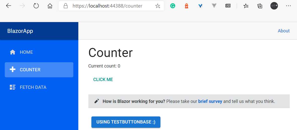
Figure 3-a: The TestButton Component (Counter Page)
If you click on the TestButton component, the button’s color will change to the secondary color, as shown in the following figure.
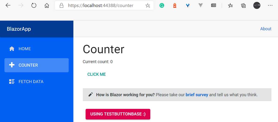
Figure 3-b: The TestButton Component with Color Changed (Counter Page)
If you click again on the TestButton component, the button’s color will change back to the primary color.
So, by going through this example, we have implemented event handling.
One-way data binding
As we have just seen, when we click on the TestButton, the color of the button changes from the primary to the secondary color and vice versa, depending on the current color value.
This happens because the ColorValue property is assigned a value by the TestButtonClick method, and this property is data-bound to the Color attribute of the Button component.
The way this happens internally, using the Blazor server-side model, is that the server handles the changes between the server and the client using a SignalR connection.
When using the Blazor WebAssembly model, the change is completely handled in the browser by the WebAssembly runtime.
So, independently of the model being used, the process of updating these changes internally is handled in a very smart and efficient way, with virtually no network traffic.
To see how Blazor handles this internally, all you need to do is open the developer tools in your browser. On Windows, for Chromium-based browsers (I’m using Microsoft Edge), the developer tools can be opened by pressing Ctrl+Shift+I.
So, hover over the TestButton component on the Counter page UI, right-click, and then click on the Inspect menu option (or press Ctrl+Shift+I).
Now, you’ll be able to see the actual HTML that Blazor has rendered. The TestButton component’s rendered HTML has been highlighted in the following figure.
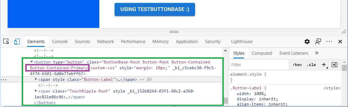
Figure 3-c: Inspecting the TestButton Component, Primary Color (Developer Tools)
Notice that Blazor has applied the CSS class Button-Contained-Primary when the primary color is being used.
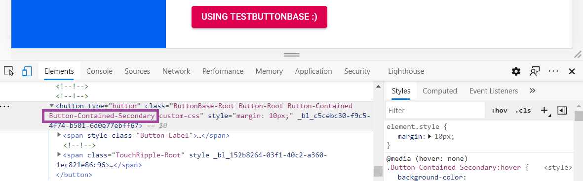
Figure 3-d: Inspecting the TestButton Component, Secondary Color (Developer Tools)
When the TestButton component is assigned the secondary color, Blazor updates the CSS class to Button-Contained-Secondary, as can be seen in the preceding figure.
If you paid close attention when clicking the button, you saw the browser developer tools highlighted with a color the part of the HTML that changed in real time.
That small change to the HTML is possible because of an internal feature that exists in Blazor called the diff mechanism.
The way the diff mechanism works is that Blazor quickly builds a new page with the new details, without rendering it, and compares it to the old one. Only the differences between the pages will be applied to the existing rendered page.
Because of this, UI updates executed by Blazor are very efficient as the browser doesn’t have to build the page every time there is a change. The diff is sent to the client in a binary format and applied by the browser.
This mechanism even works when navigating to a different page. So, the diff mechanism goes hand-in-hand with one-way data binding.
Child content
To demonstrate how child content can be passed to a component, we are going to use a feature of Blazor called RenderFragment.
Let’s say we want to add some text to the TestButton component, just below the actual Button component, but without adding any additional child components to the TestButton component.
To do that, we need a public property of type RenderFragment called ChildContent. In this case, the name of the property matters, so it has to be named exactly, ChildContent. If another name is given, it won’t work.
In Blazor, when a property needs to be set by another component, it needs to be decorated with the Parameter attribute.
So, let’s open the TestButton.razor.cs file using Solution Explorer and make these adjustments. The changes are highlighted in bold in the following listing.
Code Listing 3-c: Updated TestButton.razor.cs
using Microsoft.AspNetCore.Components; using Skclusive.Core.Component; namespace BlazorApp.Components { public class TestButtonBase: ComponentBase { protected string TxtValue { get; set; } = "Using TestButtonBase :)"; protected Color ColorValue { get; set; } = Color.Primary; protected void TestButtonClick() { ColorValue = (ColorValue == Color.Primary) ? Color.Secondary : Color.Primary; } [Parameter] public RenderFragment ChildContent { get; set; } } } |
Next, we need to open the TestButton.razor file using Solution Explorer and add the ChildContent within a div element.
We can see this as follows. The changes are highlighted in bold.
Code Listing 3-d: Updated TestButton.razor
@inherits TestButtonBase <div @onclick="TestButtonClick"> <Button Class="custom-css" Style="margin: 10px;" Variant="@ButtonVariant.Contained" Color="@ColorValue"> @TxtValue </Button> <br /> <div>@ChildContent</div> </div> |
Next, we need to open the Counter.razor file (which resides in the Pages folder) using Solution Explorer, and there make the following adjustments, which are highlighted in the following code listing in bold.
Code Listing 3-e: Updated Counter.razor (Using ChildContent)
@page "/counter" <h1>Counter</h1> <p>Current count: @currentCount</p> <button class="btn btn-primary" @onclick="IncrementCount">Click me</button> <SurveyPrompt Title="How is Blazor working for you?" /> <TestButton> This is the child content </TestButton> @code { private int currentCount = 0; private void IncrementCount() { currentCount++; } } |
As you can see, the text is passed to the TestButton component as a ChildContent, between the <TestButton> and </TestButton> tags.
Class libraries and component sharing
The ability to share as well as the reusability of a component can be expanded even further by placing components that are likely to be used in other projects into a component library—which is nothing other than a standard Razor class library.
Creating a new component in a class library is very simple. We can do this by going to Solution Explorer and right-clicking on the solution name (the top element in Solution Explorer), and then clicking Add, and after that clicking New Project.
Then, in the search box, type Razor Class and choose the Razor Class Library project template, as shown in the following figure.
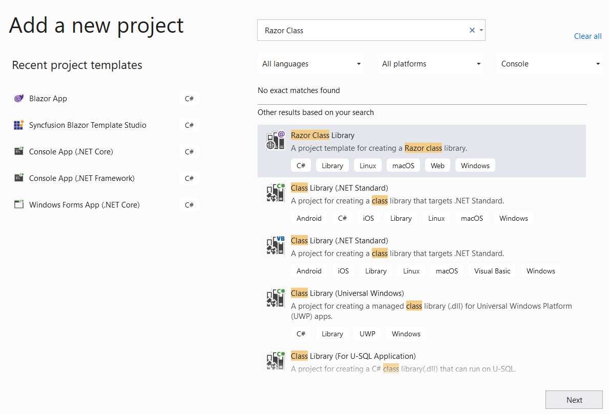
Figure 3-e: Adding a New Razor Class Library
Give it a name—let’s call it ComponentLib—and then click the Create button. Once the class library has been created, it will be shown as a project within Solution Explorer, as part of the BlazorApp solution.
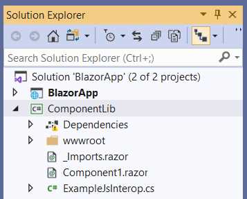
Figure 3-f: The ComponentLib Razor Class Library
To be able to use the ComponentLib library from the main BlazorApp project, we need to add it as a dependency.
This can be done using Solution Explorer, selecting the BlazorApp project (not the BlazorApp solution), right-clicking, clicking the option Add Project Reference, and then selecting the ComponentLib item from the list, as can be seen in the following figure.
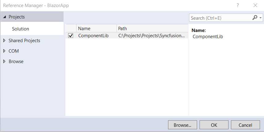
Figure 3-g: Adding ComponentLib to the BlazorApp Project
Once selected, click OK. By doing this, the ComponentLib library will now be accessible to the BlazorApp project.
However, before we can use any component defined within the ComponentLib library, we need to add the namespace to the _Imports.razor file of the BlazorApp project. We can do that by adding the following line.
@using ComponentLib
So, to test this, in Solution Explorer, open the Counter.razor file, which resides in the Pages folder, and let’s add the following line (highlighted in bold) to the existing code.
Code Listing 3-f: Updated Counter.razor (Using a ComponentLib Component)
@page "/counter" <h1>Counter</h1> <p>Current count: @currentCount</p> <button class="btn btn-primary" @onclick="IncrementCount">Click me</button> <SurveyPrompt Title="How is Blazor working for you? " /> <TestButton> This is the child content </TestButton> <Component1 /> @code { private int currentCount = 0; private void IncrementCount() { currentCount++; } } |
What we have done here is add the Component1 component (which can be found within the Component1.razor file under the root folder of the ComponentLib project) to the source code of the Counter.razor file.
If we now run the application by pressing Ctrl+F5, and then navigate to the Counter page, we can see the following.
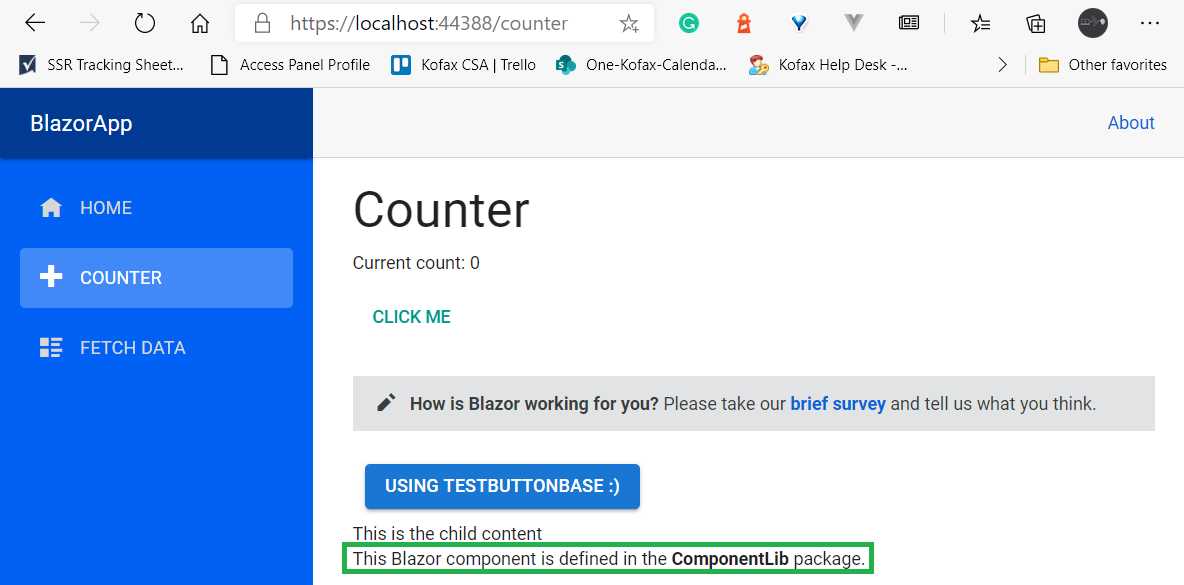
Figure 3-h: The Counter Page with Component1 Embedded
As you can see, Component1 from the ComponentLib library has been embedded within the Counter page.
So, using a library is a great way to share components among various projects. This is particularly useful when you have a set of components that you want to share between a Blazor Server app and a Blazor WebAssembly project.
Summary
Throughout this chapter, we explored some fundamental aspects of Razor components. Without some good knowledge of these, it would be very difficult to build any Blazor application.
Next, we’ll explore more advanced component features that will allow us to compose a Blazor application even further.
These features include topics such as object injection, component life cycle methods, how to preserve elements, conditional rendering, two-way data binding, using event callbacks, and referencing components.
So, we have quite a bit of ground to cover and a lot of information and techniques to digest—all very exciting things ahead.
- 80+ high performance Blazor components.
- Lightweight and user friendly.
- Stunning Built-in themes with customization.