
Public Speaking for Geeks Succinctly®

CHAPTER 4
Preparing the Presentation: To Geek or Not to Geek?
What to do with all these tools?
Do you remember the second type of geek that we mentioned at the beginning of the previous chapter? Have you ever seen presentations with these qualities?
- Too much text on the slide, with a tiny font.
- Too many bullet points (more than four), with many subitems.
- Entire pieces of documentation pasted on the slides, with a very long link at the end.
- Source code pasted on the slides using a tiny font or shown inside the editor without increasing the font or using a tool like ZoomIt.[23]
- Too many graphs, pictures, and diagrams that are difficult to read.
- Disturbing transitions that are slow and time consuming.
Always remember that people tend to read everything you put on a slide. If you need to add reference slides, you can hide them during the presentation or move them to the appendix.
Tip: A dry run with a non-technical person can help you improve slide quality, reduce distracting content, and increase readability of the presentation.
The next time you’re attending a presentation with the previous qualities, pay attention to your reactions to every slide, how much time you spend reading them, and how much time you’re distracted by complex graphs or schemas that aren’t necessary.
Must-have slides and slides to avoid
The only slides that you must have are the first and the last. The first is the one that’s projected while people are entering the room, before you start presenting, with the title of the session, your name, contact details (optional), conference logos, etc.
Showing a title slide while people are entering the room is important. It gives a positive impression that the speaker is ready, helps people understand if they’re in the right room, and allows them to take note of your contact information if present on the slide.
Tip: Sometimes it’s useful to create a little (three or four slides maximum) rolling presentation with important information that people should know before attending the talk. You can create a separate deck with the title slide and some informative slides (with “Before we begin” or a similar title) that cycle on the screen. Keep the official presentation ready so you won’t lose time when it’s time to begin.
The last slide is essential: it should have your contact details (mandatory), requests for feedback, and the session code or session title if conference organizers are collecting feedback. You should keep it on the screen while doing Q&A, unless you need some slide to answer a question.
If you’re presenting at a “no slides conference,” or if you’ve decided to avoid slides completely, you can open a text editor, increase the font size to 40 or more, and write your contact details at the end of the presentation. You can also use your contact details and the presentation title as the desktop background during the presentation—it’s not a slide, it’s the background!
You should avoid “About Me” and “Agenda” slides that are often in conference templates because people care about the value of the presentation, not about the speaker, and because an agenda is useful only for day-long or multi-day courses. You can keep the “About Me” and “Agenda” slides in the downloadable or printed version of your presentation if you’d like.
If you really want to use an “About Me” slide, it’s better to put it after the main value of the presentation. First, tell the audience why they should listen to you, and then you can spend a few seconds talking about you if you cannot avoid it.
A better “Agenda” slide, if you’re presenting a day-long or multi-day courses, could be designed as a time line, instead of a boring bullet-point list.
Keep resources and other “boring” slides in the appendix, and show them only if requested.
“Recap” slides are better than “Agenda” ones, but sometimes there is a risk of losing time by repeating the same concepts. It’s better to use them only if there are many important topics in the presentation and you need to clarify your call to action explicitly.
Note: If you should avoid using “About Me” and “Agenda” slides, why do conference templates keep using them? “We’ve always done it this way” is the typical answer. Remember, life begins at the end of your comfort zone.
Slide refactoring examples
“Code refactoring is the process of restructuring existing computer code—changing the factoring—without changing its external behavior.”[24]
Similarly, we’ll use slide refactoring to improve the readability and understandability of a typical geek slide.
Note: You cannot oversimplify a technical slide without losing information, but you can try to improve it using the right fonts, colors, animations, and pictures.
Improving a text-heavy slide
Let’s start with the following slide, taken from a real presentation about microservices and IoT.
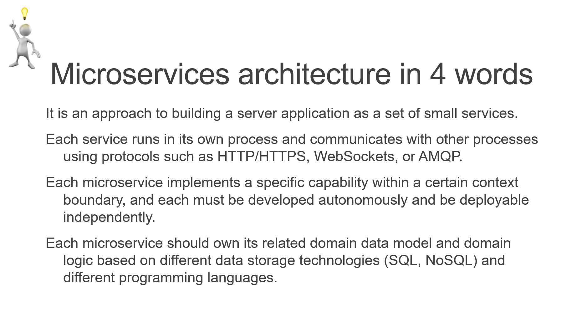
Figure 19: A text-heavy slide
We can start by highlighting the most important words.
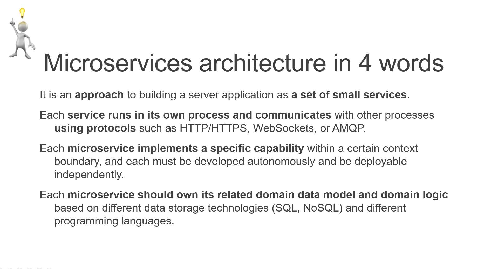
Figure 20: Highlighting words using bold
We can better highlight important parts using Convert to SmartArt from the context menu, as shown in the following figure.
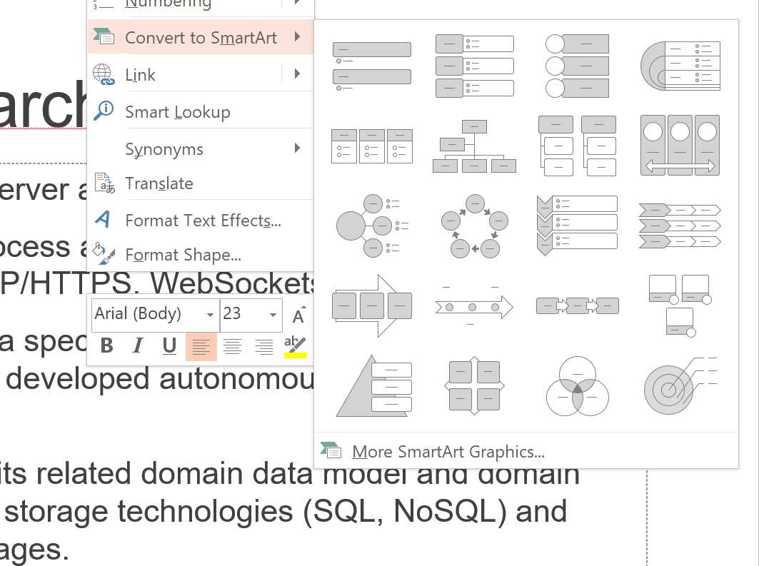
Figure 21: Converting bullet points to SmartArt
Once you’ve converted a bulleted list to SmartArt, you can play with its properties, shapes, colors, and animations to obtain a more readable slide.
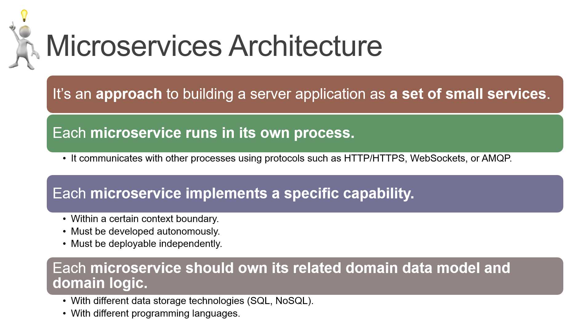
Figure 22: Slide refactoring completed!
Less is more: simplifying a complicated slide
In the previous example, we decided to keep the slide complexity, but used typography and SmartArt to improve readability.
In the next example, we’ll try to simplify a complicated slide where the key idea is not obvious, while keeping the original meaning.
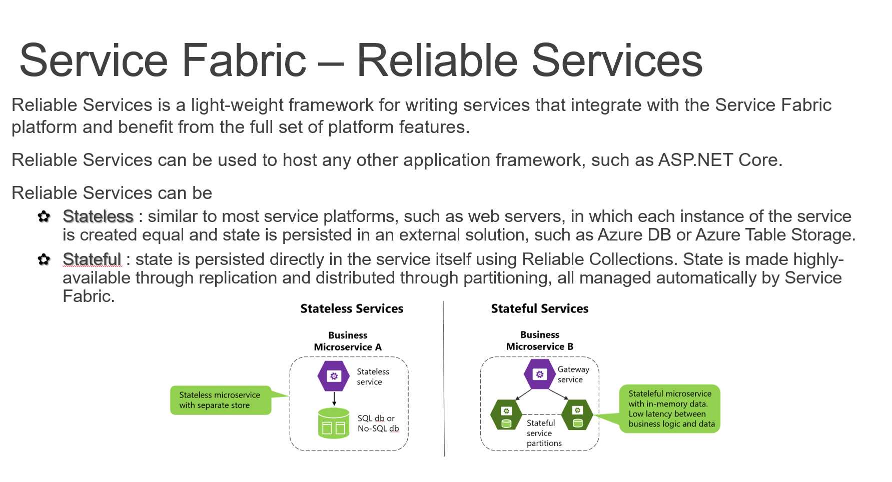
Figure 23: Too much text, no clear separation, no clear value
A better slide could have a clear definition (a light-weight framework…) and a clear separation between the two different types of services (stateless and stateful), each with its main properties and an image.
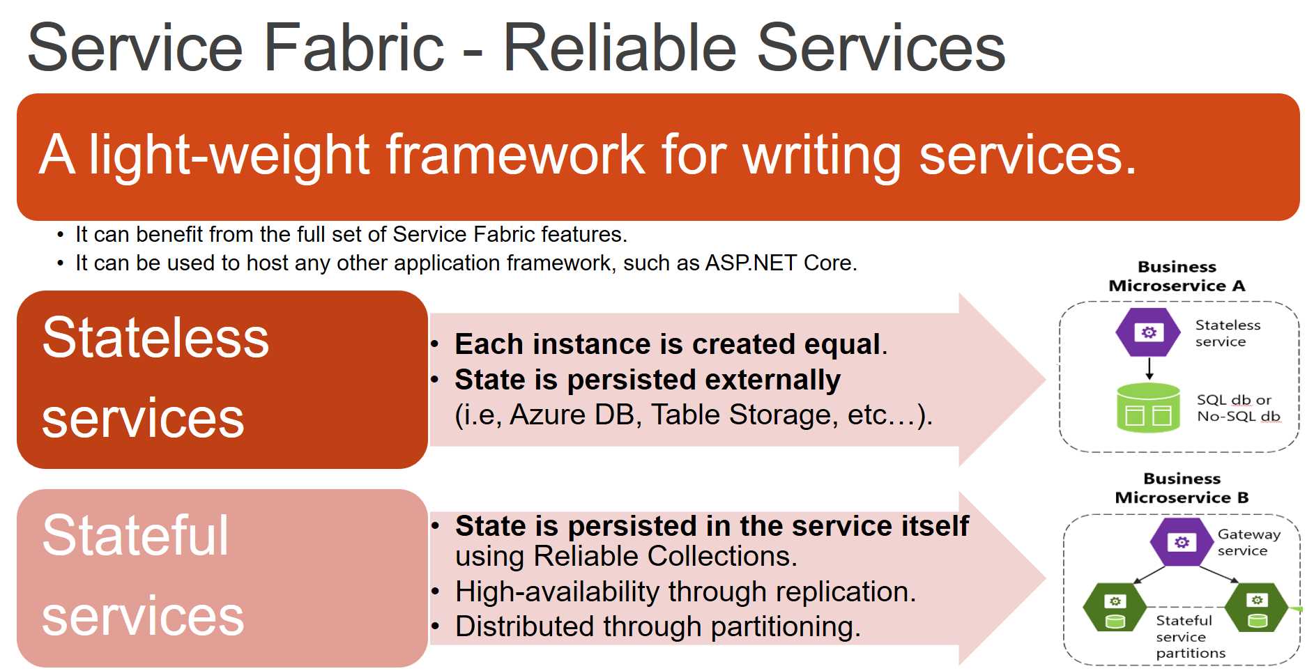
Figure 24: Clear definition, clear separation between stateless and stateful
The slide shown in Figure 24, with the right animations, could be more effective than the original.
Depending on the audience, we can decide to cut some more text from the slide, or we can split the slide into two different slides with larger pictures.
Note: SmartArt wizards are available only in PowerPoint at the time of writing. You can create them in Keynote or other tools by aligning different objects, but the overall result could be more difficult to emulate.
Visualize your lists, avoid bullet points
Bullet points are bad—they kill people’s attention. Most of the time you cannot avoid them, but you can try to add some pictures and colors to the slide to engage your audience.
It’s easy to imagine the ugly boring bullet point list that was used to create the following slide.
Figure 25: A better way to present a list
Which one do you prefer?
Can we do better? Of course we can! The last item is too wordy, and the font is smaller than the one used in the other items, but as we stated before, sometimes you cannot oversimplify a slide—it depends on the audience.
Tip: You don’t need to read your slides, but sometimes having the detailed list on the screen can help your memory. It’s better to have more items on the screen if it helps you remember important stuff. You can always remove them the next time you present to another audience.
Reduce elements, keep some variance
Look at the following two slides.
Figure 26: How to reduce complexity without reducing variance
The slide on the left is more complete; it describes many elements and has 20 logos on it. The slide on the right is simpler and has fewer logos, but offers the same general information. The important thing when you work on simplifying a slide is to keep some variability to increase interest. For example, on the right slide, there are consumer and commercial services, personal and enterprise ones, and so on.
If you know that one or more items are important for your audience, keep them! If you know that some items are unexpected by your audience, add them, or even better—animate them to create a “wow” effect.
One idea per slide: is it possible for a technical presentation?
One way to avoid using bullet points, SmartArt, and similar components is by creating slides with just one idea per slide. The advantage is clear: you can use a BIG font, with a nice picture, and talk for a few seconds about the idea, and then you can move on to the next slide.
In practice, it’s tough to have just one idea per slide because people tend to speak too much about a topic, and too little about the next one, making it difficult to estimate the time needed for the presentation without a proper dry run.
Sometimes it’s useful to show a slide full of stuff, just to highlight a specific part and let people know the complexity of the subject, like in the following slide.
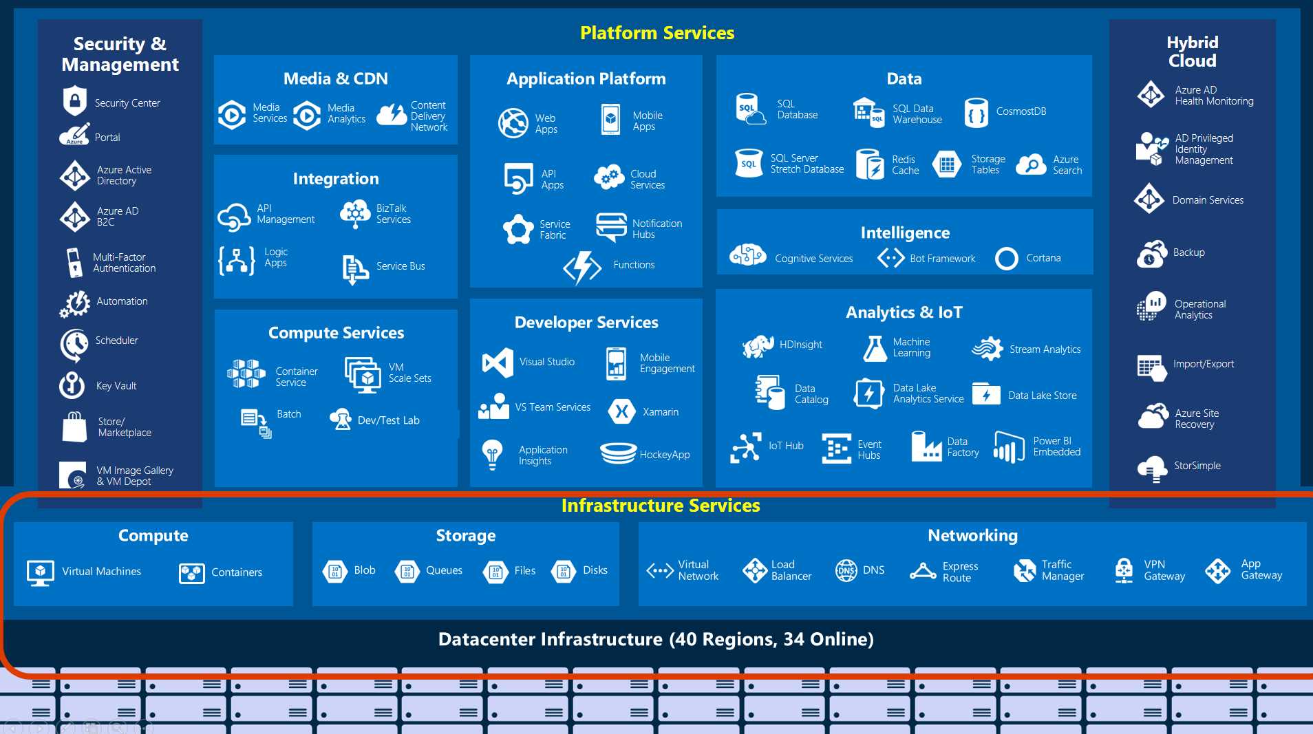
Figure 27: A complex slide with a highlighted subset
If the next slide is a deep dive on the highlighted subject, you can use a Morph transition to better connect the two slides.
Reduce source code to the minimum
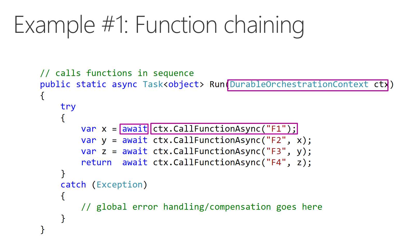
Figure 28: Slide with only the relevant source code is shown
In Figure 28, you can see that important information is highlighted, that error handling code is removed (it’s not important in the context), and only relevant comments are left in the code. Try to limit the amount of source code you put on slides, and always check that it’s visible from the last rows of the audience.
Is my presentation accessible to everyone?
As a presenter, you have to ask yourself this simple question.[25]
Disabilities could be permanent, or temporary. When presenting to someone, people with different learning styles or people speaking other languages[26] could have problems similar to people with disabilities.
Every image in your presentation should have a written description that could be read by a screen reader, every video should have captioning, fonts should be readable, and the speaker should try to give context to graphs and pictures that are difficult to understand.
Tip: PowerPoint offers a Check Accessibility command inside the Review tab. Use it to check your presentations and make them more accessible.
Note: The terms “accessibility” and “inclusion” are closely related. Loosely speaking, accessibility refers to aspects related to disabilities (such as vision impairment), and inclusion is a slightly broader term related to usability by the greatest number of people.
- 1800+ high-performance UI components.
- Includes popular controls such as Grid, Chart, Scheduler, and more.
- 24x5 unlimited support by developers.