
Public Speaking for Geeks Succinctly®

CHAPTER 3
Knowing Our Tools
Never underestimate an impeccable presentation
There are two types of geeks: those who hate using slides and do only demos, and those who create too many slides and fill them with too many details.
While there is a place for the first type of geek (the NoSlidesConf, for example), the second type tends to have bad results most of the time.
There is a golden rule in the public speaking field:
Two minutes per slide, five minutes per demo.
So, let’s say that you have 40 minutes: you can have 20 slides or 15 slides and two demos, and so on. It’s not a hard rule; you could break it and still deliver a great on-time presentation. But if you follow this rule, it’s easy to finish in time, especially at the beginning of your public speaking career.
Now that we’ve defined how long a presentation should be, let’s talk about its content. A presentation must be curated; you have to choose the right colors, the right images, the right logos, and so on. You should always remember that people could find your presentations years later, and they will be associated with your name. Always remember to follow your standards.
Some years ago, I delivered a live online presentation about public speaking for the Italian TecHeroes on Microsoft Channel 9. The show was curated in many aspects, with green-screen effects, two virtual locations, pre-recorded videos to fill blank times, and so on. I didn’t have time to curate the slides specifically for the event; I thought I could reuse a previous deck, considering that slides were used only in the first location and just for a few minutes. At the end of the live event, I received lots of feedback that it was very well executed, but some of the slides were poor. Never underestimate the effect of a curated presentation!
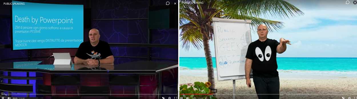
Figure 4: Public speaking live event on Microsoft Channel 9
In this chapter, we’ll see some PowerPoint features that are often overlooked, leading to low-quality slides. In the next chapter, we’ll see how to solve some common pitfalls when geeks design slides. If you prefer to use Keynote to prepare and deliver your presentations, you can find some Keynote-specific notes in Appendix B.
Slide templates and conference templates[11]
A curated presentation starts with a good template. PowerPoint includes many built-in templates.[12] You can also search online for additional ones. Once you find some useful templates, it’s difficult to discard them.
What about conference templates? There are mixed feelings about conference templates. People agree that they’re essential for the brand of the conference, but sometimes they’re too intrusive and force speakers to adapt presentations to every different conference template, losing a lot of time.[13]
Years ago, the situation was complicated because PowerPoint only supported one master template for the entire presentation, but now, you can use multiple templates.[14] This means you can keep your beloved template and insert the first and last slides from the conference one. If the conference logo is mandatory on every slide, you can embed it into your template just for that presentation.
When you’re pasting slides from one presentation to another, you can right-click and decide if you want to use the destination theme, keep existing formatting, or paste as a picture.
If you choose to keep existing formatting while pasting the slide, the original template of the slide is copied in the new presentation.
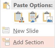
Figure 5: Different paste options when copying slides
Note: Always check your entire deck in presentation mode when you modify a template, when you apply a new one, or when you mix two templates. Subtle things can change, leading to incorrect animations, wrong colors, text size changes, words or images outside of the projected area, and so on.
When you create a new slide, you can choose the slide layout from the different templates that you have in the slide deck, like in the following figure. You can change the slide layout using the Layout button, and you can reset a slide with the Reset option.[15]
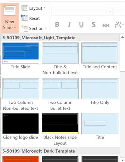
Figure 6: Different layouts to choose from
Tip: If you start mixing slides with different templates, you can end up having huge presentation files because you’re importing all the slide masters, all the background images, logos, and so on. You can reduce file size by using a macro that keeps only the slide layouts that are actually used in the presentation.
Slide masters and slide layouts
A lot of speakers, beginners and experienced ones, don’t know how to use, create, and modify a template. Have you ever tried the Slide Master option on the Views tab?
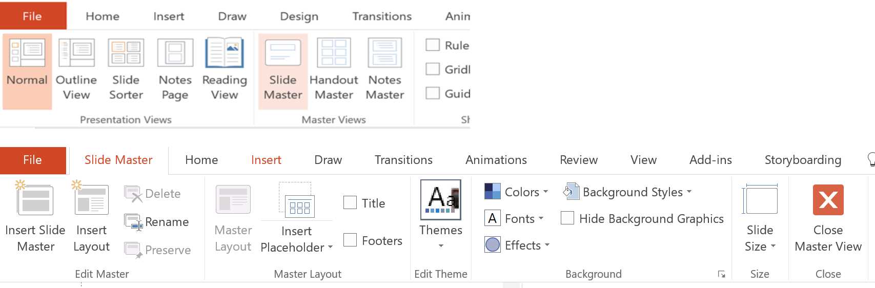
Figure 7: Slide Master in PowerPoint
Every template starts with a slide master,[16] which, as you can see in Figure 7, allows you to choose between a 4:3 or 16:9 slide size, add standard title and footers in the slide, change colors, fonts, background styles, and so on.
Slide Master is chosen by default when you create a new slide (if you have more templates in the slide deck, the slide master of the previous slide is used), and should contain common items like title, logos, text areas, and so on.
Slide layouts[17] are children of a slide master. You can insert common items in the slide masters, and they’re inherited in every slide layout. Slide layouts could be used to define other layouts, like a two-column layout, demo slide layout, presentation title layout, announcement slide layout, and so on.
In the following figure, you can see that the author’s logo was added to the slide master, and all the child slide layouts are inheriting it.
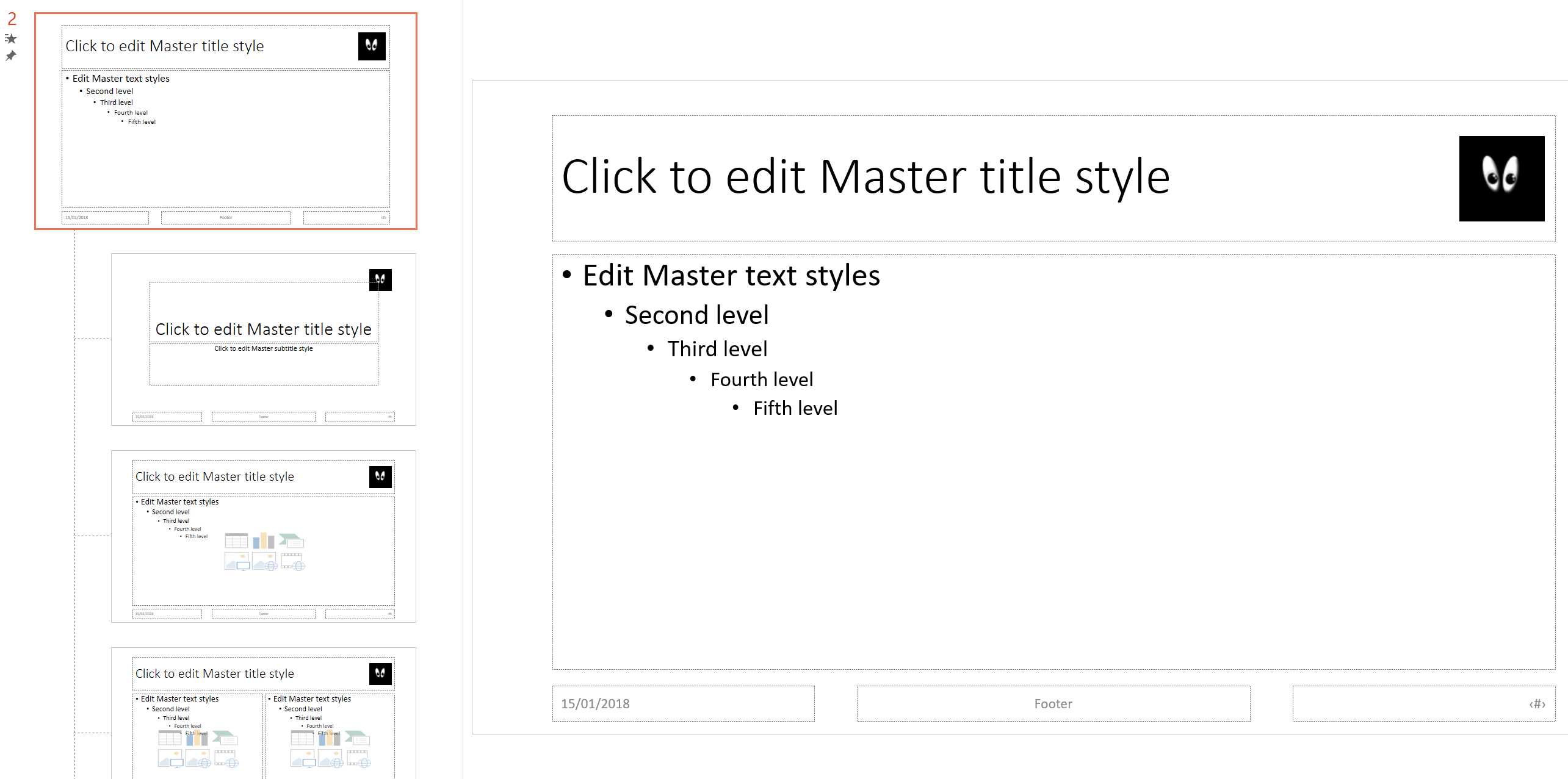
Figure 8: Slide master with many slide layouts
You can also set up transitions and animations inside the slide master or slide layouts that will be inherited by the slides that use that template; remember that you can always change an inherited behavior inside a slide.
Tip: Sometimes you find slides that advance automatically after x seconds, or that don’t do anything when you click the mouse. If you look at the slide master or specific slide layouts, you’ll find that somebody has customized the transition properties. If you change them over there, all the slides will be fixed![18]
Slide masters and layouts don’t have to be plain white. You can create different templates (a slide master with related slide layouts) with various color sets, or you can create many slide layouts under the same slide master with different colors or different background pictures to highlight parts of the presentation.
You can give a name to the slide master and every slide layout; this is important if you plan to use different templates in the same presentation.
Slide animations and transitions
Animations occur inside a slide; transitions connect one slide to another. There are many of each, as you can see in the following figure. Some are subtle, and some are very dynamic but could be perceived as invasive. Usually, you should keep exciting transitions only for a few slides in the presentation, like announcements. If you don’t have exciting news to share, refrain from using those transitions, or at least change the duration.
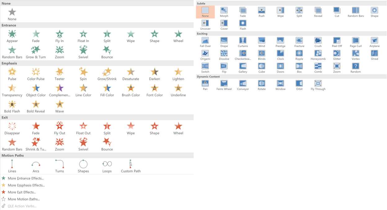
Figure 9: Animations (left) and transitions (right)
Tip: If you want all your announcements slides to use a specific transition, you can set it up in the corresponding slide layout. This way you won’t forget it!
Animation Pane
The Animation Pane is useful when you have a complex slide with a lot of animations. In the Animation Pane, you can see the temporal flow of the animated sequence; you can also see animations that co-occur. When you select an item in the pane, you can see it selected in the slide and vice versa. You can add, remove, and reorder animated items.
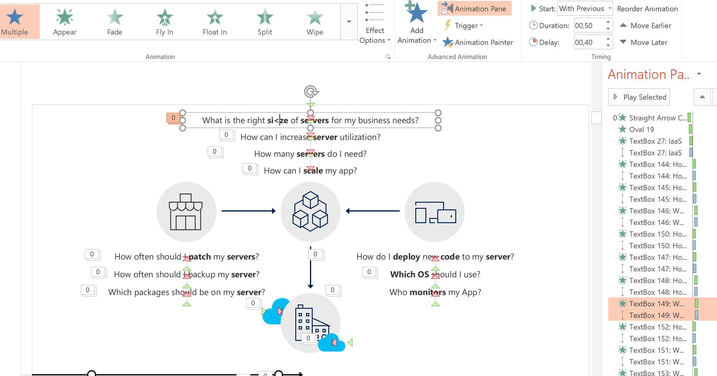
Figure 10: An animated slide with many moving objects
Common animation pitfalls
Many things could go wrong when you animate your slides:
- People could be easily distracted by animations.
- The speaker could forget to advance the animation while talking, and then have to fast-forward at the end, which looks unprofessional.
- Animated slides could need much more time than the canonical two minutes, and could lead to going overtime.
- Animated slides are often impossible to print, export to PDF, or share on https://www.slideshare.net/.[19]
- Animations (but also transitions to the next slide) could be configured to occur automatically; therefore, you need to accurately test a slide deck built by someone else in presentation mode. Otherwise, you could end up with a bad performance.
Despite these potential problems, animations are a powerful tool to explain complex ideas and processes, such as long-running transactions, protocols with many steps, and so on.
Note: If you can’t describe all the actions of an animated slide, it’s better to remove some parts or make it static. You can also split an overly complicated animated slide into two or more simple slides, with the positive side effect that it’s easier to estimate time, print or share the slide deck, and so on.
Morph transition
The Morph transition is a new feature of PowerPoint that allows you to create smooth animations in the transition between one slide and the next.
Note: At the time of writing, the Morph transition is only available in PowerPoint 2016 for Office 365 subscribers. If you don’t see it, update PowerPoint to the latest available version. If you’re using PowerPoint Online, the Morph transition is only possible for files hosted on SharePoint Online.
The easiest way to try the Morph transition is to start with a slide containing some text and objects, duplicate it, and then move objects around, changing their sizes, fonts, colors, words, and so on. Then you can apply the Morph transition to the second slide and play the presentation to see the results. As you can see, all the objects and texts move and morph smoothly without you having to create complex animations.
Tip: In one presentation, I added my avatar to all the slides and used the Morph Transition to animate between one and another, changing size, position, orientation, and so on. It’s not something that you should abuse because it distracts people, but in this case, it was done to show the power of this tool!
![]()
Figure 11: Presentation with a moving avatar
With Morph transitions, you can animate objects, words, or characters,[20] but you can also:[21]
- Create motion and emphasis animations.
- Create entrance and exit animations.
- Zoom, scroll, and crop images.
- Rotate, 3D rotate, and change the shape of an image.
Tip: You can also combine slide layouts with Morph transitions to create advanced templates with moving parts. For example, you can create a layout with a grid of objects, and another layout with an expanded object and text description. Then you can morph between them to create the effect of an animated catalog.
Selection Pane
The Selection Pane is a little-known feature that allows viewing the object hierarchy of a slide, selecting an object to hide or show again, and changing the viewing order relative to other objects. It’s found under the Select menu, as shown in the following figure.
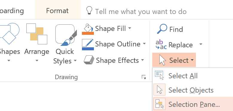
Figure 12: Enabling the Selection Pane
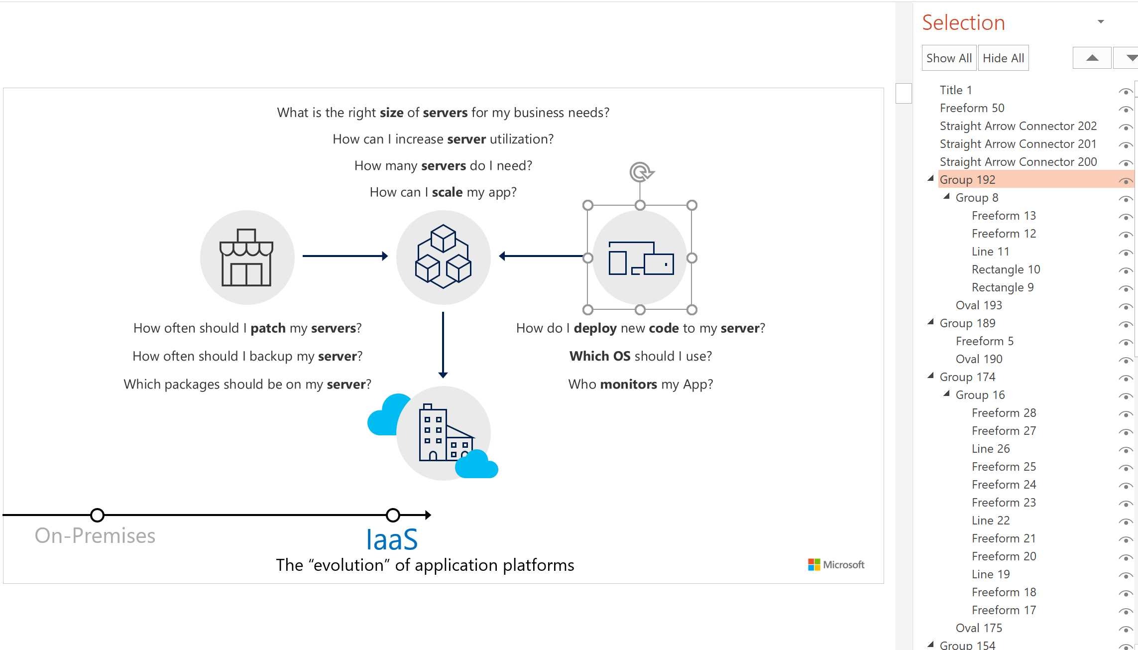
Figure 13: Selection Pane
Finishing touches
Many other tools and features could be used to improve the quality of the presentation. Let’s see the last three of them.
Improve the quality of printed slides
Sometimes you need to print slides and make sure that all important items are readable. You need to use the View menu, shown in the following figure.
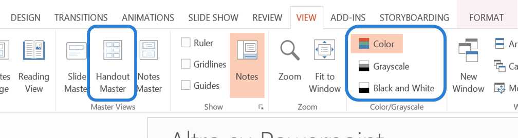
Figure 14: View menu with options for changing the format of printed slides highlighted
If you’re printing your slides in black and white or in grayscale, you can select the appropriate option in the View menu to see the slides as they will be printed. With the Grayscale and Black and White views, you can select items in the slide to hide them, invert colors, or improve the slide visibility for printing using the commands shown in the following figure.
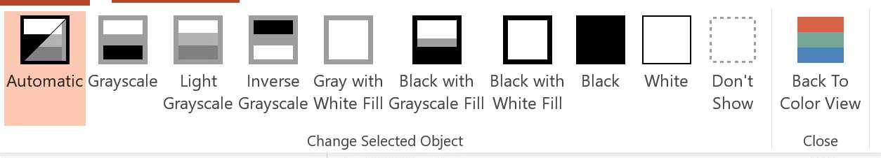
Figure 15: Control how slides will be printed in grayscale or black and white
In the View menu, you can select Handout Master to change the template of printed slides, including headers and footers, printed pages, page numbers, and so on. You can also add custom logos to the slides, like in the following figure.
![]()
Figure 16: Handout master with two slides per page and a custom logo
Arrange items
People like to spot problems on slides, especially during boring presentations. Images, graphs, and text blocks that aren’t perfectly aligned or spaced are an indicator of poor quality in a presentation.
You don’t have to be a designer to align everything correctly. The Arrange menu has all the tools that you need!
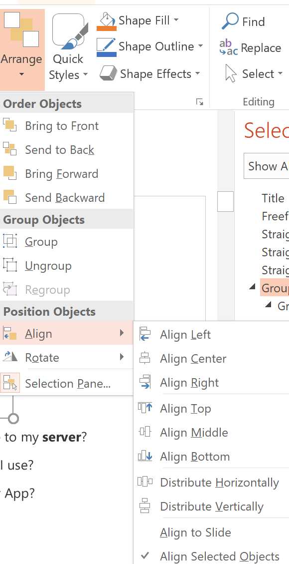
Figure 17: Arrange items
Tip: Aligning everything in the center could lead to annoying presentations. Better results can often be obtained using the rule of thirds.[22] You could use Ruler, Gridlines, and Guides from the View menu to have a better understanding of the dimensions and proportions of a slide. You can also insert a dummy object, use Distribute Horizontally or Distribute Vertically from the Arrange Items menu to better align your original object, and then remove the dummy one.
Spelling and grammar
You don’t need to be a grammar pedant to spot errors and typos. The Review menu has all the tools that you need, as shown in the following figure.
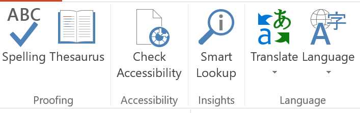
Figure 18: Spelling and grammar tools
- 1800+ high-performance UI components.
- Includes popular controls such as Grid, Chart, Scheduler, and more.
- 24x5 unlimited support by developers.