
PowerPivot Succinctly®

CHAPTER 3
Using your PowerPivot Model
Creating a rough and ready PowerPivot model is a great way to explore data, but most of the time those initial explorations need a little polishing if you are thinking about putting them in front of management or sharing it with your colleagues.
Below we will look at making the model look good and then how to make the data in it look good.
Tidying it up
There are a few simple things you can do to make the model itself a little more presentable.
Number formatting
First of all, any numeric or data column can have formatting applied to the numbers. On the Home Tab of the data Model there is a section of the Ribbon for Formatting:
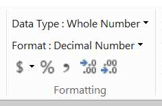
- The Formatting Section of the Ribbon on the Home Tab
Depending on your data type you get different options – effectively you can only apply formatting to Numeric and Date columns. For example we could apply a Decimal format to UnitsIn, removing the decimals, so you would get thousand separators in the numbers in that column.
The important thing is that any formatting you apply in the data model then flows on to several places. Firstly, any simple calculations directly on that column will inherit that format, so your SUM of UnitsIn will also have that format (our complex formula at a row level, however, will not).
More importantly, that formatting then also flows on to anything consuming that data – such as a Pivot Table or Chart. This is demonstrated below:
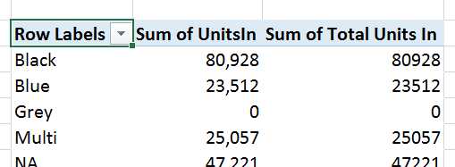
- Formatting flowing through from the data model
This is a quick and easy way to avoid applying lots of formatting in tables and charts.
Friendly Names
The next thing you can easily adjust is the names of tables and fields. Most data sources have names that work well for databases or other data storage systems, but not so great for people. For example, our starting view for browsing our model in a Pivot Table looks like this:

- Browsing the data with its original names
Most business users would probably prefer to see “Product” rather than “DimProduct”, for example. Renaming the tables is simple – at the bottom of the grid view each table has its name on a tab:
![]()
- Table name in the tabs on Grid View
We can quickly double click on each tab and rename the tables:
![]()
- Renamed Tables in the Grid View
These names are a bit more business friendly. However note that on the Product Tab we are being given a formula error warning. Renaming tables doesn’t flow through to the formulas automatically, so you can make a mess of your model pretty easily. As a recommendation it is generally easier to set the friendly name as you import the data.
Columns can also be given friendly names. This can be done in a couple of places – either within the Grid view by double clicking on the column header, or in the Diagram View by double clicking on the column name. Using the Diagram View is usually more efficient as you can see all the columns in a smaller amount of screen space.
The image below shows the effect of renaming columns in the diagram view:

- Renaming Columns
This starts making the model more presentable as you can turn technical names into terms business users will be able to understand.
Hiding Tables and Columns
The next step is to conceal components of the model that will complicate the experience for the users the model will be shared with. This can be done at the table level and individual column level.
To hide a table, right click on the name of the table and select “Hide from Client Tools”:

- Hiding a Table
This will leave the table visible in diagram view (slightly greyed out) and in grid view (with the tab name greyed out) but it won’t be available when creating a Pivot Table. This can be useful when you have working tables – like the Weight Conversions table – that in themselves are not useful for end user analysis – but support calculations or relationships that are needed elsewhere.
Similarly for columns in diagram view you can right click on an individual column and choose to “Hide from Client Tools”.

- Hiding Columns
The column name will be greyed out and as with hiding a table, will now not be available in a Pivot Table for analysis. This has a similar use case as there are columns – such as the Key columns in the above example – which have no value for end user analysis but are needed to support relationships and calculations.
The end result flows through to our Pivot Tables and Charts, so we get a much cleaner experience when browsing our data:

- Name changes flowing through to the Pivot Table field list
PivotTables
Once we have tidied up our data model we can use it to create some nice looking reports using Pivot Tables & Charts.
We have already used Pivot Tables to do some basic exploration, so let’s look at a couple of key features that PowerPivot enables or enhances in Excel. Pivot charts are pretty much unaltered in function so we won’t look at those in this book.
KPI’s
Key Performance Indicators are a standard feature of any dashboard – usually in a traffic light format so dashboard users can rapidly take in what KPI’s are performing well, and those which are not.
PowerPivot natively supports KPI’s as part of a variation of calculations. If we choose a cell in the area below the grid, we can add a KPI. To start with, we need to create a calculation as you will not in the “Calculations” section of the Home Tab of the Ribbon, the “Create KPI” option is greyed out:
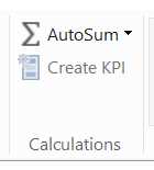
- The Calculations Tab of the Ribbon with Create KPI greyed out
We will pick an arbitrary calculation on Units Balance – in this case an Average. The Autosum option gives us this formula:
Average of Units Balance:=AVERAGE([Units Balance])
Importantly, we now see the “Create KPI” option light up:
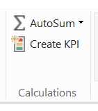
- The Calculations Tab of the Ribbon with Create KPI enabled
Clicking on the “Create KPI” option while having the calculation highlighted gives us a dialog to configure the KPI:

- Configuring a KPI
There are three key sections to work with:
- Define Target Value: This is the KPI goal – so this would be the target sales volume, for example
- Define Status Thresholds: This is where you set the boundaries for when the KPI turns Red, Amber or Green
- Select Icon Style: This is where you choose what graphics your client tool will present (if supported)
Our metric is just an example, so our thresholds don’t carry any meaning other than to demonstrate the effect. We update the settings as above then click OK.
The calculation now gets a little KPI adornment in the grid view:

- KPI adornment on a calculation
To demonstrate what this looks like in Excel, we’ll create a simple Pivot table with Color on the Rows. When we go to the Pivot Table fields to look for the calculation, we can see the way that it is displayed has changed:
- A KPI in the Pivot Table Fields list
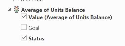
Under the traffic light icon we can see we have an option to see the measures Value, its Goal (which can matter if you’ve set a dynamic target) and the Status – which is our Icons. Selecting all three gives us this in our Pivot Table:

- KPIs in Pivot Tables
Effective display of KPI’s used to be reserved for high end dashboarding tools – but courtesy of PowerPivot, you can manage them in Excel!
Slicers
Slicers are a basic feature of Pivot tables[23] that has been available since 2010. They allow for rapid and intuitive filtering of data that works better with PowerPivot that native Pivot Tables.
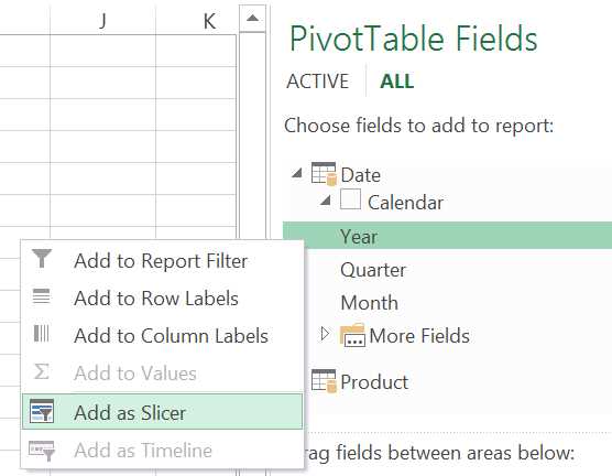
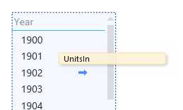
In the Pivot Table Fields section of a Pivot Table pointing at our data model, expand out the Calendar Hierarchy and right click on “Year” and choose the “Add as Slicer” Option:
- Adding a Slicer to a Pivot Table
To our Pivot Table, add “Alternate SubCategory” on the Rows, and Units Balance as the Value. What we will see is this Pivot Table with this slicer:
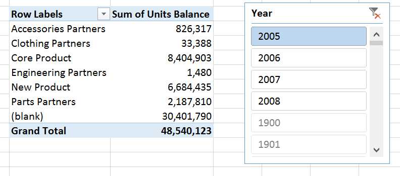
- Pivot Table with Slicer
There’s a couple of things to note from this. First, the Slicer lists the valid values for that pivot table at the top. When adding the slicer to start with before the Pivot Table have any other data, it just listed all years 1900 – 2100. Now it has some context, the valid values (2005-2008) are listed at the top. All other values are still displayed, but greyed out. The second thing to notice is how fast it is when you select different values – event though the data set has ¾ million rows in it, response times are instant.
Slicers are pretty slick in other ways – especially because you can attach them to multiple Pivot Tables and Charts to drive some flashy interactive reporting. The interactivity slicers bring – and particularly with the smarts that filters out irrelevant values makes it easy to build impressive and intuitive interactive reporting very easily.
PowerView
Another lesser known feature of Excel (2013 & Office 265 Professional Plus editions) is the Data Visualisation tool, Power View[24]. This is a rich, interactive tool that makes it easy to explore your data and create some very impressive reports.
To create a basic report, on the Insert tab of the ribbon is the Power View button. Clicking on it launches Power View in a new tab on the workbook (you may need to install Silverlight on first use).
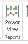
- Power View on the Ribbon
The Power View report surface is divided up into 3 functional areas:

- Power View report surface
Area 1 is the actual report canvas, where data will be displayed. Area 2 is for applying filters to the whole report – if you wanted to cut data down to just one reqion or time period, for example. Area 3 is the Field List, which functions very similarly to the Field List in Pivot Tables in terms of selecting data items to work with.
Power View is designed to be much simpler to build reports in – the design approach they took as that anything you do should never take more than two clicks, and most operations are drag and drop.
To create a simple data table, drag the Year level of the Calendar hierarchy onto the report design surface:

- The Year Hierarchy on the PowerView surface
Then into the same box, drag in the “Units In” measure from Product Inventory:
- Adding a measure to a table on the PowerView report surface
The basic table is created. Note how the formatting specified for the “Units In” measure is carried across to the report.

- A basic PowerView table
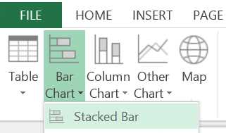
Now we can have some fun. Let’s convert this to a bar chart first. Select the table, and on the Design Tab of the Ribbon click on the dropdown Bar Chart in the “Switch Visualisation” section and choose “Stacked Bar”:
- Changing Chart Type in PowerView
The generated chart is a bit squashed, so by dragging on the corner on lower right hand side we can resize it to something more readable:

- A Bar Chart in PowerView
So, far so good. You can see the Chart has also given itself a meaningful title. Now we can demonstrate the interactivity of PowerView. On the right hand side of the design surface, drag the Color Attribute from Product, and then drag on to the table that appears Units In from Product Inventory. Then select an item on that chart and switch the visualisation to Pie Chart.
This is where it gets interesting. Click on the slice of the Pie Chart for the largest category – “Black”. You’ll see the chart to the left is then automatically filtered for Black products:
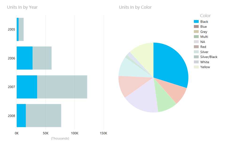
- Crossfiltering report items in PowerView
It goes the other way as well – if you click on one of the bars in the left hand chart, the pie chart’s results will be filtered for that year. The relationships in the underlying data model enable this kind of user friendly cross filtering with no expertise for the user at all. Plus it looks pretty slick!
Cards
Want to create highly visually appealing reports using images? PowerView supports the incorporation of images from the data model into reports as Cards[25], which look like this:
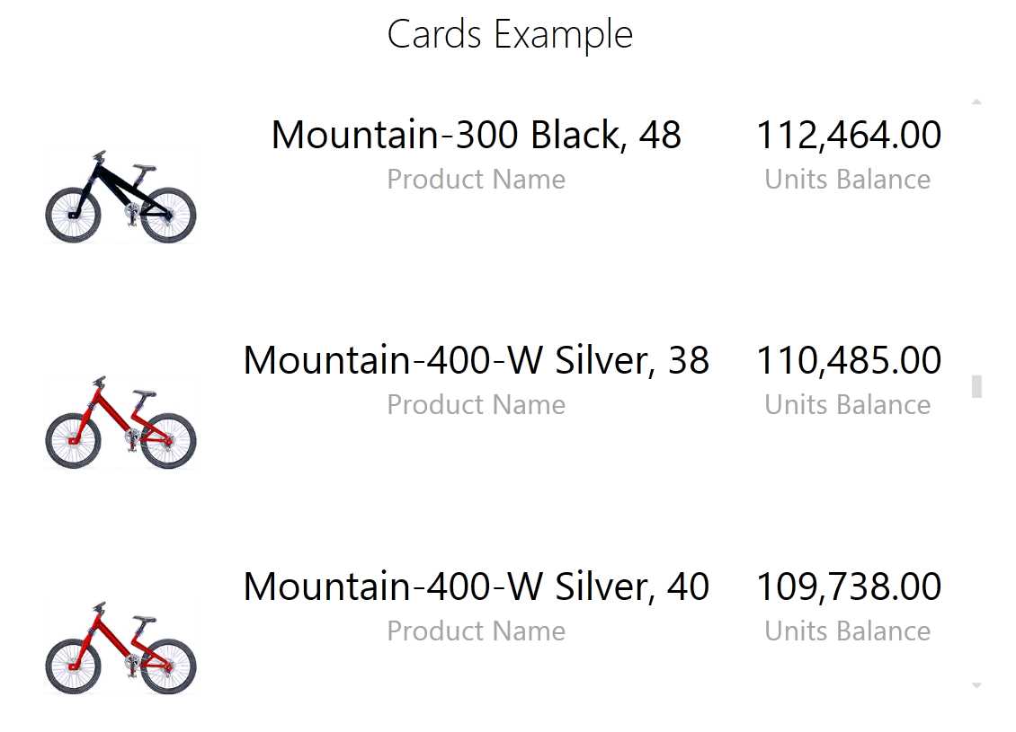
- PowerView Cards incorporating Images
Here we have brought in the images that are embedded in the product dataset and surfaced them on the report alongside some of the data sets attributes and metrics.
To get this functionality available a few tweaks need to be made to the table holding the images. On the Advanced tab of the Data Model there is a section for “Reporting Properties”. Click on the Table Behaviour option:

- Reporting Properties on the Advanced Tab of the ribbon
This launches the Table Behaviour dialog box, which needs a few settings configured. The below example has them filled out for our needs:
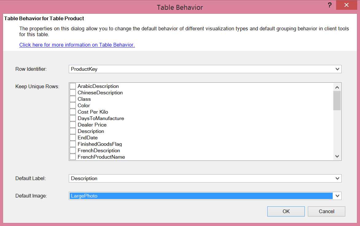
- Table Behavior dialog
The key settings are to set a unique row identifier – in this case ProductKey works for us – and a Default Image. In the model the LargePhoto column contains the image, though it displays in the Grid view like so:
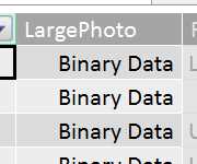
- Binary Data in the Grid View
Making the above settings makes the LargePhoto column able to be dragged onto the PowerView report surface and display as an image. Using the Cards visualisations then enables the kind of reports demonstrated at the start of this section.
Maps
Another impressive visualisation available is maps data. Below is a simple example:
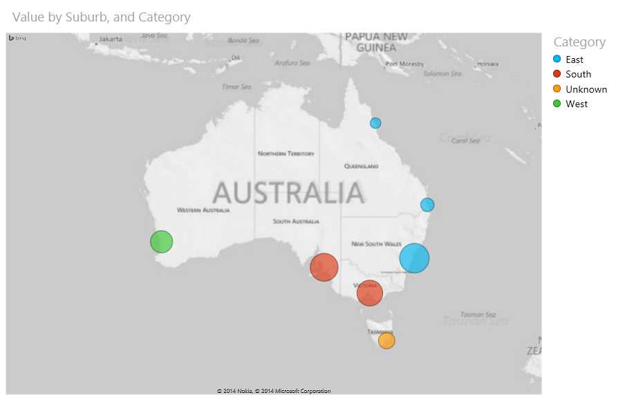
- PowerView Maps example
Which was built off of this simple data set:
Table 2: Maps Example Data set
Suburb | Value | Category |
Sydney, NSW, Australia | 10000 | East |
Brisbane, Australia | 2000 | East |
Hobart, Australia | 3000 | Unknown |
Melbourne, Australia | 7600 | South |
Perth, Australia | 5600 | West |
Cairns, Australia | 1200 | East |
Adelaide, Australia | 8900 | South |
- Maps Example Data set
One thing to immediately notice is that the data hasn’t been geocoded. PowerView takes the location data and sends it to Bing to geocode it – so as long as Bing understands it, it can create a point on the map for it. This does mean sometimes you need to add some extra detail to your data to get the correct results – the town of Birmingham, for example, can be found most famously in the United Kingdom, but also exists in Alabama, USA. It’s usually advisable to extend address data with State and Country data to get the right results.
These maps can be zoomed in and out of to give an appropriate level of scale. They do have some limitations – mainly that the visualisation is limited to circles on the map (you can subdivide the circles into pie charts but this kind of visualisation is largely useless for conveying information except in rare cases). You can colour the circles by categories – as done above using the Category column – which is the most meaningful way to apply some differentiation to the dots. This however relies on each dot only belonging to one category, otherwise the pie chart effect just discussed comes into play.
- 1800+ high-performance UI components.
- Includes popular controls such as Grid, Chart, Scheduler, and more.
- 24x5 unlimited support by developers.