
PowerPivot Succinctly®

CHAPTER 2
PowerPivot Model Basics
To help understand how to use the capabilities of PowerPivot, we will build a model using Microsoft’s AdventureWorks sample Data Warehouse for SQL Server as a source of data[2]. Don’t worry if you don’t have a SQL Server on hand – the sample workbook that supports this book contains all the data needed for these examples. The workbook is provided in two versions – one with the data imported as tables but none of the features built, and one with a completed model.
Getting Started
Enable PowerPivot
The first thing to do is to turn it on. Depending on your version of Office it’s either baked in or you need to download the Add-In.
For Office 2010 users you need to download the Add-In[3]. Then just run the installer and PowerPivot will appear on your Ribbon next time you open Excel.
For Office 2013 Professional Plus, Office 365 Professional Plus users and standalone Excel users, follow these quick steps:
- Go to File > Options > Add-Ins.
- In the Manage box, click COM Add-ins> Go.
- Check the Microsoft Office Power Pivot in Microsoft Excel 2013 box, and then click OK
The Ribbon will now feature a PowerPivot tab.
If you don’t have any of the editions mentioned, you’ll need to change your version of Office or Excel first.
Opening the PowerPivot Data Model
Accessing the Data Model is done via the PowerPivot tab on the ribbon. It is the “Manage” option in the “Data Model” section of the ribbon:

- The PowerPivot Ribbon menu in Excel
Clicking on the “Manage” button launches you into a new window with a new ribbon:

- The PowerPivot Data Model Ribbon
The main part of the data model is a blank space to start with. We will fill this out with data and relationships as we explore further.
Tables
The fundamental ingredient of a PowerPivot model are the tables holding data. This data can come from within the same workbook – or more powerfully from virtually any system you can get a connection to.
In the example below we will bring data into our model from 3 places:
- Our own workbook
- An Enterprise Source
- Azure Data Market
Using data within the same workbook
To use data from your workbook it first needs to be formatted as a table. For this exercise, we are going to create an alternative version of the Product Sub Category in the AdventureWorks database. First of all we will grab the relevant existing data from the database, paste it in and add a column called “AlternateSubCategory”:

- Sample Data in our Workbook
Then, from the Home Tab of the Ribbon, in the “Styles” section, I will choose to “Format as Table”

- Format as Table
The colour scheme you choose does not impact the functionality of the table. After applying a Style, Excel will automatically switch to the Design Tab of the Ribbon for “Table Tools”. Here it is useful to name your table in the “Properties” section of the Ribbon:

- Table Design Tools
This renaming is optional but will look better in your Data Model than a series of references to “Table1”, “Table2” etc. which are the automatically created names for tables.
Now, head to the PowerPivot tab of the Ribbon and with a cell in the table highlighted, click “Add to Data Model” in the Tables section:

- Adding a Table to the PowerPivot Data Model
PowerPivot takes over and adds the table to the data model with no further intervention from the user. The data model manager launches and you can view your data instantly.

- Excel Data in the PowerPivot Data Model
Initially we have put no values in the AlternateSubCategory column in our source in Excel. How values get updated in PowerPivot depend on how you have set up the way the table updates.
The Linked Table section of the Ribbon drives how this behaves:

- The Linked Table Manager
By default the Update Mode is set to Automatic, which means as you enter data in the workbook, PowerPivot updates automatically. In the example the worksheet was updated and the changes were reflected automatically.
It is important to note that you cannot update the data in the Data Model view – what you are looking at is a copy of your data that is reflecting what has been updated in the source – Excel. Whilst the data grid looks a lot like Excel, it’s important to remember that it is showing a read only copy of the source data. You can add calculations later but this is a layer on top of your source, not changing it.
Like in any workbook with lots of calculations, if the updates starts slowing things down you can set it to Manual. Then when you want to update the PowerPivot model with your worksheet updates, you select “Update All” or “Update Selected” to do so.
Using external data from an Enterprise Source
We have now created some alternate categorisations for some data in our Warehouse. The next step is to pull in that Warehouse data.
From the Home Tab of the PowerPivot data model manager, we have the “Get External Data” section to help us do that. We’ll start with the “From Database” option.

- Importing External Data
There are three options:
- SQL Server
- Access
- Analysis Services or PowerPivot
If the last option seems confusing it is because PowerPivot technology is also used in the Enterprise BI solutions – though usually referred to as Tabular models – and these can also be data sources. This will get covered in a little more detail later.
In this scenario we will be looking at using SQL Server. I won’t detail the Wizard here, but the steps are:
- Provide connection detail
- Select how to import data – whole table/view or custom query
- Select the tables to import – in this case FactProductInventory
- Opt to select related tables
- Click Finish
I’ll point out a couple of things from the steps above. Firstly when importing data you can specify to pull in an entire table or view – or – if you are comfortable in SQL – write a query that will select a specified amount of data. If you opt to pull in a whole table or view you can use the import wizard to restrict which columns you are pulling in and apply filters to those columns to restrict how many rows you pull in. This works as follows. In the below screenshot of the Table Import Wizard where you can select tables, there is a button for “Preview and Filter” at the bottom right hand corner:

- Table Import Wizard
Clicking on this button launches the Table Import Preview Window:

- Table Import Preview Window
This screen gives you a sample of the data but also gives you the ability to select / deselect columns from import by using the checkbox by the column name. Further, you can apply a filter by clicking the dropdown arrow to the right of the column name. This is data type sensitive – like a filter for an Excel Table – so Numeric filters can be ranges, less than and so on, whereas text filters would be “Begins with…” or “Contains…”
The below picture illustrates how this is displayed after applying a filter:

- Table Import Window with Friendly Name and Filters Pop-up
In the “Filter Details” column, a link appears. Clicking on the link launches a pop-up that shows the filter that is applied.
Also you can see that under the “Friendly Name” column, the default name has been overwritten so in the Data Model the object will have a more business friendly name. This renaming can always be done later in the Data Model Designer if you forget to do it during import, but to save yourself pain later (as name changes don’t propagate to your formulas automatically) it’s advisable to do it now.
Restricting the amount of data you pull in can be important for bigger sources because even though PowerPivot does offer impressive compression, you do have a finite size of workbook that limits how much data you can pull in. Later on in the book the section in which we discuss how compression works will give you the power to work out what columns can be removed to help prevent the size of your workbook blowing out. Row filters will make more sense in terms of the context of the data you are looking at – there is no point loading 15 years’ worth of sales data, for example, if you are only looking at the last quarter’s performance.
The other item to explore is the “Select Related Tables” button. In case you may be thinking that PowerPivot can magically detect data that is connected with the table you selected, unfortunately it can’t. What it does is for relational databases, if foreign keys have been coded in the database so that there is a strict relationship between objects (e.g. a Fact Table and the Date Dimension), is detect these coded relationships. If – like in many Data Warehouse systems – these haven’t been put in place as they are often difficult to maintain, you will have to work out what tables are related by yourself.
Using external data from the Windows Azure Marketplace
Another option for External data is Microsoft’s Market for datasets – Windows Azure Marketplace. In the “Get External Data” section from the Home tab of the Ribbon in the PowerPivot Data Model Designer (see Fig 9) there is an option for “From Data Service”. Selecting the “From Windows Azure Marketplace” option on the dropdown launches a marketplace browser.

- The Windows Azure Marketplace browser
From within this there are a range of interesting – and often free – datasets to bring in to enhance your analysis. You do need to have a Windows Live account to access the service.
In this example we will pull in Boyan Penev[4]’s very helpful “DateStream” dataset, which presents various permutations of date data for slicing up data. We search for “DateStream” and get this result:

- Table Import Wizard - Subscribing to a Data Set
Clicking on to “subscribe” brings us to a window where we can select fields and apply very limited filtering:

- Table Import Wizard - Select elements of a data set
We will just unselect some of the non-english language calendars, then click “select query”. In the next screen we just name the connection:

- Table Import Wizard - Naming the connection
Clicking next takes us to a screen where we can select which of the tables we want to import:

- Table Import Wizard - Selecting Tables
We just want the BasicCalendarEnglish so we just select that one and click next, and the import begins:

- Table Import Wizard - Import Progress
When complete, we get a new tab in our Data Model with the data from the Azure Marketplace available to integrate into our model.
Other Supported Data Sources
There are many other supported data sources which are available in the “Get External Data” section of the ribbon via the “From Other Sources” option.
Supported formats are:
- Windows SQL Azure
- Microsoft SQL Server Parallel Data Warehouse
- Oracle
- Teradata
- Sybase
- Informix
- IBM/DB2
- OLEDB/ODBC
- Microsoft SQL Server Reporting Services
- URL based Data Feeds
- Text Feeds
Whilst we won’t go into detail about connecting to each of these here, it is clear there is a wide range of data sources available to pull into our data models to support our analysis – all without the need for deep technical knowledge and/or complicated ETL processes.
Data Types
PowerPivot keeps things simple by having a limited range of supported data types[5]. These are:
- Whole Number
- Decimal Number
- TRUE/FALSE (aka Boolean)
- Text
- Date
- Currency
When importing your data into PowerPivot, it automatically maps the source data types to the target types. This simplification removes some of the common problems when working with disparate systems with incompatible data types. It also keeps expected calculation results simpler and formatting easier to work with.
One thing to be aware of is that the different types of data compress at different rates. The xVelocity Deep Dive section towards the end of this book will help you understand why, but the below table indicates which will compress better than others so you can guess at the culprits for hogging space.
Data Type | Compression Rate | Comments |
|---|---|---|
Whole Number | Good | Best compression of the numeric types |
Decimal Number | Poor | Decimal numbers do not compress well |
TRUE/FALSE | Excellent | Takes up a tiny amount of space |
Text | Good | The size of text is not significant |
Date | Good | Becomes Poor if it has a time component |
Currency | Poor | Marginally Better than Decimal |
- Table 1 - Data Type Compression rough guide
Hierarchies
Now we have our date data in our model, we can create a Hierarchy to structure how we explore the data. A hierarchy is a logical way of drilling down into a finer grain of detail from a higher level. A date hierarchy is very common when analysing data. Starting with the Year, we can drill down to Quarter, Month, Week and Day – and potentially even deeper – though for practical reasons time is usually modelled separately as the Date Dimension gets too big to work with if you include time as well.
To create a Hierarchy we first need to look at the data model in a slightly different way. So far we have only been looking at the data model in the Grid view – the Excel like way of exploring tables and rows of data.
Down at the bottom of the right hand side of the model is a small pair of icons:

- Switching between Grid and Diagram View
These icons allow you to switch between the Grid view and the Diagram View. Clicking on Diagram View opens a view of the model like this:
- The Diagram View
The Diagram view shows tables and their relationships to each other (more on this later). In the Diagram View we can also add Hierarchies.
To create a Hierarchy in the Date Dimension, right click on the highest intended level of the Hierarchy – in this case “YearKey” and choose “Create Hierarchy:”

- Creating a Hierarchy
A new Hierarchy is created with a default name:

- Default Hierarchy Name
We can change this to something more meaningful, like “Calendar”. Also we can rename the levels – double click on the name and you can overwrite the field name. The source name is shown in the designed in brackets after the field name.

- Renaming Hierarchies and Levels
A single level hierarchy is not much use, so we need to add levels in. We can just drag fields in below the top level we created, and rename them as we go.

- Adding levels to the Hierarchy
The practical impact of this is more easily understood if we view what browsing this looks like in Excel.
From the Home tab of the Ribbon in the PowerPivot Data Model, click the “Pivot Table” option and choose to create a Pivot Table in a new worksheet.
On the right hand side of the screen, the PivotTable field list will appear, just as for a normal Pivot Table. However what you see is not all the columns from your source table, but the tables in your PowerPivot Data Model:

- Browsing the Model in a Pivot Table
To explore our newly created Hierarchy, expand out BasicCalendarEnglish and click in the “Calendar” checkbox. If you expand out the Calendar node, you’ll see underneath the levels within the hierarchy that we just created.

- Exploring the Hierarchy in a Pivot Table
This automatically puts the hierarchy into the workbook. We can expand out a few nodes in the tree to see how our hierarchy looks:

- Viewing the Hierarchy in Excel
A hierarchy on its own is nice to have, but it only becomes really useful is we use it to slide and dice our data. However, if we were to drag a value from FactProductInventory to analyse – such as UnitsBalance – we would see this in the Pivot Table:

- Analyzing without relationships
And this warning would appear in the Pivot Table Fields window:

- “Relationships may be needed” warning
What is happening is that while FactProductInventory has a date element, PowerPivot hasn’t been told that the BasicCalendarEnglish table relates to FactProductInventory by the date keys. As it doesn’t know how to tie these pieces of data together, it just adds up all the values for UnitsBalance for the whole of the table for each level you look at in the hierarchy. As an interesting side note, you might notice that the levels of the hierarchy don’t total up (i.e. Year is not the sum of Quarters) – this is because at each level of the hierarchy you look at it tries to calculate the right value – but because there is no relationship every level of the hierarchy ends up returning the same value.
The logical next step in building our model is then to create a relationship so our analysis becomes more meaningful.
Relationships
One of the most powerful features of PowerPivot is its ability to formally relate data between different tables with a simple drag and drop operation, and subsequently pick up data from one table in the context of another. A simple example of this might be using your Date Hierarchy in the date table to filter the Product Inventory data in its table.
To do this in basic Excel involves sorting data and doing VLOOKUP formulas to get the related data. Too many VLOOKUPs in a workbook starts slowing it down pretty quickly, so you wouldn’t want too many of them, and certainly not against millions of rows of data.
For PowerPivot, this is bread and butter stuff and you’ll be able to create relationships between your data that enable powerful slicing and dicing with no need for complex formulas – often without the need for any formulas at all[6].
Creating relationships manually
Creating relationships is – as stated above – a simple drag and drop action. There are only a few restrictions that you need to bear in mind when creating a relationship:
- You can only build a relationship from one column to another
- i.e. you cannot create a relationship with two columns involved, unless you combine them together first to make a single column
- The columns you relate must be of a compatible Data Type
- For performance reasons, Whole Number to Whole Number are preferable
- The values in the column on one side of the relationship must be unique
- In data modelling terms, this is a one to many relationship
- Advanced workarounds exist for this – if you encounter the need for these the White Paper “The Many to Many Revolution 2.0” by Marco Russo and Alberto Ferrari is recommended reading[7].
With those factors in mind, we can create a simple relationship between our Date table and our Product Inventory Fact.
In Diagram View, click on the DateInt column in BasicCalendarEnglish to highlight it, and drag the cursor over to the DateKey column in FactProductInventory.

- Creating a relationship manually
When you release the mouse button, the relationship has been formed:

- A relationship
Note that the arrow points from the Many side of the relationship – FactProductInventory – to the Unique side of the relationship – BasicCalendarEnglish.
That is all that is needed to establish the relationship. To see it in action, we can go back to our Pivot Table we created earlier. It will have updated automatically – be careful about clicking Refresh as that doesn’t refresh the Pivot Table, but actually goes back to refresh all the data from the source.

- Exploring data with a relationship
We can see that a lot has changed now that PowerPivot understands the relationship. There are two big changes. First, the years are now filtered for the years where there is actually data, instead of every year in the calendar hierarchy. Second, each level of the hierarchy has a different number for the Sum of UnitsBalance and the months now add up to the quarter total, and quarters into the year.
To complete our relationships for this example, we will connect up DimProduct and FactProductInventory using ProductKey, and connect DimProduct and our Excel table SubCategory using ProductSubCategoryKey. With a little reorganisation, our model should now look like this:

- The Data Model with all relationships
Calculated Columns
Now we have some connected data we can start extending the model we have with some Calculated Columns. Calculated columns work pretty much the same way as a calculation in a Table in excel – you enter a formula once and then it applies to every row in the table. The key difference is that you can’t have different values in some rows to others – you can only set one formula and that will apply to every row without exception – there are no manual overrides for certain rows.
Building a Calculated column is a straightforward exercise – but we have to get familiar with a new formula language called “DAX”
DAX
DAX stands for “Data Analysis Expressions”. It is a deliberately Excel like language that makes it easy for advanced Excel users to start creating powerful calculations in PowerPivot models. As mentioned at the start of the book, it’s very easy to get started with but some of the advanced capabilities can stretch the brain quite a bit.
Creating a simple column
We will get started with DAX by creating a very simple set of columns in the DimProduct table. In Grid view, if we scroll across to the far right hand side of the model we get the option to “Add Column”

- Grid View: Add Column
In our data we have Unit Cost and Weight columns, so we can start by working out the cost of our products per kilo. To create the column, overtype the “Add Column” header in the Grid with the new column:

- Grid View with an Added column
On hitting Enter the column is added. You will see the shading of the rows turns to grey to indicate that the column is now in the model, and the “Add Column” reappears so you can add more columns.
Our next step is to create a formula. Over on the left hand side of the screen we can see the formula bar:

- The Formula Bar in the Data Model
To start creating a formula, enter into the formula bar and add an equals sign. Next, enter an opening square bracket (“[“) and a list of fields comes up. Starting to type “StandardCost” will start to filter the list. You can use the arrow keys to select a value if there are multiple options, and hit tab to select.

- Field prompting in the Formula bar
We can then follow up with a divide sign, and then choose the Weight field. Hit Enter and the formula has been created.
Unfortunately, when we hit enter this fills the column:

- Calculated Field Error
Unlike in Excel where errors are flagged on a row by row basis, in PowerPivot if you get one error thrown in the column, the whole column fails to calculate. If we highlight the field we get a dropdown menu appear at the right hand side of the cell:

- Column Error Dropdown
And our error is this:

- Calculation Error Message
This should be a simple enough problem to solve. We can quickly look at the data in the Weight column by using the filter on the grid. This is access by the drop-down button at the right of the field name, just like in Excel Tables:

- Filtering Data in the Grid
Scrolling down to the bottom of the list we see an entry for “(Blanks)” - so it quickly becomes obvious that it isn’t populated for every row. We can put in some simple handling using an IF and ISERROR statement just like in Excel:
=IF(ISERROR([StandardCost]/[Weight]),0,[StandardCost]/[Weight])
Now, our column calculates without an error whether Weight is populated or not:

- Successful Calculation
Lookup up data from another unrelated table
Exploring our data further, there is actually a column called “WeightMeasureCode” which has values of either Blank, LB or G. So our “Cost per Kilo” calculation isn’t all that accurate as none of the weights are in Kilos. We could embed the conversion in a nested IF statement, but there is a much more flexible and powerful option which starts showing the real value of PowerPivot.
First, we will add a new Table in Excel called “WeightConversions”:

- Weight conversions table
We will then add it to our Data Model.
Then in DimProduct, add a new column called “Weight Conversion”. To keep things simple, first we will show how to look up the conversion factor with the LOOKUPVALUE[8] formula like this:
=LOOKUPVALUE(WeightConversions[Conversion factor],WeightConversions[WeightUnitMeasureCode],[WeightUnitMeasureCode])
This is the equivalent to a VLOOKUP in Excel, but a lot faster and not tied to a fixed data range. If at any point new Weight Measures came in, you could simply add a row to your table in Excel, update the model and the forumla would pick it up.
LOOKUPVALUE needs 3 arguments:
- The column you want to return - WeightConversions[Conversion factor]
- The column you are looking up in - WeightConversions[WeightUnitMeasureCode]
- The column you are providing the value to look up from - [WeightUnitMeasureCode]
There’s a couple of things to note here. First is the addition of a table name into our column syntax. In our first formula everything was in the syntax “[Field Name]”. Now we are referencing another tables content, so we need to specifically call that out as “Table Name[Field Name]”.
Second is the LOOKUPVALUE formula expects that there is only one value that could be returned per lookup value – it forgives multiple rows in the lookup with the same value, but not different values.
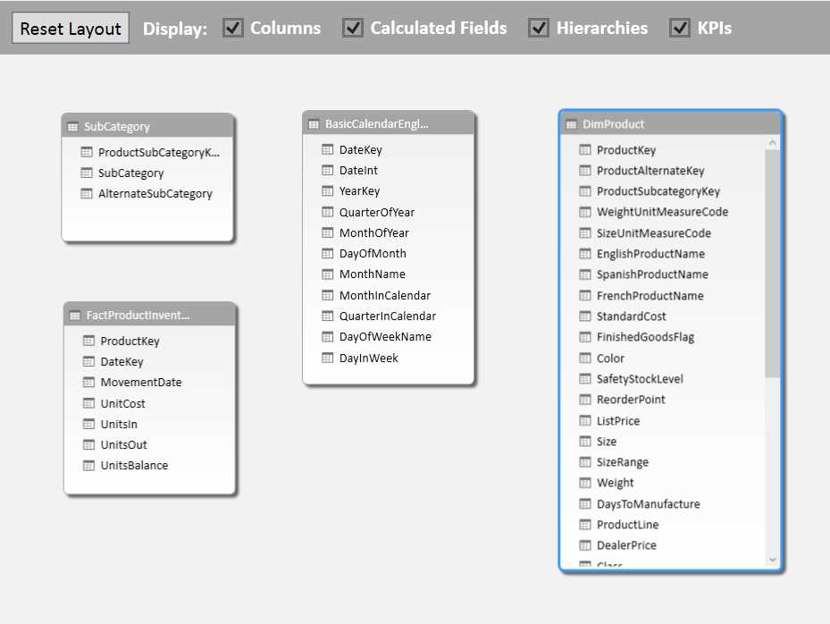
So now we have a lookup for our weight conversion that gives these results:
- Weight Conversion LOOKUPVALUE result
We can then correct our “Cost per Kilo” calculation by including this Weight Conversion in our formula:
=IF(ISBLANK([WeightUnitMeasureCode]),0,[StandardCost]/([Weight]*[Weight Conversion]))
Note also the removal of the “ISERROR” catch all and replacing it with an “ISBLANK”[9] assessing if we have a value in WeightUnitMeasureCode.
Replicating the Weight Conversion value in a column is bit inefficient – albeit a bit easier to understand, so lets shift the formula of that into our Cost Per Kilo formula:
=IF(ISBLANK([WeightUnitMeasureCode]),0,[StandardCost]/([Weight]*(LOOKUPVALUE(WeightConversions[Conversion Factor],WeightConversions[WeightUnitMeasureCode],[WeightUnitMeasureCode]))))
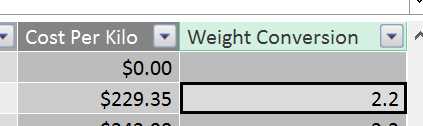
So finally we get accurate values in our Cost Per Kilo calculation using some data from another related table:
- Revised Cost per Kilo results
Lookup up data from another related table
We can simplify the above process by establishing a relationship between the two tables. In Diagram Mode create a relationship between the new table and the DimProduct table using WeightUnitMeasureCode.
Now, instead of using LOOKUPVALUE, we can use the RELATED[10] function, which uses the relationships in the data model to get related information.
The equivalent to the LOOKUPVALUE formula is this:
=RELATED(WeightConversions[Conversion factor])
Which is much simpler – we only need to know which column to retrieve. PowerPivot being aware of the relationships can then do all the thinking about how to connect them up based on its knowledge of how your data is structured.
So now the Cost per Kilo function can be simplified to:
=IF(ISBLANK([WeightUnitMeasureCode]),0,[StandardCost]/([Weight]*RELATED(WeightConversions[Conversion factor])))
The two functions exist because there may not always be a navigable relationship between the table you want to fetch information from and the table you want to reference the lookup value in. It is generally preferable to use the RELATED function as it is simpler to code and usually less computationally expensive.
Calculations on data in another table
We have just explored being able to pick up a single value from another table. But PowerPivot can do much more than that. Through the power of relationships, you have full access to the data in related tables.
This is illustrated below, where the single row for key “B” in the left hand side table is related to multiple rows in the right hand table:

- Data in a related table
The immediate challenge for this is that if you want to calculate a result, you can have only a single value returned. This means one of the key considerations when using related data is that if you want to retrieve data from the Many side of the One to Many relationship, something will need to be done to ensure only a single value is returned.
Typically this is done by using an aggregation function, such as SUM or AVERAGE. We can explore this in our model by getting some values from FactProductInventory and capturing them in DimProduct.
Let’s start with a simple SUM[11] operation. In DimProduct we can add another column, this time called “Total Units In”. We can then enter the formula:
=SUM(FactProductInventory[UnitsIn])
However when we look at the results, we get this result:

- SUM without context
This is due to a problem called Context. We will explore this topic more later – but the key problem is that the SUM expression doesn’t have any filters applied, so it simply adds every row in the FactProductInventory table.
If we turn this Calculated Column into a Calculation at the bottom of the Data Grid this problem will go away as the relationships start having an effect again – but we will look at this later as doing it this way will teach us some lessons about context.
If we want to fix it at the row level, we need to give the SUM expression an idea of how to filter the rows in FactProductInventory. We can use a variation of the SUM expression, SUMX[12]. This allows you to sum over an expression.
This is one of the moments we go for the deep end. The formula to get the result we need is:
=SUMX(FILTER(FactProductInventory,FactProductInventory[ProductKey]=EARLIER([ProductKey])),FactProductInventory[UnitsIn])
So as well as introducing SUMX, we are bringing in a very important function, FILTER[13], and also the EARLIER[14] function which doesn’t get used as often. Let’s step through building this up.
SUMX takes two arguments – a table of data, and a expression to sum. So in our first pass, we could try just using FactProductKey as the table and UnitsIn as the expression:
=SUMX(FactProductInventory,FactProductInventory[UnitsIn])
However that just gives us the same result as SUM:
- SUMX without context
This is because all we have really done is replace SUM with SUMX – all we did by changing to SUMX was explicitly specify what table UnitsIn was in, when SUM worked it out from the relationship.
What we need to do is apply a filter to FactProductInventory. Here we look to the FILTER function. The FILTER function applies a filter to the table of data you are trying to retrieve a result from. So in our example we want to filter FactProductInventory by the current value of ProductKey in DimProduct. However if we try with this formula:
=SUMX(FILTER(FactProductInventory,DimProduct[ProductKey]),FactProductInventory[UnitsIn])
We still get the same result. The reason for this is that the filter is applying the filter to FactProductInventory using every value for ProductKey in DimProduct. This is one of those places where we have to start thinking differently to how we do with Excel. In Excel in most formulas any arguments you provide are at an individual cell level. In PowerPivot it is far more common to input a table of values. This case is a good illustration – specifying DimProduct[ProductKey] is not requesting the current rows value for that field – it is specifying the contents of the whole column.
In the data we have the effect of this isn’t immediately obvious as every value of ProductKey in FactProductInventory is also in DimProduct. If there were more values for ProductKey in FactProductInventory than in DimProduct, we would have still seen the same number in every row, but that number would likely be different that we saw for the SUM function, as the result would have been filtered for only those values of ProductKey in FactProductInventory that were also in DimProduct.
So, difficult concepts aside, how do we get the filter to take the current rows value of ProductKey into account? Here we reach for the EARLIER function (we could also use the EARLIEST[15] function but EARLIER works fine in this case). What this does is grab the Row Context from an earlier pass of the calculation engine[16] – which for our example means the value of ProductKey in DimProduct for the row the calculation is being performed on.
If we revisit our target formula:
=SUMX(FILTER(FactProductInventory,FactProductInventory[ProductKey]=EARLIER([ProductKey])),FactProductInventory[UnitsIn])
The highlighted section uses the EARLIER function to set the filter to be where FactProductInventory[ProductKey] is equal to the ProductKey for the row of DimProduct the formula is being evaluated for. We now get a result like this:

- SUMX with context provided
If you still feel like you are at the deep end, don’t worry – EARLIER is one of the harder functions to understand, and it is brought up here more to start raising your awareness of Context in PowerPivot.
Calculations
Row Level calculations are useful but where PowerPivot really shines is when calculations are applied at the table level. You may have been wondering why at the lower portion of the Grid view, there were several rows of grey cells. This is the workspace for adding calculations.

- A selected cell in the calculation workspace
In the figure above we have selected a cell. To create a calculation we go to the formula bar, give our calculation a name and enter the expression. To revisit our earlier calculation, let’s SUM the UnitsIn field. Given the sum is applied to FactProductInventory, we’ll put it on that tables grid for ease of location. The syntax we need is:
Total Units In v2:=SUM(FactProductInventory[UnitsIn])
Note we have to call it “v2” or some variation as PowerPivot won’t allow calculations with the same name as one that already exists. What we see is this:

- Calculation result
If we now go to Excel we can see a couple of interesting things. From within the Data Model choose to create a Pivot Table in a New Worksheet. In the fields drag DimProduct ProductKey to the Rows, and from FactProductInventory choose UnitsIn and out measure, Total Units In v2:

- Pivot Table settings
What we see in the Pivot Table is a set of results like this:

- Pivot Table results
There’s a couple of things to pick up on here. First, it seems that our effort in creating our measure is a bit wasted, as PowerPivot seems to add up Units In in the way we want without having created a measure. Second – and more importantly – we haven’t had to do any clever calculations to get the right result on a row by row basis. We’ll look at these below.
Default Aggregations
PowerPivot by default creates a default aggregation calculation on any numeric column it finds. You may have picked this up when building the Pivot Table if you accidentally clicked the checkbox next to ProductKey instead of dragging it into the Rows area, as it would have automatically added it to the Values section.
This behaviour can be changed. On the Advanced tab of the Ribbon in the Data Model, there is an unlabelled section containing an option for “Summarize By”:

- The Summarize by option on the Advanced Tab of the Data Model Ribbon
The Dropdown menu from Summarize By gives you the following options:
- Default - which is always Sum
- Sum
- Count
- Min
- Max
- Average
- DistinctCount – which is a count of unique values
- Do not summarize
In our case ProductKey is not actually a meaningful number we can Sum, Average or otherwise. So it would be a good idea to set it to “Do not summarize”.
By default, having numeric columns Sum is a handy way to save having to do much in the way of creating calculations.
AutoSum
Sometime it is useful to perform multiple operations on a column – say we were looking at temperatures across time periods – knowing the Min, Max and Average are all useful – though the Sum itself is useless.
In a case like this it would make sense to set the default aggregation to Average. We can then quickly add the Min and Max using the AutoSum option provided. On the Home tab of the Data Model ribbon, to the far right is a section called Calculations and within that a dropdown for AutoSum:

- The Calculations section of the Home tab of the Data Model Ribbon
When you have a cell selected in the column you want to AutoSum, choosing a value from this dropdown will automatically add a calculation. If we selected ProductKey in the DimProduct table and then selected “Average” we would see the following measure created:

- A calculation generated by AutoSum
This isn’t going to save you heaps of coding time, but for those who are non-technical it’s an easy way to get calculations created.
Context in calculations
The other big takeaway from creating our calculation is that we didn’t have to do anything to get the correct context – i.e. the Sum of UnitsIn had the right value per ProductKey without us doing anything particularly clever.
We will revisit this later but the important thing to be aware of is that for calculations – as opposed to calculated columns – PowerPivot applies the correct filters to the rows of data so you get only the values you are expecting because it understands what context you are viewing the data in based on the relationships you have created.
Time Intelligence
There’s a lot of functionality within DAX for performing powerful calculations, but one of the most important is the capability Microsoft likes to call Time Intelligence[17].
To give you a taste of this, we will look at a couple of DAX functions in this category, PREVIOUSDAY and TOTALMTD. However first we need to tell PowerPivot which table should be used as the Date Table on which it will base its Time Intelligence calculations.
Creating the Date Table
We have already loaded in a Date table, but we didn’t tell PowerPivot what was the contents of the table. If we select our BasicCalendarEnglish table in the grid view, and head to the design tab, there is a “Mark as Date table” option. Choose from the Drop Down menu “Mark as Date Table”.

- Mark as Date Table option on the Design Tab
This brings up a dialog in which you need to pick the date column. This has to be a date data type and contain no duplicates. We will pick the “DateKey” column:

- Selecting the Date Column for the date table
Then the job is done – PowerPivot now knows this table can be used as a reference when building up Time Intelligence calculations. A constraint we have skipped over is that the date ranges must also be continuous – i.e. there must be an entry for every day between the lowest and the highest dates in your date table. Because we have used a reliable external source this wasn’t a problem for us, but if you build your own be sure it contains contiguous dates in the range otherwise your calculations could return incorrect results.
Now let’s look at a couple of functions to understand how Time Intelligence works.
PREVIOUSDAY
The PREVIOUSDAY[18] function unsurprisingly returns the previous day in your Date Dimension to the one currently selected. This is useful for calculating daily movements in data.
In our example, we will create a calculation that works out what UnitsIn was on the previous day. To start with, we will just calculate what the previous day was:
PreviousDay:=PREVIOUSDAY('Date'[DateKey])
In the calculation area, this shows the result:

- PREVIOUSDAY calculation result
This is not a concern however – and once again is down to Context. At this level, the Date table is not part of the filters you are applying to the data, so in this context there is no Date that the function can work out a previous day for.
If we create a simple Pivot Table that uses the Date table with the Date on rows, and our measure as the values we see the following result:

- PREVIOUSDAY calculation viewed in a Pivot Table
As we would expect, the value of the PreviousDay calculation is the previous calendar day.
Now, to leverage this to create a movement in data values from the previous day, we need to retrieve the value of UnitsIn for the previous day. The formula we need to do this is:
PreviousDayUnits:=CALCULATE(SUM([UnitsIn]),PREVIOUSDAY('Date'[DateKey]))
This introduces a new function – CALCULATE[19] - and a new concept – Filters. The CALCULATE functions power is in being able to modify the context of the formula. If we want the sum of UnitsIn, we can just create a SUM on that column. If we want to get that SUM for the previous day, we need to override the context provided by the Date table with a new context – in this case the context of the previous day, as calculated by the PREVIOUSDAY function.
Again, in the calculation area we don’t get a meaningful results as there is no Date context provided:

- PREVIOUSDAY without context
But if we add our new measure, plus the UnitsIn for comparison, into our Pivot Table, we see this:

- The PREVIOUSDAY impact in the CALCULATE function
Here we can see that the results for PreviousDayUnits are now offset by one day from the result from UnitsIn.
To then create a movement, we just need to subtract the previous days figure from todays figure:
DailyUnitsMovement:=SUM([UnitsIn])-CALCULATE(SUM([UnitsIn]),PREVIOUSDAY('Date'[DateKey]))
Which yields the result:

- Using the PREVIOUSDAY and CALCULATE functions to create a day to day movement
Obviously these figures are a bit nonsensical but the power to create this kind of calculation is very helpful if you need to monitor time based changes in numbers, such as account balances, average temperatures and so on.
TOTALMTD
The TOTALMTD[20] function calculates a Month to Date Total. All you need to supply is the value you want to total and the Date to use. So if we wanted to create a Month to Date sum of UnitsIn, we would simply add a calculation with this formula:
UnitsMTD:=TOTALMTD(SUM([UnitsIn]),'Date'[DateKey])
This then gives this result in a Pivot Table:

- TOTALMTD in action
Here we can see the UnitsMTD calculation slowly increasing in value with the UnitsIn that are added each day.
This isn’t a very complex formula – but it is something that would require some complex manipulation if you were trying to do it in Excel. The great thing about Time Intelligence functions is that it makes it very easy to do time based analysis with a very low level of effort.
Context
We have been skirting around the subject of Context throughout these last few sections[21]. Now it’s time to get to grips with it. The context defines what data is available when you do a calculation – so it is a mix of the impact of filters, relationships and location of your formula.
There are three different types of Context:
- Row Context
- Query Context
- Filter Context
We’ll explore these one by one.
Row Context
We experienced Row Context when we were creating Calculated Columns. In Row Context you have access to all the values in that Row, plus any related data from any tables that are on the “one” side of a one to many relationship with that Row.
This helps explain some of the issues we experienced building those formulas. The initial part of the formula which we built - cost per kilo – only needed values from the row we were operating in, so it worked fine:
=IF(ISERROR([StandardCost]/[Weight]),0,[StandardCost]/[Weight])
All the highlighted values we wanted to use were available in the Row Context.
As we extended this, we pulled in related data from the “one” side of a one to many relationship from our Weight Conversions table using the RELATED function:
=IF(ISBLANK([WeightUnitMeasureCode]),0,[StandardCost]/([Weight]*RELATED(WeightConversions[Conversion factor])))
However, once we tried to pull in data from the Many side of a One to Many relationship things stopped behaving quite so well and we ended up with this formula:
=SUMX(FILTER(FactProductInventory,FactProductInventory[ProductKey]=EARLIER([ProductKey])),FactProductInventory[UnitsIn])
In this case what we are effectively doing is creating our own context within that cell and largely ignoring the row context, expect for where we use EARLIER to obtain a value from the current row to act as a filter.
So as quick summary, when we are in a Calculated Column, the following data is available within that Row Context:
- Values from Columns in that Row
- Values from Related Tables that are on the One side of a Many to One relationship
Query Context
When we created Calculations and worked with them in Pivot Tables, we began to work with Query Context. Whenever we create a measure such as a SUM of a column, you’ll note that the value that appears against the formula in the calculations is always the total of everything in that column. This is because at that time the Query Context for that measure is the whole table.
When we move that calculation into the Pivot Table, the way we slice and dice the data changes the context for each cell we calculate. Let’s explore this using a sample Pivot Table:

- Query Context Sample Pivot Table settings
Here we have applied a filter, sliced on rows and columns and summed UnitsIn. Viewing this in the Pivot Table:

- Query Context Sample Pivot Table
To get our value of 2888 for the SUM of UnitsIn – highlighted in green, we get the context from Calendar as the Pivot Table filter (highlighted in blue) to year 2007. Context also comes from the Colour Blue (in purple) and SubCategory (in orange).
The application of this context is something that PowerPivot does automatically. Any time you look at a calculation in a client tool such as Excel, when it returns an individual cell (such as the one highlighted in green above) it looks at all the applied filters to work out the context and applies that to the measure to give you the correct result.
To summarise, when we are looking at a calculation, the context comes from the slicers and filters you apply to the cell of data you are looking at.
Filter Context
Last of all is filter context, which we have explored when using the CALCULATE function to work out a Previous Day value. Filter context applies on top of Query or Row context (or in some cases can deliberately override it).
The CALCULATE function is a bit of an indirect way of looking at this effect so we will look at it using a direct application. Look at the below formula, which is applying a FILTER function to a SUMX of UnitsIn:
FilteredSumOfUnitsIn:=SUMX(FILTER(FactProductInventory,RELATED(DimProduct[Color])="Blue"), FactProductInventory[UnitsIn])
It is using the RELATED function to identify if the Product is Blue in colour, and filtering the Product Inventory table for those products that meet that criteria. If we examine this in a PivotTable, where we have a Calendar Filter and use the Product Line on the Rows:

- Filter Context Pivot Table
We can see here that the FilteredSum of UnitsIn is taking into account the filters applied by the Query Context (i.e. Calendar Year and ProductLine) and overlaying the Filter context of the Product having to be Blue.
Filter context is a modification of Query context. However as mentioned, it can do more that lay on top of the query context – it can also override it.
Using the ALL[22] function you can override every filter. For example, in this formula:
UnFilteredSumOfUnitsIn:=SUMX(ALL(FactProductInventory), FactProductInventory[UnitsIn])
Here we are asking the expression to disregard all filters on FactProductInventory when appling the SUMX. If we add this to our Pivot Table:

- ALL function overriding query context
What we see is that all filters – including those from the Query context – have been removed, and we are just seeing the grand total of UnitsIn for the whole table. The use of this function in isolation is limited – but it often serves as a useful means of clearing filters in more advanced calculations such as calculating percentages of totals.
- 1800+ high-performance UI components.
- Includes popular controls such as Grid, Chart, Scheduler, and more.
- 24x5 unlimited support by developers.