
Power BI Succinctly®

CHAPTER 2
Service
Power BI is not a product we install, but rather a product that is carried out in the Microsoft Cloud that we can use in different interfaces.
The service allows us:
- Simple and quick data access
- Complete real-time vision of the business
- Search and discovery of the data (in order to create dashboards and reports)
- Data analysis from any device
- Sharing within the organization
- Company-wide displaying and analyzing of the data
Data sources
There are many types of data sources:
- SaaS solutions, e.g., Marketo, Salesforce, GitHub, Google Analytics, CRM Online
- On-premises data, e.g., SQL Server Analysis Services
- Organizational content packs, e.g., corporate data source or external data services
- Azure services, e.g., Azure SQL, Stream Analytics
- Excel files, e.g., workbook data/data models
- Power BI Desktop files, e.g., data from files, databases, Azure, and other sources
The organizational content packs stand out in the data sources. They offer a simple and intuitive way of sharing data within your company.
A program interface has been introduced in Power BI through a RESTful API that allows interaction directly with the service, building datasets and, if necessary, importing our Power BI visualizations inside our applications as web applications.
In order to try Power BI, you can register for the service free of charge. But be sure to pay attention and use an Office 365 email address, which must end with the domain microsoft.com (you can also use a company email account). Email accounts from many public servers, such as gmail.com, live.com, hotmail.com, and outlook.com do not allow the registration.
When you have registered, you can test the functionalities. It is possible to update the license at any time, simply by subscribing to Power BI Pro.
The supported browser and mobile applications
Because it is an online service, we can use Power BI directly from the browser, through a supported web browser or a mobile app. The supported browser versions are:
- Microsoft Edge
- Internet Explorer 11
- Chrome desktop, latest version
- Safari Mac, latest version
- Firefox desktop, latest version
- Power BI (works with older browser versions, but may have rendering problems)
Along with the browser, we can also use these mobile apps:
- Windows
- iOS (iPhone and iPad)
- Android
- Windows Phone 10
The supported functionalities are:
- Definition of the Favorites bar for the most important visualizations.
- In/out zoom of the visualizations
- Annotations of the visualizations and snapshot sharing.
- Alert configuration for receiving reports about the critical business KPI.
Building blocks
Power BI is composed of “tiles,” which are the main elements of Power BI. Called “building blocks,” they are:
- Dataset: the data collection that is the subject of analysis.
- Report: allow us to view our data in different ways, which can give us greater insights and allow us to draw deeper conclusions.
- Dashboards: allow us to monitor the most important data at a glance. We can select the visualizations/reports we want to publish to the dashboards through the pinning mechanism and combine them in order to offer a glance at the business.
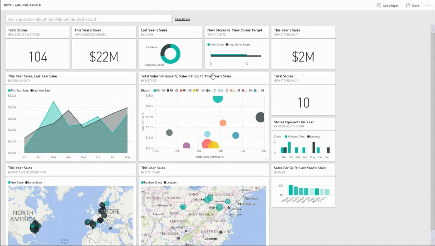
Figure 4: Dashboard Examples
It is possible to use the Navigation pane to create or select the elements, or building blocks, of interest.
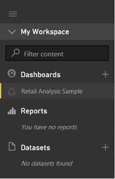
Figure 5: Building Blocks
Note that the dashboards show the tiles in a single canvas.
A tile derives from the pinning of a single display in a report or from a Q&A answer.
A dashboard can be based on one or more datasets.
The tiles can be resized, and they can be updated.
As Figure 6 shows, you can use Q&A to ask questions in the dashboard and in the natural language.
![]()
Figure 6: Q&A Field
In order to connect to a dataset, the dashboard must contain at least one tile.
Only cloud-based datasets associated with the current dashboard are supported. Q&A provides support for the formulation of questions, and Q&A also formats the questions with suggestions, autocomplete, and even corrections. Note that only questions in basic English are supported. Using meaningful nouns within the basic model works best.
A report is built starting from a dataset. The model is displayed, and we select the data from the dataset directly in the report.
Power BI Services is composed of the following areas seen in Figure 7.
Figure 7: Power BI Service
- Navigation bar
- Dashboard with tiles
- Q&A question box
- Help and Feedback buttons
- Dashboard title
- Office 365 app launcher
- Power BI home buttons
- Additional dashboard actions
Service types
Power BI Services is, in fact, a particular service that we can access through a set of functions. It offers a number of functionalities and is free, so we refer to this version as the “freemium.” There is also a pay version of the same service, Power BI Pro, which does not have the limitations of the freemium version.
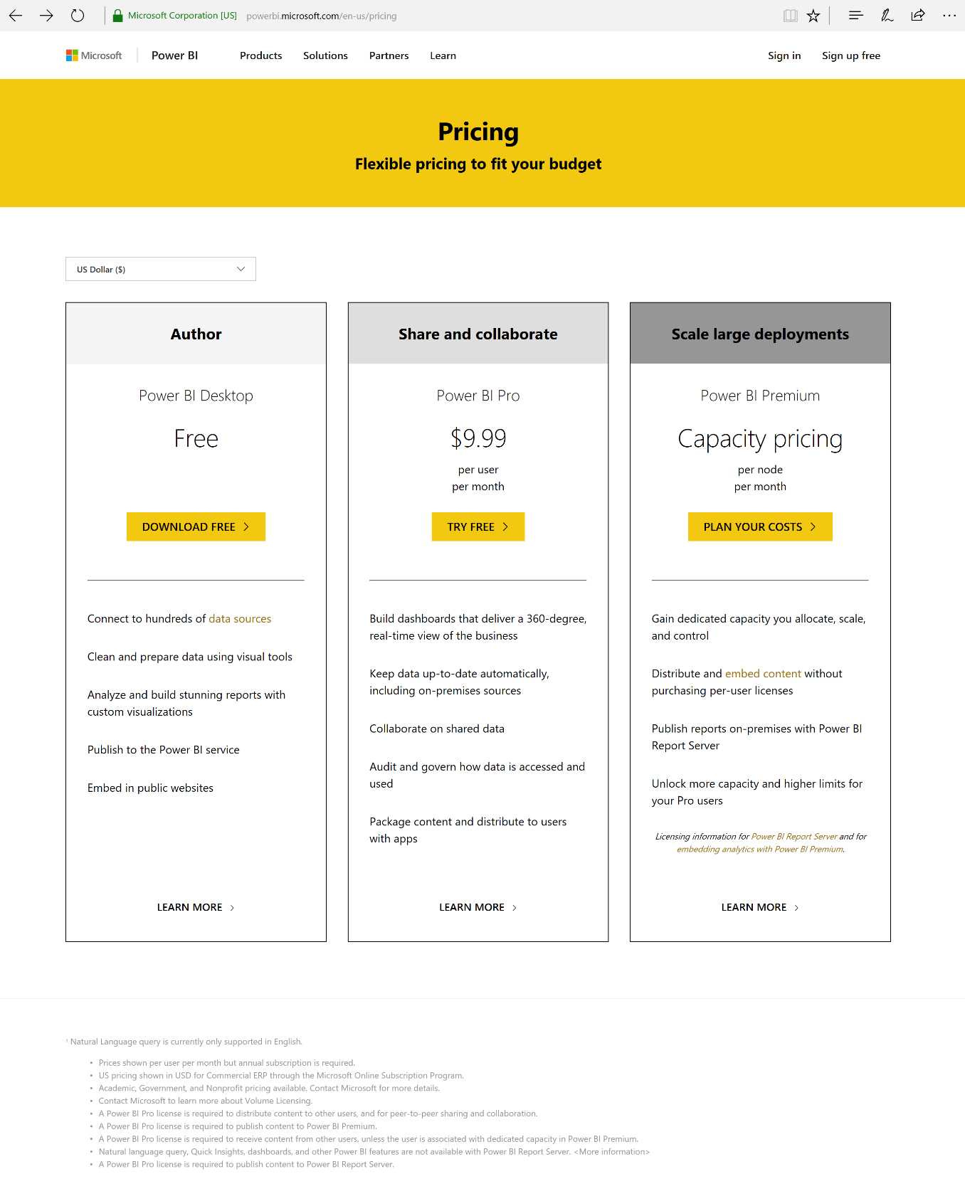
Figure 8: Power BI Licensing
Note that the “publish to the web” option is a free functionality in both versions. However, the data update and the cooperation of the two versions differ from each other—with the pay version, the data can be updated with very high frequency. Also, with the pay version we have 10 GB available for data storage and processing, while with the free version we have only 1 GB.
With the pay version, we can carry out planned updates more than eight times a day. With the free version, the updates can be carried out only once a day.
An example
Let’s start from zero. We import a certain example of data that we can download from this website: Financial Sample workbook for Power BI. Note that the data can be loaded from:
- My Organization
- Services
- Files (directly from the system file)
- Databases
Uploading the data from the system file, a CSV in our example, Financial Sample workbook for Power BI, the data model is imported quickly and available within a few seconds.
The fields are automatically recognized by Power BI.
Figure 9 shows that if you drag the Sales field to the white page of the report, Power BI will display the data in the method it considers most appropriate at the time.
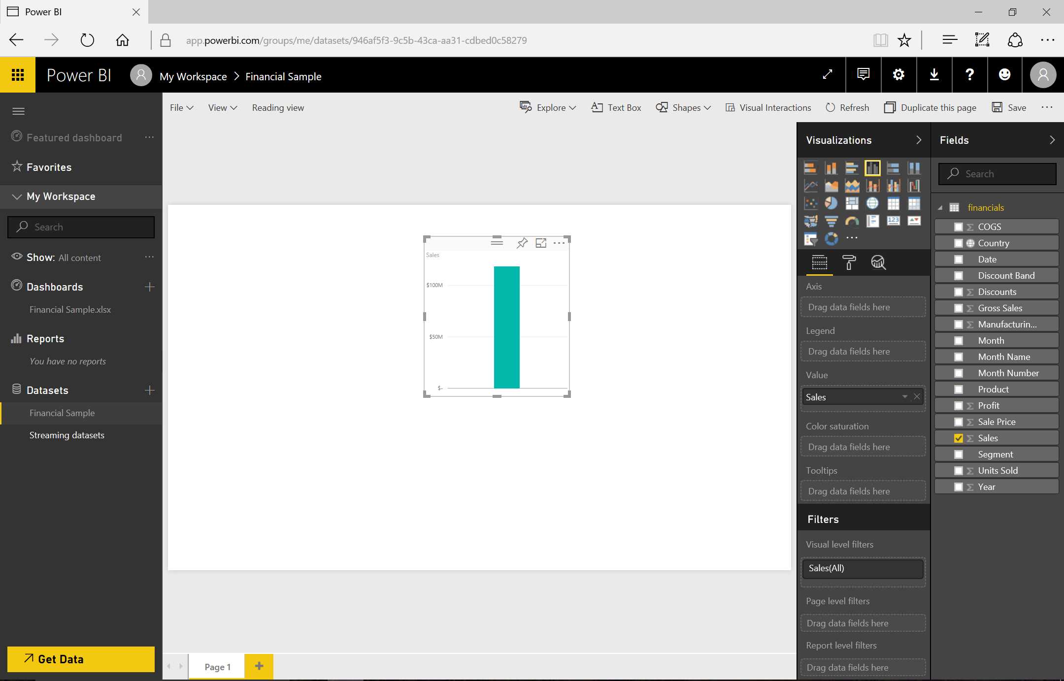
Figure 9: Power BI Displays Data
If you drag the Year field to the graph, as in Figure 10, you will immediately notice that Power BI reworks the visualization by adding the year.

Figure 10: Power BI Displays Data
We can move the year to the abscissas field and see how Power BI now changes the visualization by taking the modification into consideration, as in Figure 11.

Figure 11: Power BI Displays Data
We can implement the drill down by placing the Month field under the Year field (in the x-axis section). The drill down is enabled by clicking the round icon with the “down” arrow. If we analyze the data by clicking the Year, the visualization changes by also showing the Months.
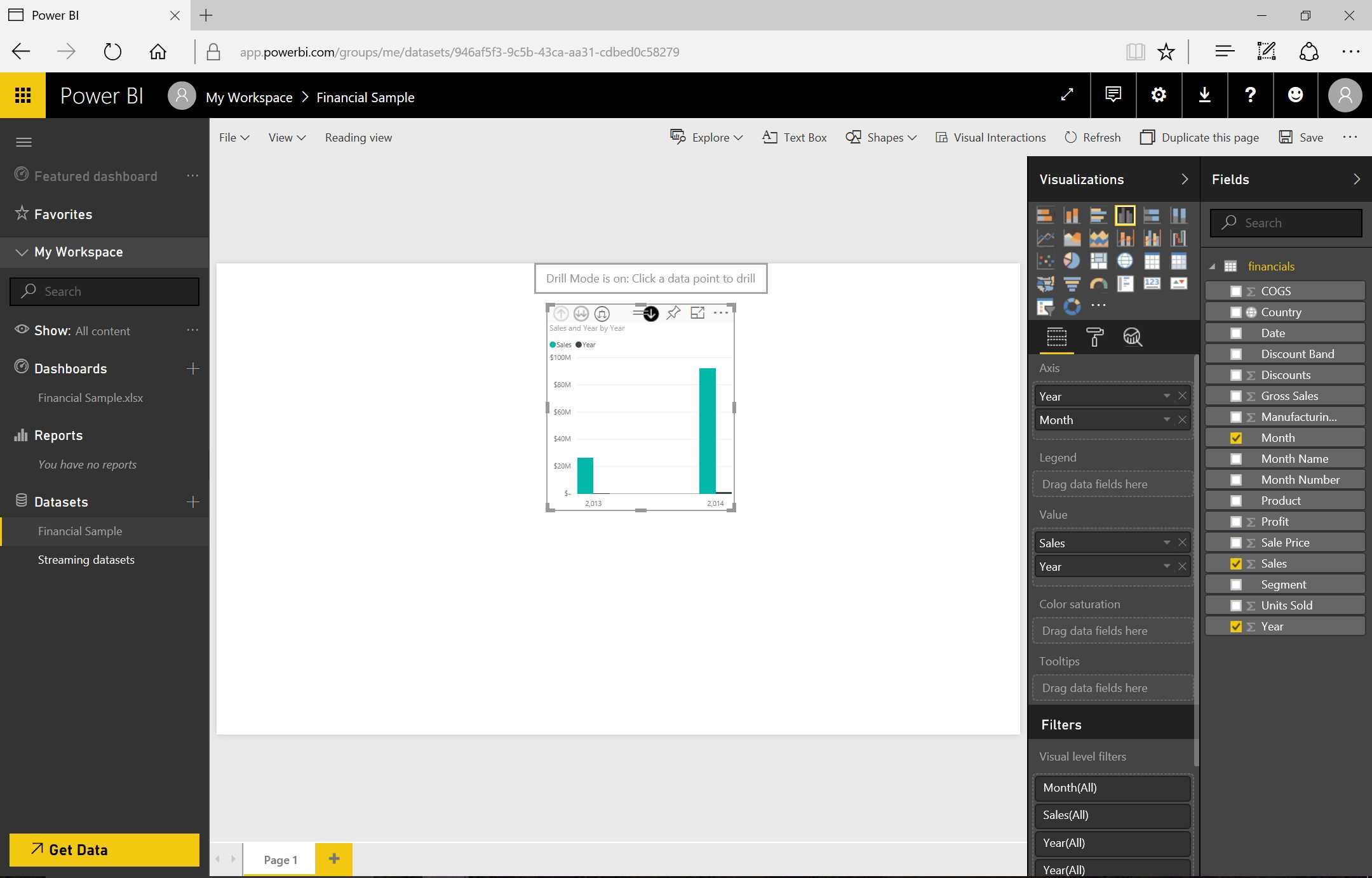
Figure 12: Power BI Displays Data—sequence
Note that by double-clicking on one particular year, we can go into detail.
If we want to go up with the visualization, we must click the “Drill Up” icon.

Figure 13: Power BI Displays Data
Afterward, we add another visualization—a slicer.
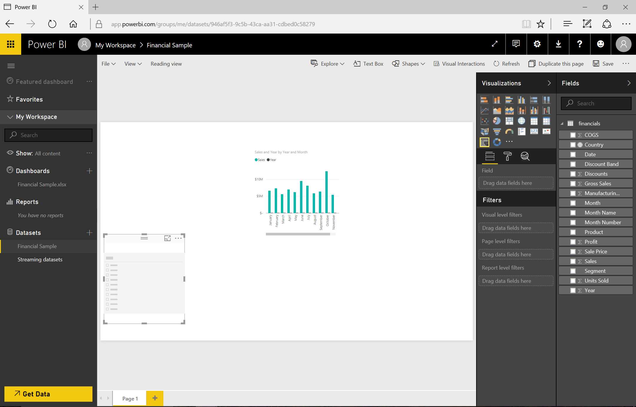
Figure 14: Power BI Displays Data—Slicer
Next, as we see in Figures 15 and 16, we select the Segment field and drag it into the slicer.

Figure 15: Power BI Displays Data—Use of Slicer

Figure 16: Power BI Displays Data—Use of Slicer
We can interact with the report by noticing how the selection of a value in the slicer affects the adjacent visualization.

Figure 17: Power BI Displays Data—Use of Slicer
Now we create a new dashboard and save the report, as the three graphics in Figure 18 demonstrate.


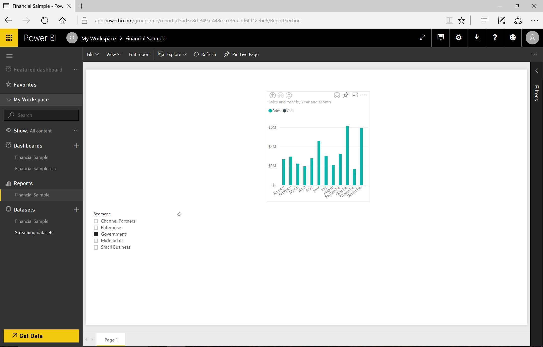
Figure 18: Power BI Display—Datase of Slicer—sequence
When we have saved the report, we can select the Reading View mode, which allows us to interact with the data by clicking the Edit report tab. By going back to the Design mode, we can change the information we want to modify by clicking the Pin icon.

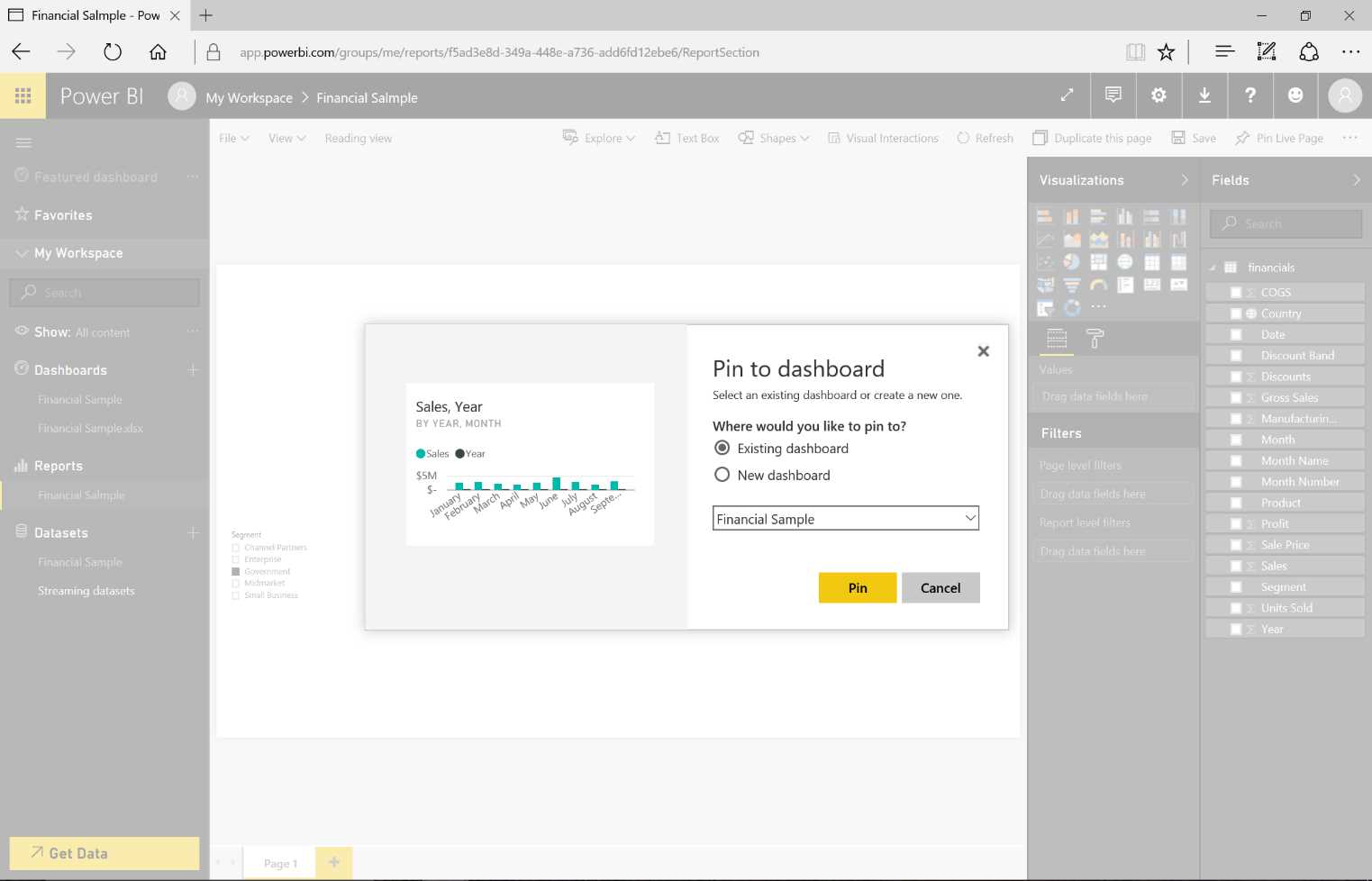
Figure 19: Pin to Dashboard—sequence
Next, we add the graph that has been pinned to the new dashboard.
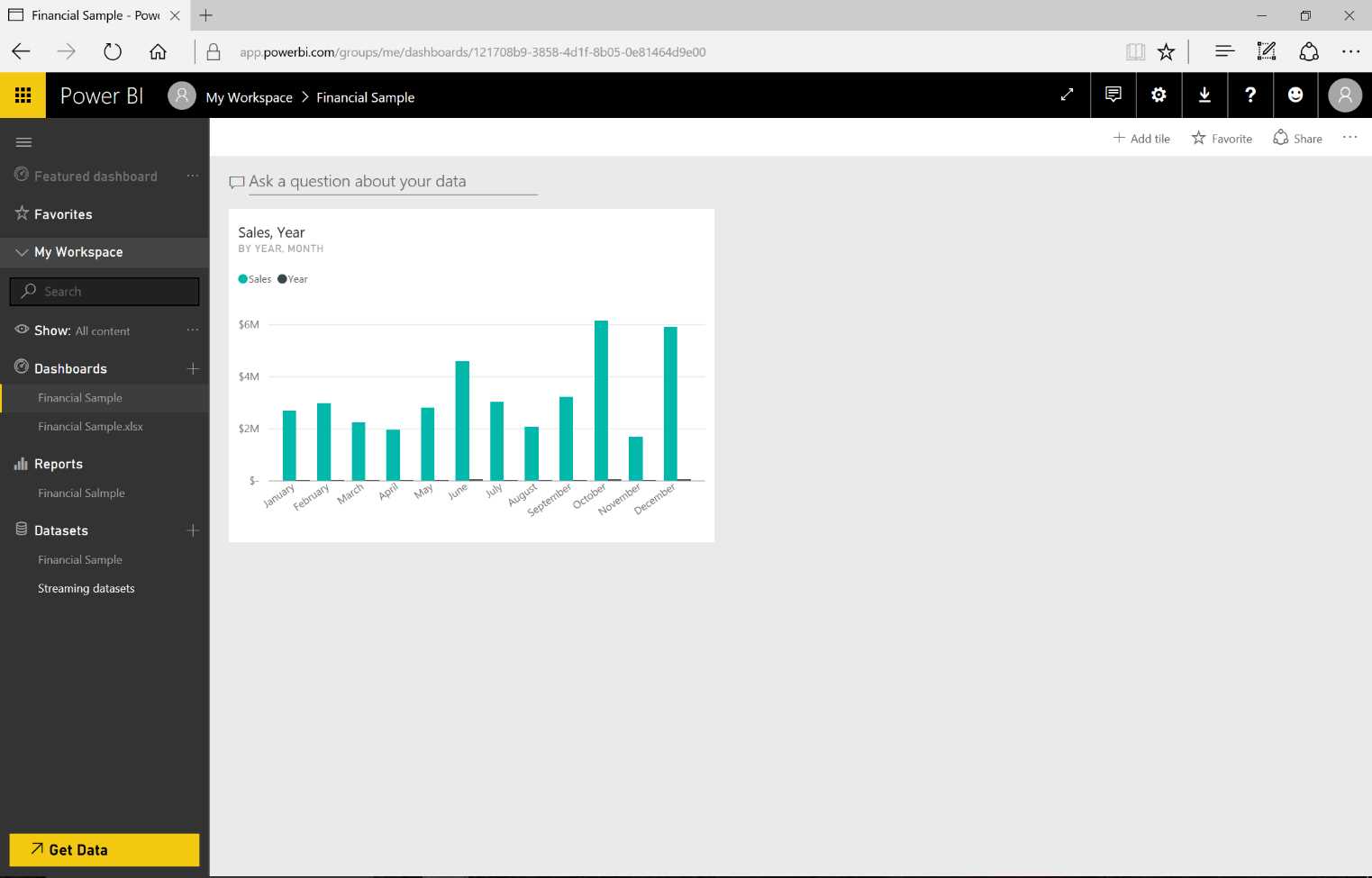
Figure 20: Tile
When the operation has been completed, we will notice a tile, which is the graph we pinned into the dashboard. By clicking the tile, we open the original report in Reading View mode.
Another mode for pinning the report is accessed by going back to the same edit page, reducing it, then clicking Pin Live Page on the top right of the screen. The report will be pinned into the dashboard. This mode is important because it allows us to interact with the data through the slicer.


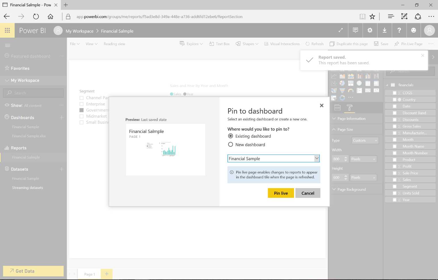
Figure 21: Pin Live Page—sequence
If we want to delete a tile from a dashboard, we click the ellipsis icon (…) that indicates whether a context menu is available. In the following visualization, we click on the Delete entry.
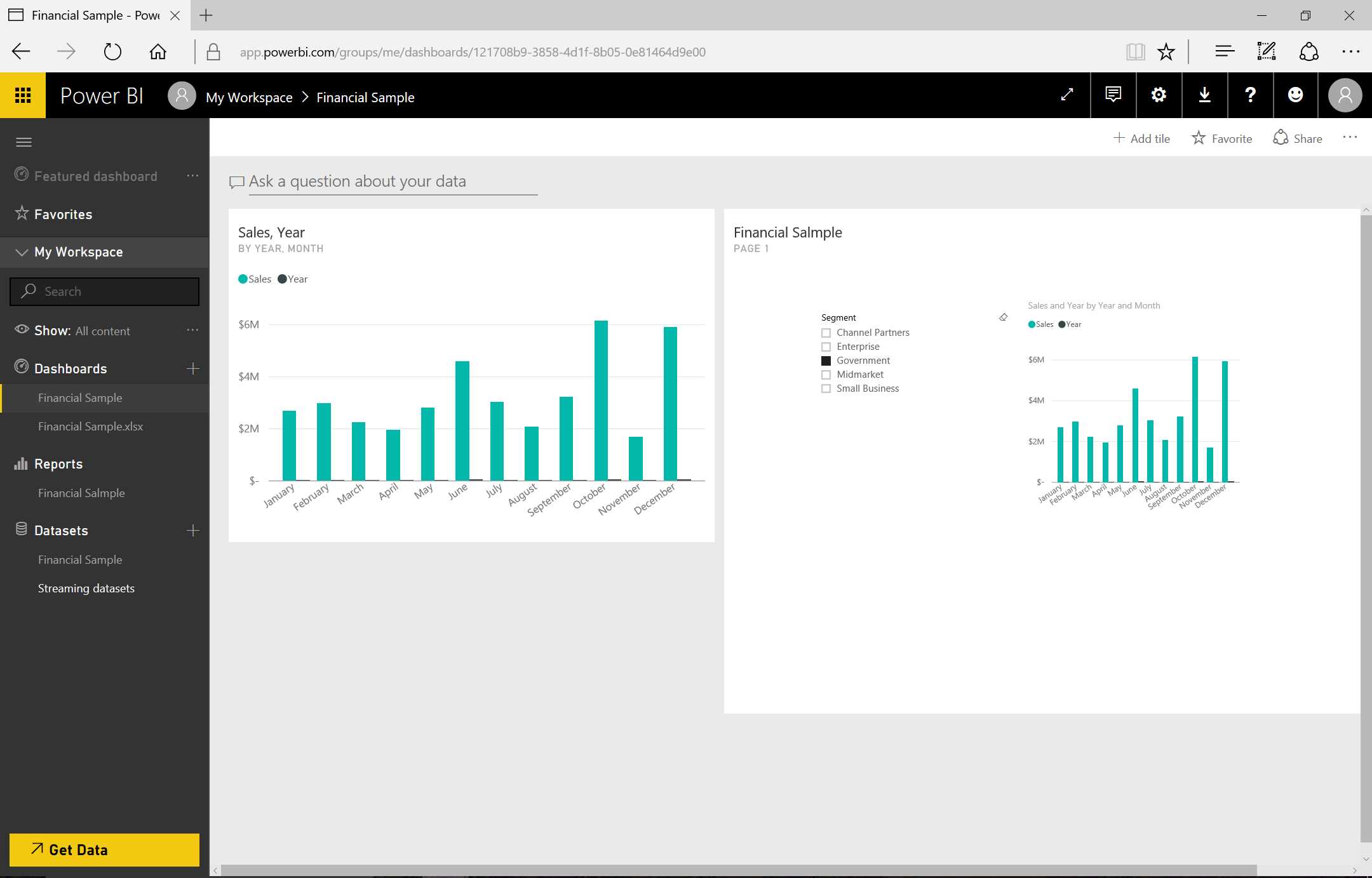
Figure 22: Dashboard
In the Context menu, we can also carry out other operations, such as Focus mode, which opens the graph to full screen, and Insights, which also opens the graph in full screen and offers significant values such as Value Sum and Summary charts.
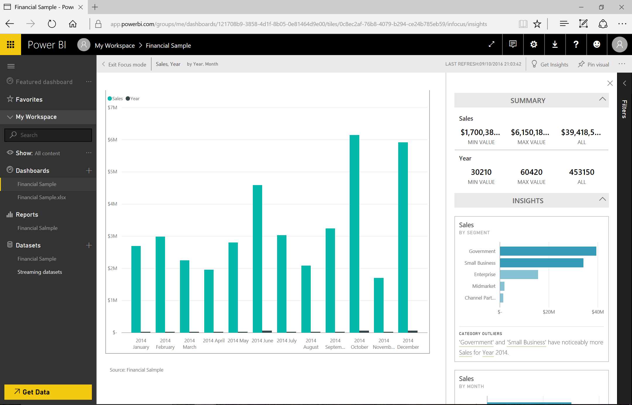
Figure 23: Insights
We can also use the “Pin visual” icon to pin the same tile into another dashboard. “Export data” allows us to export the data present in the tile (in CSV format).
With “tile details,” shown in Figure 24, another window is displayed in which we can edit the information of the tile.
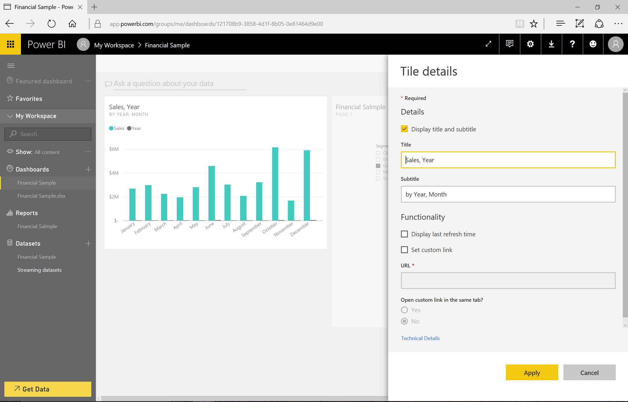
Figure 24: Tile Details
As we can see in the Edit page of the report in Figure 25, if we click a new page at the bottom left, we can add new pages to the report. If we explore the various fields, we’ll notice that the Country field of the dataset is represented by a little globe. Power BI recognizes the data type and, if we drag it to the report, it will be identified as geographical data and so a map will be displayed. When we drag and drop the Sales field to the geographical map, the sales distribution across the map is displayed.
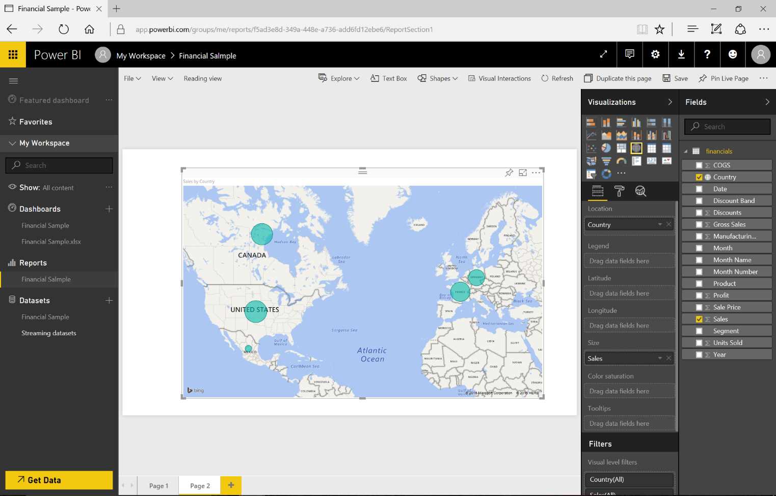
Figure 25: Power BI Visualizations
Figure 26 shows that we can add a new chart on the same page by inserting the Sales field, and in the same graph we can add the Month field in order to have a temporal base. By clicking the graph type, we can change the visualization to one that best meets our expectations.

Figure 26: Power BI Visualizations
Visual gallery
If the visualizations are not sufficient, we can obtain new ones from the visual gallery at https://store.office.com/en-us/appshome.aspx?productgroup=PowerBI, where we can see numerous visualizations published by people who have implemented and shared them.
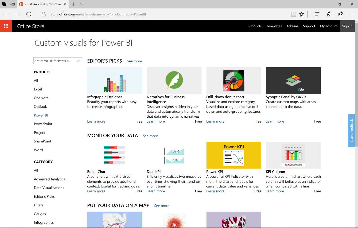
Figure 27: Power BI Visual Gallery
As Figure 28 shows, we can also download the Timeline. Note that the checks can be constantly updated, so it is advisable to always download them in order to be certain you have the updated version. To do this, click Add, then click Select to download Timeline Slicer.

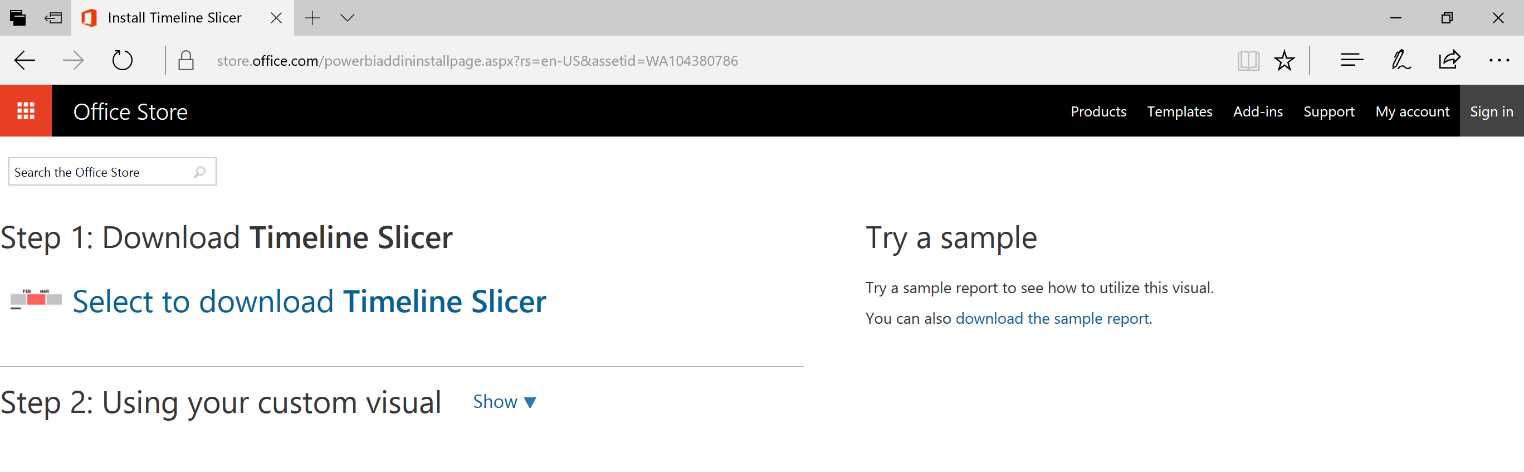
Figure 28: Power BI Timeline Slice—sequence
We import this new control by clicking the “...” icon in the visualizations section.

Figure 29: Power BI Visualizations
The Timeline visualization will be available on the display commands. By adding the Timeline to the report and later dragging the Data field there, we can implement a control that allows us to select the data based on temporal intervals. It is simple and intuitive. The other visualizations present in the report will display the data based on the selection carried out through the Timeline.
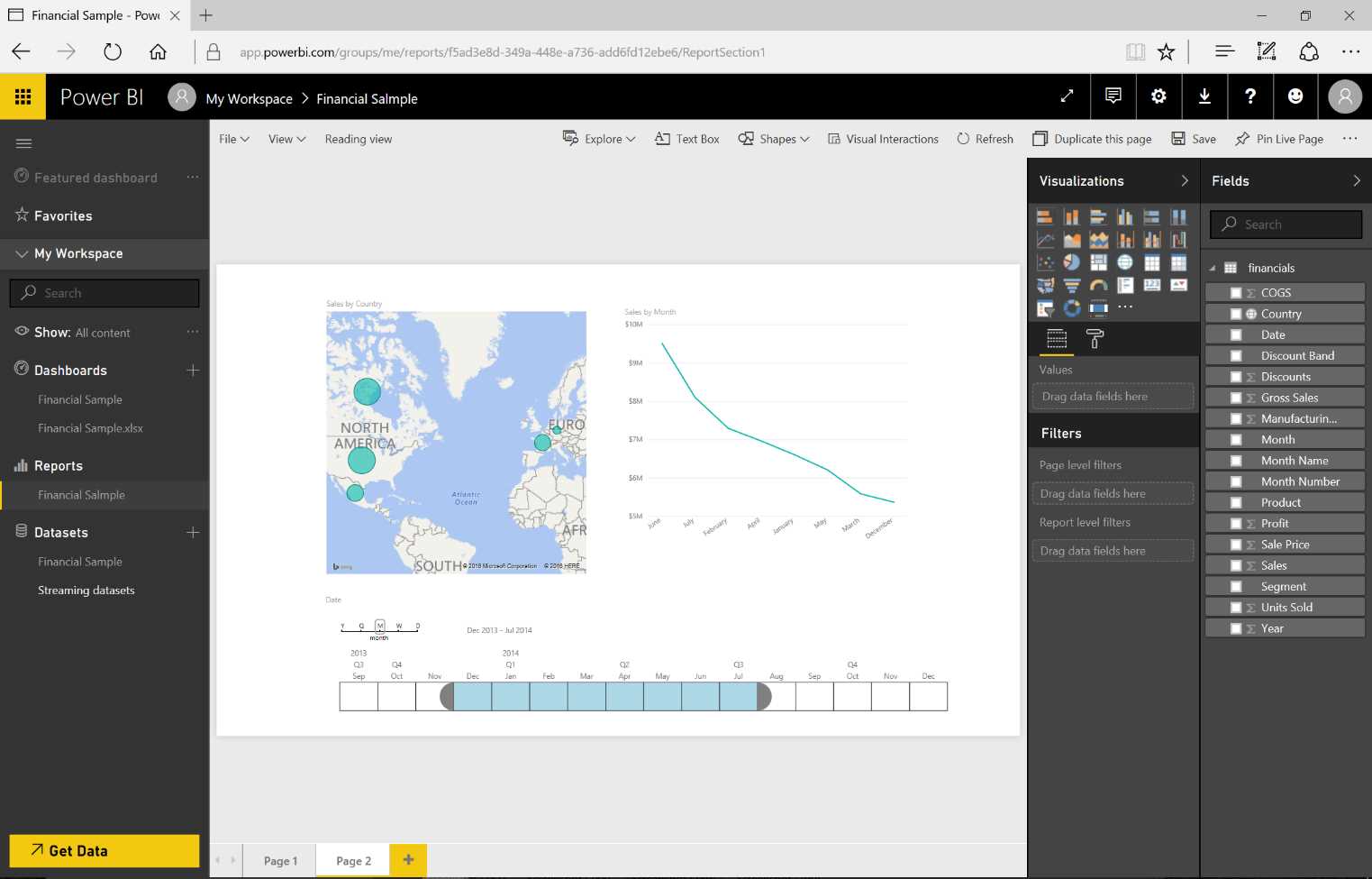
Figure 30: Power BI Visualizations—use of custom visuals
Note that because the custom visuals have been developed by third parties, they include a disclaimer asking us for usage confirmation.
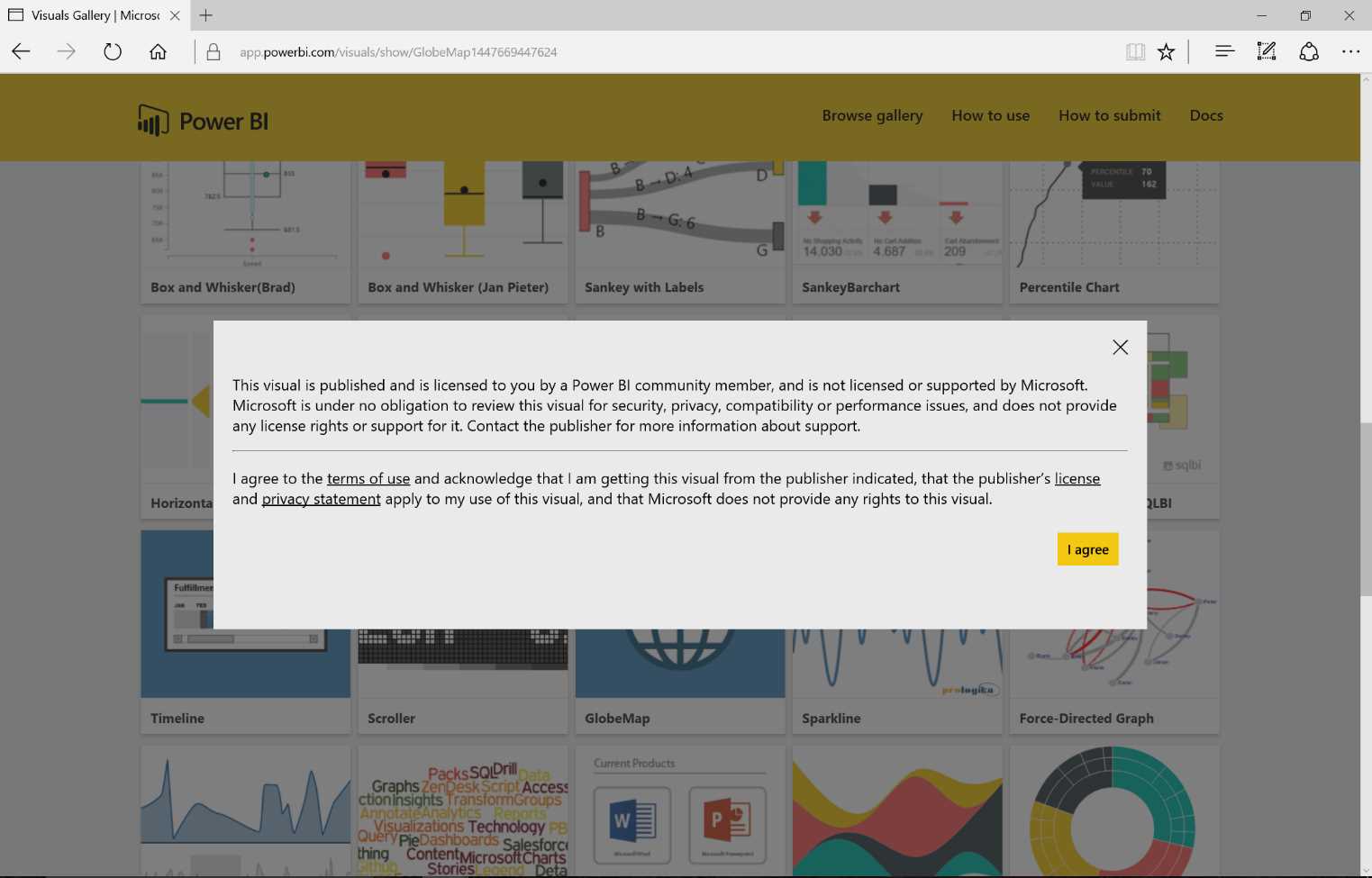
Figure 31: Custom Visual Terms of Use
Figure 32 demonstrates the download of a custom visual from the visual gallery. We can add a report on a new page by dragging the Country field onto it, and then, for example, the Sales field. Doing so will create a stage visualization.
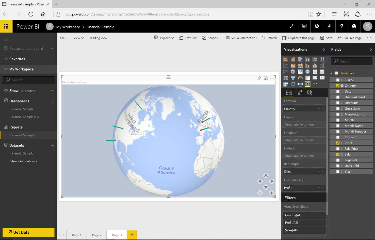
Figure 32: Use of Custom Visual
The report pages are independent. We can set certain filters on a page or report basis. On a page basis, the data is filtered on the page only, and therefore the visualizations will show only data that makes it through the filter. On a report basis, the visualizations present in all the report pages will show the data that makes it through that filter. In Figure 33, the Segment field has been selected and linked to a report-level filter. All the pages will interact based on the filtered data.
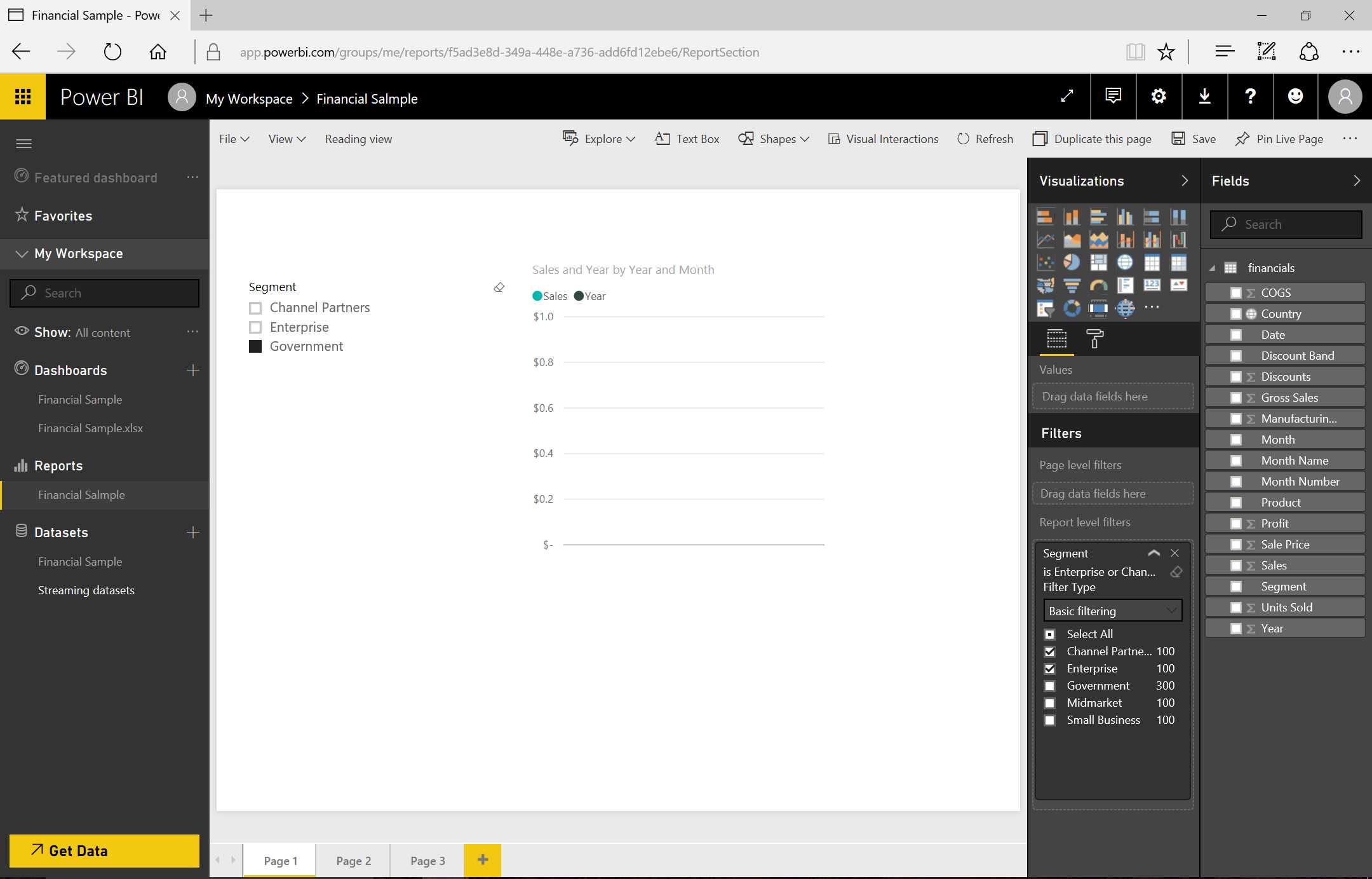
Figure 33: Use of Filters
Natural language capability
We can pose questions to Power BI based on the data model we are analyzing.
For example, in asking, “Which segment has the most revenue?” the term “the most” tells Power BI that we are asking for a system.

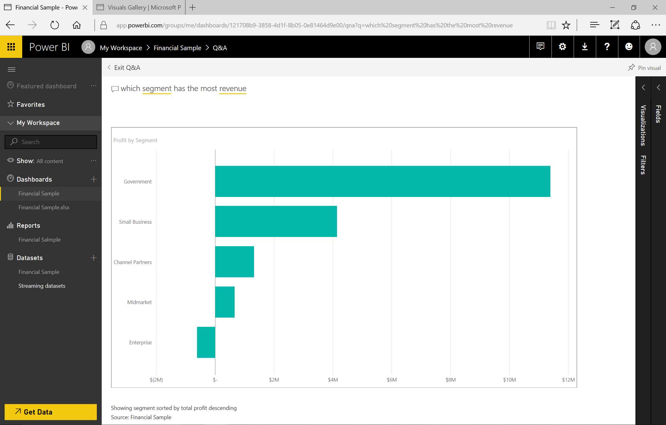
Figure 34: Use of Q&A—sequence
“What segment got the greatest number of profits?” will receive an answer through a visualization. If we are not satisfied with the graph form, we can change it by choosing the visualization that most satisfies us. We can carry out the pinning directly in the dashboard. And by clicking the tile that has just been inserted, we can go back to the original question. Notice that Revenue is not present in our data model, but Power BI has realized that that is related to the Profit field and shows us the profits.
Sharing and cooperation
Sharing and cooperation can be achieved through three different and complementary methods:
- Sharing dashboards and tiles directly with the users of our organization.
- Using Groups of Office 365: reporting and cooperating directly in a workspace dedicated to the group.
- Publishing an organizational content pack, which is shown in an internal gallery (all the users of the organization or of a group inside the organization are able to surf the store, the content packs are displayed, and it is possible to install the relevant packs with the same usage experience).
Each method requires that all users have a Power BI Pro license. And except for the dataset on-premises Analysis Services case, all the users will see the same shared data.
Table 1: Share Options Comparison
Share | Office 365 Group | Org Content Pack | |
Purpose | Ad hoc | Cooperation | Large content delivery |
Target audience | Individuals or members of an Office 365 distribution group. Typically suitable for users who strictly work together and need to display specific dashboards or tiles. | Members of an Office 365 group. Generally suitable for teams and collaborators engaged in a project or in a common scope. | The entire organization, members of a security group and/or Office 365 group, or singles. Suitable for all those who might be interested in a particular content. |
It is applied to: | Specific dashboards or tiles | All the contents | All the contents |
Discovery | Invitation email | Office 365 group | Get Data à Content Gallery |
Permits | Read-only invisible datasets. The reports are in Reading View. Resharing permits can be granted. | Edit. All the members of the group have the same rights in the management of the group contents. | Mainly read-only. Members can unlock in order to personalize their copy. Personalized content packs that must be updated will serve a notice. |
Some functions are more suitable to specific contexts than others. For example: the sharing of a dashboard is very useful when we must share it with a collaborator in a very short time. In this case, we must insert the account of the collaborator—we will receive a notice and will be able to display the dashboard—but we will not be able to modify the work. In the context of a collaboration group, we can utilize the collaboration method through a workspace, and all the users can modify reports and dashboards, cooperating as a team for the writing of a report. In short, the content pack is well suited for scenarios in which multiple people are using the data because we publish the package (which includes dashboard, report, and dataset) in a package and we publish it to a gallery that is visible to all the users of the organization (who are therefore free to install and modify it).
Cooperate
In order to cooperate, we must go into the dashboard and click Share.

Figure 35: Dashboard
Next, we indicate the users we want to share the dashboard with and click Share.
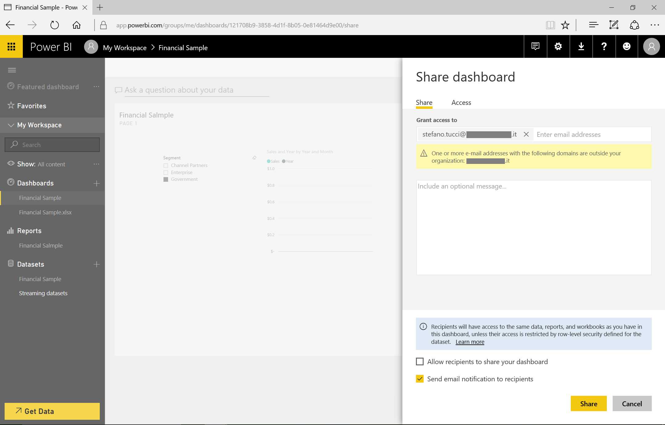
Figure 36: Share Dashboard
On the same sharing page, we will find the option to specify whether or not the user can share the dashboard with other users. We can also choose to send notifications via email (or not).
In the cooperation example (where Option 1 is no and Option 2 is yes), the user who receives the shared dashboard will not be able to modify it—only display it.
We can cancel the sharing with particular users by selecting Share in the Access section and then clicking Cancel invite.
Regarding cooperation through the Office 365 groups, on the upper left of the screen we will find the entry “My workspace,” indicating it is our personal workspace.
We can browse to check whether there are several group workspaces. If there are none, we can create a new one by specifying the name of the group, whether the group is private or public, and if all the members of the group are able to modify the contents within the workspace or only display them. Lastly, we include the users who belong to the workspace.

Figure 37: Dashboard

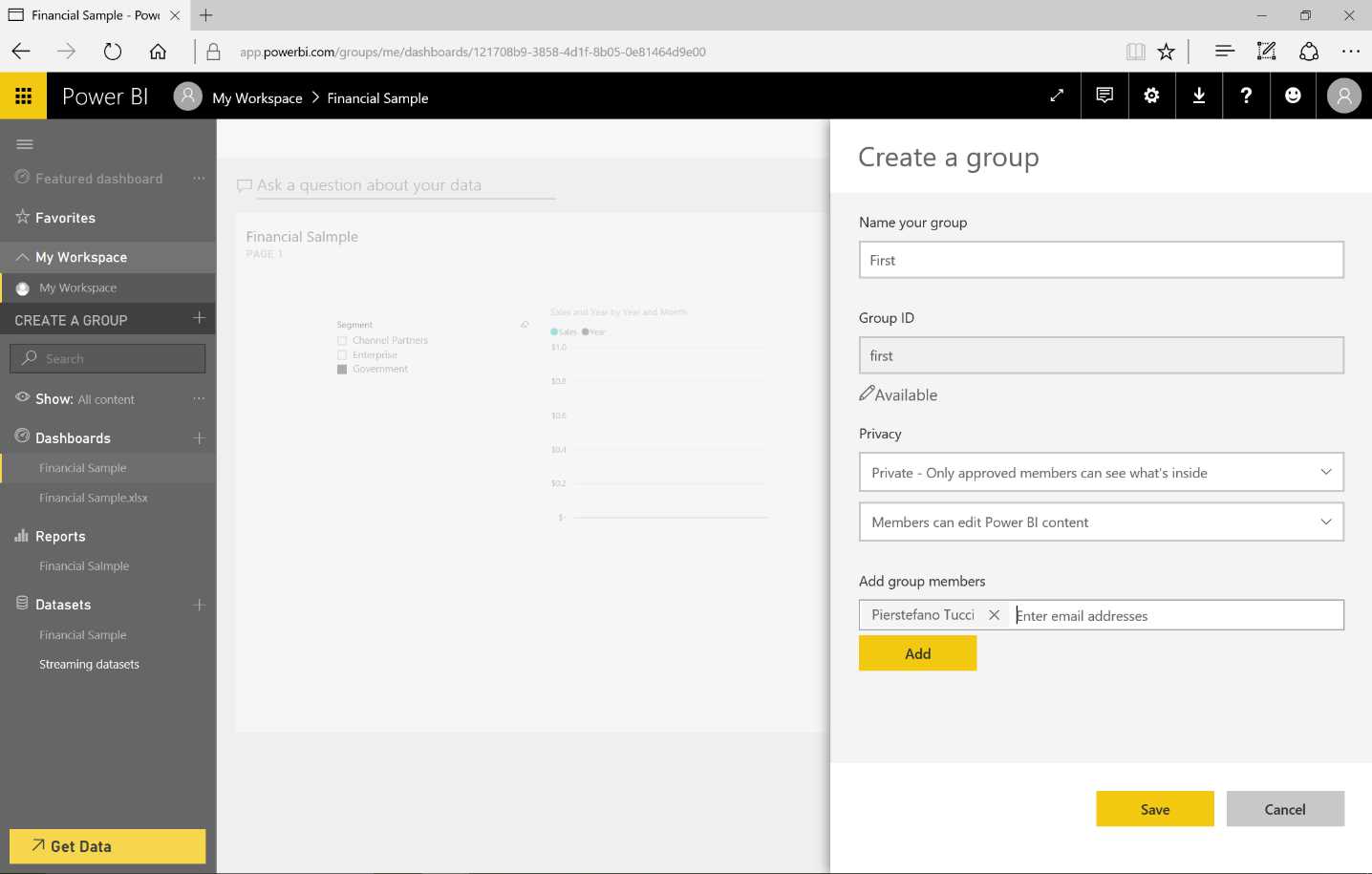
Figure 38: Share Dashboard to Cooperate—sequence
We can go back to sharing by selecting a group workspace. We get a new triple set of dashboard, report, and datasets that are independent from the personal ones. In this new workspace, we are able to cooperate with others who are part of the Office 365 group.
We can also share the report we write over the web.
Publishing a report on the web allows us to make the report visible to anyone, assuming we allow default anonymous access to the report.
From the report, we click File, then Publish to web.
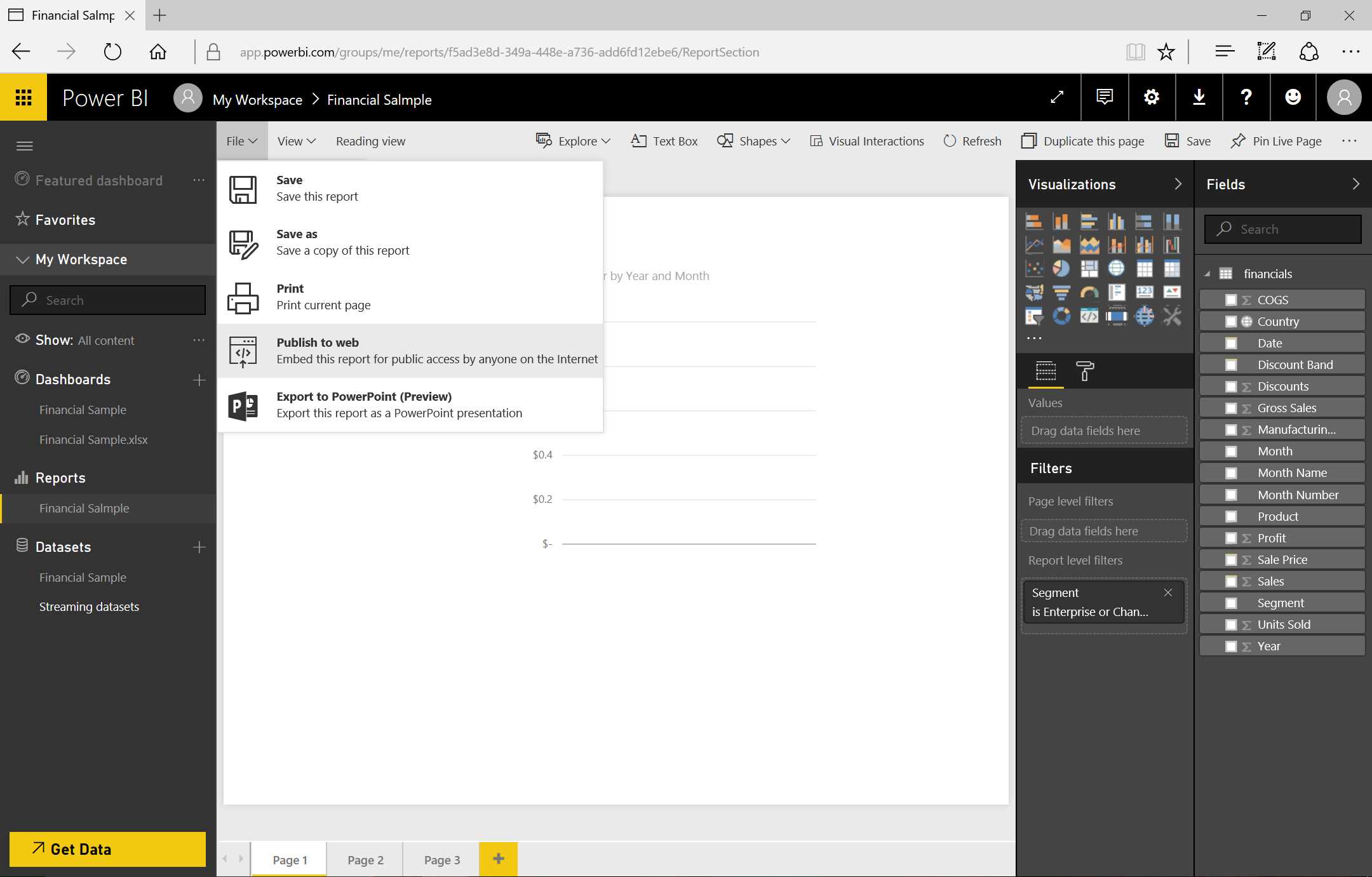
Figure 39: Publish to Web
Figure 40 shows the sequence of our next actions—selecting Create embedded code, then Publish.

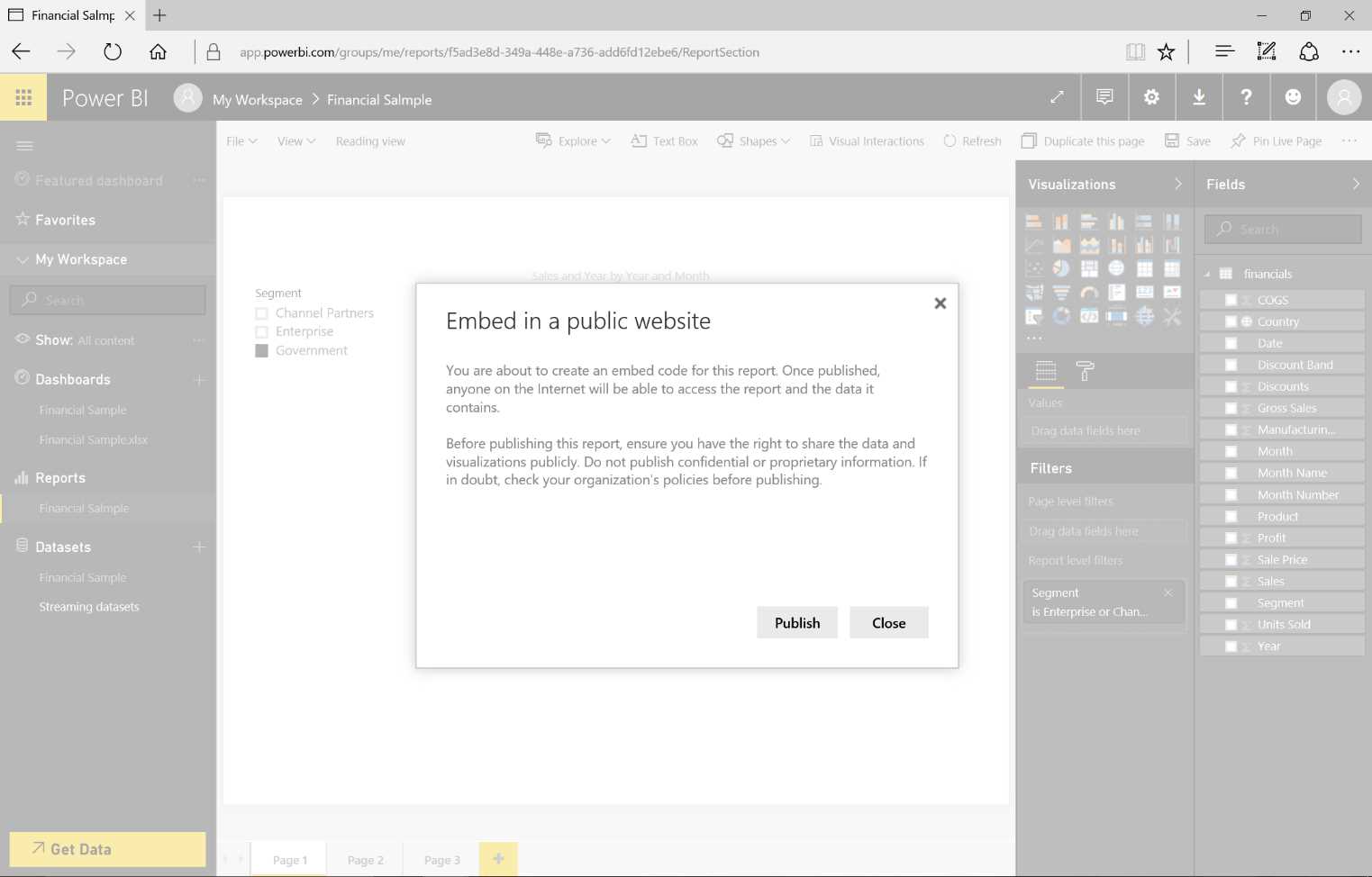
Figure 40: Publish to web—sequence
The new window (in Figure 41) will display several items: a link we can send by email; HTML we can paste into our blog or website; and HTML iframe tags we can integrate in our web application. Note that the size of the graph is in pixels and we can choose from three different dimensions.

Figure 41: Publish to Web—finishing the publish step
Figure 42 depicts the available dimension choices.

Figure 42: Publish to Web—finishing the publish step
If we use the link by specifying it in the URL of a browser, we will have direct access to our report and can browse it without authentication.
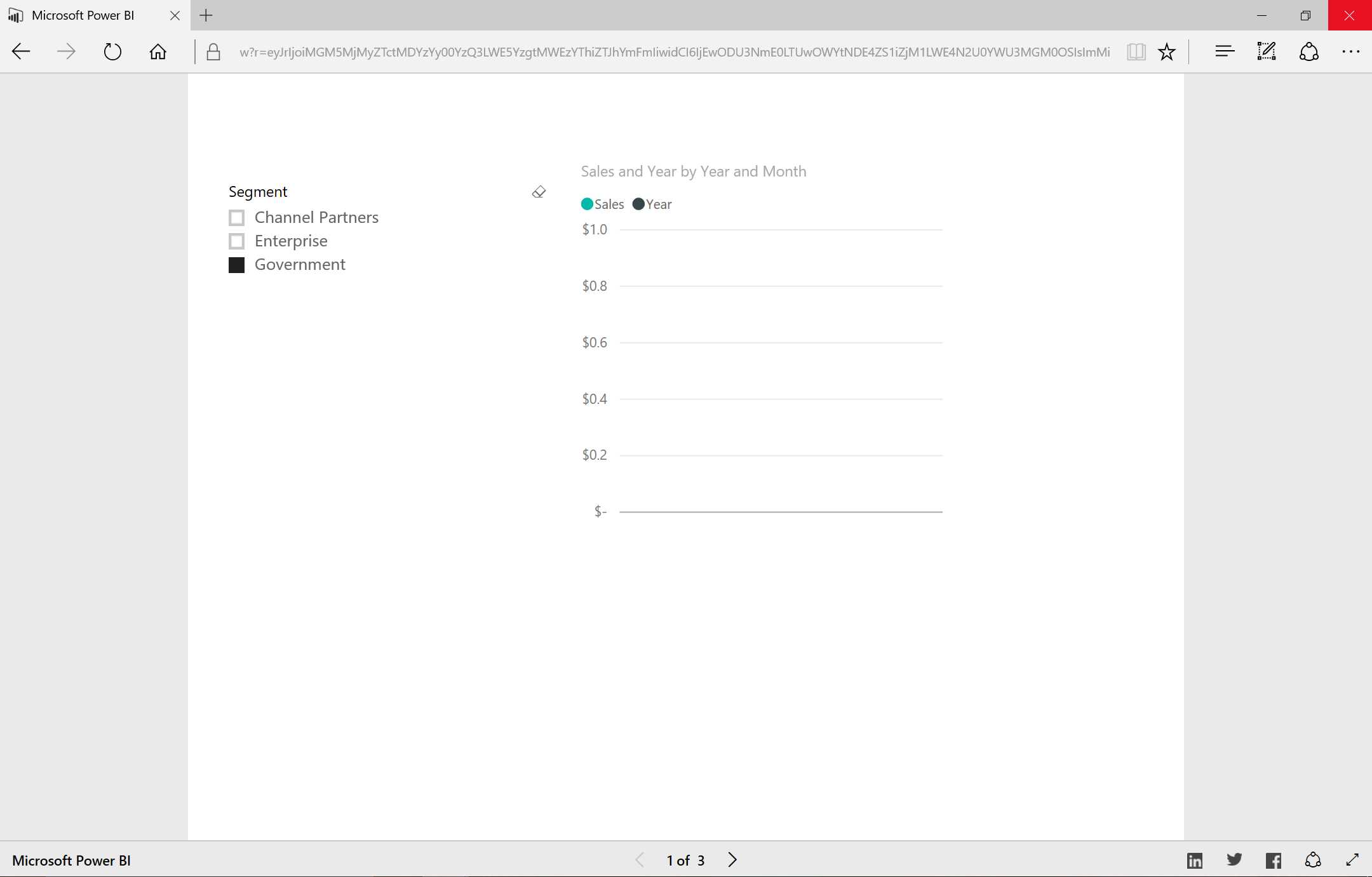
Figure 43: Publish to Web—result
Import data sources: focus
Logging on to the data sources through the web interface is very simple.
We choose the data source type we want to use by clicking Get Data.
In the Content pack, we can specify one of four different sources for the data:
- Organizational
- SaaS application (files included)
- Excel workbook
- Files produced through the Power BI Desktop app (databases and data services present in the cloud)
The Excel files can be imported directly from the browser and can be loaded from a local source, or we can access OneDrive for Business, OneDrive Personal, or SharePoint team sites.
The file updates in OneDrive/SharePoint are recognized automatically in the reports and dashboards, and the data will remain in the workbook. If the workbook connects to the external data sources, we can use Power BI for the refresh.
Supported file types:
- Power BI Desktop file (PBIX)
- Excel workbook
- CSV file
Figure 44: Get Data
The maximum size for the uploaded files is 250 MB (240 MB for the data model present in the workbook and 10 MB for the remaining part of the data inside the workbook).
If the Excel files are in OneDrive Personal/For Business or in a SharePoint team site, in addition to the import, we can also connect to the Excel workbook, which will have its own life (where it lies). We can also use refresh functions to update our dataset once the data has been imported.
During the import of the Excel workbook, everything contained in the data model will be converted to a dataset. In this particular case:
- Contents of the data model take precedence over the contents at the worksheet level.
- Workbook data model will be converted to a Power BI dataset.
- Workbook Table will be converted to a Power BI dataset.
- Power View Sheets will be converted to pages of a Power BI.
- PivotTable, PivotChart, and custom fields are not recognized.
The data in the workbook will be imported only if it is defined as tables. Power BI will ignore scattered data in the workbook.
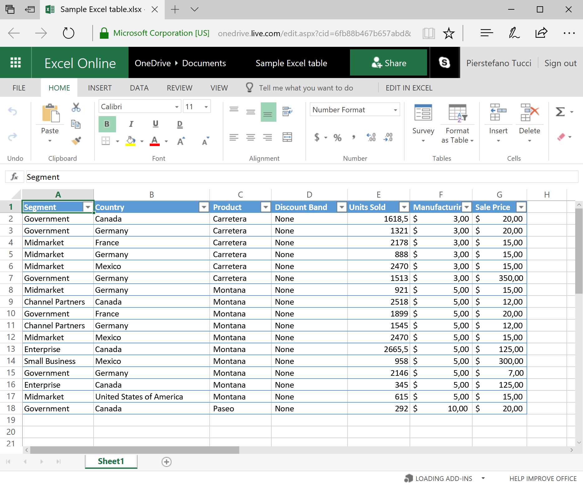
Figure 45: Excel Online—sample Excel table
Figure 46 shows how to look up an Excel sheet.

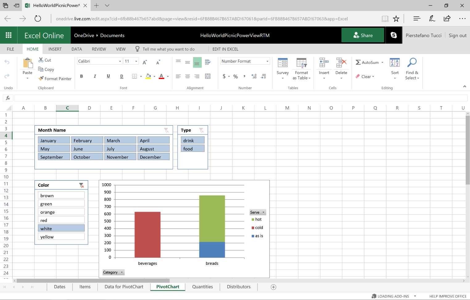
Figure 46: Excel Online—Pivot Chart—sequence

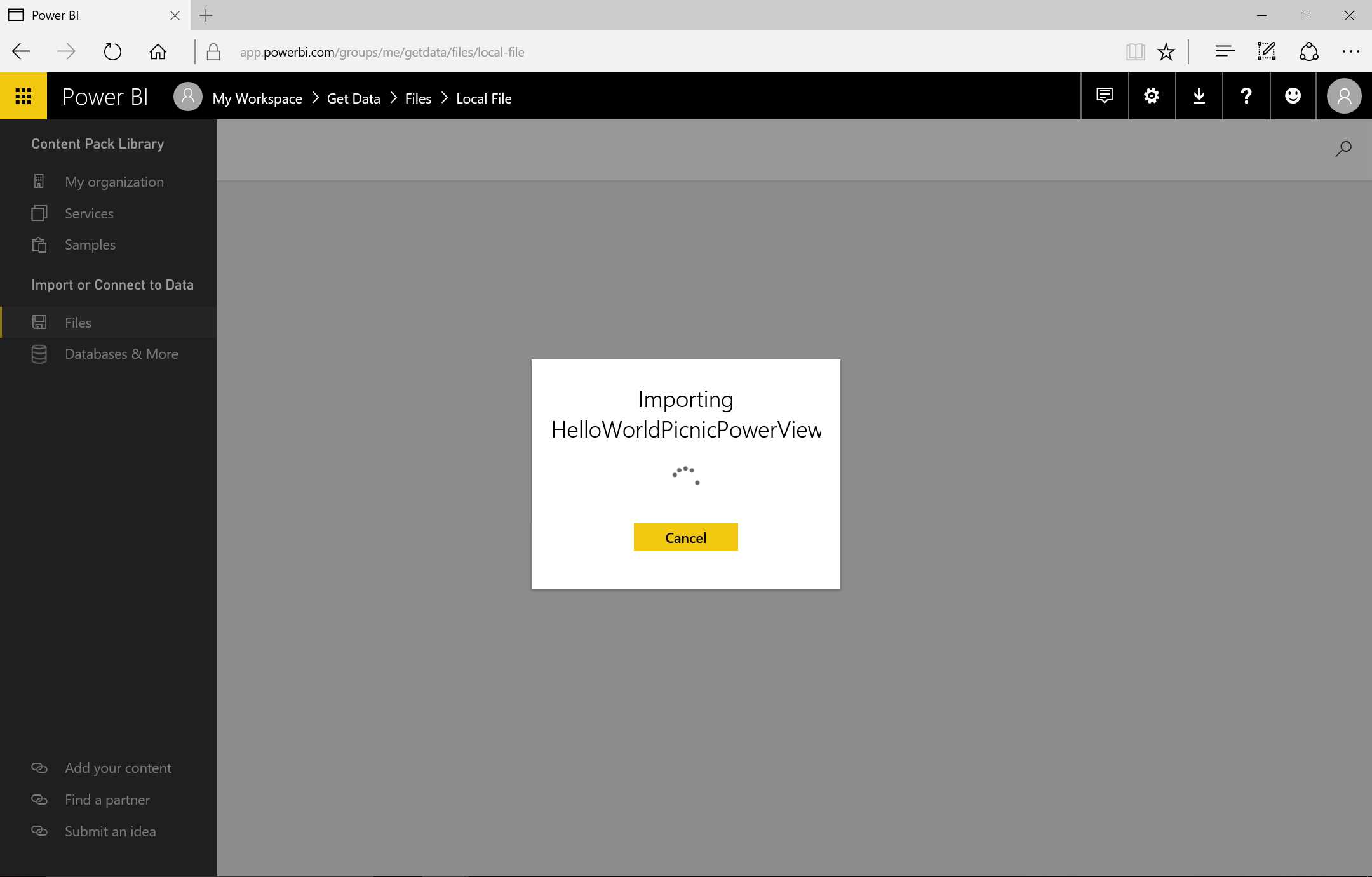
Figure 47: Importing Excel file—sequence
Note that the workbook is converted to various Power BI contents, which are created gradually. After importation of a single content, it will be present in the corresponding section (report, dataset).
By displaying the dataset, we can see how the table present in the PowerPivot data model has been converted to a Power BI dataset and that all the columns have been reported.
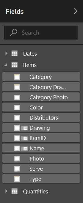
Figure 48: Fields from Excel File
A report will be created that contains a page (with the name of the imported Power View sheet) and the same graph we had on the Power View sheet in the workbook.
We can edit the content or create new graphs and use them together to create dashboards. The content will be identified as a Power BI graph.
Here is an example with OneDrive:
First, select an XLSX file.
Two options will be shown:
- Import Excel data into Power BI
- Connect, manage, and view Excel in Power BI
The connect option does not convert the workbook but rather embeds it into Power BI. We can see this in the Navigation pane on the left side, among the reports with the Excel icon.
By selecting it, we can now surf the Excel workbook in Excel Online.
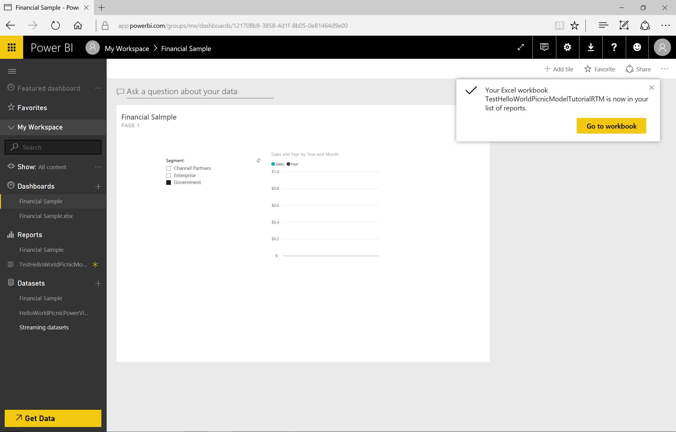
Figure 49: Finishing the Import
The value of this workbook connection with Excel in OneDrive or SharePoint lies in the possibility of setting up the data to refresh. As Figures 50 and 51 show, we can carry out the pinning of the contents by selecting a table or part of a table and doing the pinning in the dashboard.
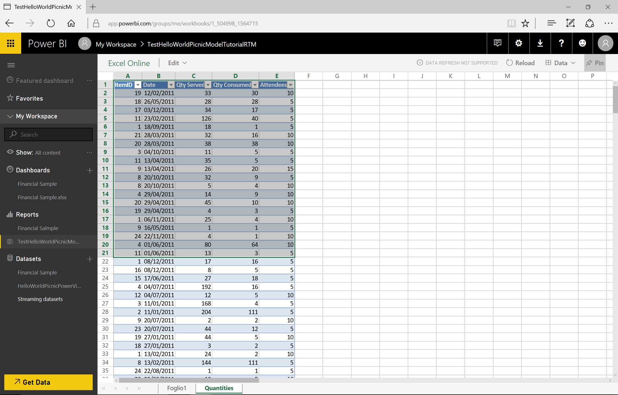
Figure 50: Excel Workbook on Power BI


Figure 51: Pin to Dashboard—sequence
When we click the tile in the dashboard, we are redirected to the Excel file with Excel Online.
- 1800+ high-performance UI components.
- Includes popular controls such as Grid, Chart, Scheduler, and more.
- 24x5 unlimited support by developers.