
Power BI Succinctly®

CHAPTER 3
Desktop
An overview of the Power BI site
The website www.powerbi.com is the starting point for learning about this product. There you will find:
- Products: a display of the product differences and the licensing and service policies.
- Solutions: examples of how Power BI has been used in certain industries and departments. The examples are interactive and available for download.
- Partners: a gallery dedicated to partners. You can search for and find partners who have developed solutions or have experience with your concerns.
- Learning: a set of resources for studying relevant topics; a community where we can compare our work or look for new information.
If we look toward the bottom of the website, we will find a section that offers an entire series of tools. Below that, there is a series of resources for developers available together with a series of examples, so that we can develop the application and embed to Power BI inside our websites, mobile applications, or dashboards. We will also find important examples and in-depth videos. The second resource is the YouTube channel of Power BI. Accessible in user/mspowerbi, the channel is very informative, and it is constantly updated directly by the product group.
Power BI Desktop
The Power BI Desktop app can be downloaded free of charge through Power BI.
Power BI Desktop a visual tool for reporting as well as for elaboration of the data. It is available in 32- or 64-bit, and it is optimized for use with the Power BI service. It completes consolidated Microsoft technologies, such as Excel, where an add-in is available: Power Query, PowerPivot, and Power View.
The application allows us to connect to different data sources, and it is typically updated on a monthly basis. It simplifies the building of data models used as the basis for the reporting design that will be published on Power BI.
Development method
The development method consists of these simple steps:
- Query creation to filter, format, or improve the data.
- Set up relations to create the basis of a data model.
- Enhance the data model with calculation logic and formatting.
- Explore the data in a new mode through the drag-and-drop canvas.
- Choose an interactive design for the report from a wide range of data visualization types.
- Publish the solution directly on the Power BI service.
The procedure is summarized in the following data flow:
Query creation à Relation set up à Data model definition à Report design à Publication on Power BI
The development method consists of a series of necessary steps and uses the creation of queries to work toward our data sources, filter the data, and determine the correct formats for the data as well as the information we want to build our reporting on. Once we have imported different data sources and determined the queries for those data sources, we can identify or establish relationships between the data. Possible relationship types are 1-to-1, or 1-to-N relations, just as in the relational (i.e., SQL) world. The data model can be enhanced by defining calculated columns or measures. We can explore the data model by using drag-and-drop functionalities, which is exactly what we do when we work with the online Power BI. We start from the dataset, drag the columns related to the tables (part of our dataset), and establish the most appropriate visualizations for building our reporting.
Steps 4 and 5 are actually the same steps, the same techniques we carry out online. The difference is that we carry them out on the app. In the end, the result of our work can be shared with our coworkers and other users in our organization by publishing reports and datasets directly on Power BI. Afterward, we would be able to build dashboards online.
A query is defined as a “data retrieval,” and data source types include File, Database, and Azure, along with other services and data sources.
For creation of a query:
- Specify the data source (file, database, Azure, etc.).
- Specify a unique name for the query.
- Define the behavior of the query using the “M” language (where advanced logic can optionally be passed to a program-defined function).
- Call the query to load data into a table in the data model.
These steps are performed using Power Query.
In the app, the query creation uses a module that is easily linked to the experience of Power Query in Excel. Power Query was an add-in of Excel until the 2013 version, then it was integrated into the 2016 version. The same techniques are used—defining the data sources and carrying out the necessary elaborations, which are later described through a particular language, the “M” language, which is the informal name of Power Query Formula Language. Through this language, we can refine our data source and our table. The supported data sources are numerous, and they are the same supported in Power Query.
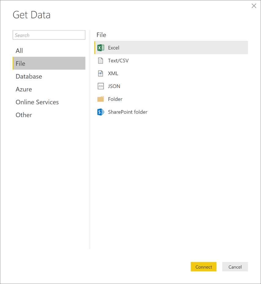
Figure 52: Power BI Desktop—Get Data
Figure 52 shows how to get data such as Excel, CSV, XML, text files, or other files.

Figure 53: Power BI Desktop—Get Data
Figure 53 shows that sources such as SQL Server, Analysis Services, Oracle, and many others are added as the app updates are released.
It supports the online data services present on Azure such as SQL Azure Database and SQL Azure Data Warehouse.

Figure 54: Power BI Desktop—Get Data

Figure 55: Power BI Desktop—Get Data
Supported data connectors allow us to access data sources ranging from Facebook to Google Analytics, Sales Force, ODBC, and so on.
As shown in Figure 56, we can open the query editor by right-clicking the loaded table.
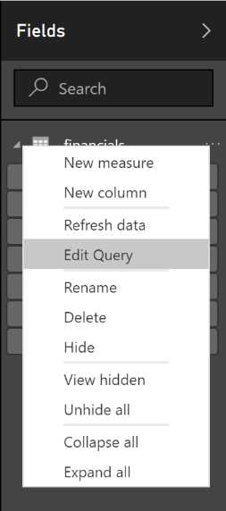
Figure 56: Fields—contextual menu
In this editor, we can manage columns and formulas, we can filter, and we can load other data (Figure 57).
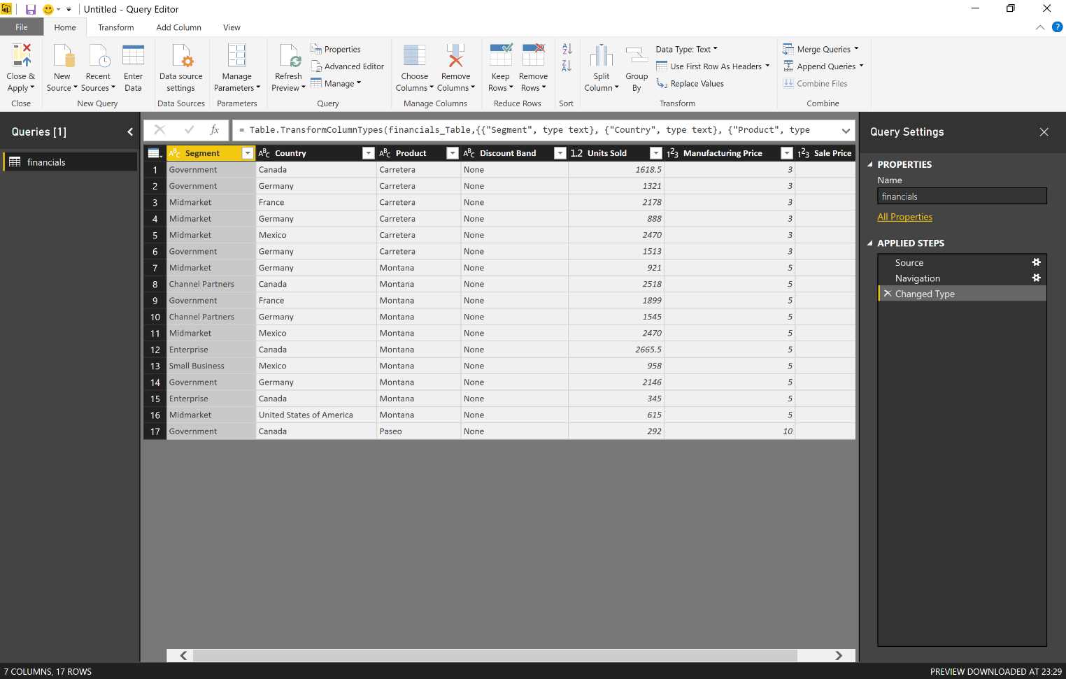
Figure 57: Query Editor
By clicking the columns, we can apply filters, order the data, or remove empty values (Figure 58).
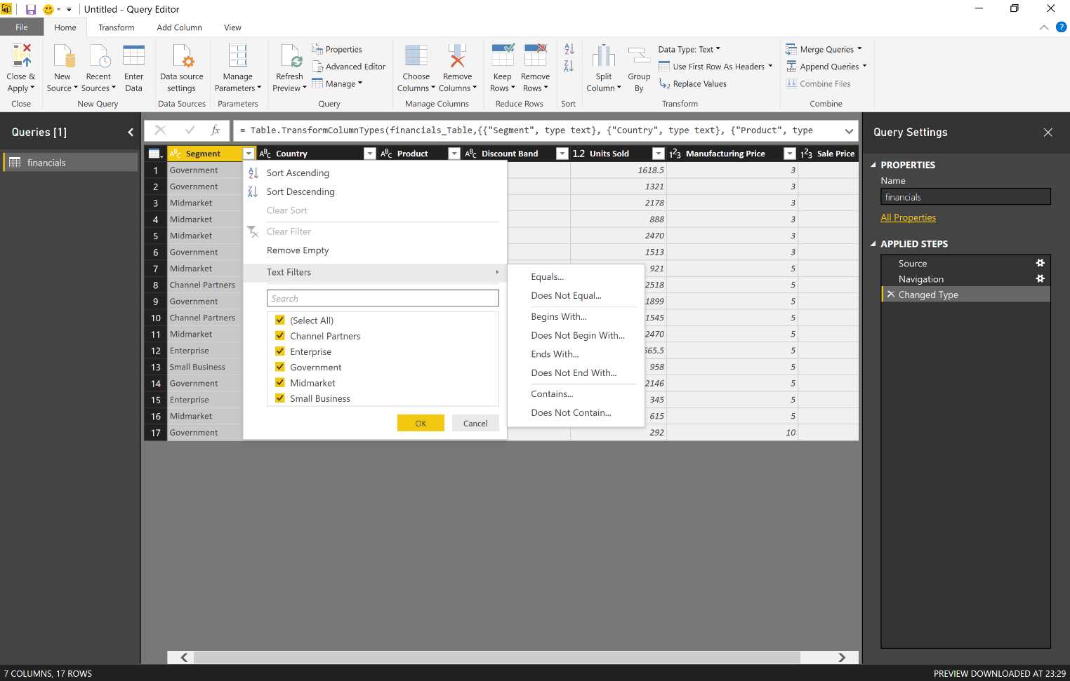
Figure 58: Query Editor—text filters
The creation of queries allows us to filter data, format, and refine them in order to obtain the desired result. The steps can be created easily by applying filters to the columns through the use of controls available from the ribbon or through the context menus of the query or columns. We can select a step and have a preview of the resulting data. The steps can also be removed, and the formula steps can be shown or edited in the formula bar.
As these sources are saved and we carry out the editing steps of our query, they are saved in a descriptive panel, as seen in Figure 59.
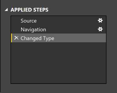
Figure 59: Applied Steps—descriptive panel
We can also delete or edit intermediate steps at any time. If, for example, we accidentally remove all the rows by leaving only the first 10, when we intended to remove all rows except for the first 20, we can cancel the remove operation and then correct the operation. All of the following steps will recognize the modification that has been carried out in the intermediate step.
Step definition of a query: the controls
Numerous controls are available on the ribbons of the query editor and in the context menus so that we can manage columns. For example, we can:
- Delete the rows and remove any mistakes.
- Transform the data.
- Split the data.
- Add columns by using a formula.
Because the query editor is WYSIWYG, we can easily test and do a rollback of the modifications.
We can also use different controls on the query that we want to define, and all that we do will be reflected in the data we display in tabular format. We display exactly the result of the steps as we carry them out. It is possible to manage columns, change data types, remove or add columns, split the tables (columns), and take many other actions.
New queries can be created through the merge of two queries (joined in a common column) or with the appending of two queries (union).
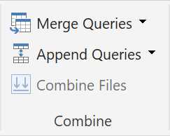
Figure 60: Query Editor Ribbon—combine section
As shown in Figure 61, the operations of merge and join include:
- Left Outer (all the data from the first table, matching with the second one)
- Right Outer (all the data from the second table, matching with the first one)
- Full Outer (all the rows from both the reported tables)
- Inner (only matching rows)
- Left Anti (rows only related to the data present in the first table)
- Right Anti (rows only related to the data present in the second table)
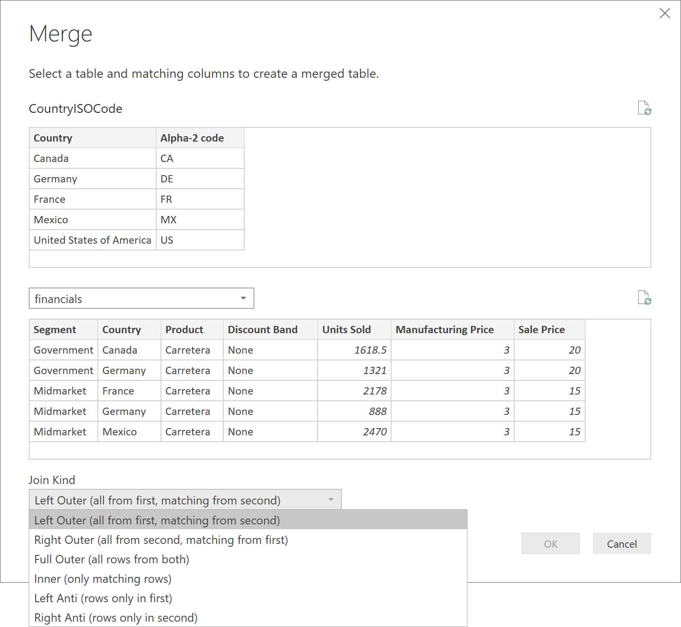
Figure 61: Query Editor—Merge options
We can define more than one query. Typically, numerous queries are used, and they can be connected to heterogeneous data sources. Once the queries are defined, they can be combined by carrying out the merge or the append. In the case of the merge, a join is defined. In fact, we connect two queries. In the case of the append, the results of two different queries are put together and connected. It is good to make sure that the tables are compact as well as solid and that they have the same column names so that the columns can be identified in both tables.

Figure 62: Query Editor—merge options
Figure 63 demonstrates that you can edit this merge via the Merged Queries icon.
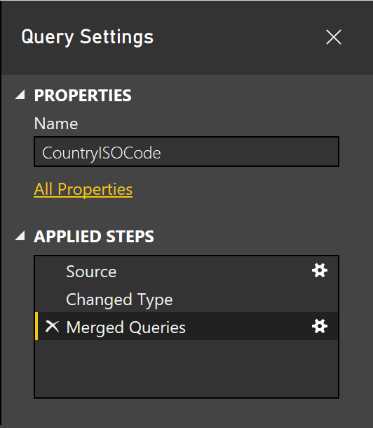
Figure 63: Query Settings—descriptive panel
Configure relations
By defining a relationship, we create an implied filter that operates across two or more tables. The filtering relationship is not the same as Foreign Key Constraint, which is used to ensure data integrity. The relationship can be defined between any two tables, independent of their data connection or data source type, but they must be based on a single column with matching data types. Self-referential relations are not supported.
In fact, with a merge between two queries, we set up a relationship on which we can carry out further steps. There are restrictions for which a relationship cannot be created in a single table (hence the so called self-referential relationships are not supported). However, there are no restrictions at the level of Foreign Key.
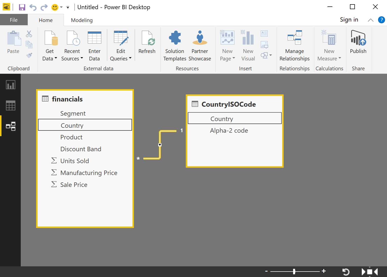
Figure 64: Power BI Desktop—relationship section
In this way, we define our relations by obtaining, for example, a model like the one represented in Figure 64, in which we have N relations that can be 1-to-1 or 1-to-N. We are, in fact, building our data model.
Data model definition
The data model tables can be extended with calculations or they can hide the calculated field that has already been created (in other words, they are made unavailable for reporting). We can set up these features of the data model columns:
- Data type
- Format
- Category (that is spatial or web URL)
- System (based on another column of the table)
- Visibility
Starting from the relationship, we have a data model. At this stage, once the data model has been defined, we can define the types that will be used and the formats, and we can decide if and which columns will be visible or not, define the systems among data, and so on.
Data model definition: calculations
We can also enhance the data model by using the Data Analysis Expression language (DAX). People familiar with the PowerPivot models will have a familiarity with the DAX language, which allows us to implement calculated columns and measures.
DAX consists of:
- Excel functions (about 80 functions)
- Table functions
- Aggregated functions
- Web-surfing functions of the relations
- Modification functions of the context
- Time intelligence functions
We must insert calculated columns or measures in whichever data model we use. We will hardly be able to do without it. All the support for the DAX language is also present in Power BI.
There are two different types of calculations, and both are defined by using DAX:
- Calculated column
- Measure
Calculated column
We use a formula to define a calculated column. Starting from other columns, we add a new column, which is the result of the formula we have previoiusly defined. A calculated column in a model uses memory space at runtime. We should keep this in mind to avoid Power BI out-of-memory errors.
There are defined calculated columns to add new columns to the tables. Each Column Value per row creates and saves the data in the data model. Note that they use up space in the data model. The Column Values are recalculated when a refresh occurs in the table and when the refresh is carried out on the dependencies of the formula.
Measure
The measures, unlike the calculated columns, do not use up storage space. The measures are defined by using a formula. They are made available to the dataset of Power BI, but they are calculated in real time, and for this reason they do not use up space. The formulas are defined by using the group functions, such as sum, count, distinct count, average, minimum, and maximum.
There are defined measures for adding group logic to the data model. The values are neither created nor saved in the data model. The formulas are enhanced in the query time mode.
Design report
Once the data model has been set up, we can proceed with the report design exactly as it occurs online by using the Power BI service through the browser interface. We can also build a report by using the Power BI app.
The reports can be designed based on the interface of the visible data model. It is also possible to add text boxes and pictures.
The design experience is very similar to the one available with the online service of Power BI.
Publication on Power BI
At the end, our work can be directly published online on Power BI, and it can be shared with other users. Starting with the reports and datasets we published, we can also define certain dashboards.
The Power BI Desktop file can be loaded on the Power BI service or published directly. In case of overwriting an existing dataset, we must take into account that if there are two or more datasets with the same name, one must be removed and the Power BI Desktop file must be renamed.
Remember, too, that when renaming the columns or the measures, the report or the dashboard tile can be damaged.
A work example with Power BI Desktop app
We start Power BI Desktop and import the data sources that are online.

Figure 65: Power BI Desktop—Get Data
In particular, we will use the following data source:
http://www.bankrate.com/finance/retirement/best-places-retire-how-state-ranks.aspx
The link includes an article about retirement in the United States—specifically, which states are the best for retirement. It displays the states with different indexes, such as the cost-of-living, the crime rate, and so on. Let’s use one of the article’s tables for writing a report.
Note that the use of the full name of a state can be a problem in the graphical representations. Generally, the use of standard abbreviations as recorded by Wikipedia is preferred. In particular, we will use ANSI abbreviations.
The reference website is:
https://en.wikipedia.org/wiki/List_of_U.S._state_abbreviations
Consequently, we import the data through the Get Data functionality.
If we click on the More entry, we can display all the source data currently supported. We choose the entry Web, click Connect in the URL, specify the page concerning the state statistics, and click OK.
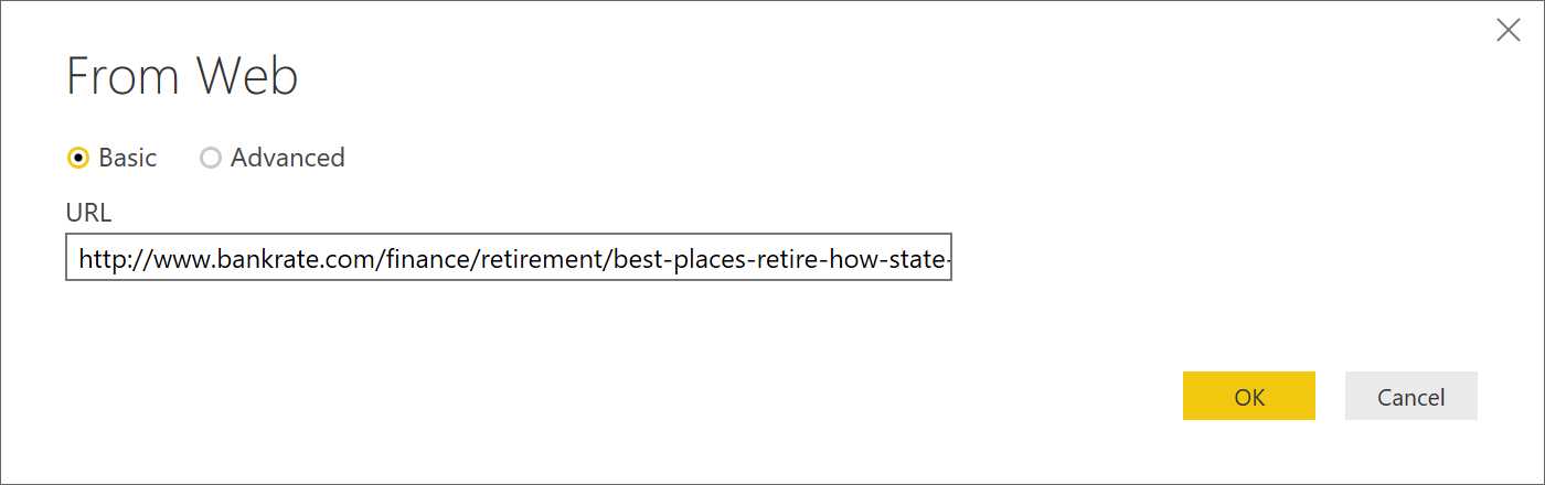
Figure 66: Power BI Desktop—Get Data, From Web
As we see in Figure 67, two types of content are recognized on the page (Document and Table). By searching, we can see the contents and select the table containing the data we are interested in.
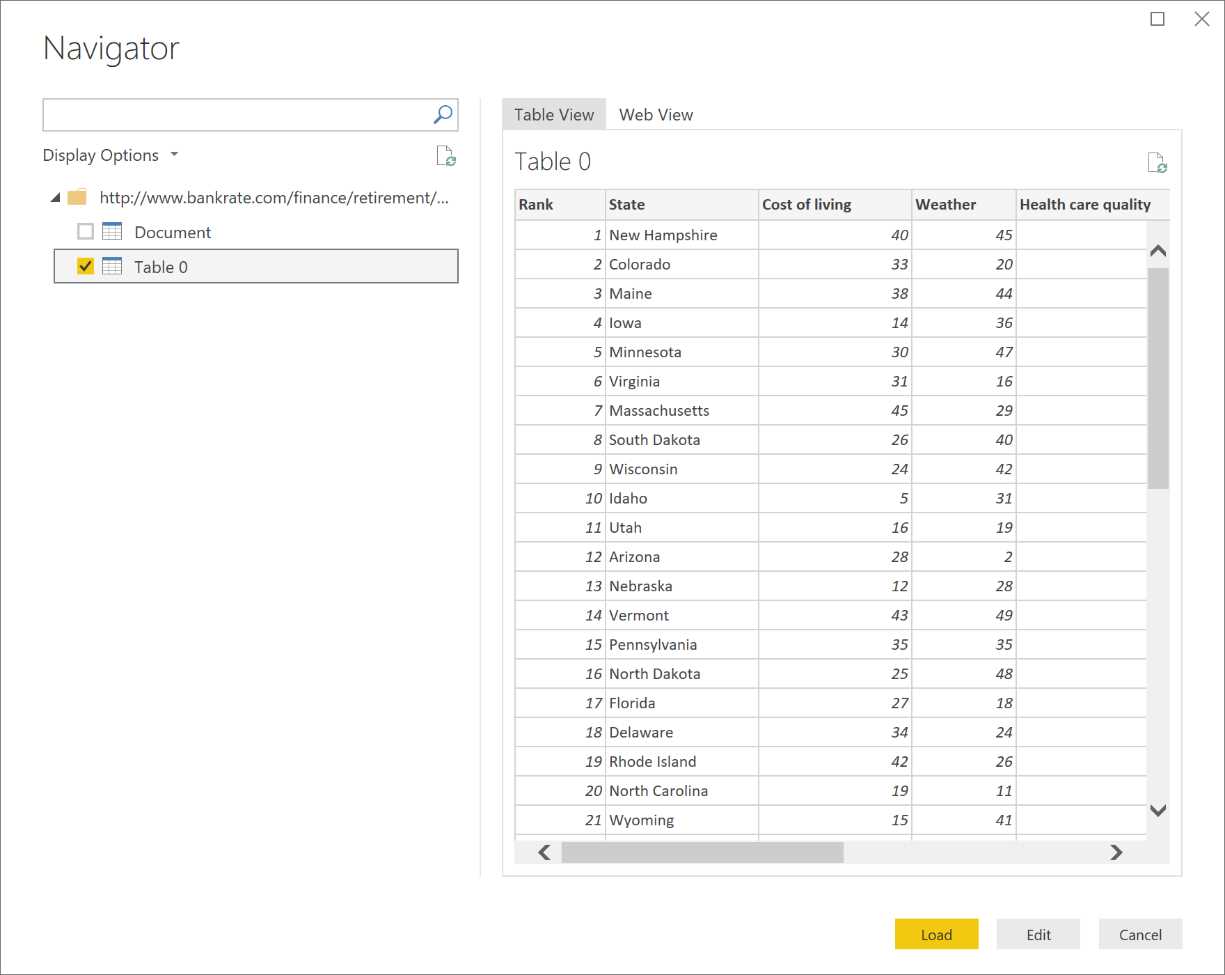
Figure 67: Power BI Desktop—Get Data, Navigator
Note that Figure 68 shows how to click Edit in order to edit as well as to work on the data of the table.
The column named Rank is not relevant, and we can remove it (right-click).

Figure 68: Query Editor
If a field has been identified as a numerical whole number, we must correct the string with empty spaces via the Replace Values interface, as in Figure 69.
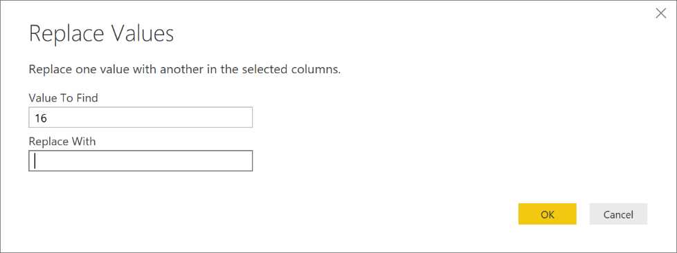
Figure 69: Query Editor—replace with
Note that when all the target values have been replaced, it is possible to convert them to whole numbers (no decimal points) by right-clicking and selecting from the context menu.
![]()
Figure 70: Query Editor—the formula bar
Figure 71 shows how to use Advanced Editor on the ribbon in the query section in order to get a summary of all the reproducible steps.
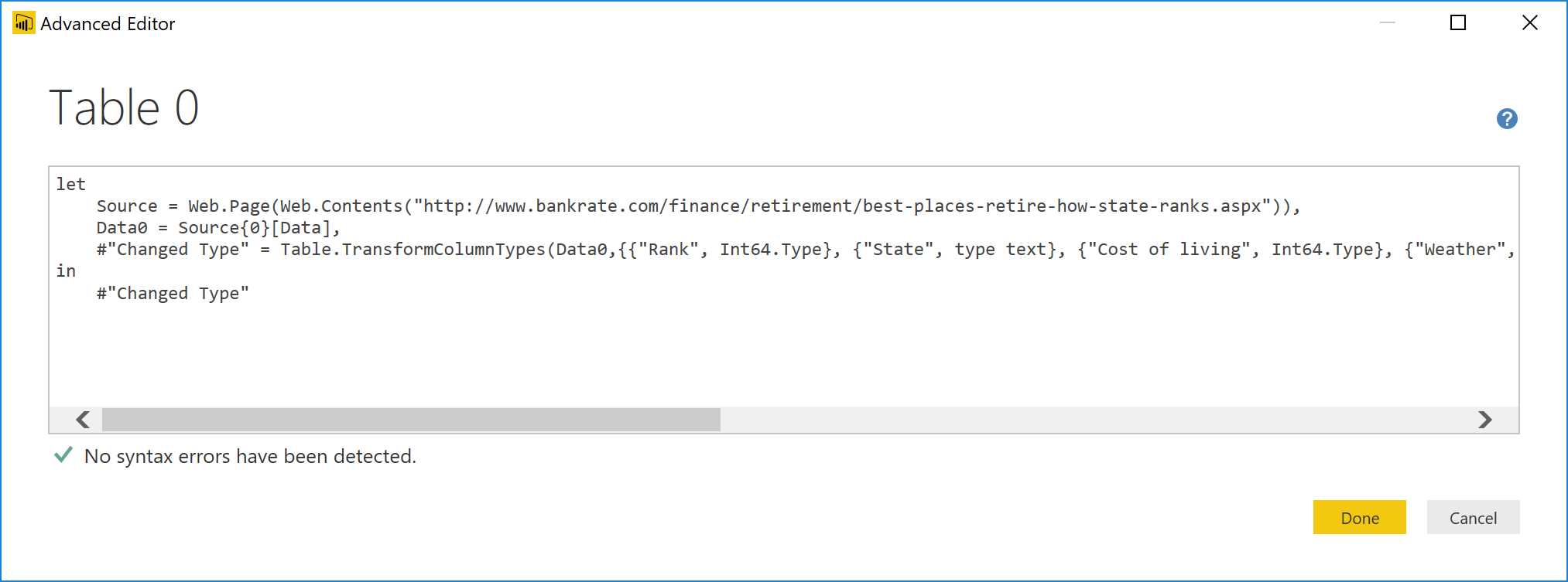
Figure 71: Query Editor—Advanced Editor
Next, save the query by naming it.
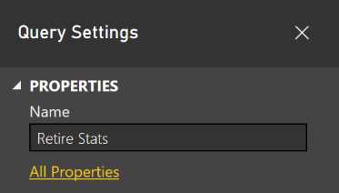
Figure 72: Query Editor—Query Settings
The query is imported automatically and is visible on the right panel, as in Figure 73.
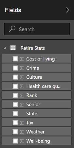
Figure 73: Report—Fields
We also import the data concerning the abbreviations present in Wikipedia. We use the “Get data” functionality, then we click Web and specify the address in which the information is contained.
In Figure 74, you can see the address we want—the one that contains the table with state abbreviations—and we edit.

Figure 74: Power BI Desktop—Get Data, From Web
Next, click OK.

Figure 75: Power BI Desktop—Get Data, Navigator
In Figure 75, we click Load.
We remove rows via the row removing functionality present on the ribbon: Reduce Rows, Remove Rows, and Remove Top Rows.
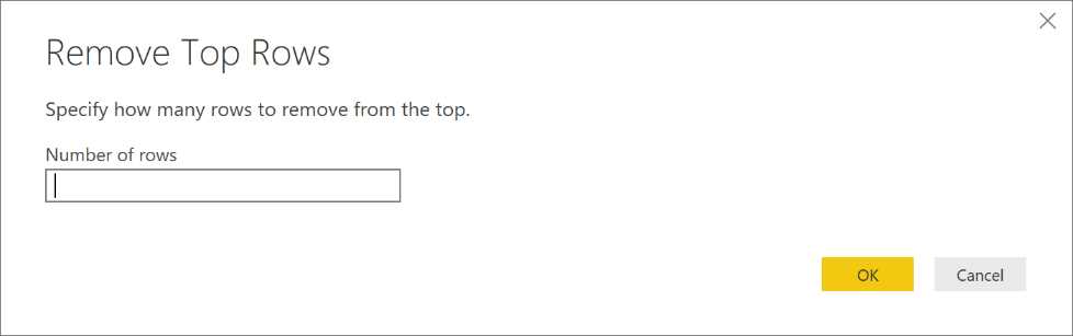
Figure 76: Query Editor—Remove Top Rows form
Next, we specify the number of columns to be removed (two, in this case).
We are only interested in the states present in the statistics, therefore all the other areas won’t matter here. By using the Remove Bottom Rows button in Figure 77, we will remove the 25 rows from number 54 to 78.
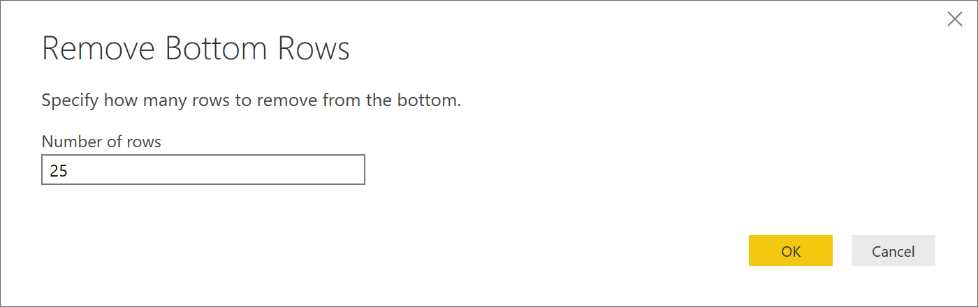
Figure 77: Query Editor—Remove Bottom Rows form
Remember, we are only interested in the abbreviations with the ANSI two-letter codes, so it makes sense to select the two columns we are interested in and remove all the others.
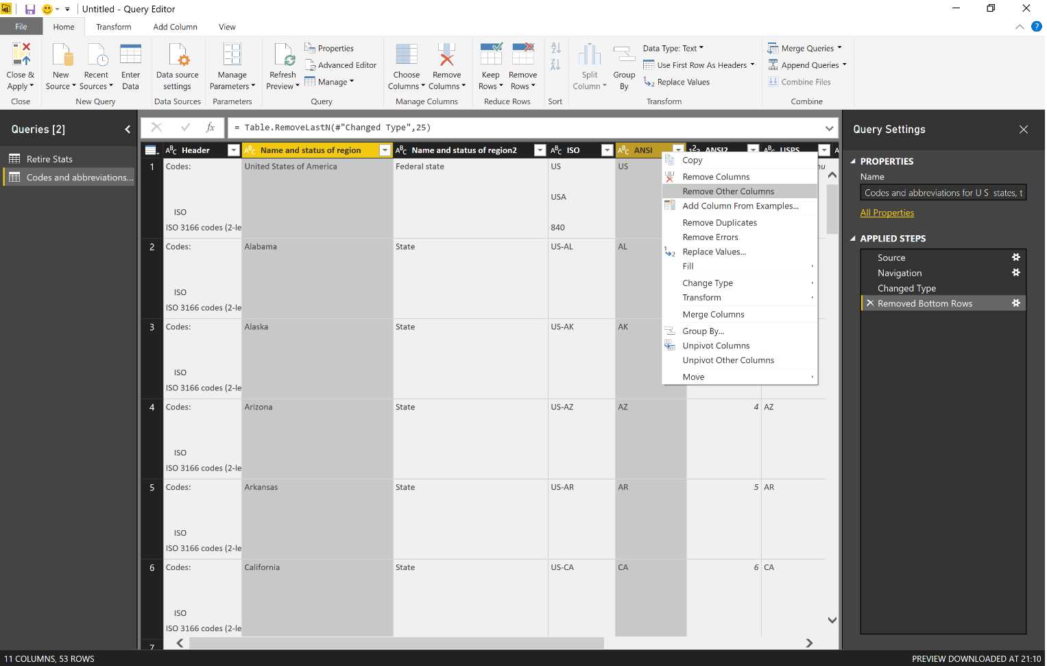
Figure 78: Query Editor—column options
As a result, we have the table we will use to build the data model.
We can rename the table and save it with Close and Apply, which is the first entry on the top left of the ribbon.
Both tables are now ready to be reported.

Figure 79: Report—Fields
We use the “Manage relationships” function present on the ribbon Relationships in order to obtain the relationship.
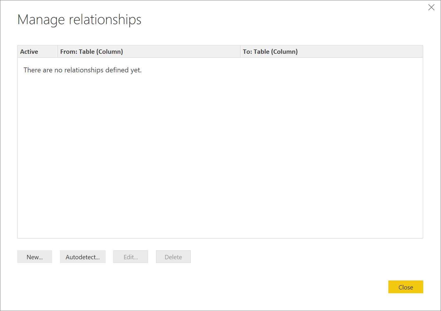
Figure 80: Relationships—Manage relationships
We can also try to implement Autodetect in order to carry out the automatic survey, which is based on the names of the columns.

Figure 81: Relationships—Autodetect
Figure 81 shows a case that will not work, which demonstrates why it is wise to create the report in manual mode.
Next, we click the entry New and identify the first table. As shown in Figure 82, the other table is automatically selected.
We use the name of the state to create a relationship of 1-to-1. Note that the direction of the filter can work both ways.
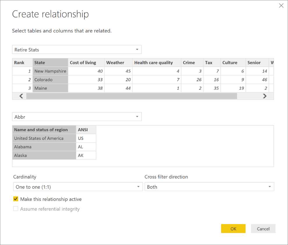
Figure 82: Relationships—Create relationship
In light of the modifications, Figure 83 displays the graph of the relationships.
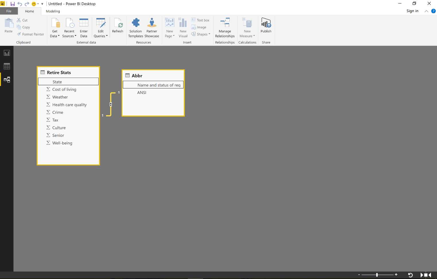
Figure 83: Relationships
Now the data model is set up. We can display the data of our queries at any time (see Figure 84).
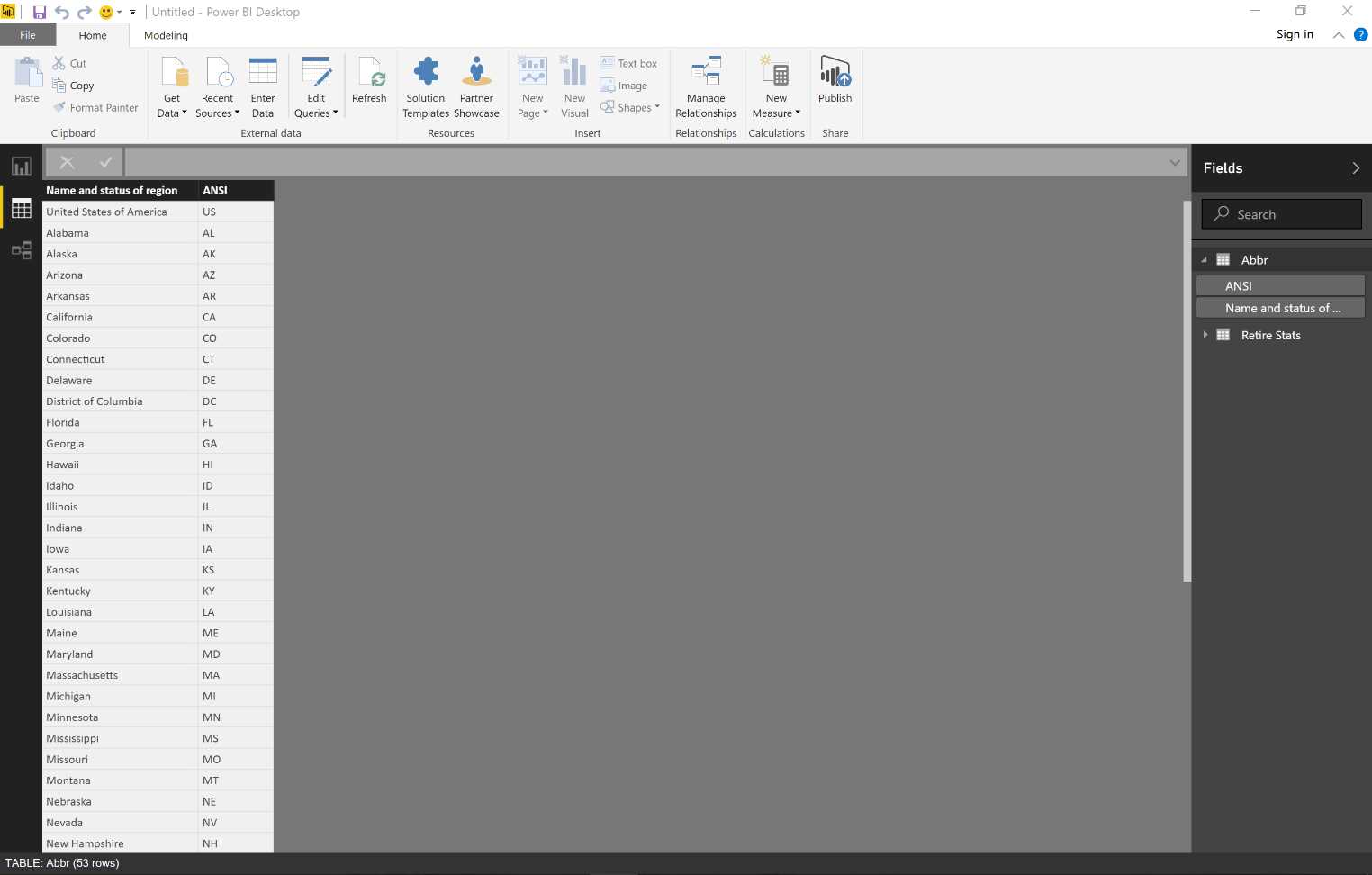
Figure 84: Data Section
We create the report exactly as it takes place online.
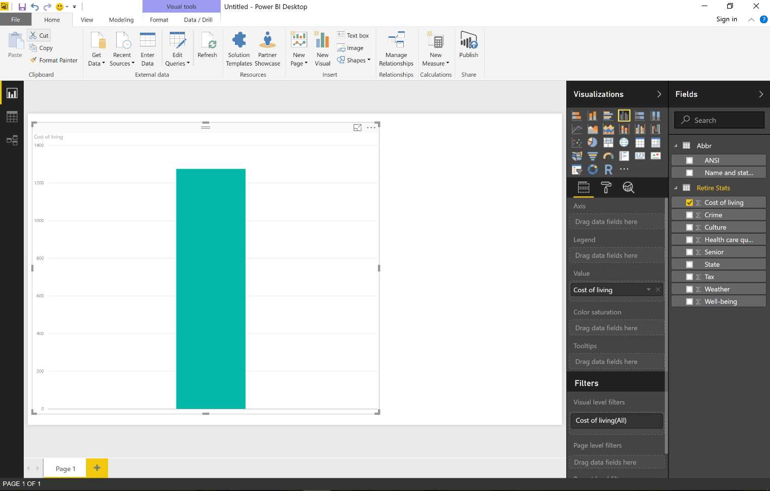
Figure 85: Visualizations
Figure 86 shows that we can create a graph about the cost of living. Note again that instead of using the name of the state, we use the two-letter ANSI code.

Figure 86: Visualizations
Figure 87 shows how we might change our graph by using a more suitable visualization.

Figure 87: Visualizations
Next, we save the result of our work in PBIX format.
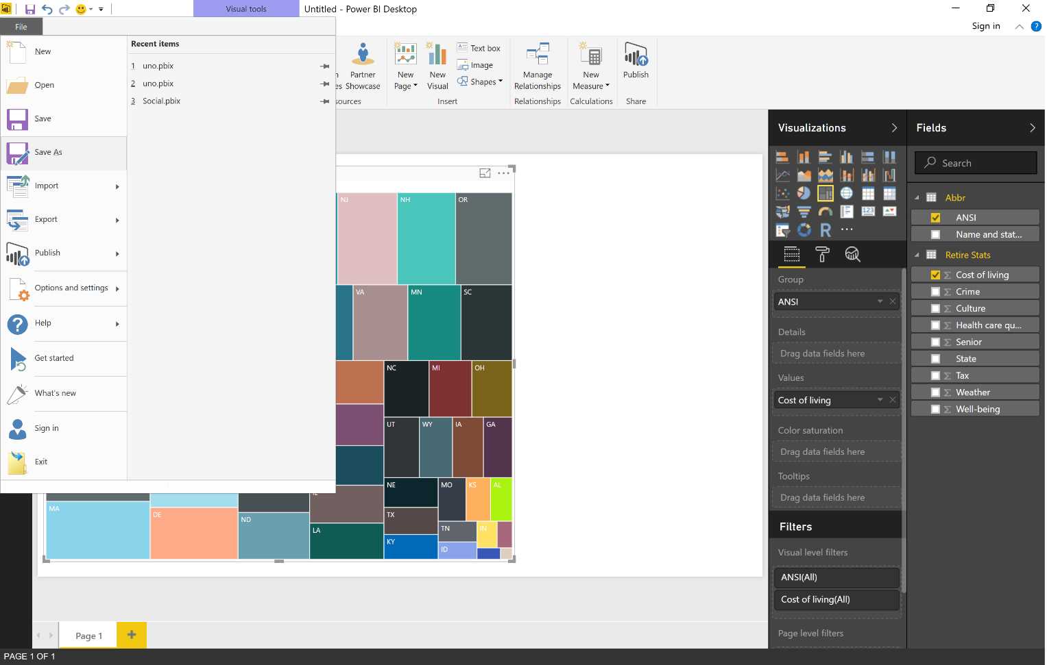
Figure 88: Save Power BI File
Now we proceed with the publication.
Click the entry Publish in the Share section of the ribbon (Figure 89).
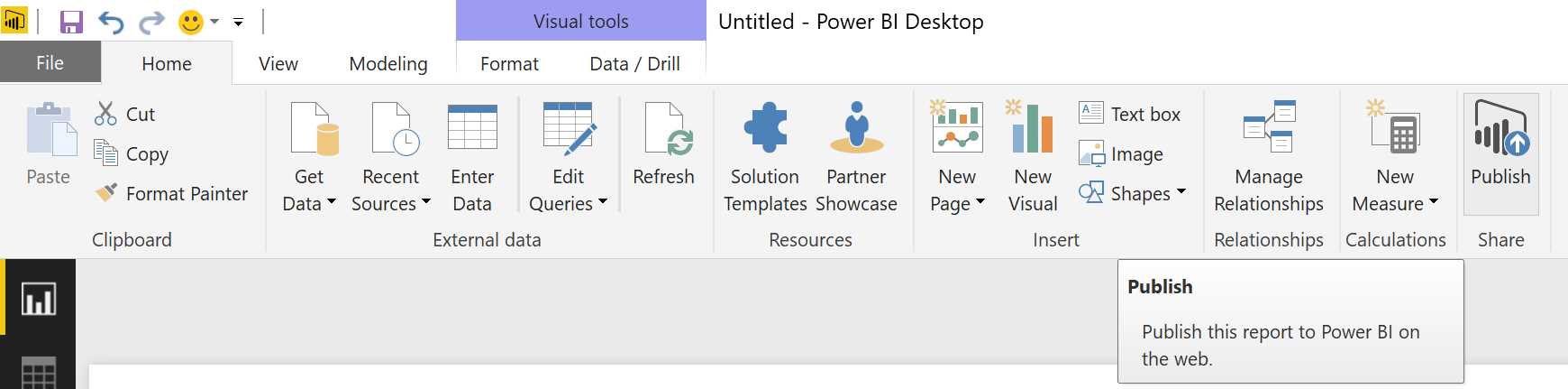
Figure 89: Publish
Now go to “Sign in.”
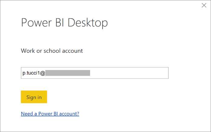
Figure 90: Publish—Sign in
Figure 91 depicts how to authenticate—by supplying our access credentials to Power BI.

Figure 91: Publish—Sign in
At this point, the publication takes place.

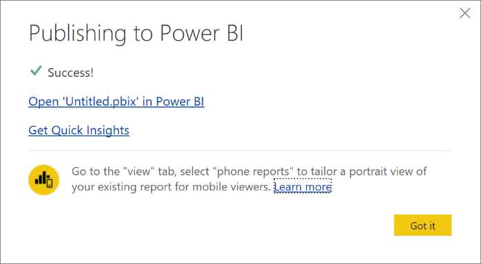
Figure 92: Finishing Publishing—sequence
Now we display Power BI through the browser to see the effect of our last operation.
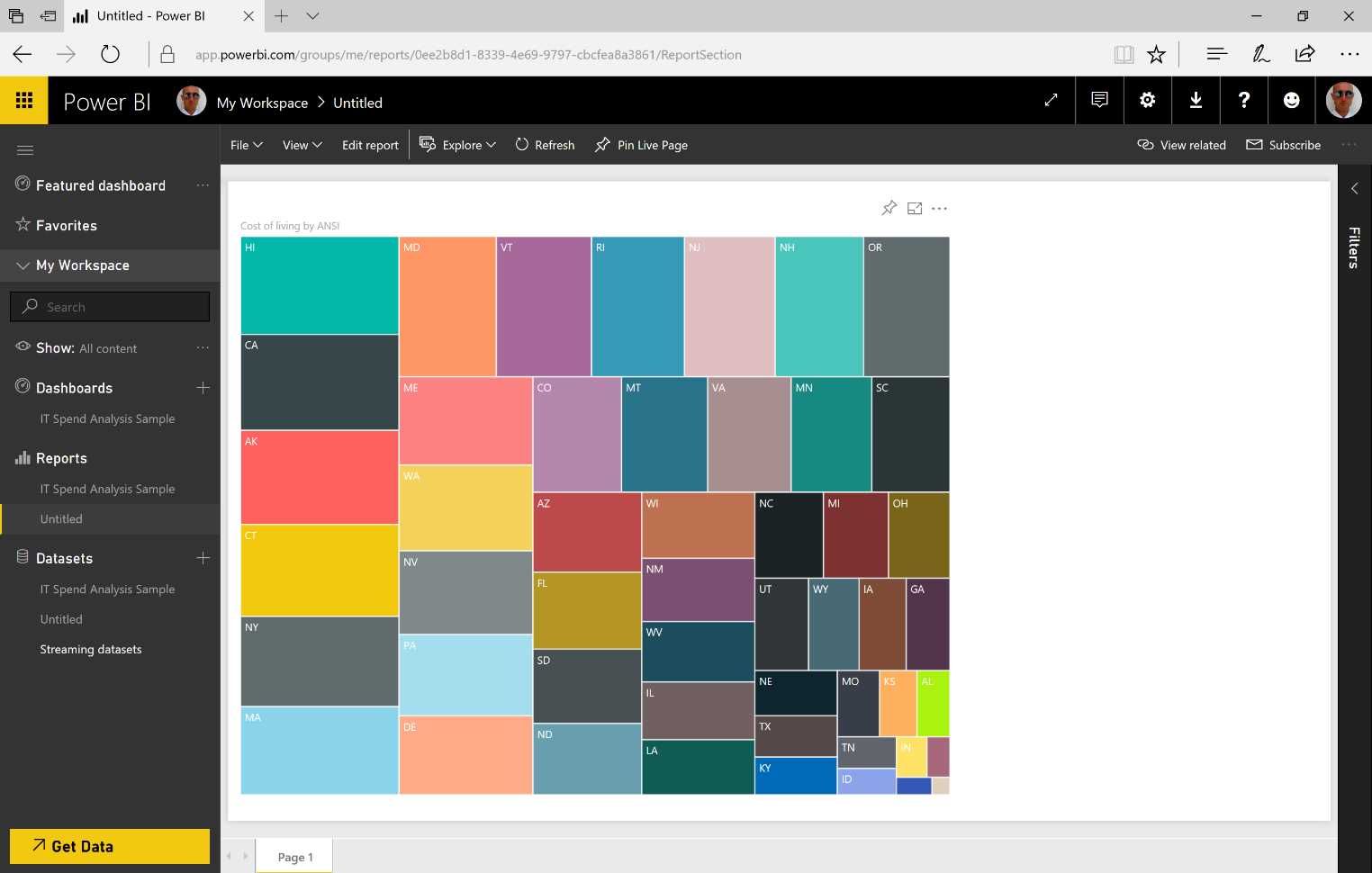
Figure 93: Publish Result
As we can see on the left panel, we have options of Datasets and Reports. The dataset is exactly the one we have built with the data model using the app. And the report containing the visualization we chose is also present.
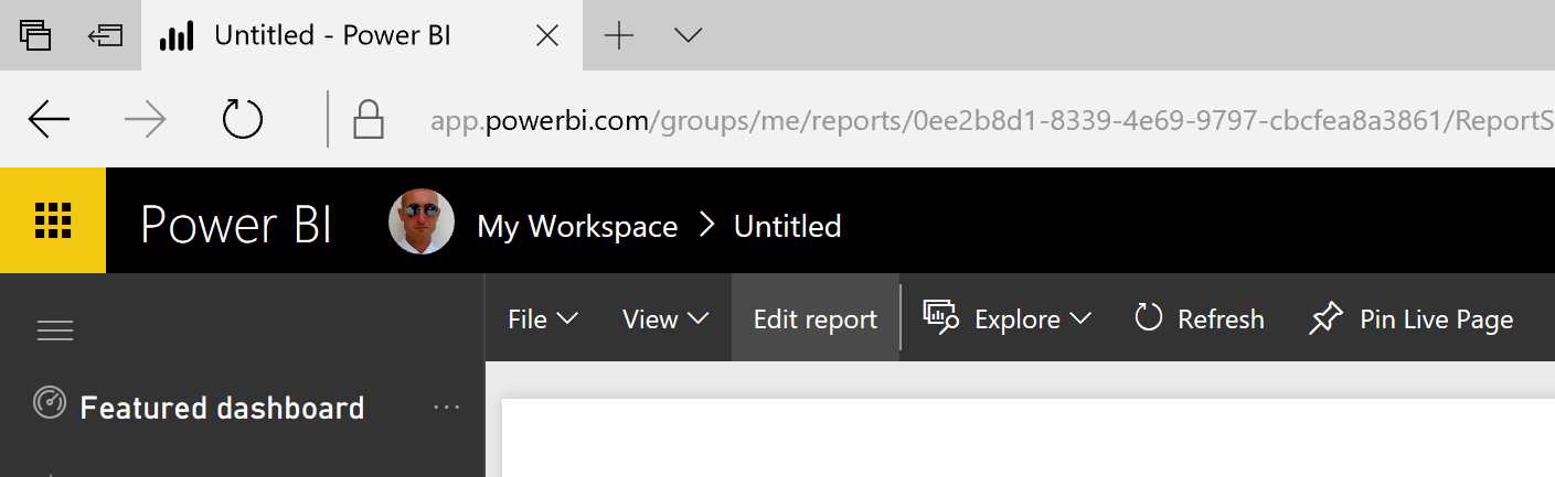
Figure 94: Power BI Service—Edit report
We can create a dashboard at any time.
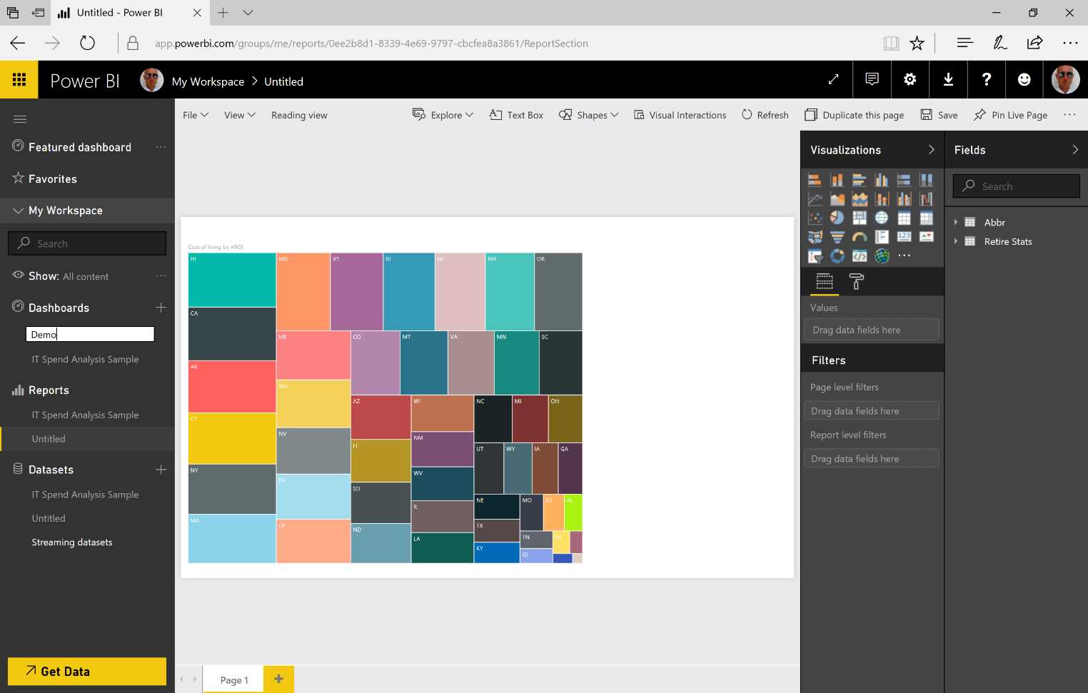
Figure 95: Power BI Service—create a dashboard
Figure 96 is a reminder that, as usual, we need to pin the visualization to the dashboard.


Figure 96: Pin to Dashboard—sequence
Our report, which has been built on-premises through the app, can be edited in order to enhance its information. Any modifications will remain available online.
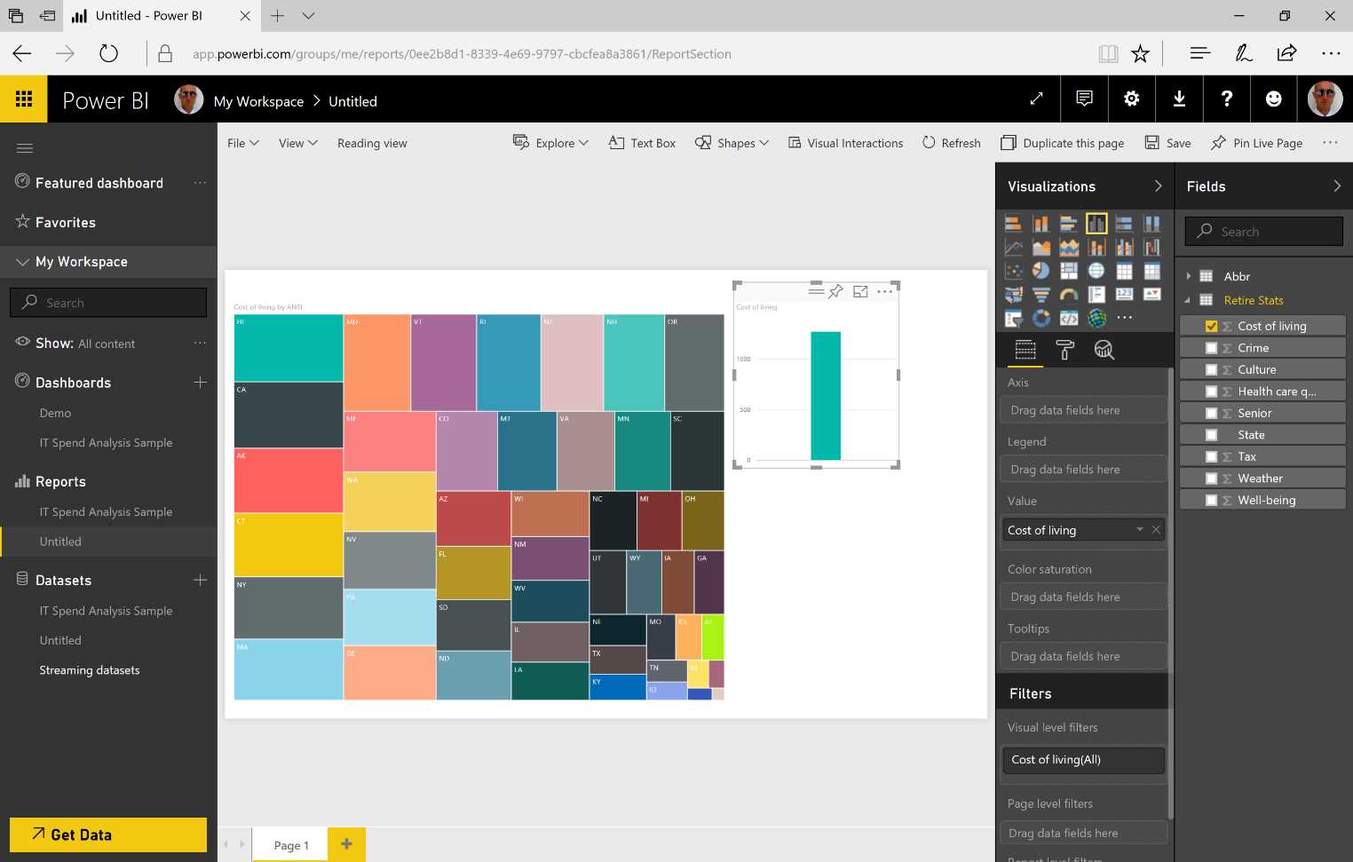
Figure 97: New Chart
- 1800+ high-performance UI components.
- Includes popular controls such as Grid, Chart, Scheduler, and more.
- 24x5 unlimited support by developers.