
More UWP Succinctly®

CHAPTER 1
The core concepts: adaptive layout, navigation, and application’s lifecycle
Adaptive layout
As I’ve mentioned in the first part of this series of books, moving from the Windows Runtime to the Universal Windows Platform isn’t a big challenge: most of the APIs and the core features are the same. However, things are different when it comes to create the user interface: the most distinctive feature of Windows 10 is that it runs on multiple types of devices, with different screen sizes: smartphones, tablets, desktop computers, games consoles, etc.
This flexibility was already a challenge in Windows 8.1, since on the market you could find phones and tablets with multiple screen resolutions and sizes, so the concept of creating a layout that can adapt to different screens isn’t something new. However, with Windows 10 this concept has become even more important, because in the past Universal apps for 8.1 were based on different projects (one for Windows and one for Windows Phone) and, consequently, it was easy to create different XAML pages, different resources, different user controls, etc.
In Windows 10, instead, we have seen that we have a single project that runs on every platform, so we need to be able to adapt the same XAML page to different devices. In this first part of the chapter we’re going to explore all the built-in Windows 10 features that makes easier to achieve this goal.
Effective pixels
Designing the user interface for an application that runs on multiple devices can be a challenge because it’s simply not possible to design the interface working with real pixels, since there is a set of factors (resolution, screen size and viewing distance) that makes the experience too hard to handle. Working with real pixels would lead the designer to create elements that are perfectly rendered on a phone, but that may be barely visible on the Xbox One, since it’s a device used with a big screen and from a longer viewing distance. As such, Windows 10 has introduced the concept of effective pixels: when you design an element in a XAML page and you set a size (like a TextBlock control with a 14pt font or a Rectangle control with a width of 200 px), you aren’t targeting the real screen pixels, but effective pixels.
This size will be automatically multiplied by Windows for a scale factor, which is a value between 100% and 400% assigned to the device based on the resolution, the screen size and the viewing distance. This way, as a developer, you won’t have to worry if an element is too big or too small: it’s up to Windows to automatically adapt it based on the device where the app is running, to keep the viewing experience consistent. This is possible thanks to the fact that XAML is a markup language that can manipulate vector elements: if you scale in or out, you don’t lose quality.

- How effective pixel can help to set a fixed size to an element and, at the same time, keeping it consistent for the user
Breakpoints
The most important consequence of the effective pixel approach is that, since the pixels are independent from the device, you can define a set of breakpoints, which is a series of snap points at which you can start thinking about changing the layout of your app, since you have switched to a device with a bigger or smaller screen.
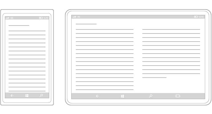
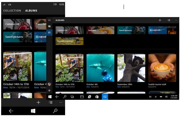
The below image shows a good example of breakpoints usage, taken from the native Mail app included in Windows 10: based on the size of the screen, you get three different experiences.
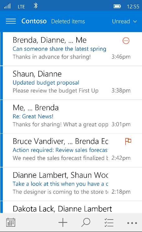
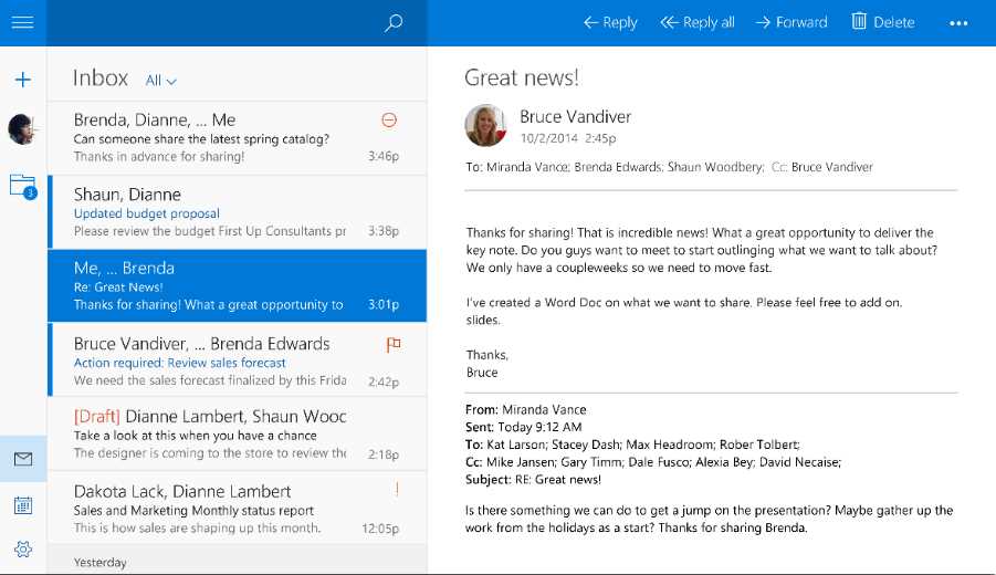
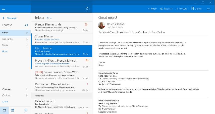
The biggest advantage of using effective pixels is that you can use breakpoints to distinguish between the various device families:
- From 320 to 720: phones
- From 720 to 1024: tablets & phablets
- Over 1024: big screens, like a desktop monitor, a TV Screen or a Surface Hub

- How effective pixels are handled across different devices
As you can see, these pixels aren’t connected to the real resolution of the device, but to the effective pixel’s concept. As such, for example, if the screen is wider than 1024 effective pixels, we can treat it as a desktop / laptop or Xbox, it doesn’t matter which is the real resolution or DPIs of the monitor.
Manage the layout
As we’ve just seen, the XAML framework helps us to create adaptive layout experiences: since it’s a vector-based technology, it’s able to automatically adapt to the screen’s size and resolution without losing quality. However, it doesn’t mean that there aren’t any precautions to keep in mind. The most important one is to avoid assigning a fixed size to our controls. In fact, when you give a fixed size to a control, it’s not able to automatically fill the available space. Consequently, it’s important to avoid using controls like Canvas and Border when you define the layout, since they work with an absolute positioning: the content can’t automatically fit the container, but they’re placed in a fixed position using properties like Top and Left. On the contrary, the Grid control is the best container that you can use to define a fluid layout: as we’ve seen in the previous book, you’re able to define rows and columns which size can automatically adapt to the content.
- A fluid layout sample: on a bigger screen, the application can display more content than on a smaller screen.
However, there are some scenarios where this approach can lead to some issues, especially in games. Let’s take, as example, a chess game: the number of squares on a chessboard is fixed, no matter the size of the device. In a scenario like this, we don’t need to display more content if the screen is bigger: we just need to display the content with a bigger size. For these situations, we can use the ViewBox control, which can automatically scale the content based on the screen’s size: on bigger devices, the content will simply look bigger, but the content’s density will be always the same.
Using this control is very easy: just wrap, inside it, the XAML controls you want to automatically scale, like in the following sample.
<Viewbox> <StackPanel> <TextBlock Text="Some text" /> <TextBlock Text="Some other text" /> </StackPanel> </Viewbox> |
Visual states and adaptive triggers
If you have ever worked with modern web technologies, like HTML5 and CSS, you should already be familiar with the concept of responsive layout: a web page can adapt its layout based on the size of the window, so that it can always deliver a great user experience, no matter if the user is browsing the website from his PC or from a mobile phone. Adapting the layout doesn’t mean just making things bigger or smaller but, more often, deeply changing the way the content is displayed: for example, we could span the content horizontally on a wide screen by leveraging the GridView control, while on a phone it would be better to use the ListView one since it’s a device typically used in portrait mode.
The same concept applies to Universal Windows apps: based on the size of the window, you can adapt the layout of your application so that the content can always properly fit the available space. The best way to achieve this goal in XAML is using the visual states. We have already seen this concept in first book of the series: a visual state is the definition of how a control should look like in a specific state. The power of them is that you don’t have to redefine, for each state, the whole template that describes the control, but just the differences. Do you remember the example we made about the Button control in the previous book? It can have multiple states (pressed, disabled, highlighted) but every visual state doesn’t redefine the template from scratch, but just the differences compared to the basic template.
Windows 10 allows you to leverage the same approach with the entire page: instead of defining multiple pages, one for each breakpoint, you can just specify the differences between the basic state. This goal can be achieved with a new feature introduced in the Universal Windows Platform, which is called AdaptiveTrigger: you can create a visual state and let Windows automatically apply it based on the size of the window.
Here is how the definition of a page which uses adaptive layout looks like:
<Grid> <VisualStateManager.VisualStateGroups> <VisualStateGroup x:Name="AdaptiveVisualStateGroup"> <VisualState x:Name="VisualStateNarrow"> <VisualState.StateTriggers> <AdaptiveTrigger MinWindowWidth="0" /> </VisualState.StateTriggers> <VisualState.Setters> <Setter Target="HeroImage.Height" Value="100" /> </VisualState.Setters> </VisualState> <VisualState x:Name="VisualStateNormal"> <VisualState.StateTriggers> <AdaptiveTrigger MinWindowWidth="720" /> </VisualState.StateTriggers> <VisualState.Setters> <Setter Target="HeroImage.Height" Value="200" /> </VisualState.Setters> </VisualState> <VisualState x:Name="VisualStateWide"> <VisualState.StateTriggers> <AdaptiveTrigger MinWindowWidth="1024" /> </VisualState.StateTriggers> <VisualState.Setters> <Setter Target="HeroImage.Height" Value="400" /> </VisualState.Setters> </VisualState> </VisualStateGroup> </VisualStateManager.VisualStateGroups> <!-- content of the page --> </Grid> |
We create a VisualStateGroup inside the VisualStateManager.VisualStateGroups property, which is exposed by every control. Typically, when we are talking about visual states that controls the whole page, we place them as children of the outer container (like the default Grid included in every page that contains all the other controls).
Inside the VisualStateGroup we create multiple VisualState objects, one for every page layout we want to handle. In a typical UWP application, we’re going to have a visual state for each breakpoint, so that we can truly optimize the experience no matter the size of the screen.
Windows 10 has introduced two new features in Visual State handling which make easier to create adaptive layout experiences:
- StateTriggers, which is a way to have a visual state automatically applied based on a specific condition. The Universal Windows Platform comes with a built-in trigger called AdaptiveTrigger, which allows us to specify the window’s size. When the size of the window reaches this value, the VisualStateManager will automatically apply this visual state. Before Windows 10, we couldn’t achieve this goal just using XAML, but we needed to write some C# code. As developers, we have the chance also to create custom triggers, by leveraging the StateTriggerBase class. Morten Nielsen, a Microsoft MVP, has created a great open source collection of custom triggers to handle many common scenarios (orientation, device family, etc.) which you can find on GitHub: https://github.com/dotMorten/WindowsStateTriggers
- An easier syntax to change the value of the property: to specify the properties we want to change when the visual state is applied, we just set as Target the name of the control (dot) the name of the property and, as Value, the new value. For example, to change the height of the control called HeroImage, we just set HeroImage.Height as Target and the new size as Value.
It’s important to remind that, in each visual state, we are describing only the differences compared to the base state: all the controls in the page will continue to look the same, no matter the size of the window, except for the control called HeroImage. In this case, we’re changing the Height of the image based on the size of the window. Windows 10 will automatically apply the proper visual state, without requiring us to write any line of code in C#, but just using XAML.
Handling the same page with different views
The adaptive triggers approach we’ve seen in the previous section is, without any doubt, the best way to implement an adaptive layout in your applications: this approach, in fact, works well both on the desktop (where the user has the chance to resize the window as he likes) and on other platforms where, thanks to the breakpoints, we can deliver an optimized user experience for each kind of device.
However, there may be some corner case scenarios where this approach can be too complex to implement, because the user interfaces between two different devices may be too different. Or, for example, when the app is running on a peculiar device like a Raspberry Pi, we want to provide a minimal user interface with a subset of features compared to the version that runs on a desktop.
To handle these scenarios, the Universal Windows Platform has introduced the concept of XAML Views, which are different XAML pages connected to the same code behind class. With this approach, our project will have:
- A generic XAML page with a code behind class, that will be used for every device (unless specified otherwise)
- A specific XAML page, with the same name of the generic one, without a code behind class, that will be used for a specific category of devices. The XAML page will refer to the original code behind a class, so that you can reuse all the logic, controls references, event handlers, etc.
The following image shows how a project that uses this approach looks like:
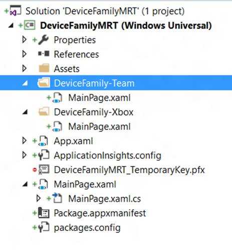
- A sample project that uses different XAML views for the same page
As you can see, the root of the project contains a MainPage.xaml file with its corresponding code behind class, MainPage.xaml.cs. The XAML file contains the layout that will be used by default, unless the app is running on a device for which there’s a specific layout. The code behind class, instead, will contain all the logic and it will handle the interactions with the user.
You can notice that there are two folders called DeviceFamily-Team and DeviceFamily-Xbox and each of them contain another MainPage.xaml file. The difference compared to the main one is that, in this case, you can notice that the code behind class is missing: the controls in the XAML will reference the original MainPage.xaml.cs file for everything regarding logic, event handling, etc.
Specific layouts are handled with a set of naming conventions, applied to the folders that will contain the specific XAML files:
- DeviceFamily-Desktop for desktop computers.
- DeviceFamily-Mobile for mobile devices.
- DeviceFamily-Team for Surface Hub.
- DeviceFamily-Xbox for Xbox One.
- DeviceFamily-IoT for Windows 10 IoT Core.
To add a new XAML view, just create the folder with the proper naming convention in the project, then right click on it and choose Add -> New item. In the list of available templates, choose XAML View, give a name to the file and press Add.
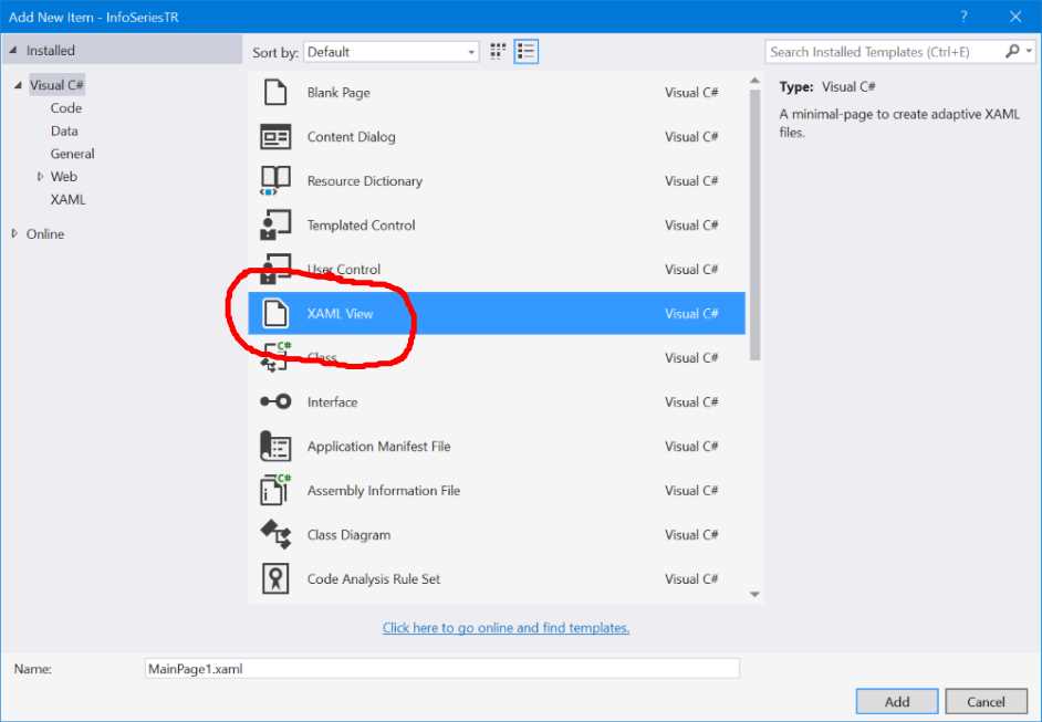
- The template in Visual Studio to create a XAML View
Detecting the size of the screen
In some cases, it may happen that neither of the previous options is good for your scenario. For example, we may require having two completely different pages based on the size of the screen, not only from a user interface but also from a logic point of view. In this case, we can’t leverage neither adaptive triggers or XAML Views. However, we have a last resort, which is an API defined in the Windows.Graphics.Display namespace and it’s calledDisplayInformation which was introduced in the November Update. This API allows you to retrieve many useful information about the display, like the size of the screen, which is one of the key factors that you can take in consideration when you want to tailor the user experience.
For example, after having retrieved a reference to the API for the current view by using the GetForCurrentView() method, you can leverage the DiagonalSizeInInches property to get the size of the screen in inches. This way, you can decide for example to have two different navigation flows: one for bigger devices and one for smaller devices, with a layout optimized for a one-handed experience. The following code leverages this property to redirect the user to a different page in case the screen is smaller than 6 inches:
public void NavigateToDetail(object sender, RoutedEventArgs e) { double size = DisplayInformation.GetForCurrentView().DiagonalSizeInInches.Value; if (size < 6.0) { Frame.Navigate(typeof(OneHandedPage)); } else { Frame.Navigate(typeof(StandardPage)); } } |
Device family detection
Another approach is to leverage the AnalyticsInfo API, which is part of the Windows.System.Profile. namespace that allows you to retrieve, among other info, the device family where the app is running, thanks to the DeviceFamily property. The following sample code shows how you can change the navigation flow based on the device’s type:
public void NavigateToDetail(object sender, RoutedEventArgs e) { if (AnalyticsInfo.VersionInfo.DeviceFamily == "Windows.Mobile") { Frame.Navigate(typeof(MobilePage)); } else { Frame.Navigate(typeof(StandardPage)); } } |
In this sample, we have created a specific page tailored for mobile devices, where we’re redirecting the user in case we detect that the app is running on a phone.
Pay attention!
However, it’s important to highlight that the last two approaches should be used as last resort, since they have many downsides compared to implementing a real adaptive layout experience:
- You must maintain multiple versions of the same page, which probably will display the same data, just in a different way. Patterns like MVVM or XAML Views can help to reduce the impact of this issue, but it’s still more complex and time consuming that having a single page to handle.
- Sometimes, the difference between the device type can be very thin. For example, on the market you can find small tablets which features the Mobile edition of Windows 10, rather than the traditional full one. In this case, relying on the device family detection can deliver to the user an improper experience.
- They don’t fit the desktop world well, since the user can resize the window as he prefers, no matter the size of the screen or the kind of device (traditional desktop, tablet, 2-in-1, etc.)
In the end, Windows 10 has introduced a feature called Continuum, which is available on some Windows 10 Mobile phones (like the Lumia 950 and the Lumia 950 XL), that can turn them into a desktop when they are connected to a bigger screen through the dedicated dock or wirelessly using the Miracast standard. In this scenario, when you launch the app on the big screen on a Continuum enabled device, you get the same user experience of a desktop app, even it’s still running on a mobile device. The previous techniques may not be able to deliver the best user experience, because there can be a mismatch between the size of the screen (detected as wide, like if it’s a desktop computer) and the device where the app is running (a mobile phone).
Adaptive layout techniques
There are many techniques to implement an adaptive layout experience in your application. Let’s see them not from a technical point of view (since they are all based on the concepts and features we’ve seen before), but with a more descriptive approach.
Resize
The resize approach, in adaptive layout, means changing the size of the elements in the page so that they can properly fit all the available space.
- The resize approach
In most of the cases, if you have properly created the page following the suggestions described in the previous section titled Managing the layout, this approach is implemented automatically for you: for example, when you use controls like Grid, GridView or ListView, they are all designed to automatically fill the available space, no matter which is the size of the screen. However, in some scenarios, you can leverage adaptive triggers to manually resize some elements to adapt them in a better way, like an image.
- An example of an application which requires handling the Resize approach manually
The previous image shows an example of an application running in two different window’s sizes: in both of them you can see implemented the automatic and the manual approach. In case of the collection of images, we don’t have to worry about the size of the screen because the GridView control can automatically split the items in multiple columns in case there’s more space (in the first image we have just one column of items, in the second one they automatically become two). However, we can’t say the same about the header image: on a wide screen, it becomes less meaningful compared to a small screen, since most of the characters in the photo are cut. In this scenario, you should leverage an adaptive trigger to change the size of the image based on the size of the screen.
Reposition
The reposition technique consists of moving sections of the application in different places to make a better use of the available space. Take, as example, the below image: on a large screen, there’s more space so the two sections (labeled A and B) can be placed one right to the other. On a smaller screen, like on a phone, instead, we can move them one below the other, since a phone privileges a vertical scrolling experience.

- With the reposition technique, you move the controls in the page based on the size of the window
This approach is usually achieved combining adaptive triggers with the RelativePanel control we’ve learned to use in first book of the series: based on the size of the screen, you can change the relationships between the children controls inside a RelativePanel.
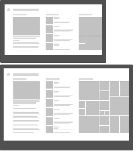
Reflow
Reflow means that the layout of the application should be fluid, so that the user can get the best out of the application’s content, no matter the size of the screen. The density of the content should always be appropriate based on the device where the app is running.
- The content of the application is flowed into two different columns on a device with a bigger screen
This approach, most of the times, can be achieved automatically thanks to controls like GridView, which can automatically reflow the content. Otherwise, you can also manually implement it by leveraging adaptive triggers: for example, you can decide to assign a different ItemTemplate to a GridView or ListView control, based on the size of the screen.
Rearchitect
Rearchitect means that we are in a situation where the same layout can’t be applied both to a small and a wide screen and moving sections or resizing them isn’t enough: we need to rethink the user experience based on the device where the app is running. One of the best examples of this scenario is the master – detail one: we have a list of items and the user can tap on one of them to see more details about it. When we are on a device with a wide screen, we can display both side by side. When we are, instead, on a device with a small screen, we fallback to an experience based on two different pages: one with the list and one with the details. There are many Windows 10 built-in apps that leverages this approach, like Mail or People.
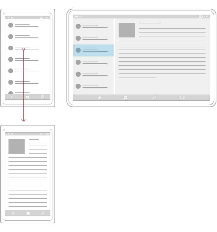
- A master detail scenario is a good example of the rearchitect scenario
This approach can be more complicated to implement compared to the other ones. It can be implemented using adaptive triggers, by creating multiple controls and hiding or displaying them based not just on the size of the screen, but also on the page status (if we’re displaying the master or the detail of the page). Another approach is to leverage device family or screen size detection techniques: in this case, you can redirect the user to different pages based on your scenario.
Reveal
The reveal technique consists of hiding or displaying new information based on the size of the window.
- A Pivot control displays more elements when it’s used on a bigger device
Some controls automatically implement this behavior: for example, as you can see in the above image, the Pivot control can automatically hide or display a different number of sections based on the size of the screen. In other situations, it’s up to our scenario to define which elements we want to display and which, instead, we want to hide: with this approach, you typically leverage adaptive triggers to change the Visibility property of a control.
The below image shows an example of this technique applied to the SplitView control we’ve learned to use in the first part of the book. In this scenario, we change the DisplayMode property of the control based on the size of the screen:
- if it’s a small screen, we use the CompactOverlay mode, where the panel is completely hidden and it can be displayed only by tapping on the hamburger button. Additionally, the panel overlaps over the content of the page, without taking its space.
- If it’s a medium screen (like a phablet or a tablet), we use the CompactInline mode, where the panel still overlaps over the content of the page, so that can save some space, but it isn’t completely hidden: a preview of the section’s icons is always visible.
- If it’s a wide screen, we use the Inline mode, where the panel is always visible and takes his space on the page.
- The Reveal technique applied to a SplitView control
Replace
The replace technique should be considered as “last resort”, since it doesn’t fully satisfy the “adaptive layout” experience and, in fact, it leverages the approaches we’ve described before like detecting in code the size of the screen or the device family.
Replace, in fact, means that you’re going to completely replace some parts of the user interface to be better optimized for the size of the screen or the device type.
The original version of the first party Photos app in Windows 10 leveraged this technique to provide a good navigation experience to the user tailored for each device. In the Photos app, in fact, the various sections of the app were handled:
- With a hamburger menu on the PC, since this kind on navigation approach works well on big devices which are controlled with mouse and keyboard.
- With a pivot on the phone, since the hamburger menu approach may not be the best to use on a mobile device. The hamburger button, in fact, can be hard to reach with the thumb on a device with a big screen
- The Photos app implements two completely different navigation techniques based on the device family
Managing images
When it comes to working with images, we don’t have the same flexibility offered by the XAML approach: images, in fact, are rendered as bitmaps, not as vectors, so bigger the image is resized, the bigger is the quality loss. To manage images, the Universal Windows Platform offers a naming convention that greatly help developers to support all the devices: you will need to add different versions of the images (with different resolutions) and Windows will automatically pick the best one, based on the device’s scale factor.
Scale factors | 100 | 125 | 150 | 200 | 250 | 300 | 400 |
The table above shows all the different scale factors supported by Windows: the best approach, of course, is to provide an image for each of them but, if you don’t have this opportunity, it’s important that you provide at least an image for the ones highlighted in bold (100, 200 and 400)
For example, let’s say that you have an image with resolution 100x100 (which corresponds to scale factor 100): to properly support all the possible screen sizes and resolution, we will have to add to the project at least the same image with resolution 200x200 (for the 200 scale factor) and 400x400 (for the 400 scale factor). There are two ways to manage this scenario. They both produce the same result; it’s up to you to choose which one fit bets your needs and your coding habits.
The first way is to include the images in the same folder, but with a name that ends with a different suffix. For example, if the original image is called logo.png, you should add the following files:
- logo.scale-100.png for the 100-scale factor.
- logo.scale-200.png for the 200-scale factor.
- logo.scale-400.png for the 400-scale factor.
The second way, instead, requires to always use the same file name, but stored in different folders. Based on the previous sample, you should organize the project with the following folders:
- /scale-100/logo.png for the 100-scale factor.
- /scale-200/logo.png for the 200-scale factor.
- /scale-400/logo.png for the 400-scale factor.
The most important thing to highlight is that this approach is completely transparent to the developer: you’ll simply have to assign to the control the base name of the image and Windows will take care of picking up the best image for you. For example, to display the previous image called logo.png using an Image control, you will have just to declare the following code:
<Image Source="/Assets/logo.png" /> |
The app will automatically use the proper version of the image, based on the scale factor assigned to the device where the app is running.
Managing external images
Of course, the previous approach works only for images that are part of the Visual Studio’s project: if the image is downloaded from the web, you’ll have to manually manage the different versions of the image. You can rely on the ResolutionScale property offered by the DisplayInformation class we’ve seen before to achieve this goal: you’ll be able to retrieve the current scale factor and download the proper image for your device.
protected override void OnNavigatedTo(NavigationEventArgs e) { string url = string.Empty; ResolutionScale scale = DisplayInformation.GetForCurrentView().ResolutionScale; switch (scale) { case ResolutionScale.Scale100Percent: url = "http://www.mywebsite.com/image100.png"; break; case ResolutionScale.Scale200Percent: url = "http://www.mywebsite.com/image200.png"; break; case ResolutionScale.Scale400Percent: url = "http://www.mywebsite.com/image200.png"; break; } MyImage.Source = new BitmapImage(new Uri(url)); } |
Managing the visual assets
The approach we’ve just seen about images is applied also to the standard visual assets required by any Universal Windows Platform application, like icons, tiles, etc. If you have read Chapter 2 of the first book of the series, you would remember that the standard visual assets of the application are defined inside the manifest file, in a specific section called Visual Assets. You can notice that, for every image requested in the section, you’ll be able to load multiple versions of them, to support the different scale factors. The visual manifest editor will help you to understand the proper resolution to use when you define the image to use. For example, if you look at the Splash screen section in the manifest file, you’ll notice that, under every image, it reports the proper resolution required for every specific scale factor, like:
- The base image, with scale factor 100, should have a 620x300 resolution.
- The image with scale factor 125 should have a 775x375 resolution.
- The image with scale factor 150 should have a 930x450 resolution.
- The image with scale factor 200 should have a 1240x600 resolution.
- The image with scale factor 400 should have a 2480x1200 resolution.
Let’s see, in details, which are the different kind of images required in the manifest file.
Tile images and logos
This section is used to define the logo of the application. Multiple formats are required: each of them corresponds to a specific use case. Let’s see them in details.
- Square71x71 Logo refers to the small tile image.
- Square150x150 Logo is the image used for the standard square tile.
- Wide310x150 Logo is the image used for the wide rectangular tile.
- Square310x310 Logo is the image used for the big square tile, which however is not available on Windows Mobile.
- There are some pages, in the operating system, where a smaller logo is required (like in the application list). This image is defined in the Square44x44 Logo section.
- Store Logo is the image used for the Store.
Badge logo
Universal Windows Platform apps can interact with the user also on the lock screen, which is displayed when the user is not actively using the device. The most common scenario are notifications: we can alert the user that something happened in the application (for example, they have received a new mail) without forcing him to unlock his device. In this section, you’ll be able to define the image that will be used to display such notifications. The peculiarity of this image is that it must be monochromatic and with a transparent background.
Splash screen
The splash screen image is displayed to the user when the application is loading: as soon as the loading is completed, the splash screen is hidden and the first page of the application is displayed. The splash screen image is displayed at the center of the screen and it doesn’t fill all the available space (the requested resolution, in fact, is 620x300, which is less than any resolution supported by any Windows device). Consequently, you must set also a background color, which will fill the remaining space. It’s important, to obtain the best result, that the color matches the background color of the image used as splash screen.
How to test scaling
Testing that you have properly managed the layout and the images of your application so that it can perform well, no matter which the device the app is running on is, can be tricky: you would require access to many devices, each of them with different resolutions and screen sizes. Luckily, Visual Studio 2015 offers some tools that can help the developer to simulate different scale factors.
The first one is the integrated designer, which you can access when you open any XAML page. If you switch to the design view using the proper tab placed at the lower left corner, Visual Studio will show a preview of the layout of the application. At the top right corner, you will find a dropdown that you can use to simulate different kind of devices, each of them with its own resolution and scale factor.
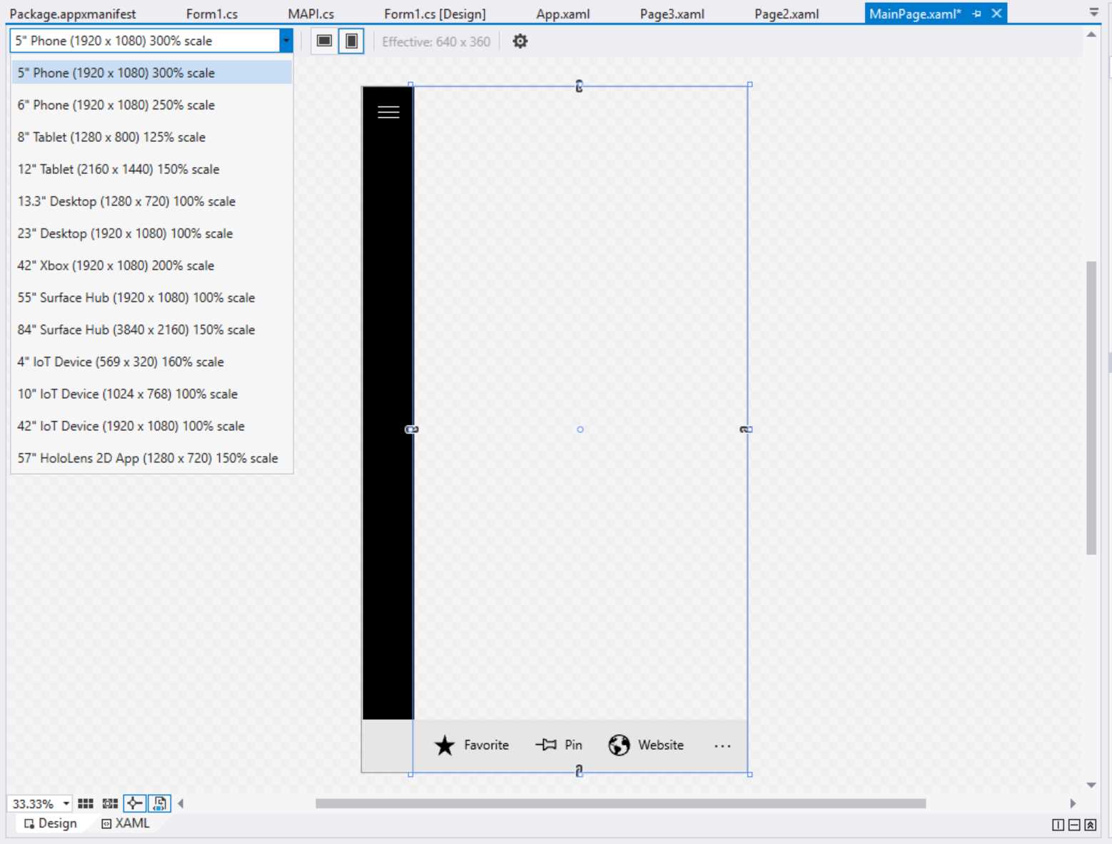
- The Visual Studio designer
Additionally, you can also notice that, at the right of the dropdown, you have an option to change the orientation and a label that shows the current resolution of the device in effective pixels (so with the scale factor already applied). Additionally, the Visual Studio designer can apply adaptive triggers in real time: if you have created multiple visual states, connected to different sizes of the screens, they will be automatically applied and you’ll see a preview of the result without running the application.
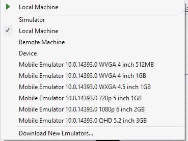
However, sometimes, you need to test the different scaling factors during the real execution of the application, so you need to effectively launch it. In this case, you can use the simulator we’ve described in the first book: it offers, in fact, an option in the toolbar that can change the current resolution and screen’s size for of the simulator.
The Windows Mobile emulator includes this feature too, by offering multiple versions with different screen sizes and resolutions, as you can see from the following image:
- The different mobile emulators in Visual Studio 2015
Managing orientation
The approach previously described to manage the screen resizing can be applied also to orientation management. In the previous versions of Windows, orientation management was optional in some cases: for example, if you were working on a Windows Phone only project, managing the landscape orientation wasn’t necessarily a requirement, since most of the time a mobile phone is used in portrait mode. However, remember that Universal Windows Platform apps can run across a wide range of devices: some of them are used mainly in portrait (like a phone), some of them in landscape (like a traditional desktop), some of them in both ways (like a tablet).
As such, it’s important to implement an adaptive layout experience not only when it comes to the handle the size of the screen, but also the orientation.
By default, Universal Windows apps automatically handle the orientation: when you rotate the device, the page content is rotated. You will find, in the manifest file, in the Application tab, a section called Supported rotations. However, if you read the description, you’ll understand that it doesn’t really enforce a requirement, but it’s more a way to indicate the orientation’s preferences. In fact, Windows 10 is always able to override the behavior described in the manifest if it isn’t supported by the current platform. Let’s say, for example, that you have configured the manifest to support only portrait mode, but then the app is launched on a desktop which supports only landscape mode. In this case, Windows will ignore the manifest setting and will rotate the application anyway.
The automatic orientation handling can be a good starting point, but it doesn’t always provide good results: working with visual states is the best way to manage the orientation change, so that we can manually change the layout of the application based on the way the user is holding the device.
From the XAML point of view, the code is the same we’ve seen when we talked about implementing an adaptive layout with visual states: you can simply define two visual states, one for the portrait and one for the landscape, in which you’re going to set how the controls will look like based on the orientation.
You can decide to manage orientation change in code, by leveraging the SizeChanged event exposed by the Page class, like in the following sample.
public sealed partial class MainPage : Page { public MainPage() { this.InitializeComponent(); this.SizeChanged += MainPage_SizeChanged; } private void MainPage_SizeChanged(object sender, SizeChangedEventArgs e) { if (e.NewSize.Width > e.NewSize.Height) { VisualStateManager.GoToState(this, "DefaultLayout", true); } else { VisualStateManager.GoToState(this, "PortraitLayout", true); } } } |
The SizeChanged event is triggered, among other scenarios, when the orientation of the device changes: in this case, we can use the Width and Height properties offered by the NewSize property to determine the current orientation. If the Width is higher than the Height, it means that the device is being used in landscape mode; otherwise, it’s being used in portrait mode. Using the VisualStateManager, we trigger the proper visual state, based on this condition.
However, if you prefer to continue working just with XAML without writing C# code, you can leverage the already mentioned StateTriggerBase class, which allows you to create your own visual states triggers. The community library called WindowsStateTriggers (https://github.com/dotMorten/WindowsStateTriggers) already contains a trigger that you can easily use to handle orientation changes, like in the following sample:
<Grid> <VisualStateManager.VisualStateGroups> <VisualStateGroup > <VisualState x:Name="landscape"> <VisualState.StateTriggers> <triggers:OrientationStateTrigger Orientation="Landscape" /> </VisualState.StateTriggers> <VisualState.Setters> <Setter Target="orientationStatus.Text" Value="Landscape mode" /> </VisualState.Setters> </VisualState> <VisualState x:Name="portrait"> <VisualState.StateTriggers> <triggers:OrientationStateTrigger Orientation="Portrait" /> </VisualState.StateTriggers> <VisualState.Setters> <Setter Target="orientationStatus.Text" Value="Portrait mode" /> </VisualState.Setters> </VisualState> </VisualStateGroup> </VisualStateManager.VisualStateGroups> <TextBlock x:Name="orientationStatus" HorizontalAlignment="Center" VerticalAlignment="Center" /> </Grid> |
This XAML page simply contains a TextBlock control inside a Grid: using the OrientationStateTrigger included in the library, we change the value of the Text property based on the orientation of the device.
Both the Windows simulator and the Windows Mobile emulator can help us to test this scenario, by providing an option to rotate the device.
Enhancing the user interface with Composition APIs
Being capable of adapting the user interface of an application to the different screens and devices isn’t enough to deliver a great user experience. The application should also be pleasant to use and attract the user to return using it not just because it’s useful, but also because it’s delightful to use.
The best way to achieve this goal is to design a great user interface and animations and effects play a significant role in this: they help to create the feeling that the application is smooth, fast and responsive.
In the past, developers tended to overuse this technique. Many times, applications included animations and effects just for the sake of it, obtaining the opposite effect: slowing down the workflow of the user, who needed to wait an animation (like a transition between one page to the other) to be completed before moving on.
The current approach embraced by most of the platforms, instead, is to leverage animations and effects only when they make sense: adding a transition animation between a page and the other helps to create a great user experience if it’s smooth and quick, but if the user needs to wait 10 seconds every time he navigates across the app he will probably stop using it very soon.
Composition APIs is a new set of APIs added in Windows 10, which have been expanded with every update (both November and Anniversary Update brought new features to the table). They help to add animations and effects and, compared to the XAML animations we’ve seen in the previous book implemented with Storyboards, they offer more opportunities and better performances.
Let’s look at the following image:
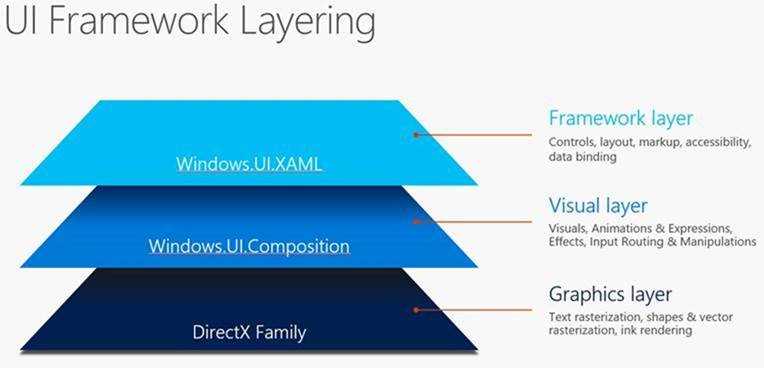
- The UI Framework Layering in Windows 10
When it comes to work with the user interface of a Windows application, before Windows 10, we had two options:
- XAML, which we have started to know in the previous book. It’s the easiest way to create the user interface, since it provides a built-in set of controls, properties and features like data binding. However, it isn’t the most performant stack since, under the hood, Windows must take care of converting all the XAML code into UI elements and rendering them.
- DirectX, which won’t be covered into this book and it’s typically leveraged by games. You can think of if it like an empty draw board: you have the power to create everything from scratch, including shapes, complex 3d objects, etc. without being “limited” by the XAML controls that are built-in into the platform. Additionally, this layer talks directly with the rendering engine, so you get the best performances. However, the downside is that you must do everything from scratch: even a simple text needs to be manually rendered, since you don’t have access to built-in controls like in XAML.
Windows.UI.Composition is a new namespace which has been added in Windows 10 that acts as a middle layer between the other two: it offers power and performances closer to the ones offered by the DirectX layer, but without the same complexity in terms of logic and code to write, making the coding experience more similar to the XAML one.
Composition APIs can be used to achieve two goals: create animations and render effects. Let’s briefly see both scenarios.
Creating animations
There are four type of animations that can be created with Composition APIs:
- Keyframe animations
- Implicit animations
- Expression animations
- Connected animations
Composition animations can be applied to most of the properties of the Visual class, which is the one that represents a basic XAML objects rendered in the visual tree. An example of these properties is Opacity, Offset, Orientation, Scale, Size, etc. Additionally, you have the chance to apply them also to just a sub component of one of these properties. For example, when you to apply an animation to the Size property of an element, you can decide to work only with the x property and ignore the y one.
Composition APIs are a complex topic, since they offer a lot of opportunities and features. As such, we won’t discuss all the different types in this book. If you want to learn more, you can refer to the official documentation https://msdn.microsoft.com/en-us/windows/uwp/graphics/composition-animation and to the official sample app on GitHub, which demoes all the available features https://github.com/Microsoft/WindowsUIDevLabs
Let’s see some of the most important animations and effects that you can achieve with these APIs. All of them belongs to the namespace Windows.UI.Composition.
Keyframe animations
Keyframe animations are like the ones that you can achieve with XAML storyboards and let you define animations which needs to be performed at a specific point in time. As such, we’re talking about time driven animations, where the developer can control, at a specific time, which exact value the property of a control needs to have. One of the most important features of keyframe animations is Easing Functions support (known also as Interpolators), which is an easy way to describe transitions (which can also be quite complex) between one frame and the other. Thanks to Interpolators, you will be able to configure just some key frames of the animation (like which value you want to apply to a property at the beginning, in the middle and in the end) and the APIs will take care of generating all the intermediate frames for you.
Let’s see a real example, by animating one of the properties we have mentioned before of a XAML control: we want to change the Opacity of a Rectangle, so that it slowly disappears, turning from visible to hidden.
First, we need to add the control in our page and assign to it a name, using the x:Name property:
<StackPanel> <Rectangle Width="400" Height="400" Fill="Blue" x:Name="MyRectangle" /> <Button Content="Start animation" Click="OnStartAnimation" /> </StackPanel> |
Additionally, we have added also a Button control, which is going to trigger the animation. Here is the code that is invoked when the button is pressed:
private void OnStartAnimation(object sender, RoutedEventArgs e) { Compositor compositor = ElementCompositionPreview.GetElementVisual(this).Compositor; var visual = ElementCompositionPreview.GetElementVisual(MyRectangle); visual.Opacity = 1; var animation = compositor.CreateScalarKeyFrameAnimation(); animation.InsertKeyFrame(0, 1); animation.InsertKeyFrame(1, 0); animation.Duration = TimeSpan.FromSeconds(5.0); animation.DelayTime = TimeSpan.FromSeconds(1.0); visual.StartAnimation("Opacity", animation); } |
The first thing we need is a reference to the compositor, which is the object that will allow us to interact with the Composition APIs and apply animations and effects. To get it, we need to call the GetElementVisual() of the ElementCompositionPreview object, passing as parameter a reference to the parent container of the control we want to animate (in this case, it’s the current XAML page, identified by the this keyword). The result will contain a property called Compositor, which is the one we need to work with.
The second step is to get a reference to the Visual property of XAML control we want to animate: in this case, it’s the Rectangle one, so we use again the ElementCompositionPreview object but, this time, we call the GetElementVisual() method, passing as parameter the name of the control (in our sample, it’s MyRectangle).
Now we have both the compositor and the visual, which are the two elements we need to work with. The Compositor class offers many methods to create animations, based on the type of property we need to animate. For example, if you need to animate the Size property of a control (which is made by a vector with two components, x and y), you can use the CreateVector2KeyFrameAnimation() method. Or in case you want to change the color of a control, you can use the CreateColorKeyFrameAnimation() one. In this case, we’re working with the Opacity property, which is a scalar value (a decimal number between 0 and 1): as such, we have to use the CreateScalarKeyFrameAnimation() method to create the animation.
Now we can start to customize the animation by:
- Using the InsertKeyFrame() method for every point in time you want to manipulate. The method requires a first parameter, which is the frame number, and a second one, which is the value we want to assign to the property when we reach that frame. In this sample, we’re creating just two frames: a starting one, where the control is visible (so the Opacity is equal to 1) and an ending one, where the control is hidden (so the Opacity is equal to 0).
- Setting the duration of the animation, by using the Duration property which requires a TimeSpan value (in the previous sample, the animation will take 5 seconds to be completed).
- Optionally, you can also set a DelayTime, which is another TimeSpan: in this case, you can leverage it if don’t want to start the animation immediately, but after a while (in this case, the animation will start after 1 second we have pressed the button).
In the end, we start the animation by calling the StartAnimation() method exposed by the Compositor object, passing as parameter a string with the name of the property we want to change (Opacity, in this case) and the animation object we have just created.
That’s all: now, by pressing the button, after 1 second the Compositor will take care of generating all the intermediate key frames, giving to the user the impression that the Rectangle control is slowly fading away.
We could have achieved the same goal using a Storyboard XAML, but in a real scenario with a greater number of objects to animate at the same time, Composition APIs allows us to achieve the same result with better performances and lower CPU usage.
For example, another scenario where the keyframe animations can be useful is when you’re dealing with collections displayed with a control like ListView or GridView. Thanks to Composition APIs, you can apply an entrance effect to every item in the page, without impacting on the performances even if the collection is made by thousands of elements.
To achieve this goal, you can leverage an event exposed by controls like ListView or GridView which is called ContainerContentChanging: it’s triggered every time the control is visually rendering a new item in the list and, as such, we can use it, to animate the entrance effect.
Here is how a GridView control that implements this feature looks like:
<GridView ItemsSource="{x:Bind TopSeries, Mode=OneWay}" x:Name="TvSeries" ItemTemplate="{StaticResource GridTemplate}" ContainerContentChanging="GridView_ContainerContentChanging" /> |
Here is, instead, how the event handler of the ContainerContentChanging event is implemented:
private void GridView_ContainerContentChanging(ListViewBase sender, ContainerContentChangingEventArgs args) { Compositor compositor = ElementCompositionPreview.GetElementVisual(this).Compositor; var visual = ElementCompositionPreview.GetElementVisual(args.ItemContainer); visual.Opacity = 0; var animation = compositor.CreateScalarKeyFrameAnimation(); animation.InsertKeyFrame(0, 0); animation.InsertKeyFrame(1, 1); animation.Duration = TimeSpan.FromSeconds(4); animation.DelayTime = TimeSpan.FromMilliseconds(args.ItemIndex * 200); visual.StartAnimation("Opacity", animation); } |
As you can see, the code is the same we’ve seen before. The only differences are that:
- Instead of getting a reference to a specific control in the page (like the previous Rectangle one), we get a reference to the visual container of the item that is being rendered, thanks to the ItemContainer property of the event handler’s parameter.
- The DelayTime, instead of being a fixed time, it’s calculated based on the index of the item that is being rendered (thanks to the ItemIndex property). The reason is that we want each item of the list to be animated in sequence, one after the other, to give a better result.
The outcome of this code is that we will see all the items of the collection slowly appearing in the page, one after the other. This is an example of an animation which could have been complex to achieve with a standard Storyboard using XAML.
Implicit animations
The basic concept behind implicit animation is the same we’ve just seen with keyframe animations: the difference is that, in the previous scenario, the animation was defined in an explicit way and it was up to the developer to decide when the animation had to start and finish (like the click of a button or the rendering of an item in a GridView).
Implicit animations, instead, are automatically triggered when a property of a XAML control changes, outside from the developer’s control.
Let’s see an example by reusing the previous XAML code, where we had a Rectangle control that we want to animate:
<StackPanel> <Rectangle Width="400" Height="400" Fill="Blue" x:Name="MyRectangle" /> <Button Content="Start animation" Click="OnStartAnimation" /> </StackPanel> |
Since the animation, in this case, isn’t manually triggered by the user, we’re going to define it in the OnNavigatedTo() method of the page:
protected override void OnNavigatedTo(NavigationEventArgs e) { Compositor compositor = ElementCompositionPreview.GetElementVisual(this).Compositor; var visual = ElementCompositionPreview.GetElementVisual(MyRectangle); var offsetAnimation = compositor.CreateVector3KeyFrameAnimation(); offsetAnimation.InsertExpressionKeyFrame(1, "this.FinalValue"); offsetAnimation.Duration = TimeSpan.FromSeconds(1); offsetAnimation.Target = "Offset"; var implicitMap = compositor.CreateImplicitAnimationCollection(); implicitMap.Add("Offset", offsetAnimation); visual.ImplicitAnimations = implicitMap; } |
Most of the part of the code is like the one we’ve seen for keyframe animations: we get a reference to the Compositor and to the Visual object connected to the Rectangle control. However, in this case, we don’t want any more to hide or show the Rectangle, but we want to move it: as such, we need to work with the Offset property, which is expressed by a vector on the three axes X, Y, Z. As such, we create the animation using the CreateVector3KeyFrameAnimation().
Also in this case, we set the duration using the Duration property, but there are two important differences compared to the keyframe animations:
- We set a Target property, by specifying which is the property that, when it will be changed, will trigger the animation. In this example, we’re setting as Target the Offset property, which means that the animations we’re creating will be automatically triggered every time someone will try to change the position of the Rectangle control.
- We use the InsertExpressKeyFrame() method, passing as parameters the frame number and a fixed string, which is this.FinalValue. When using implicit animations, you don’t need to set a key frame for the starting point of the animation, since it’s implicit (in this case, the animation will start when the Offset property will change because the rectangle has moved). We need to specify, however, the end of the animation. this.FinalValue is a special expression that identifies the final value of the property (remember that the animation we’re setting up will run because the target property is set by someone else)
The last step is to create a collection of implicit animations (since you can assign more than one to the same control) by calling the CreateImplicitAnimationCollection() method on the Compositor object. The collection is a dictionary, where every item is made by a key (the Target property) and a value (the animation we have just created).
In the end, we connect all the pieces of the puzzle by setting the collection we have just created to the ImplicitAnimations property of the control’s visual (in this case, the visual of the Rectangle control).
Now, if we want to test this animation, we need some how to change the offset of the Rectangle control. The easiest way to do it is to delegate this operation to a Button control, like in the following sample:
private void OnStartAnimation(object sender, RoutedEventArgs e) { var visual = ElementCompositionPreview.GetElementVisual(MyRectangle); visual.Offset = new System.Numerics.Vector3(350, 0, 0); } |
That’s all. Now, if you press the button, you will see the rectangle moving of 350 pixels from the right to the left. However, since we have added an implicit animation, the Compositor object will create a set of keyframes animations for us, so the rectangle will slowly move from one point to another, instead of just disappearing from one place and appearing in another one.
You may be wondering which is the scenario where implicit animations can be useful: in the end, the previous sample code could have achieved also with keyframe animations, by directly setting the various key frames when the button is pressed. However, keep in mind that not every action can be directly controlled by the developer: some of them are a consequence of something that the user did outside the control of our application.
To better explain this scenario, let’s use again the GridView control and let’s subscribe again to the ContainterContentChanging event:
<GridView ItemsSource="{x:Bind TopSeries, Mode=OneWay}" x:Name="TvSeries" ItemTemplate="{StaticResource GridTemplate}" ContainerContentChanging="GridView_ContainerContentChanging" /> |
Here is how the event handler can be configured to use implicit animations:
private void GridView_ContainerContentChanging(ListViewBase sender, ContainerContentChangingEventArgs args) { Compositor compositor = ElementCompositionPreview.GetElementVisual(this).Compositor; var visual = ElementCompositionPreview.GetElementVisual(args.ItemContainer); var offsetAnimation = compositor.CreateVector3KeyFrameAnimation(); offsetAnimation.InsertExpressionKeyFrame(1.0f, "this.FinalValue"); offsetAnimation.Duration = TimeSpan.FromMilliseconds(450); offsetAnimation.Target = "Offset"; var implicitMap = compositor.CreateImplicitAnimationCollection(); implicitMap.Add("Offset", offsetAnimation); visual.ImplicitAnimations = implicitMap; } |
We have added the same animation as before (based on the Offset property): the difference is that, this time, it has been applied to the container of the item that is currently being rendered of the GridView control. With this code, we’re going to apply an animation every time an item of the collection is going to change his position. Can you think of a scenario where this could happen? We have seen an example when we have talked about adaptive layout and the reflow experience: when the application is running on a desktop and user starts resizing the window, the GridView control, automatically, will start to move the items back and forth in new rows and columns, so that the content will always properly fit the available space. The difference, compared to the previous approach, is that, thanks to implicit animations, now the reflow will be animated: every time the user will start to resize the window of the app, the items in the GridView control, instead of simply disappearing from one row or column and reappear in another one, will slowly move to the new position, creating a much smoother user experience.
This is the perfect scenario for implicit animations: since the Offset of every item of the GridView control can change outside the control of the developer, we couldn’t have achieved the same result with keyframe animations.
Grouping animations
Composition APIs offers also the chance to connect to the same control multiple animations, no matter if they are implicit or keyframe based. Let’s take, again, the usual Rectangle sample:
<StackPanel> <Rectangle Width="400" Height="400" Fill="Blue" x:Name="MyRectangle" /> <Button Content="Start animation" Click="OnStartAnimation" /> </StackPanel> |
This time, to the visual of the Rectangle control, we’re going to apply the two animations we’ve created before: the keyframe one, which acts on the Opacity property, and the implicit one, which acts on the Offset property. Here is the code of the OnNavigatedTo() method of the page:
protected override void OnNavigatedTo(NavigationEventArgs e) { Compositor compositor = ElementCompositionPreview.GetElementVisual(this).Compositor; var visual = ElementCompositionPreview.GetElementVisual(MyRectangle); var offsetAnimation = compositor.CreateVector3KeyFrameAnimation(); offsetAnimation.InsertExpressionKeyFrame(1, "this.FinalValue"); offsetAnimation.Duration = TimeSpan.FromSeconds(1); offsetAnimation.Target = "Offset"; var implicitMap = compositor.CreateImplicitAnimationCollection(); implicitMap.Add("Offset", offsetAnimation); var rotationAnimation = compositor.CreateScalarKeyFrameAnimation(); rotationAnimation.Target = "Opacity"; rotationAnimation.InsertKeyFrame(0, 1); rotationAnimation.InsertKeyFrame(1, 0); rotationAnimation.Duration = TimeSpan.FromSeconds(1); var animationGroup = compositor.CreateAnimationGroup(); animationGroup.Add(offsetAnimation); animationGroup.Add(rotationAnimation); var implicitAnimations = compositor.CreateImplicitAnimationCollection(); implicitAnimations.Add("Offset", animationGroup); visual.ImplicitAnimations = implicitAnimations; } |
As you can see, the code is a mix of both samples we’ve seen before: the two animations are created exactly in the same way. The difference is in the last part of the code, where we call the CreateAnimationsGroup() method of the Compositor object to get access to a collection of animations we want to apply. In this case, by using the Add() method, we add both of them: the keyframe one (which acts on the Opacity, by hiding the rectangle) and the implicit one (which acts on the Offset, by animating the movement of the rectangle).
In the end, we still create a collection of implicit animations using the CreateImplicitAnimationCollection() method of the Compositor object and we bind it to the Offset property (since we still want that the animations will be triggered when the rectangle will change its position): the difference is that, this time, we are not passing anymore a single animation as second parameter, but the group of animations we have just created.
The last piece of the code is the same as before: when the Button on the page is pressed, we change the Offset of the Rectangle, so that we trigger the implicit animation.
private void OnStartAnimation(object sender, RoutedEventArgs e) { var visual = ElementCompositionPreview.GetElementVisual(MyRectangle); visual.Offset = new System.Numerics.Vector3(350, 0, 0); } |
However, in this case the change of the Offset property will trigger both animations: the result is that the rectangle will slowly move from the right to the left and, at the same time, it will slowly disappear.
Applying effects
Composition APIs can be used not just to trigger the animation, but also to apply effects like blur, shadows, masked opacity, etc. The easiest way to implement them is to leverage Win2D, a library created by Microsoft to apply two dimensional effects. The reason of this requirement is that, to promote consistency across UWP, the Composition effects pipeline was designed to reuse the effect description classes in Win2D rather than create a parallel set of classes.
As such, the first step is to right click on your project, choose Manage NuGet packages and search and install the package called Win2d.uwp.
- The Win2d NuGet package required to apply effects using Composition APIs
Let’s consider the following XAML code, with an Image and a Button control:
<StackPanel> <Image Source="Assets/image.jpg" Width="400" x:Name="BackgroundImage" /> <Button Content="Apply effect" Click="OnApplyEffect" /> </StackPanel> |
We can use Composition APIs to apply a blur effect to the image by invoking the following code when the button is pressed:
private void OnApplyEffect(object sender, RoutedEventArgs e) { var graphicsEffect = new GaussianBlurEffect { Name = "Blur", Source = new CompositionEffectSourceParameter("Backdrop"), BlurAmount = 7.0f, BorderMode = EffectBorderMode.Hard }; var blurEffectFactory = _compositor.CreateEffectFactory(graphicsEffect, new[] { "Blur.BlurAmount" }); _brush = blurEffectFactory.CreateBrush(); var destinationBrush = _compositor.CreateBackdropBrush(); _brush.SetSourceParameter("Backdrop", destinationBrush); var blurSprite = _compositor.CreateSpriteVisual(); blurSprite.Size = new Vector2((float)BackgroundImage.ActualWidth, (float)BackgroundImage.ActualHeight); blurSprite.Brush = _brush; ElementCompositionPreview.SetElementChildVisual(BackgroundImage, blurSprite); } |
The Microsoft.Graphics.Canvas.Effects namespace contains multiple effects that can be applied to a XAML control. In this case, we’re using the GaussianBlurEffect, which we use to create a blur effect. When we create it, we configure a set of parameters to define the effect, like Name (which is the unique identifier), BlurAmount (which is the intensity of the effect) and Source, which is the property where the effect will be applied (in this case, it’s the Backdrop of the Image control).
The rest of the code is a bit “verbose”:
- First we need to create an effect factory, by calling the CreateEffectFactory() method passing, as parameter, the effect and the property we want to control (in this case, the BlurAmount property of the effect identified by the Blur name).
- Then we need to create a brush from the factory, by calling the CreateBrush() method.
- Since, in this case, the effect will be applied to the Backdrop of the Image control, we need to call the CreateBackdropBrush() method on the Compositor object and assign to the result as source of the brush we’ve previously created, by using the SetSourceParameter() method.
- In the end, we need to apply this brush to a sprite, which is created by calling the CreateSpriteVisual() method of the Compositor object. To this Sprite object we assign a Size (which is the same of the original image) and a Brush (which is the brush we’ve previously created).
- In the end, finally, we are able to put all the pieces of the puzzle together by calling the SetElementChildVisual() method of the ElementCompositionPreview class, by passing as parameters the name of the Image control we have placed in the XAML page and the Sprite we’ve previously created).
That’s all: if we did everything correctly, when we press the button our image should have a blur effect, like in the following image.
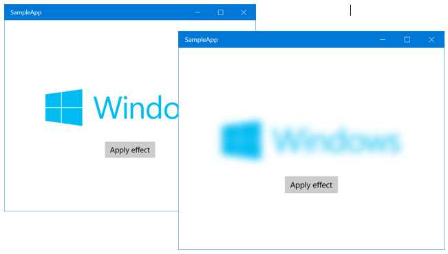
- The blur effect applied thanks to Composition APIs
The nice thing about effects with Composition APIs is that they can be combined with animations. Let’s change the event handler connected to the Button with the following code:
private void OnApplyEffect(object sender, RoutedEventArgs e) { var graphicsEffect = new GaussianBlurEffect { Name = "Blur", Source = new CompositionEffectSourceParameter("Backdrop"), BlurAmount = 0.0f, BorderMode = EffectBorderMode.Hard }; var blurEffectFactory = _compositor.CreateEffectFactory(graphicsEffect, new[] { "Blur.BlurAmount" }); _brush = blurEffectFactory.CreateBrush(); var destinationBrush = _compositor.CreateBackdropBrush(); _brush.SetSourceParameter("Backdrop", destinationBrush); var blurSprite = _compositor.CreateSpriteVisual(); blurSprite.Size = new Vector2((float)BackgroundImage.ActualWidth, (float)BackgroundImage.ActualHeight); blurSprite.Brush = _brush; ElementCompositionPreview.SetElementChildVisual(BackgroundImage, blurSprite); ScalarKeyFrameAnimation blurAnimation = _compositor.CreateScalarKeyFrameAnimation(); blurAnimation.InsertKeyFrame(0.0f, 0.0f); blurAnimation.InsertKeyFrame(0.5f, 7.0f); blurAnimation.InsertKeyFrame(1.0f, 12.0f); blurAnimation.Duration = TimeSpan.FromSeconds(4); _brush.StartAnimation("Blur.BlurAmount", blurAnimation); } |
Highlighted in yellow you can see the lines of code we have added compared to the previous sample. We have created a standard keyframe animation, in this case a scalar one since the BlurAmount property is defined by a number. We have defined three key frames animations:
- At the beginning, the blur intensity should be 0 (so the image is fully clear).
- At half of the animation, the blur intensity should be 7.
- At the end of the animation, the blur intensity should be 14.
You can notice that a brush behaves like a standard Visual object, so it offers the same StartAnimation() method we’ve previously seen when we talked about animations. To trigger the animation, we simply call this passing as parameters, the string that identifies the property we want to animate (Blur.BlurAmount) and the animation we’ve just created.
Now, when the user will press the button, we will achieve the same result as before (a blur effect applied to the image), but with a smooth transition that it will last 4 seconds.
Making your life easier with the UWP Community Toolkit
In the previous part of this book we have mentioned the UWP Community Toolkit, an open source collection of controls, services and helpers created and maintained by Microsoft with the help of the community. The UWP Community Toolkit can be a great friend when it comes to leverage Composition APIs to apply effects and animations to a control.
Let’s take, as example, the blur effect we have applied in the previous code: as you can see, it isn’t a straightforward operation, since there’s a lot of code to write in the right sequence.
The UWP Community Toolkit includes a built-in set of behaviors, which are special XAML elements that can be applied to a control and that can perform, under the hood, a series of operation that, alternatively, you would have the chance to do only in code.
The UWP Community Toolkit includes a specific NuGet package, called Microsoft.Toolkit.Uwp.UI.Animations, which can make your life easier when it comes to use some of the features of the Composition APIs.
- The NuGet package we need to use Composition APIs effects in a simpler way
For example, let’s see how, after we have installed this package in our project, we can apply a blur effect to the same Image control using a different approach:
<Page x:Class="SampleApp.MainPage" xmlns="http://schemas.microsoft.com/winfx/2006/xaml/presentation" xmlns:x="http://schemas.microsoft.com/winfx/2006/xaml" xmlns:local="using:SampleApp" xmlns:d="http://schemas.microsoft.com/expression/blend/2008" xmlns:mc="http://schemas.openxmlformats.org/markup-compatibility/2006" xmlns:interactivity="using:Microsoft.Xaml.Interactivity" xmlns:behaviors="using:Microsoft.Toolkit.Uwp.UI.Animations.Behaviors" mc:Ignorable="d"> <Grid HorizontalAlignment="Center" VerticalAlignment="Center"> <Image Source="Assets/image.jpg" Width="400" x:Name="BackgroundImage"> <interactivity:Interaction.Behaviors> <behaviors:Blur x:Name="BlurBehavior" AutomaticallyStart="True" Duration="0" Delay="0" Value="7"/> </interactivity:Interaction.Behaviors> </Image> </Grid> </Page> |
As you can see, we don’t have to write any code in code-behind. We have just to assign a behavior to the Image control (thanks to the Interaction.Behaviors property): in this case, the name of the behavior is Blur.
You can notice that both objects aren’t part of the standard Universal Windows Platform and, as such, you will have to declare their XAML namespaces in the Page definition: Microsoft.Xaml.Interactivity for the Interaction.Behaviors collection and Microsoft.Toolkit.Uwp.UI.Animations.Behaviors for the Blur behavior.
To configure the behavior, we can rely on a simple set of properties, like:
- AutomaticallyStart, which is a bool that defines if we want to apply the effect immediately or not.
- Duration, which is the duration of the optional animation.
- Delay, which is after how much time the animation will start.
- Value, which is the value assigned to the effect (in this case, the blur intensity will be 7).
As you can notice, we can use this behavior to just apply the effect (since we have specified 0 as Duration, the blur will be applied immediately) or to include animations (by simply setting the Duration property with a different value). For example, here is how we can achieve the same animation that, previously, we have created in code, that changes the blur intensity from 0 to 12 in 4 seconds:
<Page x:Class="SampleApp.MainPage" xmlns="http://schemas.microsoft.com/winfx/2006/xaml/presentation" xmlns:x="http://schemas.microsoft.com/winfx/2006/xaml" xmlns:local="using:SampleApp" xmlns:d="http://schemas.microsoft.com/expression/blend/2008" xmlns:mc="http://schemas.openxmlformats.org/markup-compatibility/2006" xmlns:interactivity="using:Microsoft.Xaml.Interactivity" xmlns:behaviors="using:Microsoft.Toolkit.Uwp.UI.Animations.Behaviors" mc:Ignorable="d"> <Grid HorizontalAlignment="Center" VerticalAlignment="Center"> <Image Source="Assets/image.jpg" Width="400" x:Name="BackgroundImage"> <interactivity:Interaction.Behaviors> <behaviors:Blur x:Name="BlurBehavior" AutomaticallyStart="True" Duration="0" Delay="4" Value="12"/> </interactivity:Interaction.Behaviors> </Image> </Grid> </Page> |
The Microsoft.Toolkit.Uwp.UI.Animations.Behaviors contains many other behaviors to apply different effects, like Fade, Rotate, Scale, etc. You can easily notice how, thanks to the UWP toolkit, we have achieved two important goals:
- We have been able to keep all the code that is related to the user interface in the XAML.
- The XAML code to write is much simpler and easier to remember than the C# code we had to write to manually leverage the Composition APIs.
Navigation in Universal Windows Platform apps
As we’ve already mentioned previously in this series of books, Universal Windows Platform apps, unlike traditional desktop applications, are based on pages. Every page displays some content and the user can navigate from one page to another to explore the application. Consequently, Universal Windows Platform apps are based on the Frame concept, which is the container of all the application pages. A Frame can contain one or more Page objects, which are managed with a hierarchy like the one offered by web sites: the user has the chance to move back and forth across the different pages.
The page’s lifecycle
As we’ve already seen, every application’s page inherits from the Page class, which offers a set of events that are important to manage the page’s lifecycle. In this book we’ll often use two of them: OnNavigatedTo() and OnNavigatedFrom(). The first one is triggered when the user navigates to the current page: it’s one of the best entry points to initialize the data that needs to be displayed in the page (for example, to retrieve some data from a database or a web service). One of the main reasons is that, frequently, data loading is often best done using asynchronous code, by leveraging the async and await pattern. However, the constructor of the page (which usually is one of the first places where a developer tries to include the data loading logic) can’t be asynchronous. This is a general limitation of C#: creating a new instance of an object should be an immediate operation, as such the constructor, in most of the cases, can’t execute asynchronous code. The OnNavigatedTo() method, instead, being connected to an event, doesn’t have this limitation and it can use the async and await keywords without any limitation. The second one, instead, is triggered when the user is navigating away from the current page to another one. These two entry points are also very useful to save and restore the page’s state so that we can properly manage the application’s lifecycle.
protected override void OnNavigatedTo(NavigationEventArgs e) { //load the data } protected override void OnNavigatedFrom(NavigationEventArgs e) { //save the data } |
Navigation across pages
The Frame class, since it’s the pages’ container, offers the basic methods to perform navigation from one page to another. The basic one is called Navigate() and it accepts, as parameter, the type that identifies the page where you want to redirect the user.
For example, if you want to redirect the user to a page called MainPage.xaml, with type is MainPage, you can use the following code:
private void OnGoToMainPageClicked(object sender, RoutedEventArgs e) { this.Frame.Navigate(typeof(MainPage)); } |
The Navigate() method accepts also a second parameter, which is an object that you want to pass from one page to another: it’s useful in common master – detail scenarios, where the user taps on an element in one page and he’s redirected to another page to see more information about the selected item.
The following sample code retrieves the selected item from a ListView control and passes it to another page:
private void OnGoToMainPageClicked(object sender, RoutedEventArgs e) { Person person = People.SelectedItem as Person; this.Frame.Navigate(typeof(MainPage), person); } |
Then we’re able to retrieve the parameter in the OnNavigateTo() event handler of the destination page, thanks to the Parameter property stored in the navigation parameters, like in the following sample:
protected override async void OnNavigatedTo(NavigationEventArgs e) { Person person = e.Parameter as Person; MessageDialog dialog = new MessageDialog(person.Name); await dialog.ShowAsync(); } |
Since the Parameter property can contain a generic object, we need to perform first a cast to the expected type. However, it’s important to highlight that the object passed as parameter should be serializable,. We’ll talk again about this important concept in the next chapter.
Managing the page stack
Universal Windows Platform apps follow a hierarchical approach when it comes to navigation, which is very like the one offered by web applications: typically, the user starts from a main page and then he moves to the other pages of the application. However, he can also decide to navigate backwards and move back to the previous pages.
The page hierarchy is managed like a stack: every time you navigate to a new page, a new item is added at the top of the stack; when you navigate back, instead, the page at the top of the stack is removed. Both platforms requires the developer to properly manage the backward navigation, by using the GoBack() button offered by the Frame class. By default, in fact, the Back button that is included in every Windows 10 device redirects the user to the previously opened application and not to the previous page. As such, if we want to keep our app’s behavior consistent with the user experience of the system and to the user’s expectation, we need to manually manage the backward navigation.
Handling the back button
Windows 10 introduced an important difference in handling the back button compared to Windows 8.1. In the past, you needed to handle it only in Windows Phone apps, since it was the only platform with an integrated hardware back button. Since desktop and tablets didn’t have a dedicated button, it was up to the developer to integrate it directly into the user interface of the application.
Windows 10, instead, has introduced a unified back button management, which is implemented in different ways based on the platform where the app is running:
- On a phone, the back button is part of the interface of the operating system. On some devices, it’s a physical button, in others it’s virtual and is part of the user interface. In both cases, it’s placed at the bottom of the shell of the phone.
- The back button on a Windows 10 mobile device
- On a tablet (or on a PC with Tablet mode activated), the back button is included in the navigation bar at the bottom of the device, between the Start button and Search / Cortana one.
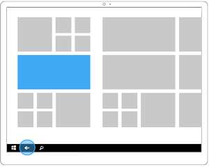
- The back button on a Windows 10 tablet
- On a desktop, the back button is included in the chrome of the window and placed at the top left corner.
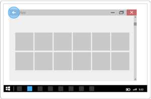
- The back button on a Windows 10 PC
- On the Surface Hub, the experience is like the tablet one: there’s a virtual button placed in the bottom navigation bar, the only difference is that it’s placed in the middle of the screen.
- The back button on the Surface Hub
- On the Xbox One, backward navigation is triggered by pressing the B button on the joypad

- The Xbox One S controller
No matter which is the device where the app is running, the Universal Windows Platform offers a dedicated API to detect and handle that the user has pressed the back button and, as such, we need to redirect him to the previous page of the application (unless the back stack is empty, which typically means that we are on the main page).
This API is exposed by the SystemNavigationManager class (included in the Windows.UI.Core namespace), which offers an event called BackRequested that is invoked every time the user presses the back button, no matter the device where the app is running:
public sealed partial class MainPage : Page { public MainPage() { this.InitializeComponent(); SystemNavigationManager.GetForCurrentView().BackRequested += MainPage_BackRequested; } private void MainPage_BackRequested(object sender, BackRequestedEventArgs e) { //perform back navigation } } |
As you can notice, before subscribing to the BackRequested event, we need to get a reference to the SystemNavigationManager implementation for the current page, by calling the GetCurrentView() method.
Additionally, the SystemNavigationManager class offers a property called AppViewBackButtonVisibility, which applies only to the desktop. By default, in fact, the back button included in the chrome of the window isn’t visible. If we want to display it, we need to set this property to true.
However, the approach we’ve just described would be quite expensive to maintain, because we would need to write the same code to handle the back button in each page of the application. As such, the best way to handle this requirement is to centralize the back-button management in the App class of the page: this way, the expected behavior (redirecting the user to the previous page of the application) will be applied automatically to every page of the app.
The first step is to open the App class (stored in the App.xaml.cs file) and look for the OnLaunched() method. For the moment, it’s important just to know that it’s the method that is invoked when the app is launched from the beginning: we’re going to see more details later in this chapter, when we’re going to talk about the application’s lifecycle.
This is how the default method looks like:
protected override void OnLaunched(LaunchActivatedEventArgs e) { Frame rootFrame = Window.Current.Content as Frame; // Do not repeat app initialization when the Window already has content, // just ensure that the window is active if (rootFrame == null) { // Create a Frame to act as the navigation context and navigate to the first page rootFrame = new Frame(); rootFrame.NavigationFailed += OnNavigationFailed; if (e.PreviousExecutionState == ApplicationExecutionState.Terminated) { //TODO: Load state from previously suspended application } // Place the frame in the current Window Window.Current.Content = rootFrame; } if (e.PrelaunchActivated == false) { if (rootFrame.Content == null) { // When the navigation stack isn't restored navigate to the first page, // configuring the new page by passing required information as a navigation // parameter rootFrame.Navigate(typeof(MainPage), e.Arguments); } // Ensure the current window is active Window.Current.Activate(); } } |
We need to change a bit the previous code to achieve a couple of goals:
- We need to check if the back stack is empty or not. In case the app is running on the desktop, in fact, we’re going to display the back button in the chrome of the window only if there are effectively pages where to go back.
- We need to repeat the previous check at every navigation, because the situation may change (for example, if we are in the main page the button will be probably hidden, but if we are in one of the inner pages, the button must be displayed again).
- We need to handle the back button globally so that, whatever page the user is visiting, he’ll always be able to return to the previous one.
Here is how the new method looks like, with highlighted in yellow the changes we have made:
protected override void OnLaunched(LaunchActivatedEventArgs e) { Frame rootFrame = Window.Current.Content as Frame; // Do not repeat app initialization when the Window already has content, // just ensure that the window is active if (rootFrame == null) { // Create a Frame to act as the navigation context and navigate to the first page rootFrame = new Frame(); rootFrame.NavigationFailed += OnNavigationFailed; rootFrame.Navigated += OnNavigated; if (e.PreviousExecutionState == ApplicationExecutionState.Terminated) { //TODO: Load state from previously suspended application } // Place the frame in the current Window Window.Current.Content = rootFrame; SystemNavigationManager.GetForCurrentView().BackRequested += OnBackRequested; SystemNavigationManager.GetForCurrentView().AppViewBackButtonVisibility = rootFrame.CanGoBack ? AppViewBackButtonVisibility.Visible : AppViewBackButtonVisibility.Collapsed; } if (e.PrelaunchActivated == false) { if (rootFrame.Content == null) { // When the navigation stack isn't restored navigate to the first page, // configuring the new page by passing required information as a navigation // parameter rootFrame.Navigate(typeof(MainPage), e.Arguments); } // Ensure the current window is active Window.Current.Activate(); } } |
The first change we have done is to subscribe to the Navigated event of the root frame of the application, which means that we will be notified each time the user moves from one page to another. We use this method to understand if, when the app is running on a desktop, we need to show or hide the back button. Here is the implementation of the event handler:
private void OnNavigated(object sender, NavigationEventArgs e) { SystemNavigationManager.GetForCurrentView().AppViewBackButtonVisibility = ((Frame)sender).CanGoBack ? AppViewBackButtonVisibility.Visible : AppViewBackButtonVisibility.Collapsed; } |
It’s easy to achieve this goal thanks to the bool property called CanGoBack: if it’s true, it means that there are other pages in the stack, so the button should be visible; otherwise, we hide it. We achieve this goal by changing the value of the AppViewBackButtonVisibility property of the SystemNavigationManager for the current page.
The second change we’ve made to the OnLaunched() method is to subscribe to the BackRequested event of the SystemNavigationManager class, as we’ve seen in a previous sample but, in that case, it was applied to a single page and not to the overall app. Here is the implementation of the event handler:
private void OnBackRequested(object sender, BackRequestedEventArgs e) { Frame rootFrame = Window.Current.Content as Frame; if (rootFrame.CanGoBack) { e.Handled = true; rootFrame.GoBack(); } } |
Also in this case, we leverage the CanGoBack property of the root frame of the application. Only if it’s true, it means that there are other pages in the back stack, so we trigger the backward navigation by calling the GoBack() method. Important: we need to set also the Handled property of the method parameter to true, to prevent Windows to manage the back button anyway (and force the opening of the previously used application).
The last piece of code we’ve added to the OnLaunched() method is the same we’ve seen in the handler of the Navigated event: the reason is that, when the app is launched for the first time, the Navigated event hasn’t been triggered yet, so we need to manually check if there are pages on the back stack and, consequently, we need to display or show the back button on the desktop.
Avoiding the circular navigation issue
One really important thing to manage when you work with the page stack is to always use the GoBack() method of the Frame class when you want to redirect the user to the previous page and never use the Navigate() one.
This is required since, as we’ve already mentioned, pages are managed with a stack: the GoBack() method removes the top page from the stack, while the Navigate() one adds a new one to the top. The result is that, if we use the Navigate() method to go back to the previous page, we create a circular navigation and the user keeps moving between the same two pages.
Let’s see a real example: you have an application with a main page, which displays a list of news. The application offers a Settings button that redirects the user to a page where he can configure the application. At the bottom of this page we have added a Confirm button: when it’s tapped, the settings are saved and the user is redirected back to the main page.
Let’s say that we perform this backward navigation to the main page using the Navigate() method: what happens is that, instead of removing the Settings page from the stack, we have added the Main page on the top of it. The result is that, if now the user presses the Back button, instead of returning to the Start menu (which is the expected behavior, since he’s on the main page), he will be redirected back to the Settings page, since it’s already present in the stack.
The proper way to manage this scenario is to call the GoBack() method when the user presses the Confirm button: this way, the Settings page will be removed from the stack, leaving the Main page as the only available page in the stack. This way, pressing the Back button again will correctly redirect the user to the Start Screen, quitting the application.
Managing the page’s state
If you’ve already worked with Windows Phone 8.0 and Silverlight you’ll remember that, until a page was removed from the stack, its state was kept in memory. This means that if the user pressed the Back button to go back to the previous page, he would have found it in the same state he previously left.
The Windows Runtime has changed this behavior, which still applies to the Universal Windows Platform: whenever the user is redirected to a page (no matter if it’s a forward navigation to a new page or a backward navigation to a page already in the stack), a new instance is created. This means that the state is never maintained: if, for example, a page contains a TextBox control and the user writes something in it, as soon as he moves away from the page that content will be lost.
If you want to avoid this issue and keep the previous behavior, you can set the NavigationCacheMode property of the page to Required or Enabled in the page constructor or by setting a property in XAML offered by the Page class: this way, the page state will always be maintained. It’s important to highlight that, in this case, you’ll need to properly manage the data loading and avoiding loading things in the page constructor, since it gets called only the first time the page is requested. It’s better to use, instead, methods like OnNavigatedTo(), which are triggered every time the user navigates to the page. Which is the difference between the two values? They both preserve the page’s state, but Required uses more memory since it will always cache the page, no matter how many other pages have already been cached. With Enabled, instead, the page will be cached but, if the cache size limit is hit, the state will be deleted.
The following sample shows how to set the NavigationCacheMode property in code behind:
public sealed partial class MainPage : Page { public MainPage() { this.InitializeComponent(); this.NavigationCacheMode = NavigationCacheMode.Required; } } |
The application’s lifecycle
One of the biggest differences between a Universal Windows Platform app and a traditional Windows desktop application is the lifecycle, which means the different states that the application can assume while it’s running. Usually, the lifecycle of traditional desktop apps is quite simple, since they are limited only by the hardware where the app is running. The user is always in control of the status of the application: the app is started and it always stays active until he closes it, without any limitation about the chances to perform background operations.
This approach, however, doesn’t fit well applications that can run on devices with battery and performance constraints, like a phone or a tablet: performance, small battery impact and responsiveness are key factors on these platforms and the freedom offered by standard desktop applications doesn’t respect these requirements.
Universal Windows Platform apps aren’t always running: when the user switches to another activity (like by opening another application, or moving back to the Start screen) the app is suspended. Its state is preserved in memory, but it’s not running anymore so it doesn’t use any resources (CPU, network, etc.). Consequently, when an application is suspended, it can’t perform background operations (even if there’s an exception, thanks to a feature called Extended Execution that we’ll see in details later): for this purpose, the Universal Windows Platform has introduced background tasks, which will be detailed in another one of the books of this series. In most of the cases, the suspension management is transparent to the developer: when the user resumes our application, it will simply be restored, along with its state. This way, the user will find the application in the same state that he previously left.
However, some devices (especially tablets and smartphones) don’t have unlimited memory: consequently, the operating system can terminate the older applications in case it’s running out of resources. As developers, it’s important to save the state of the application during suspend, so that we can restore it in case the application is terminated by the system. The goal is to offer a fluid experience to the user: he should always find the application in the same state he left, no matter if the app was just suspended or terminated.
It’s important not to confuse the application’s state (like, for example, the content of a form that the user is filling and the he doesn’t want to lose, even if switches to another task) with the application’s data (like a database): as we will learn in the next chapter of this book, application’s data should be saved as soon as it’s changed, to minimize data loss in case something goes wrong (like an unexpected crash of the application).
Let’s see in details the different states of the application’s lifecycle.
Launching
All the Universal Windows Platform apps start from a base state called NotRunning, which means that the app hasn’t been launched yet. When the application is started from this state, the launching event is triggered, which takes care of initializing the frame and the main page. Once the application is initialized, it’s moved to the Running state.
A Universal Windows Platform application is able to manage the lifecycle events in the App class, defined in the App.xaml.cs file: specifically, the launching event is called OnLaunched(). It’s triggered only when the application is initialized from scratch because it wasn’t already running or suspended.
The following code show a typical launching management and it’s the same we’ve already seen when we talked about the back-button management:
protected override void OnLaunched(LaunchActivatedEventArgs e) { Frame rootFrame = Window.Current.Content as Frame; // Do not repeat app initialization when the Window already has content, // just ensure that the window is active if (rootFrame == null) { // Create a Frame to act as the navigation context and navigate to the first page rootFrame = new Frame(); rootFrame.NavigationFailed += OnNavigationFailed; if (e.PreviousExecutionState == ApplicationExecutionState.Terminated) { //TODO: Load state from previously suspended application } // Place the frame in the current Window Window.Current.Content = rootFrame; } if (e.PrelaunchActivated == false) { if (rootFrame.Content == null) { // When the navigation stack isn't restored navigate to the first page, // configuring the new page by passing required information as a navigation // parameter rootFrame.Navigate(typeof(MainPage), e.Arguments); } // Ensure the current window is active Window.Current.Activate(); } } |
The most important part of the previous code is when we check the value of the PreviousExecutionState property, which is one of the properties offered by the event’s parameters. This property can assume different states, based on the previous status of the application. Typically, in the launching event, you’ll be able to catch the following states:
- NotRunning, which means that it’s the first time the application is launched.
- Terminated, which means that the application was already in memory, but it’s been terminated by the operating system due to low resources.
- ClosedByUser, which means that the application was already in memory, but it’s been terminated by the user.
As default behavior, the standard App class code suggests managing just the Terminated state: the application has been killed by the operating system, so it’s our duty, as developers, to restore the state we’ve previously saved. We’ll see later in this chapter which are the proper ways to do it. As you can see, the two other states (NotRunning and ClosedByUser) are not managed: the app wasn’t running or it has been explicitly closed by the user, so it’s correct to start it from scratch, without restoring any previous state.
Pre-launching
Pre-launching is a way to speed up the loading times of your application. When pre-launching is activated, Windows 10 can detect which are the apps you use most frequently and prelaunch them. During this phase (which will be completely invisible to the user, unless he’s monitoring the running processes with the Task Manager), apps will be able to perform some operations that can speed up the real launching by the user, like loading some data. For example, a news application, during the prelaunch phase, can download the latest news from a web source, so that when the user explicitly opens it, he won’t have to wait for the news to be loaded, but they will be already there.
Pre-launch has been added in the November Update, but the way it’s handled has changed in the Anniversary Update. In build 10586, prelaunch was enabled by default for every app and, if you wanted to opt out, you needed to check, in the OnLaunched() method, if the property PrelaunchActivated of the method’s parameter was set to true: in this case, you needed to return from the method, without performing any additional operation, like in the following sample.
protected override void OnLaunched(LaunchActivatedEventArgs e) { if (e.PrelaunchActivated) { return; } //standard initialization code } |
However, since not all the apps were able to take benefits from this approach, the Windows team has decided to disable it by default in the Anniversary Update: it’s up to developers to opt-in if they want to do it.
To opt-in, you need to call the EnablePrelaunch() method of the CoreApplication class (included in the Windows.ApplicationModel.Core namespace), passing true as parameter. Here is how the OnLaunched() method looks like in an application based on SDK 14393:
protected override void OnLaunched(LaunchActivatedEventArgs e) { Frame rootFrame = Window.Current.Content as Frame; // Do not repeat app initialization when the Window already has content, // just ensure that the window is active if (rootFrame == null) { // Create a Frame to act as the navigation context and navigate to the first page rootFrame = new Frame(); rootFrame.NavigationFailed += OnNavigationFailed; if (e.PreviousExecutionState == ApplicationExecutionState.Terminated) { //TODO: Load state from previously suspended application } // Place the frame in the current Window Window.Current.Content = rootFrame; } CoreApplication.EnablePrelaunch(true); if (e.PrelaunchActivated == false) { if (rootFrame.Content == null) { // When the navigation stack isn't restored navigate to the first page, // configuring the new page by passing required information as a navigation // parameter rootFrame.Navigate(typeof(MainPage), e.Arguments); } // Ensure the current window is active Window.Current.Activate(); } else { //initialize the data of the application } } |
Highlighted in yellow you can see the changes from the original code: right before checking if the application was enabled from pre-launching, we enable this feature using the CoreApplication class. If the PrelaunchActivated property is false, it means that the user has explicitly launched the app, so we need to follow the regular flow (which is activating the current window and trigger a navigation to the main page). Otherwise, we are in a prelaunch state, so we can start to load some data that can be useful when the user will launch the app for real.
Once the pre-launching is terminated, the app will be placed in a suspended state: as such, you can’t perform long running operations during pre-launching, otherwise your loading operation will be cancelled before it’s finished.
Suspending
Typically, suspension is triggered when the current app isn’t in foreground anymore: on a phone, it means that the user has started another app or he has returned to the Start screen; on the desktop, instead, it means that the user has minimized the app in the taskbar. When such a situationoccurs, the operating system will wait 10 seconds, then it will proceed to suspend the application: this way, in case the user changes his mind and goes back to the app, it’s immediately restore d.
After that, the application is effectively suspended: it will be stored in memory (so it will keep using RAM), but it won’t be able to perform any other operation and to use resources like CPU, network, storage, etc. This way, the new application opened by the user will have the chance to make use of all the device’s resources, which is an important performance benefit.
As for every other application’s lifecycle event, also the suspending one is managed in the App class, by using the OnSuspending() method, which, by default, has the following definition:
private void OnSuspending(object sender, SuspendingEventArgs e) { var deferral = e.SuspendingOperation.GetDeferral(); // TODO: Save application state and stop any background activity deferral.Complete(); } |
Before the Anniversary Update, the main purpose of this method was to allow the developer to save the application’s state: since we don’t know in advance if the application will be terminated or not, we need to do it every time the application is suspended. As you can see from the code, the standard template for a Universal Windows Platform app still leverages this approach: the default code to handle the suspension is included in this event.
The previous code uses the deferral concept, which is widely used in the Universal Windows Platform and it’s needed to manage asynchronous operations. If you recall the basics concepts of the async and await pattern that have been detailed in the previous book, when we execute an asynchronous method the compiler sets a sort of bookmark and the method execution is terminated, so that the main thread is free to keep managing the UI and the other resources. When we’re dealing with the suspending event, this behavior can raise some issues: the OnSuspending() method could be terminated before the operations are completed. The deferral object solves this problem: until the Complete() method is called, the execution of the OnSuspending() method won’t terminate.
Of course, we can’t use this workaround to hijack the Windows guidelines and to keep the application running for an indefinite time: we a few seconds to save the application’s state, otherwise the application will be forcedly suspended, no matter if the saving operations are completed or not. As you can see, the timeframe is quite short: as already mentioned before, the purpose of the OnSuspending() method is to save the application’s state, so that the user can’t see any difference between a standard suspension and a termination. It’s not the ideal place, instead, to save the application’s data. To achieve the goal of saving the application’s state you can leverage, for example, the settings API we’re going to discuss in the next chapter of this book.
However, the November Update first and the Anniversary Update later have introduced new features (like extended execution, background audio playback and single process background execution), where the app isn’t suspended anymore when it isn’t in foreground. As such, your app could be suspended when it’s running in background and, consequently, the Suspended event isn’t triggered. In one of these scenarios, if you leverage one of these new features in your app and you continue to save the application state in the Suspended event, you may risk losing data. Later in the chapter I will highlight the differences compared to the past with the new features introduced in the Anniversary Update.
Resume
The resume process happens when the application is restored from the suspension, but it wasn’t terminated by the operating system. This process is completely transparent to the developer: since the application was still in memory, the application’s state is preserved and we don’t need to manually restore it.
However, the App class offers a way to intercept this event: since applications are terminated due to low resources and not based on time constraints, if the system has enough memory to keep it alive the application can stay suspended for a long time. Consequently, it can happen that when the application is restored the data displayed in the page isn’t up-to-date anymore.
This is the purpose of the resuming event: it’s triggered every time the application is resumed from a suspension without a termination and we can use it to refresh the application’s data (for example, by performing a new request to a web service to refresh the list of news displayed in the main page).
By default, the App class doesn’t manage this event, so you’ll need to manually subscribe it in the class constructor, like in the following sample:
public sealed partial class App : Application { public App() { this.InitializeComponent(); this.Resuming += App_Resuming; } private void App_Resuming(object sender, object e) { //refresh the data } } |
Activating
The Universal Windows Platform offers a contract system, which is used by developers to integrate their apps into the operating system. Consequently, a Universal Windows Platform app can be launched in different ways than simply by tapping on its icon or tile on the Start screen: it can be triggered by a sharing request or because the user has activated the app using a voice command through Cortana. In all these scenarios, the application isn’t opened with the launching event, but with a specific activation event, which usually contains the information about the request, which are required to identify the context and act in the proper way.
The App class offers many activation methods, according to the event that triggered the request: for example, the OnFileActivated() method is triggered when a file we support is opened. In another book of this series we’ll see, in details, all the available contracts and extension and the related activation events.
Closing
The closing event is triggered when the user explicitly closes the application: on a desktop, this operation is performed by clicking on the X icon on the top right of the screen; on a tablet, by dragging the application from the top to the bottom of the screen; on a phone, instead, it’s triggered when the user closes it from the Task Switcher, which is activated by long pressing the Back button.
If you have some previous experience with Windows Phone development, there’s an important difference between Windows Phone 8.0 and Windows 10. In the old versions of Windows Phone, when you pressed the Back button in the main page of the application you were effectively terminating it. In Windows 10, instead, on every platform, pressing the Back button on the main page will simply redirect you to the Start screen, but the app will simply be suspended and not terminated.
Some important changes in the Anniversary Update
It’s important to know and understand the previously described lifecycle, because if you’re targeting the November Update SDK or a prior version you should continue leveraging this approach. Additionally, if your app doesn’t make use of any of the new background execution features, you can safely continue to adopt the lifecycle previously described.
However, the November Update first and the Anniversary Update later have added some new features that changed a bit the way the application’s lifecycle can be handled: extended execution, background audio playback and single process background execution. Extended execution will be discussed later in this chapter, while the other two features will be detailed in another book of the series, when we’ll talk about multimedia applications and background tasks. In these scenarios, the app can continue to run even when it isn’t in foreground. As such, the Suspension and Resuming event may not be reliable anymore: if the app is suspended or resumed when it’s running in background, these two events aren’t triggered. Consequently, if for example you included the logic to save the application’s state when the app is suspended and, then, Windows 10 suspends it when it’s running in background, the Suspension event will never be triggered and, as such, the data won’t be saved.
To solve this problem, the Anniversary Update has introduced two new event that you can handle: EnteringBackground and LeavingBackground.
Here is the updated lifecycle in the Anniversary Update:
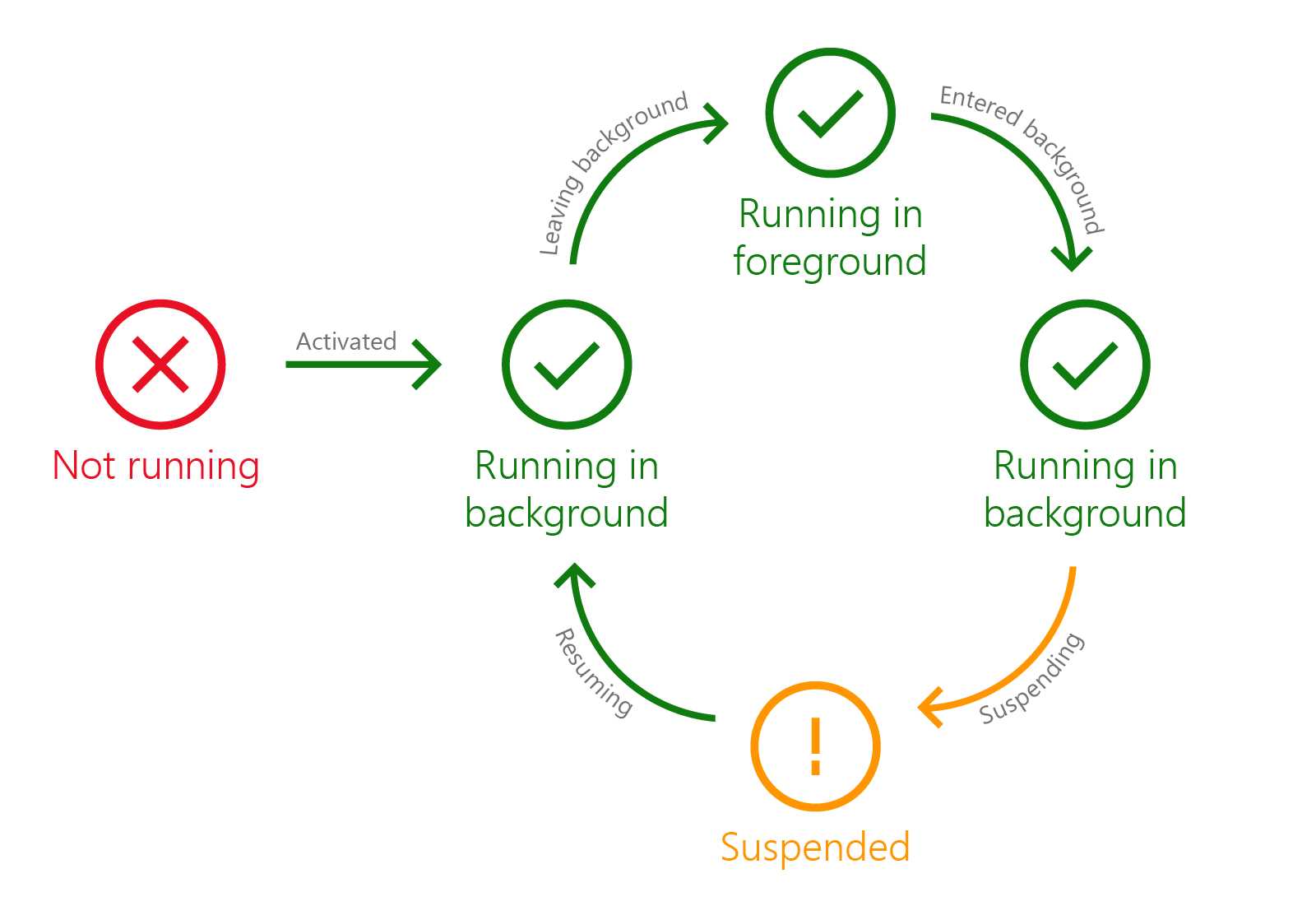
- The application’s lifecycle of a Universal Windows Platform app in Windows 10 Anniversary Update
EnteredBackground
EnteredBackground is a new event which is triggered when the app is moving from foreground to background. Starting from the Anniversary Update, this is the event which is better to leverage to save the state of your application: in fact, this event will be triggered in any case, regardless if the app is moving to background to continue running or to be suspended.
When the app is moved from foreground to background, the difference between the two scenarios is that:
- If the app is leveraging one of the new background running features, Windows will trigger only the EnteriedBackground event.
- If the app isn’t leveraging one of these new features, Windows will trigger first the EnteriedBackground event and then the Suspending one.
In this case, if you move the state saving logic in the EnteriedBackground event, you make sure that it will always be triggered. However, to adopt this new approach, you need to manually subscribe to the EnterieedBackground event, since the default Visual Studio template subscribes just to the Suspending one. Here is how your updated App class looks like:
sealed partial class App : Application { public App() { this.InitializeComponent(); this.Suspending += OnSuspending; this.EnteredBackground += App_EnteredBackground; } private void App_EnteredBackground(object sender, EnteredBackgroundEventArgs e) { var deferral = e.GetDeferral(); //TODO: Save application state and stop any background activity deferral.Complete(); } } |
As you can see, exactly like we’ve seen for the Suspending event, also in this case, thanks to the event handler’s parameter, we have access to the deferral by calling the GetDeferral() method, in case we need to perform asynchronous operations.
LeavingBackgroundState
This event is the opposite of the previous one and it’s triggered when the app is moved from background to foreground: in this stage, the UI isn’t visible yet and, immediately after that, the app will be moved to the Running state. As such, if you need to perform any operation to prepare the UI before the app is visible to the user, it’s better to leverage the LeavingBackgroundState event rather than the Resuming or Activating ones. Also in this case, the standard App class implementation doesn’t handle this event, so you’ll have to manually subscribe to it in the class constructor, like in the following sample.
sealed partial class App : Application { public App() { this.InitializeComponent(); this.Suspending += OnSuspending; this.LeavingBackground += App_LeavingBackground; } private void App_LeavingBackground(object sender, LeavingBackgroundEventArgs e) { //prepare the UI } } |
Single process background model
In another book of this series, you will learn that the Universal Windows Platform offers the concept of background tasks, which are separate projects of your solution that are executed by a separate process. They contain a set of operations that can be performed even when the app is suspended or not running at all. Background tasks are connected to triggers, which are the events that cause the execution of the task: the user has received a push notification, there’s an incoming connection from a socket, a time interval we have defined has passed, etc.
The Anniversary Update has introduced the concept of single process background model: we can leverage the same triggers but, instead of handling the background code in a separate project of our application (the background task), it can be managed directly by the application itself inside the App class. We won’t discuss this topic in details in this chapter, since it’s strictly connected to the concept of background tasks, which will be described in another book of the series.
Extended execution
Extended execution is one of the new Windows 10 features that changed the way the application’s lifecycle is handled in the Anniversary Update. Before Windows 10, in fact, a Windows Store application was suspended when it wasn’t in foreground anymore, no matter what. The only way to perform some operations in background was to leverage background tasks.
Windows 10, instead, has introduced the concept of extended execution: when the app is suspended, we can ask to the operating system to keep it running in background. There are two scenarios where this feature is typically useful: to complete a long running operation that was started in foreground (like synchronizing some data on a server) or to keep tracking the location of the user. Based on the approach, there are two different ways to implement the feature, even if we’re going to leverage the same APIs.
Completing an operation
We have already mentioned previously in this chapter that, when the app is suspended, we have a few seconds to wrap up all the pending operations and save the application’s state. However, in some cases, this time isn’t enough and could lead to data loss. For example, let’s say that the user has started a sync operation and, at some point, he receives a WhatsApp message and decides to reply immediately. In this case, the app that was performing the sync is moved in background and, if it can’t complete the operation in 10 seconds, the sync will simply be aborted.
Extended execution can be used to ask for more time, which is granted based on different conditions (like the available memory or battery life). Since we’re asking for more time when the user is moving to another task, we need to perform this request in the Suspending event of the App class: when the app is being suspended, we ask for more time. Here is a sample code:
private async void OnSuspending(object sender, SuspendingEventArgs e) { var deferral = e.SuspendingOperation.GetDeferral(); using (var session = new ExtendedExecutionSession()) { session.Reason = ExtendedExecutionReason.SavingData; session.Description = "Upload Data"; session.Revoked += session_Revoked; var result = await session.RequestExtensionAsync(); if (result == ExtendedExecutionResult.Denied) { UploadBasicData(); } // Upload Data await UploadDataAsync(session); } deferral.Complete(); } private void session_Revoked(object sender, ExtendedExecutionRevokedEventArgs args) { //clean up the data } |
Extended execution is managed with the ExtendedExecutionSession class, which belongs to the Windows.ApplicationModel.ExtendedExecution namespace
When we create a new ExtendedExecutionSession object, we must handle some properties:
- The Reason property, which is one of the value of the ExtendedExecutionReason enumerator. In case we’re asking for more time to complete an operation, so we use the SavingData value.
- The Description property, which is simply a string that describes which kind of operation we’re going to do.
- Revoked, which is the event that it’s triggered when the session is canceled (for example, because the system is running out of memory) and it gives you a few seconds to clean up your data, so that you can leave the app in a consistent state.
After having configured the object in the proper way, we call the RequestExtensionAsync() method. It’s important to highlight that Windows, based on the available resources, has the chance to deny our request: consequently, the method will return an ExtendedExecutionResult object, which we can use to understand if the session has been granted or not.
In case it has been denied (ExtendedExecutionResult.Denied), we still must comply with the few seconds’ limit before the app is suspended: as such, we need to implement an alternative solution that takes less than the allowed time to be completed. For example, in the previously mentioned sync scenario, we could mark a flag in the application (like by saving a value in the storage) that the sync hasn’t been performed so we need to do it again as soon as the app is relaunched. In case, instead, the session has been allowed, we can move on and perform the full operation.
In the previous sample, in case the session gets denied we call the UploadBasicData() method (which takes only a few seconds to be completed), otherwise we call the full UploadData() one.
With this model, the app is effectively suspended: however, it will stay into this state for an indefinite time, until the operation is completed or the extended session gets revoked.
Detecting the user’s location
Another common scenario when we want to keep the application running is background is when we want to detect the user’s position. A common example is an application dedicated to runners: the user should be able to start the app, create a new run, then lock the phone, put it into his pocket and start running. Even if the phone is locked, we want the app to be able to continue tracking the location of the user so that, when he returns home, he can see on his phone the route he followed during the run and a series of statistics (like the time, the average speed, etc.).
By default, this is a scenario that isn’t supported by a Universal Windows Platform application. Locking the device, in fact, has the same consequence of moving the app in background: it’s moved in a suspended state and, as such, every running operation (including the one which is tracking the user’s position using the geo location APIs) will be terminated.
Extended execution APIs can be used also to handle this scenario. However, in this case, the approach is different: the execution, in fact, should be requested as soon as the app starts and not when it’s being suspended. The reason is that, in this scenario, the model is different: the app won’t be kept in a suspended state for an indefinite time, but it will effectively continue to stay in the running state, like if it’s still in foreground.
The following sample shows an implementation of this scenario, by requesting the extended execution session in the OnNavigatedTo() method of the main page of the app:
public sealed partial class MainPage : Page { public MainPage() { this.InitializeComponent(); } protected override async void OnNavigatedTo(NavigationEventArgs e) { using (var session = new ExtendedExecutionSession()) { session.Reason = ExtendedExecutionReason.LocationTracking; session.Description = "Turn By Turn Navigation"; session.Revoked += session_Revoked; var result = await session.RequestExtensionAsync(); if (result == ExtendedExecutionResult.Denied) { //show a warning to the user } Geolocator locator = new Geolocator(); locator.PositionChanged += Locator_PositionChanged; } } private void Locator_PositionChanged(Geolocator sender, PositionChangedEventArgs args) { //store the new position in the database } private void session_Revoked(object sender, ExtendedExecutionRevokedEventArgs args) { //clean up data } } |
As you can see, from a code point of view the APIs and the properties to set are the same. The only difference is that, this time, as reason we use the LocationTracking value of the ExtendedExecutionReason enumerator.
If the session doesn’t get denied, we’re fine: now the when the app will be placed in background, it will continue to run normally and, as such, the PositionChanged event of the Geolocator class (which gets triggered every time the user has moved from the current position) will continue to be fired. We’ll see more details about the Geolocator class and the geo localization APIs in another part of this series of books.
In case the session gets denied, we don’t have too many options: typically, we can just show a warning to the user that the app hasn’t been allowed to run in background, so any background location tracking feature won’t work.
Windows 10 can keep running one background location tracking app at a time.
Testing the application’s lifecycle
Testing all the scenarios we’ve described in this chapter could be a hard challenge: applications aren’t terminated following a precise pattern, by it’s up to the operating system to kill them when the resources are low. Additionally, it’s important to highlight that, to facilitate the debugging experience, when the debugger is connected to the running application, the lifecycle events aren’t triggered. For example, if you move an app from foreground to background when the debugger is connected, suspension will never happen, even after you have exceeded the maximum amount of time. Consequently, Visual Studio offers a series of options that the developer can use to force the various states of the lifecycle: they are available inside a dropdown menu that it’s included in the Debug location toolbar and it’s activated once you’ve launched a debugging session for a Universal Windows Platform app.
- The dropdown menu used to force one of the lifecycle’s states
The standard available options are:
- Suspend: the application is suspended and kept in memory.
- Resume: the application is resumed from a suspension.
- Suspend and shutdown: it suspends the application and simulates the termination by the operating system. This is the option we need to choose if we want to test that we’re properly managing the application’s state.
However, as we’re going to see in the other books of the series, this dropdown can display also additional options, since it helps also to test background tasks.
Another scenario that can be hard to test is when the application is activated using a path different from the standard launching event, like a secondary tile, a notification or a voice command through Cortana. To help developers testing these cases, Visual Studio offers an option that allows the debugger to start but without effectively launching the app. This way, no matter which way will be used to activate the application, the debugger will be connected and ready to catch any error or to help us in debugging specific issues. This option can be enabled in the project’s properties (you can see them by right clicking on the project in Solution Explorer and choosing Properties): you can find it in the Debug section and it’s called Do not launch, but debug my code when it starts.
- The option to enable to debug the application without launching it
- 70+ advanced UWP components for Windows Store apps.
- UI controls for LOB apps: Charts, DataGrid, Diagram, and more.
- Comprehensive features for building touch-friendly, Windows 10-style applications.