
MATLAB Succinctly®

CHAPTER 6
Data Visualization
The simplest way to plot some data is to do it via the UI, so we will begin this chapter by learning how to prepare data for plotting and then using the ribbon interface to quickly plot the data. We will then move to doing plots entirely from the console and discuss all the different ways that one can plot data. We will also discuss the idea of plotting symbolic functions, even though this is part of the Symbolic Toolbox.
We will then discuss figure windows and the ways one can have several sets of data plotted on a single graph. Then we will look at adding various text annotations such as labels to the plots, as well as ways of combining multiple plots in a single window. I will then show some of MATLAB’s functionality for editing the plot in the figure window.
To finish it all off, we will discuss one potential problem with MATLAB: the fact that it doesn’t automatically generate origin axes lines.
Plotting via the UI
Before we’re able to plot anything in MATLAB, we need to define the data that we are going to plot. Let’s do a 2D plot of the function y=x3. The typical way of doing this is to define a range of x values, then calculate a range of y values, then plot the two:
>> x = linspace(-10,10,101); |
Having calculated the coordinate values, we can now do the following:
- Select both x and y variables in the Workspace window (to select multiple variables, on Windows, you need to hold either Shift or Control).
- Open up the Plots ribbon tab.
- Click one of the ready-made plot types, in our case the one called plot:
Various plot options.
Here’s what we get:
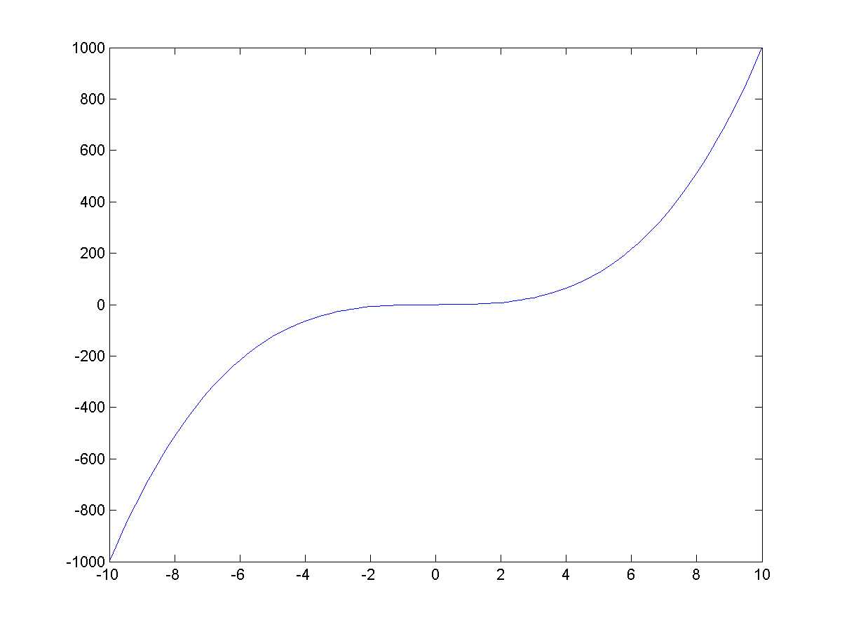
A plot of the function f(x)=x3.
The set of buttons you can press on the Plots tab corresponds to the data you have selected. For example, you cannot do a 3D plot from two sets of arrays. Instead, to do a 3D plot, we need to define something called a mesh grid. The correspondingly named meshgrid command creates two 2D arrays, each of which is a grid of values in a range we define. For example:
>> [x,y] = meshgrid(-10:0.5:10,-10:0.5:10) |
Note that the function returns not one but two values—the previous code illustrates how two values are stored in corresponding variables. So what we have now is variables x and y, each of which is a 41×41 array. In the array x, each row has values going from -10 to 10 (all rows are identical), whereas the array y has all columns going from -10 to 10.
The reason we’re performing this strange manipulation is that we want to do a surface plot, i.e. to calculate the z values from these x and y values. We can now calculate the value of z using elementwise operations:
>> z = sin(x) .* sinh(y); |
And now I can simply select the variable z in the workspace and choose the surf type of plot to get this:
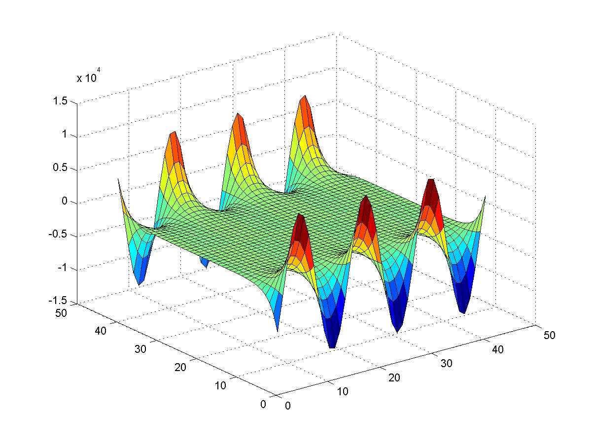
Surface plot of the function f(x,y)=sinx sinhy.
Note once again that, as you selected the z value, the range of possible plots in the Plots ribbon tab was correspondingly adjusted. Oh, just for fun, try surf(membrane)… does the image look familiar? (Hint: try logo, too.)
Simple Two-Dimensional Plots
If you look at the Command Window as you press those plot buttons, you’ll see that all they do is send MATLAB certain plot commands such as plot or surf. We are now going to stop using the Plots tab altogether and only use the command window, entering the commands by hand.
Most of the 2D plots are done using the plot command. For example, say we want to plot y=sinx using a solid red line. You can simply type the following into the Command Window:
>> x = linspace(-10, 10, 101); |
The ‘-r’ above plots a red line. I’ll explain the syntax in a moment; let’s continue plotting things for now.
Now, the plot command continues to recycle the same window, so if we did another plot, it would overwrite the old one. How to show both sin and cos on the same figure window? For that, we need to use the hold command. hold on causes all plots to go to the same window, and hold off correspondingly reverts this behavior. So let’s plot y=cosx in blue over our existing plot:
>> hold on |
Here is the end result:
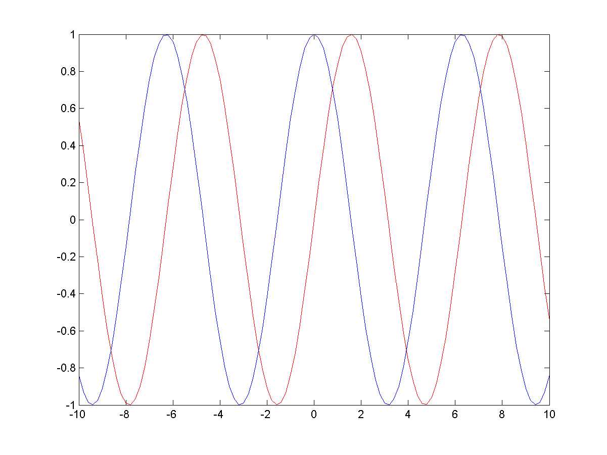
The functions fx=sinx and cosx rendered in red and blue respectively.
The last parameter used in both of the plot functions above (‘-r’ and ‘-b’) is a set of options for controlling how the lines are rendered. The dash (-) indicates we need a solid line (there are also dotted : and dashed -- styles available), and ‘r’ and ‘b’ refer to the red and blue colors respectively (other available colors are g(reen), m(agenta), c(yan), y(ellow) and (blac)k). This is also the location where it’s possible to control the shape of the marker for each data point: there are many options such as 'x' (draws a cross) or 'o' (draws a circle) – consult the documentation for more!
MATLAB is typically very flexible in terms of ways in which options are defined, and you should consult the documentation on the myriads of ways of specifying options for, e.g., a plot. For example, one can specify plot color using the following:
>> plot(x,y,'color','green'); |
Well, this is what we have for the plot command. The plot command has very extensive documentation, listing its numerous properties and customizations.
Something has to be said for plotting complex numbers: the real and imaginary parts are only plotted if plot takes a single input array that happens to contain complex values. If you supply more than one array, imaginary values of all of the input arrays are all ignored. Then again, sometimes it’s not such a bad thing:
x = [-2:.001:2]; |
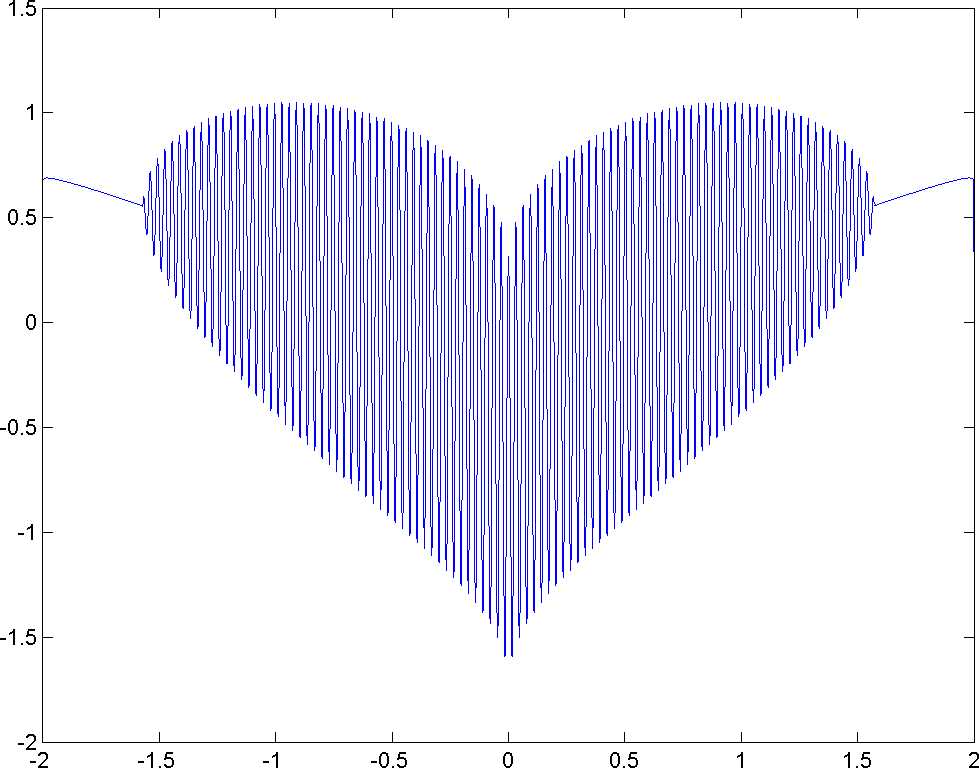
A plot of the function f=cosxcos200x+x-0.74-x20.01.
Imaginary values of y are completely ignored.
Multiple Plots from 2D Arrays
The plot function also lets us plot several sets of values at the same time. Naturally, this use of the function requires us to provide two-dimensional arrays of y values. Preparing data for such a plot is a bit more challenging, so let’s take a step-by-step look at generating, for example, several Brownian motion paths. To do this, we’ll be using the following formula:
Wi+1=Wi+Zdt where Z~N0,1 and W0=0
We begin by defining the number of paths to generate and the number of points in each of the paths. We also generate a range of time values and calculate ⅆt , the size of one time increment:
pathCount = 6; % number of paths pointCount = 500; % points per path t = linspace(0,1,pointCount+1); |
So far, so good, right? Well, don’t celebrate just yet. We now need to calculate the Brownian increments ( dW=Z√dt ), but remember that we need to multiply dt by each of the 6×500 values sampled from the Normal distribution. Luckily, as with most of MATLAB’s functions, the function randn that generates Normally distributed values can take two parameters indicating the dimensions. This lets us calculate the increments:
dw = randn(pointCount,pathCount) * sqrt(dt); |
Given that dt is a single value, there is no need for elementwise calculations; we now have a 6×500 array of increments and we’re ready to calculate Wi. As we look at the recurrence relation we outlined at the beginning of the section, we realize that what we effectively have is a cumulative sum: at each Wi, we calculate the sum of all the increments up until that point (which we took care to preemptively multiply by dt). Using MATLAB’s cumsum function, we calculate the cumulative sums across the array of dW values, taking care to ensure the condition W0=0:
w0 = zeros(1,pathCount); w = cumsum([w0;dw]); |
At last, we can take the array of Wi values and feed it to the plot function:
plot(w); |
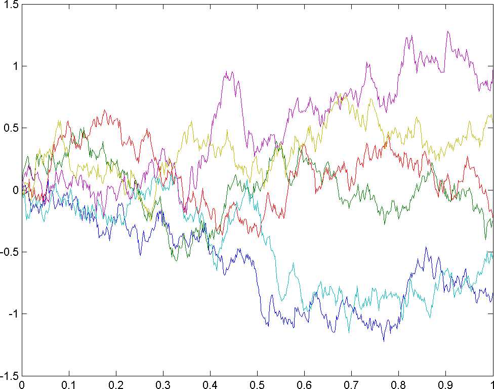
Six realizations of Brownian motion.
This image is what it’s all been about: we’ve generated a 2D array of values such that it effectively contained several sets of realizations of Brownian motion. MATLAB then helped us draw each one as a separate line, and even added a splash of color.
Surface Plots
Phew, that was a tough one! At any rate, let’s get back to plotting things. Another command that we used for surface rendering was called surf. Here’s what its invocation from the command line would look like:
>> [x,y] = meshgrid(-10:0.5:10,-10:0.5:10); |
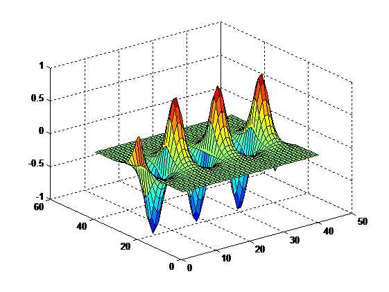
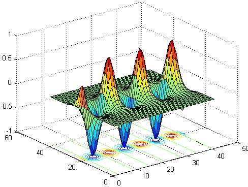
In the above case, it’s as simple as calling surf with a single parameter. But let’s say we wanted to customize it: by default, the command colors the highest z-values red and the lowest blue. What if we wanted the coloring along the x axis instead? In this case, we would need to call a more complete surf command—we provide x, y, and z values and indicate explicitly that we want to use x for the color:
>> surf(x,y,z,x) |
Note the color distribution:
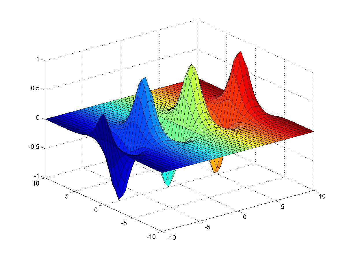
The function fx,y=sinxcoshy rendered with coloring along the x axis.
We could go on practically forever discussing the different plot types, but since space is limited, we leave it to the reader to investigate.
Common plot types.
Plot type | What it draws |
|---|---|
plot, plotyy | Two-dimensional plot of data. The ‘yy’ variety renders the y axis on both left and right hand sides of the plot. |
semilogx, semilogy | A plot with a logarithmic scale on either the x or y axis. |
loglog | A plot with logarithmic scales on both the x and y axes. |
bar, barh | Vertical and horizontal bar graph. |
area | Area plot. |
pie | Pie chart. |
hist | A histogram. |
The MATLAB Plot Gallery contains a particularly good selection of different plot types, and is worth checking out.
Figures and Multiple Plots
So you may have noticed that any time you make a new plot, you lose the existing one. What can we do about it? Well, first of all, you need to be aware of the figure command. This command creates an empty figure window, i.e. a window that you can render your plots in. You can actually invoke the command several times, creating more than one of these windows.
Say you have several figure windows. If you now invoke a command such as plot, it will render to the figure window that’s currently in focus. But, if you render twice to the same figure window, you will lose the old image—unless, of course, you used the hold on command beforehand.
One thing I haven’t mentioned is the idea of plot handles. Essentially, once you plot something to a figure window, you can change its properties post-hoc. For example, say you did a plot but forgot to set the color of the line. Luckily, there’s a fix for this, because all graphic objects in MATLAB have handles (this is why MATLAB’s graphics are called “Handle Graphics”). So what you can do is preserve a handle to the plot and then use the set command to adjust its property:
>> p = ezplot('x^3'); |
As you may have guessed, in addition to set there is a corresponding get function for reading properties.
In case you want to save a figure window as an image (e.g., PNG or PDF), you can use the saveas function. This function uses the current window handle (which MATLAB lets you access through a function called gcf) and the file format is actually inferred from the extension of the filename you specify. For example, to save a figure window as PNG (exactly what the author did while preparing this book’s manuscript), we write saveas(gcf, 'test.png').
Customizing Plots
Let’s get back to our plot of the sin and cos functions and try to add some extra embellishments to our plot. The first thing you might want to do is add some labels to the coordinate axes (note that these don’t go through the origin—we’ll deal with this later).
>> xlabel('x'); |
The first line is straightforward, but the second line is doing something else entirely. Essentially, for the y label, I decided to use LaTeX instead of plain text. As a result, I’ve had to use special notation and also had to tell MATLAB to use a LaTeX interpreter (once again, using the notation ‘key’, ’value’ to specify options).
Next up, we want to add legend text for the different colored lines. Let’s use LaTeX once again, but this time set the interpreter post-hoc:
>> l = legend('$\sin x$', '$\cos y$'); |
Note MATLAB’s complaints about not being able to interpret a string—it expects a TeX string, whose syntax is slightly different to LaTeX string. After we set the right option, all is fixed. Also, we set the position of the legend box to north, meaning top-and-center of the figure window.
Finally, let’s set the plot title:
>> title('sin and cos functions') |
And, after all these customizations, here is the image we get:
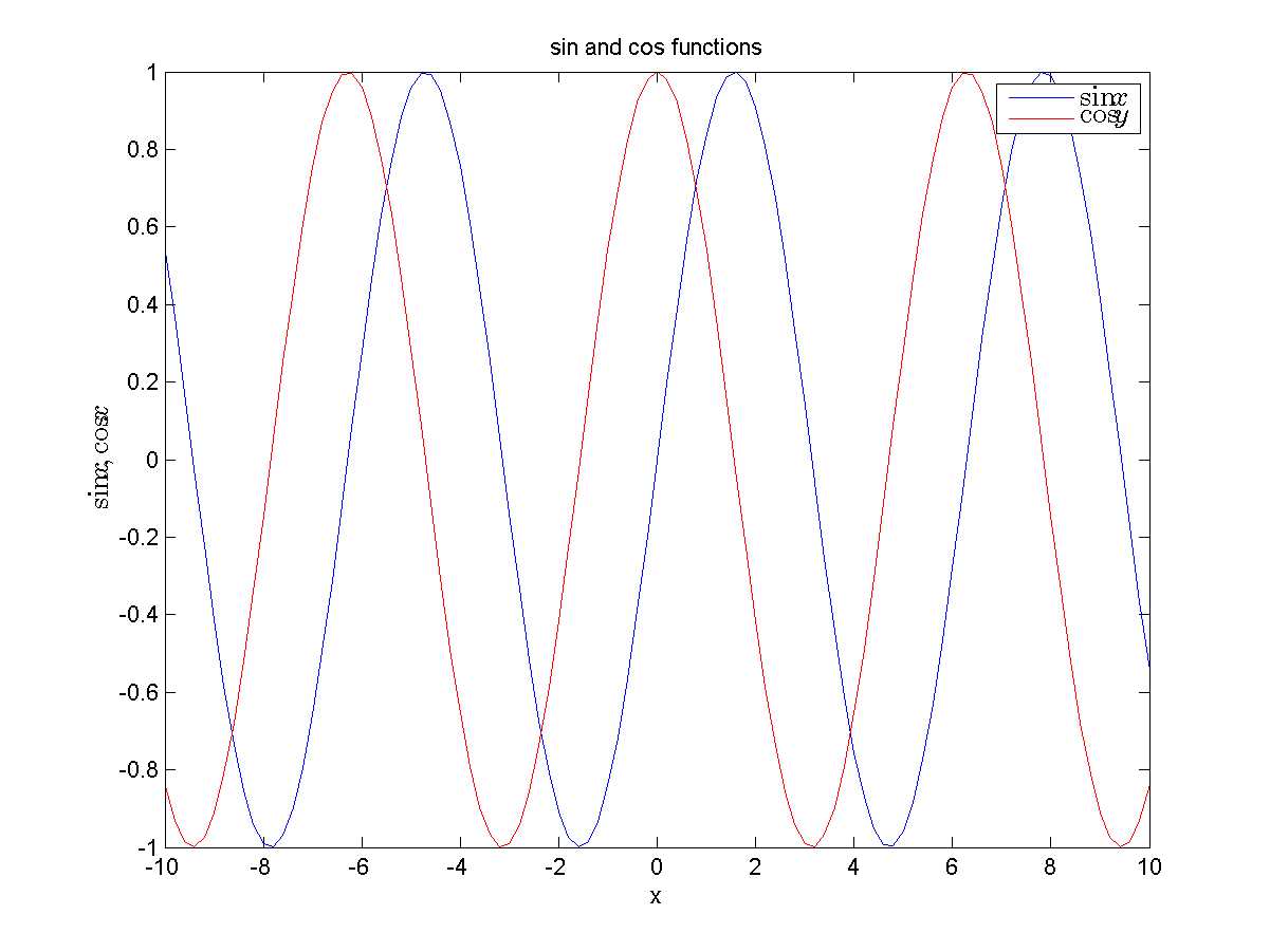
Functions fx=sinx and fx=cosx rendered with x and y labels, legend text, and title.
Subplots
The idea of subplots is to have several plots appear in a single figure window, but instead of overlapping each other, the subplots feature lets you put several plots side-by-side by effectively subdividing a single figure window into an M-by-N grid. This is best illustrated with an example. First of all, I create a new figure window, use the subplot function to create a plot in the first quadrant of a 2×2 window arrangement (these are supplied as function arguments), and then do a plot in that area.
>> figure |
Try it. I will not present the result here because it looks a bit silly to have an image with 75 percent whitespace. Instead, let’s complete the other plots (with indices 2, 3, and 4) and then look at the result.
>> subplot(2,2,2) |
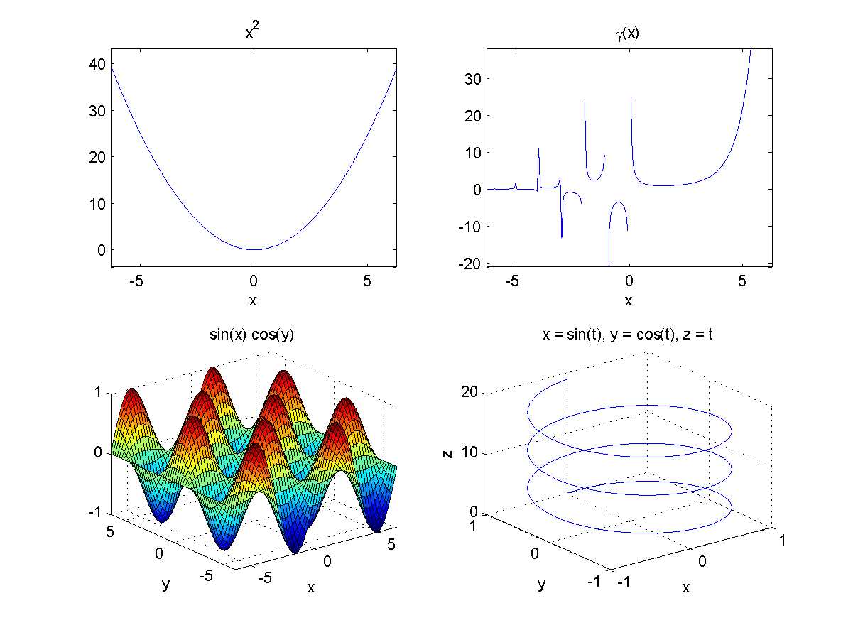
Four different subplots illustrating the functions fx=x2, fx=Γx, and
fx,y=sinxcosy , and a parametric plot with x=sint, y=cost, z=t for t=0..6π .
We have been a bit lazy in the above demo by using functions such as ezplot and ezsurf, which are part of the core MATLAB installation. This was done for the sake of brevity.
Note: You can have your subplot take up more than one cell in a grid of plots by specifying an array of cell positions to occupy. For example, subplot(2,2,3:4) will take up the whole bottom part of a 2×2 plot window.
The tools provided by MATLAB let you manipulate each of the subplots (e.g., rotate or pan) individually. There are no hard constraints in terms of the number of subplots you can have within a single plot, and as soon as you exceed the dimension of the original plot grid, MATLAB repositions the existing subplot windows to accommodate the new structure.
Plot Editing in the Figure Window
Once we’ve rendered our graph, we can modify the graph either using the command window or by using the user interface of the Figure window itself. We can rotate and pan plots, add axes labels, legend text, and other things. These actions are available either from the toolbar or from the top-level menu of the figure window:
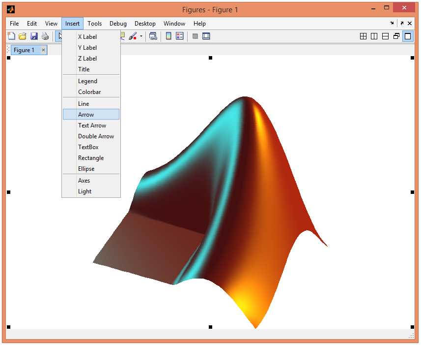
Editing a plot in the figure window.
Both the toolbar and the Tools menu let you customize the way that the figure looks; you can rotate the image, pan, zoom in and out, and a lot more.
There is one menu item I want to mention in particular: using File | Generate Code, we can generate a script file containing all the plot customizations that you applied using the UI. This is an excellent choice for demonstration scripts when you want to present a plot in just the right way.
Plotting Origin Axes
Every piece of software has its pain points, and MATLAB’s pain point is its inability to automatically render the origin axes when plotting graphs. Instead, what you typically get on a graph is a set of edge markers rather than lines going through zero.
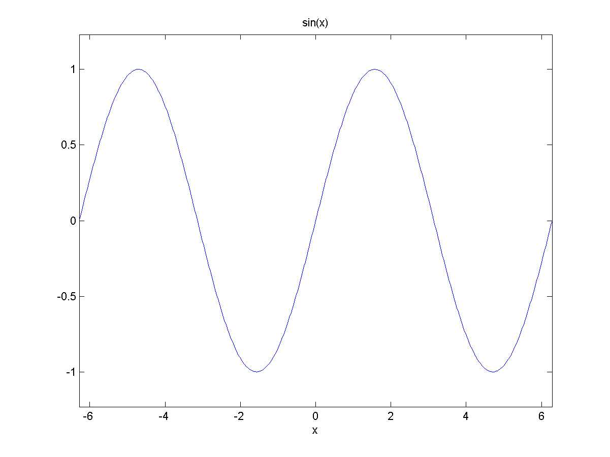
Graph of f(x)=sin(x) without axis lines.
One might think there is some easy solution to this problem, but unfortunately, there is not. So, what can we do about it? Well, the simplest solution is that you can turn on the grid:
>> grid on |
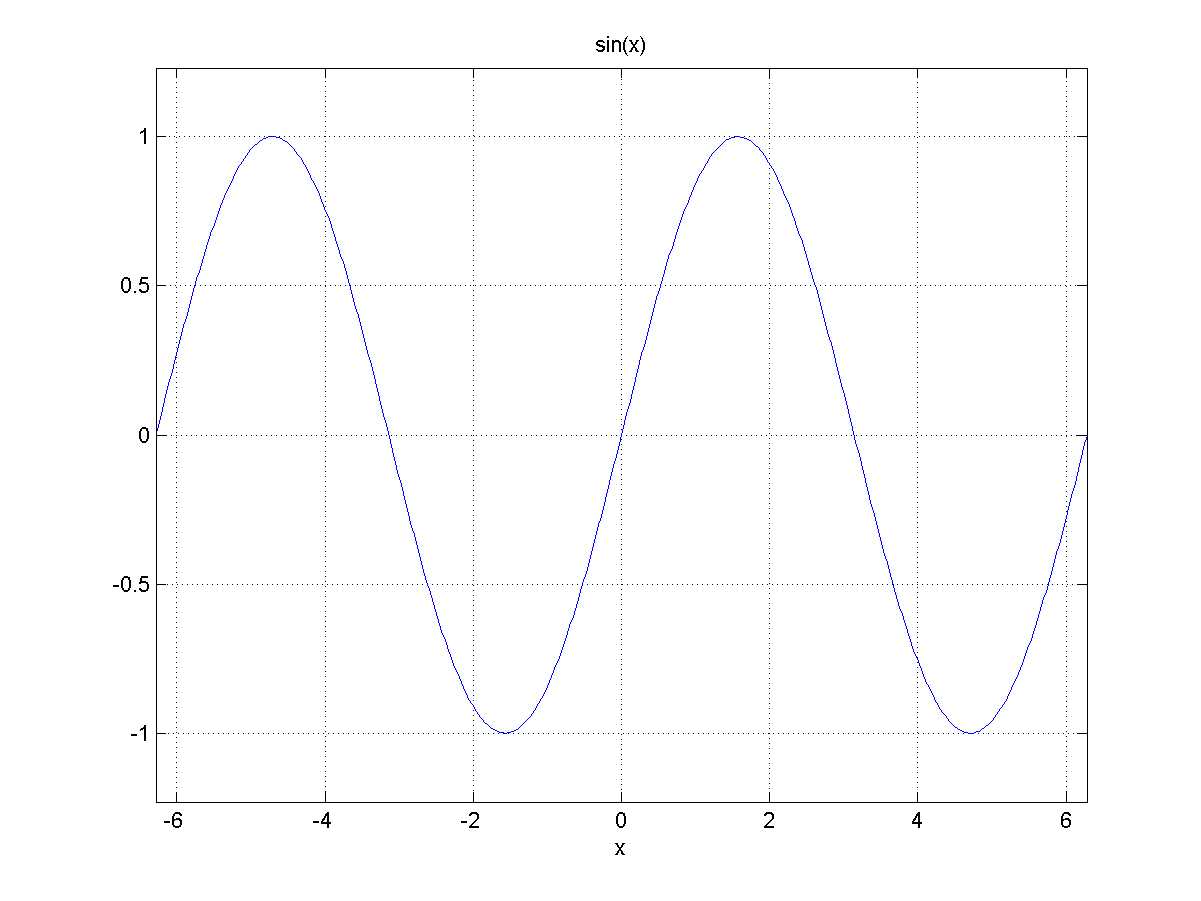
Function graph with the grid turned on.
The dotted, equally spaced grid lines are good indicators of where the graph lies, but this isn’t the same as drawing axes lines, because there are too many lines, and it doesn’t emphasize the lines going through zero.
Another option is to draw the lines yourself. You can get the figure limits from the xlim and ylim variables and then simply draw the lines through the origin:
>> xl = xlim; |
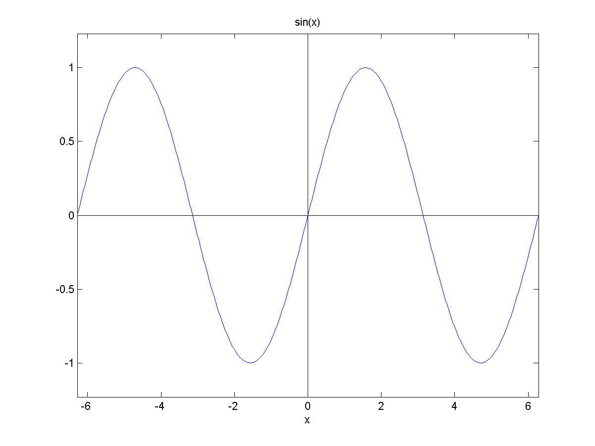
Axes lines rendered with the line command.
There are no tick marks or arrowheads here; we get just the lines. Not to mention the fact that if you pan or rotate the view, you will get a broken-looking graph.
My advice is to use a third-party component. For example, I use a component called oaxes that renders the axes together with arrow heads and tick marks. This implementation also renders the Z axis if you need it, and it actually supports panning/rotating the graph. It is a bit slow to render, but it is the best solution we have.
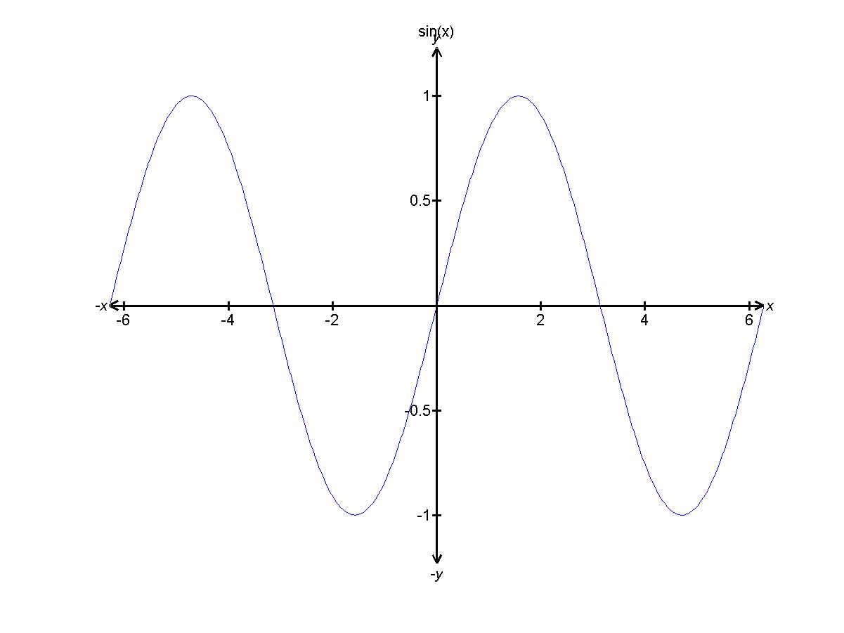
Axes lines rendered via the oaxes component.
To download oaxes (or some other solution), head over to MATLAB Central’s File Exchange (FEX). Oaxes, like all other FEX submissions, is open-source software.
Image Processing
All graphs that we’ve plotted so far were meant to visualize data, but MATLAB also supports dedicated functions for interacting with images (and, by extension, movies).
In order to appreciate MATLAB’s image processing capabilities, let’s try loading the following image. To load an image, we can either use the big Import Data button or the imread function.
Our original image, taken at a café in Sigtuna, Sweden’s oldest city.
Let’s examine what we actually get as we load this image into MATLAB:
>> pic = imread('33.png'); |
So the image got converted into a 1772 x 1181 x 3 array of uint unit values. You can already guess that the first two dimensions correspond to the width and height of the image and the third dimension is used to contain the red, green, and blue values respectively. The class uint8 basically means a single-byte (8-bit) integer value having a range 0..255.
To get MATLAB to render this (or any other) image, we can simply write image(pic). But let’s manipulate it first. For example, we can invert the image and save it with:
>> pic2 = 255 - pic; |
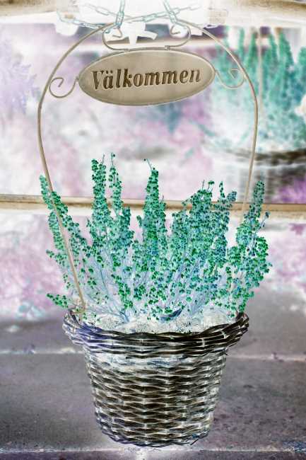
The inverted image.
Of course, in addition to being able to change the pixel value ourselves, MATLAB also provides a wealth of functions for manipulating images. It has functions for geometric transformations, image enhancement, analysis, and plenty of other things that are too advanced for non-professionals.
- 1800+ high-performance UI components.
- Includes popular controls such as Grid, Chart, Scheduler, and more.
- 24x5 unlimited support by developers.