
Flutter UI Succinctly®

CHAPTER 6
Stack, ListView, and GridView
Overview
We’ve covered quite a bit of ground so far, and have now reached the final chapter of this book, which is going to be short but to the point, given what we know so far about creating UIs with Flutter.
User interfaces are one of those topics where there are so many things to talk about that we would need a full library of books to cover it, and even then, we might still miss out on some topics since this is an ever-evolving field.
Take, for example, animations. There are so many different ways to create animations in Flutter that delving into this topic would require a least one book covering the fundamentals. This is something I’ll keep in mind for the future.
Nevertheless, most Flutter applications rely on the Stack, ListView, and GridView widgets, and that’s exactly what we’re going to explore now. Let’s get started.
Stack
Before can dive into the details of how the ListView and GridView widgets work, we need to understand what the Stack class is.
According to the official Flutter documentation, a Stack is a widget that can position its children relative to the edges of its box. A key aspect to know about a Stack widget is that its size is determined by the size of its largest child component.
What we want to do next is create a screen that uses a Stack, as this will help us to fully understand how ListView and GridView widgets work.
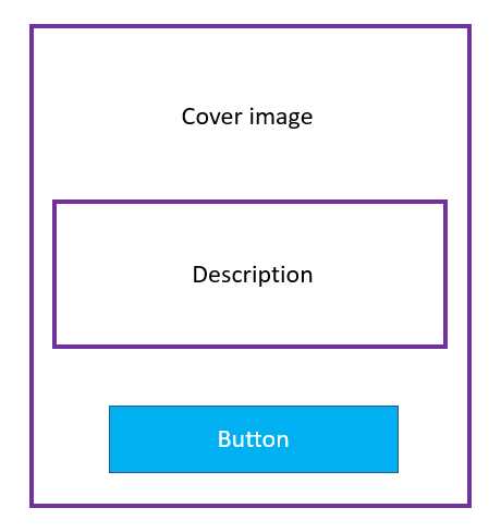
Figure 6-a: The Stack Screen to Build
What we want to build is a screen that has the book’s cover image in the background, then an area on top of the image with a description—a Card, and at the bottom of the screen, a RaisedButton. The following code does that, and the changes are highlighted in bold.
Codee Listing 6-a: Updated main.dart – Using a Stack
import 'package:flutter/material.dart'; void main() => runApp(MyApp()); class StaticBooks { static const String cdn = "https://cdn.syncfusion.com/"; static const String path = "content/images/downloads/ebook/ebook-cover/"; static const List<String> covers = [ "visual-studio-for-mac-succinctly-v1.png", ]; } class Succinctly extends StatelessWidget { List<Widget> stackScreen(double sizeX, double sizeY) { List<Widget> layout = List<Widget>(); Container cover = Container( decoration: BoxDecoration( image: DecorationImage( image: NetworkImage( StaticBooks.cdn + StaticBooks.path + StaticBooks.covers[0]), fit: BoxFit.scaleDown, ), ), ); layout.add(cover); final card = Positioned( top: sizeY / 1.45, left: sizeX / 4.2, child: Card( elevation: 15, color: Colors.blue, shape: RoundedRectangleBorder( borderRadius: BorderRadius.circular(5), ), child: Column( children: [ Padding( padding: EdgeInsets.all(10), child: Text('Succinctly Series'), ), ], ), ), ); layout.add(card); Positioned button = Positioned( width: sizeX - sizeY / 10, bottom: sizeY / 40, left: sizeX / 12, child: RaisedButton( // Or use ElevatedButton color: Colors.lightBlue, elevation: 8, shape: RoundedRectangleBorder( borderRadius: BorderRadius.circular(10) ), child: Text('Browse collection'), onPressed: () { // Do something later... }, ), ); layout.add(button); return layout; } @override Widget build(BuildContext context) { final sizeX = MediaQuery.of(context).size.width; final sizeY = MediaQuery.of(context).size.height; return Container( child: Stack( children: stackScreen(sizeX, sizeY), ) ); } } class MyApp extends StatelessWidget { @override Widget build(BuildContext context) { return MaterialApp( debugShowCheckedModeBanner: false, home: Succinctly(), theme: ThemeData( primaryColor: Colors.indigo, accentColor: Colors.amber, textTheme: TextTheme( bodyText2: TextStyle( fontSize: 26, fontStyle: FontStyle.italic), ), brightness: Brightness.dark, ), ); } } |
After we’ve made these changes and saved main.dart, the app’s UI should be updated on the emulator. On my machine, this looks as follows.
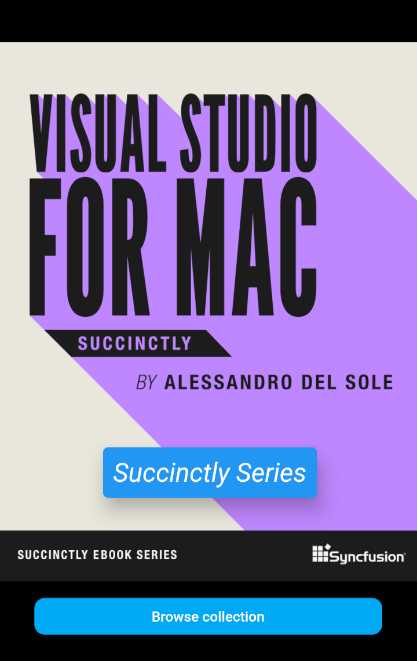
Figure 6-b: Succinctly Books App – Stack
To better understand the code changes, let’s have a look at the following diagram, which serves as a visual point of reference between the part of the code contained within the stackScreen method and the UI.
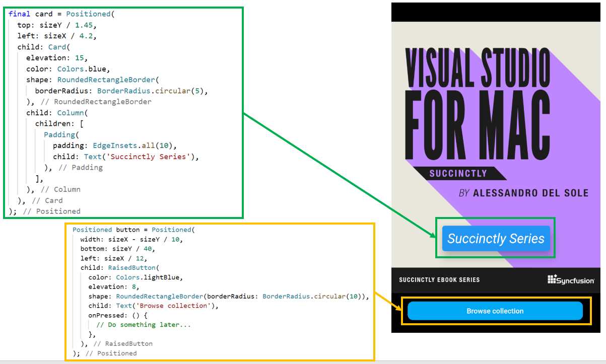
Figure 6-c: Code to UI Relationship (Succinctly Books App – Stack)
As you can see in Figure 6-c, the two main parts of the stackScreen method have to do with the Card widget (highlighted in green), and the RaisedButton (highlighted in yellow). So, with this visual reference in mind, let’s explore the code changes, which are quite a few.
The first thing you might have noticed is that the titles list was removed from the StaticBooks class, and the covers list was reduced to one item—this is because we are only showing one book cover.
Next, within the Succinctly class, we created a stackScreen method that is responsible for creating a layout that renders an image (cover), a Card, and a RaisedButton.
This layout is returned by the stackScreen method, and it is assigned to the children property of a Stack widget, which is assigned to the child property of a Container widget.
In essence, we have built a layout wrapped around a Stack widget, wrapped in a Container.
That Container widget, returned by the stackScreen method, is then returned by the build method and assigned to the home property of the MaterialApp widget.
Before exploring the stackScreen method in detail, let’s have a look at the other changes made to the build method.
We can see that within the build method, we get the width (sizeX) and height (sizeY) of the screen by retrieving these values from the context object using the MediaQuery class.
Both the sizeX and sizeY values are then passed to the stackScreen method and used to position the Card and the RaisedButton.
Within the stackScreen method, the first thing we did was declare the layout variable as a list of widgets (List<Widget>). This is because the Stack widget will contain the image (cover), the Card, and the RaisedButton widgets.
Next, we created a Container instance, which is assigned to the cover variable, using the same code we used before when creating the book cover.
The first object that gets added to the layout used by the Stack widget is the cover (image), which happens when the following instruction executes: layout.add(cover).
After that, the Card widget is created, and wrapped around a Positioned widget. This is because we want to be able to place the card on a specific location of the screen.
To do that, the sizeX and sizeY parameters are used to calculate the values of the top and left properties of the Positioned widget.
The Card widget is assigned to the child property of the Positioned widget, and the elevation, color, and shape properties of the Card are defined.
The child property of the Card widget contains a Column, and within its children property a Padding widget that contains a Text widget, with some padding defined. This is a great example of how a Flutter widget can be composed of many other smaller widgets.
Finally, the card object is added to the layout, and this is achieved when the following instruction executes: layout.add(card).
The last piece of this puzzle is the button, which is visible at the bottom of the layout. Just like with the Card widget, the RaisedButton widget is wrapped around a Positioned widget, so it can be easily placed in a specific part of the screen.
The width, bottom, and left properties of the Positioned widget are calculated using the sizeX and sizeY parameters.
The RaisedButton widget is assigned to the child property of the Positioned widget. For this button, the color, elevation, and shape properties are defined.
The text shown in the button is a Text widget assigned to the child property of the RaisedButton widget.
There’s also an onPressed event that can be used in the future, which is triggered when the button is pressed, as the name of the event implies.
Finally, the button is added to the layout when the following instruction executes: layout.add(button).
There we go—that’s how this example using a Stack widget was composed.
ListView
One of the most common features you’ll find in mobile apps is lists of items, such as products, documents, contacts, or email addresses.
Let’s create a list of documents that have an expiration date, such as passports and driver licenses, and this is where we will use the ListView widget. Let’s dive right into the code—the changes are highlighted in bold in the following listing.
Code Listing 6-b: Updated main.dart – Using a ListView
import 'package:flutter/material.dart'; void main() => runApp(MyApp()); class Doc { String name; String description; DateTime expires; Doc(this.name, this.description, this.expires); } class Succinctly extends StatelessWidget { List<Doc> createDocs() { List<Doc> docs = List<Doc>(); docs.add(Doc('Driver License', 'Florida driver license', DateTime.now().add(new Duration(days: 1825)))); docs.add(Doc('Passport Ed', 'Ed\'s passport', DateTime.now().add(new Duration(days: 825)))); docs.add(Doc('Passport John', 'John\'s passport', DateTime.now().add(new Duration(days: 2801)))); docs.add(Doc('ID card', 'John\'s national ID card', DateTime.now().add(new Duration(days: 801)))); return docs; } List<ListTile> showList() { List<ListTile> items = List<ListTile>(); List<Doc> docs = createDocs(); docs.forEach((doc) { items.add(ListTile( title: Text(doc.name), subtitle: Text(doc.description), leading: CircleAvatar( child: Icon(Icons.book), backgroundColor: Colors.lightBlueAccent, ), trailing: Icon(Icons.keyboard_arrow_down), onTap: () => true, )); }); return items; } @override Widget build(BuildContext context) { final sizeX = MediaQuery.of(context).size.width; final sizeY = MediaQuery.of(context).size.height; return Scaffold( appBar: AppBar( title: Text('Documents'), ), floatingActionButton: FloatingActionButton( child: Icon(Icons.book_online), onPressed: () { print('New doc!'); }, ), body: Container( width: sizeX, height: sizeY, child: ListView( children: showList(), ), ) ); } } class MyApp extends StatelessWidget { @override Widget build(BuildContext context) { return MaterialApp( debugShowCheckedModeBanner: false, home: Succinctly(), theme: ThemeData( primaryColor: Colors.indigo, accentColor: Colors.amber, brightness: Brightness.dark, ), ); } } |
After we’ve made these changes and saved main.dart, the app’s UI should be updated on the emulator. On my machine, this looks as follows.
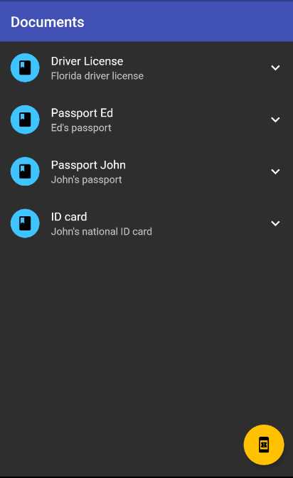
Figure 6-d: Docs App – ListView
Let’s review the code changes. The first thing to notice is that the Succinctly class has been revamped. The build method returns a Scaffold widget that includes the usual AppBar and FloatingActionButton widgets that we’ve used before.
The Scaffold widget contains a Container that includes a ListView that is assigned to its child property. The children property of the ListView widget contains an array of ListTile widgets, which is what the showList method returns.
The showList method starts by invoking the createDocs method, which returns a list of Doc objects (List<Doc>).
For each Doc object returned by the createDocs method, a ListTile item is created and added to the items list (List<ListTile>).
Each ListTile item contains a title, subtitle, leading, and trailing property, as well as an onTap event. To understand this better, let’s look at the following diagram.
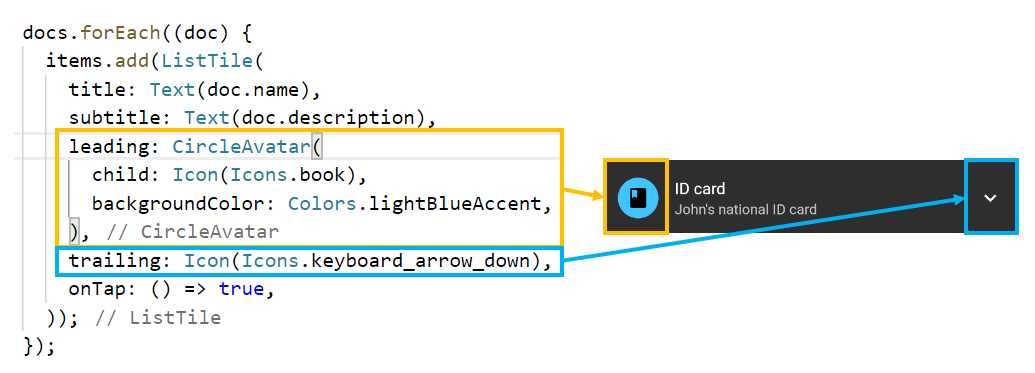
Figure 6-e: ListTile Item – Docs App
From the preceding diagram, we can see that the leading property is assigned to a CircleAvatar widget, which contains an Icon widget and has its backgroundColor property set to Colors.lightBlueAccent. This is highlighted in yellow.
We can also see that the trailing property is assigned to an Icon widget, which is the down arrow we can see highlighted in blue.
The createDocs method starts by initializing the docs variable (List<Doc>), and a Doc object is created for every item seen in the ListView widget. Four items are added to the docs list and returned by the method.
The Doc class contains a name, description, and expires property. These are the details displayed by each ListTile.
That’s how easy it is to create a ListView widget in Flutter.
GridView
Now that we know how to create a ListView, let’s cover the final topic of this book, which is how to create a Flutter GridView.
A GridView, which looks like a set of tiles, is a great way to display images, and can be used as an image gallery. Image galleries are widely used in e-commerce, photo, social media, real estate, and car rental apps, just to name a few.
A great use of a GridView widget would be to display some of the Succinctly books we saw before. So, let’s implement that—the changes are highlighted in bold in the following code.
Code Listing 6-c: Updated main.dart – Using a GridView
import 'package:flutter/material.dart'; void main() => runApp(MyApp()); class StaticBooks { static const String cdn = "https://cdn.syncfusion.com/"; static const String path = "content/images/downloads/ebook/ebook-cover/"; static const List<String> covers = [ "visual-studio-for-mac-succinctly-v1.png", "angular-testing-succinctly.png", "azure-devops-succinctly.png", "asp-net-core-3-1-succinctly.png", "angulardart_succinctly.png" ]; } class Succinctly extends StatelessWidget { List<Widget> createGrid() { List<Widget> imgs = List<Widget>(); Widget cImage; for (int i = 0; i <= StaticBooks.covers.length - 1; i++) { cImage = Container( child: Image.network( StaticBooks.cdn + StaticBooks.path + StaticBooks.covers[i]) ); imgs.add(cImage); } return imgs; } @override Widget build(BuildContext context) { final sizeX = MediaQuery.of(context).size.width; final sizeY = MediaQuery.of(context).size.height; return Scaffold( appBar: AppBar( title: Text('Succinctly Books'), ), body: Container( width: sizeX, height: sizeY, child: GridView.count( children: createGrid(), padding: EdgeInsets.all(10), crossAxisSpacing: 4.5, mainAxisSpacing: 5.5, crossAxisCount: 2, scrollDirection: Axis.vertical, ))); } } class MyApp extends StatelessWidget { @override Widget build(BuildContext context) { return MaterialApp( debugShowCheckedModeBanner: false, home: Succinctly(), theme: ThemeData( primaryColor: Colors.indigo, accentColor: Colors.amber, brightness: Brightness.dark, ), ); } } |
Before having a look at the updated UI, let’s dive into the code changes. The first thing to notice is that we’ve brought back the StaticBooks class, but only with the covers array, and without the titles.
Within the Succinctly class, we have a createGrid method that loops through the covers array, and for each, a Container widget is created.
Within the Container widget, the Image.network method is used to fetch each of the cover images of the books, which is assigned to the child property.
Each image is added to a list of images (imgs), which is returned by the createGrid method.
The build method returns a Scaffold widget that contains the usual AppBar widget and the body, which is what renders the grid.
Before we continue exploring the code changes, let’s look at the app’s UI, which should be updated on the emulator after we save the main.dart file. On my machine, this looks as follows.
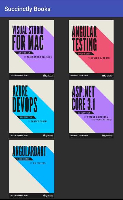
Figure 6-f: Books App – GridView
So there’s the app using a GridView widget—it looks great! The body property of the Scaffold widget is assigned to a Container, which wraps a GridView widget.
The GridView widget contains several properties, all of which are important to display the grid correctly, such as the crossAxisSpacing, mainAxisSpacing, crossAxisCount, and scrollDirection properties.
The crossAxisSpacing and mainAxisSpacing properties define the spacing between the images on the GridView widget, whereas the crossAxisCount property indicates the number of images per row. The scrollDirection property indicates that the images are placed vertically.
Finally, the children property is assigned the result returned by the createGrid method, which retrieves the book cover images.
Final thoughts
I find that creating user interfaces is a rewarding experience, even though most of the work I do is on the back end. I know that everyone might not agree with me, and that’s fine. For some developers, UIs are not their thing.
For me, there’s something magical about creating a UI and seeing it come to life, catching the eye—a pixel here, a pixel there—and seeing them turn into a shape, widget, or form.
Flutter is a fabulous framework for building rich UIs; it’s designed from the ground up with that purpose in mind.
Throughout this book, my goal was to present Flutter’s UI capabilities by describing its core features and key widgets so anyone reading could gain enough knowledge to build a UI without getting too deep into the realm of what designers do.
For those who are designers, Flutter is an excellent choice to bring a design to life with relatively few lines of code.
GitHub’s Dart repositories are packed with amazing open-source Flutter projects, many focusing on UI design. I invite you to explore them further.
Other than that, another interesting aspect of UIs which we didn’t cover in this book is animations. A full book on that topic probably wouldn’t cover everything that can be done with them.
So, going forward, if the UI is something that ignites a spark within you, rest assured that we’ve just scratched the surface of what is possible with Flutter.
I’d personally love to write a book on creating advanced UIs and animations, and perhaps it is something I will bring up in due time with Syncfusion—which, in my opinion, would also add value to their Flutter widgets offering and the customers using them.
I hope this book has given you some solid grounding on how to start creating UIs with Flutter, and that it has inspired you to continue your journey to keep learning about this wonderful framework.
Once again, thank you for taking the time to read a Succinctly book. I hope you continue to be inspired by what you can achieve with Flutter. Until next time, take care, and all the best.
- Advanced custom widgets and file-format libraries.
- Built from scratch.
- Dart-powered widgets for extraordinary apps.
- A wide range of products and hassle-free licensing.