
Flutter UI Succinctly®

CHAPTER 2
Scaffolds
Overview
Flutter is full of great features, and one of the most important features, in my opinion, is how easy it is to build high-quality user interfaces with it.
The goal of this book is to give you the fundamental knowledge to create engaging user interfaces using layouts, containers, rows and columns, and common widgets.
Scaffolds, as they are known in Flutter, or layouts are at the core of building user interfaces with Flutter, and this is what this chapter is all about.
Our first layout
Building user interfaces is one of those things you can only learn by experimenting, so let’s dive right into the action by modifying the default application and building a layout.
The layout that we’ll build will be a MaterialApp class, which includes a Scaffold widget with an AppBar, along with a body property that includes a FloatingActionButton.
So, with your editor of choice open (I’ll be using VS Code), go to the main.dart file, delete the existing (default) code, and replace it with the following code.
Code Listing 2-a: Updated main.dart
import 'package:flutter/material.dart'; void main() => runApp(MyApp()); class MyApp extends StatelessWidget { @override Widget build(BuildContext context) { return MaterialApp( debugShowCheckedModeBanner: false, home: Scaffold( appBar: AppBar( title: Text('Flutter UI Succinctly'), ), body: Center( child: Text( 'Our first Flutter layout', style: TextStyle(fontSize: 24), ), ), floatingActionButton: FloatingActionButton( child: Icon(Icons.ac_unit), onPressed: () { print('Oh, it is cold outside...'); }, ), ), ); } } |
Once the code has been replaced, save the main.dart file.
If you don’t have the emulator running, go to Run > Run Without Debugging, and follow the steps to start the emulator and run the app.
If you already have the emulator running, Flutter’s hot reload mechanism will automatically update the application’s user interface, which should look as follows.

Figure 2-a: Our First Flutter Layout
Before we dive into the details, let’s have a look at the following diagram, which describes the relationship between the UI elements and the code.
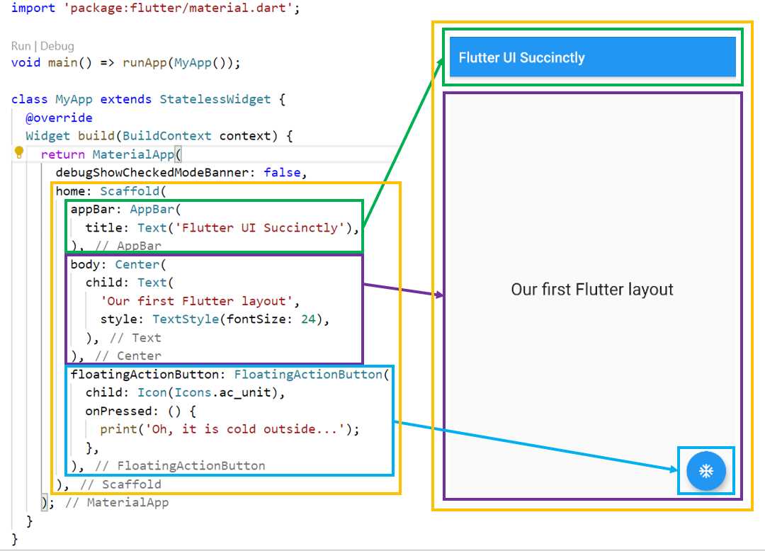
Figure 2-b: UI-to-Code Relationship
As you can see in Figure 2-b, there are three essential parts to this layout, which is the Scaffold widget (highlighted in yellow).
The first is the AppBar widget (highlighted in green), the body property (highlighted in purple), and the FloatingActionButton widget (highlighted in blue).
Let’s review in detail what we have done. The first thing we did was import the Material Design Flutter library with this instruction: 'package:flutter/material.dart'.
Next, within the app’s main function, which serves as the application’s entry point, we created an instance of the MyApp class, which we then passed as a parameter to the runApp method. This method is responsible for executing the Flutter application.
The MyApp class is a stateless widget that does not require a mutable state and is often used as a starting point for building a user interface.
This is why the MyApp class inherits (referred to as extends in the Dart programming language) from the StatelessWidget class.
The build method from the MyApp class overrides the build method inherited from the StatelessWidget class, which is why the @override decorator is used.
The build method from the MyApp class returns an object that renders the user interface. This object is a MaterialApp instance that is used for wrapping several widgets that are required when building Material Design applications.
For the MaterialApp widget, there are two properties that we are using. One is the debugShowCheckedModeBanner property, and the other is home.
The debugShowCheckedModeBanner property, as its name implies, is used to display a debug banner at the top of the application’s screen when set to true. In this case, its value is set to false, so the debug banner is not shown.
The home property contains the complete layout that we’ve created: a Scaffold widget, which contains the app’s header (appBar), the body, and the floating blue button (floatingActionButton) properties.
The appBar property includes only one child property, the title, which is assigned the value that is passed to the Text widget.
A Center widget is assigned to the body property of the Scaffold widget. As its name implies, the Center widget is used to align content to the center of the screen.
The Center widget contains a child property to which a Text widget is assigned. This Text widget contains some text which is passed as a string, as well as the style property.
The floatingActionButton property has a FloatingActionButton widget assigned to it. This FloatingActionButton widget contains a child property and an onPressed event, which is triggered when the user taps the floating button.
The child property of the FloatingActionButton widget is assigned to an Icon widget. The Icon widget displays the type of icon seen within the floating button, which looks like one of those drawings of a snowflake you see on fridges or air conditioners (Icons.ac_unit).
When the onPressed event is triggered, a message is printed out to the console, which can be seen in the Debug Console area in VS Code.

Figure 2-c: The Debug Console Output – VS Code
We’ve created our first layout with Flutter. Now, let’s have a look at how we can take this further and use colors and themes.
Colors and themes
When you were building the previous layout, you may have noticed that by default, Flutter provided us with a “blue and white” application look and feel (theme), which looks quite good. This theme is based on the Material Design specifications.
However, we can easily customize the appearance of the application while staying within the Material Design specifications. Let’s see how we can do that.
The first thing we can do is change the app’s brightness settings. This is very simple to do by making a few changes to the main.dart code, which are highlighted in the following listing.
Code Listing 2-b: Updated main.dart (Brightness Changes)
import 'package:flutter/material.dart'; void main() => runApp(MyApp()); class MyApp extends StatelessWidget { @override Widget build(BuildContext context) { return MaterialApp( debugShowCheckedModeBanner: false, home: Scaffold( appBar: AppBar( title: Text('Flutter UI Succinctly'), ), body: Center( child: Text( 'Our first Flutter layout', style: TextStyle(fontSize: 24), ), ), floatingActionButton: FloatingActionButton( child: Icon(Icons.ac_unit), onPressed: () { print('Oh, it is cold outside...'); }, ), ), theme: ThemeData( brightness: Brightness.dark, ), ); } } |
After you have saved those file changes, Flutter should be able to update the application’s UI automatically through the hot reload feature. On my machine, it looks as follows.

Figure 2-d: The Updated Flutter Layout (Dark Brightness)
Let’s see what we have done. With a few lines of code, we were able to change the app’s colors. We were able to achieve this by adding a theme property to the MaterialApp widget. This theme property takes a Theme widget, which contains a brightness property that has been set to Brightness.dark.
Although this looks very cool, we might not want to use only one color for most of the app’s layout. We can customize the colors of the app’s layout, as well as the text font on the app’s header. In order to do so, we’ll make the following changes to the main.dart code.
Code Listing 2-c: Updated main.dart (Color and Text Font Changes)
import 'package:flutter/material.dart'; void main() => runApp(MyApp()); class MyApp extends StatelessWidget { @override Widget build(BuildContext context) { return MaterialApp( debugShowCheckedModeBanner: false, home: Scaffold( appBar: AppBar( title: Text('Flutter UI Succinctly'), ), body: Center( child: Text( 'Our first Flutter layout', style: TextStyle(fontSize: 24), ), ), floatingActionButton: FloatingActionButton( child: Icon(Icons.ac_unit), onPressed: () { print('Oh, it is cold outside...'); }, ), ), theme: ThemeData( primaryColor: Colors.indigo, accentColor: Colors.amber, textTheme: TextTheme( bodyText2: TextStyle( fontSize: 26, fontStyle: FontStyle.italic), ), brightness: Brightness.dark, ), ); } } |
After you save the changes to main.dart, Flutter should be able to update the application’s UI automatically. On my machine, it looks as follows.

Figure 2-e: The Updated Flutter Layout (Color and Text Font Changes)
Let’s have a look at what we have done. To the ThemeData widget, we’ve added the primaryColor, accentColor, and textTheme properties.
To know what colors are available to use with Material Design, we can refer to the Material Design Colors website.
The primaryColor property has been set to Colors.indigo, which is why the app’s header is no longer black. The accentColor property has been set to Colors.amber, and the body text has been changed to italic.
To change the body text, a TextTheme widget instance is assigned to the textTheme property. This widget contains a bodyText2 property of type TextStyle that is used to specify the properties of the body text, such as the fontSize and fontStyle—in this case, set to FontStyle.italic.
Summary
Scaffolds, or layouts, are the basic foundations required to build user interfaces with Flutter. Even though the code so far has not been very complex, we’ve explored the fundamental widgets and properties that are most commonly used to build layouts with Flutter.
With this knowledge, we are ready to explore containers, which are Flutter widgets that allow us to create more complex user interfaces, by embedding widgets within widgets. This is what we’ll dive into next.
- Advanced custom widgets and file-format libraries.
- Built from scratch.
- Dart-powered widgets for extraordinary apps.
- A wide range of products and hassle-free licensing.