
Flutter UI Succinctly®

CHAPTER 4
Rows and Columns
Overview
To be able to create and structure a complex UI with Flutter, which involves using multiple widgets, it might be necessary to use Row and Column classes. They are very easy to use and have some unique properties that give them flexibility and power when designing layouts. In this chapter, we will explore how to work with them, which will give us the ability to better understand how to build more complex layouts and UIs.
Definitions
Before we dive into specific Flutter details regarding rows and columns, let’s make sure we have a clear understanding of what rows and columns are. So, let’s have a look at the following diagram.
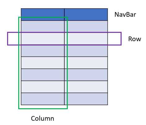
Figure 4-a: App Layout with Rows and Columns
In the preceding diagram, we have our app’s layout, which consists of various rows and two columns. One of the rows is highlighted in purple, and the left column is highlighted in green.
Both the rows and columns contain cells, which look like rectangles. Each cell could perfectly contain a Flutter widget. Therefore, a Row widget is a list of child widgets placed horizontally, while a Column widget is a list of child widgets that are vertically stacked.
Rows and columns have the same properties, which makes it easy to learn how to use them. This means that whatever property you use in a Row widget, you can also use it in a Column widget.
Alignment
Before we can start using rows and columns in our Flutter code, we need to understand how the alignment of rows and columns differ one from the other.
Say we have a row (the blue box in Figure 4-b), and we draw a white cross inside of it. The line that goes from top to bottom is known as the cross axis of the row. The line that goes from left to right is known as the main axis of the row. This can be seen in the following diagram.

Figure 4-b: Row – Cross and Main Axis
Say we have a column, and we draw that same white cross inside of it. The line that goes from top to bottom is known as the main axis of the column.

Figure 4-c: Column – Main and Cross Axis
In essence, in any screen, there are always two axes: the vertical axis and the horizontal axis. The vertical axis is called the cross axis for a Row widget, and the main axis for a Column widget. The horizontal axis is called the main axis for a Row widget and the cross axis for a Column widget.
This means that the cross axis and the main axis change based on the widget that you are using. Understanding alignment is essential when working with widgets that are placed within rows and columns.
Boxes
To put these concepts into practice, let’s take a step back and use the following code as a starting point.
Code Listing 4-a: Updated main.dart (Container with a LinearGradient)
import 'package:flutter/material.dart'; void main() => runApp(MyApp()); class MyApp extends StatelessWidget { @override Widget build(BuildContext context) { return MaterialApp( debugShowCheckedModeBanner: false, home: Scaffold( appBar: AppBar( title: Text('Flutter UI Succinctly'), ), body: Container( decoration: BoxDecoration( color: Colors.lightBlue, gradient: LinearGradient( begin: Alignment.topRight, end: Alignment.bottomLeft, colors: [Colors.blue, Colors.orange]), shape: BoxShape.rectangle, ), ), floatingActionButton: FloatingActionButton( child: Icon(Icons.ac_unit), onPressed: () { print('Oh, it is cold outside...'); }, ), ), theme: ThemeData( primaryColor: Colors.indigo, accentColor: Colors.amber, textTheme: TextTheme( bodyText2: TextStyle( fontSize: 26, fontStyle: FontStyle.italic), ), brightness: Brightness.dark, ), ); } } |
After making these changes and saving main.dart, we should see the app’s UI updated on the emulator. On my machine, it looks as follows.

Figure 4-d: A Container Widget with a LinearGradient
We’ve seen this before, so no surprises here. However, what we want to do next is create a Column widget (which later we can swap for a Row widget) that we can add as a child property to the existing Container widget.
This child property of the existing Container widget will be made up of a list of boxes (each of which will be a Container widget).
Before we make any changes to the code, let’s look at the following diagram to understand what we want to achieve.

Figure 4-e: A Container Widget with a Column of Boxes (Each Box is a Container)
To achieve this, we need to add a Column widget to the Container widget’s child property. The Column widget contains a children property, to which we will assign a List of Container widgets that we will create with a separate method called boxes. The code changes are highlighted in bold in the following listing.
Code Listing 4-b: Updated main.dart (Container with a Column of Containers – Dynamically Created)
import 'package:flutter/material.dart'; void main() => runApp(MyApp()); class MyApp extends StatelessWidget { List<Widget> boxes(int n, double w, double h) { List<Widget> bxs = List<Widget>(); List fill = [Colors.blue, Colors.green, Colors.purple, Colors.pink]; for (int i = 0; i <= n - 1; i++) { Container bx = Container( child: Text(i.toString()), color: fill[i], width: w, height: h, ); bxs.add(bx); } return bxs; } @override Widget build(BuildContext context) { return MaterialApp( debugShowCheckedModeBanner: false, home: Scaffold( appBar: AppBar( title: Text('Flutter UI Succinctly'), ), body: Container( decoration: BoxDecoration( color: Colors.lightBlue, gradient: LinearGradient( begin: Alignment.topRight, end: Alignment.bottomLeft, colors: [Colors.blue, Colors.orange]), shape: BoxShape.rectangle, ), child: Column( children: boxes(4, 40, 40), ), ), floatingActionButton: FloatingActionButton( child: Icon(Icons.ac_unit), onPressed: () { print('Oh, it is cold outside...'); }, ), ), theme: ThemeData( primaryColor: Colors.indigo, accentColor: Colors.amber, textTheme: TextTheme( bodyText2: TextStyle( fontSize: 26, fontStyle: FontStyle.italic), ), brightness: Brightness.dark, ), ); } } |
After making these changes and saving main.dart, we should see the app’s UI updated on the emulator. On my machine, it looks as follows.

Figure 4-f: A Container with a Column of Containers – Dynamically Created
By looking at the code changes, we can see that the boxes are dynamically created by a method called boxes, which returns a list of widgets (List<Widget>). Each widget (box) within that list is a Container.
This list is assigned to the children property of the Column widget, which is assigned to the child property of the main Container widget.
The boxes method starts by initializing the bxs variable as an empty list of widgets (List<Widget>). This will contain each of the Container widgets (boxes) that will be dynamically created.
Then a list of colors called fill is defined. Each box (Container) will have its color—one color for each box.
We loop n times, and for each iteration, a Container is created, with a defined width (w) and height (h), along with its color (fill[i]).
Each Container created is added to the bxs list for every iteration, and when the loop has been completed, the bxs list is returned, which is assigned to the children property of the Column widget.
What happens when we change the Column widget to a Row widget? Let’s have a look.
Code Listing 4-c: Updated main.dart (Container with a Row of Containers – Dynamically Created)
import 'package:flutter/material.dart'; void main() => runApp(MyApp()); class MyApp extends StatelessWidget { List<Widget> boxes(int n, double w, double h) { List<Widget> bxs = List<Widget>(); List fill = [Colors.blue, Colors.green, Colors.purple, Colors.pink]; for (int i = 0; i <= n - 1; i++) { Container bx = Container( child: Text(i.toString()), color: fill[i], width: w, height: h, ); bxs.add(bx); } return bxs; } @override Widget build(BuildContext context) { return MaterialApp( debugShowCheckedModeBanner: false, home: Scaffold( appBar: AppBar( title: Text('Flutter UI Succinctly'), ), body: Container( decoration: BoxDecoration( color: Colors.lightBlue, gradient: LinearGradient( begin: Alignment.topRight, end: Alignment.bottomLeft, colors: [Colors.blue, Colors.orange]), shape: BoxShape.rectangle, ), child: Row( children: boxes(4, 40, 40), ), ), floatingActionButton: FloatingActionButton( child: Icon(Icons.ac_unit), onPressed: () { print('Oh, it is cold outside...'); }, ), ), theme: ThemeData( primaryColor: Colors.indigo, accentColor: Colors.amber, textTheme: TextTheme( bodyText2: TextStyle( fontSize: 26, fontStyle: FontStyle.italic), ), brightness: Brightness.dark, ), ); } } |
After making these changes and saving main.dart, we should see the app’s UI updated on the emulator. On my machine, it looks as follows.

Figure 4-g: A Container with a Row of Containers – Dynamically Created
From having a column of boxes, we now have a row of boxes instead. It’s the same logic; the boxes method hasn’t changed. The only difference is that within the main Container widget, a Row widget is assigned to the child property, rather than a Column widget.
Alignment adjustment
To position the Column or Row widget we have created, let’s use the axes properties. The changes to the code are highlighted in bold in the following listing.
Code Listing 4-d: Updated main.dart (Row of Containers with Axes – Dynamically Created)
import 'package:flutter/material.dart'; void main() => runApp(MyApp()); class MyApp extends StatelessWidget { List<Widget> boxes(int n, double w, double h) { List<Widget> bxs = List<Widget>(); List fill = [Colors.blue, Colors.green, Colors.purple, Colors.pink]; for (int i = 0; i <= n - 1; i++) { Container bx = Container( color: fill[i], width: w, height: h, ); bxs.add(bx); } return bxs; } @override Widget build(BuildContext context) { return MaterialApp( debugShowCheckedModeBanner: false, home: Scaffold( appBar: AppBar( title: Text('Flutter UI Succinctly'), ), body: Container( child: Row( mainAxisAlignment: MainAxisAlignment.center, crossAxisAlignment: CrossAxisAlignment.stretch, children: boxes(4, 40, 40), ), decoration: BoxDecoration( color: Colors.lightBlue, gradient: LinearGradient( begin: Alignment.topRight, end: Alignment.bottomLeft, colors: [Colors.blue, Colors.orange]), shape: BoxShape.rectangle, ), ), floatingActionButton: FloatingActionButton( child: Icon(Icons.ac_unit), onPressed: () { print('Oh, it is cold outside...'); }, ), ), theme: ThemeData( primaryColor: Colors.indigo, accentColor: Colors.amber, textTheme: TextTheme( bodyText2: TextStyle( fontSize: 26, fontStyle: FontStyle.italic), ), brightness: Brightness.dark, ), ); } } |
After making these changes and saving main.dart, we should see the app’s UI updated on the emulator.
Before you continue reading to have a look at the result, let me give you a heads up. What you will see is counterintuitive to what you expect to see.
The reason for this is that we are using a Row widget. With that said, you may now have a look.

Figure 4-h: Row of Containers with Axes – Dynamically Created
This looks like one of those old TV color bar screens. The really interesting thing about this effect is that we visually ended up with four columns rather than four boxes in a row, even though we are using a Row widget. Why is that?
Although visually, these look like four columns, they are indeed four child Container widgets, one after the other, contained within a Row widget.
The reason they appear as four columns has to do with the crossAxisAlignment property of the Row widget being set to CrossAxisAlignment.stretch. In this way, the boxes have been stretched to the height of the parent Container.
The key takeaway from this example is that when working with Row and Column widgets, there are multiple ways to arrange your widgets on the screen, and sometimes by using a single property, you can end up with a completely different result.
Spacing
Before we wrap up this chapter, there’s one more thing I’d like to show you, and that is how to add spacing between the child widgets contained within a Row or Column widget.
The following code contains some changes to add spacing between the boxes, highlighted in bold. Let’s have a look.
Code Listing 4-e: Updated main.dart (Column of Containers with Axes and Spacing – Dynamically Created)
import 'package:flutter/material.dart'; void main() => runApp(MyApp()); class MyApp extends StatelessWidget { List<Widget> boxes(int n, double w, double h) { List<Widget> bxs = List<Widget>(); List fill = [Colors.blue, Colors.green, Colors.purple, Colors.pink]; for (int i = 0; i <= n - 1; i++) { Container bx = Container( color: fill[i], width: w, height: h, ); bxs.add(bx); } return bxs; } @override Widget build(BuildContext context) { return MaterialApp( debugShowCheckedModeBanner: false, home: Scaffold( appBar: AppBar( title: Text('Flutter UI Succinctly'), ), body: Container( child: Column( mainAxisAlignment: MainAxisAlignment.spaceEvenly, crossAxisAlignment: CrossAxisAlignment.stretch, children: boxes(4, 40, 40), ), decoration: BoxDecoration( color: Colors.lightBlue, gradient: LinearGradient( begin: Alignment.topRight, end: Alignment.bottomLeft, colors: [Colors.blue, Colors.orange]), shape: BoxShape.rectangle, ), ), floatingActionButton: FloatingActionButton( child: Icon(Icons.ac_unit), onPressed: () { print('Oh, it is cold outside...'); }, ), ), theme: ThemeData( primaryColor: Colors.indigo, accentColor: Colors.amber, textTheme: TextTheme( bodyText2: TextStyle( fontSize: 26, fontStyle: FontStyle.italic), ), brightness: Brightness.dark, ), ); } } |
After making these changes and saving main.dart, we should see the app’s UI updated on the emulator. Let’s have a look.
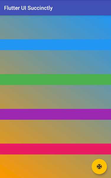
Figure 4-i: Column of Containers with Axes and Spacing – Dynamically Created
From the code changes, two things stand out. The first is that we are no longer using a Row widget, but instead a Column widget.
The second is that the value of the mainAxisAlignment property is now set to MainAxisAlignment.spaceEvenly, which spaces the columns evenly along the parent Container.
Although visually these four boxes within a column look like rows, they are four child Container widgets inside a Column widget, each box taking the width of the parent Container widget.
This is achieved because the crossAxisAlignment property of the Column widget is set to CrossAxisAlignment.stretch, which makes the boxes within the column appear as rows.
Summary
Before we started this chapter, we were only able to work with one child widget per Container widget. By adding Row and Column widgets, we have seen how we can add more than one child widget per Container.
Rows and columns are a great and useful way to enrich a Flutter application’s UI, but they are not the only way. Later, we will look at exploring how to use other Flutter widgets, which will allow us to compose more complex UIs.
But before we do that, in the next chapter we will look at navigation widgets, which most Flutter applications rely on.
- Advanced custom widgets and file-format libraries.
- Built from scratch.
- Dart-powered widgets for extraordinary apps.
- A wide range of products and hassle-free licensing.