
Flutter UI Succinctly®

CHAPTER 3
Containers
Overview
The most flexible widget in Flutter is the Container class, which allows for painting, sizing, and positioning other widgets within a Flutter application.
The way the Container widget works is that it wraps the child widget with padding, and then applies constraints to the padded extent by using the width and height as constraints if either is different than null. The container is then surrounded by an additional space described from the margin.
Containers are used to contain other widgets, with the possibility of applying styling properties to the container itself and its children.
Container sizing
Let’s carry on from where we left our code in the previous chapter. We’ll start by removing all the code assigned to the body property of the Scaffold widget and replacing it with a Container widget. The changes are highlighted in bold in the listing that follows.
Code Listing 3-a: Updated main.dart (Adding a Container)
import 'package:flutter/material.dart'; void main() => runApp(MyApp()); class MyApp extends StatelessWidget { @override Widget build(BuildContext context) { return MaterialApp( debugShowCheckedModeBanner: false, home: Scaffold( appBar: AppBar( title: Text('Flutter UI Succinctly'), ), body: Container( color: Colors.lightBlue, ), floatingActionButton: FloatingActionButton( child: Icon(Icons.ac_unit), onPressed: () { print('Oh, it is cold outside...'); }, ), ), theme: ThemeData( primaryColor: Colors.indigo, accentColor: Colors.amber, textTheme: TextTheme( bodyText2: TextStyle( fontSize: 26, fontStyle: FontStyle.italic), ), brightness: Brightness.dark, ), ); } } |
After the changes are saved to main.dart, Flutter should be able to update the application’s UI automatically. On my machine, it looks as follows.
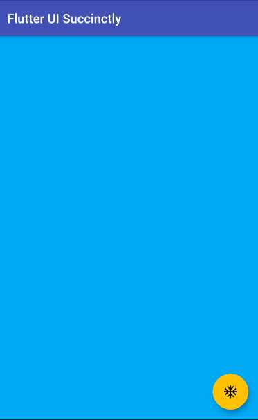
Figure 3-a: The Updated App UI (Adding a Container)
Although to the naked eye it seems the only modification we’ve made is to change the color of the body property, what we have really done is added a Container widget, which will provide our application with a lot of flexibility for adding and positioning other widgets within the body of the app.
Before this change, we were limited to only using text within the body of the app. This is a subtle but significant improvement to the app. For now, within the Container widget, we’ve set the value of its color property to Colors.lightBlue.
Something you’ve probably noticed is that even if the Container widget is empty (for now), setting the color property fills in the entire space of the Scaffold body.
But what happens when we insert a child widget into the Container widget? Let’s do precisely that by making the following adjustment to our code (highlighted in bold).
Code Listing 3-b: Updated main.dart (Adding a Child to the Container)
import 'package:flutter/material.dart'; void main() => runApp(MyApp()); class MyApp extends StatelessWidget { @override Widget build(BuildContext context) { return MaterialApp( debugShowCheckedModeBanner: false, home: Scaffold( appBar: AppBar( title: Text('Flutter UI Succinctly'), ), body: Container( color: Colors.lightBlue, child: ButtonBar() ), floatingActionButton: FloatingActionButton( child: Icon(Icons.ac_unit), onPressed: () { print('Oh, it is cold outside...'); }, ), ), theme: ThemeData( primaryColor: Colors.indigo, accentColor: Colors.amber, textTheme: TextTheme( bodyText2: TextStyle( fontSize: 26, fontStyle: FontStyle.italic), ), brightness: Brightness.dark, ), ); } } |
What we have done is added a ButtonBar widget as a child of the Container widget. If we save the changes to main.dart, we should see the following.
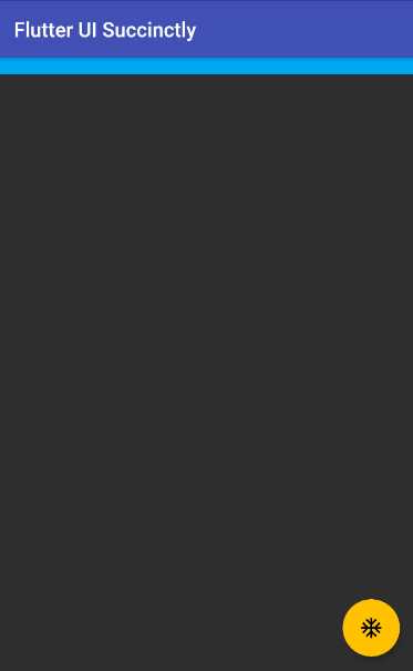
Figure 3-b: The Updated App UI (Adding a Child to the Container)
Notice that after making this change, the Container widget is as big as the ButtonBar widget. This means that the size of the Container widget is dynamic, and may vary depending on the content of its child property and the widgets that come under it.
So, when using containers, they will size themselves to their child, unless the width or height properties of the Container widget are set. This is why when we added the ButtonBar to the Container widget, it became the same size as the ButtonBar.
On the other hand, containers without children will follow these two rules:
- If the parent widget provides unbounded constraints, the Container widget without children will always try to be as small as possible.
- If the parent widget provides bounded constraints, the Container widget without children will always try to be as big as possible.
Therefore, we can interpret that four parameters govern how much space a Container widget may take. These parameters are known as box constraints, and can be seen in the following diagram.

Figure 3-c: Parent and Container Spatial Relationship (Box Constraints)
The area in the lighter blue color represents the Container widget, and the area in the darker blue color indicates the parent widget.
To see how the width and height properties affect the sizing of a Container widget, let’s make some changes to our code. These are highlighted in bold.
Code Listing 3-c: Updated main.dart (Container Width and Height)
import 'package:flutter/material.dart'; void main() => runApp(MyApp()); class MyApp extends StatelessWidget { @override Widget build(BuildContext context) { return MaterialApp( debugShowCheckedModeBanner: false, home: Scaffold( appBar: AppBar( title: Text('Flutter UI Succinctly'), ), body: Container( width: 300, height: 300, color: Colors.lightBlue, child: ButtonBar()), floatingActionButton: FloatingActionButton( child: Icon(Icons.ac_unit), onPressed: () { print('Oh, it is cold outside...'); }, ), ), theme: ThemeData( primaryColor: Colors.indigo, accentColor: Colors.amber, textTheme: TextTheme( bodyText2: TextStyle( fontSize: 26, fontStyle: FontStyle.italic), ), brightness: Brightness.dark, ), ); } } |
Save the changes to main.dart, and the app’s UI should be updated on the emulator. On my machine, it looks as follows.
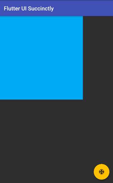
Figure 3-d: A Container Widget with Specific Width and Height
By specifying fixed values for the width and height properties, we were able to overcome the out-of-the-box constraints that govern Container widget sizing in Flutter.
Container placement
Now that we know how to size a Container widget, let’s explore how we can place it in any part of the screen. But before we do that, we need to get some basic placement concepts clear. When placing any Container widget, two fundamental definitions must be understood: the margin and padding properties.
The margin property is the space outside the border of a Container widget, whereas the padding property is the space between the border of the Container widget and its content. To understand this better, let’s look at the following diagram.

Figure 3-e: Container Margin and Padding
For defining the values of the margin and padding properties of a Container widget, we can use the EdgeInsets class, which is used for setting an offset from each of the four sides of a box.
The EdgeInsets class contains three constructor methods, which take double values as parameters that can be used to set offsets:
- EdgeInsets.all: Creates an offset on all four sides of the box.
- EdgeInsets.only: Allows you to choose on which sides to create an offset.
- EdgeInsets.symmetric: Allows you to create symmetrical horizontal and vertical offsets.
To understand this better, let’s make some adjustments to our code to add some margin and padding properties to the Container widget, and change the ButtonBar to a Text widget. The changes are highlighted in bold in the following code.
Code Listing 3-d: Updated main.dart (Container Margin and Padding)
import 'package:flutter/material.dart'; void main() => runApp(MyApp()); class MyApp extends StatelessWidget { @override Widget build(BuildContext context) { return MaterialApp( debugShowCheckedModeBanner: false, home: Scaffold( appBar: AppBar( title: Text('Flutter UI Succinctly'), ), body: Container( margin: EdgeInsets.all(100), padding: EdgeInsets.all(50), width: 300, height: 300, color: Colors.lightBlue, child: Text('Container'), ), floatingActionButton: FloatingActionButton( child: Icon(Icons.ac_unit), onPressed: () { print('Oh, it is cold outside...'); }, ), ), theme: ThemeData( primaryColor: Colors.indigo, accentColor: Colors.amber, textTheme: TextTheme( bodyText2: TextStyle( fontSize: 26, fontStyle: FontStyle.italic), ), brightness: Brightness.dark, ), ); } } |
After the changes are saved to main.dart, the app’s UI should be updated on the emulator. On my machine, it looks as follows.
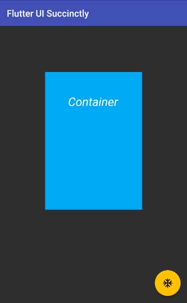
Figure 3-f: A Container Widget with Margin and Padding
By using the EdgeInsets.all(100) instruction to set the margin property of the Container widget, we are indicating that the Container widget will be placed 100 pixels away, in all offsets in terms of visual edges.
By using the EdgeInsets.all(50) instruction to set the padding property of the Container widget, we are indicating that the content of the Container widget (in this case the Text widget assigned to its child property) will be placed 50 pixels away, in all offsets.
However, you might be asking yourself, why then is the Text widget within the Container widget not centered, if padding of 50 pixels was applied in all four offsets (left, top, right, and bottom)?
The reason is that there is a fixed value assigned to the width and height properties. If we want to see the Text aligned within the Container widget, based on the padding assigned, we need to remove the width and height. Let’s do that now.
Code Listing 3-e: Updated main.dart (Container Margin and Padding, Width and Height Removed)
import 'package:flutter/material.dart'; void main() => runApp(MyApp()); class MyApp extends StatelessWidget { @override Widget build(BuildContext context) { return MaterialApp( debugShowCheckedModeBanner: false, home: Scaffold( appBar: AppBar( title: Text('Flutter UI Succinctly'), ), body: Container( margin: EdgeInsets.all(100), padding: EdgeInsets.all(50), color: Colors.lightBlue, child: Text('Container'), ), floatingActionButton: FloatingActionButton( child: Icon(Icons.ac_unit), onPressed: () { print('Oh, it is cold outside...'); }, ), ), theme: ThemeData( primaryColor: Colors.indigo, accentColor: Colors.amber, textTheme: TextTheme( bodyText2: TextStyle( fontSize: 26, fontStyle: FontStyle.italic), ), brightness: Brightness.dark, ), ); } } |
After we remove the width and height properties and save the changes to main.dart, the app’s UI should be updated on the emulator. On my machine, it looks as follows.

Figure 3-g: A Container Widget with Margin and Padding (Width and Height Removed)
After removing the width and height properties from the Container widget, we can see that the padding value is visible on all four offsets, which results in the Text widget being centered within the content of the Container widget.
After doing this small exercise, there’s one key takeaway to keep in mind: sometimes to get a widget’s desired look and feel, you’ll have to be patient and experiment a bit, even though you might know Flutter very well.
Box decorations
A Container widget, which has a square or rectangular shape, might not always be best suited for the look and feel of our app’s UI. This is when the BoxDecoration class comes in handy.
Let’s give this a try. I’ve made some changes to the existing code, which are highlighted in bold in the following listing.
Code Listing 3-f: Updated main.dart (Container with a BoxDecoration)
import 'package:flutter/material.dart'; void main() => runApp(MyApp()); class MyApp extends StatelessWidget { @override Widget build(BuildContext context) { return MaterialApp( debugShowCheckedModeBanner: false, home: Scaffold( appBar: AppBar( title: Text('Flutter UI Succinctly'), ), body: Container( margin: EdgeInsets.all(100), padding: EdgeInsets.all(50), decoration: BoxDecoration( color: Colors.lightBlue, shape: BoxShape.rectangle, ), child: Text('Container'), ), floatingActionButton: FloatingActionButton( child: Icon(Icons.ac_unit), onPressed: () { print('Oh, it is cold outside...'); }, ), ), theme: ThemeData( primaryColor: Colors.indigo, accentColor: Colors.amber, textTheme: TextTheme( bodyText2: TextStyle( fontSize: 26, fontStyle: FontStyle.italic), ), brightness: Brightness.dark, ), ); } } |
After these changes are saved to main.dart, the app’s UI should be updated on the emulator. On my machine, it looks as follows.
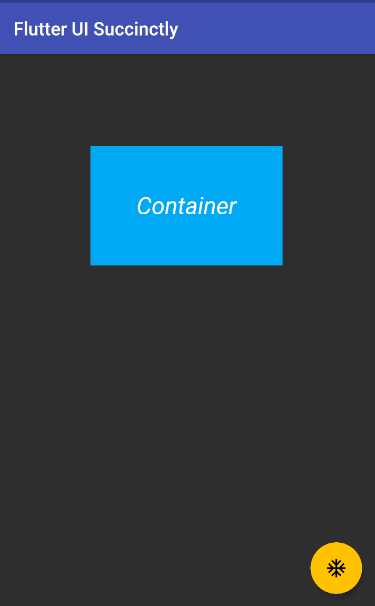
Figure 3-h: A Container Widget with a BoxDecoration (Rectangle)
You might be wondering, what’s the point of changing the code to use a BoxDecoration widget, if we end up with the same look and feel we previously had?
Before answering this question, let’s look at the code changes. To the Container widget, we added a decoration property, to which we assigned a BoxDecoration widget.
The color property was moved within the BoxDecoration widget, and a shape property with a value of BoxShape.rectangle was added.
The reason why no apparent UI changes are visible is that the value of the shape property was set to BoxShape.rectangle.
If we want to see some visible changes, let’s set the value of the shape property to BoxShape.circle. This change is highlighted in bold in the following code.
Code Listing 3-g: Updated main.dart (Container with a Box Decoration Using a Circle)
import 'package:flutter/material.dart'; void main() => runApp(MyApp()); class MyApp extends StatelessWidget { @override Widget build(BuildContext context) { return MaterialApp( debugShowCheckedModeBanner: false, home: Scaffold( appBar: AppBar( title: Text('Flutter UI Succinctly'), ), body: Container( margin: EdgeInsets.all(100), padding: EdgeInsets.all(50), decoration: BoxDecoration( color: Colors.lightBlue, shape: BoxShape.circle, ), child: Text('Container'), ), floatingActionButton: FloatingActionButton( child: Icon(Icons.ac_unit), onPressed: () { print('Oh, it is cold outside...'); }, ), ), theme: ThemeData( primaryColor: Colors.indigo, accentColor: Colors.amber, textTheme: TextTheme( bodyText2: TextStyle( fontSize: 26, fontStyle: FontStyle.italic), ), brightness: Brightness.dark, ), ); } } |
After these changes are saved to main.dart, the app’s UI should be updated on the emulator. On my machine, it looks as follows.
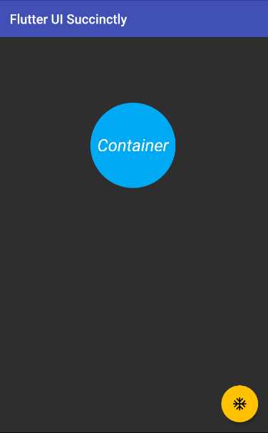
Figure 3-i: A Container Widget with a BoxDecoration (Circle)
Alright, that’s certainly different than what we had before. But, in this context, a circle is also not very useful or aligned with the look and feel we want to give our app.
Maybe adding rounded corners would be more practical from a UI perspective. We can do this by adding a borderRadius property to the BoxDecoraton widget. The changes to the code are highlighted in bold in the following listing.
Code Listing 3-h: Updated main.dart (Container with a BoxDecoration Using borderRadius)
import 'package:flutter/material.dart'; void main() => runApp(MyApp()); class MyApp extends StatelessWidget { @override Widget build(BuildContext context) { return MaterialApp( debugShowCheckedModeBanner: false, home: Scaffold( appBar: AppBar( title: Text('Flutter UI Succinctly'), ), body: Container( margin: EdgeInsets.all(100), padding: EdgeInsets.all(50), decoration: BoxDecoration( color: Colors.lightBlue, shape: BoxShape.rectangle, borderRadius: BorderRadius.only( topRight: Radius.elliptical(50, 50), bottomLeft: Radius.elliptical(25, 25), ), ), child: Text('Container'), ), floatingActionButton: FloatingActionButton( child: Icon(Icons.ac_unit), onPressed: () { print('Oh, it is cold outside...'); }, ), ), theme: ThemeData( primaryColor: Colors.indigo, accentColor: Colors.amber, textTheme: TextTheme( bodyText2: TextStyle( fontSize: 26, fontStyle: FontStyle.italic), ), brightness: Brightness.dark, ), ); } } |
After these changes are saved to main.dart, the app’s UI should be updated on the emulator. On my machine, it looks as follows.
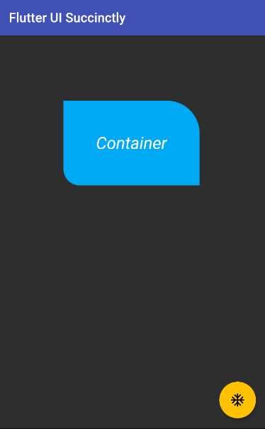
Figure 3-j: A Container Widget with a BoxDecoration (Using borderRadius)
Wow—that looks so much better than using a circle! I’m sure you agree. Let’s analyze these changes.
First, we changed the shape of the BoxDecoration widget back to BoxShape.rectangle. Second, we have added a borderRadius property to the BoxDecoration widget.
The borderRadius property takes a BorderRadius widget that gets instantiated using the only constructor method.
This creates a border radius with only the given non-zero values (the topRight and bottomLeft corners, in this case). The other corners will be right angles.
Both the topRight and bottomLeft corners are assigned the values returned from invoking the Radius.elliptical constructor method, which can create an elliptical radius with the given radii.
The topRight and bottomLeft corners look different because the values passed to the Radius.elliptical method is not the same for both.
You can further experiment with this example, and instead of changing the values for the topRight and bottomLeft corners, you could change the topLeft and bottomRight values, or do any other combination.
Feel free to use the Radius.circular constructor method as well. The following listing contains an example, where the changes are highlighted in bold.
Code Listing 3-i: Updated main.dart (Container with a BoxDecoration Using borderRadius – Another Example)
import 'package:flutter/material.dart'; void main() => runApp(MyApp()); class MyApp extends StatelessWidget { @override Widget build(BuildContext context) { return MaterialApp( debugShowCheckedModeBanner: false, home: Scaffold( appBar: AppBar( title: Text('Flutter UI Succinctly'), ), body: Container( margin: EdgeInsets.all(100), padding: EdgeInsets.all(50), decoration: BoxDecoration( color: Colors.lightBlue, shape: BoxShape.rectangle, borderRadius: BorderRadius.only( topRight: Radius.elliptical(50, 50), topLeft: Radius.circular(20), bottomRight: Radius.elliptical(25, 25), ), ), child: Text('Container'), ), floatingActionButton: FloatingActionButton( child: Icon(Icons.ac_unit), onPressed: () { print('Oh, it is cold outside...'); }, ), ), theme: ThemeData( primaryColor: Colors.indigo, accentColor: Colors.amber, textTheme: TextTheme( bodyText2: TextStyle( fontSize: 26, fontStyle: FontStyle.italic), ), brightness: Brightness.dark, ), ); } } |
After you have made these changes and saved main.dart, the app’s UI should be updated on the emulator. On my machine, it looks as follows.

Figure 3-k: A Container Widget with a BoxDecoration (Using borderRadius – Another Example)
As you have seen, there are quite a lot of possibilities to create useful Container widget shapes when working with the BoxDecoration class. As long as you have a vivid imagination, there are a ton of interesting combinations you can create.
Images
There are occasions when just having a nice looking Container widget might not be enough for your app’s requirements, and you will have to add an image.
We all know how the old saying goes: a picture is worth a thousand words. Images are a great way to add value to your application and provide a user-friendly experience.
Before we can add an image, we need to do a few things. First, we need to find a suitable image. Pixabay is a stock photo and picture website that contains free-to-use images.
I found the following image on the Pixabay website that I’m going to download and use for this example.
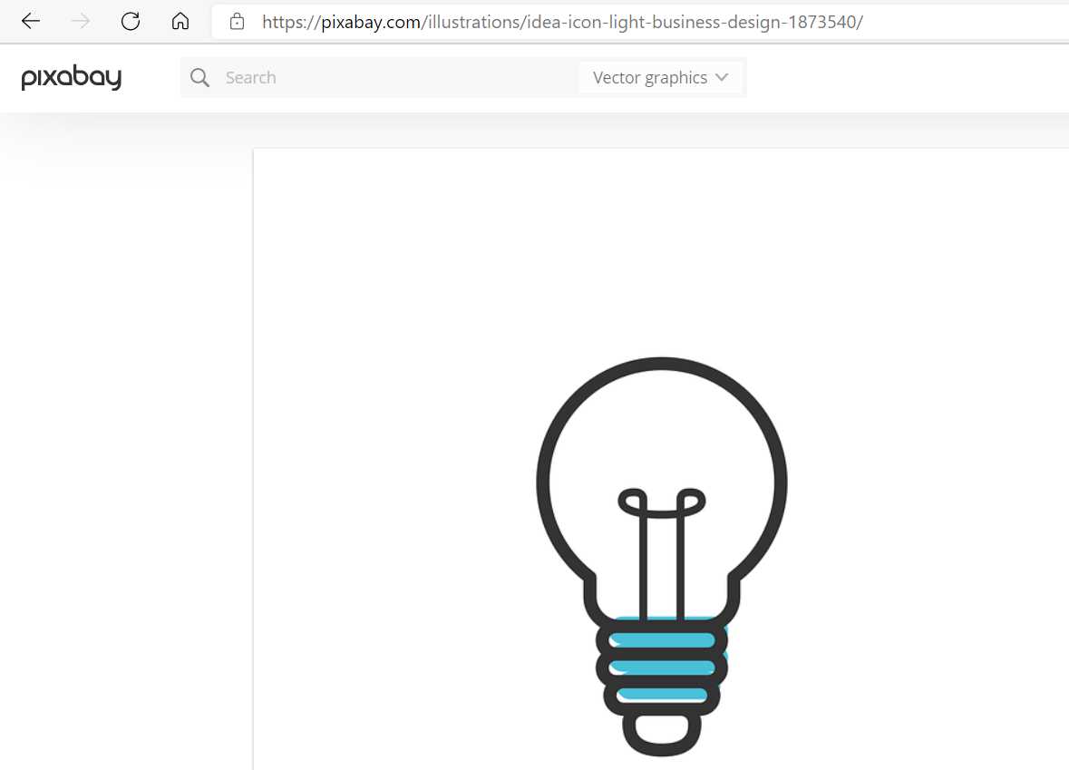
Figure 3-l: Pixabay Stock Image
Once the image has been downloaded, I’m going to switch over to VS Code and create a new folder called images by (1) clicking on the new folder icon under the Flutter project directory, and (2) placing the downloaded image within that folder, as you can see in Figure 3-m.
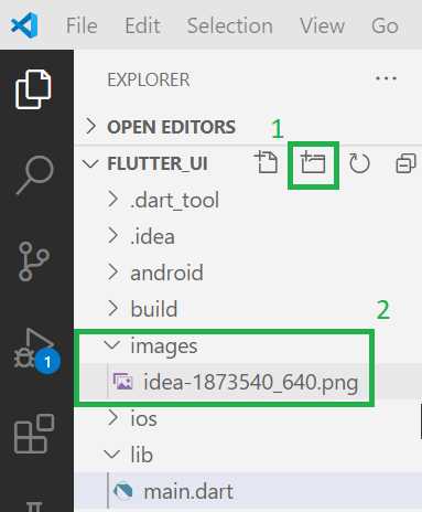
Figure 3-m: Adding an Image Asset to the Flutter Project (VS Code)
Now that we’ve created the images folder and placed the image within it, we need to update our project’s pubspec.yaml file, add an assets section, and add the path to the image.
Here is my updated pubspec.yaml file with the changes highlighted in bold.
Code Listing 3-j: Updated pubspec.yaml (Including the Downloaded Image Path)
name: flutter_ui description: A new Flutter project. publish_to: 'none' version: 1.0.0+1 environment: sdk: ">=2.7.0 <3.0.0" dependencies: flutter: sdk: flutter cupertino_icons: ^1.0.0 dev_dependencies: flutter_test: sdk: flutter flutter: uses-material-design: true assets: - images/idea-1873540_640.png |
As you can see, the assets section has been added, along with the file path to the image, within the images folder where it has been placed.
With that ready, let’s make some code changes to the main.dart file to use the image within the Container widget. The changes are highlighted in bold.
Code Listing 3-k: Updated main.dart (Container with a DecorationImage)
import 'package:flutter/material.dart'; void main() => runApp(MyApp()); class MyApp extends StatelessWidget { @override Widget build(BuildContext context) { return MaterialApp( debugShowCheckedModeBanner: false, home: Scaffold( appBar: AppBar( title: Text('Flutter UI Succinctly'), ), body: Container( margin: EdgeInsets.all(100), padding: EdgeInsets.all(50), decoration: BoxDecoration( color: Colors.lightBlue, shape: BoxShape.rectangle, borderRadius: BorderRadius.only( topRight: Radius.elliptical(50, 50), topLeft: Radius.circular(20), bottomRight: Radius.elliptical(25, 25), ), image: DecorationImage( image: AssetImage("images/idea-1873540_640.png"), fit: BoxFit.cover, ), ), child: Text('Container'), ), floatingActionButton: FloatingActionButton( child: Icon(Icons.ac_unit), onPressed: () { print('Oh, it is cold outside...'); }, ), ), theme: ThemeData( primaryColor: Colors.indigo, accentColor: Colors.amber, textTheme: TextTheme( bodyText2: TextStyle( fontSize: 26, fontStyle: FontStyle.italic), ), brightness: Brightness.dark, ), ); } } |
After you’ve made these changes and saved main.dart, the app’s UI should be updated on the emulator. On my machine, it looks as follows.
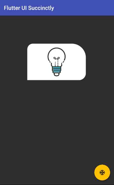
Figure 3-n: A Container Widget with a DecorationImage
To achieve this, we added an image property to the BoxDecoration widget. This image property takes a DecorationImage widget.
The image property of the DecorationImage widget indicates the file path where the image can be found. This path is passed as a parameter to the constructor of the AssetImage class, which is used for fetching images that are specified as Flutter project assets.
The fit property is used to indicate how much space the image will cover within the BoxDecoration widget. In this case, we are indicating that the image will cover the space available, which is why the BoxFit.cover value is assigned to it.
Cool—now we know how to add an image. But what happened to the Text widget? As you can see from the preceding code, the Text widget is still being used, and it’s assigned to the child property of the Container widget. So, why isn’t it visible?
The reason that the Text widget is barely visible is that the color of the text is white, so it fades almost entirely into the background image.
Instead of changing the color of the text, let’s add opacity to the image. The changes to the code are highlighted in bold in the following listing.
Code Listing 3-l: Updated main.dart (Container with a DecorationImage with Opacity)
import 'package:flutter/material.dart'; void main() => runApp(MyApp()); class MyApp extends StatelessWidget { @override Widget build(BuildContext context) { return MaterialApp( debugShowCheckedModeBanner: false, home: Scaffold( appBar: AppBar( title: Text('Flutter UI Succinctly'), ), body: Container( margin: EdgeInsets.all(100), padding: EdgeInsets.all(50), decoration: BoxDecoration( color: Colors.lightBlue, shape: BoxShape.rectangle, borderRadius: BorderRadius.only( topRight: Radius.elliptical(50, 50), topLeft: Radius.circular(20), bottomRight: Radius.elliptical(25, 25), ), image: DecorationImage( colorFilter: ColorFilter.mode( Colors.black.withOpacity(0.6), BlendMode.dstATop), image: AssetImage("images/idea-1873540_640.png"), fit: BoxFit.cover, ), ), child: Text('Container'), ), floatingActionButton: FloatingActionButton( child: Icon(Icons.ac_unit), onPressed: () { print('Oh, it is cold outside...'); }, ), ), theme: ThemeData( primaryColor: Colors.indigo, accentColor: Colors.amber, textTheme: TextTheme( bodyText2: TextStyle( fontSize: 26, fontStyle: FontStyle.italic), ), brightness: Brightness.dark, ), ); } } |
After you’ve made these changes and saved main.dart, the app’s UI should be updated on the emulator. On my machine, it looks as follows.
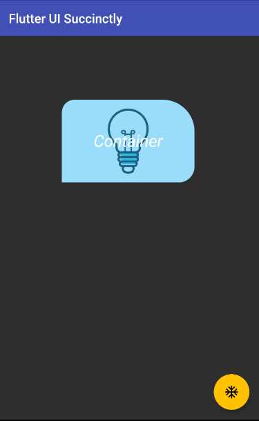
Figure 3-o: A Container Widget with a DecorationImage (with Opacity)
Awesome—we can see that text is visible again. Let’s have a look at the code changes to understand how this works.
What we have done is added a colorFilter property to the DecorationImage widget. To this property, we have assigned the value returned by the ColorFilter.mode constructor method. This method creates a color filter that applies the blend mode given as the second parameter—in this case, BlendMode.dstATop.
We are creating a new blended color that originates from black, on top of the image, with the alpha channel replaced with the given opacity, which is what the instruction Colors.black.withOpacity(0.6) does.
We can also do some other interesting things with the image, like repeating it. Let’s have a look. The changes are highlighted in bold in the following listing.
Code Listing 3-m: Updated main.dart (Container with Image Repetition)
import 'package:flutter/material.dart'; void main() => runApp(MyApp()); class MyApp extends StatelessWidget { @override Widget build(BuildContext context) { return MaterialApp( debugShowCheckedModeBanner: false, home: Scaffold( appBar: AppBar( title: Text('Flutter UI Succinctly'), ), body: Container( width: 450, height: 450, margin: EdgeInsets.all(100), padding: EdgeInsets.all(50), decoration: BoxDecoration( color: Colors.lightBlue, shape: BoxShape.rectangle, borderRadius: BorderRadius.only( topRight: Radius.elliptical(50, 50), topLeft: Radius.circular(20), bottomRight: Radius.elliptical(25, 25), ), image: DecorationImage( colorFilter: ColorFilter.mode( Colors.black.withOpacity(0.6), BlendMode.dstATop), image: AssetImage("images/idea-1873540_640.png"), repeat: ImageRepeat.repeatY, ), ), child: Text('Container'), ), floatingActionButton: FloatingActionButton( child: Icon(Icons.ac_unit), onPressed: () { print('Oh, it is cold outside...'); }, ), ), theme: ThemeData( primaryColor: Colors.indigo, accentColor: Colors.amber, textTheme: TextTheme( bodyText2: TextStyle( fontSize: 26, fontStyle: FontStyle.italic), ), brightness: Brightness.dark, ), ); } } |
After you’ve made these changes and saved main.dart, the app’s UI should be updated on the emulator. On my machine, it looks as follows.
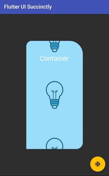
Figure 3-p: A Container Widget with a DecorationImage (with Image Repetition)
The first thing to notice (which might not be that obvious) is that the fit property was removed from the DecorationImage widget. This was done so that the image doesn’t take all the widget’s area.
Next, to the Container widget, we added fixed values for the width and height properties. This was done so that the Container widget is big enough to be able to repeat the image.
Finally, we added a repeat property to the DecorationImage widget, setting its value to ImageRepeat.repeatY, which indicates that the image will be repeated vertically.
Gradients
Now that we’ve seen how to use the BoxDecoration widget and also how to work with images, we can also use Flutter’s Gradient class.
We can easily achieve this by adding a gradient property to the BoxDecoration widget. Let’s have a look. The code changes are highlighted in the following listing.
Code Listing 3-n: Updated main.dart (Container with a LinearGradient)
import 'package:flutter/material.dart'; void main() => runApp(MyApp()); class MyApp extends StatelessWidget { @override Widget build(BuildContext context) { return MaterialApp( debugShowCheckedModeBanner: false, home: Scaffold( appBar: AppBar( title: Text('Flutter UI Succinctly'), ), body: Container( decoration: BoxDecoration( color: Colors.lightBlue, gradient: LinearGradient( begin: Alignment.topRight, end: Alignment.bottomLeft, colors: [Colors.blue, Colors.orange]), shape: BoxShape.rectangle, ), ), floatingActionButton: FloatingActionButton( child: Icon(Icons.ac_unit), onPressed: () { print('Oh, it is cold outside...'); }, ), ), theme: ThemeData( primaryColor: Colors.indigo, accentColor: Colors.amber, textTheme: TextTheme( bodyText2: TextStyle( fontSize: 26, fontStyle: FontStyle.italic), ), brightness: Brightness.dark, ), ); } } |
After we’ve made these changes and saved main.dart, the app’s UI should be updated on the emulator. On my machine, it looks as follows.
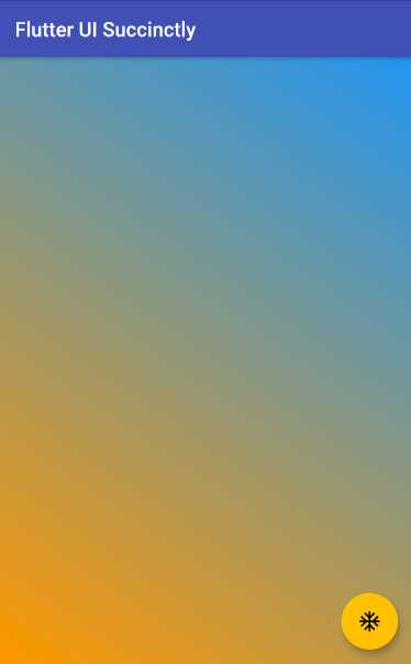
Figure 3-q: A Container Widget with a LinearGradient
Now, look at that—the UI looks awesome! You might have noticed that besides the changes highlighted in bold, the margin, padding, and child properties of the Container widget were removed. This was done so that the Container widget could take the available space.
Furthermore, the borderRadius property was removed from the BoxDecoration widget, and a gradient property was added.
With regards to the gradient property, this is assigned to a LinearGradient widget, starting with the blue color on the topRight corner, and ending with the orange color on the bottomLeft corner. To understand this better, let’s look at the following diagram.
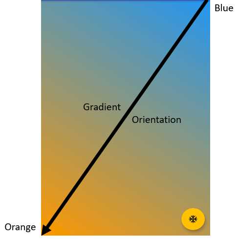
Figure 3-r: LinearGradient Orientation Example
By using the LinearGradient widget, we can combine colors from a beginning to an endpoint, resulting in a beautiful display of gradients using the colors specified within the colors property.
Experimenting with gradients is a bit like being a painter. You have a canvas, multiple colors, and combinations to experiment with, where you are only limited by your imagination (and the colors available).
Let’s experiment a bit more with gradients, and make some changes to the code. These changes are highlighted in bold in the following code.
Code Listing 3-o: Updated main.dart (Container with a LinearGradient – Mirror TileMode)
import 'package:flutter/material.dart'; void main() => runApp(MyApp()); class MyApp extends StatelessWidget { @override Widget build(BuildContext context) { return MaterialApp( debugShowCheckedModeBanner: false, home: Scaffold( appBar: AppBar( title: Text('Flutter UI Succinctly'), ), body: Container( decoration: BoxDecoration( color: Colors.lightBlue, gradient: LinearGradient( begin: Alignment(0, -1), end: Alignment(0, -0.4), tileMode: TileMode.mirror, colors: [Colors.blue, Colors.orange]), shape: BoxShape.rectangle, ), ), floatingActionButton: FloatingActionButton( child: Icon(Icons.ac_unit), onPressed: () { print('Oh, it is cold outside...'); }, ), ), theme: ThemeData( primaryColor: Colors.indigo, accentColor: Colors.amber, textTheme: TextTheme( bodyText2: TextStyle( fontSize: 26, fontStyle: FontStyle.italic), ), brightness: Brightness.dark, ), ); } } |
Before we save the changes and see them on the emulator, let’s try to understand how alignment coordinates work in Flutter by looking at the following diagram.
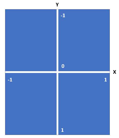
Figure 3-s: Alignment Coordinates in Flutter
By using the alignment coordinates between the values of -1 and 1, you can align widgets in the available space, both horizontally and vertically.
So, in this latest example, what we have done is set the value of the begin property (which uses the blue color) to start with the coordinates X=0, Y=-1. This will make the blue color appear first within the available space.
We’ve also set the value of the end property (which uses the orange color) to start with the coordinates X=0, Y=-0.4. This will make the orange color appear after the blue color within the available space, but while taking a bit less space.
After making these changes and saving main.dart, we should see the app’s UI updated on the emulator. On my machine, it looks as follows.
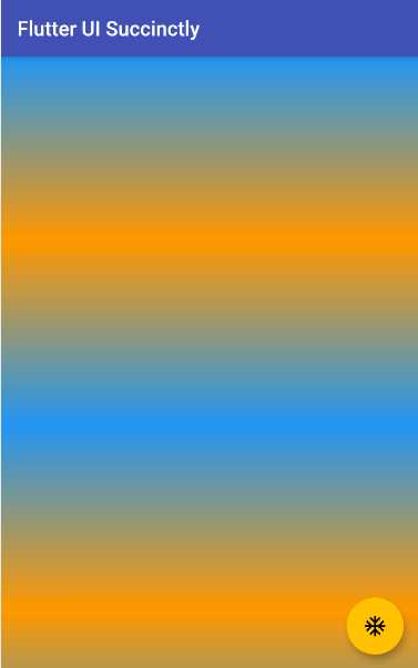
Figure 3-t: A Container Widget with a LinearGradient – Mirror TileMode
I’m sure you agree with me that this effect looks quite cool. This is one of the many reasons why Flutter, in my opinion, is such a great platform for creating amazing UIs.
However, if the orange color in principle should be taking a bit less space than the blue color, how is it possible that to the naked eye, it would seem that the orange color is more prevalent than the blue color?
The reason that the orange color seems more prevalent is that we are using a TileMode.mirror effect. This means that the original color reflects itself (including its gradient variations), resulting in two areas with blue, and two areas with orange.
Therefore, given the dimensions of the emulator screen, and the order in which the colors are positioned, the orange color and its gradient variations are slightly favored, rather than the blue color and its variations. Thus, the orange seems a bit more prevalent.
Let’s experiment a little bit more, by using a RadialGradient class instead of the LinearGradient we are currently using.
What I would like to achieve is to have a background effect that originates from the center of the Container widget, using concentric circles that begin with blue, then use deepPurple (as the background), and end with lightBlue.
In other words, something that looks similar to two images I’ve found on this science photo library website.
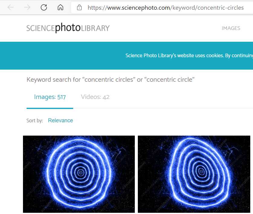
Figure 3-u: The Desired RadialGradient Effect
Creating something similar to this in Flutter is easier than you might think. Let’s see how—the changes are highlighted in bold in the following code.
Code Listing 3-p: Updated main.dart (Container with a RadialGradient)
import 'package:flutter/material.dart'; void main() => runApp(MyApp()); class MyApp extends StatelessWidget { @override Widget build(BuildContext context) { return MaterialApp( debugShowCheckedModeBanner: false, home: Scaffold( appBar: AppBar( title: Text('Flutter UI Succinctly'), ), body: Container( decoration: BoxDecoration( color: Colors.lightBlue, gradient: RadialGradient( radius: 0.15, center: Alignment(0, 0), tileMode: TileMode.mirror, colors: [Colors.blue, Colors.deepPurple, Colors.lightBlue]), shape: BoxShape.rectangle, ), ), floatingActionButton: FloatingActionButton( child: Icon(Icons.ac_unit), onPressed: () { print('Oh, it is cold outside...'); }, ), ), theme: ThemeData( primaryColor: Colors.indigo, accentColor: Colors.amber, textTheme: TextTheme( bodyText2: TextStyle( fontSize: 26, fontStyle: FontStyle.italic), ), brightness: Brightness.dark, ), ); } } |
After making these changes and saving main.dart, we should see the app’s UI updated on the emulator. On my machine, it looks as follows.
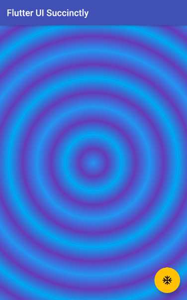
Figure 3-v: A Container Widget with a RadialGradient (Concentric Circles)
That looks fairly similar to the concentric circles from the science photo library website, which is awesome!
By looking at the code changes, we can see that a RadialGradient widget was used instead of a LinearGradient widget.
The two key properties that make the effect possible are the radius property, which indicates how big the circles are, and the center property, which specifies where the innermost circle (the first drawn) and subsequent ones will be placed on the screen.
The higher the value of the radius property, the larger the circles, which means that fewer of them would fit on the screen. The lower the value of radius property, the smaller the circles, which means that more of them would fit on the screen.
By setting the value of the center property to Alignment(0, 0), we are indicating that the most inner circle will be drawn on the alignment coordinates with a value of X=0, Y=0, which corresponds to the center of the Container widget.
Finally, instead of using two colors, we used three colors, which are rendered in the same order as they are described within the colors property of the RadialGradient widget.
By implementing these small changes, we were able to come up with an interesting effect.
Summary
Throughout this chapter, we’ve explored in depth how to create and work with the Container widget. This is one of the most useful widgets that Flutter has to offer, and it is a fundamental component when it comes to building Flutter UIs.
Although quite a lot can be achieved when working with Container and related child widgets, we are still missing a couple of key features required for building a UI with Flutter, such as rows and columns.
When rows and columns are used in combination with Scaffold and Container widgets, we suddenly find ourselves with unlimited possibilities of what layouts we can build with Flutter. This is what the next chapter is all about.
- Advanced custom widgets and file-format libraries.
- Built from scratch.
- Dart-powered widgets for extraordinary apps.
- A wide range of products and hassle-free licensing.