
Flutter Succinctly®

CHAPTER 3
App UI—Document Details
Quick intro
Throughout this chapter, we’ll look at how to create some of the required UI parts of our application, which is essentially the Document Details screen. Without further ado, let’s dive right in.
Document Details
We’ve reached quite a milestone! We’ve pretty much written all the utility and underlying database code that our application will use. But we are not done yet—we still need to create the UI logic that our application will use.
We’ll start writing that UI logic by creating the Document Details window, which will contain the details of each document that our application will store.
So, under the project’s lib folder, create a subfolder called ui, and under it, create a new file called docdetail.dart. This is how your lib folder structure should look so far.
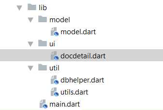
Figure 3-a: The project’s lib folder structure so far
With the docdetail.dart file created, let’s add some code—we’ll start by importing the references to the libraries and packages we’ll need.
Code Listing 3-a: Import statements—docdetail.dart
import 'dart:async'; import 'package:flutter/material.dart'; import 'package:flutter/services.dart'; import 'package:flutter_masked_text/flutter_masked_text.dart'; import 'package:flutter_datetime_picker/flutter_datetime_picker.dart'; import '../model/model.dart'; import '../util/utils.dart'; import '../util/dbhelper.dart'; |
Okay—let’s check what references we’ve imported. First, we are importing the dart:async library, which we’ll need to make asynchronous calls to the database.
Next, we reference the Flutter Material Design (package:flutter/material.dart) and Services (package:flutter/services.dart) packages. Material Design is used for the app’s UI layout, and the Services library exposes platform-specific services to Flutter apps, such as handling text input.
Following that, notice how we are referencing two packages we have not come across before. The first one is going to be used for a masked text input field, which we will use for entering dates manually: flutter_masked_text.dart.
The second is going to be used for selecting dates, as you would normally do using an iPhone. It is inspired by the Flutter Cupertino Date Picker component, flutter_datetime_picker.dart.
We can see an example of it as follows.
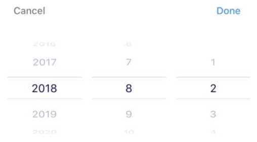
Figure 3-b: The Flutter Cupertino Date Picker
The final three import statements refer to the code files we previously wrote and will need to use in docdetail.dart, These are: model.dart, utils.dart, and dbhelper.dart.
Something very important we need to do is add a reference to the flutter_masked_text and flutter_datetime_picker packages to the Pubspec.yaml file, and then install the referenced packages using the Packages get option, which can be seen as follows.
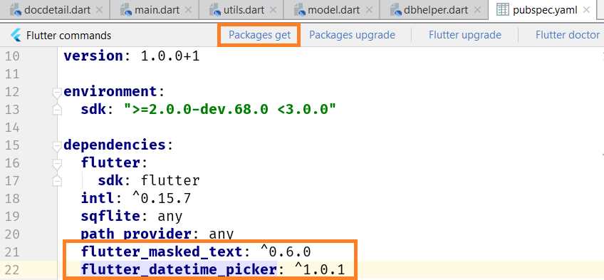
Figure 3-c: Adding the packages—Pubspec.yaml
That wraps up the import statements that the docdetail.dart file needs. Next, let’s add a menu option that allows us to delete a document in case it was incorrectly entered.
Menu options
For every document that exists within the database that can be edited, we should also have the option to remove it. This is particularly useful if you’ve entered a document that is incorrect. We can do this as follows.
Code Listing 3-b: Delete document menu option—docdetail.dart
// Import statements… previous code. // Menu item const menuDelete = "Delete"; final List<String> menuOptions = const <String> [ menuDelete ]; // More code will follow… |
As you can see, the Delete menu option is simply an element that is part of a menuOptions array that we’ll add to the Flutter UI shortly.
We could add more menu options to this array, but the only one we really need is the option to delete an existing document, for which we’ll add the logic later.
Stateful widget
We are now ready to create the base widget that will be used within docdetail.dart. This is going to be a stateful widget, which is a widget that describes part of the user interface by building a set of other widgets that describe the user interface more concretely.
The stateful widget has a state that can change. The state is information that can be read synchronously when the widget is built and might change during its lifetime.
Having a stateful widget is useful when part of the user interface that is being rendered can change dynamically. This is exactly our case, as docdetail.dart will contain document details that can vary.
Let’s go ahead and define the stateful widget we will use for rendering the UI of docdetail.dart.
Code Listing 3-c: Stateful widget class—docdetail.dart
// Previous code… class DocDetail extends StatefulWidget { Doc doc; final DbHelper dbh = DbHelper(); DocDetail(this.doc); @override State<StatefulWidget> createState() => DocDetailState(); } // More code will follow… |
As we can see, a stateful widget is simply a Dart class—in this case called DocDetail—that inherits from the base StatefulWidget Flutter UI class.
This class has a constructor called DocDetail that is initialized with an instance of the Doc class from model.dart.
A very important part of the DocDetail class is the createState method inherited from the StatefulWidget class, which needs to be overridden—that’s why the @override attribute is used. The overriding is done by invoking an instance of the DocDetailState class using the lambda or arrow (=>) syntax.
Notice that an instance of the DbHelper class is created and assigned to the dbh (database handler) variable, which will be used by the logic contained within docdetail.dart to read and write to the database.
As you can see in Code Listing 3-c, there is a pattern—for each StatefulWidget class, there is a corresponding State class. Let’s go ahead and create that State class as follows.
Code Listing 3-d: State class—docdetail.dart
// Previous code… class DocDetailState extends State<DocDetail> { final GlobalKey<FormState> _formKey = new GlobalKey<FormState>(); final GlobalKey<ScaffoldState> _scaffoldKey = new GlobalKey<ScaffoldState>(); final int daysAhead = 5475; // 15 years in the future. final TextEditingController titleCtrl = TextEditingController(); final TextEditingController expirationCtrl = MaskedTextController( mask: '2000-00-00'); bool fqYearCtrl = true; bool fqHalfYearCtrl = true; bool fqQuarterCtrl = true; bool fqMonthCtrl = true; bool fqLessMonthCtrl = true; // More code to follow… } |
Here we have our DocDetailState class declared. As you can see, it inherits from State<DocDetail>, which means that this class handles the state of the DocDetail stateful widget class we previously declared.
Within the DocDetailState class, we have declared a set of variables that we will need, and they represent the state of a document being created or edited. Let’s explore these variables and what they are used for.
The first two variables we have declared, _formKey and _scaffoldKey, are going to be used for keeping the state of the form once it has been submitted—when the data is saved.
The FormState class in Flutter is associated with keeping the state of a Form widget, which we will add shortly to the DocDetailState class code.
The ScaffoldState class in Flutter handles the state for a Scaffold object. The Scaffold widget will contain the Form widget—we’ll see this later.
Next, we have declared a variable called daysAhead, which indicates how far into the future we can assign an expiration date to a document.
This has been set to a maximum of 5,475 days (approximately 15 years) into the future, which is usually longer than the expiration date of standard types of documents such as passports, credit cards, and driver’s licenses. So, the expiration date of a document cannot be greater than the value of daysAhead.
Following that, we have two TextEditingController variables: one for the document’s title (or description), titleCtrl, and another for the document’s expiration date, expirationCtrl.
A TextEditingController represents a handy controller for a text field. So, when the text field associated with the TextEditingController has been modified, the text field updates its value property and the controller notifies its listeners. You can find more details on the official Flutter documentation.
Given that both the document title and expiration date can be manually entered, it is logical to bind both to TextEditingController objects.
The main difference between them is that the expiration date field, which binds to expirationCtrl, is instantiated as a MaskedTextController and assigned a default mask, so when the date is manually entered, it follows the date format YYYY-MM-DD (for example, 2020-10-12).
Notice that, so far, all the variables declared within the DocDetailState class have been marked as final, which means that their value can only be set once.
Finally, we have five variables (which are technically objects) that represent the specific alerts of when we would like the application to remind us that a document is going to expire.
We won’t implement the alert mechanism itself within the scope of this book. However, by adding these variables (which already have their matching columns in the database), we leave these building blocks ready. So in the future, you could add your own alert mechanism using these variables:
- The fqYearCtrl variable, when set to true, would indicate that we would like our app to remind us of the expiration date of a document when it’s due to expire within a year’s time.
- The fqHalfYearCtrl variable, when set to true, would indicate that we would like our app to remind us of the expiration date of a document when it’s due to expire within the next six months.
- The fqQuarterCtrl variable, when set to true, would indicate that we would like our app to remind us of the expiration date of a document when it’s due to expire within the next three months.
- The fqMonthCtrl variable, when set to true, would indicate that we would like our app to remind us of the expiration date of a document when it’s due to expire within the next month.
- The fqLessMonthCtrl variable, when set to true, would indicate that we would like our app to remind us of the expiration date of a document when it’s due to expire less than a month from now.
These are all the variables needed within the DocDetailState class. Let’s move on with the rest of the code.
Initializing text controllers and variables
When the Document Details screen is shown, it is important that the right data is correctly displayed to the user—this could be data from an existing document on the database, or alternatively, blank data. Let’s see an example of each.
Here’s an example of how the Document Details screen looks when loading data from an existing document.
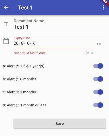
Figure 3-d: Document Details screen—Existing document
As you can see, all the respective variables we previously described—represented by those UI widgets—have corresponding values assigned, which represent the value stored in the database for that document.
Let’s now have a look at how this same screen would look for an empty document.
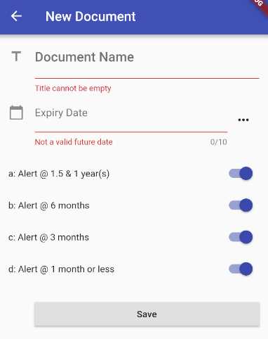
Figure 3-e: Document Details screen—New document
Notice that the Document Name and Expiry Date fields are empty; however, by default, the alert fields are all enabled, which is what the initialization code is responsible for.
Code Listing 3-e: Initialization code—docdetail.dart
// Previous code… class DocDetailState extends State<DocDetail> { // Previous code // Initialization code void _initCtrls() { titleCtrl.text = widget.doc.title != null ? widget.doc.title : ""; expirationCtrl.text = widget.doc.expiration != null ? widget.doc.expiration : ""; fqYearCtrl = widget.doc.fqYear != null ? Val.IntToBool(widget.doc.fqYear) : false; fqHalfYearCtrl = widget.doc.fqHalfYear != null ? Val.IntToBool(widget.doc.fqHalfYear) : false; fqQuarterCtrl = widget.doc.fqQuarter != null ? Val.IntToBool(widget.doc.fqQuarter) : false; fqMonthCtrl = widget.doc.fqMonth != null ? Val.IntToBool(widget.doc.fqMonth) : false; } // More code will follow… } |
As you can see, all we are doing is assigning a value to each of the variables that are represented on the screen by using a ternary conditional expression.
This means that if there’s a value assigned to its corresponding doc property, then that value is assigned to the variable if no default value is assigned.
In essence, if there’s a doc object with values, those values will be used and assigned to their corresponding variables (field widgets seen on the screen). But where is this doc object coming from?
That doc object is the model representation of a document record stored in the database, if there is one. It’s the doc property of the DocDetail class. To understand this better, let’s have a look at the following diagram.
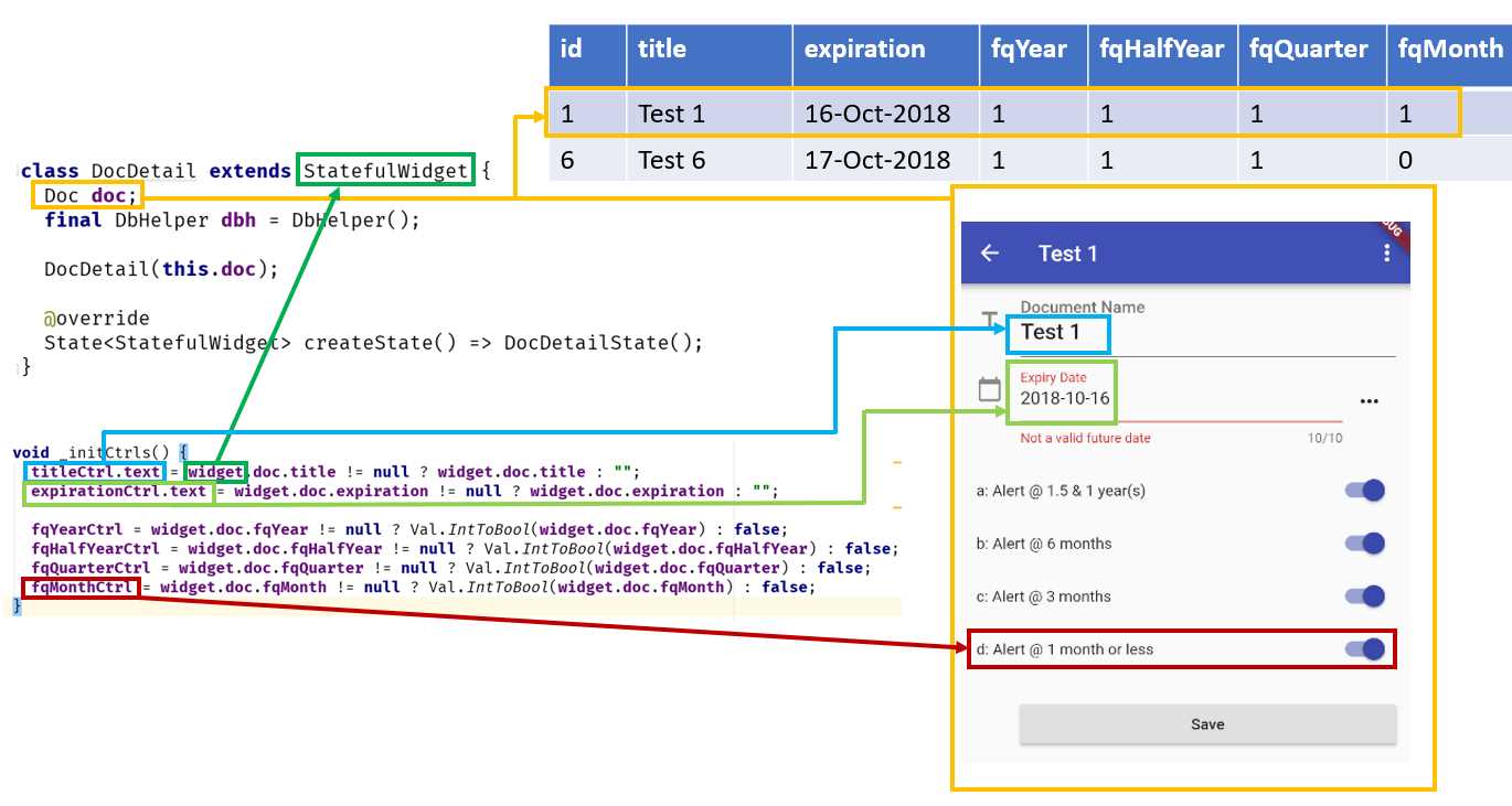
Figure 3-f: Relationship among the code, screen and database—Document Details
Now that we know how the initialization code relates to the Document Details screen, and how this relates to a record stored in the database, let’s move on and focus on how to create the required UI widgets and their underlying logic.
Choosing a date
One of the nicest features about the Document Details screen is the possibility to be able to either manually enter the document’s expiration date, or choose it from an iOS-styled date picker component, which looks like the following image.
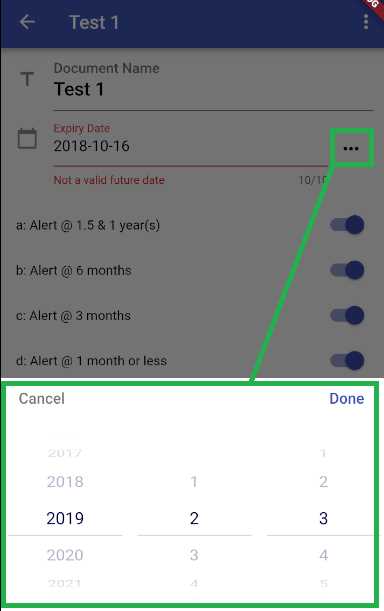
Figure 3-g: iOS-styled date-picker component
Let’s write the code that displays this component and allows us to choose the date without having to write it manually.
Code Listing 3-f: Date-picker code—docdetail.dart
// Previous code… class DocDetailState extends State<DocDetail> { // Previous code // Date Picker & Date function Future _chooseDate(BuildContext context, String initialDateString) async { var now = new DateTime.now(); var initialDate = DateUtils.convertToDate(initialDateString) ?? now; initialDate = (initialDate.year >= now.year && initialDate.isAfter(now) ? initialDate : now); DatePicker.showDatePicker(context, showTitleActions: true, onConfirm: (date) { setState(() { DateTime dt = date; String r = DateUtils.ftDateAsStr(dt); expirationCtrl.text = r; }); }, currentTime: initialDate); }
// More code to follow… } |
Let’s go over what this method does. The first thing we see is the _chooseDate method, which is marked as async and returns a Future object.
This is because the _chooseDate method is going to be triggered when the “…” button on the Expiry Date field is tapped—this corresponds to an onPressed event, so the operation needs to be asynchronous.
Notice the parameters being passed to the _chooseDate method. One is of type BuildContext, and the other of type initialDateString, which indicates an initialization date passed as a String object.
The BuildContext class handles the location of the widget in Flutter’s internal widget tree. You can find additional information about this class here.
In the _chooseDate method, the first thing that happens within the first two lines of code is that the initialDate is assigned to either the DateTime value of initialDateString, or to the current DateTime value, when the DateTime value of initialDateString is null.
var now = new DateTime.now();
var initialDate = DateUtils.convertToDate(initialDateString) ?? now;
We need to ensure that the date-picker component doesn’t give us the possibility to choose a date that is in the past. Therefore, the code checks if the value of initialDate is in the future, or at least equal to the current date. If so, the value of initialDate is used; otherwise, the current date value is used, represented by the variable now. This then becomes the final value of the initialDate variable.
initialDate = (initialDate.year >= now.year &&
initialDate.isAfter(now) ? initialDate : now);
The final value of initialDate is passed on to the showDatePicker method and assigned to the currentTime property of the DatePicker instance.
The actual date assignment happens within the onConfirm event of the DatePicker instance.
The onConfirm event gets triggered when a date is selected from the date-picker component and the Done button is tapped.
The date parameter passed to the onConfirm event corresponds to the date chosen using the date-picker component.
All the logic that follows is executed inside the setState method, which notifies the Flutter framework that the internal state of DocDetailState has changed.
setState(() {
DateTime dt = date;
String r = DateUtils.ftDateAsStr(dt);
expirationCtrl.text = r;
});
That selected date is converted to a DateTime value, formatted accordingly using the ftDateAsString method from the DateUtils class, and assigned to the Expiry Date field, which is represented by expirationCtrl.text.
Deleting a document
Remember the menu options array we previously created? We are now going to put it to use.
The reason is that the application needs to give users the ability to be able to delete a document, in case it was entered incorrectly, or it is no longer valid (expired a long time ago).
This option is accessed by clicking the “…” button on the top, next to the title of the document.
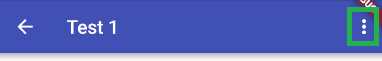
Figure 3-h: The document menu
Here is what the menu option to delete a document looks like.
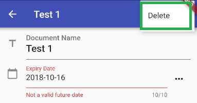
Figure 3-i: The delete document menu option
Let’s explore the code-behind, to see what it does.
Code Listing 3-g: Delete document code—docdetail.dart
// Previous code… class DocDetailState extends State<DocDetail> { // Previous code // Upper Menu void _selectMenu(String value) async { switch (value) { case menuDelete: if (widget.doc.id == -1) { return; } await _deleteDoc(widget.doc.id); } } // Delete doc void _deleteDoc(int id) async { int r = await widget.dbh.deleteDoc(widget.doc.id); Navigator.pop(context, true); }
// More code to follow… } |
If we inspect the code more closely, we can see that we have two methods, each responsible for an action. The _selectMenu method is invoked when the user selects the menuDelete option—we’ll look at that specific trigger later.
This method invokes the _deleteDoc method when the active document on the Document Details screen is not empty, which means that it exists in the database—it has a corresponding record.
When the document is new (empty), the method returns to its caller. This is what the widget.doc.id == -1 conditional check is for.
The _deleteDoc method is very simple—all it does is invoke the deleteDoc method from the dbh (database helper) instance through the parent DocDetail stateful widget. This will remove the corresponding document record from the database.
Then, the control is returned to the main screen by closing the current context (the Document Details screen) by calling the Navigator.pop method.
You can find additional information about how to navigate between Flutter screens in the official documentation.
Now that we know how to delete a document, let’s explore how we can save the data entered through the Document Details screen.
Saving a document
A fundamental part of the Document Details screen is the ability to save data that has been entered or has changed—this what the following code does.
Code Listing 3-h: Save document code—docdetail.dart
// Previous code… class DocDetailState extends State<DocDetail> { // Previous code // Save doc void _saveDoc() { widget.doc.title = titleCtrl.text; widget.doc.expiration = expirationCtrl.text; widget.doc.fqYear = Val.BoolToInt(fqYearCtrl); widget.doc.fqHalfYear = Val.BoolToInt(fqHalfYearCtrl); widget.doc.fqQuarter = Val.BoolToInt(fqQuarterCtrl); widget.doc.fqMonth = Val.BoolToInt(fqMonthCtrl); if (widget.doc.id > -1) { debugPrint("_update->Doc Id: " + widget.doc.id.toString()); widget.dbh.updateDoc(widget.doc); Navigator.pop(context, true); } else { Future<int> idd = widget.dbh.getMaxId(); idd.then((result) { debugPrint("_insert->Doc Id: " + widget.doc.id.toString()); widget.doc.id = (result != null) ? result + 1 : 1; widget.dbh.insertDoc(widget.doc); Navigator.pop(context, true); }); } } // More code to follow… } |
The first two lines of code read the values entered through titleCtrl.text and expirationCtrl.text fields, which correspond to the Document Name and Expiry Date fields seen on the screen, and assign them to their corresponding properties within the doc instance. This represents the object model that is stored in the database.
The following four lines of code do the same for the alert properties. The only difference is that those widgets on the screen have a value of on (true) or off (false), which need to be converted to their integer equivalent, so they can be saved in the database. This Boolean-to-integer conversion is done by invoking the BoolToInt method from the Val class (found in utils.dart).
To better understand this, let’s have a look at the following figure.
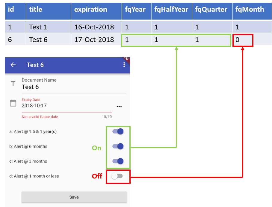
Figure 3-j: The on and off alerts database values
At this stage, we have assigned all the values to the doc instance that is going to be saved to the database. Next comes the most interesting part of the _saveDoc method.
To be able to save the data correctly, we need to check if the data being entered corresponds to a new document or an existing one.
If the condition (widget.doc.id > -1) evaluates to true, then we are modifying an existing document. Therefore, we invoke the updateDoc method from the dbh (database handler) instance and pass the document object model (doc) that is going to be updated.
If the condition (widget.doc.id > -1) evaluates to false, then we are saving a new document to the database. Therefore, we invoke the insertDoc method from the dbh (database handler) instance and pass the document object model (doc) that is going to be inserted.
Notice that when inserting a new document, we need to make sure that we assign a doc.id value that is larger than the largest doc.id value stored in the database table. Therefore, we invoke the getMaxId method.
Finally, to return the navigation control back to the main screen, we invoke Navigator.pop.
Submitting the form
We now know how we can save newly entered data, or data that has been modified from the Document Details screen—but how does that save action get triggered?
Just like with HTML, Flutter has the concept of a form—and as you might have guessed, forms in Flutter can also be submitted. Submitting a form is what triggers the save action.
Let’s look at the code to understand better how this works.
Code Listing 3-i: Submitting a form code—docdetail.dart
// Previous code… class DocDetailState extends State<DocDetail> { // Previous code // Submit form void _submitForm() { final FormState form = _formKey.currentState; if (!form.validate()) { showMessage('Some data is invalid. Please correct.'); } else { _saveDoc(); } } void showMessage(String message, [MaterialColor color = Colors.red]) { _scaffoldKey.currentState .showSnackBar(new SnackBar(backgroundColor: color, content: new Text(message))); } // More code to follow… } |
The _submitForm method is quite simple. First, we get the current state of the form. We do this by invoking _formKey.currentState and assigning that value to an instance of the FormState Flutter class.
The great thing about forms in Flutter is that they are almost self-managed and keep their state, so to know if something has changed, all we need to do is invoke the validate method from the FormState instance.
If the validate method returns true, it means that the field values on the form are valid and the data is okay to be saved, so the _saveDoc method can be invoked.
If the validate method returns false, it means that one or more field values on the form are invalid and the data cannot be saved, so an alert message is displayed to the user. This is what the showMessage method does.
The showMessage method displays a message—this is achieved by using a SnackBar widget, which we can see as follows.
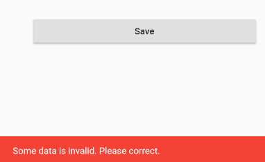
Figure 3-k: The SnackBar displayed—Invalid form data
Now that we know how the save action gets triggered, let’s wrap this up and build the UI, which is what we’ll do next.
Building the UI
We’ve reached the last part of docdetail.dart, which is both a major milestone for us and exciting at the same time.
Throughout this last part, our focus is going to be on how to build the UI and tie together all the previous docdetail.dart code parts we’ve written.
Let’s start off by overriding a fundamental method of the inherited State class, which is the initState method.
Code Listing 3-j: The initState method—docdetail.dart
// Previous code… class DocDetailState extends State<DocDetail> { // Previous code @override void initState() { super.initState(); _initCtrls(); } // More code to follow… } |
The initState method is responsible for initializing the state of its class—in this case, the DocDetailState class. This is where we can do all initializations needed before building the UI.
This method is described with the @override attribute, as it overrides the behavior of the initState method inherited from the State<DocDetail> class.
Within the method, the inherited initState method from the State<DocDetail> class is called. This is done by invoking it as super.initState.
Following that, the _initCtrls method is called, which, as you might remember, is responsible for initializing the values of the text controllers and alert reminder widgets.
It’s important to note that the initState method gets triggered by the Flutter framework when the object is inserted into the widget tree. You can find more details about the initState method within the official Flutter documentation.
With the initState method described, we are now ready to build the UI—this is done with the build method. The complete code of the build method for the DocDetailState class looks as follows.
Code Listing 3-k: The build method—Docdetail.dart
// Previous code… class DocDetailState extends State<DocDetail> { // Previous code @override Widget build(BuildContext context) { const String cStrDays = "Enter a number of days"; TextStyle tStyle = Theme.of(context).textTheme.title; String ttl = widget.doc.title; return Scaffold( key: _scaffoldKey, resizeToAvoidBottomPadding: false, appBar: AppBar( title: Text(ttl != "" ? widget.doc.title : "New Document"), actions: (ttl == "") ? <Widget>[]: <Widget>[ PopupMenuButton( onSelected: _selectMenu, itemBuilder: (BuildContext context) { return menuOptions.map((String choice) { return PopupMenuItem<String>( value: choice, child: Text(choice), ); }).toList(); }, ), ] ), body: Form( key: _formKey, autovalidate: true, child: SafeArea( top: false, bottom: false, child: ListView( padding: const EdgeInsets.symmetric(horizontal: 16.0), children: <Widget>[ TextFormField ( inputFormatters: [ WhitelistingTextInputFormatter( RegExp("[a-zA-Z0-9 ]")) ], controller: titleCtrl, style: tStyle, validator: (val) => Val.ValidateTitle(val), decoration: InputDecoration( icon: const Icon(Icons.title), hintText: 'Enter the document name', labelText: 'Document Name', ), ), Row(children: <Widget>[ Expanded( child: TextFormField( controller: expirationCtrl, maxLength: 10, decoration: InputDecoration( icon: const Icon(Icons.calendar_today), hintText: 'Expiry date (i.e. ' + DateUtils.daysAheadAsStr(daysAhead) + ')', labelText: 'Expiry Date' ), keyboardType: TextInputType.number, validator: (val) => DateUtils.isValidDate(val) ? null : 'Not a valid future date', )), IconButton( icon: new Icon(Icons.more_horiz), tooltip: 'Choose date', onPressed: (() { _chooseDate(context, expirationCtrl.text); }), ) ]), Row(children: <Widget>[ Expanded(child: Text(' ')), ]), Row(children: <Widget>[ Expanded(child: Text('a: Alert @ 1.5 & 1 year(s)')), Switch( value: fqYearCtrl, onChanged: (bool value) { setState(() { fqYearCtrl = value; }); }), ]), Row(children: <Widget>[ Expanded(child: Text('b: Alert @ 6 months')), Switch( value: fqHalfYearCtrl, onChanged: (bool value) { setState(() { fqHalfYearCtrl = value; }); }), ]), Row(children: <Widget>[ Expanded(child: Text('c: Alert @ 3 months')), Switch( value: fqQuarterCtrl, onChanged: (bool value) { setState(() { fqQuarterCtrl = value; }); }), ]), Row(children: <Widget>[ Expanded(child: Text('d: Alert @ 1 month or less')), Switch( value: fqMonthCtrl, onChanged: (bool value) { setState(() { fqMonthCtrl = value; }); }), ]), Container( padding: const EdgeInsets.only( left: 40.0, top: 20.0), child: RaisedButton( child: Text("Save"), onPressed: _submitForm, ) ), ], ), ))); } } |
The build method is what builds the UI—in this case, the UI of the Document Details window.
That’s quite a bit of code, so to understand how the UI has been built using this method, it’s best to break the code into smaller chunks to describe how each individual part is composed. Let’s start from the top.
The first thing to notice is that the build method has the @override attribute, which means that its logic will override any logic from the build method inherited from State<DocDetail>.
Next, notice how the build method returns a type of Widget, which describes the configuration for an Element. You can find more details about the Widget class in the official documentation.
Because the build method is going to return a Widget, it’s necessary to handle the location of the widget returned within the widget tree. Therefore, the BuildContext class is passed as a parameter.
Next, let’s explore the following three lines, which correspond to internal initializations.
const String cStrDays = "Enter a number of days";
TextStyle tStyle = Theme.of(context).textTheme.title;
String ttl = widget.doc.title;
The first instruction declares and initializes a String object constant that is totally self-descriptive.
The second instruction basically initializes the TextStyle instance that will be used for this UI. You can find more details about text styling in Flutter in the official documentation.
The third instruction, also self-descriptive, simply initializes the ttl variable with the value of the document title, accessible through widget.doc.title.
Scaffold
With all the initializations ready, now comes the interesting part: the build method returns a Scaffold object, which implements a basic Material Design visual layout structure.
You can think of the Scaffold object as a layout container that will contain the widgets displayed on the screen. The Scaffold object has two essential properties: appBar and body.
The Scaffold object also has two other properties that are quite important: key and resizeToAvoidBottomPadding.
The key property is assigned to the _scaffoldKey property, which is used for tracking the state of the Scaffold.
The resizeToAvoidBottomPadding property is used to indicate whether the body or floating widgets should size themselves to avoid the window’s bottom padding.
AppBar
The appBar represents the uppermost area of the layout that includes the title and any menu options. The body represents the rest of the useable screen area, which contains all the other fields, such as the Document Name, Expiry Date, and the various alert reminders.
The appBar section of the code is quite easy to understand without looking at a diagram, but the body section is more elaborate. To understand how the different parts of the screen are composed, it’s easier to associate the code with a diagram—which we’ll look at shortly.
The appBar section is made of an AppBar Material Design-based Flutter object, which has title and actions properties.
The actions property, which is a Widget array, represents possible menu options that the widget can have—in our case, the Delete option.
In our case, we are doing something unconventional with the actions property—we are using a ternary conditional expression (?) and assigning an empty Widget array (Widget[]) if the title variable (ttl) contains an empty String value.
An empty ttl indicates that we are working on a new document and are not editing an existing document. For a new document, there is no need to have a Delete option, as obviously there’s nothing to delete—the document hasn’t been created yet.
For an existing document that is already present in the database, it is then logical to have the Delete menu option available, as we can then opt to remove the document from the database if we don’t need the document any longer, if its data is incorrect, or if it has expired.
So, when ttl is not empty (the document exists in the database), we assign to the appBar property a Widget array (Widget[]), which contains a PopupMenuButton object that is responsible for building the Delete menu-option widget.
The PopupMenuButton has two properties that are being used: the onSelected property, which is assigned to the _selectMenu method that we previously wrote, and itemBuilder, which is responsible for building the menu options and adding them to the appBar.
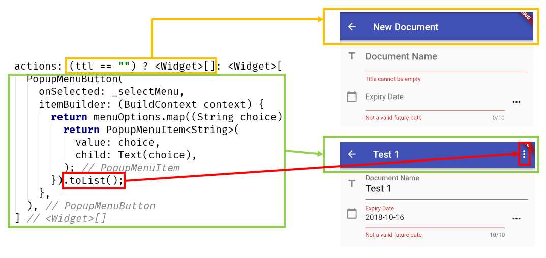
Figure 3-l: The appBar actions property
From the preceding diagram, we can see that the actual menu is built by converting the result of executing the menuOptions.map method to a list using the toList method.
We can also see how each section of the actions property relates to what is seen on the screen when a new document is added, or an existing document is being edited.
So, itemBuilder is assigned to an anonymous function, which receives a BuildContext parameter and returns a mapped list of items contained within the menuOptions array we previously declared. Each individual menu option is an instance of PopupMenuItem.
Body
Let’s now focus on the most extensive part of the Scaffold object, which is the body property. Given that the body code is quite long, we’ll have to break it down into chunks. To understand this better, let’s start off by looking at the following diagram.
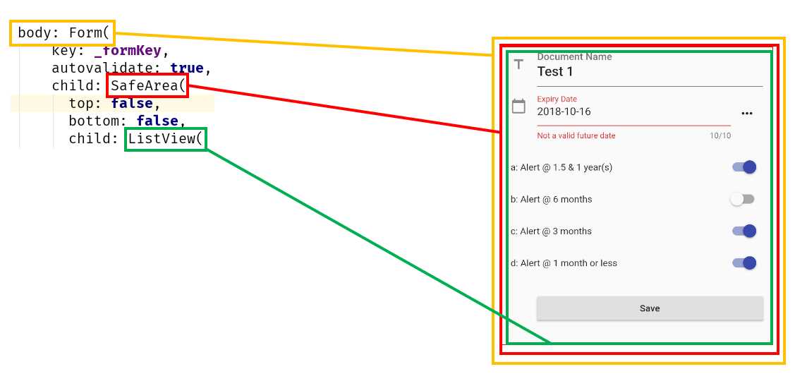
Figure 3-m: The main body section parts
We can see that the body is nothing more than a Flutter Form, which includes a SafeArea object as a child, which includes a ListView.
The reason for this nested layout is that we want to be able to have a list of widgets arranged one below the other. This is why we are using a ListView and have enough padding to avoid any visual intrusions from the device’s operating system—which is why we are using a SafeArea as the child of the Form.
Notice that the key property of the Form object is assigned to the _formKey method that we previously wrote. The autovalidate property is set to true, which means that validation takes place when the form is submitted.
With this well-organized, top-level layout, we have a good foundation on which to render and organize the rest of the widgets that are seen on the screen.
Document Name and Expiry Date
Given that the ListView object will contain all the widgets seen on the screen, let’s now explore how the ListView code is organized in more detail, by looking at the following diagram—this explains how the first two fields are composed.
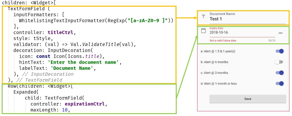
Figure 3-n: The first two data-entry widgets—Document Details screen
We can see that the first widget within the ListView is the text input for the Document Name field.
Document Name field
This field is of type TextFormField, and it is basically a FormField that contains a TextField object.
The TextFormField contains an inputFormatters array that includes a regular expression that specifies which characters can be typed within the field—these are assigned to the WhiteListingTextInputFormatter property.
The controller property is used for indicating that this TextFormField binds to the titleCtrl variable (which is a TextEditingController).
The validator property is used for running field validations; here the Val.ValidateTitle method is executed when the value of the field has changed.
The decoration property, as its name implies, basically sets the icon, hint (hintText), and label text (labelText) messages that are seen on the screen.
That wraps up the Document Name field—let’s now talk about the field that follows, the Expiry Date.
Expiry Date field
The Expiry Date field is slightly more complex, as it renders as a TextFormField contained within an Expanded object, which is part of a Row object.
The reason for this composition is that the Row object also contains an IconButton object, which is used for displaying the Cupertino (iOS-styled) Date Picker widget that was previously explained.
To get a better understanding of how the Expiry Date field is composed, let’s look at the following diagram.
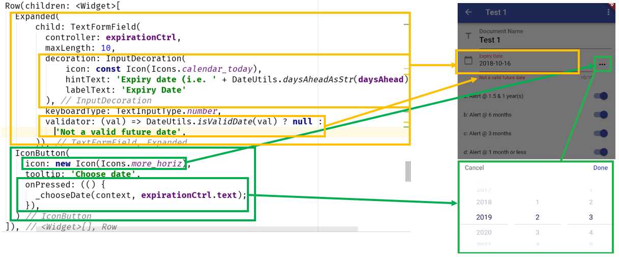
Figure 3-o: The Expiry Date field—Document Details screen
You can clearly see that the Expanded widget corresponds to the area where the text can be manually entered.
The decoration and validator properties of TextFormField work the same way as the Document Name field.
Notice though, how TextFormField binds to the expirationCtrl variable, and the maximum number of characters that can be entered is set to 10—the maxLength property.
For the Expiry Date, the DateUtils.isValidDate method gets triggered when the field value changes and checks if the expiration date is a future date or not.
As for the IconButton object, you can clearly see in the diagram that its icon property renders the “…” button, and the onPressed event triggers the execution of the _chooseDate method, which we previously explored, and runs the iOS-styled Date Picker widget.
With the main two fields explored, let’s move on to the alert fields of the form.
Alert fields
The way the alert fields are composed is almost the same for each one of them—the only difference is the text displayed on the screen and the variables to which they bind.
Let’s explore each one. Each alert field is composed within a Row object.
I have intentionally left an empty Row object before the first alert field—this is to give enough space on the screen between the Expiry Date field and the first alert field. We can see this as follows.
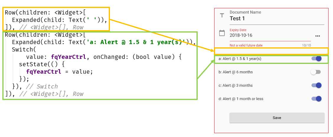
Figure 3-p: The empty row and first alert field—Document Details screen
Let’s explore the details of how a Row object is composed. We can see that the empty Row object contains a children property, assigned to an Expanded object. The Expanded object has a child property that is assigned to a Text object containing an empty String value.
As for the non-empty Row object, we can clearly see that the Expanded object contains a Text child object with the caption that is displayed on the screen.
The Switch widget is used to toggle the on/off state of a single setting. The Switch widget is bound to the fqYearCtrl variable, which indicates that an alert would get triggered when there’s one year remaining for the document to expire.
The Switch widget includes an onChanged event that gets triggered when its value changes (goes from on to off, or vice versa). When its value changes, the setState function is executed and notifies Flutter that the internal state of the object has changed; the changed value is assigned to fqYearCtrl.
As for the other alerts seen on the screen (6 months, 3 months, and 1 month or less), the code is the same as this one. The only difference is that each binds to a different variable—to fqHalfYearCtrl, fqQuarterCtrl, and fqMonthCtrl, respectively.
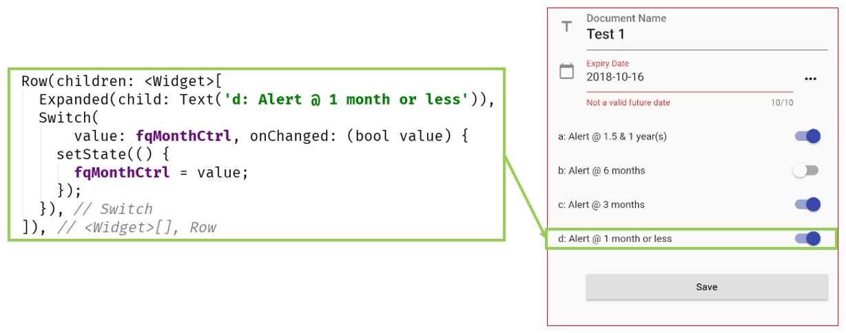
Figure 3-q: Last alert field—Document Details screen
That wraps up the alert fields—let’s now finalize the form by exploring the Save button.
Save button
The Save button is the last part of the form that makes the Document Details screen. Let’s explore how it is composed—to wrap up the Docdetail.dart code.
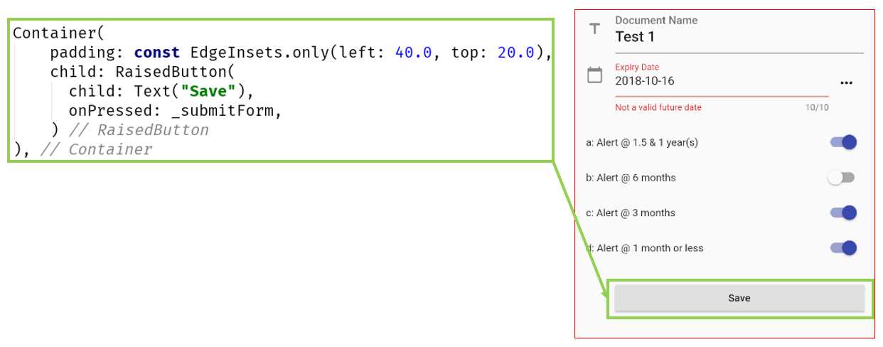
Figure 3-r: Save button—Document Details screen
As we can see, the Save button itself is wrapped around a Container widget. It helps combine common painting, positioning, and decoration of child widgets with padding.
The button is assigned to the child property of the Container widget, and it is a RaisedButton widget. The _submitForm event gets executed when the onPressed event occurs.
Summary
This has been a long and challenging chapter, so if you’ve read this far—congrats! It’s quite interesting what we’ve been able to achieve so far with Flutter, with a relatively little amount of code.
When I say it’s not that much code, we necessarily must praise the awesome framework that the engineers at Google have created, which is Flutter.
As we’ve been able to see, the syntax feels familiar for any developer coming from a C or Java family-based language, and the constructs are easy to grasp and follow.
Something I really enjoy about Flutter is that the UI can be written within Dart without the need to use a markup language.
Normally, this is contrary to what most frameworks do, but with Flutter, it feels natural and enjoyable to create the UI using Dart code—which to me, was a very pleasant surprise.
We’re almost at the end of our application, but we’ve got one final hurdle to overcome: creating the main screen and the logic behind it, which we will do in the next chapter.
- Advanced custom widgets and file-format libraries.
- Built from scratch.
- Dart-powered widgets for extraordinary apps.
- A wide range of products and hassle-free licensing.